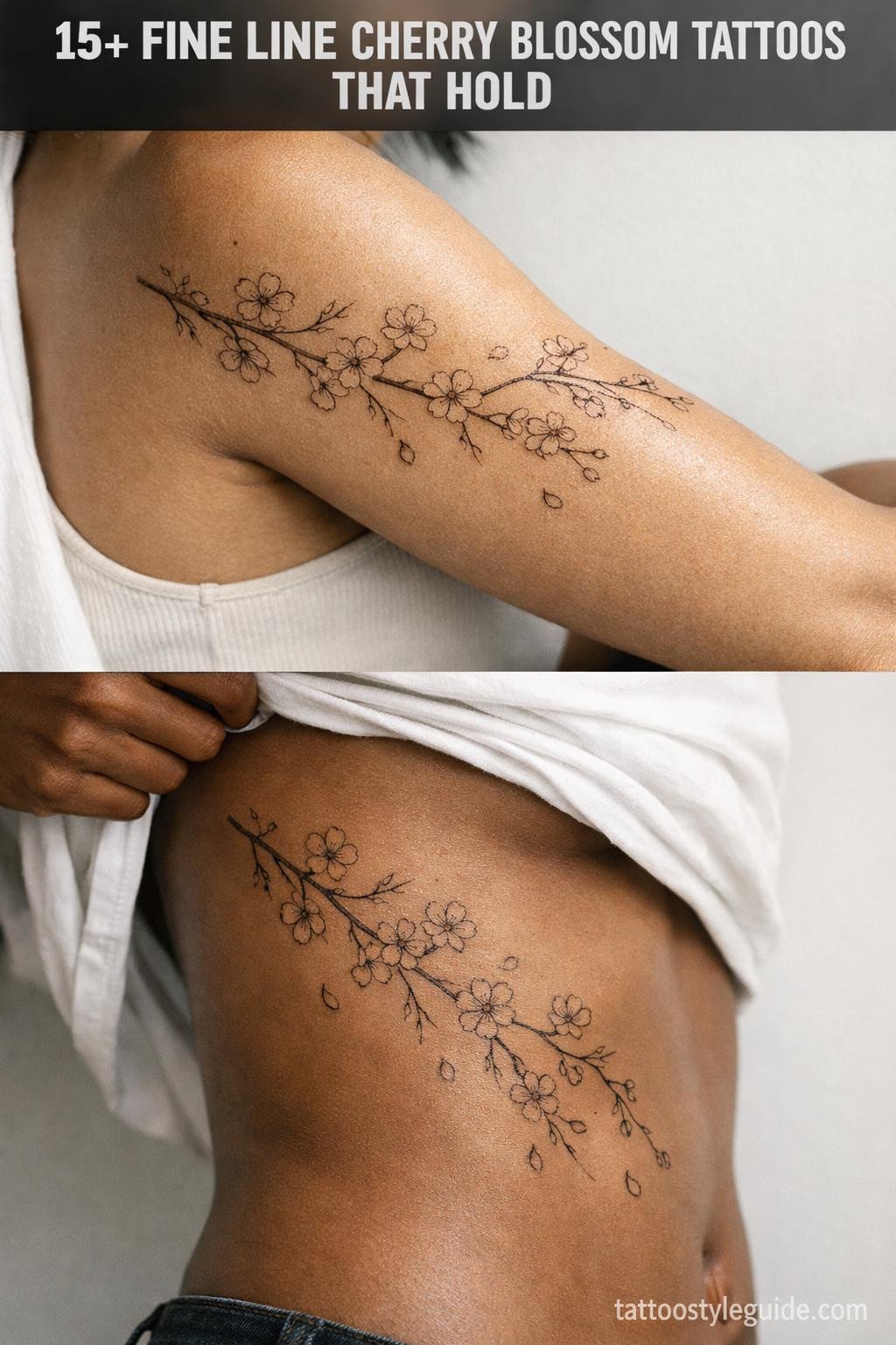
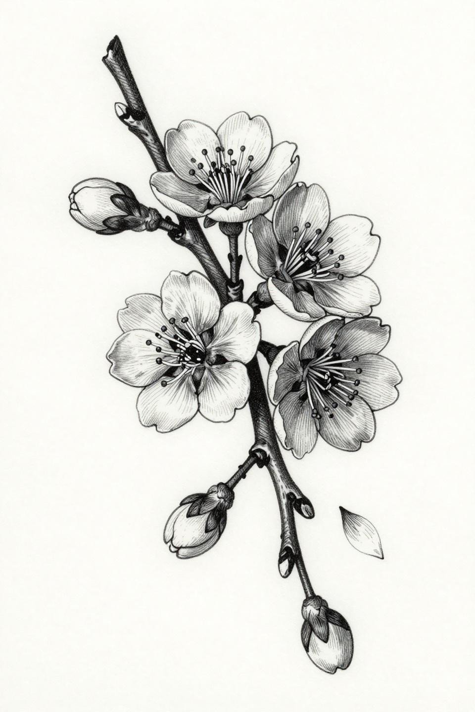
Cherry blossom tattoos fail when artists treat them as filler. The petal clusters need deliberate negative space to read at scale, and the branch structure has to carry visual weight without going heavy enough to kill the delicacy. Most versions collapse into a pink blur within five years because the linework was too fine to survive.
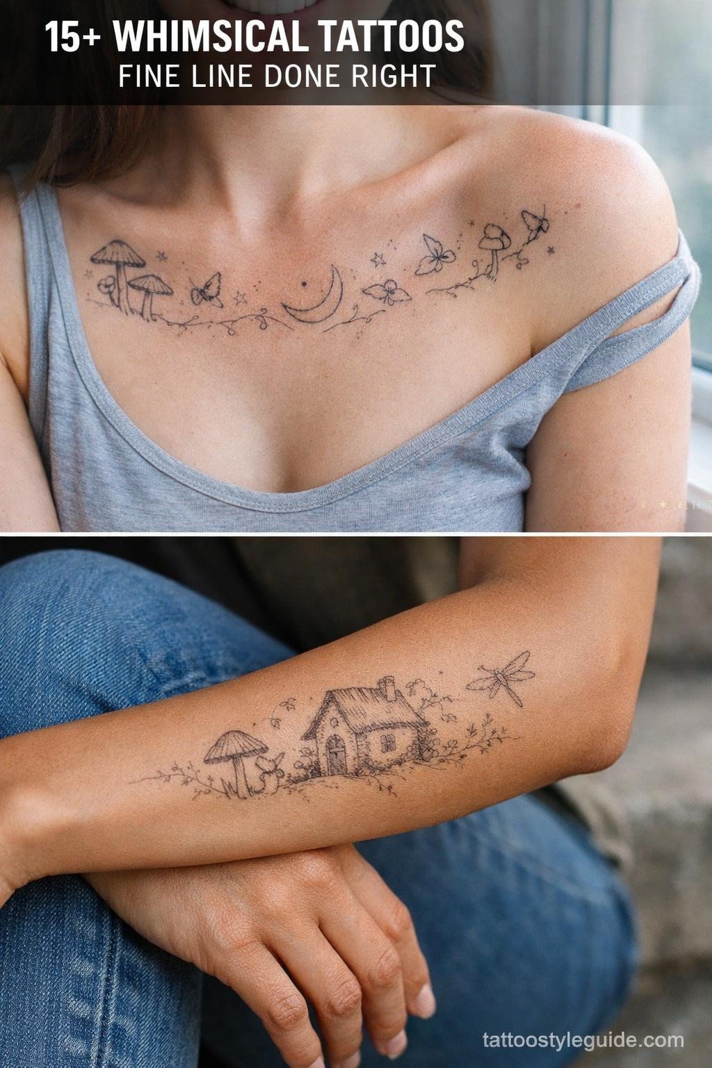
The designs below cover thirteen floral styles worth studying alongside sakura references. Each one has a technical reason it works.
Why Lily of the Valley Outlasts Most Floral Flash
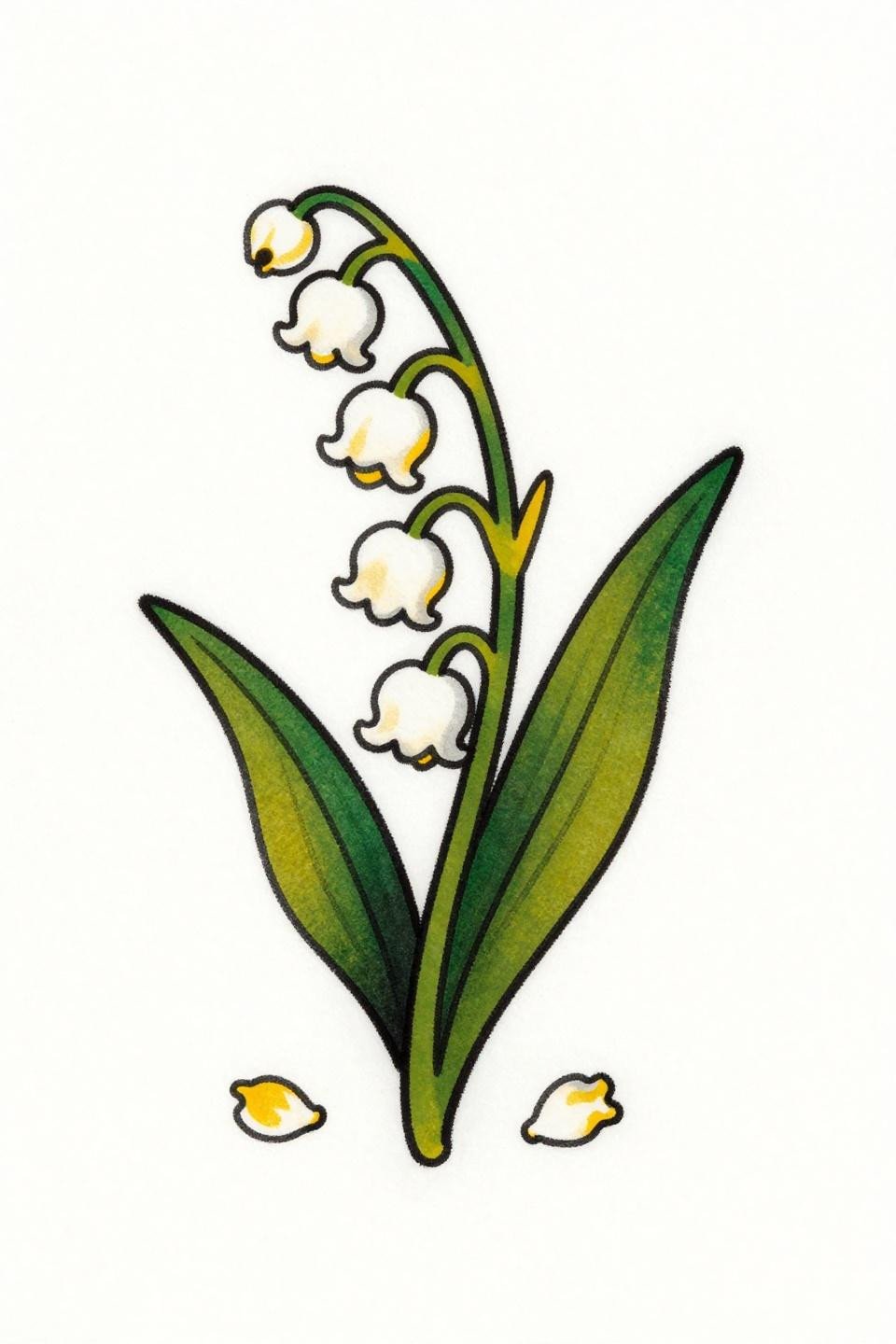
Three nodding bell-shaped blooms on arching threadlike stems, two lanceolate leaves with prominent central ribs, fallen petals scattered at the base. The stacked vertical composition makes this an obvious candidate for forearm or shin placement where the format matches the canvas.
Traditional flat fills like these hold their read for decades. The forest green and cadmium white stay separated under skin because the bold outline prevents color migration across the boundary.
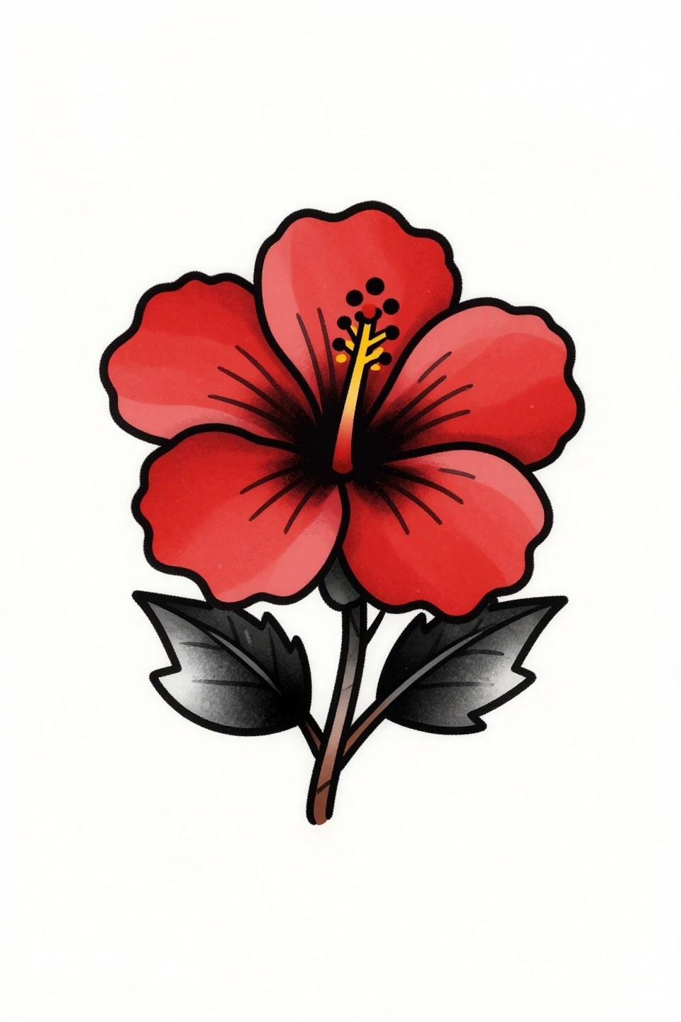
Ignorant Style Hibiscus: Where Wobbly Lines Actually Work
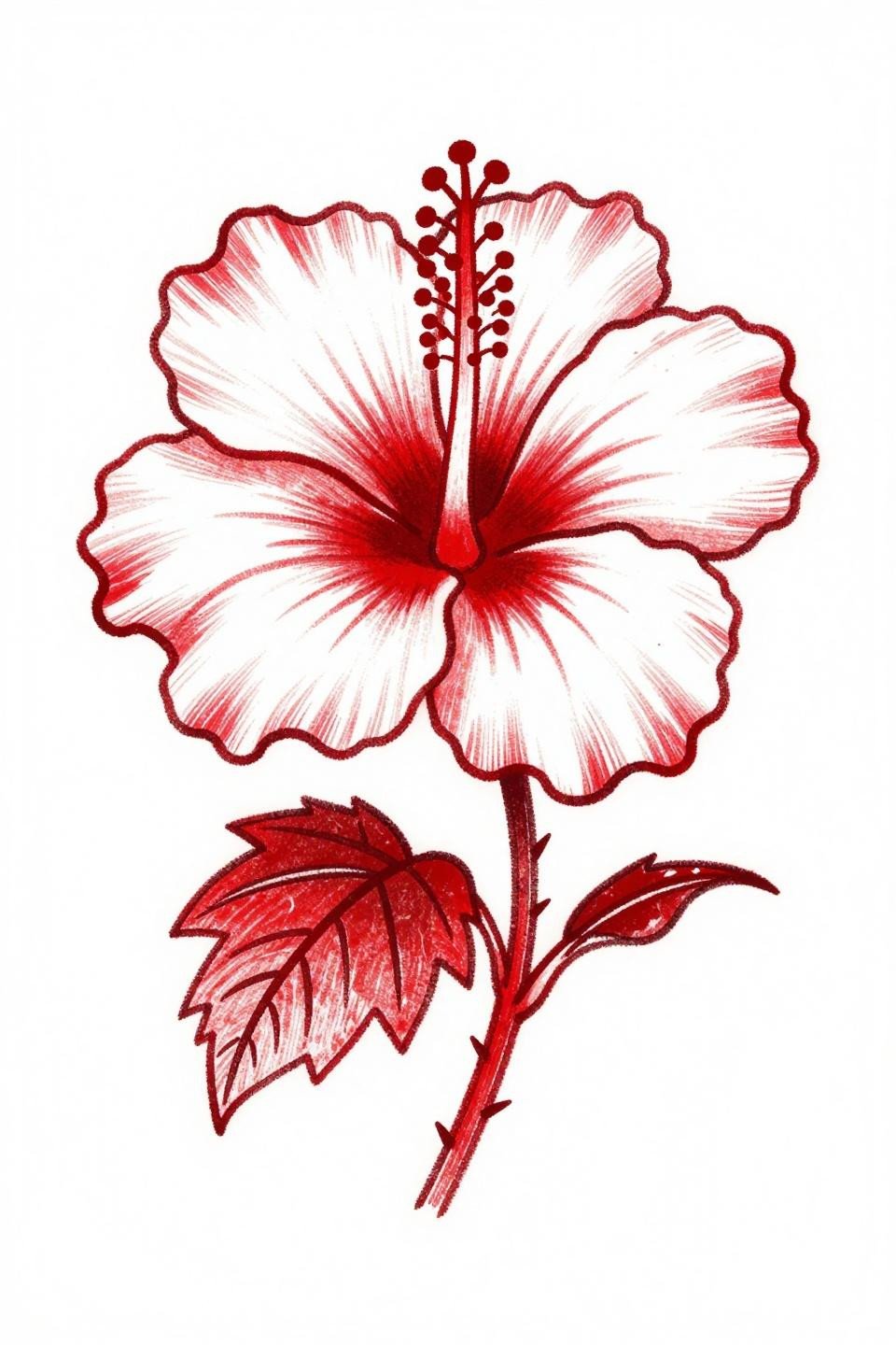
This hibiscus leans on raw irregular outlines and a flat crimson fill, no shading, no gradient. The ignorant style execution is a deliberate choice, not a skill gap: the wobbly linework reads as controlled irreverence, which is entirely different from an unsteady hand.
On darker skin tones, that flat crimson will need bolder saturation to maintain contrast. Ask to see the artist’s healed ignorant work before committing.
Sketch Style Sakura: Reading the Difference Between Raw and Rushed
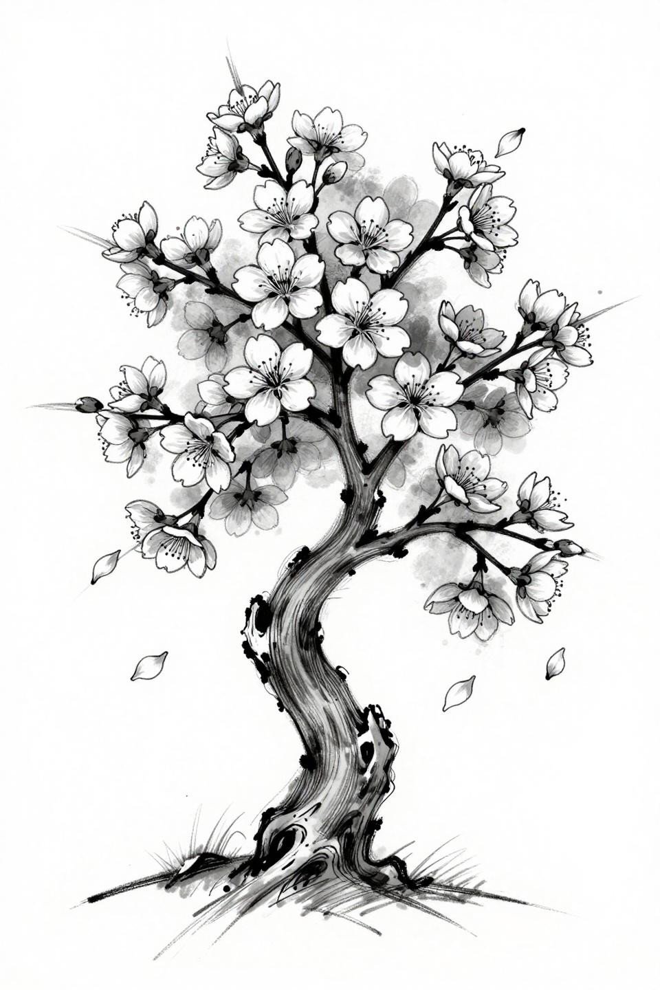
A gnarled trunk base with multiple asymmetric branches, dense bloom clusters showing visible stamens, and falling petals placed with enough spacing to breathe. The aggressive whip shading strokes create the gestural energy that separates sketch style from simply unfinished work.
Grey wash diluted from dense at the trunk to open at the petal edges keeps the midtones from muddying. The tell is those midtones: no muddy grey pooling means the artist controlled their wash ratios correctly.
Sak Yant Geometry on a Peony: When Sacred Structure Meets Floral Form
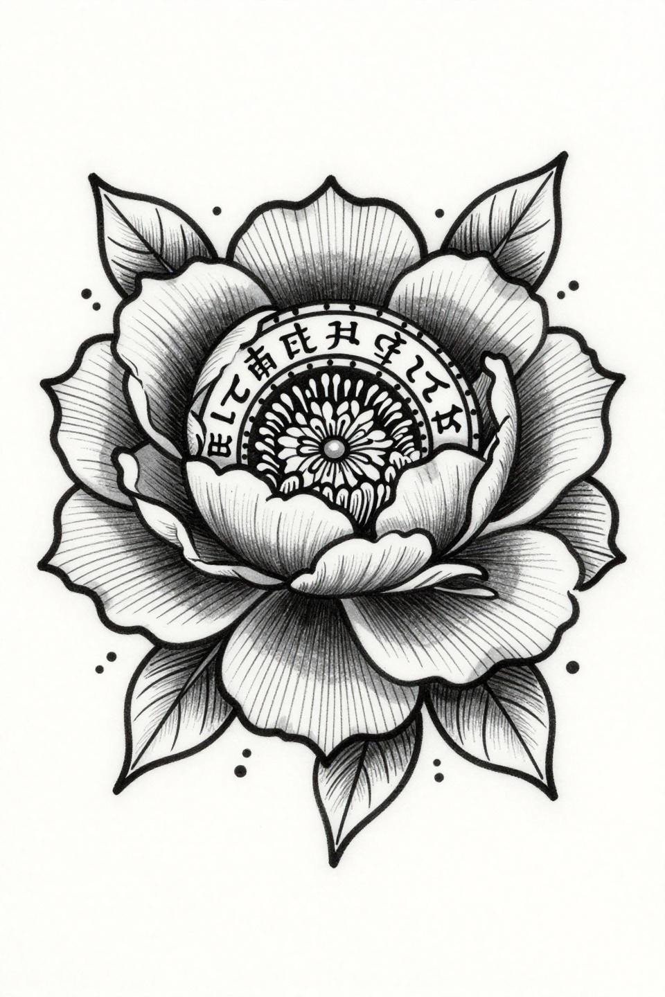
A peony bloom at the center of a circular mandala, ringed by Buddhist script and radiating protective parallel line patterns, with ceremonial dot accents on the compound leaves. The bilateral symmetry here is load-bearing: any drift in the ruling destroys the composition’s authority.
Collarbone placement suits this format because the bilateral axis aligns with the body’s natural centerline. Precision parallel line work like this signals an artist who uses guides, not freehand rulers.
Single Continuous Line Orchid: The Technique That Punishes Hesitation
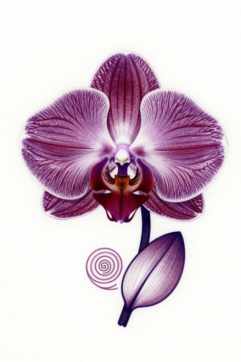
A slipper orchid rendered in one unbroken line, spiraling into a circular mandala format, with threadlike roots trailing from the base and no fills anywhere. Single needle 1RL work at this level requires an artist who controls machine speed to keep the line weight consistent through every curve.
No fills means this design lives or dies on the line itself. Protected placements like the upper arm or sternum give it the best shelf life; high-friction zones will ghost the thinnest segments within two to three years.
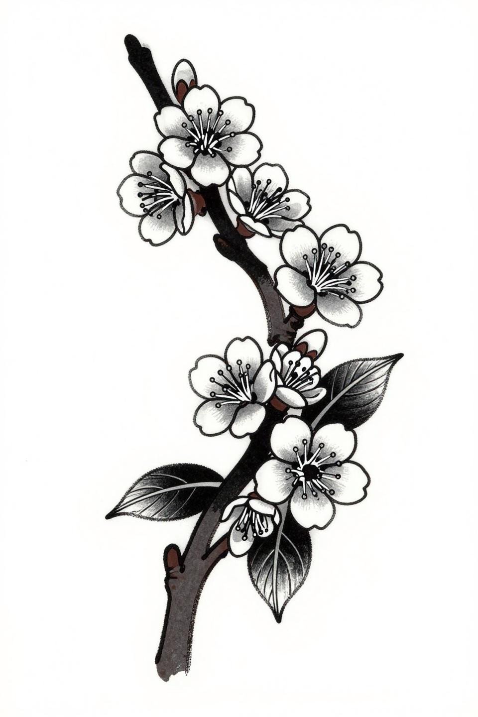
Etching Line Cherry Blossom Branch: Old Print Logic Applied to Skin
Four blossom clusters at varied bloom stages, an offshoot with unopened buds, and falling petals arranged across an asymmetric diagonal flow. The crosshatch shadow depth mimics 19th-century botanical engraving, where shadow is built from ruled lines rather than grey wash.
Fine 0.3mm stroke work this dense will compress with age on looser skin, so placement matters. Upper back or outer forearm, where the skin stays taut, preserves the line separation longest.
Stipple Dot Peony: Where Dot Density Does All the Shading Work
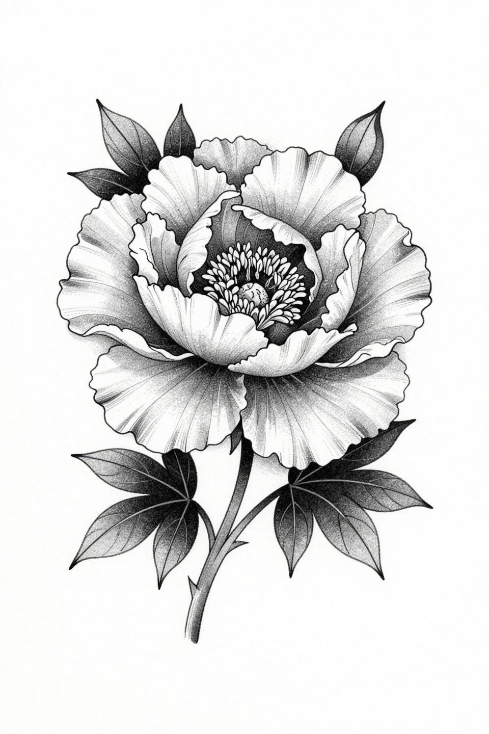
A fully doubled peony in profile, no outlines at all, built entirely from stipple dot density that runs heavy at the petal center and opens to bare white at the edges. The stipple density gradient here is the technical argument: consistent dot size across the full radius separates a skilled hand from a labored one.
This approach ages differently than lined work. The form softens slightly over time rather than blurring, which on olive and darker skin tones can actually improve the read by smoothing the transition zones.
Tribal Diamond Frame Lily: When Geometry Locks a Botanical
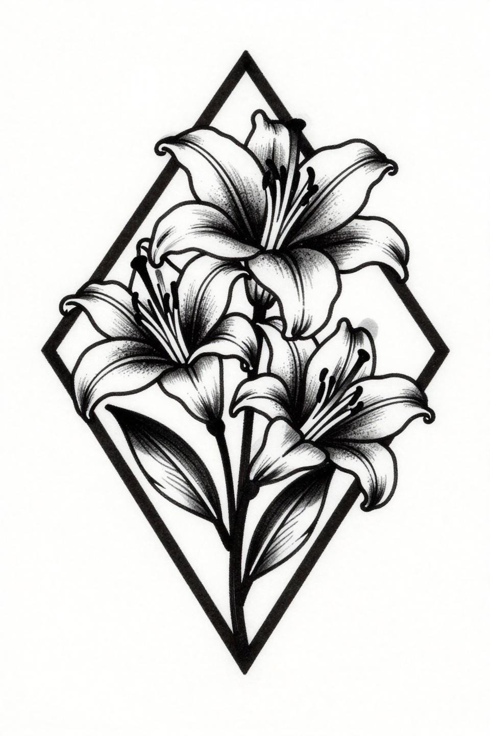
A six-petaled lily with recurved petals and pollen-dusted stamen filaments, enclosed inside a bold diamond frame, bilateral symmetry locked along the vertical axis. The high-contrast negative space inside the frame does the compositional work that color would do in traditional American flash.
Full black saturation at this weight requires multiple passes to avoid patchiness. Flat fills with no patchiness are the clearest signal separating veterans from beginners in blackwork.
Art Nouveau Orchid in Gold: Two Colors That Cannot Fake Craft
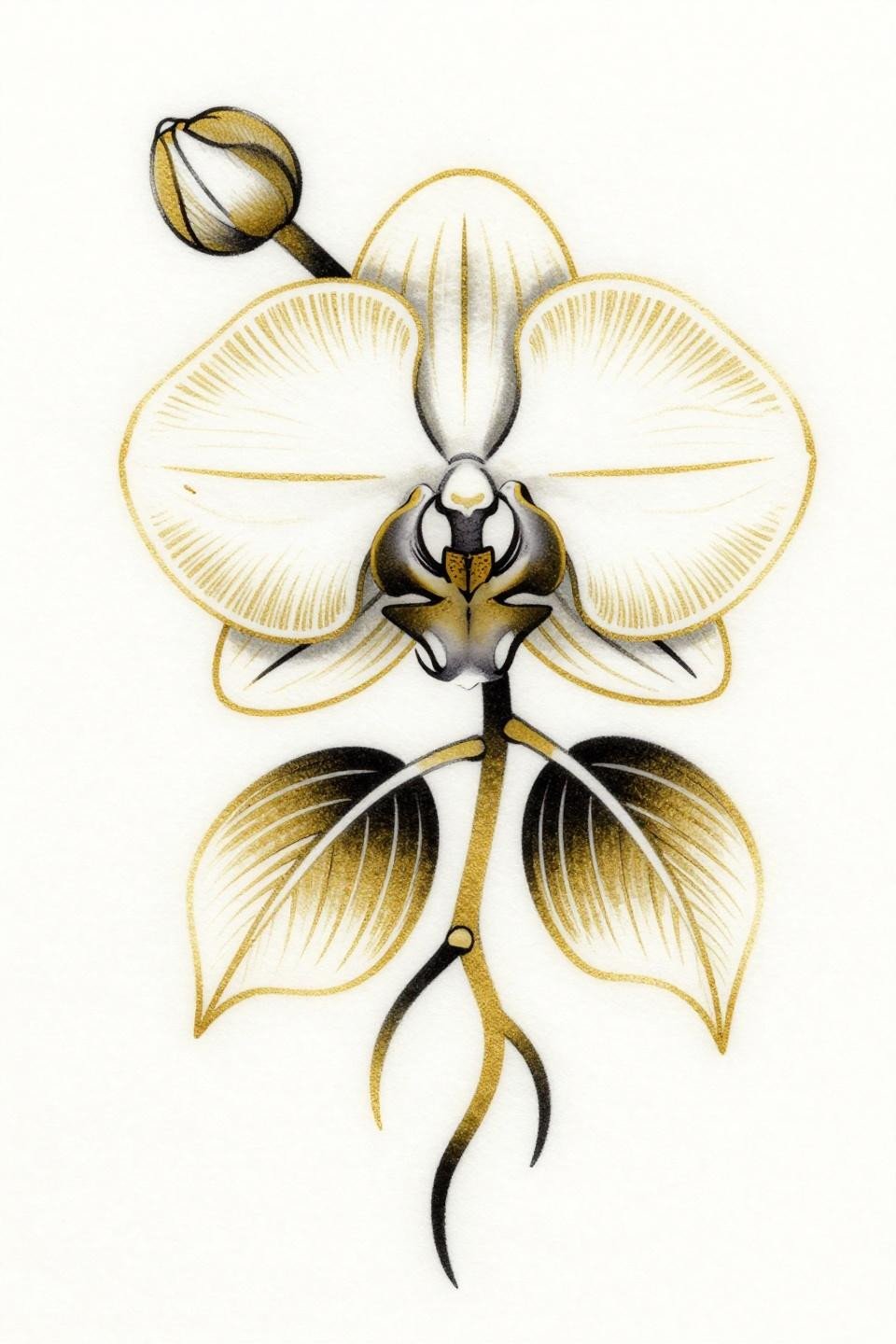
An orchid rendered in pure art nouveau line logic: flowing sinuous contours, ornamental flourishes, flat gold fills against solid black outlines, no shading anywhere. The flat gold saturation has no grey wash to hide behind, so the fill quality is completely exposed.
Gold pigment is notoriously inconsistent across skin tones. On lighter skin it reads close to flash reference; on medium and deeper tones the gold can shift warm-yellow and lose the metallic contrast the design depends on.
Watercolor Peony: What the Wet Bleed Edge Actually Risks
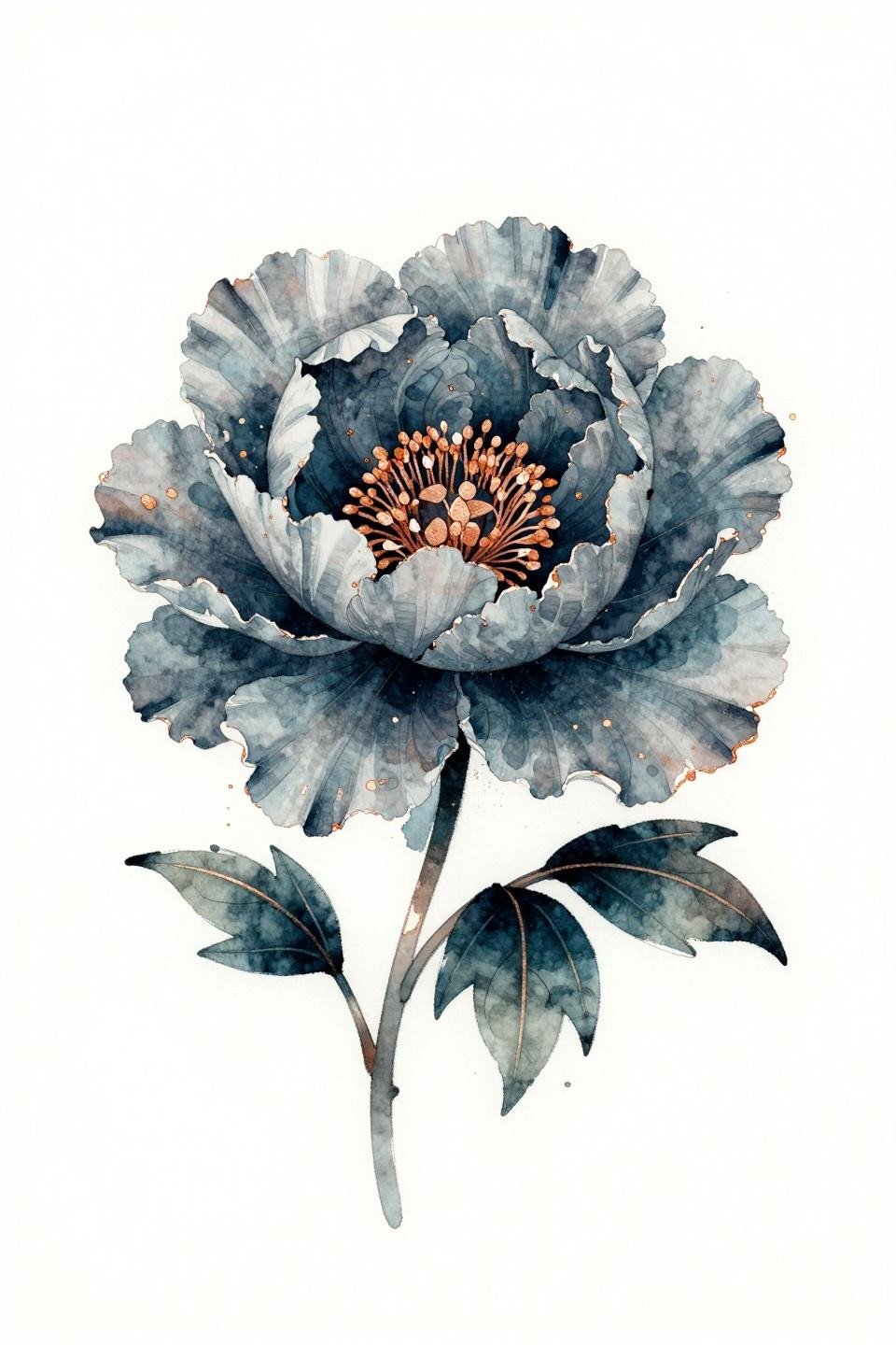
A peony in three-quarter view, built from open watercolor washes with wet bleed edges, calligraphic brush marks, and deep teal paired with a copper metallic accent at the stamen center. The wet ink bleed edges are the defining risk in this style: without an anchoring outline, those edges blur by year three to five under real skin conditions.
The copper accent is a smart move technically. It anchors the center with enough density that the stamen cluster stays readable even as the surrounding wash softens with age.
Irezumi Sakura Branch: Reading Brush Stroke Quality as a Linework Test
A single sakura branch arching diagonally across the frame, three bloom clusters at varied stages, fine threadlike stamens, secondary buds along the curved stem, asymmetric leaf placement. The brush stroke outline quality in irezumi flash is the technical test: the pressure variation should read like ink on rice paper, not a mechanical line.
Grey wash midtones on this design fill the space between the black outlines and the bare white ground. On olive skin, that grey reads warmer, which can shift the mood of the piece from stark to soft.
Neo-Traditional Hibiscus: Where Bold Outline Earns Its Keep
A hibiscus in full frontal bloom, five rounded petals with a prominent stamen cluster, serrated leaves flanking symmetrically, rendered in crimson red against solid black with no additional color. The 2-3pt neo-traditional outline weight here is the longevity anchor: it holds the crimson fill from bleeding outward across years of sun and friction.
Bold outlines at this weight hold clean for ten or more years on protected placements. Upper arm, thigh, and outer calf give this format its best shelf life.
Botanical Fine Line Cherry Blossom: The Format That Demands Slow Needlework
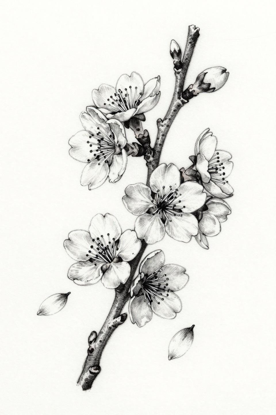
A cherry blossom branch built from hairline 0.5mm single-needle strokes, five-petaled blooms with visible stamens, scattered falling petals preserving the negative space that makes botanical illustration readable. The open negative space composition depends entirely on consistent stroke weight: any variation in speed changes the line thickness and breaks the botanical reference logic.
Fine line cherry blossom work like this needs a protected placement to survive. Sternum, upper back, and inner arm are the realistic options for maintaining this level of detail past year five.
Take three to five references from this collection and match them to your placement before the consultation. Scale, skin tone, and sun exposure should filter your shortlist, not aesthetics alone. A reference that matches your placement’s geometry does more work in a consultation than a reference that simply looks like what you want.