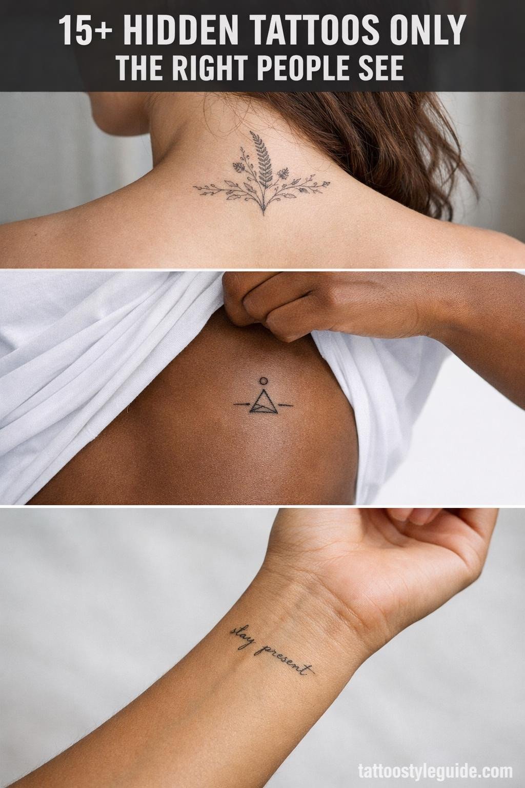
Hidden tattoos punish vague placement decisions more than any other category. The skin zones that stay covered, inner wrist creases, the nape, behind the ear, the hip, all have different movement patterns and sun exposure histories that directly affect how fine line work ages.
Most people choosing hidden placements gravitate toward the smallest possible design. That instinct is wrong half the time. A design too small for its placement loses legibility before year five, especially on skin that flexes constantly.
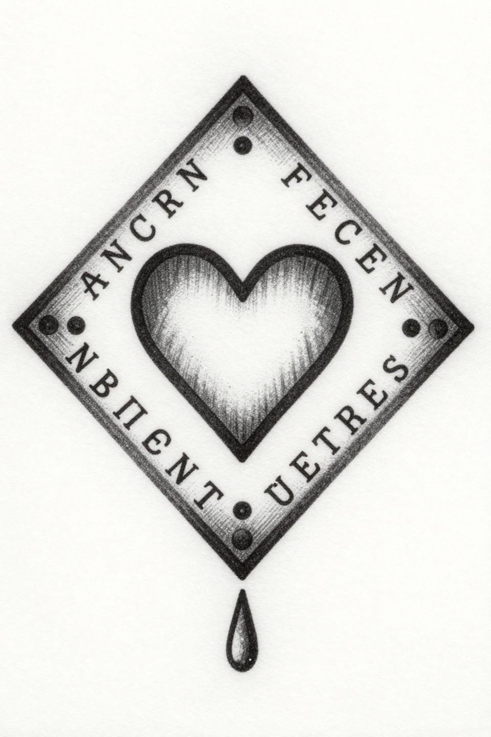
Art Deco Geometry as a Personal Cipher Nobody Else Reads
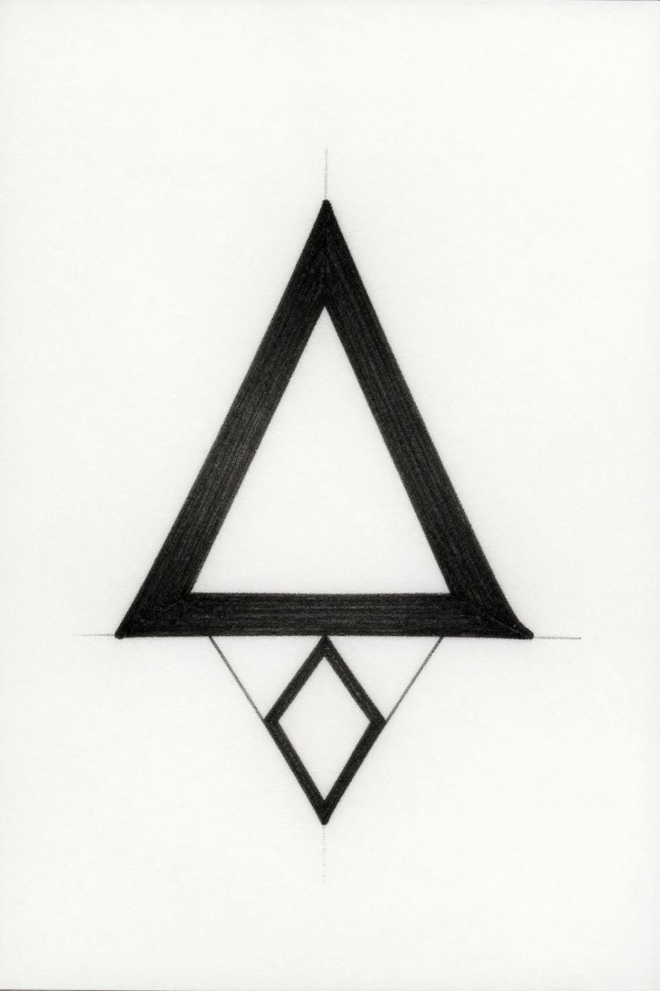
This Art Deco flash pairs a geometric triangle with a nested serif initial and diamond frame border, all built on compass-drafted bilateral symmetry with a uniform 1pt stroke weight throughout.
The single stroke weight is the longevity signal here. Uniform line weight at this scale holds legibility on protected placements like the sternum or inner arm for well over a decade without touch-up.
A Birthdate Nobody Reads Unless You Tell Them
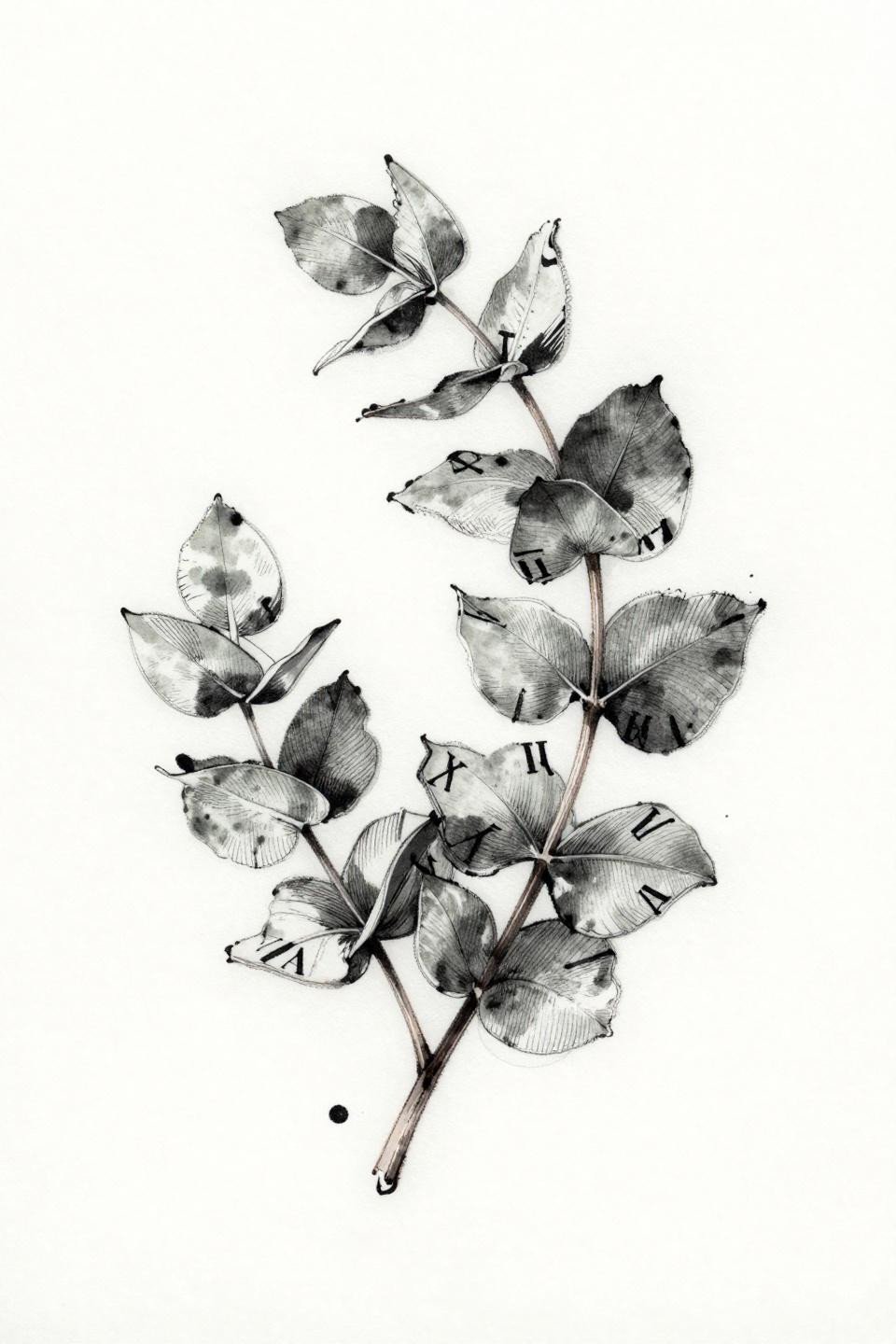
Roman numeral inscription anchored inside an asymmetric eucalyptus wreath, rendered in botanical scientific linework with wet-ink gestural marks and grey wash midtones for the leaf body.
The grey wash dilution on the leaves is the technical risk. On olive and darker skin tones, those midtones compress toward the outline weight and lose contrast by year three. Ask your artist for healed portfolio shots on matching skin.
Tribal Mandala Scaled to Stay Invisible at a Glance
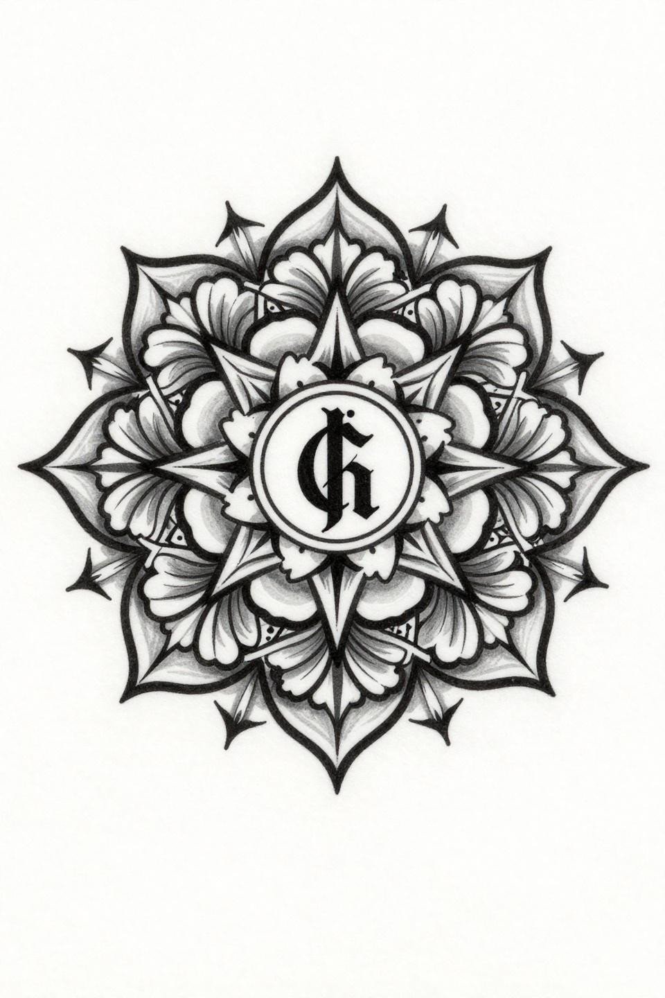
Compact circular mandala built from micro floral units and angular tribal rays, with a serif ampersand at the core and bold 2-3pt outlines supporting flat black fills throughout.
This outline weight is exactly what ankle placements need. The constant flexion and friction at the ankle joint degrades fine line work fast. Bold outlines at 2-3pt hold the silhouette even after the fill softens.
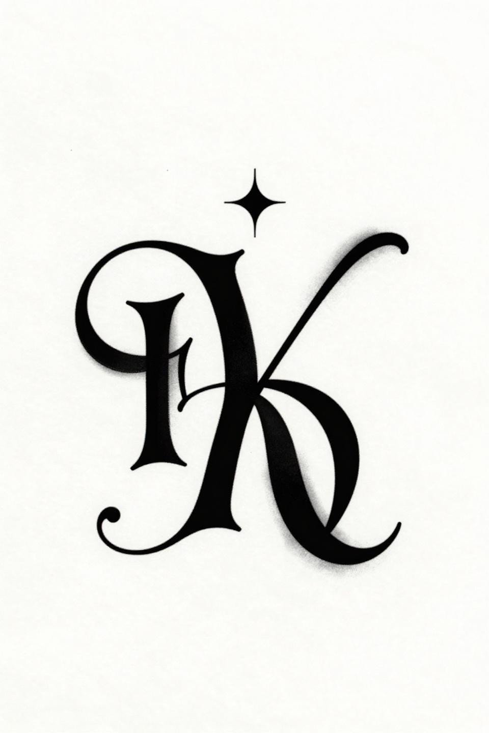
The Ampersand as a Relationship Marker Only Two People Understand
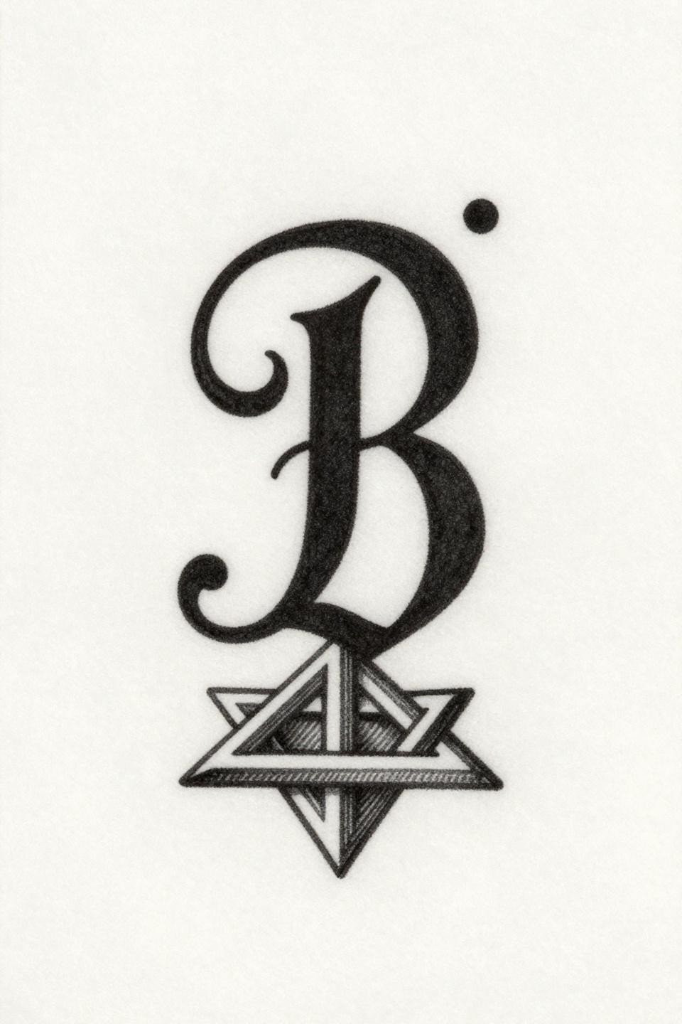
A tiny serif ampersand with flourished terminals and a single decorative dot accent, rendered in parallel crosshatch engraving with grey wash dilution handling the midtone shadow areas.
The hatching technique here ages differently than solid fill. Cross-hatched shadows open up slightly over time, which reads as a softening of contrast, not degradation. Protected placements like the inner wrist or behind the ear extend that shelf life considerably.
Coordinate Heart That Only Resolves Up Close
A geometric heart outline sits inside a diamond border, with micro serif coordinate numerals placed below the heart interior. Parallel engraving fills the border only, leaving the heart outline clean and unshaded.
That negative space decision is smart at this scale. Any interior fill on a motif this small compresses into grey mud within a few years. The open heart reads crisper at year seven than a filled version would at year two.
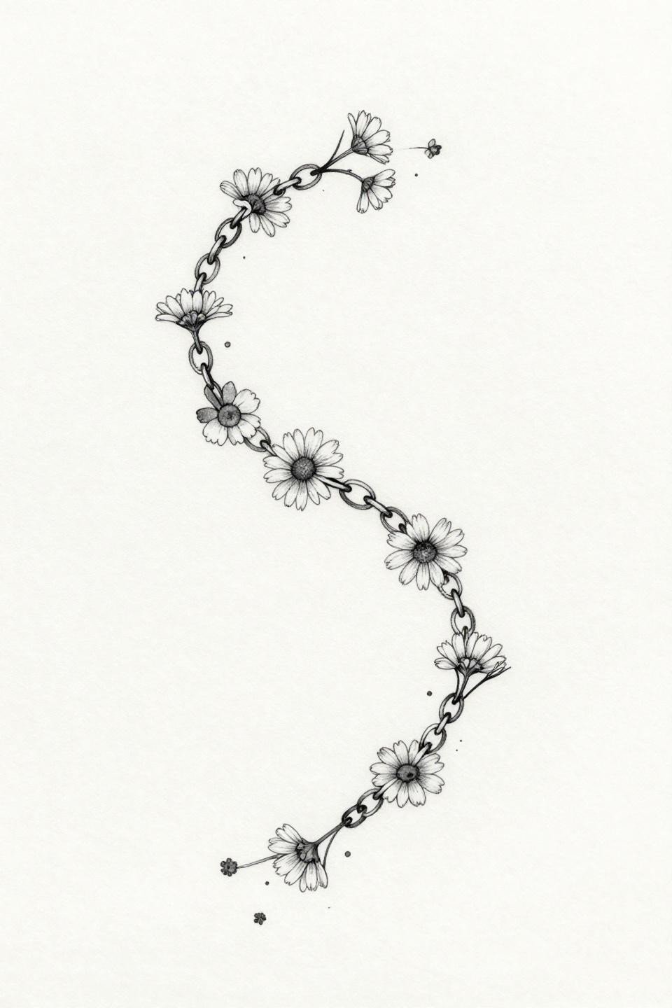
Single Needle Bracelet Chain That Sits Like Jewelry
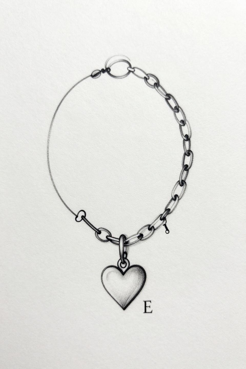
A bracelet chain rendered as one unbroken hairline stroke with a dangling heart charm and micro serif initial, executed entirely in 0.5mm single-needle 1RL linework with zero fills and open negative space.
Single needle work at this weight requires an artist who controls hand speed precisely. Check their healed portfolio specifically for bracelet and wrap designs, not just fresh shots. Fresh single needle always looks clean. Healed is where the skill gap shows.
Wrist Crease Moon and Star That Disappears in a Closed Fist
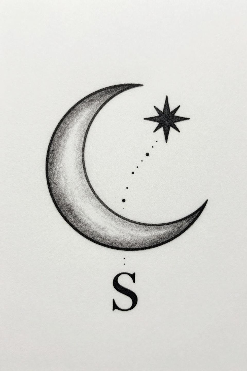
Crescent moon with an off-center star and serif initial S, connected by a micro dotted constellation trail in diagonal asymmetric arrangement, all hairline 0.5mm single-needle linework.
The dot trail is the element most likely to blur first. Dots this fine at close spacing need low friction placement to hold their separation. Inner forearm or sternum keeps them distinct. Finger or wrist crease turns them into a smear within two years.
Roman Numerals Arranged as a Falling Composition, Not a Stamp
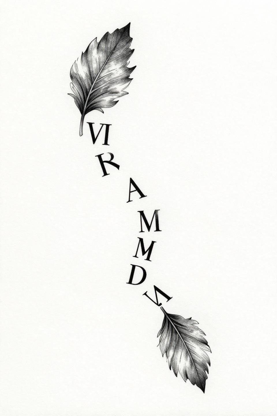
Roman numeral sequences in graduating scale arranged on a diagonal scatter, connected by hairline quill-stroke flourishes that reference falling leaf movement, rendered in single-needle 0.5mm linework.
The graduating scale across the numerals adds visual depth without adding surface area. This composition logic works well on the ribcage or shoulder blade where the diagonal can follow the natural body contour instead of fighting it.
Botanical Letter Architecture That Reads as Flora First
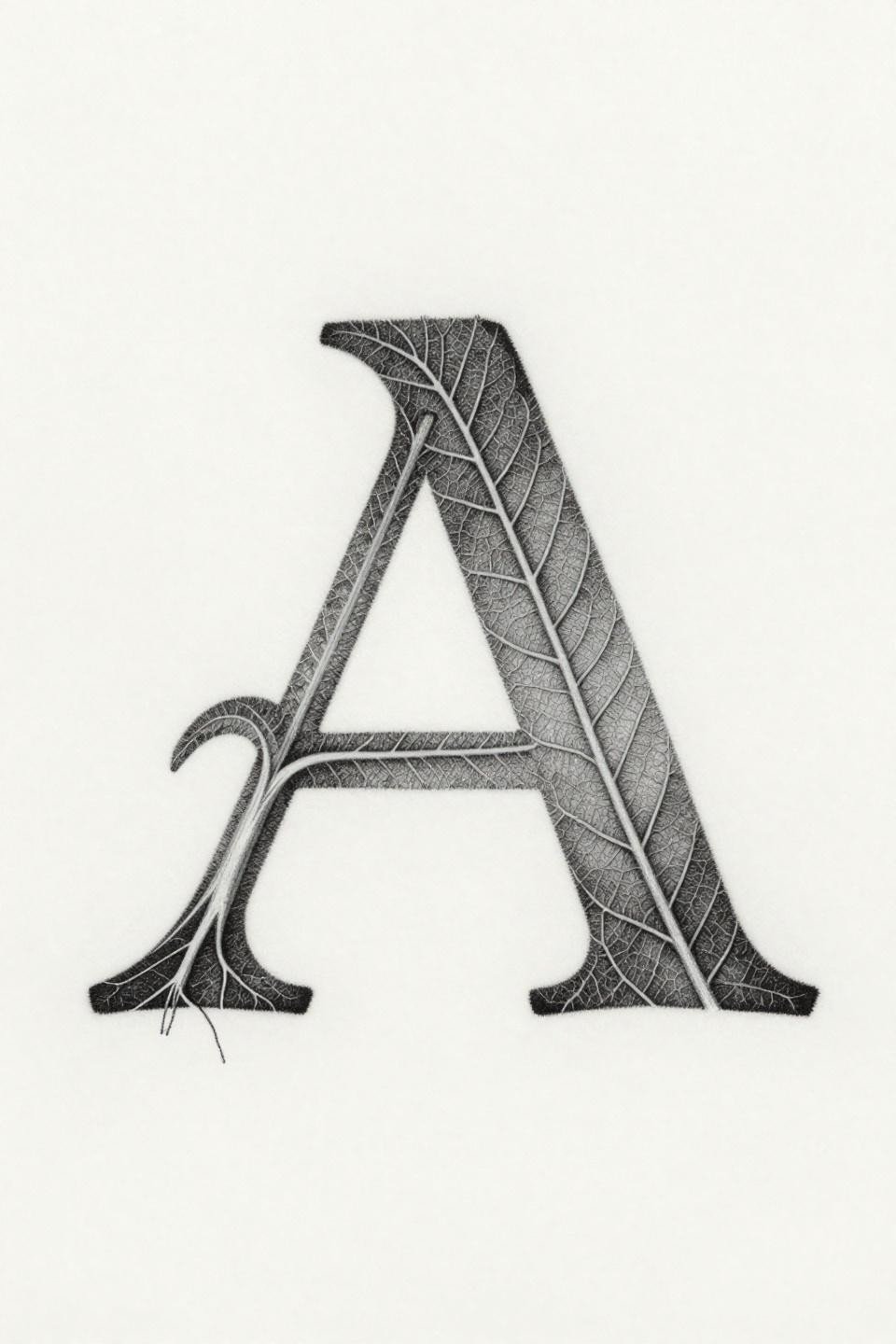
An abstract letter A constructed entirely from leaf vein architecture, with a dominant midrib and branching gossamer capillary networks handling weight variation from spine to terminal edge.
The variable stroke weight from midrib to terminal veins is what separates this from a simple outline letter. An artist who can hold that taper consistently at this scale across 30-plus direction changes is working at a technical level worth paying a premium for.
Dainty Monogram Built for a Hidden Wrist or Collarbone
Two serif initials interlocked with a connecting flourish line and single ornamental dot, executed in Art Nouveau vector precision with sharp 1pt outlines and flat fills.
Flat fills at this scale need a steady saturated pass to avoid patchiness. Patchiness in a motif this small reads immediately and cannot be corrected without reworking the entire piece. Look for artists whose small lettering healed with consistent density, not spotty grey tone.
Constellation Finger Tattoo With Zero Margin for Error
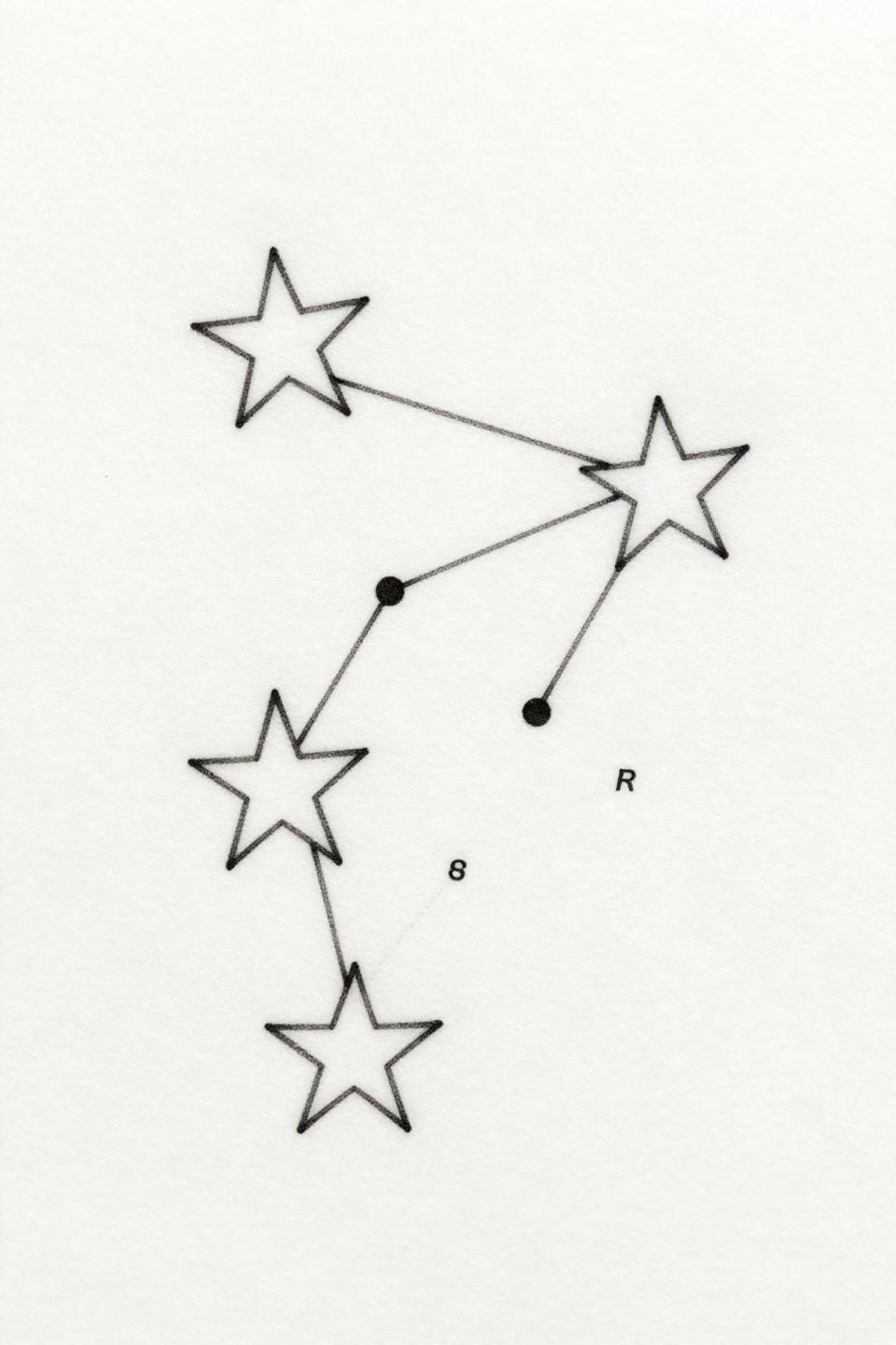
Three stars in an open triangle constellation with hairline connecting lines and micro coordinate notation in asymmetric serif placement, zero fills, pure single-needle linework.
Finger placement means this is a temporary tattoo priced at permanent tattoo rates. Friction, sun, and constant flexion will fade this within two to three years. Plan for a touch-up schedule before you book it, not after.
Art Deco Moon Phases Inside a Geometric Frame That Suits the Nape
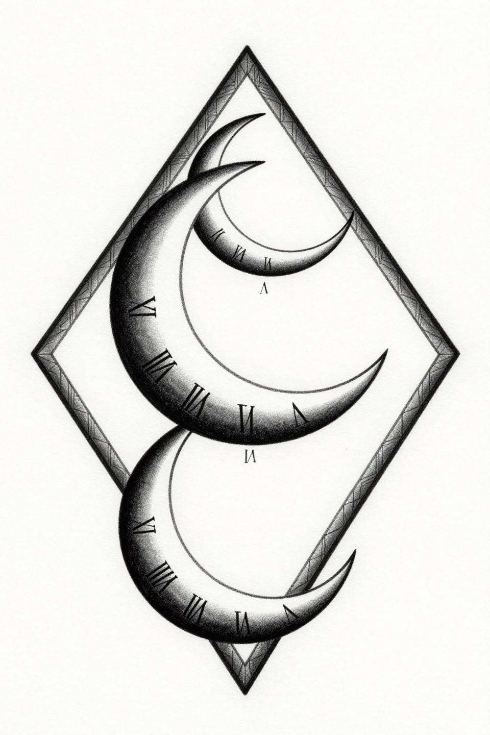
Three moon phases in waxing-to-waning sequence, compass-drafted with geometric pointed edges inside an Art Deco diamond border frame, Roman numerals in micro serif font beneath each phase.
The horizontal format of this composition suits nape and collarbone placements directly. The Art Deco border contains the spread and prevents the design from reading as three disconnected elements when viewed at distance.
Botanical Ankle Bracelet That Functions as Permanent Jewelry
A delicate chain bracelet with chamomile and clover silhouettes dangling between open oval links, entirely hairline single-needle linework with intentional negative space between each botanical motif.
Ankle placement is the highest-friction zone for fine line bracelet designs. Without bold enough outlines to anchor the chain links, those open ovals blur into each other within five years. This flash sits right at the edge of what single-needle can hold long-term at the ankle.
Dotwork Heart That Reads as Solid at Thumbnail Scale
A classic heart silhouette filled entirely with stipple dot gradient, densest at the core and opening toward the edge, with no outline at all, form held entirely by dot density mapping.
Outline-free dotwork depends on the density contrast between center and edge to read as a shape. On lighter skin, this holds well. On medium and darker skin tones, that contrast compresses, and the silhouette can lose its edge definition over time. Bold center saturation is non-negotiable for longevity.
Infinity Heart Loop That Fits a Single Finger Segment
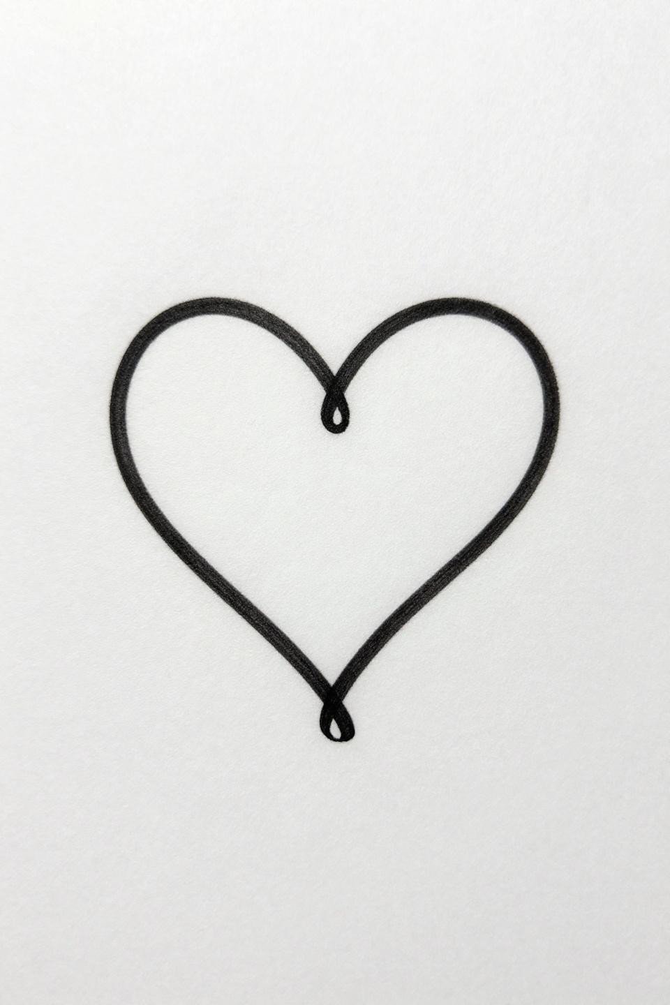
An infinity symbol interwoven with a tiny heart outline, drawn as one unbroken hairline stroke with a single clean intersection point where both forms meet, zero fills, open negative space throughout.
The intersection is where execution separates artists. A wobble or hesitation mark at the crossing point reads permanently in single-needle work. The tell is smoothness through direction change. Look for that specific transition in portfolio examples before booking.
Pick three of these references maximum before your consultation. One for the design, one for the execution style, one for scale reference. Artists work faster and more accurately when the brief is tight. A focused reference set is more useful than a folder of forty options.