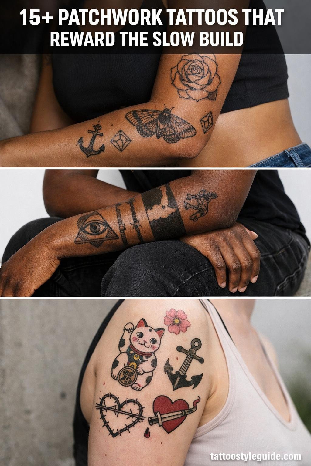
Patchwork tattoo ideas work precisely because they refuse the unity that traditional sleeves demand. No background filler, no forced flow, just discrete panels holding their own weight, with negative skin acting as the connective tissue. That constraint is also the trap: without consistent outline weight across every panel, the whole thing reads as unfinished rather than intentional.
The slow build is the point. A patchwork sleeve built over years carries its own timeline in the gaps. The sections below cover 13+ flash references across styles, from blackwork geometric to fine line botanical, each one designed to function as a standalone patch or anchor piece for a longer collection.
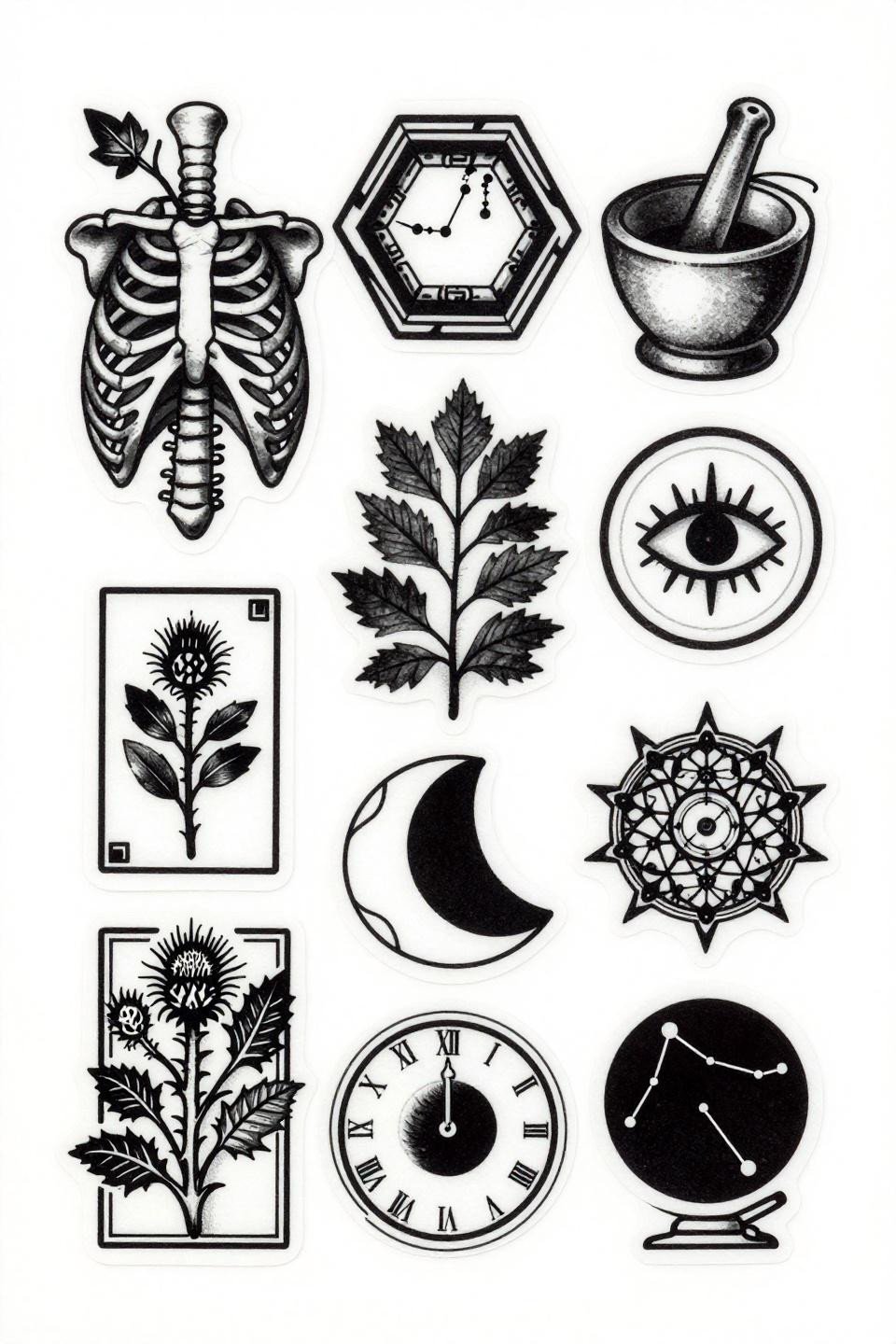
When Old School Flash Anchors a Patchwork Build
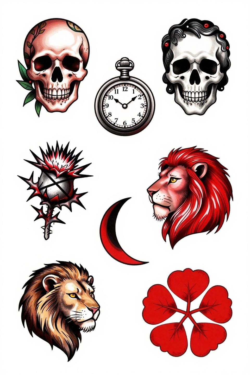
Eight panels in scattered organic layout, each self-contained: flowering skull, ornate pocket watch, barbed thistle, tarot strength card, all framed with bold 3pt black outlines and flat crimson fills that read across a room.
Traditional flash at this outline weight holds clean for 10+ years, even on high-friction placements like the forearm. The single-color accent strategy also ages predictably, crimson fading warmer rather than muddy.
Watercolor Washes That Actually Hold Their Shape
Watercolor bleeds in muted sage, ochre, and dusty rose sit behind calligraphic linework, with color diffusing at the patch edges rather than bleeding into adjacent panels.
Watercolor without an anchoring outline blurs by year three to five, but this sheet keeps ink linework as the structural frame, which is the correct call for longevity in a patchwork context.
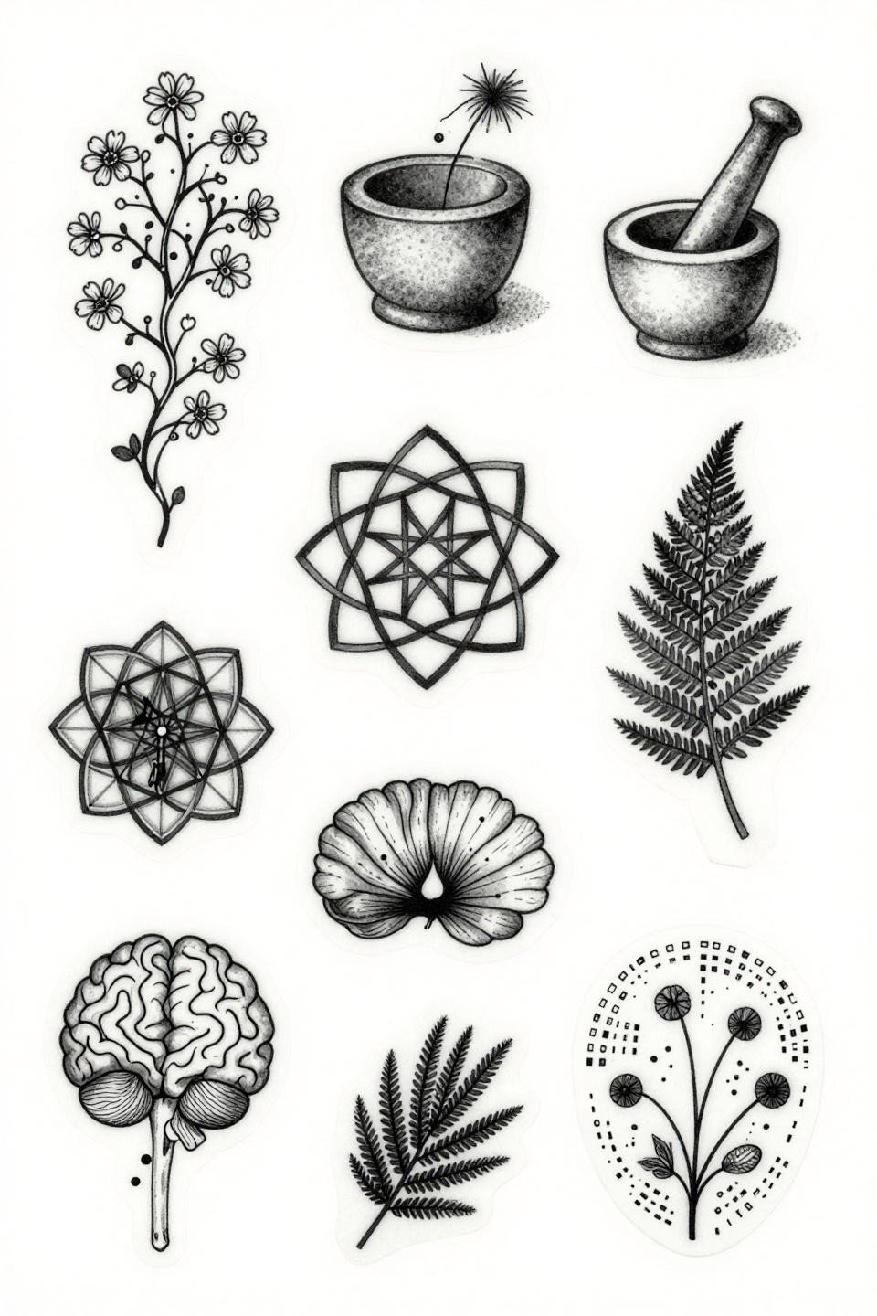
Botanical Science as a Patchwork System
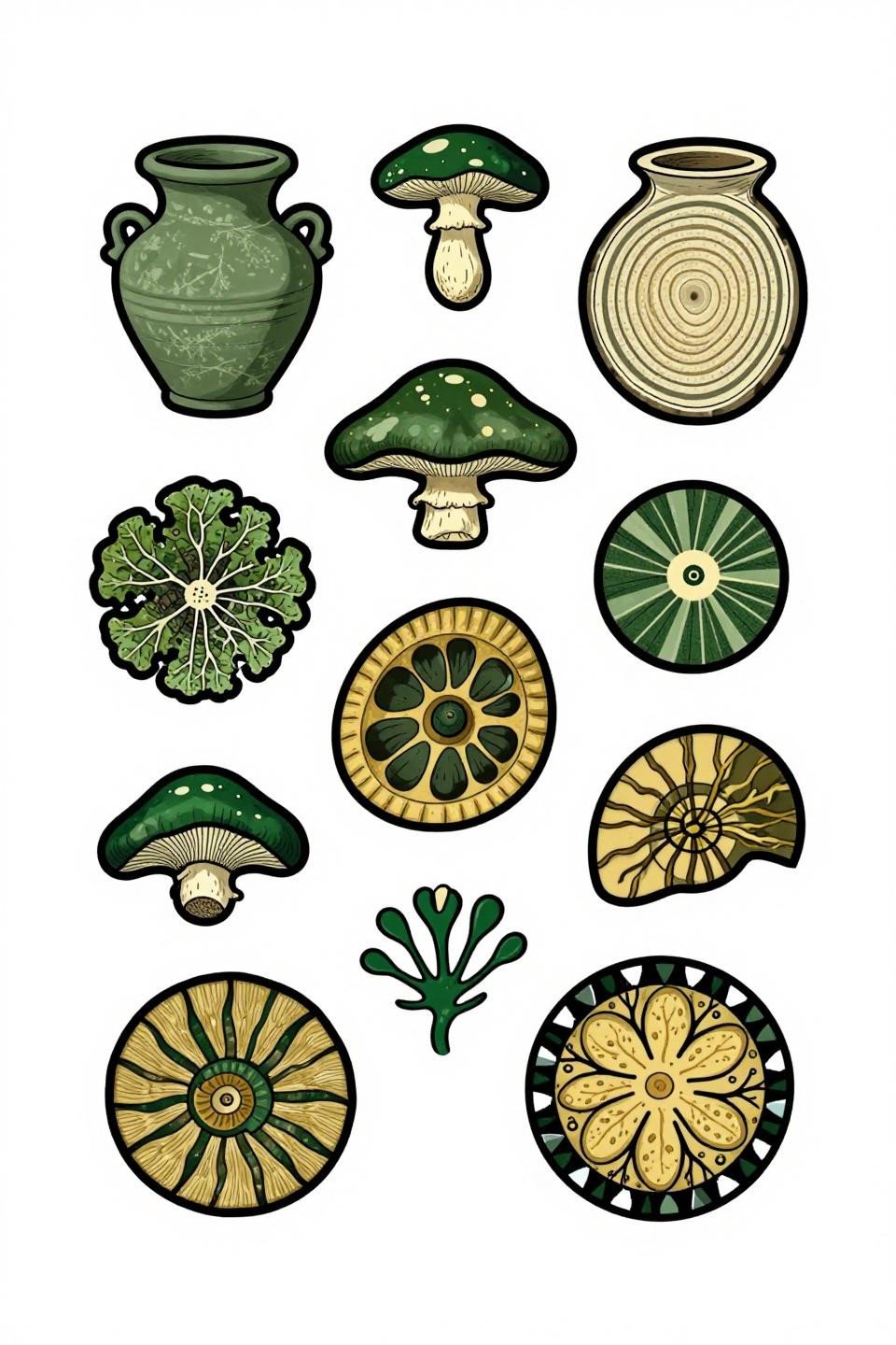
Ten panels built from the natural world: mushroom cross-section, mycelium network, soil stratification, ammonite spiral, each rendered in vector-precision linework with flat forest green and gold fills.
Earthy tattoos in this palette read differently by skin tone. On olive skin, forest green holds contrast well at five years; on lighter skin, the gold can soften faster and may need a touch-up pass at the three-year mark.
Celtic Borders as the Unifying Logic
Each of the seven panels carries its own interlocking Celtic border trim, which is a smart framing device for patchwork because it creates visual consistency across wildly different interior motifs.
Dense black ink in knotwork borders requires an artist who executes the direction changes without wobble. The tell is the curves, any hesitation at a corner shows immediately on healed work.
Maximum Graphic Contrast in a Dark Patchwork System
Twelve panels in an asymmetric mosaic, using flat black fills and open white negative space with zero grey wash. Maximum graphic contrast is the design language here, and it commits fully.
Blackwork at full saturation holds density indefinitely when the artist commits to layered passes. On darker skin tones, the open white negative space reads sharper than grey wash ever would, making this approach the stronger technical choice.
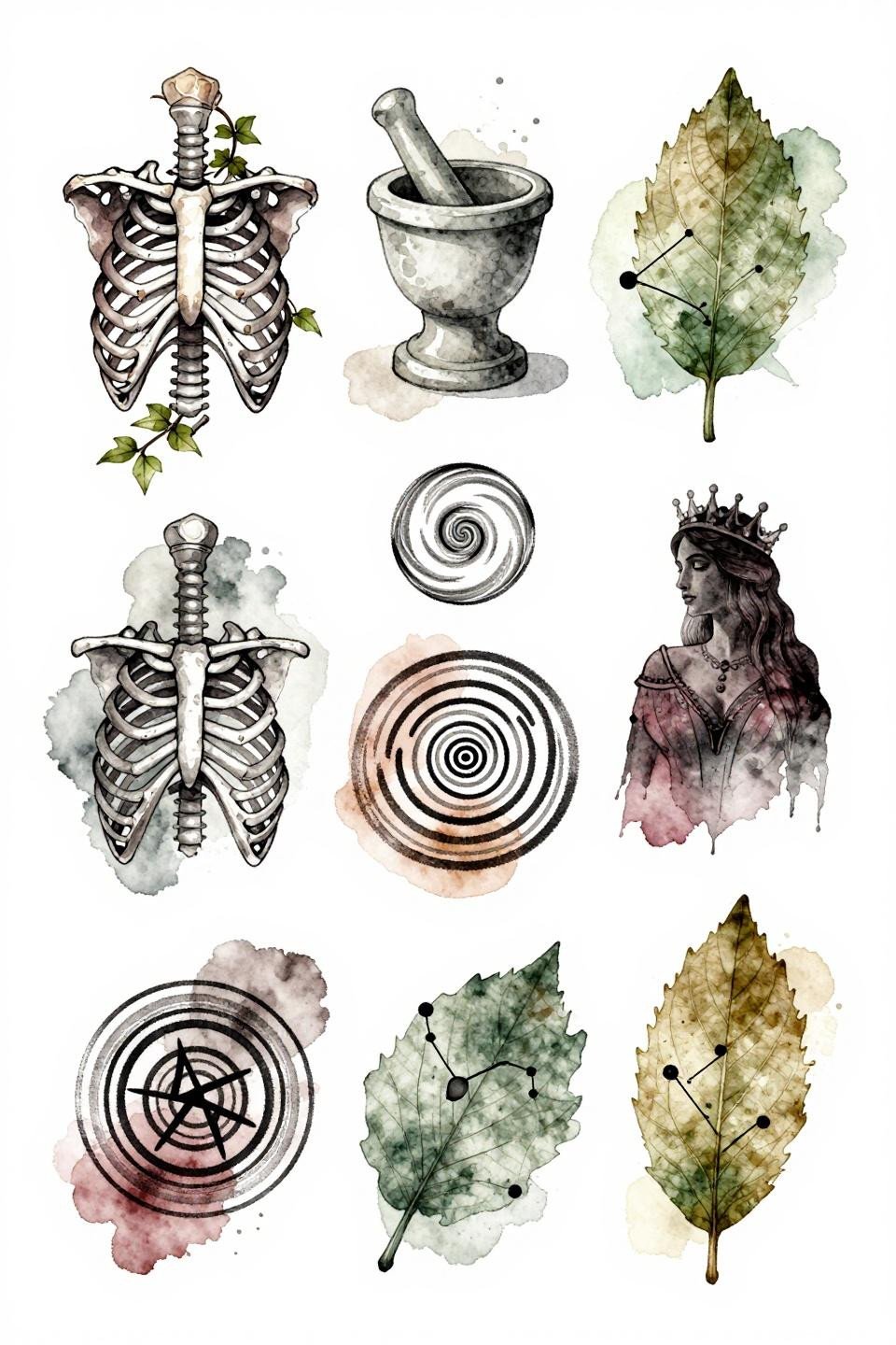
Single Needle Patchwork and the Limits of Fine Line
Ten panels built on hairline 0.5mm single-needle strokes with grey wash dilution for midtones, anatomical brain with flowering neural pathways, pressed fern, Orion constellation, topographic valley contours.
Single needle work at this scale needs an artist who controls machine speed precisely. Protected placements like the upper arm or sternum give this style its best shelf life; high-friction zones like the elbow ditch will soften faster.
Etching and Woodcut Lines in a Patchwork Grid
Parallel line engraving and thick woodcut block print strokes replace solid fills here, with fine crosshatch texture building density inside each panel. Crosshatch density is doing the tonal work that grey wash would handle in other styles.
This approach signals an artist who understands that patchwork design is a collection of micro-decisions. Look at their healed portfolio specifically, fresh crosshatch can look tight on day one and then lose separation within two years if the lines were placed too close.
Trash Polka Logic Applied to a Patchwork Build
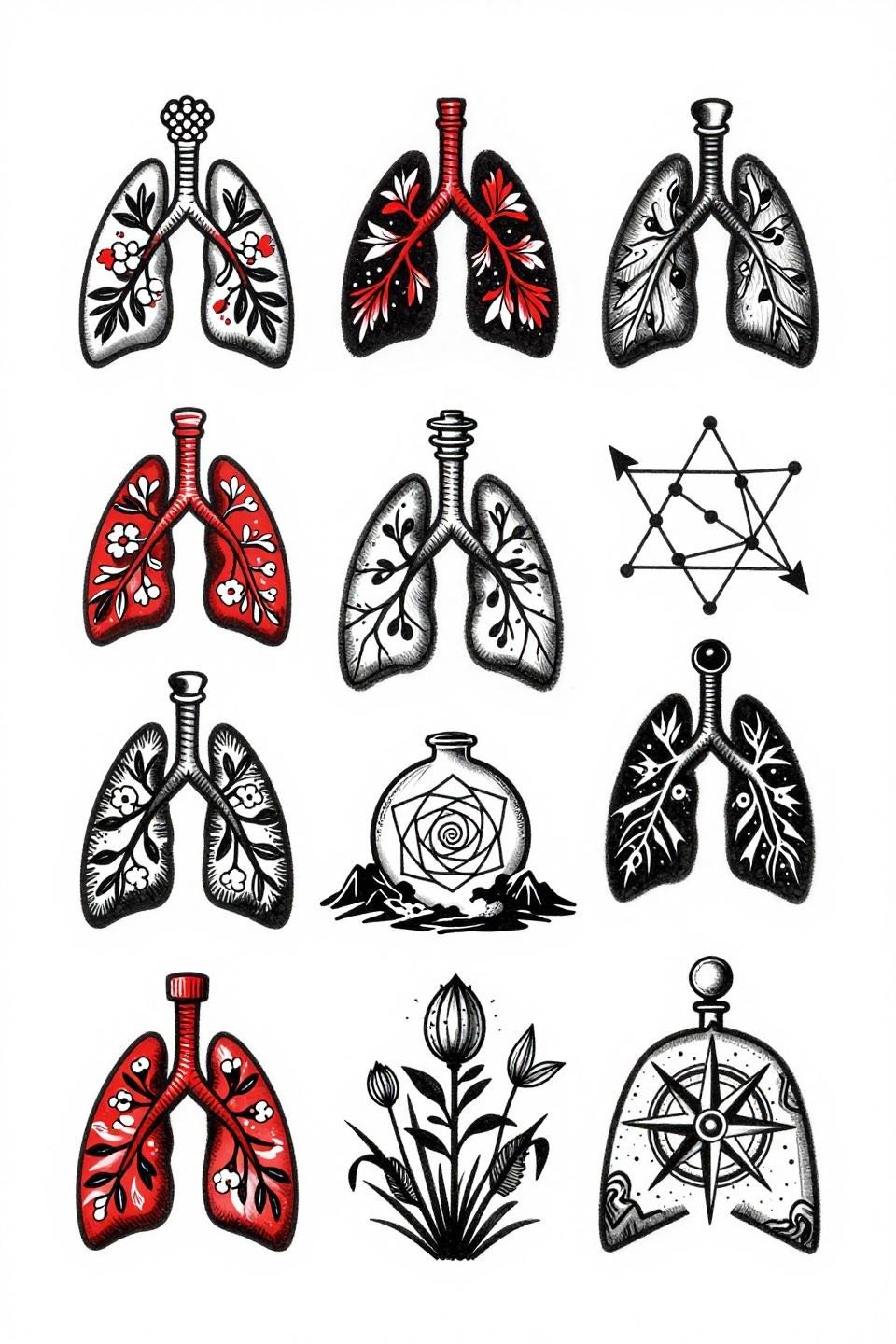
Nine panels in a collision layout, each containing botanical, anatomical, and occult motifs, tied together by flat crimson red accents on dense black ink, the core visual logic of trash polka applied to a patchwork structure.
Using a two-color patchwork system forces compositional discipline. When every panel shares the same red-and-black language, the sleeve reads as unified even without background filler connecting the pieces.
Why Irezumi Framing Works on a Patchwork Sleeve for Women
Bold 3pt outlines with flat black fills and grey wash midtones across nine panels, borrowing irezumi structural weight without committing to full background coverage. The outline weight consistency across panels is what makes a patchwork sleeve for women read as a planned collection rather than a random accumulation.
Grey wash dilution from dense to open, with no muddy midtones, is the artist skill signal to look for here. Flat, patchy fills between panels indicate a rushed second pass.
Japanese Grid Structure for Men Who Build Slowly
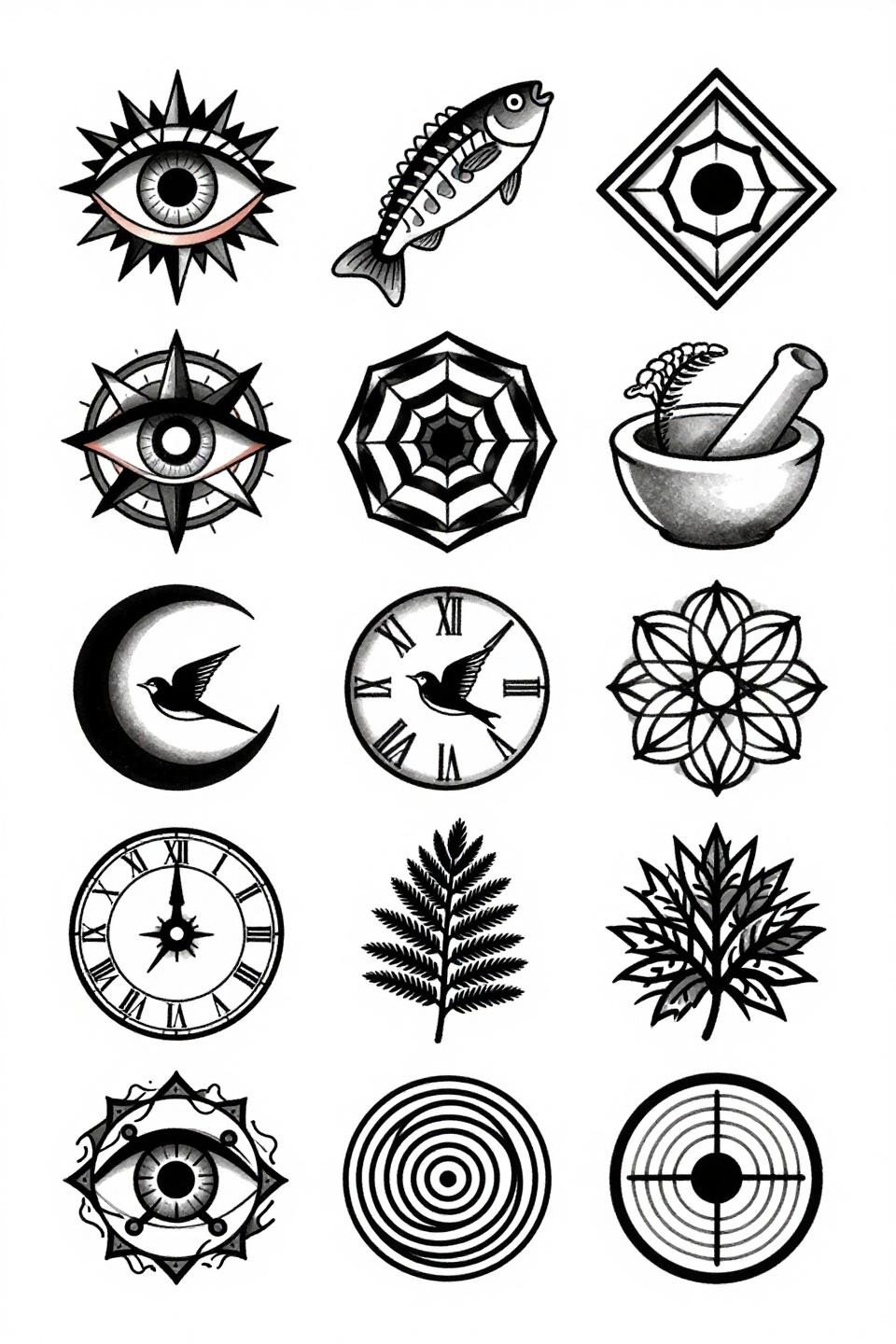
Twelve panels in a staggered vertical grid, anatomical eye with iris mandala, compass rose, skeletal fish spine, nested hexagons, each bordered by bold 3pt black outlines that give the collection masculine graphic weight without needing color.
The staggered vertical grid format works particularly well for a full sleeve on men because it maps cleanly to the arm’s cylindrical form, each panel sitting flat against the skin rather than distorting around the curve.
Art Nouveau Symmetry as a Patchwork Anchor
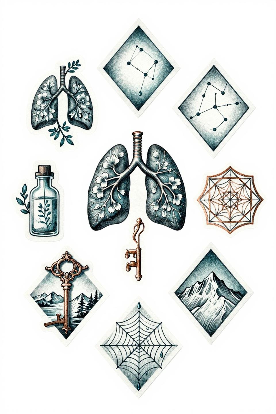
Eight panels arranged in a bilateral diamond formation, with whip shading curved strokes adding dimensional depth to anatomical lungs, botanical vines, and sacred geometry hexagons in deep teal with copper metallic accents.
Teal ink requires a pigment-heavy formula to hold saturation past year five. Ask to see healed teal work from your artist specifically, fading in this palette runs green-yellow on some skin tones.
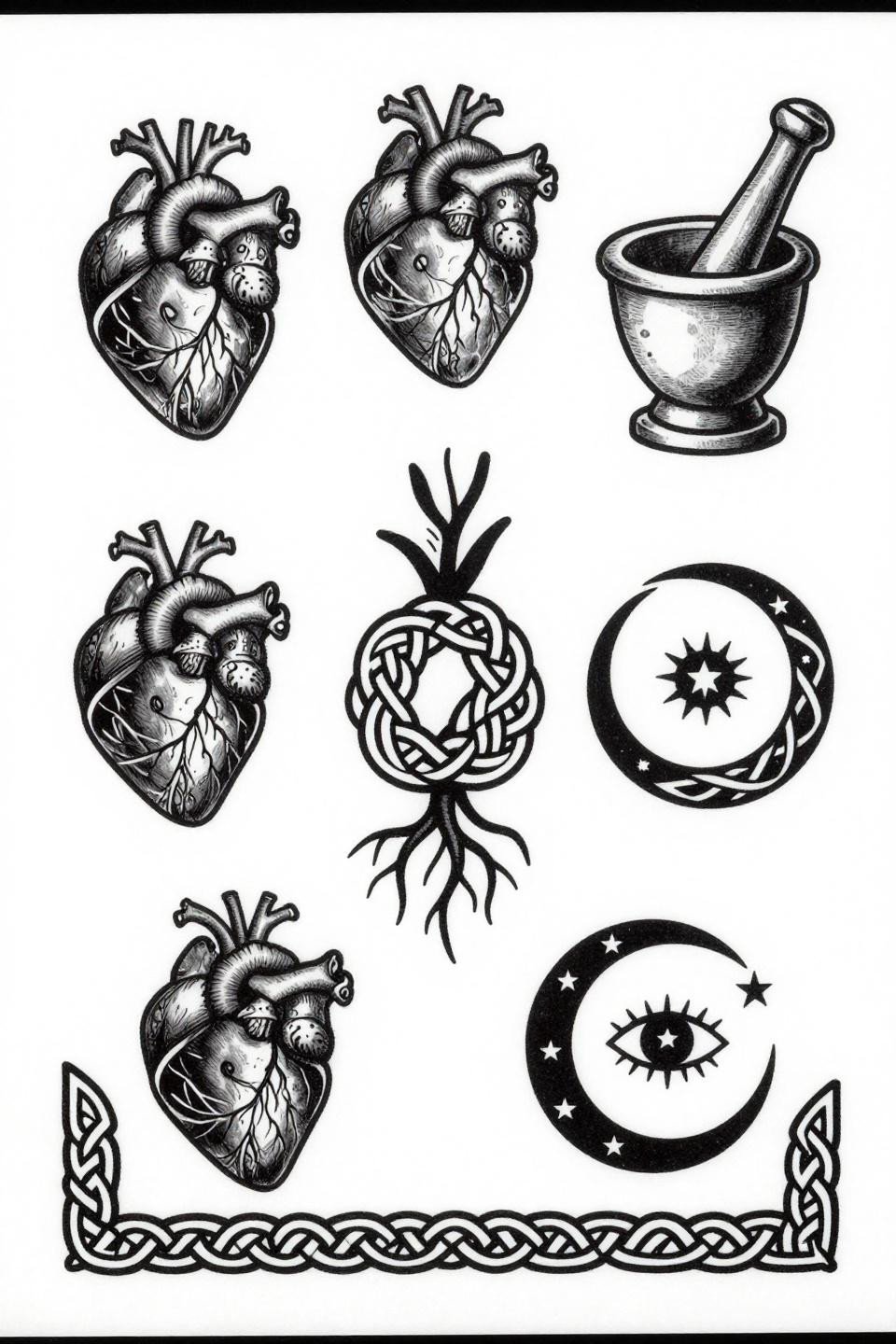
Neo-Traditional Panels That Work as Standalone Pieces
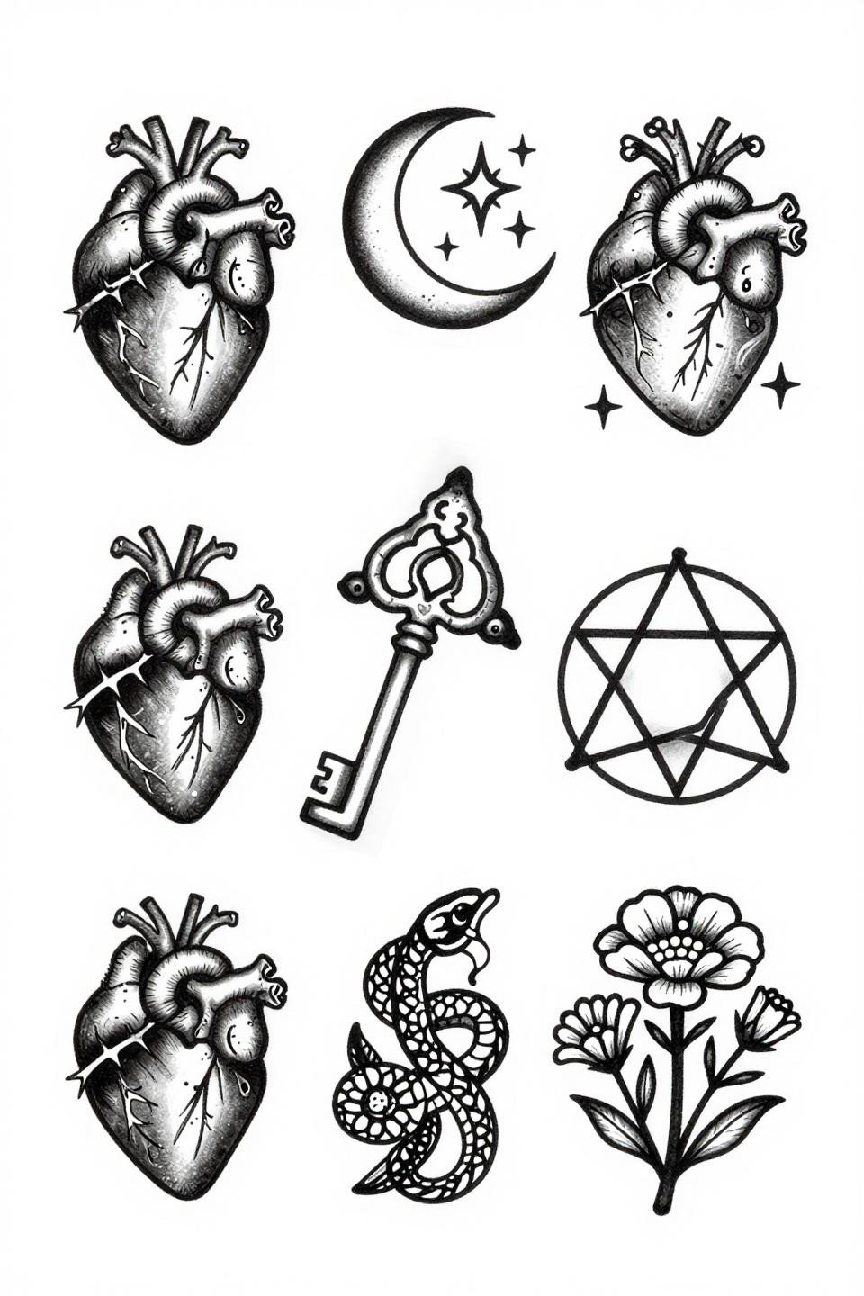
Seven panels stacked vertically, each holding one symbol at full graphic weight: anatomical heart with thorns, ouroboros serpent, bird skeleton in flight. Bold 2-3pt black outlines are the longevity signal in neo-traditional work, and every panel here earns it.
Neo-traditional patchwork translates well as a meaningful tattoo system because each panel functions as a discrete personal symbol. The flat fill execution is also forgiving across skin tones in a way that fine line gradients are not.
Single Continuous Line as the Connective Thread
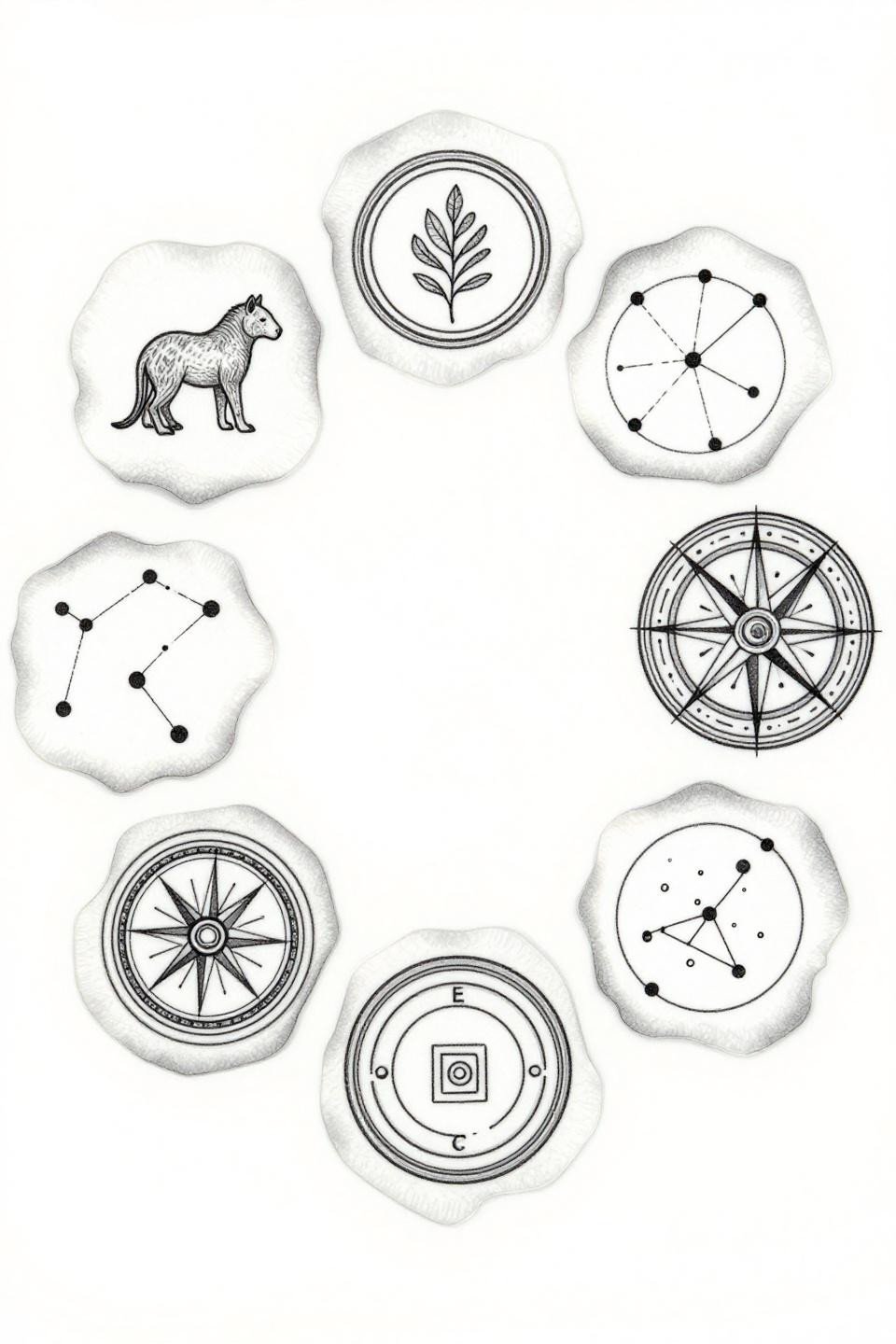
Nine panels arranged in a tondo circle, connected by an unbroken hairline 0.5mm contour line that flows between animal silhouette, botanical outline, compass rose, and constellation dot-map.
The continuous line trick solves patchwork’s core tension: how to make separate panels feel related without background filler. On lighter skin tones this reads crisp; on olive and darker tones the hairline weight needs to step up to maintain contrast.
Dotwork Gradients Where Solid Black Would Flatten Everything
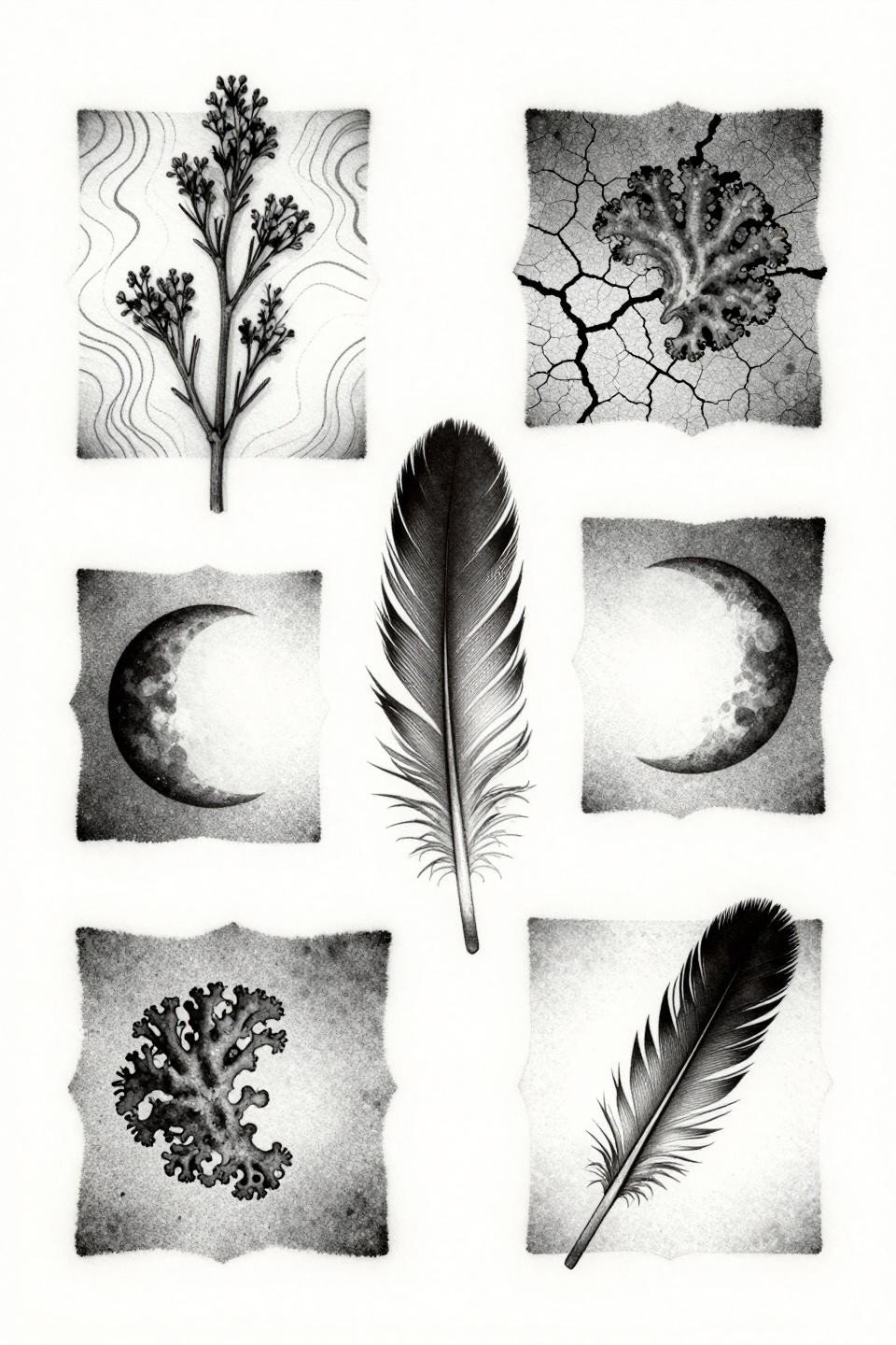
Six panels using stipple dot gradients that run from dense at center to open at edges, with no solid black fills, covering dried botanical specimens, topographic contours, cracked earth, and moon phase progressions.
Look for consistent dot size across the full gradient on healed work. Inconsistent dot size is the first artist skill signal to catch; it reads as uneven texture at six months and only gets more visible over time.
Pick five references from this collection, not fifteen. Your artist needs a direction, specifically: outline weight preference, color or no color, and the motif territory you want to claim first. Send those five and let the conversation start there.