Simple tattoos fail when artists treat “simple” as permission to rush. Thin lines placed too close together blur into grey smudges within five years, and designs without enough negative space lose their form even faster. The pieces that hold are the ones built on deliberate spacing and line weight appropriate to the placement.
Scale matters more than style here. A motif that reads sharp at two inches on the inner wrist disappears or bleeds on a finger. Every design below was evaluated for that relationship between size, line weight, and placement logic.
Celtic Knotwork That Doesn’t Fall Apart at Scale
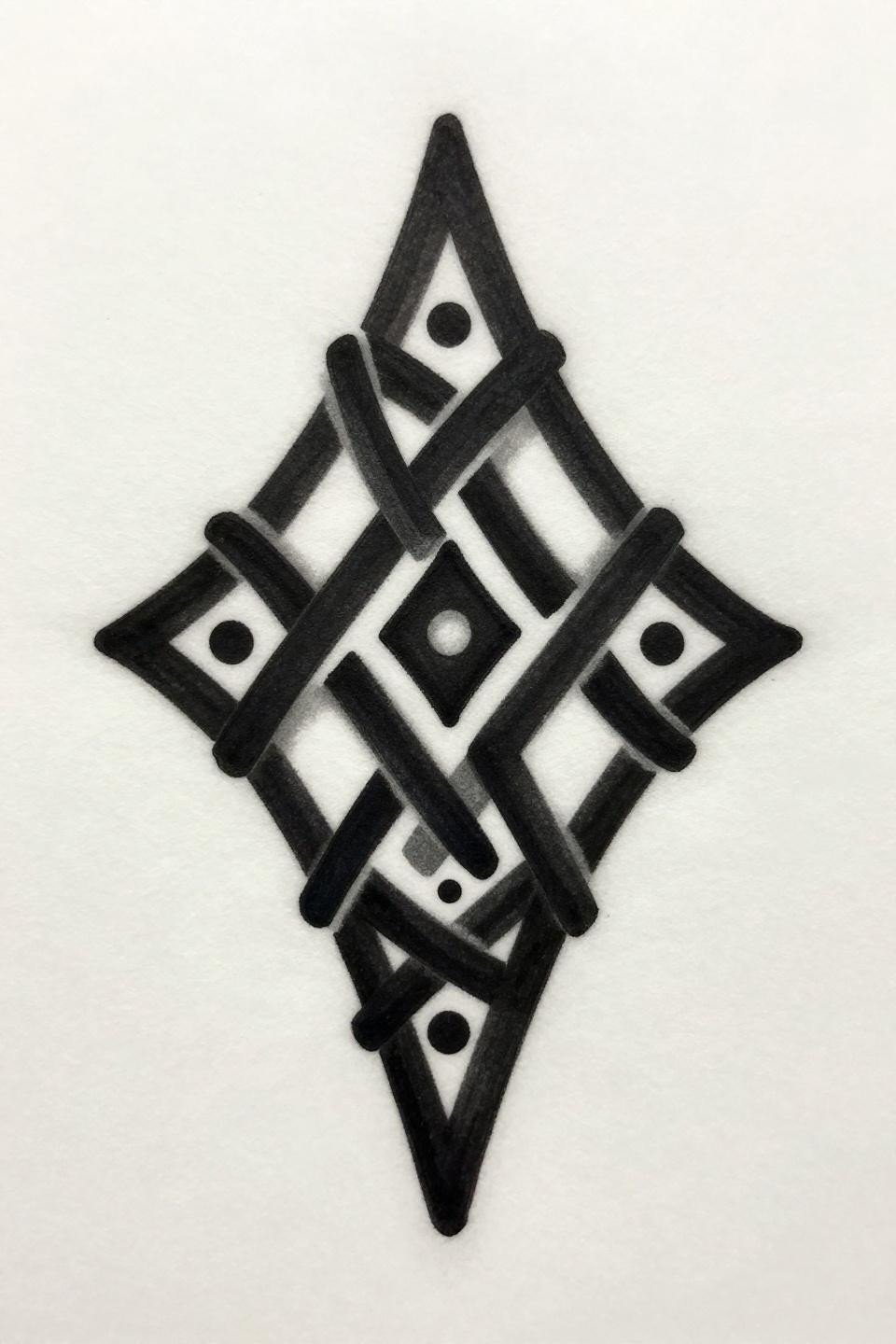
A diamond form bisected by a vertical axis, with interlocking knot junctions at each corner. The bold 2-3pt outline weight is doing real structural work here, keeping the knot transitions readable without needing extra detail to carry them.
Celtic knotwork at small scales is a longevity test for any artist. Symmetry breaks at direction changes, and patchiness in the flat fills exposes uneven needle pressure. Check healed portfolio shots, not fresh ones.
Fine Line Snake: Where Negative Space Does the Work
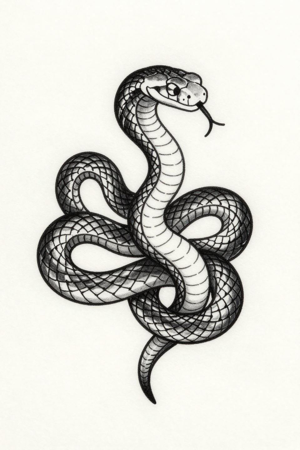
A coiled snake rendered in hairline single-needle work, with scale texture implied by closely spaced parallel strokes rather than filled shading. The circular composition uses open negative space to let the form breathe at small sizes.
Single needle 1RL work like this reads crisp on lighter skin tones but needs bolder line weight on olive and darker skin to maintain contrast over time. Ask to see this style healed at the two-year mark before committing.
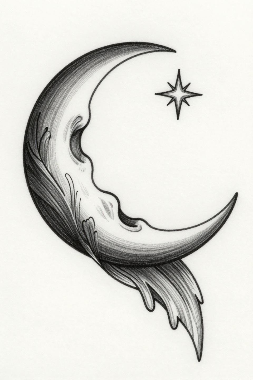
Ignorant Style Moon: Intentional Imperfection With a Long Shelf Life
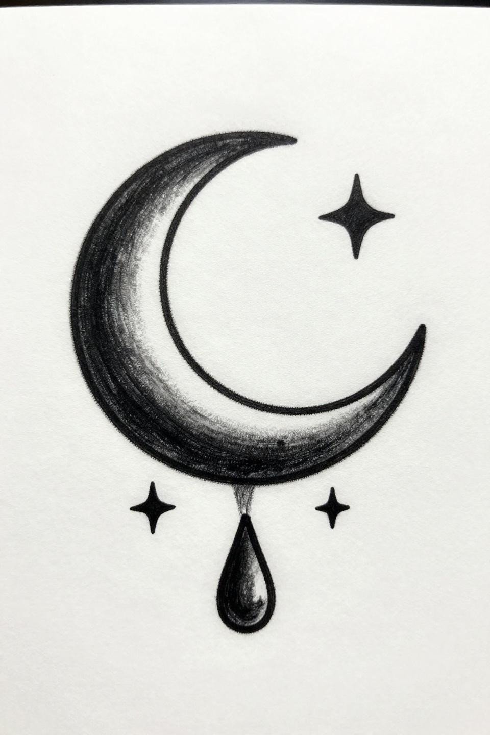
Crescent moon with a hanging teardrop and flanking stars, executed in ignorant style with deliberately wobbly outlines and whip-shaded shadow fills. The rough line quality is structural, not accidental. It ages without the blowout risk that hairline work carries.
Ignorant style holds up because the intentional outline irregularity absorbs the natural ink spread that happens over five to ten years. A line that starts imperfect has nowhere to “go wrong.”
Arrow Flash That Earns Its Negative Space
![]()
An upward arrow with fletching detail and a geometric triangle cutout through the shaft. The voided triangle element adds visual tension without adding surface area, keeping the piece minimal while giving it something to look at up close.
Art nouveau framing on a geometric form works best in vertical placements where the arrow axis follows the body’s natural lines. Forearm, spine, and shin all suit this orientation.
Watercolor Lotus Without the Blowout Risk
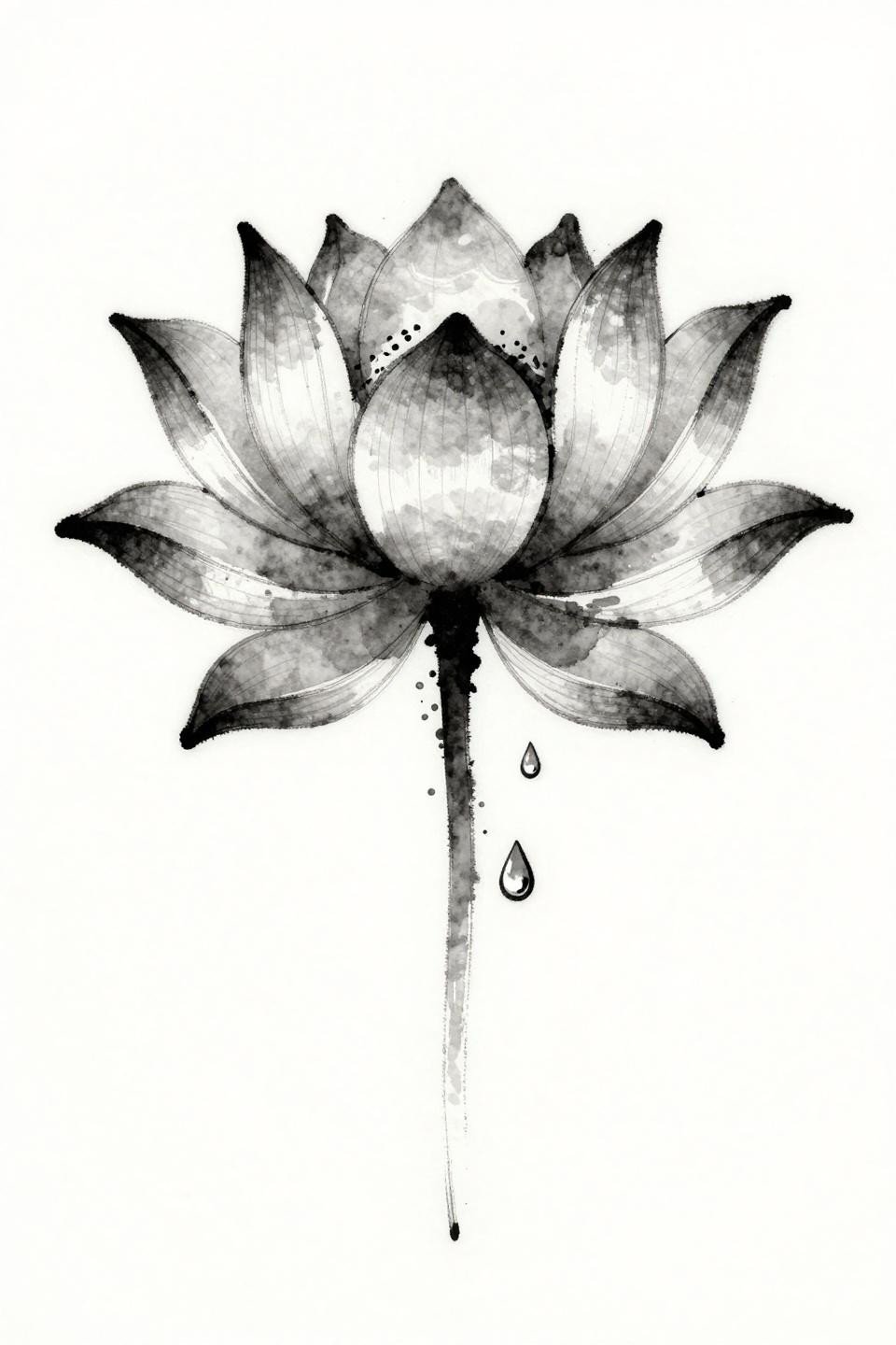
A seven-petal lotus with calligraphic linework and watercolor diffusion bleeding outward from the petal edges. The stem and dewdrop detail anchor the composition without competing with the soft washes above.
Watercolor work without a solid outline typically blurs significantly by year three to five. This design’s calligraphic ink marks at the petal edges function as partial anchors, which extends legibility compared to pure wash-only designs.
Single-Line Feather and the Artist Speed Problem
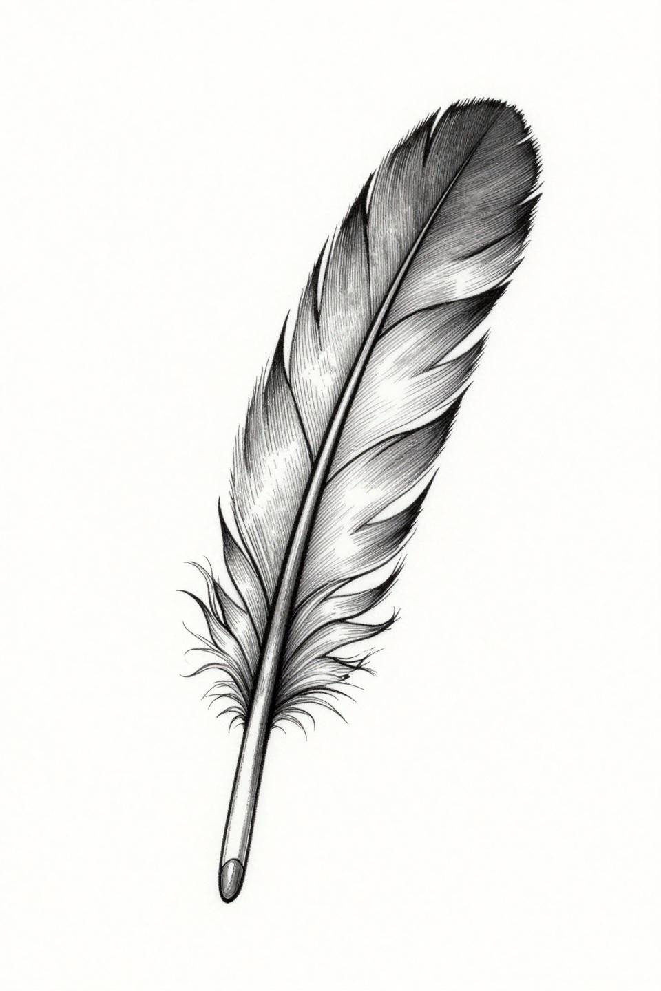
A feather drawn in one unbroken hairline stroke, with the center spine running tip to base and barbs trailing as organic extensions of that same line. The diagonal composition gives the piece movement that a centered format wouldn’t.
The tell on continuous line work is the curves. No wobble at direction changes signals an artist who controls machine speed, not just needle depth. Slow pass, consistent tension, no pulled strokes.
Neo-Traditional Anchor Scaled for Small Placements
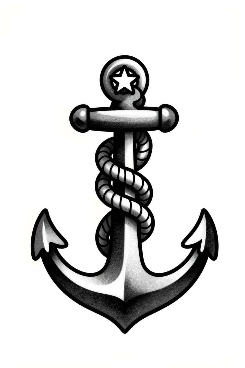
A vertical anchor with rope-wrapped shank and a single star at the crown. Neo-traditional line weight at this scale means bold 2-3pt outlines that will hold their shape for a decade plus without needing touch-up to maintain readability.
This kind of scaled-down neo-traditional flash works well at three to four centimeters on the inner wrist or ankle. Below two centimeters, the rope texture detail compresses and reads as noise rather than form.
Zero-Fill Honeybee: A Longevity Gamble Worth Taking
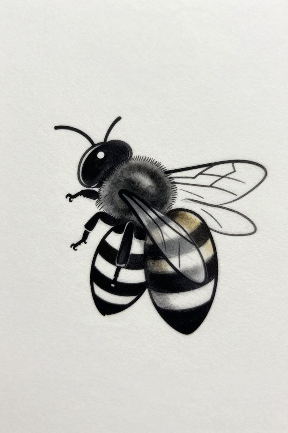
A honeybee in profile with striped abdomen segments and wings rendered as parallel hairlines only. No fill, no shading, pure open linework. This is one of the harder designs to execute well because every line is fully exposed.
Open linework with no fill to absorb aging shows every inconsistency in needle speed and spacing. Flat fills in the abdomen bands would significantly improve the piece’s five-year outlook, but the airiness is the point for collectors who want it.
Tribal Moon: Graphic Weight as a Longevity Strategy
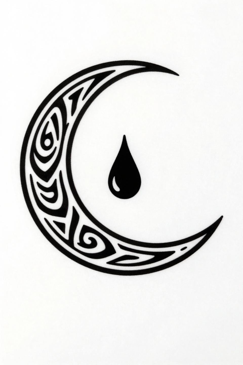
A tribal crescent with nested concentric circles and a downward teardrop. The flat solid black fills and bold outlines create graphic contrast that reads from a distance, which most fine line moon designs cannot claim after a few years of healing.
Solid black areas this dense require layered passes to achieve full saturation. Patchiness in fresh photos often signals an artist who stopped at one pass. Ask specifically about their black saturation technique before booking.
Fine Line Moon and Star: Placement Determines Everything
A tilted crescent with a four-pointed star near the upper horn, drawn in 0.5mm hairline precision with no fill. The slight diagonal orientation keeps the composition from feeling static.
Protected placements like the inner wrist, sternum, or upper back give this style its best shelf life. Sun-exposed or high-friction areas will soften these hairlines noticeably within two years.
Pine Tree on a Finger: What the Flash Doesn’t Tell You
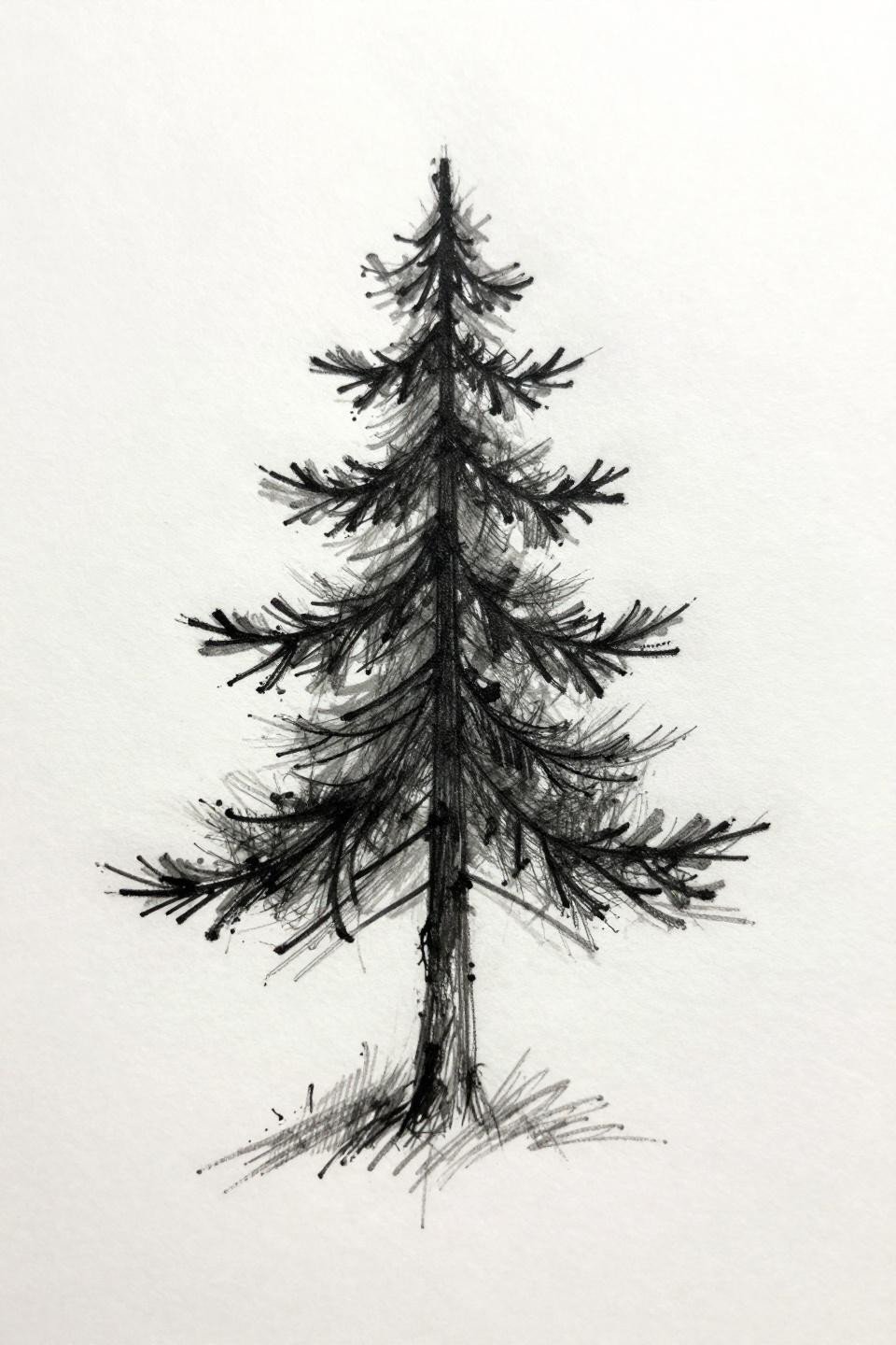
A three-tiered pine silhouette in loose sketch style with 0.3mm irregular strokes and dominant negative space. As flash it reads cleanly, but finger placement means touch-up every two to three years minimum due to skin friction and sun exposure.
The sketch quality is a smart choice for this motif because the irregular lines won’t show aging as harshly as crisp single-needle work would. Intentional looseness builds in forgiveness.
Dotwork Infinity Hearts and the Gradient Test
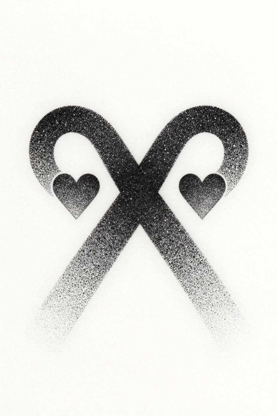
A horizontal infinity symbol with geometric hearts at the center crossing, built entirely from stipple dots with no solid outlines. Dot density clusters at the intersection and dissolves into open negative space at the outer loops.
Look for consistent dot size across the full gradient, from dense center to open edges. Inconsistent dot size in fresh work signals inconsistent needle speed, and that problem only becomes more visible after healing.
Divided Circle: The Simplest Design With the Highest Failure Rate
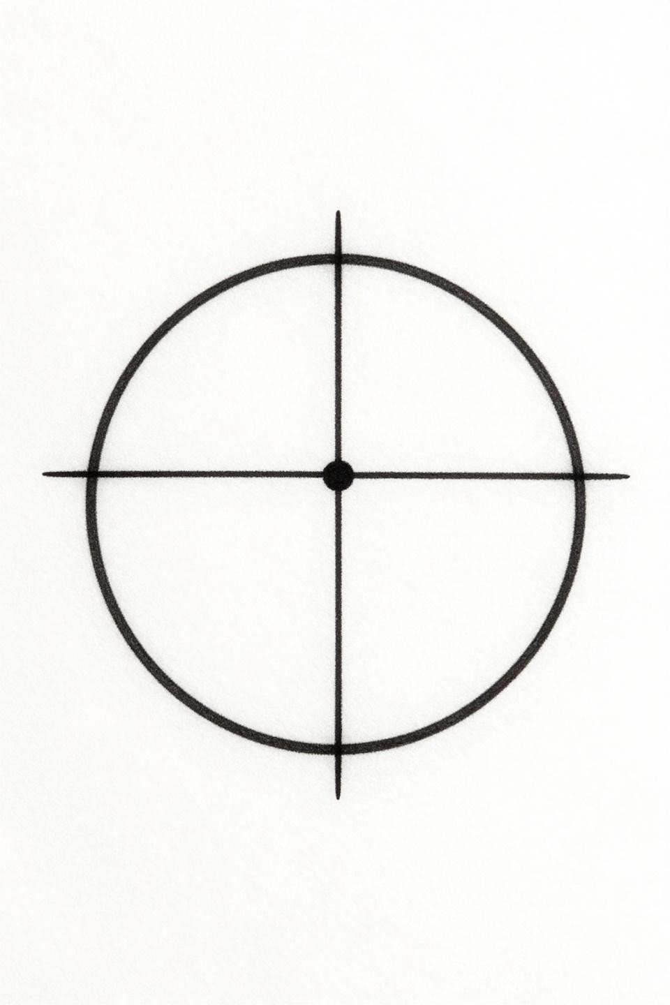
A perfect circle divided into four quadrants by a cross, with a single dot at the center. The design reads meditative and minimal, but a circle is one of the most unforgiving forms to tattoo. Any wobble in the curve is immediately visible.
The single-pass hairline circle is the clearest technical test in linework tattooing. No correction possible, no fill to hide inconsistency. This one belongs on a specialist’s portfolio, not a general shop.
Art Deco Triangle: Geometry That Justifies Bold Outlines
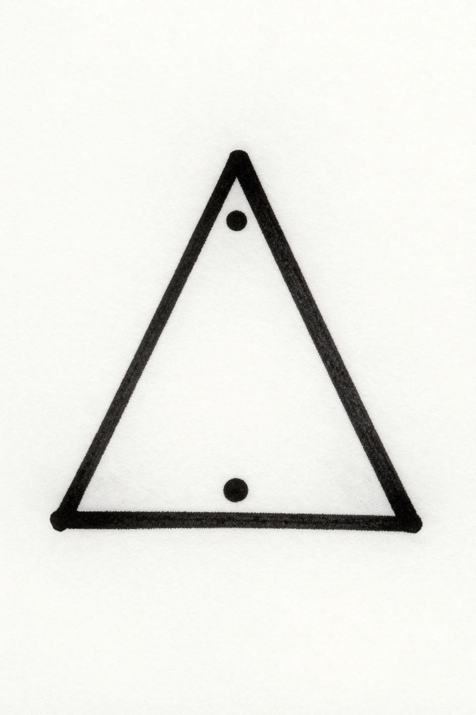
An equilateral triangle bisected by a horizontal line with a filled dot at the apex, rendered in art deco styling with bold outlines and flat black fills. The geometric hierarchy, dot over line over form, gives the piece visual structure that scales down without losing meaning.
Art deco tattoos rely on straight-line precision. Any deviation in the equilateral geometry or bisecting line reads immediately against the style’s inherent rigidity. This is a design where the artist’s compass and stencil work matter as much as their needle control.
Continuous Line Moon and Stars: When Minimalism Has a Time Limit
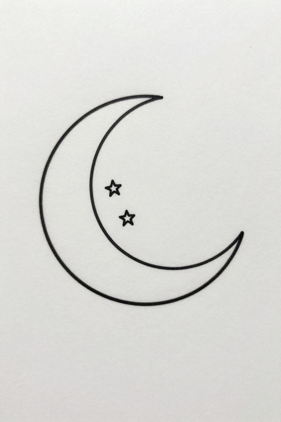
A crescent moon drawn in one unbroken hairline stroke with three five-point stars aligned through its inner curve. Maximum negative space, zero fill, no shading. This is the style people mean when they say they want something small and simple.
The single continuous stroke format puts every aging variable on display. On sun-exposed placements this softens noticeably by year two. On protected skin with a committed aftercare routine, it holds its form significantly longer.
Narrow the reference set to three to five designs before the consultation. Match each one to a specific placement and note the line weight of the original. Bring that information to the artist. A reference with context books faster and lands closer to what you actually want.