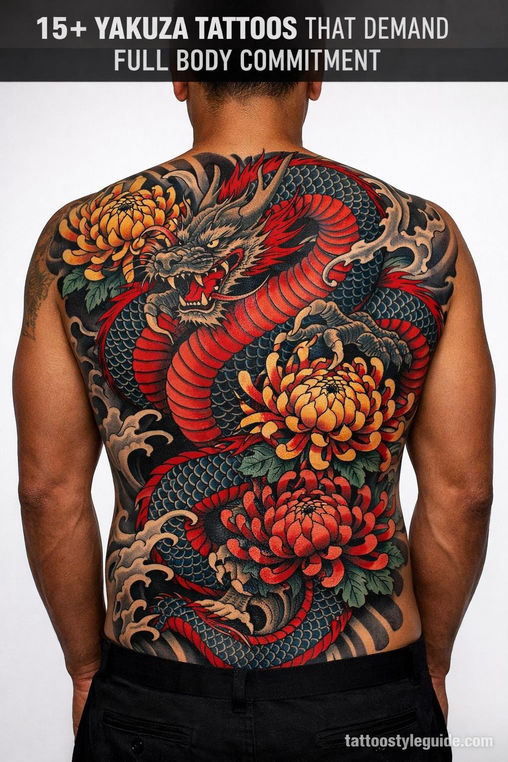
Yakuza tattoos fail when artists treat them as decorative. The irezumi tradition was engineered for full-body coverage, and individual motifs pulled out of context lose the compositional logic that makes the style read correctly at scale.
Scale and placement are non-negotiable here. A design meant to anchor a back piece will look orphaned on a forearm. The references below are organized by motif and execution style so you can match the right piece to the right canvas.
The Serpent Mon: When Organic Line Meets Family Crest Geometry
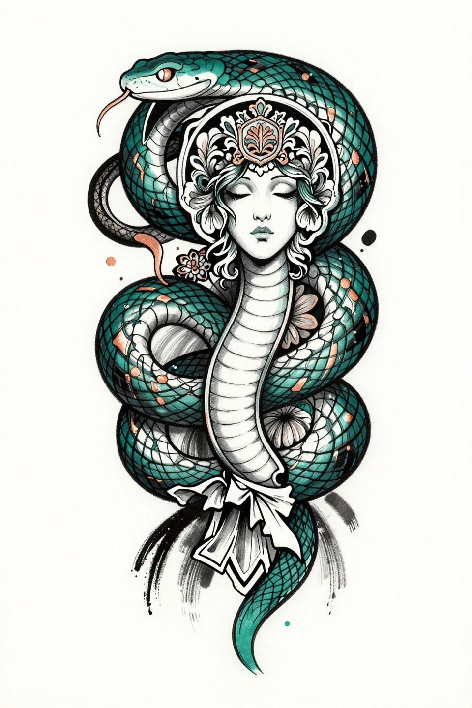
This art nouveau flash pairs a coiled serpent along a vertical axis with an ornate family mon crest, using organic whip curves against the hard geometry of the medallion to create deliberate compositional tension.
The deep teal with copper accent reads well on lighter skin but loses separation on olive and deeper tones. An artist who can hold that wet-ink calligraphic line quality throughout a full piece is worth booking out months for.
Woodcut Oyabun: Bold Silhouette Logic for Large-Scale Back Work
Woodcut block print rendering strips the yakuza boss figure to flat black silhouette shapes with zero midtone detail, which forces bilateral symmetry to carry the entire compositional weight.
This approach holds its contrast longer than grey wash on any skin tone. The thick carved lines at 2-3pt weight will still read clean at the 15-year mark without a touch-up.
Dotwork Enforcer: Reading Stipple Density as an Artist Skill Signal
This blackwork flash uses stipple dot gradient running from 90% density at the figure’s core to open white at the edges, giving the enforcer silhouette a controlled atmospheric depth without any grey wash.
Look for consistent dot size across the full gradient when vetting an artist for this style. Inconsistent dot size is the most common technical failure in dotwork figure work.
Shrine Seiza: The Neo-Traditional Frame That Holds Narrative Detail
A scarred yakuza elder in seiza before a shrine altar, rendered in neo-traditional with bold 2-3pt black outlines and flat color fills, uses a diamond frame to compress a dense narrative scene into a clean placement shape.
The diamond containment makes this scale well from a chest piece down to a large upper arm. Protected placements like the sternum give this style its best shelf life for the flat fill fields.
Grey Wash Boss Portrait: Chicano Technique in an Irezumi Context
Chicano grey wash technique applied to a yakuza boss portrait uses whip shading curved gradients from dense black to open mid-grey, with cherry blossom petals moving across the composition to break the profile’s hard edge.
Grey wash diluted to open tones on this scale needs a protected placement. Forearm or hand exposure will flatten those midtones within five years. Ribs or upper back are the right call.
Samurai in American Traditional: When Flat Fill Discipline Matters Most
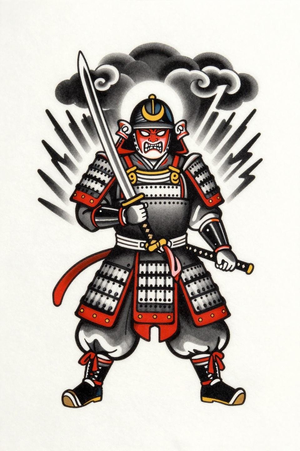
This samurai flash applies American old school discipline to a Japanese subject: flat crimson red and solid black fills with bold 2-3pt outlines and zero tonal complexity, framed by storm clouds and lightning bolts in traditional arrangement.
Flat fills with no patchiness separate veterans from beginners on a piece this dense. Request healed portfolio shots specifically, not fresh work, before committing to this style.
Sak Yant Dragon: Sacred Geometry as a Compositional Anchor
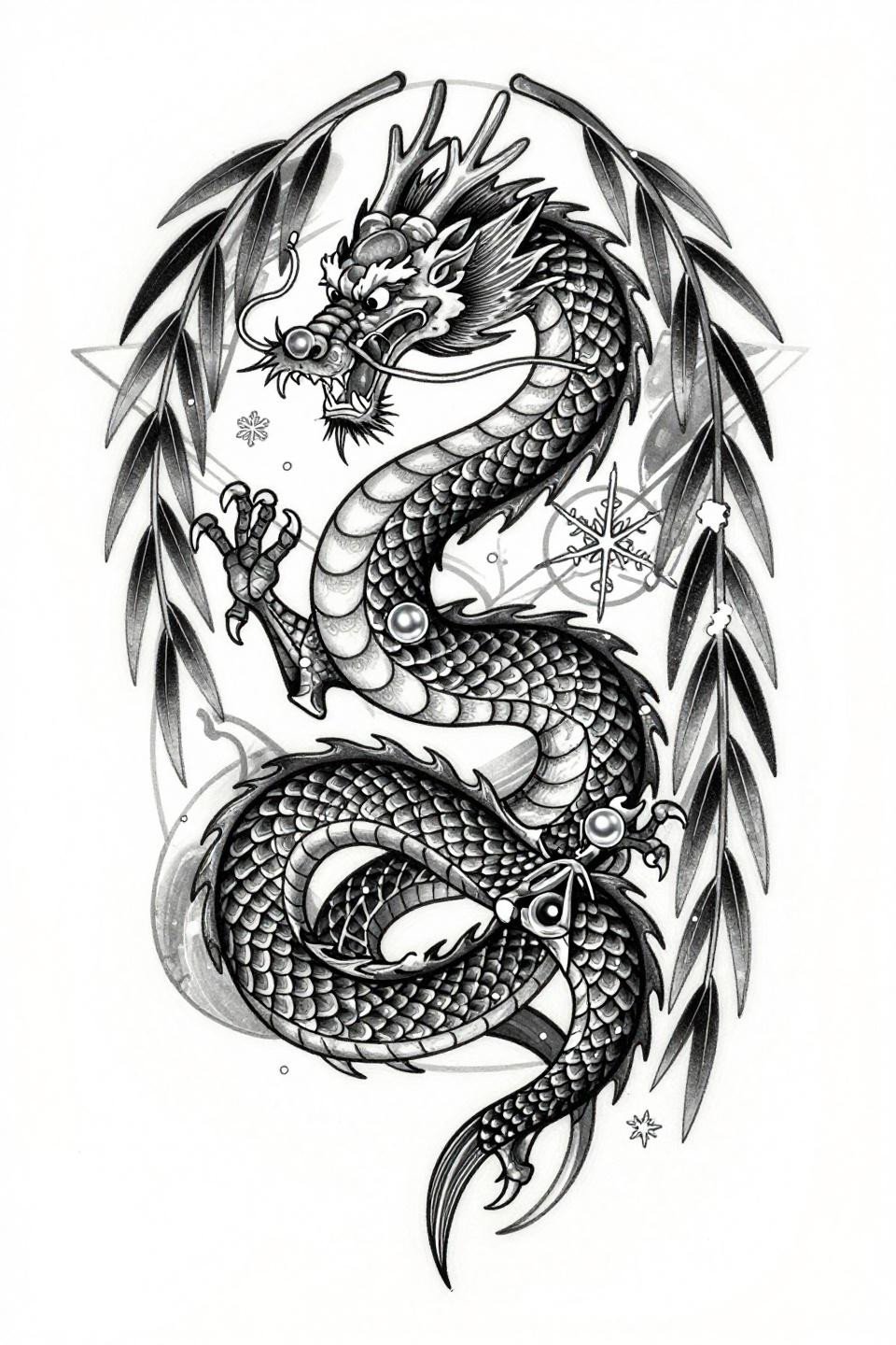
A vertically descending Japanese dragon framed by sacred geometry lines borrows Sak Yant compositional logic, with willow branches and scattered snowflakes filling negative space in a stacked arrangement built for spine or sternum placement.
The flat black fills at this density require an artist who commits to layered passes. Undersaturated black in a dragon scale field will look patchy within three years.
Noh Mask in Stipple: Porcelain Texture Through Dot Density Control
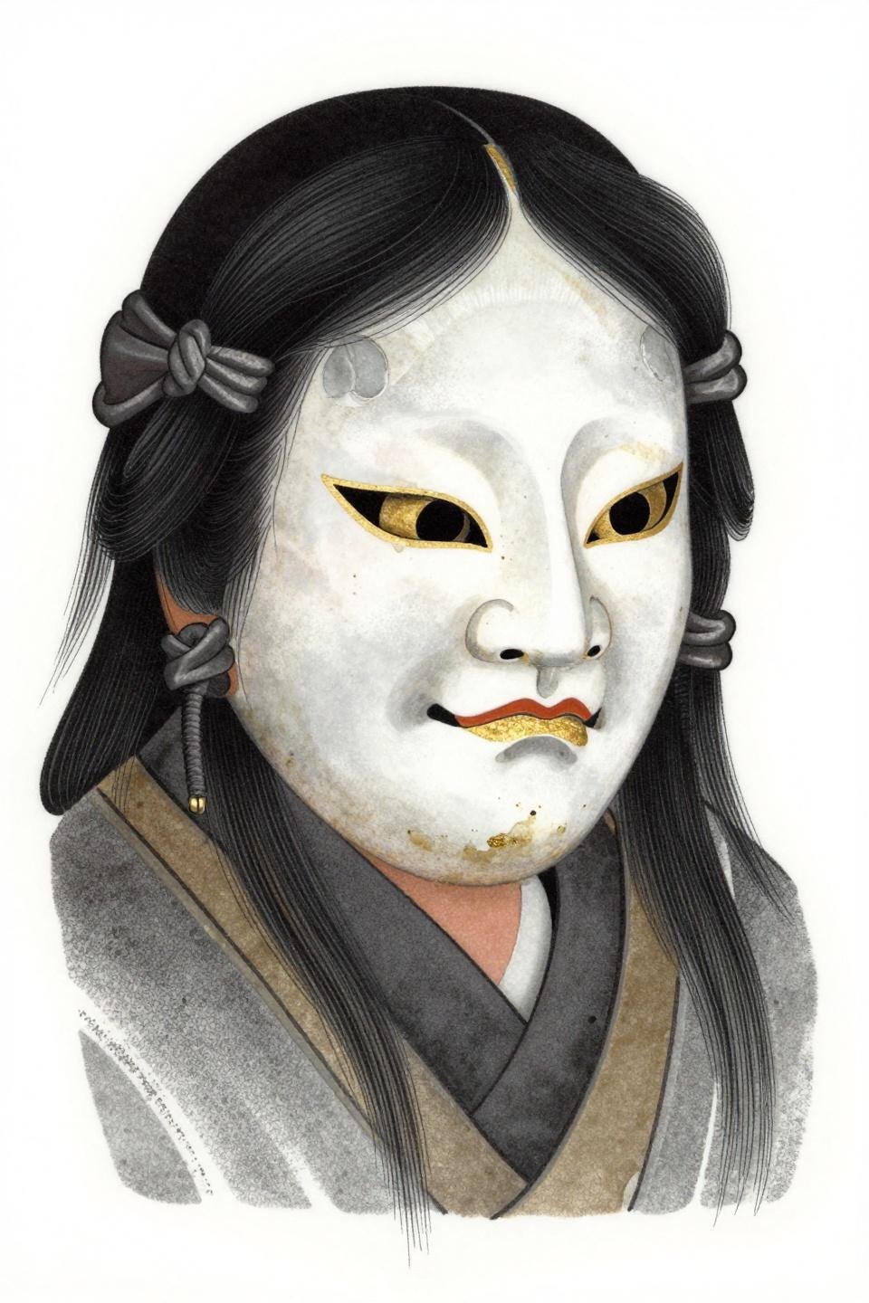
The Noh mask rendered in stipple uses dot density reversal, packing the gradient into carved recesses and opening it at raised surfaces, which mimics the actual light behavior of lacquered porcelain more accurately than line shading can.
The gold accent detail here needs an artist experienced with color-over-black-base timing. Premature layering kills the contrast between the gold and the surrounding stipple field.
Guardian and Phoenix: Vertical Stacking for the Full Back Tradition
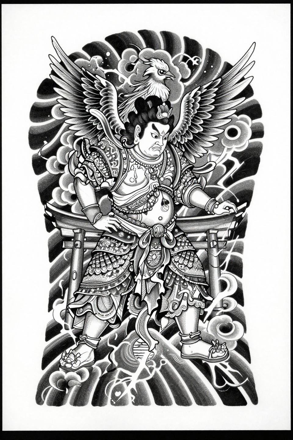
Temple guardian deity below, phoenix ascending above, torii gate at base: this stacked vertical irezumi composition uses fine parallel line engraving and dense hatching to build tonal depth without any flat fill fields.
This is a back piece reference, not a standalone panel. Trying to adapt this to an arm or chest without restructuring the stacked hierarchy collapses the compositional logic entirely.
Koi Ascending: Crosshatch Technique and the No-Grey-Wash Commitment
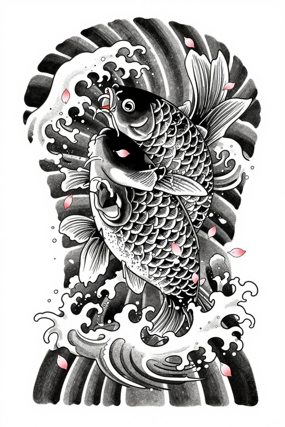
Koi ascending left through churning water, rendered entirely in crosshatch parallel line shading with grey wash omitted, forces the tonal range to come from line density alone. The etching quality reads differently from standard grey wash at every scale.
This is a sleeve reference, not a flash panel. The asymmetric vertical flow composition is designed to wrap and breathe across a full arm, with the wave spray extending naturally into surrounding negative space.
Hannya in Bilateral Symmetry: The Mandala Frame Changes the Reading
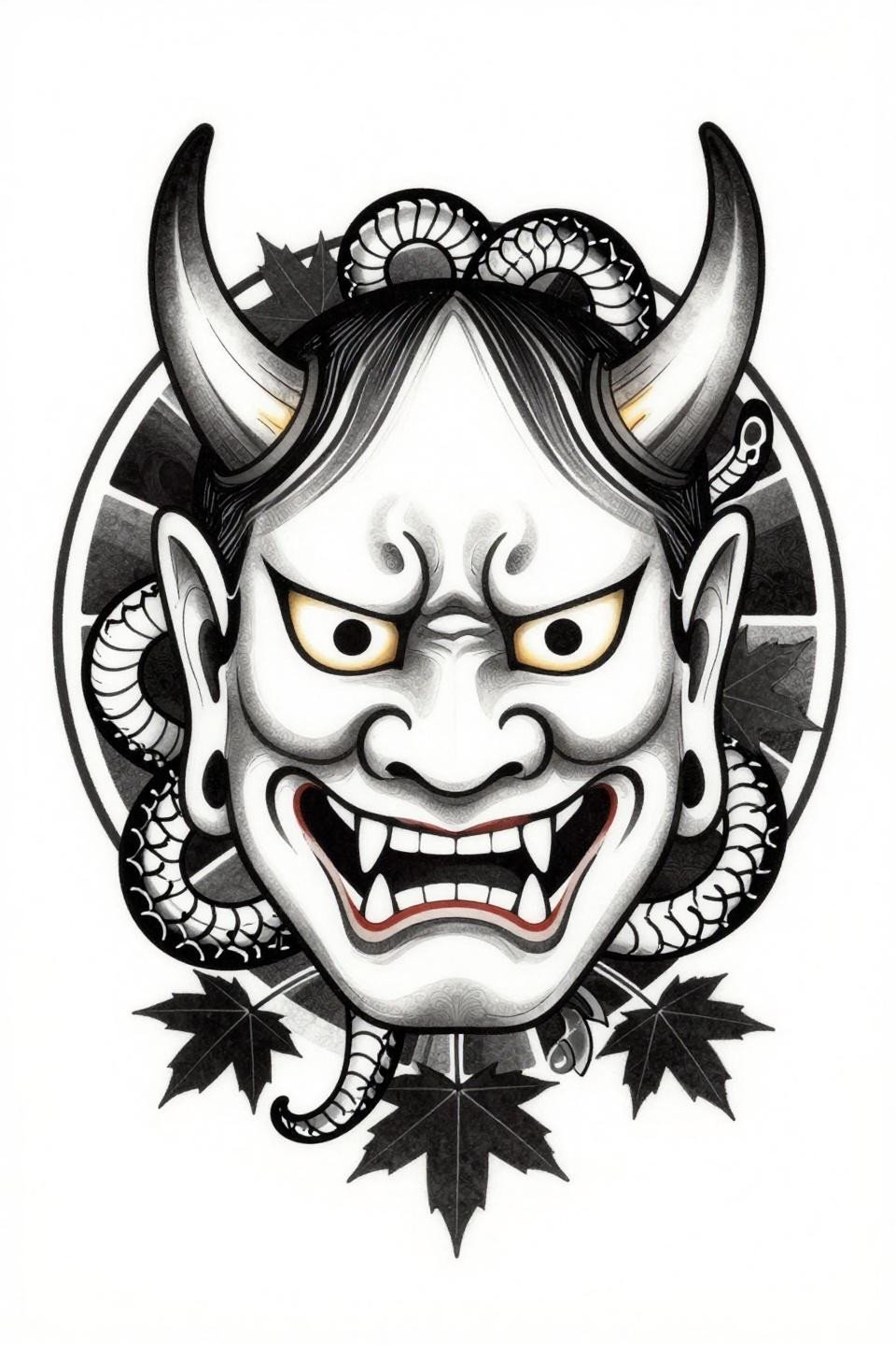
The Hannya mask placed within a circular mandala frame with bilateral symmetry changes its reading entirely: instead of the mask as a directional symbol, the circular mandala containment gives it the weight of a centered back piece anchor.
Bold 2-3pt outlines at this scale hold the bilateral symmetry over time. Any line wobble at the direction changes in the horn curves will read immediately. Check the artist’s healed symmetrical work before booking.
Dragon and Peony in Grey Wash: The Traditional Irezumi Pairing Tested Over Time
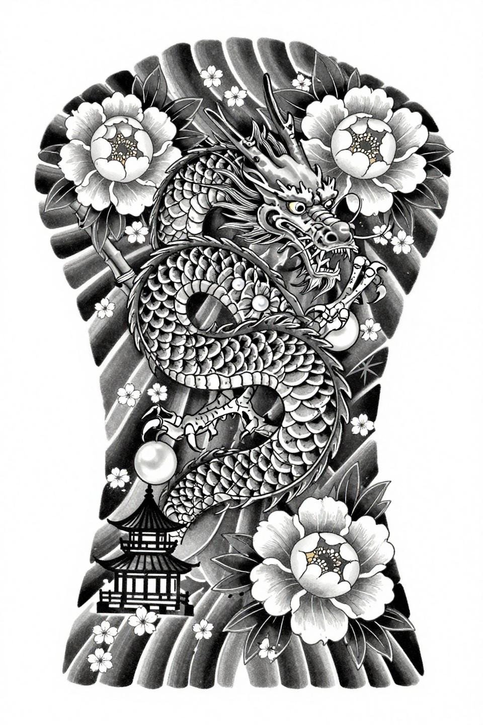
Coiled dragon, full-bloom peonies, bamboo framing, pagoda silhouette at base: this is the canonical irezumi pairing rendered in pure grey wash dilution from dense to open, with no solid black fields anchoring any section.
Grey wash without solid black anchoring is the highest-risk execution choice in traditional Japanese work. On olive and darker skin tones, the open dilution tones disappear within five to seven years. This reference requires the right skin tone match to hold its range.
Take the three references that stopped you longest and send those to your artist. Not the full set. A specific direction is more useful than a mood board, and an artist who knows irezumi will tell you immediately which of those three works for your placement and skin tone.