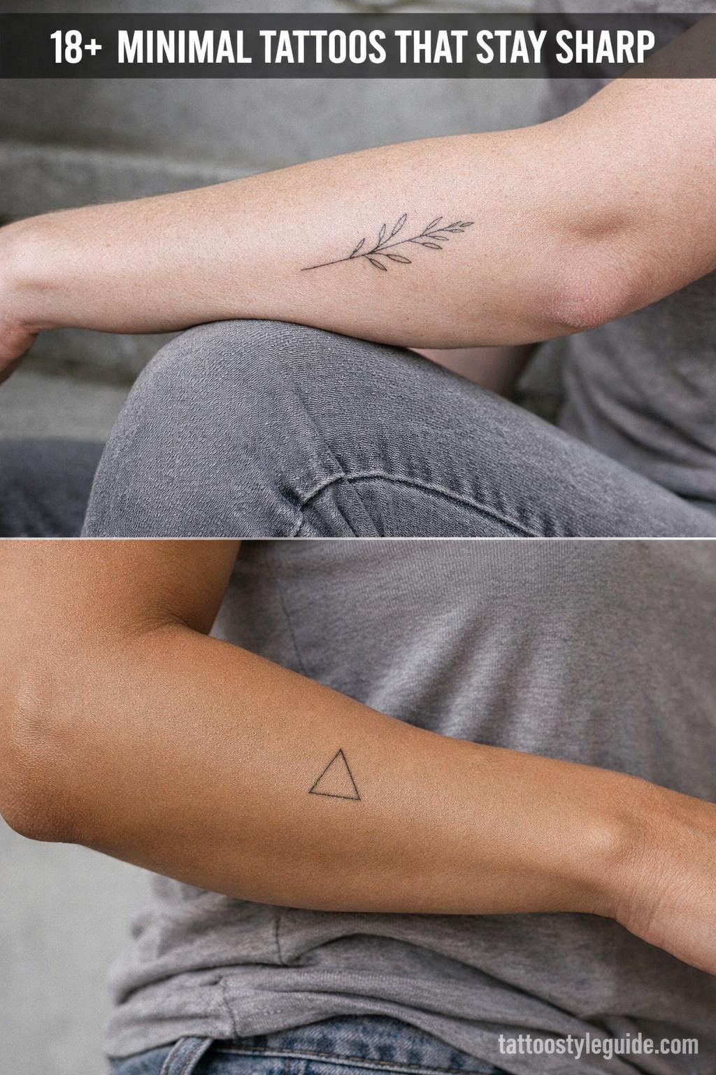
Minimal tattoos fail when the line weight is too light. A 0.5mm single-needle stroke that looks razor-sharp fresh will spread into a soft blur within three to five years on most placements, especially anywhere that sees sun or friction.
The designs that hold are the ones built with enough negative space that slight migration reads as softening, not destruction. Geometric forms and high-contrast split fills age the most predictably. That’s what this collection prioritizes.
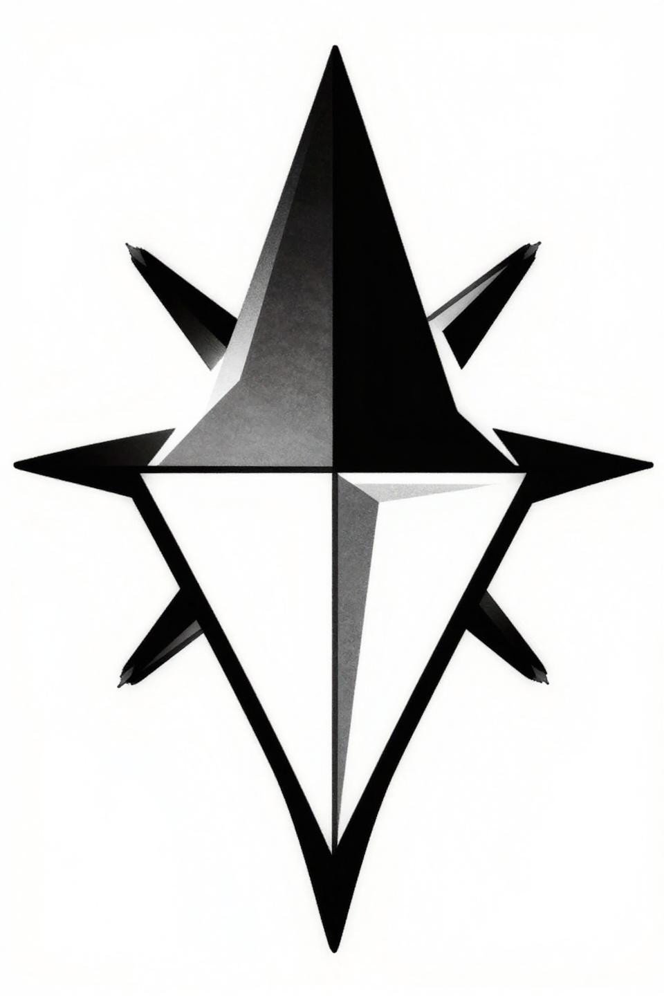
Five Points, Zero Margin for Drift
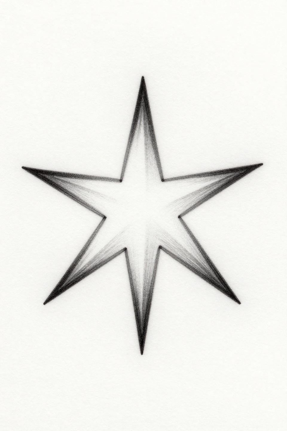
Five hairline strokes radiating from a single hub, nothing else. The entire design lives or dies on the acute tip precision at each point.
On lighter skin, this reads crisp at year one. On olive and darker tones, the fine line weight needs to be heavier to maintain contrast as the ink settles.
Lotus Geometry Where Radial Symmetry Does the Work
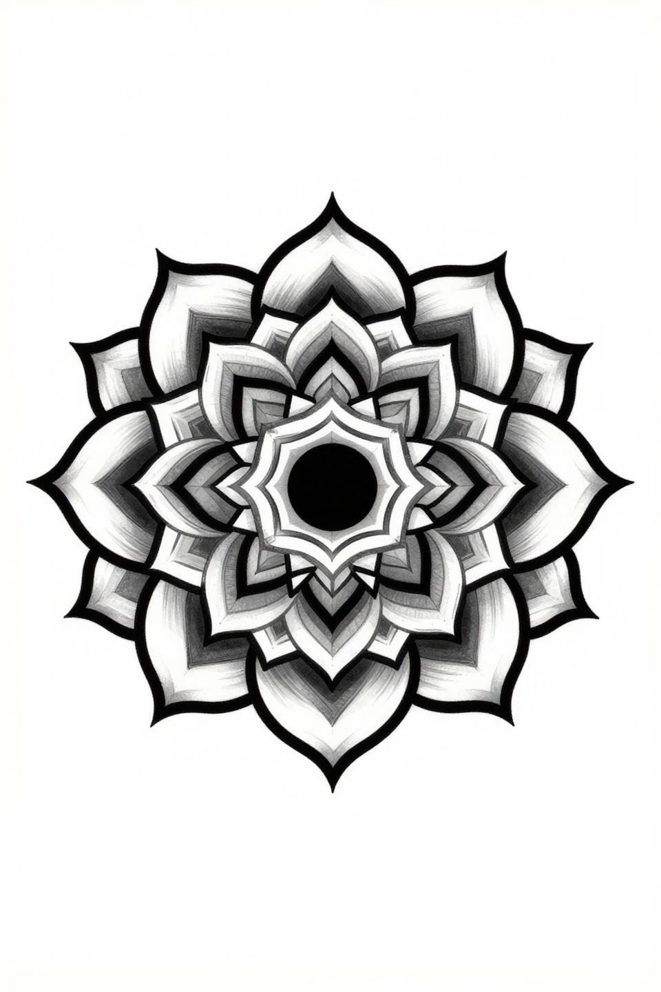
Four concentric petal layers built with compass-drafted precision, the center anchored by a solid black dot. The open negative space silhouettes carry all the visual weight without any fill.
Protected placements like the sternum or upper back give this style its best shelf life. Wrist placement means the fine contours will need revisiting within four to six years.
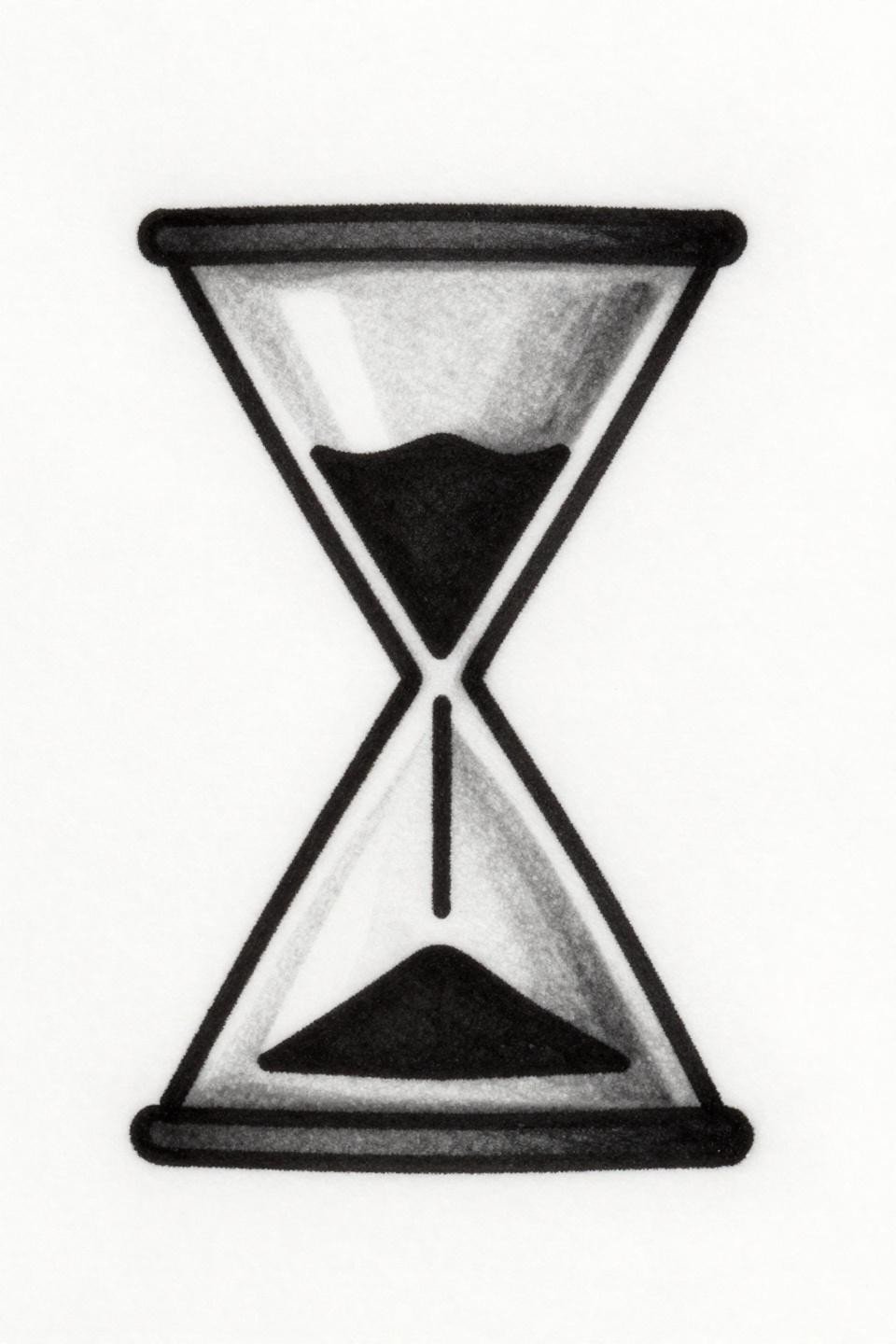
Dotwork Hourglass Built From Density, Not Outline
Two inverted triangles meeting at a pinched waist, the entire form constructed from stipple dots with no outlines at all. The stipple density gradient runs from 90% at the center waist to open negative space at the outer edges.
Look for consistent dot size across the full gradient. Uneven dot spacing is the first sign an artist is rushing the dotwork pass.
Sunburst Medallion Where the Rays Create the Form
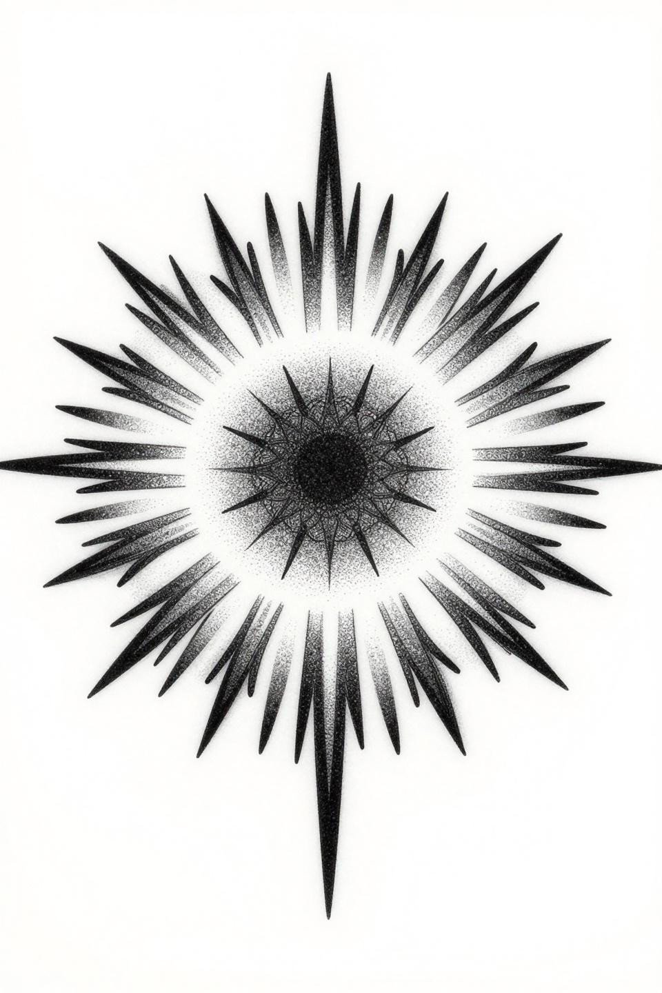
Dense radial segments radiating from a central point to the circumference edge, the negative space between each ray doing as much work as the ink itself. Stipple dot graduation from core to edge prevents the piece from reading flat.
This construction ages better than solid-fill circles because the open channels between rays absorb any ink migration without collapsing the overall read.
Half-Fill Diamond and the Logic of Deliberate Contrast
A diamond rotated 45 degrees, top half solid black, bottom half open. The 50/50 flat fill split is a classic duality motif executed here with compass-drafted precision and a clean 2pt outline.
Bold 2 to 3pt outlines at this scale hold for a decade without touch-up, provided the artist commits to full saturation on the flat fill. Patchy black is the longevity killer in this format.
Sun Wheel Geometry Scaled for Tight Placements
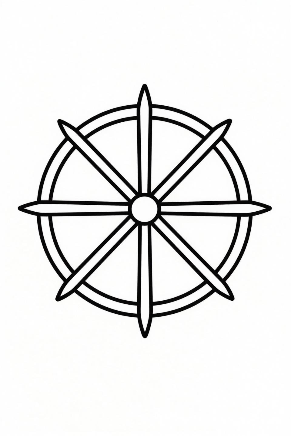
A perfect circle with eight radial segments at mathematically exact 45-degree intervals, nothing more. The compass-drafted geometry means any deviation in the circle or segment spacing reads immediately.
This is a finger tattoo candidate, but be aware: finger placement means touch-up every two to three years minimum due to constant friction and sun exposure.
Parallel Line Engraving Inside a Hexagon Frame
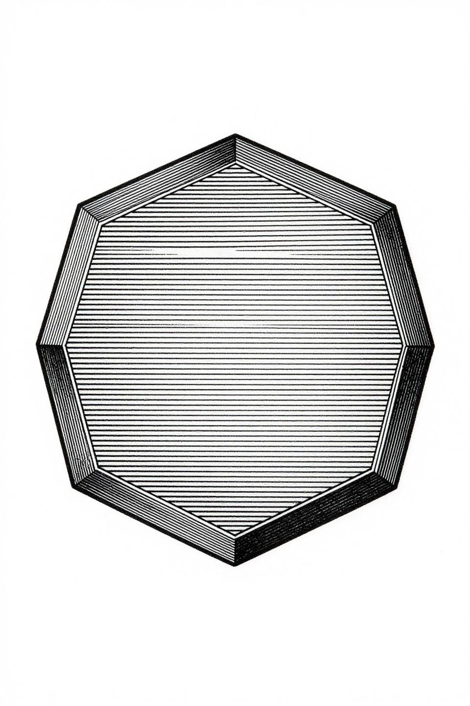
A regular hexagon filled entirely with tightly packed parallel horizontal lines, the hairline outer border holding the form. The ruled line engraving technique creates dense graphic weight from zero solid fill.
This reads differently across skin tones. On lighter skin, the line gaps stay crisp. On deeper tones, the lines need slightly wider spacing to maintain the optical separation as ink settles.
The Split Circle That Relies on a Clean Bisection
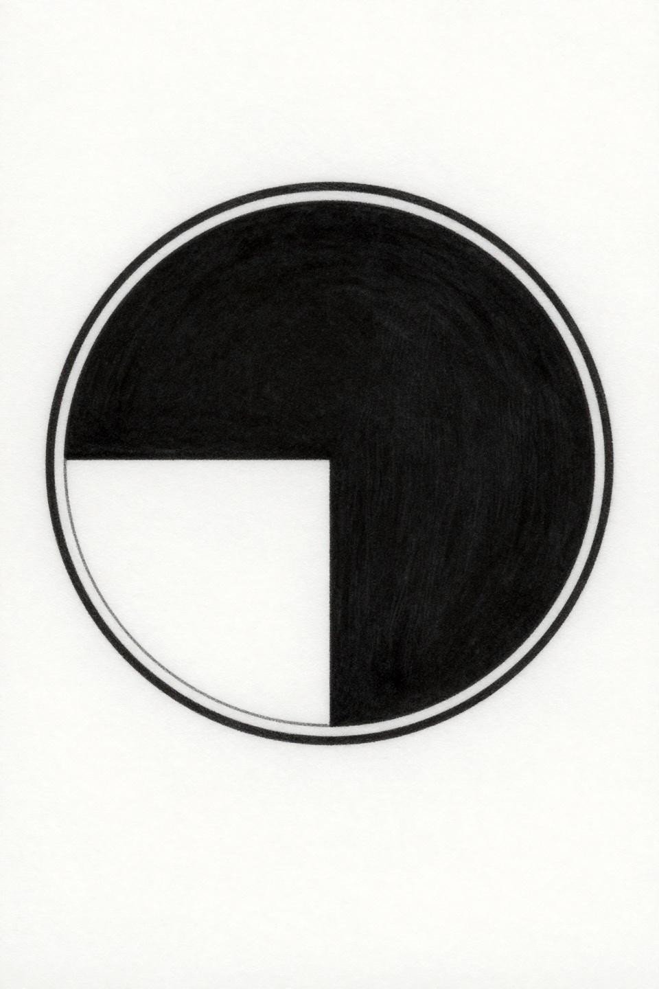
A perfect circle bisected by one vertical hairline, top half solid black, bottom half open. The grey wash transition at the bisection prevents the split from reading too abrupt.
The tell is the circle’s roundness. No wobble at the direction changes. Any deviation in the compass line signals an artist who rushed the linework pass.
Two Lines Into a Peak: Restraint as the Whole Design
Two hairline strokes converging at a sharp apex, the base left open to negative space. The entire design is built from single-needle 1RL work, which requires an artist who controls machine speed precisely.
Placed on the inner wrist or collarbone, this holds its read for years because the form is so reduced that minor ink migration doesn’t compromise the silhouette.
Crosshatch Crescent With Lunar Surface Texture
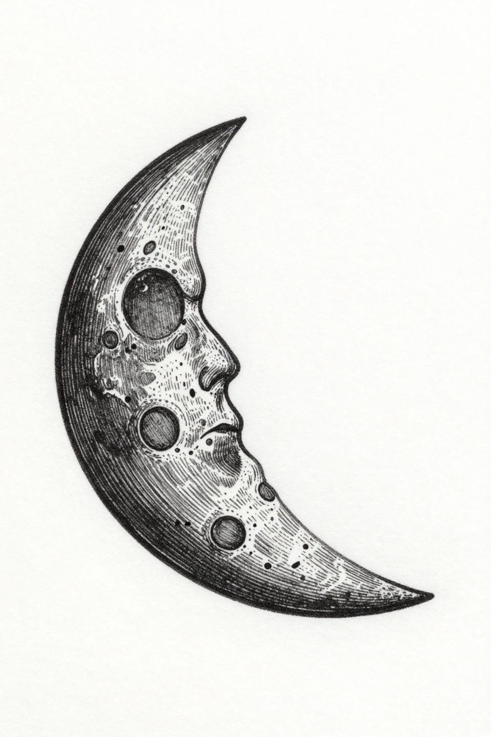
A geometric crescent filled entirely with dense crosshatch parallel lines, no open areas inside the form. The crosshatch etching technique reads as deep tonal shading without any grey wash dilution.
This holds better than single-needle fine line crescents because the layered line density gives migration somewhere to go without destroying the overall read.
Arrow on a Finger: The Placement Calculus
![]()
A minimal arrow built from two converging hairline strokes, the base void left as open negative space. Clean. Angular precision at the apex is the only technical demand, but it’s non-negotiable.
Finger tattoos are temporary tattoos at permanent tattoo prices. This design fades faster on the finger than any other placement. Plan for regular touch-ups or move it to the inner wrist.
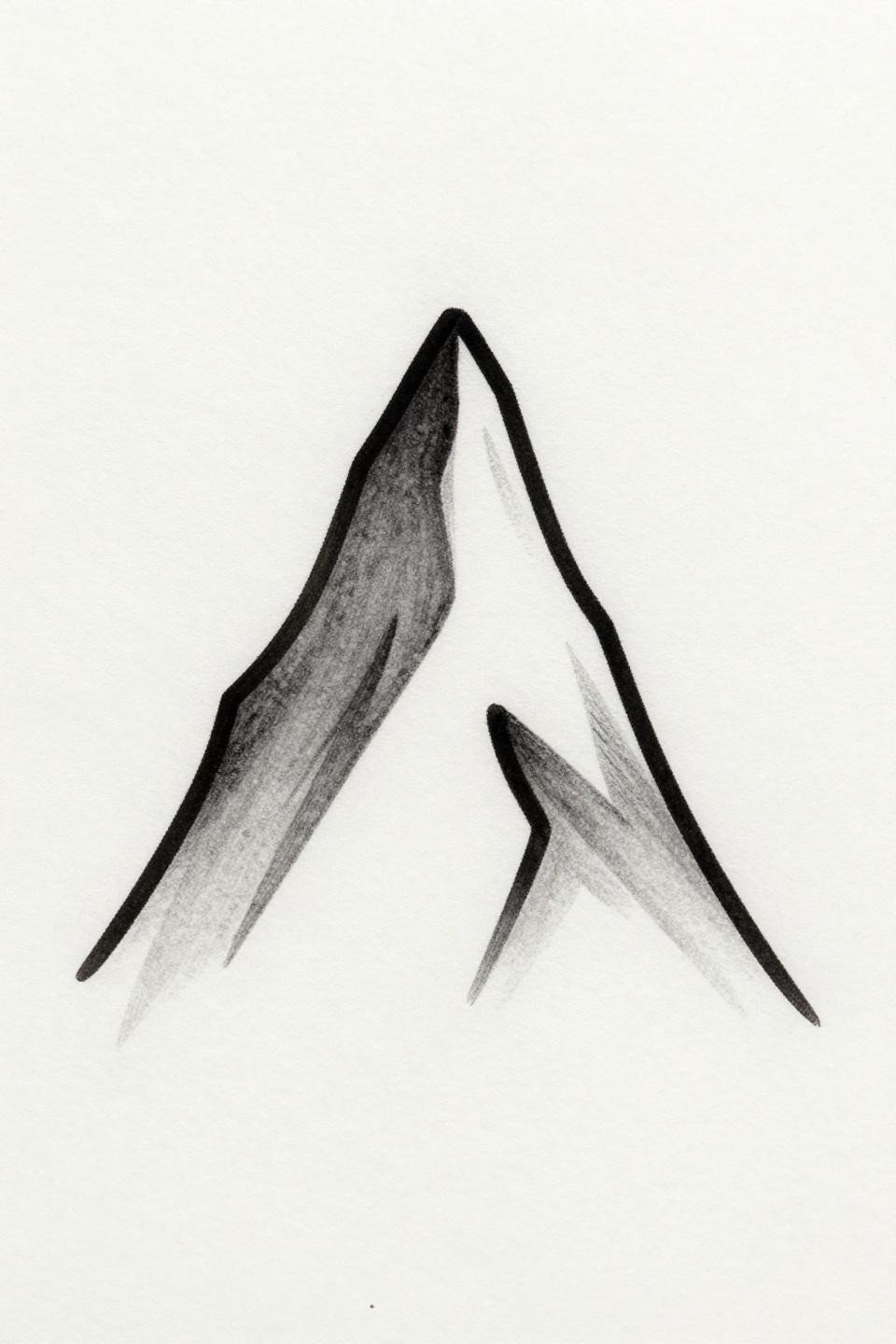
Geometric Pine Built From Stacked Triangle Logic
Three stacked solid black triangles decreasing in width upward, a single hairline trunk below. The flat black fill with bold 2 to 3pt outlines is the longevity signal here.
At full saturation, blackwork holds density indefinitely if the artist commits to multiple passes. Flat fills with no patchiness separate veterans from beginners on a form this geometric.
Dotwork Teardrop Where the Bisection Line Does Double Duty
A downward-pointing teardrop filled with stipple dot clusters, one hairline bisecting line splitting the interior. The horizontal bisection creates negative space division inside an otherwise dense form.
Check the artist’s healed dotwork portfolio, not just fresh shots. Fresh stipple always looks dense. Healed work reveals whether the dots held their separation or merged into muddy grey.
Infinity in a Single Unbroken Stroke
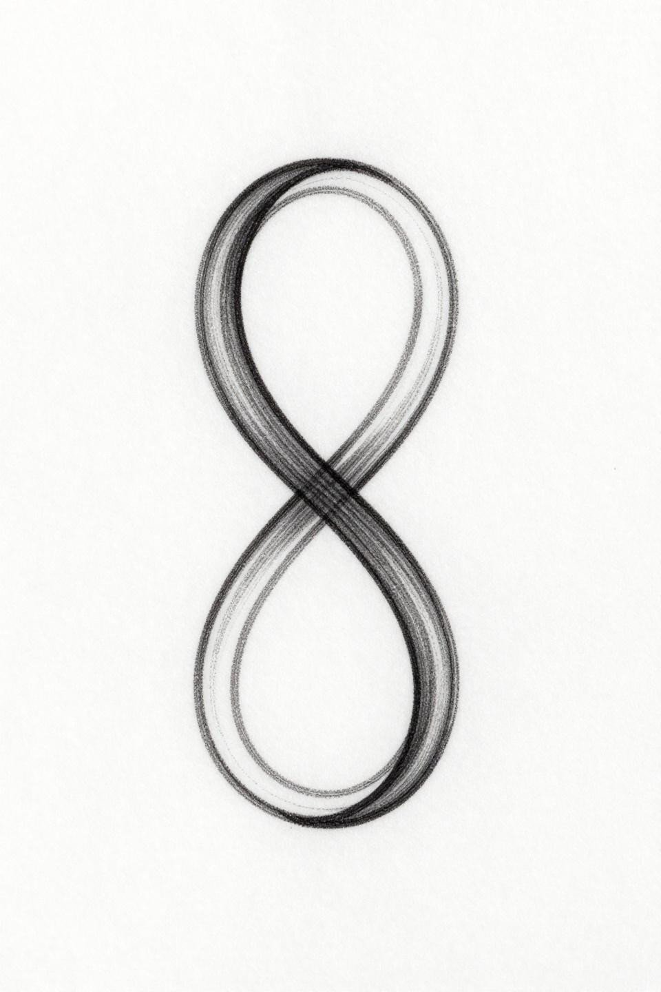
A vertical figure-eight traced by one continuous hairline, the asymmetric amplitude giving it organic movement. The single continuous line technique demands no pen lifts and no speed variation across the full stroke.
Stacked vertical compositions work well on the spine or sternum. Both are protected placements that give this fine line work its best shot at long-term clarity.
Art Deco Hourglass With Precision as the Point
Two stacked triangles meeting at a pinched center, both filled flat black with a hairline bisecting line at mid-form. The art deco angular precision here depends entirely on the sharpness of that center pinch point.
This design reads well at small scale because the bold outlines hold the geometry. At 1cm or smaller, the flat fill and outline weight carry the form even after years of settling.
Botanical Stem Where Negative Space Defines the Leaves
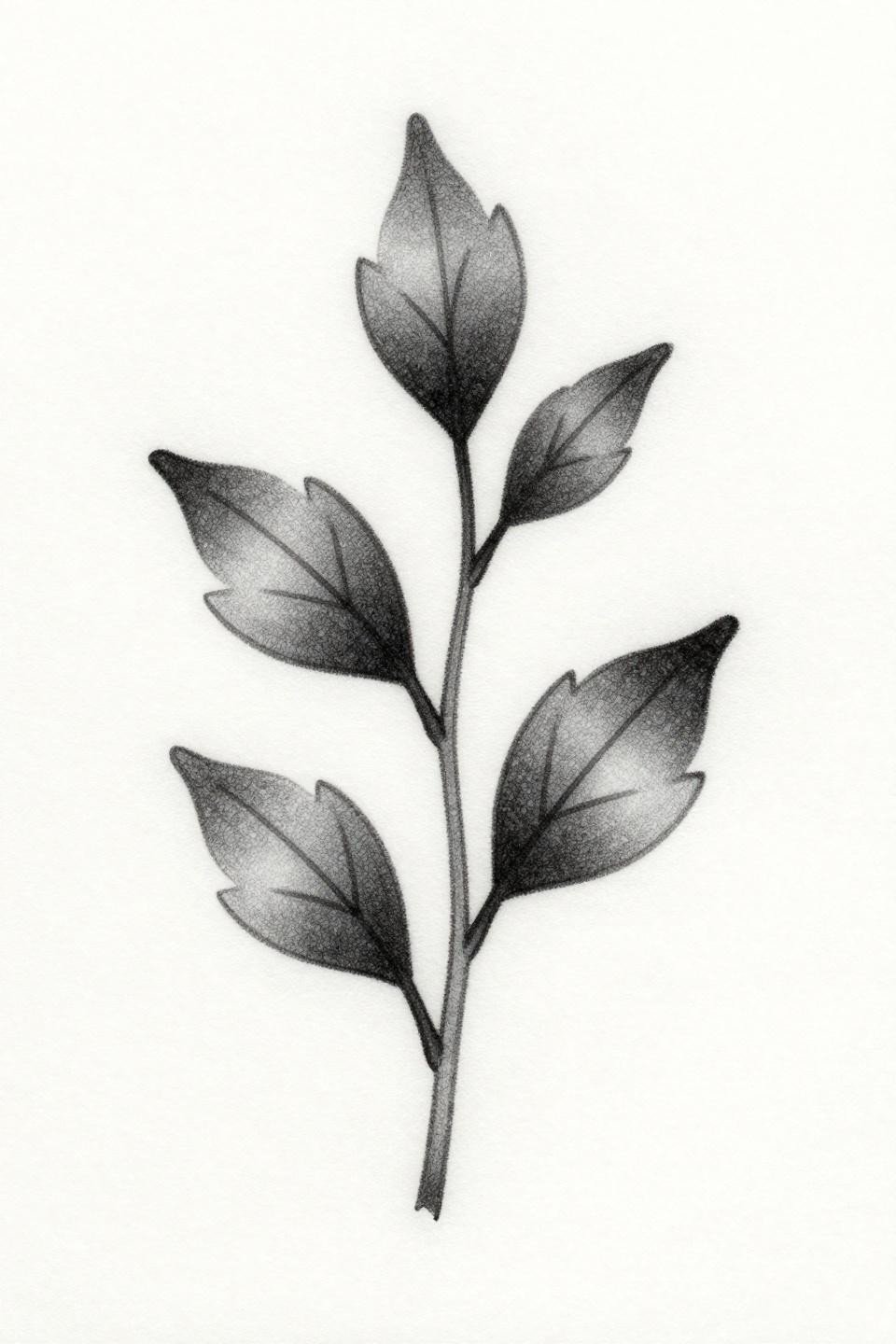
A vertical stem with three asymmetric leaves rendered entirely as open negative space cutouts from the hairline outline. Negative space leaf construction means the skin itself becomes part of the design.
This is a fine line ankle or forearm piece. The asymmetric leaf placement reads natural rather than mechanical, which is harder to execute than it looks at this weight.
Compass Star Anchored by a Single Solid Dot
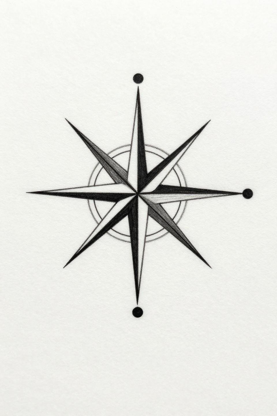
A single solid black dot at center with two perpendicular hairline axes extending to four cardinal points. The solid anchor dot prevents the fine line arms from looking unmoored as the ink ages.
Grey wash dilution is absent here by design. The high-contrast dot-to-hairline ratio is what gives this piece its graphic read at minimal scale.
Three Moon Phases in One Unbroken Geometric Line
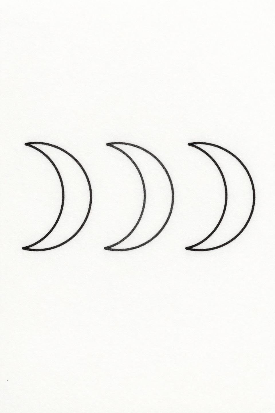
Three crescent phases progressing from left to right in fullness, drawn as one unbroken geometric contour with zero fill. The single continuous line construction is unforgiving: any speed variation reads as inconsistent line weight.
This works on the collarbone or inner forearm where the horizontal composition follows the natural axis of the placement. Rotate it and the phase progression loses its directional logic.
Save three to five of these references, not all eighteen. Your artist needs a direction and a scale, not a mood board. Note which designs use bold outlines versus single-needle hairlines, because those two approaches require different artists and carry different aging expectations.