Elegant tattoos fail when the artist mistakes “delicate” for “light.” The line weight still needs to hold. The composition still needs to anchor. Refinement is a technical decision, not just an aesthetic one.
What separates a tattoo that reads polished at year ten from one that muddles by year three is placement logic, outline weight, and ink density calibrated to skin tone. Every reference below was chosen with that standard.
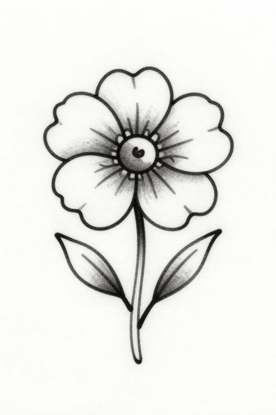
Why Ignorant Style Rose Buds Age Cleaner Than You’d Expect
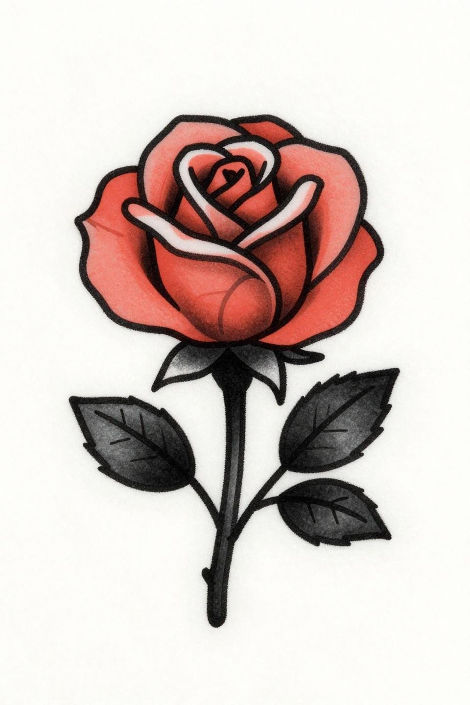
An ignorant-style rosebud with bold 3pt outlines and flat coral fill. The deliberately uneven strokes are a technique choice, not a shortcut, and they hold form where overworked fine line work would fade.
Coral pigment on lighter skin reads vivid for years. On olive and deeper tones, confirm the artist uses a pigment-dense brand since lighter fills can turn chalky without proper saturation.
Constellation Geometry That Lives or Dies by Needle Control
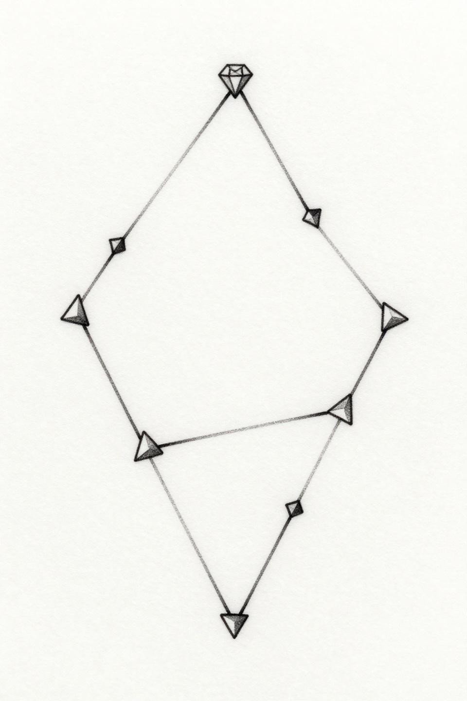
Seven interlocking triangles connected by hairline strokes, a floating diamond at apex, zero fill. This is 1RL single-needle work operating entirely on negative space to create weight.
Single-needle work at this scale needs an artist who controls hand speed precisely. Any inconsistency in pressure reads immediately on geometric linework, check healed portfolio shots before booking.
The Swallowtail Pose That Locks in Traditional Longevity
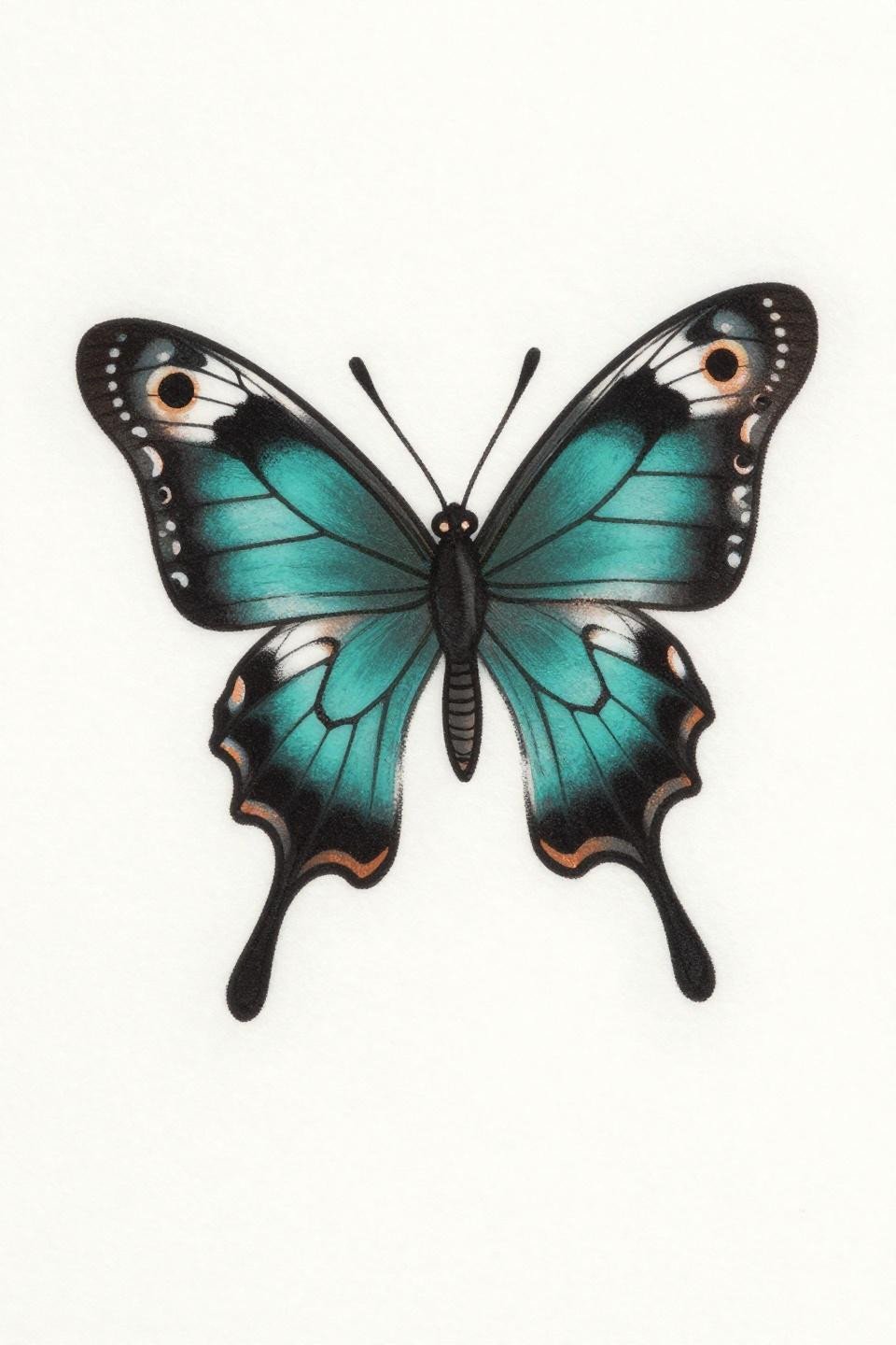
A swallowtail in ventral view with bold 2-3pt outlines, flat teal fills, and copper accents hitting the eyespot detail. Traditional structure means this reads from distance without losing the wing anatomy specifics.
Bold 2-3pt outlines are the longevity signal in traditional flash. At year ten, this butterfly holds its silhouette where fine line butterfly work typically bleeds into the surrounding skin.
Feather Dotwork Where Density Gradient Is the Whole Point
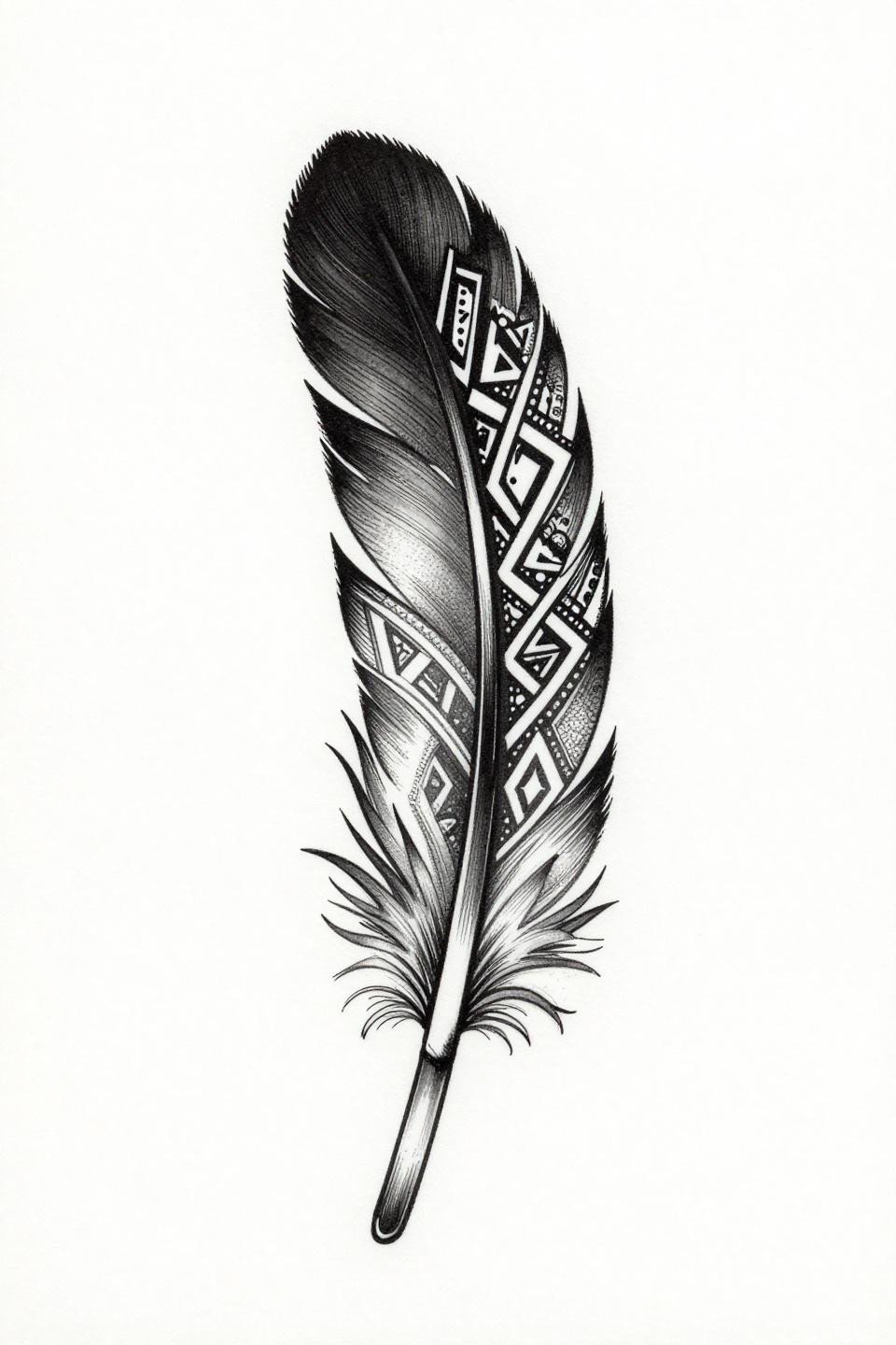
A tribal geometric feather with lacework infill sections and a stipple density gradient running from 90% saturation at the spine to open negative space at the tip edges.
This gradient only reads correctly if dot size stays consistent across the full field. Inconsistent stipple is the most common failure point, look at the artist’s close-up healed dotwork before committing.
Hummingbird Sketch Lines That Read as Intentional, Not Rushed
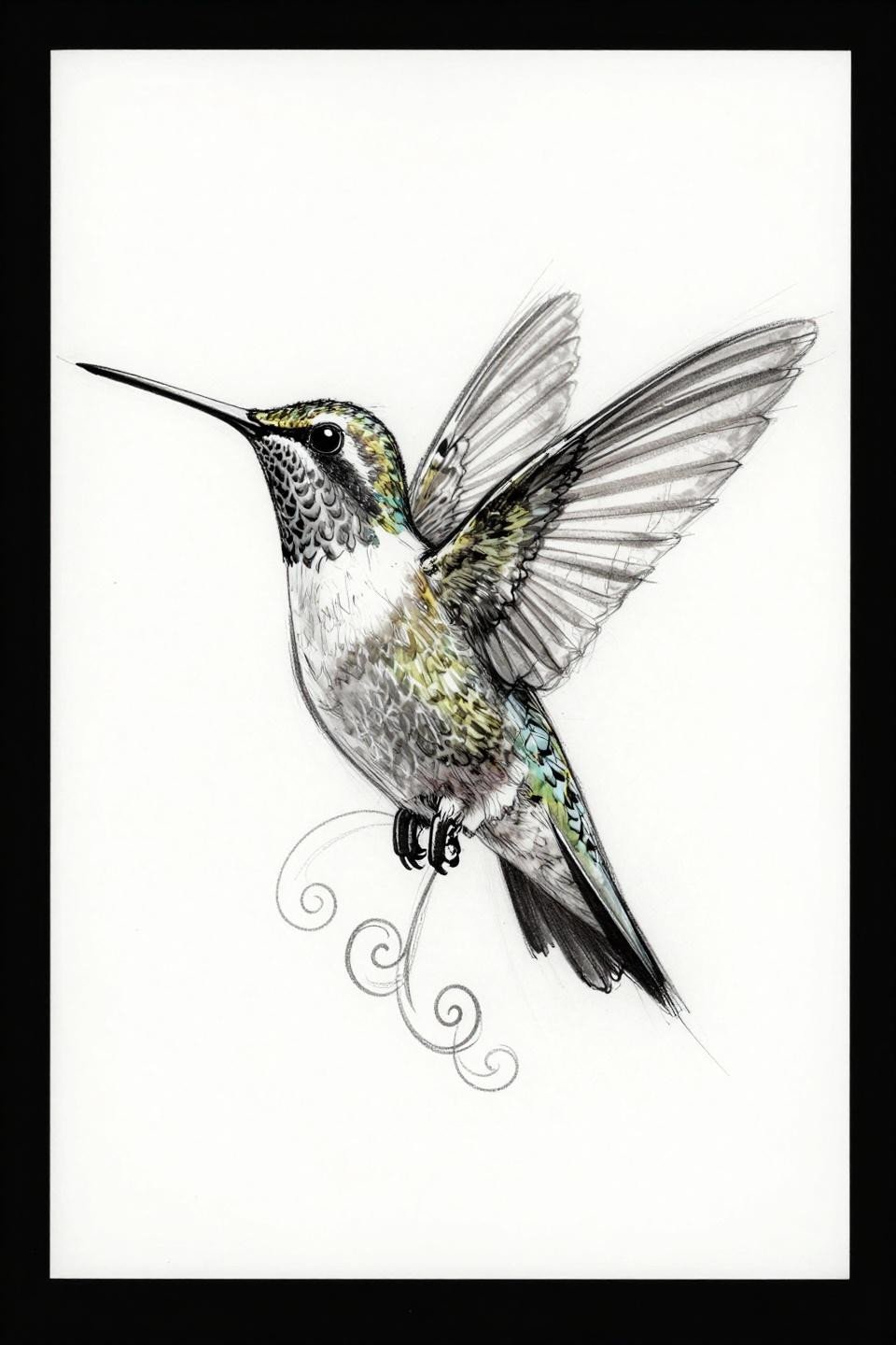
A sketch-style hummingbird in profile, mid-wing-beat, with a spiral vine below. Gestural cross-contour strokes do the structural work here, raw energy contained within a deliberate composition.
Protected placements like the inner wrist or behind the ear give sketch-style lines their best shelf life. High-friction zones turn the loose stroke quality into blur, not atmosphere.
Art Deco Diamond Where Compass Drafting Separates Clean From Sloppy
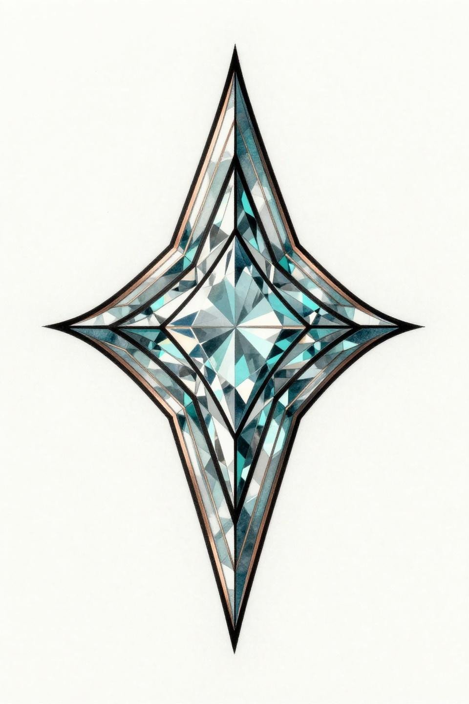
A Swarovski-referenced diamond motif with geometric facets, internal refraction lines, and vector-precision compass drafting holding the stepped pavilion cuts in bilateral symmetry.
Teal and copper as an ink palette holds contrast on most skin tones better than standard black-and-grey. The geometric structure means any wobble in the facet angles reads immediately, this is a design that exposes technical weakness fast.
Jasmine Moon: Where Fine Line Placement Decides Everything

A crescent moon cradling a single jasmine bloom, five-petal asymmetric spread with fine vein mapping across each surface. The hairline 0.5mm single-needle linework requires zero dotwork to generate depth.
Hand placement for this level of fine line detail means touch-ups every 2-3 years minimum. For back tattoo placement ideas for women, this composition translates to the upper back with significantly better longevity.
Sak Yant Vine Motion That Only Works in Calligraphic Ink
An asymmetric Sak Yant-influenced vine with interlocking teardrop motifs and dot-fill nodes at each curve junction. The calligraphic brush stroke quality requires an artist experienced in wet-ink tattooing, not just linework.
For context on how this decorative vocabulary translates to skin, the henna designs for elegant body art reference shows how the same flowing motifs age on different placements. Gold ink needs confirmation on longevity from your artist.
Crown Constellation Where Negative Space Carries the Weight
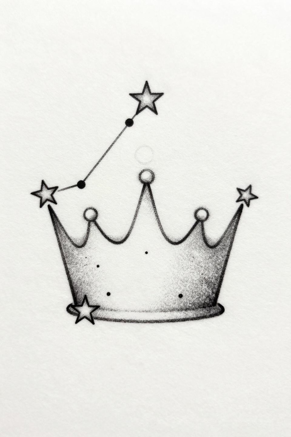
Three stars forming an abstract crown, a crescent cradling the apex point, scattered micro-dots suggesting field depth. Dominant negative space is the compositional engine, the lines are almost incidental.
On olive or deeper skin tones, the micro-dots and hairline connections need heavier needle weight to maintain legibility. What reads crisp on lighter skin can disappear entirely at these scales without line weight adjustment.
Japanese Iris Where Indigo Outline Weight Does the Structural Work
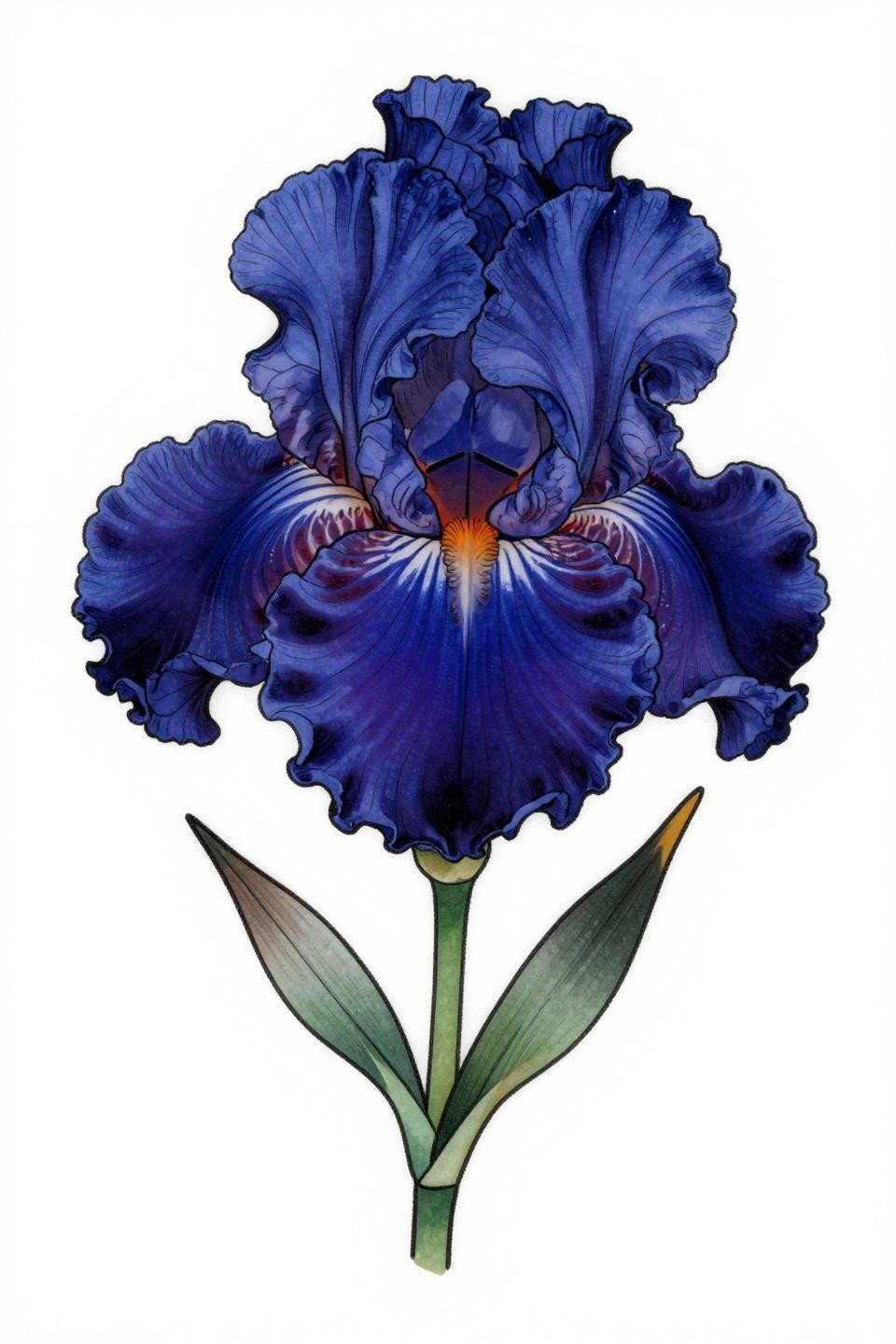
An irezumi-influenced iris in three-quarter profile with ruffled upper petals, drooping lower sepals, and bold 2-3pt outline weight maintaining structure across the full petal surface.
The deep indigo and crimson two-color palette is rare and reads formally on skin. On lighter tones, indigo holds its hue long-term. On darker skin, confirm the artist tests the crimson accent pigment for visibility.
Art Deco Chevron Bands That Demand Geometric Tattoo Specialists
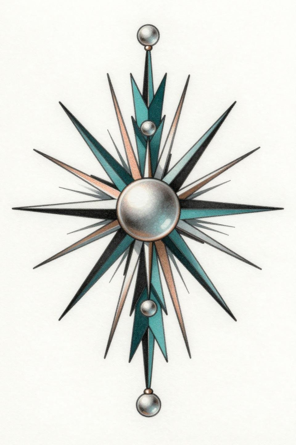
Stacked chevron bands with pearl-drop terminals and a radiating sunburst, executed in compass-drafted precision with flat teal and copper fills. Bilateral symmetry at 90-degree angles exposes any needle wobble at direction changes immediately.
Finger placement means this design needs touch-up work every 2-3 years regardless of artist quality. The flat fills are the tell for veteran execution, patchiness at the color boundaries signals a beginner.
Continuous Line Feather Where One Stroke Has to Be Right
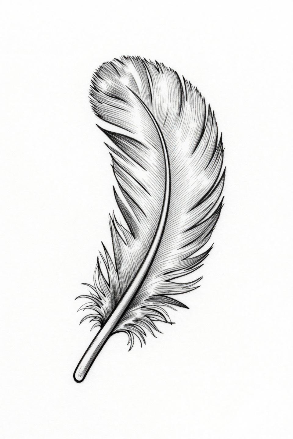
A feather formed from one unbroken hairline stroke, the quill spine and branching rachis lines all resolved without lifting the needle. Single continuous line execution like this is a specific technical skill, not every fine line artist has it.
Protected placements on the inner arm or sternum are where this design belongs. Any high-movement zone will stretch the delicate barb lines into distortion within a few years.
Monarch Neo-Traditional: When Cell Pattern Complexity Earns Its Outlines
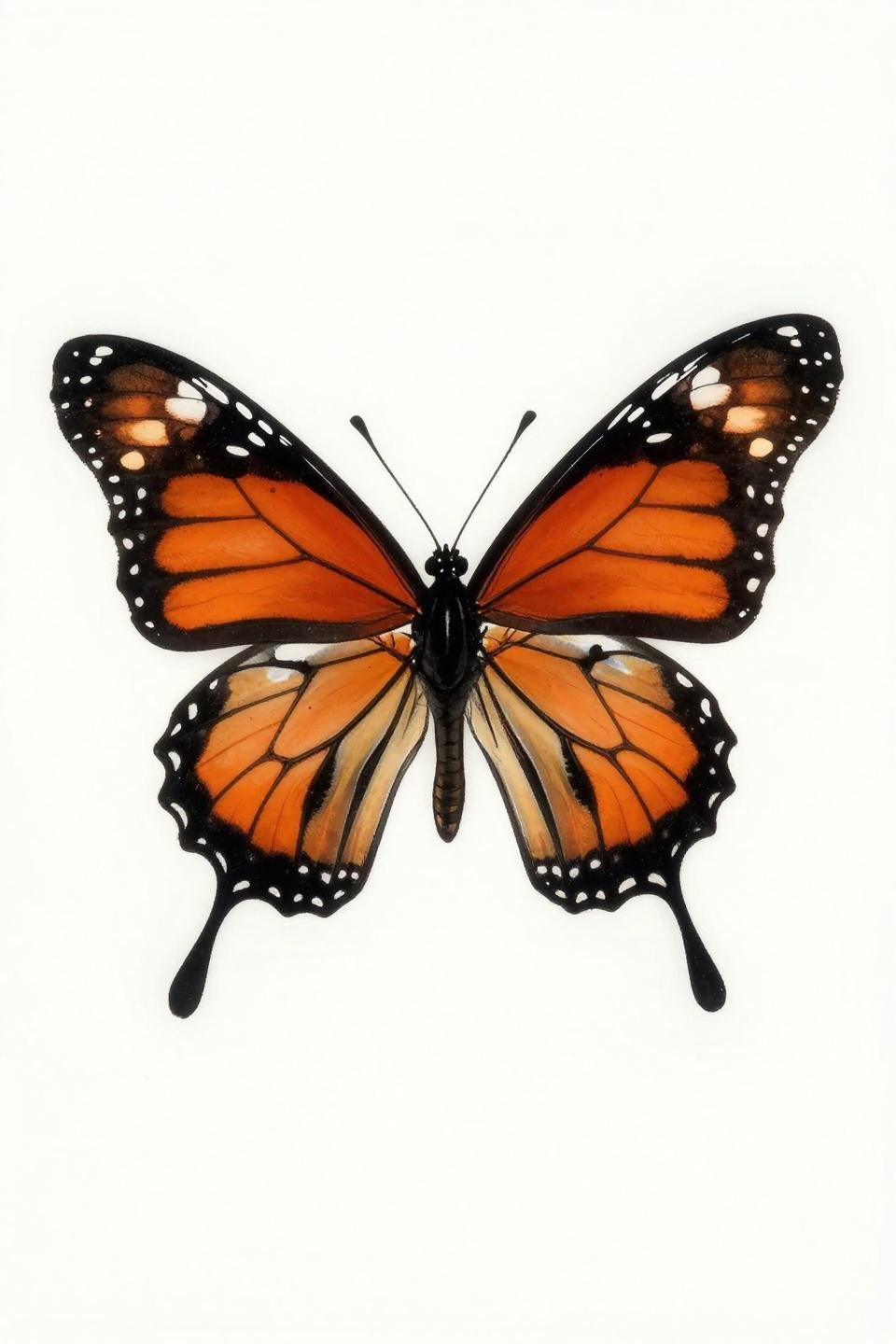
A monarch in full dorsal spread, scalloped wing margins, orange and black cell mosaic with fine vein tracery, and white spots at the forewing tips. The cadmium orange flat fill within bold 2-3pt outlines is what keeps this readable at scale.
Neo-traditional orange holds significantly better than watercolor orange on skin. This is the technically sound version of a design category that frequently gets executed in styles that fade fast.
Fine Line Lotus Where Weight Variation at Petal Edges Is the Signal
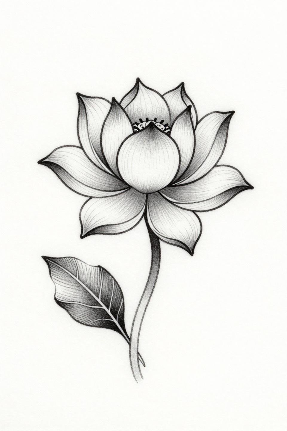
A single lotus in profile, three asymmetrically unfurling petals with deliberate line weight variation at the petal edges creating depth without grey wash filling the interior forms.
Grey wash dilution from dense base to open midtone is handled cleanly here with no muddy transitions. On olive skin, this level of tonal control reads sharper than full black fields at comparable scales.
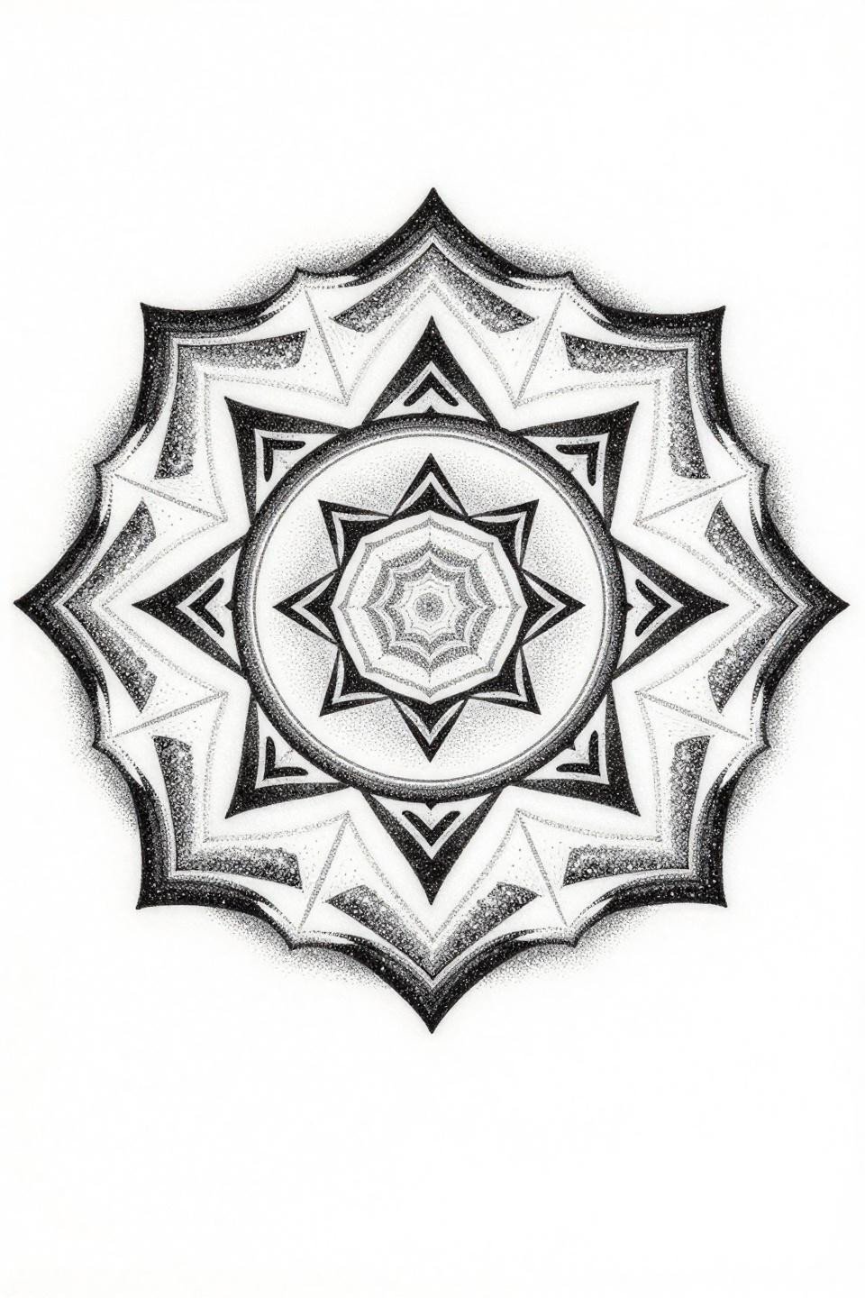
Brittle Star Mandala Where Crosshatch Engraving Has to Be Even
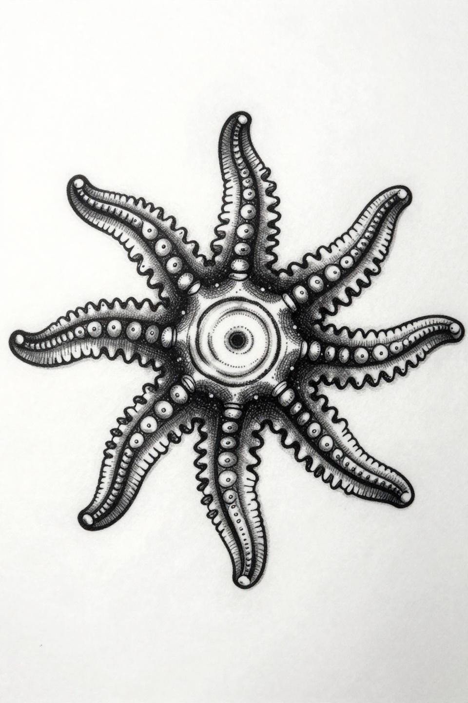
A five-armed ophiuroid in circular mandala arrangement, each arm with segmented joint detail and the central disc rendered in concentric crosshatch engraving using 0.5pt ruled parallel strokes.
Etching-style crosshatch in a tattoo requires consistent parallel line spacing across the full field. Uneven ruled strokes collapse the tonal illusion entirely, this is a design where checking the artist’s healed engraving work is non-negotiable.
Monogram Fine Line Where Letterform Serifs Signal Artist Precision
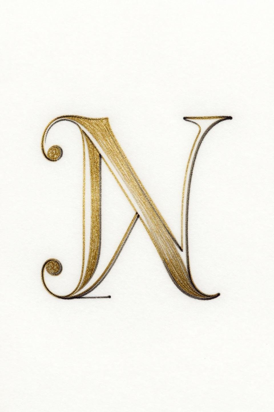
Two serif capital initials intertwined into a single closed-loop monogram, hairline cross-strokes linking the forms with refined terminal serifs at each letter endpoint in 18k gold on black outline.
Gold ink longevity varies by brand and skin chemistry. Ask specifically about which gold formulation the artist uses and whether they have healed shots of gold work at 18 months or beyond.
Watercolor Forget-Me-Nots and the Outline Question That Decides Longevity
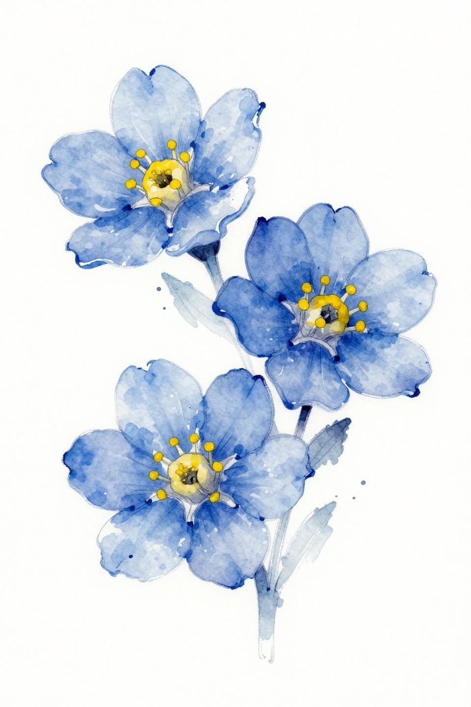
Three forget-me-not blooms in a loose watercolor cluster, periwinkle washes bleeding at petal edges over fine navy linework. The anchoring navy ink outline is what separates this from pure watercolor work.
Watercolor without an anchoring outline blurs by year 3-5. This reference keeps the linework, which means the composition survives the pigment migration that eventually softens the washes into the skin.
Art Nouveau Mandala Where Calligraphic Consistency Is the Whole Craft
A six-fold radial mandala with flowing vine tendrils, dot-matrix petal arrangements, and lacework borders. The wet ink calligraphic mark quality means each brushstroke has to resolve cleanly at every repeat of the symmetry.
For comparable decorative vocabulary across styles, simple mehndi patterns with timeless appeal shows how this motif language adapts when the scale or placement changes. Crimson accent on black holds contrast on all skin tones well.
Moon and Star Celestial Minimalism Where Every Serif Flourish Has to Earn Its Place
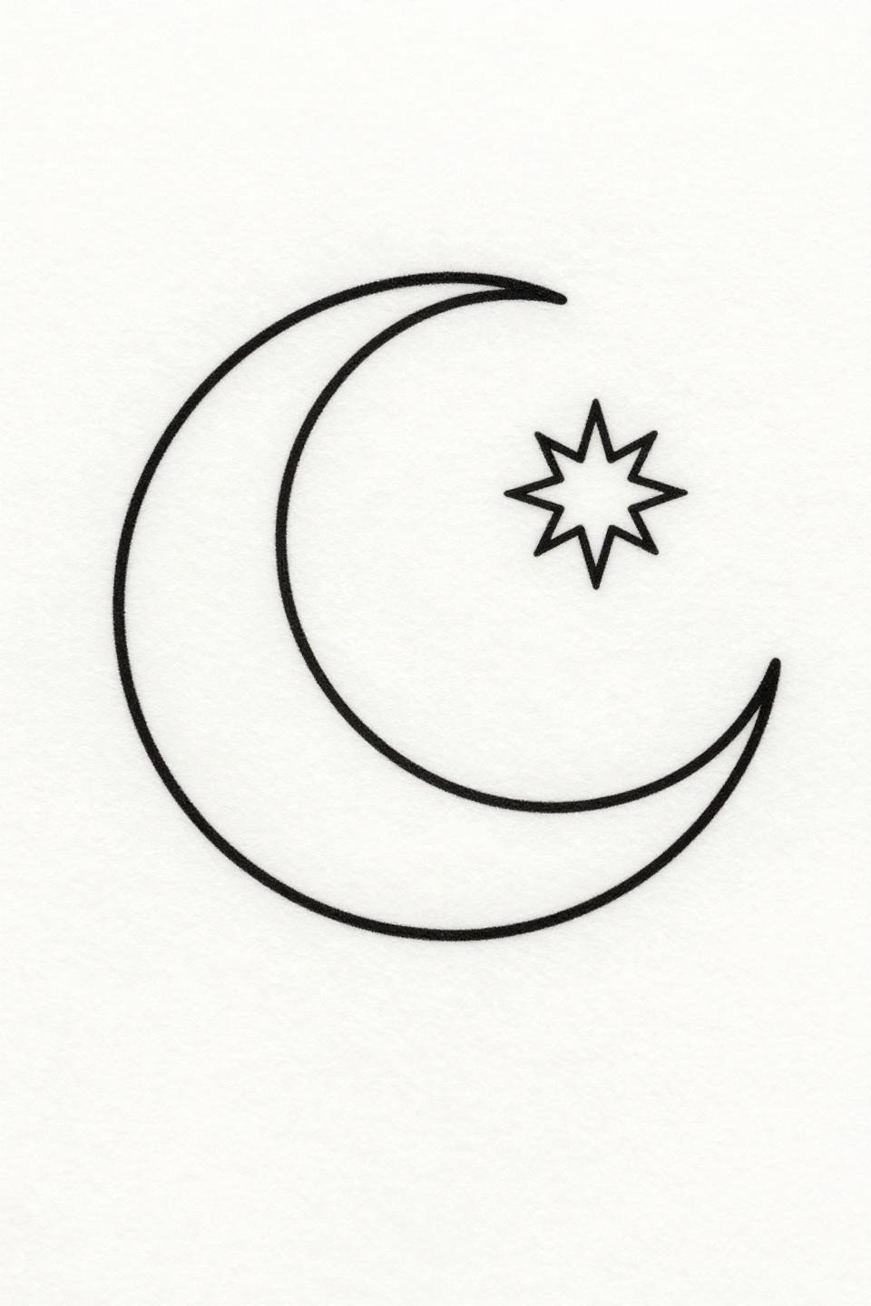
A crescent moon cradling a single five-pointed star, hairline connection between the forms, with art nouveau serif flourishes at each star point adding weight without disrupting the open composition.
At this minimal scale, the entire design depends on consistent 0.5mm hairline execution. Any variation in stroke weight across the star points reads as error, not texture.
Botanical Peony Where Line Weight Variation Replaces Color
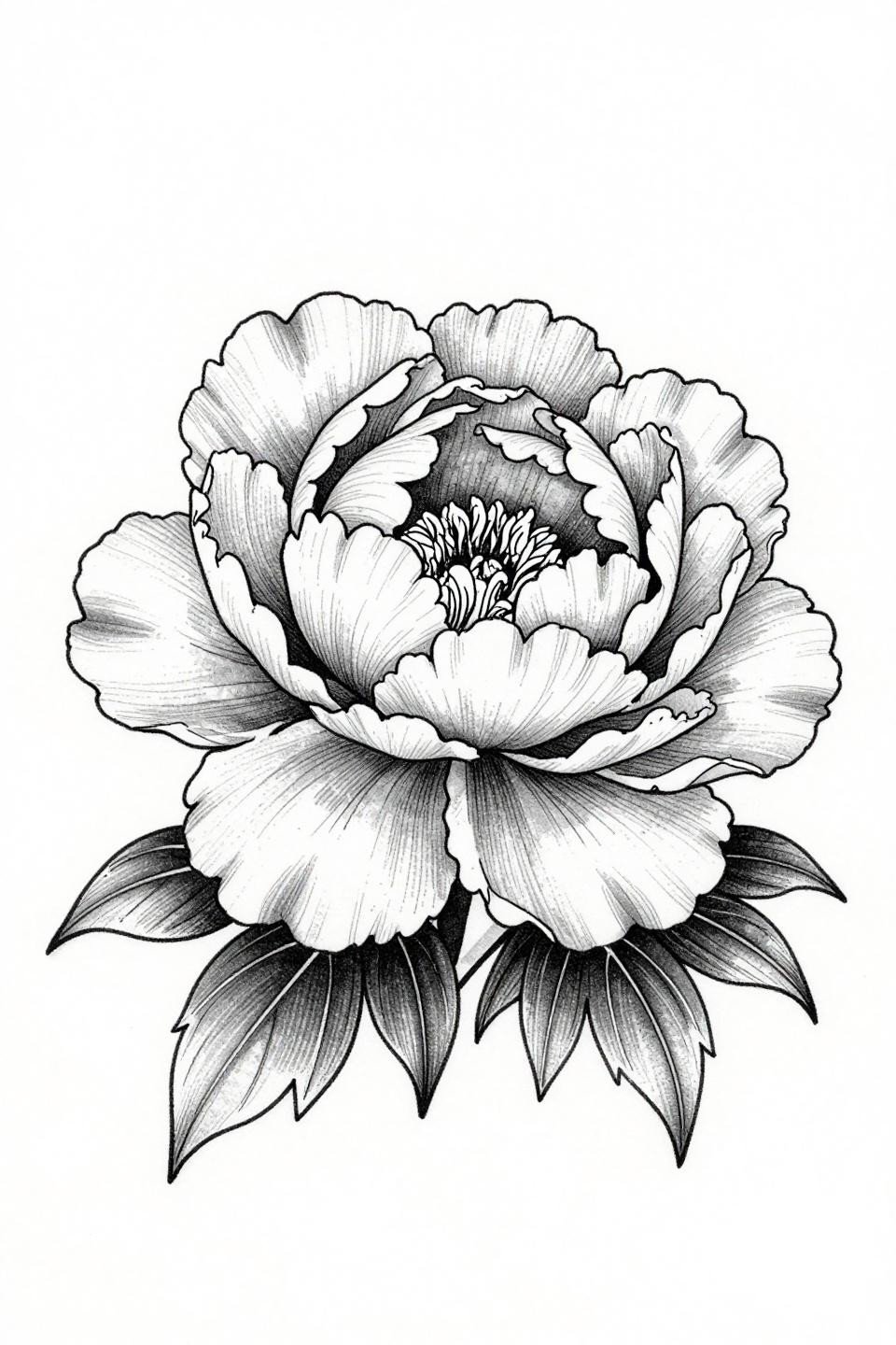
A peony in three-quarter view, layered ruffled petals mapped with fine vein detail, no stipple or dotwork. Controlled line weight variation from heavy at the petal base to hairline at the tips creates the full tonal range.
Grey wash dilution on a botanical peony ages better than color fills on this style. On olive skin, this reads as a clean tonal study at year five if the artist commits to proper grey wash dilution from dense to open with no muddy midtones.
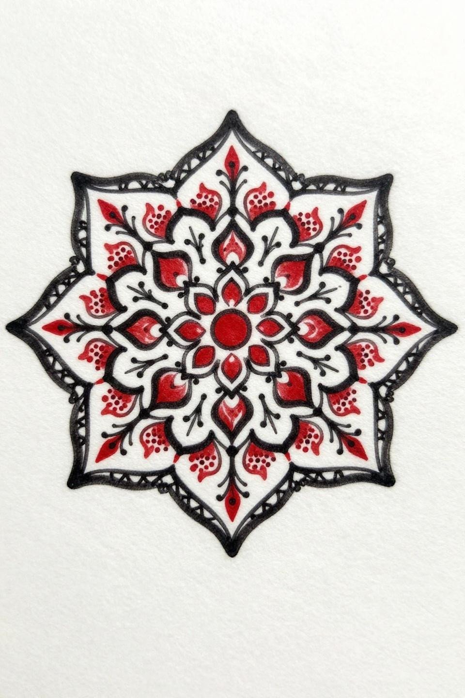
Dotwork Mandala Where Center Saturation Tells You Everything About the Artist
A geometric mandala with concentric circles, radiating triangle points, and a central hexagon hub built entirely from stipple dot gradient density, heavy at center and opening to near-white at the outer edge.
Look for consistent dot size across the full gradient radius. Inconsistent dot size at the transition zones is the single most common failure in dotwork mandala execution, and it reads clearly in healed photos.
Continuous Line Forget-Me-Not: Where No Breaks Means No Excuses
A forget-me-not resolved in a single unbroken 0.5mm hairline stroke, five petals, a botanical stem, and two lateral leaves without lifting the needle. Continuous single-line botanical work at this scale is one of the most unforgiving formats in fine line tattooing.
The curves at the petal junctions are where most artists lose the form. No wobble at direction changes is the standard. Anything less and the design reads as a study, not finished work.
Filter these by placement first, then skin tone. Scale up the line weight of any hairline or single-needle reference if you are going on a high-friction zone. Send 3 references maximum to your artist, not a folder.