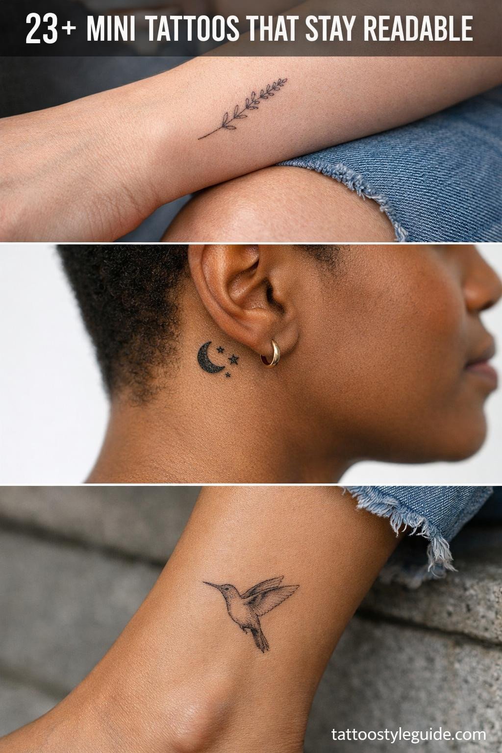
Mini tattoos fail for one consistent reason: the artist chose too much detail for the scale. At under two inches, every line that touches another becomes one blurred line by year three. The designs that hold are the ones built with enough negative space to breathe.
Scale discipline separates readable mini work from the muddy dots people get lasered off at 35. Bold outlines at 2-3pt, open composition, and restrained detail count are the technical requirements, not stylistic preferences.
Sak Yant Geometry Scaled Down Without Losing Its Structure
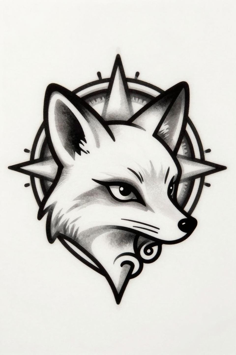
A fox head in strict profile with Sak Yant mandala framing overhead: the ceremonial geometry does double work here, filling vertical space without crowding the subject.
The bold 2-3pt outline weight is the right call at this scale. On lighter skin, it holds clean contrast for a decade without a touch-up.
Trash Polka at Postage Stamp Size: What Survives the Reduction
Trash polka at mini scale strips the style to its core contrast: precise metalwork outline against chaotic splatter geometry, with nothing in between to muddy the read.
The splatter marks here are the risk. Any artist executing this needs to keep splatter elements at least 2mm from the linework or they merge on healing.
Three-Segment Arrow: Why Geometric Fletching Outlasts Feathered Versions
![]()
This upward arrow uses stacked chevron fletching instead of organic feather rendering, a direct response to the scale problem: angular geometry holds at small sizes where soft shapes blur.
Zero wash or stipple in this design is a deliberate longevity choice. Flat black fills on wrist or forearm placement stay readable well past the five-year mark.
Raven Skull in Chicano Grey Wash: Placement Makes the Difference

The asymmetric off-center placement with open negative space at left is not accidental: whip shading grey wash needs room to exhale or the tonal range compresses into a grey smear.
On olive and deeper skin tones, this style requires a denser black anchor at the outline or the midtone gradient disappears within two years. Ask to see healed grey wash work before booking.
Filigree Clock at Micro Scale: The Single Needle Truth
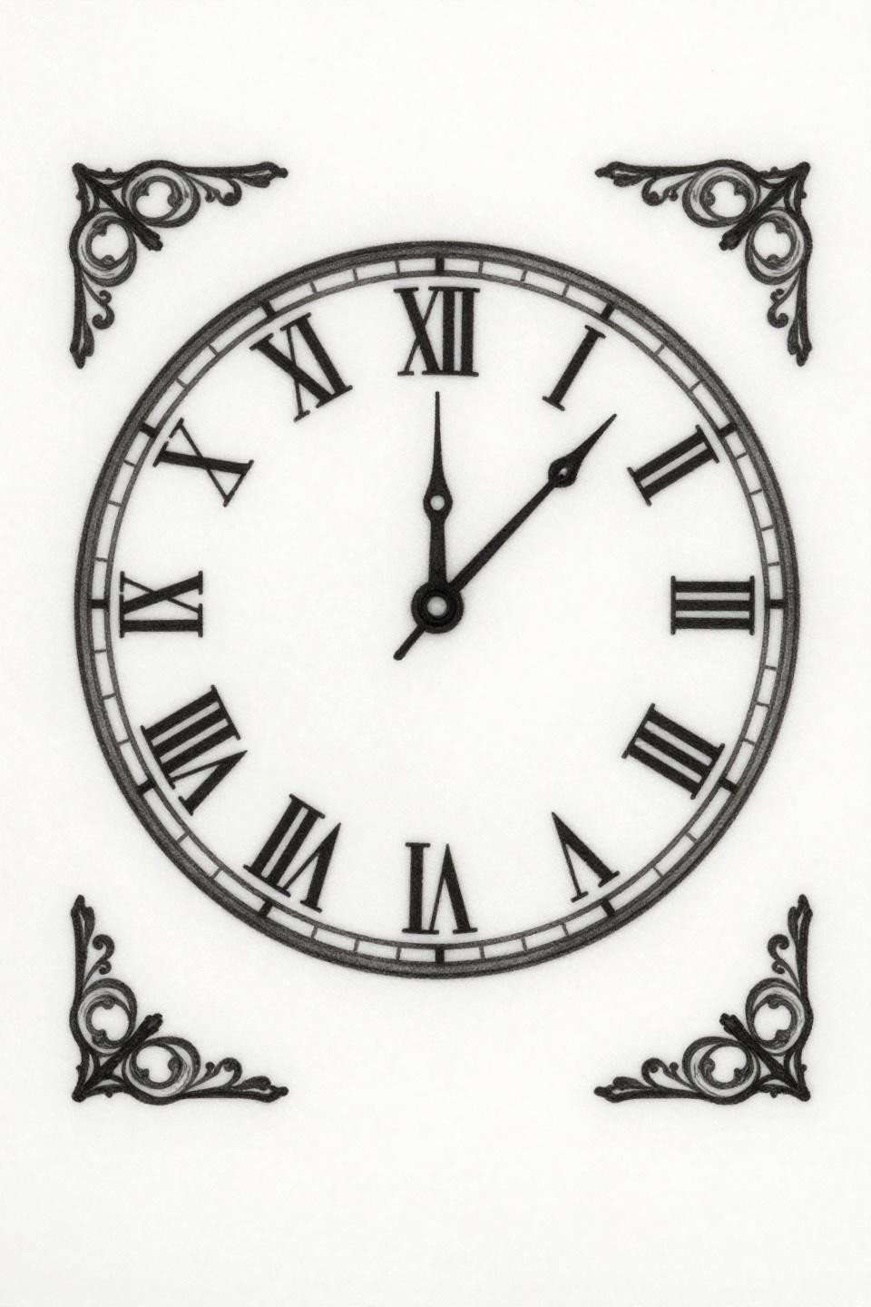
Hairline 0.5mm single-needle strokes rendering filigree corner flourishes at clock-face scale: this is the design that exposes whether an artist controls hand speed or just claims to.
Single needle work like this needs protection. Sternum or inner arm placement gives it the best shelf life. Wrist exposure to sun contact degrades these fine lines within 18 months.
Celtic Knotwork Locket: Bold Interlace That Holds at Small Scale
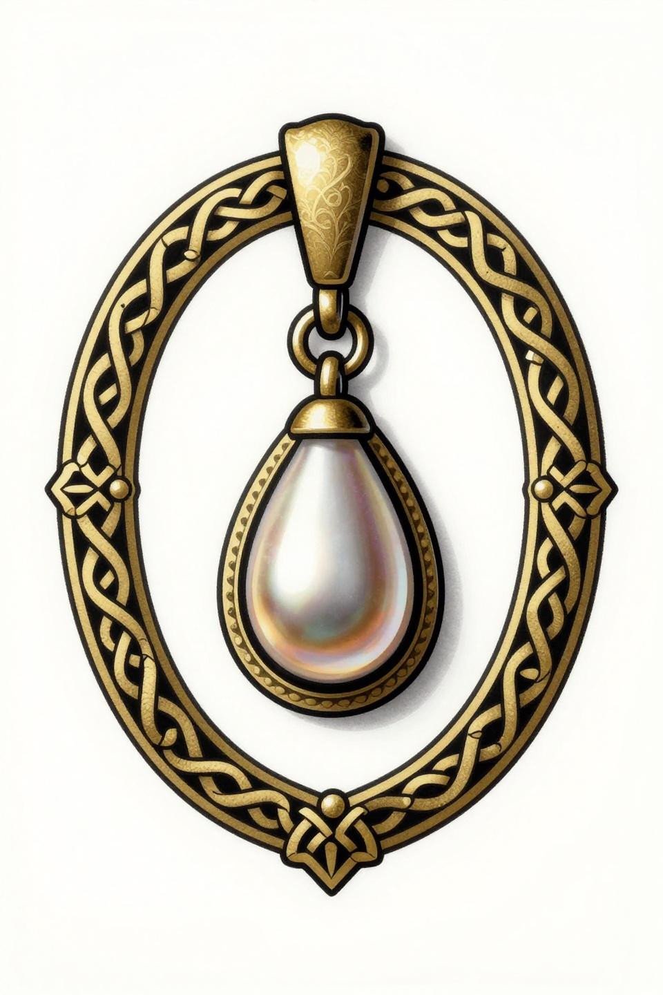
Celtic interlace at pendant scale works because the knotwork border frame provides a built-in containment system, keeping the design from reading as visual noise at small dimensions.
The bilateral symmetry here is the artist signal. Any drift in the interlace crossing pattern reads immediately at this size, the same way a wobbly circle reads on a wrist.
Phoenix in Etching Style: How Hatching Replaces Wasted Grey Wash
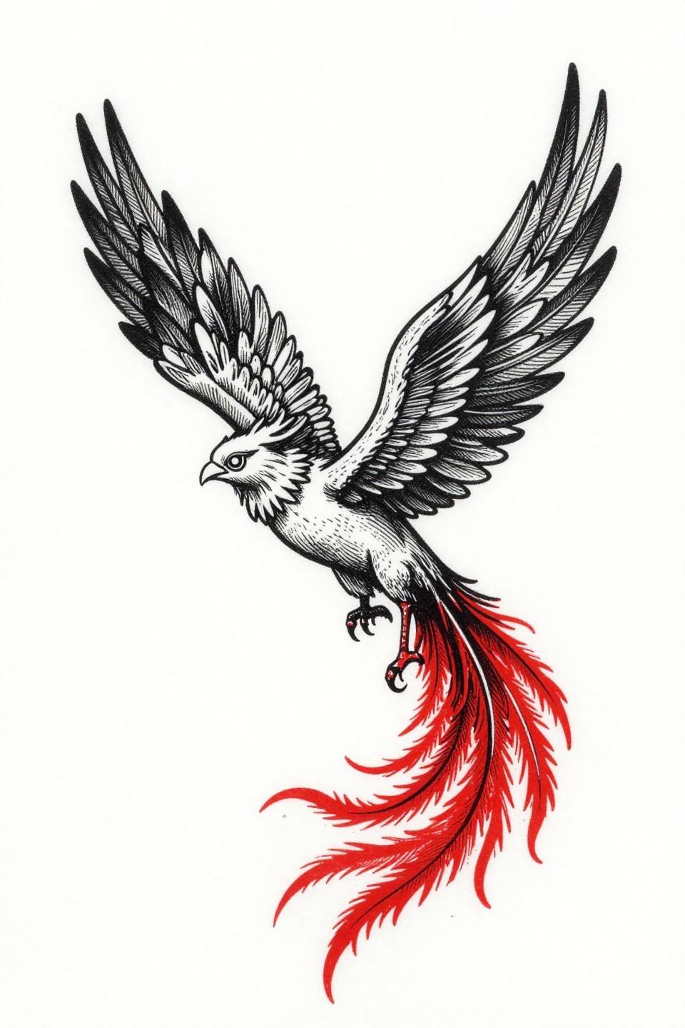
The parallel line engraving hatching on the wing rows does what grey wash cannot at this scale: it creates tonal depth without requiring smooth gradients that blow out by year three.
The crimson red accent on black works at small sizes because it hits a single high-contrast zone, the tail feathers, without competing with the linework. Color discipline at mini scale is underrated.
Dotwork Ouroboros: Stipple Density as the Design Logic
No outline strokes anywhere: this ouroboros reads entirely through stipple dot density mapping, with the dorsal ridge at near-solid black and edges dissolving into open paper.
Look for consistent dot size across the full gradient in the artist’s portfolio. Dot size variation means inconsistent hand pressure, and that inconsistency gets worse on curved body surfaces.
Art Deco Bee: Why Two Colors Beat Four at This Size

Flat gold and solid black only, no other color: the two-color art deco restraint here is a technical decision, not an aesthetic one, because additional hues at this scale compete for read priority.
Geometric motion lines on the wings age better than photorealistic wing detail because the lines have enough weight to survive skin movement and sun exposure over time.
Irezumi Moth: Brush Quality Readable Even at One Inch
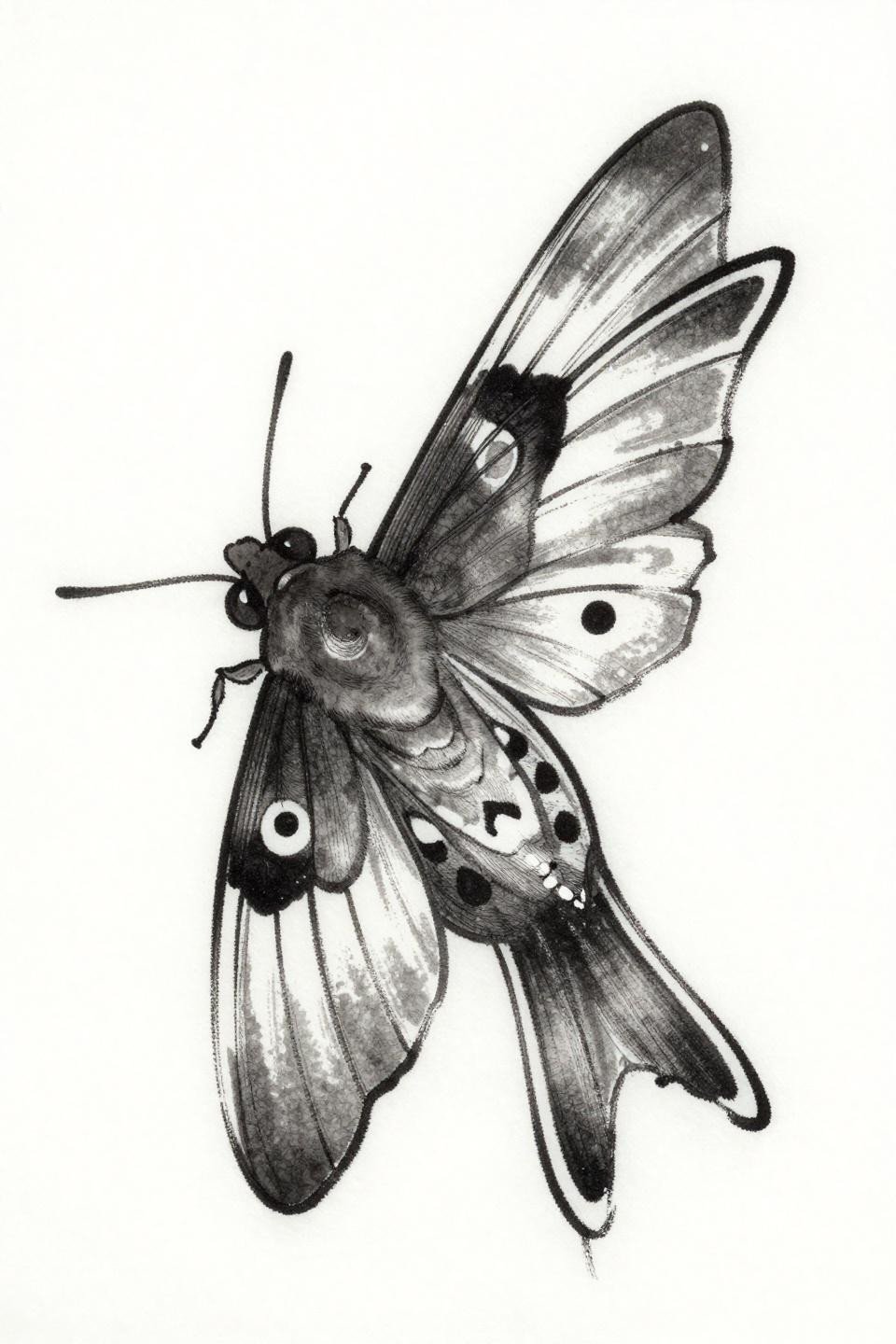
The calligraphic brush stroke quality in the wing outline is what makes this moth work at small scale: expressive taper at stroke ends creates lightness that rigid linework cannot fake.
Japanese irezumi moth designs read best in protected placements, inner forearm, sternum, upper back, where fabric covers the piece between sun exposures and slows the grey wash from shifting.
Ignorant Style Teacup: The One Finger Tattoo That Can Last

Ignorant style’s deliberately irregular outline weight is a tactical advantage on finger placement: the imperfect line variation is designed-in, so when the skin moves and lines shift, it reads as intentional.
Finger tattoos need touch-up every 2-3 years minimum regardless of style. The ignorant aesthetic ages into that reality more gracefully than fine line work, which just looks faded.
Watercolor Infinity Symbol: What the Bleed Costs You at Year Five
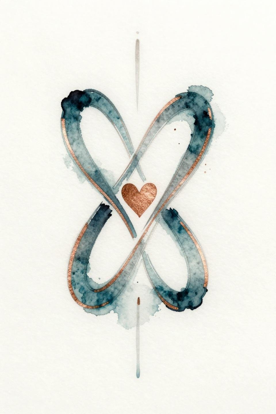
Watercolor bleeds diffusing outward from a tapered fine line infinity symbol: the design accounts for the style’s fundamental weakness by centering the read on the crisp linework, not the color wash.
Watercolor without an anchoring outline blurs by year three to five. The teal and copper accent here will shift toward a unified grey if placed anywhere with regular sun exposure.
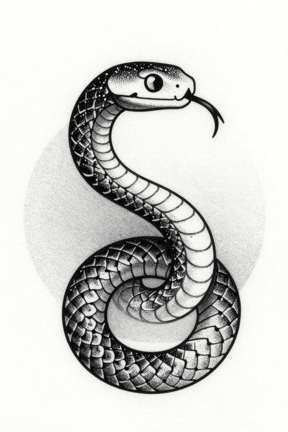
Traditional Cobra Head: Bold Outlines Are the Only Thing That Scales Down Clean
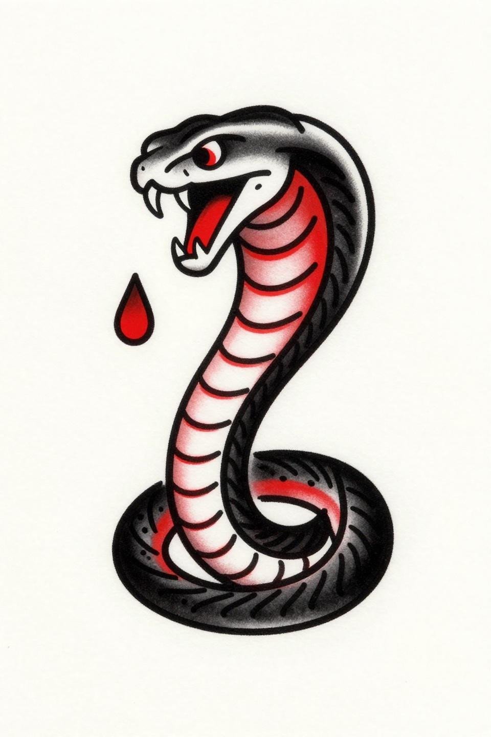
Traditional American cobra at mini scale: the bold 2-3pt outline weight is the entire technical argument for why this style transfers to small formats when neo-trad or realism cannot.
The flat crimson red fill reads at distance even at one inch because it sits inside a contained black border. No color bleeding across the outline means no loss of silhouette over time.
Neo-Traditional Skeleton Key: Grey Wash Dimension at Minimum Size
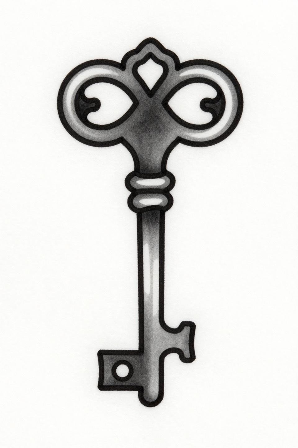
The ornate scrollwork at the bow crown is where the artist earns the piece: neo-traditional dimensionality at key-sized scale requires grey wash control precise enough to separate planes without mudding them together.
Compact vertical compositions like this one work well on inner wrist or behind-the-ear placement, where the narrow canvas length matches the subject’s natural proportion.
Sketch Style Hourglass: Raw Line Quality That Ages Honestly
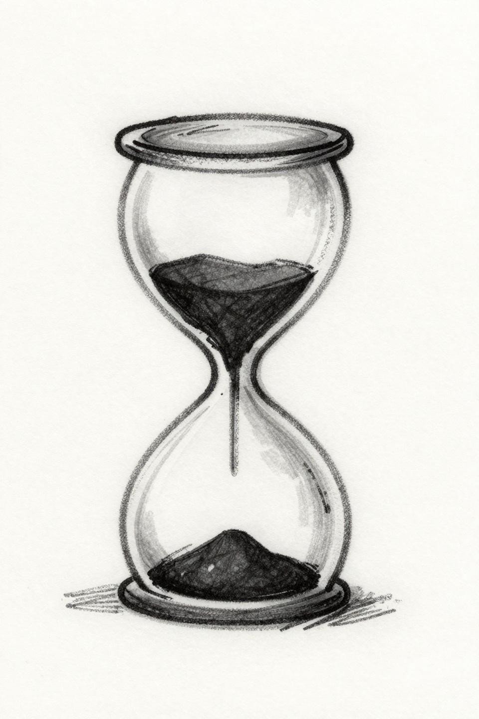
The deliberate roughness of the gestural outline here mirrors the ignorant style’s longevity logic: a design built around imperfect line character ages into its own look rather than just looking faded.
The single grain suspended mid-fall is a scale detail that requires the artist to commit to a confident single needle dot, not a blunt mark. Check the artist’s fresh versus healed comparison shots.
Fine Line Crescent Moon: Negative Space as the Actual Design
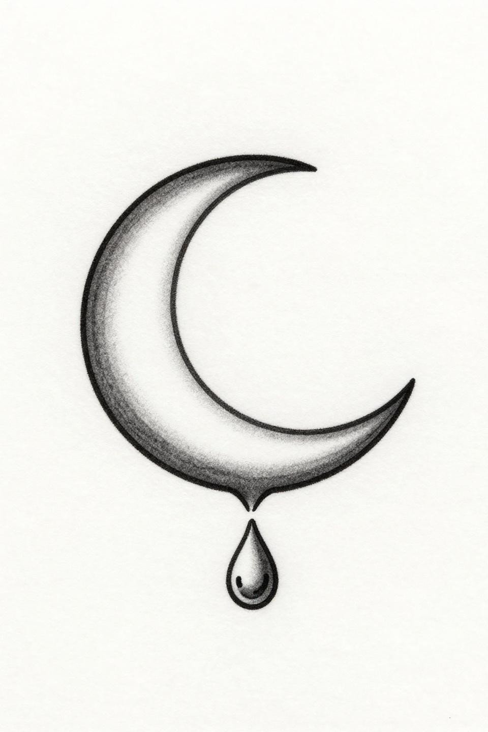
Off-center placement with negative space dominating the composition: the hairline 0.5mm crescent form only works because the surrounding white is doing active compositional work, not just empty paper.
On olive skin, fine line weights this light need to be bumped to a 0.8mm equivalent or the crescent reads as a shadow at healed stage, not a clean line.
Dotwork Sacred Mandala: Density Gradient as the Only Line
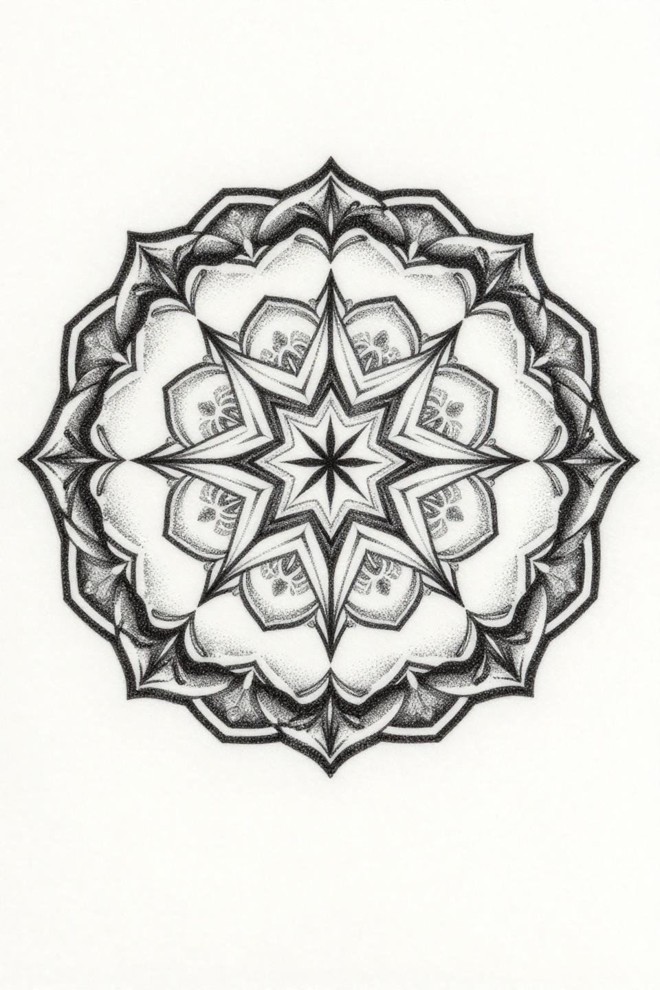
No outlines anywhere: the eight-point star core reads entirely because the stipple dot gradient density shifts from near-solid at center to open at the petal edges, creating the illusion of a boundary line.
This approach requires consistent dot spacing across the full radial symmetry. Any clustering or gaps in the outer petal ring break the gradient and expose the technique as uneven.
Continuous Line Triangle Compass: The Single Stroke That Cannot Hide Errors
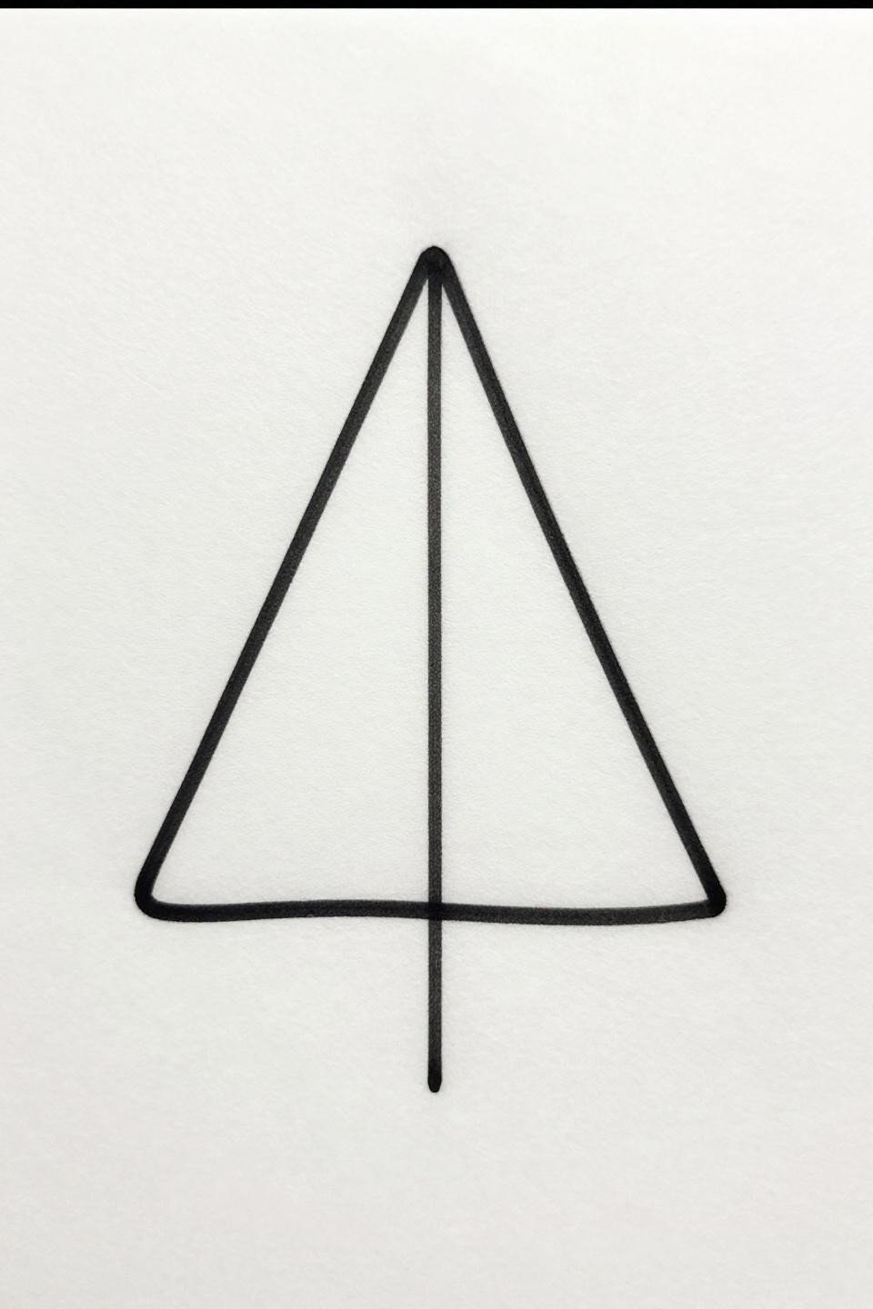
One unbroken line forming a perfect equilateral triangle with a compass needle interior: continuous line technique at this scale leaves zero room for correction because every hesitation mark is permanent.
The tell is the corners. Any wobble at direction change reads immediately on a geometric form this simple. This flash separates artists who control their hand from artists who just say they do.
Botanical Dotwork Moon Flower: Stipple Shading Without a Single Outline
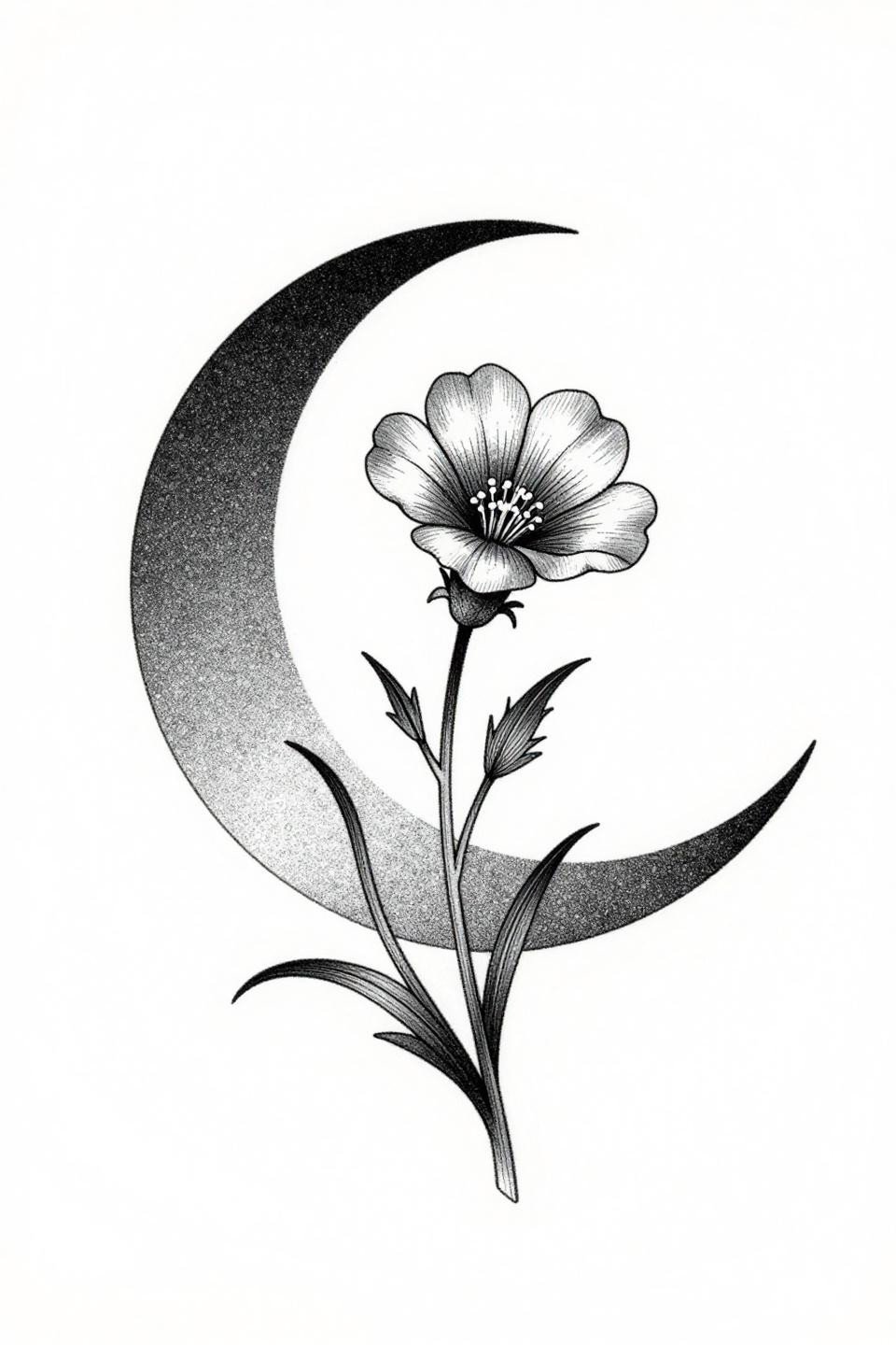
A crescent moon cradling a five-petal wildflower rendered entirely in stipple dot gradient shading, with no solid outlines defining the forms: the silhouette reads through density variation alone.
Asymmetric organic flow leaning left gives this composition a natural placement logic for inner wrist or collarbone, where the lean mirrors the body’s own lines rather than fighting them.
Geometric Compass Rose: Eight Points Must Be Mathematically Even
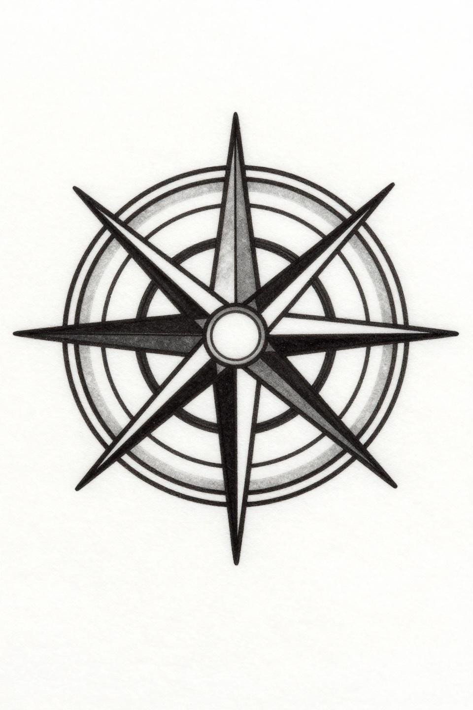
Eight cardinal points with a North Star center: geometric compass rose symmetry at small scale is unforgiving because the human eye calibrates radial evenness faster than almost any other shape.
Bold 2-3pt uniform outlines with flat solid fills give this design its longevity advantage. Protected placement on the upper back or sternum keeps the crisp geometry readable well past the decade mark.
Art Nouveau Anchor: Organic Line Weight Where Straight Lines Fail
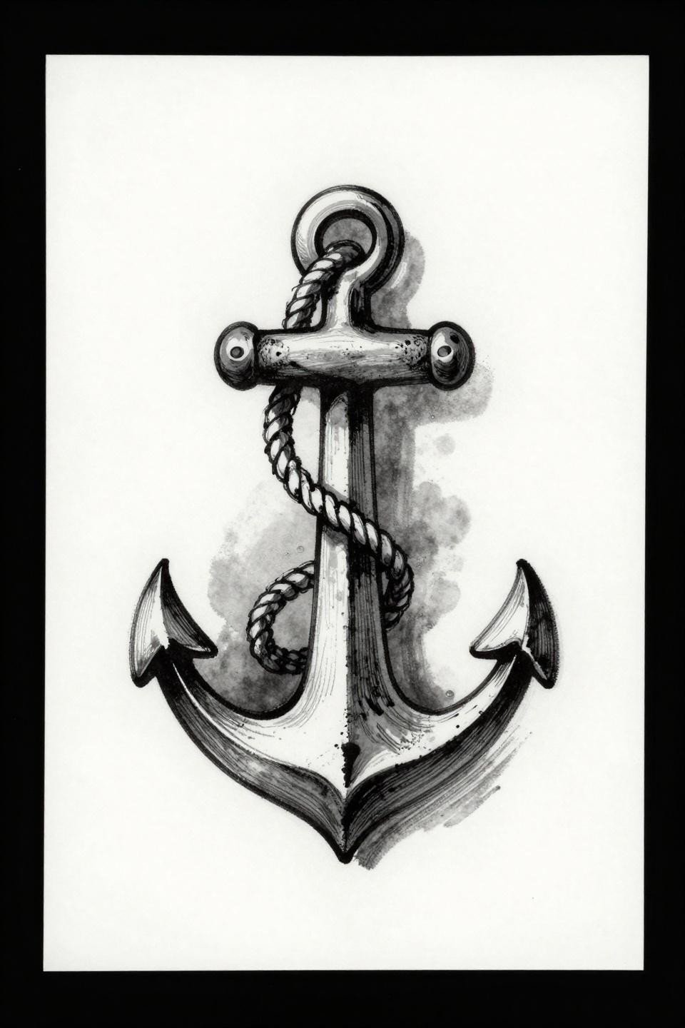
The rope coiling around the shank uses calligraphic tapered stroke weight to suggest tension and dimension without requiring detailed rendering that would collapse at small scale.
Art nouveau’s organic line quality ages more predictably than geometric styles on finger placement because slight line migration reads as organic flow rather than measurement error.
Tribal Geometric Feather: Solid Black Sections as the Anti-Blur Strategy
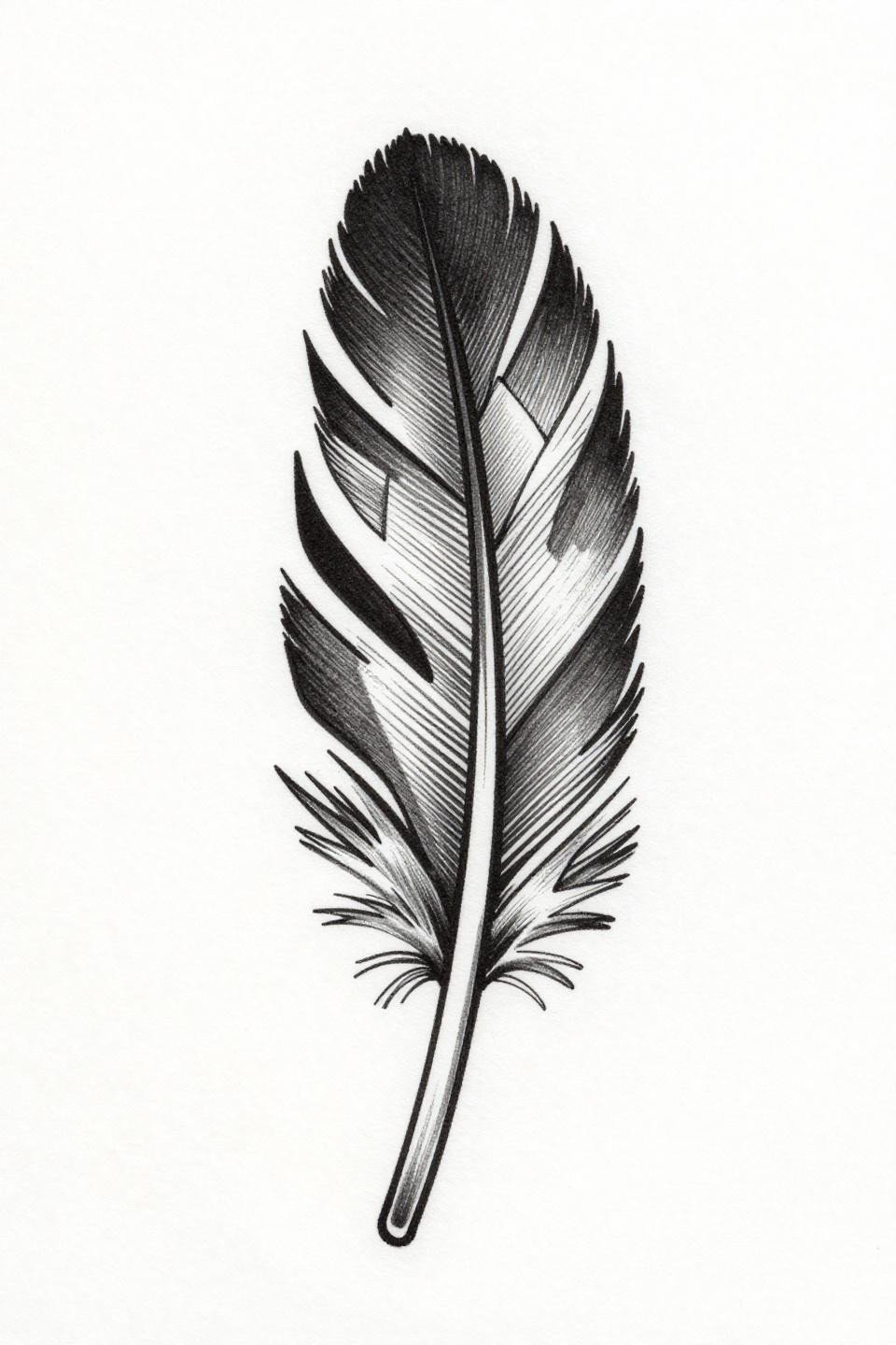
Alternating solid black and open negative space triangles along the quill sections: tribal geometric fill logic is the most blowout-resistant approach available for small feather designs.
No grey wash anywhere means this design has a simple aging equation: the black either holds or it migrates slightly at the edges. Either outcome still reads as a feather in ten years.
Fine Line Moon and Star: Negative Space Proportion Determines Longevity
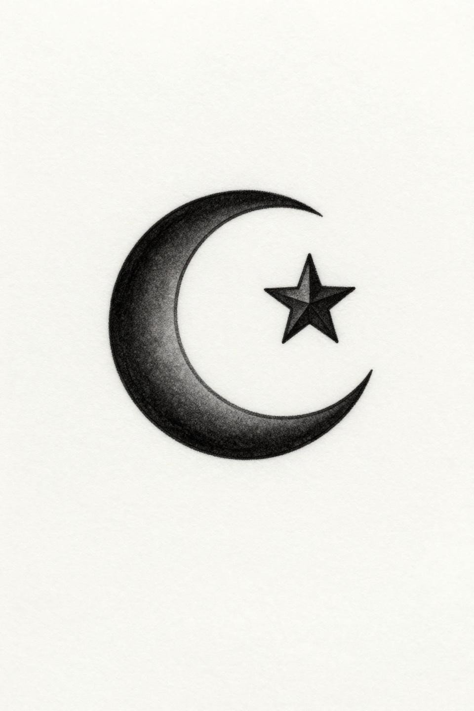
Crescent tips tapered to fine points with a geometrically proportioned star positioned off-center: the open surrounding negative space is doing more compositional work than the linework itself.
This design reads clean at wrist scale on lighter skin tones. On deeper skin, the 0.5mm line weight needs to increase to maintain contrast at healed stage, or the star reads as a smudge.
Pick three of these references based on your placement, not your mood. Wrist and finger pieces need the bold outline options. Protected placements like sternum or inner arm can handle the fine line and dotwork designs. Send the reference with the placement context and let the scale conversation happen from there.