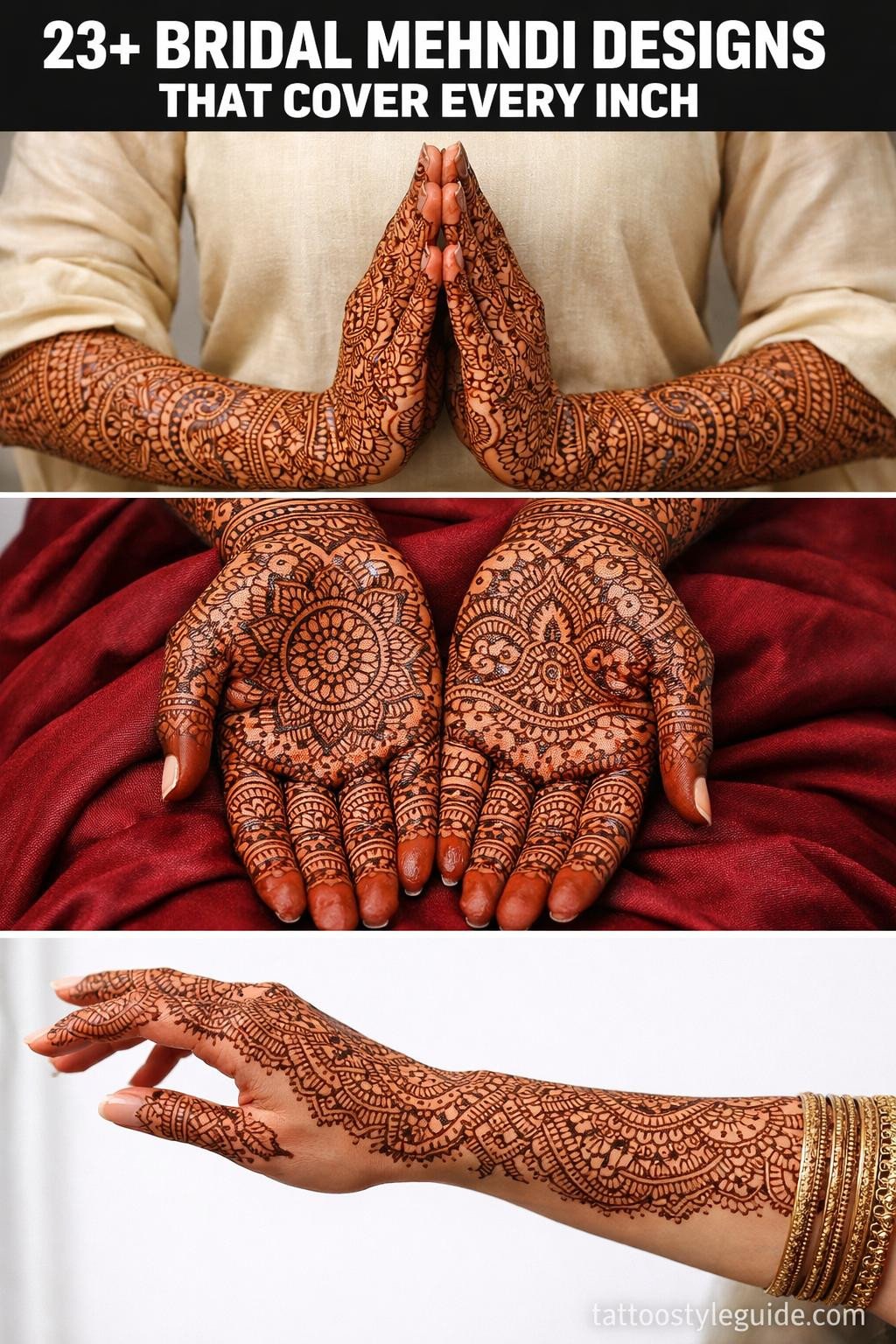
New bridal mehndi designs fail most often at density. Brides bring in references that look balanced on paper, then watch the finished work read sparse under reception lighting because the artist didn’t account for how much negative space contracts on a curved hand. The designs that hold across every photo are the ones built with intentional fill logic, not just decorative instinct.
Coverage matters technically. Motif choice, lattice weight, and border continuity determine whether a design reads at arm’s length or only in macro shots.
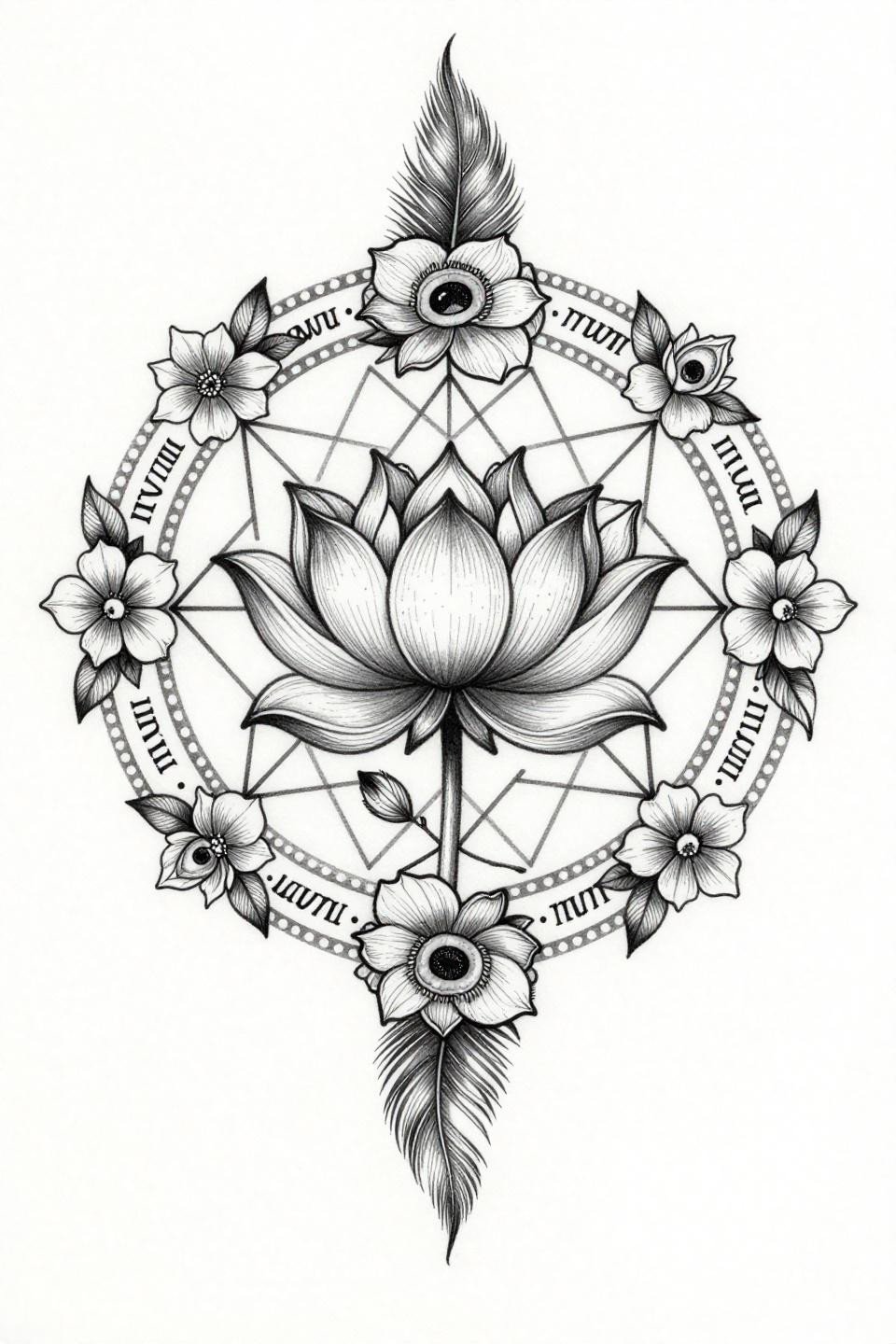
Mango Leaf Medallions With Geometric Star Lattice: What Holds
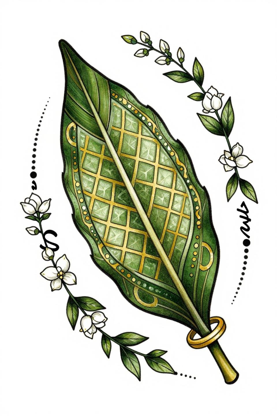
This botanical-style flash uses bilateral mango leaf medallions anchoring a geometric star lattice, with jasmine vine chains filling the negative zones between motifs at a density that reads clean at distance.
The forest green and gold flat fills are the technical signal here. Flat fill fields with zero patchiness separate artists who understand mehndi-to-flash translation from those who don’t.
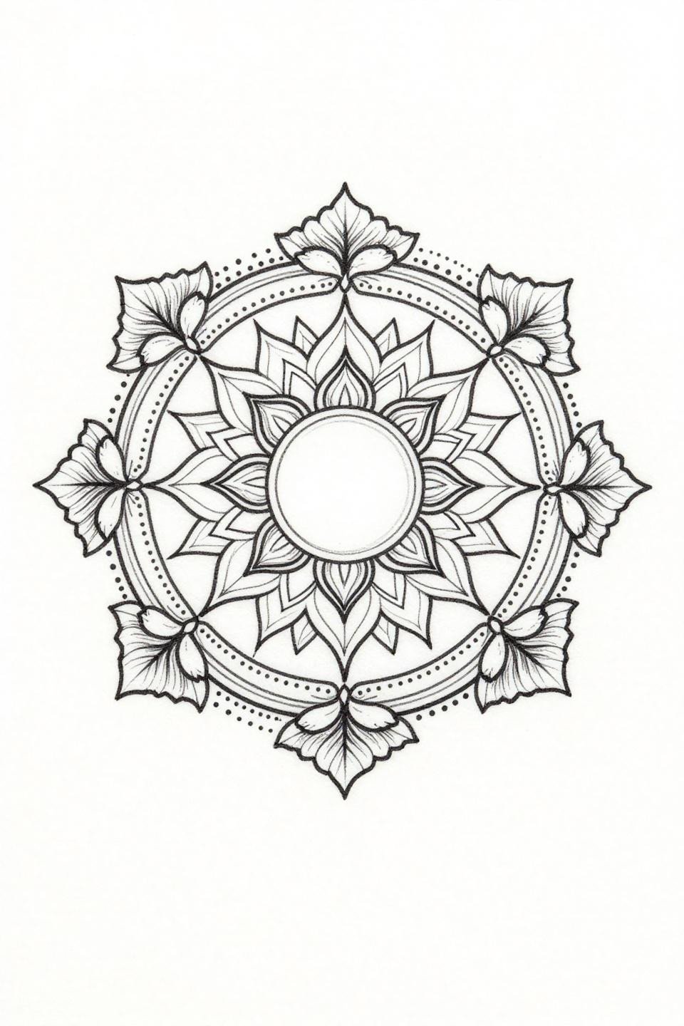
Woodcut Mandala: When Solid Black Is the Right Call
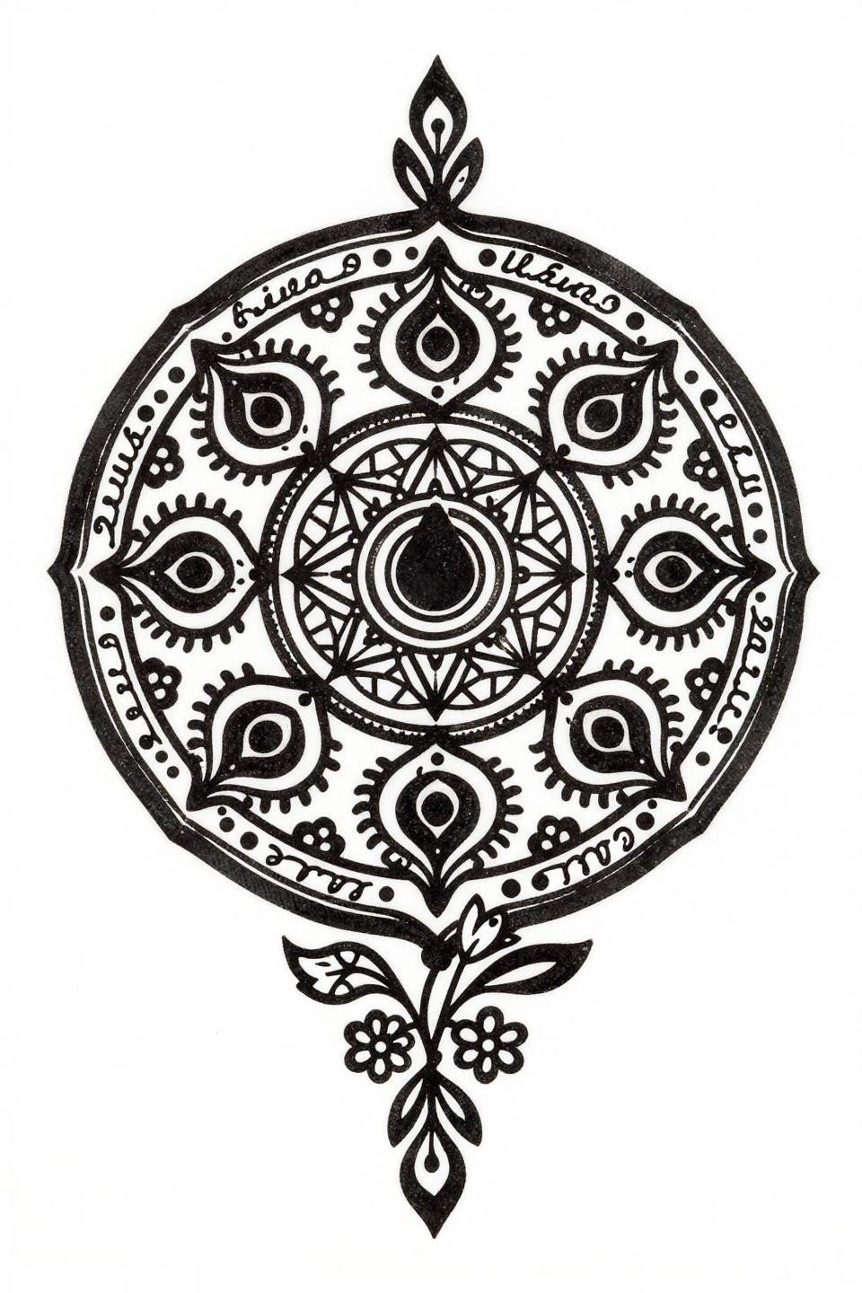
Linocut execution with zero grey wash forces every motif to carry its weight through shape alone. The alternating solid and dotted kalam border is a structural decision, not ornamental, it locks the mandala composition at the perimeter so the eye doesn’t drift.
On darker skin tones, this level of solid black density reads sharper than fine line work ever could. This is the reference to bring when contrast is the priority.
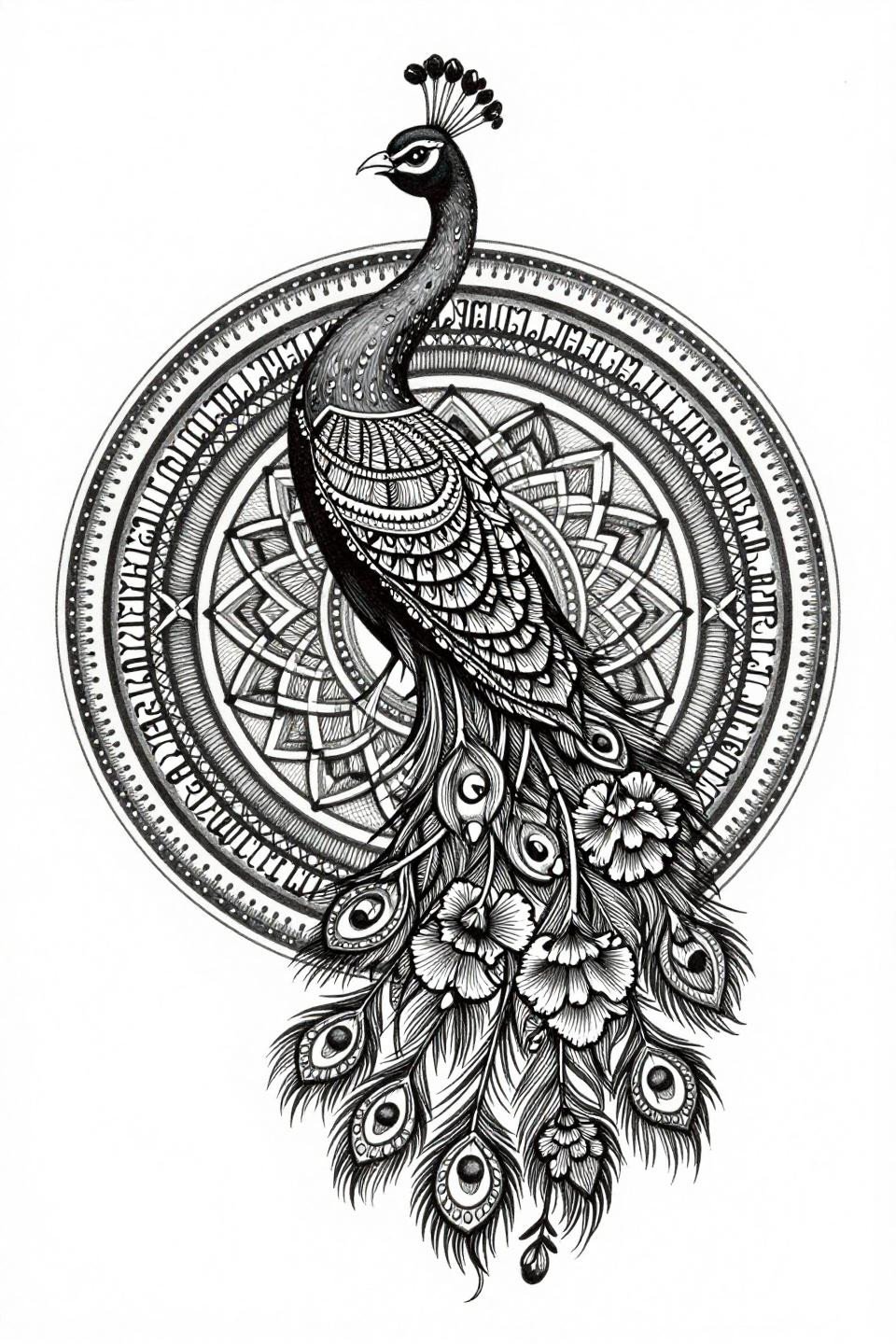
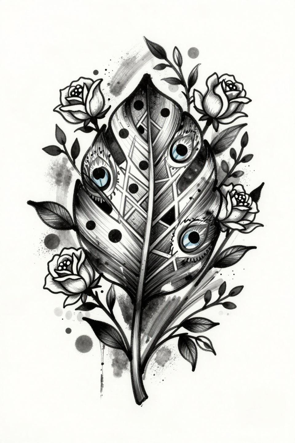
Peacock Dotwork: Stipple Density as a Structural Tool
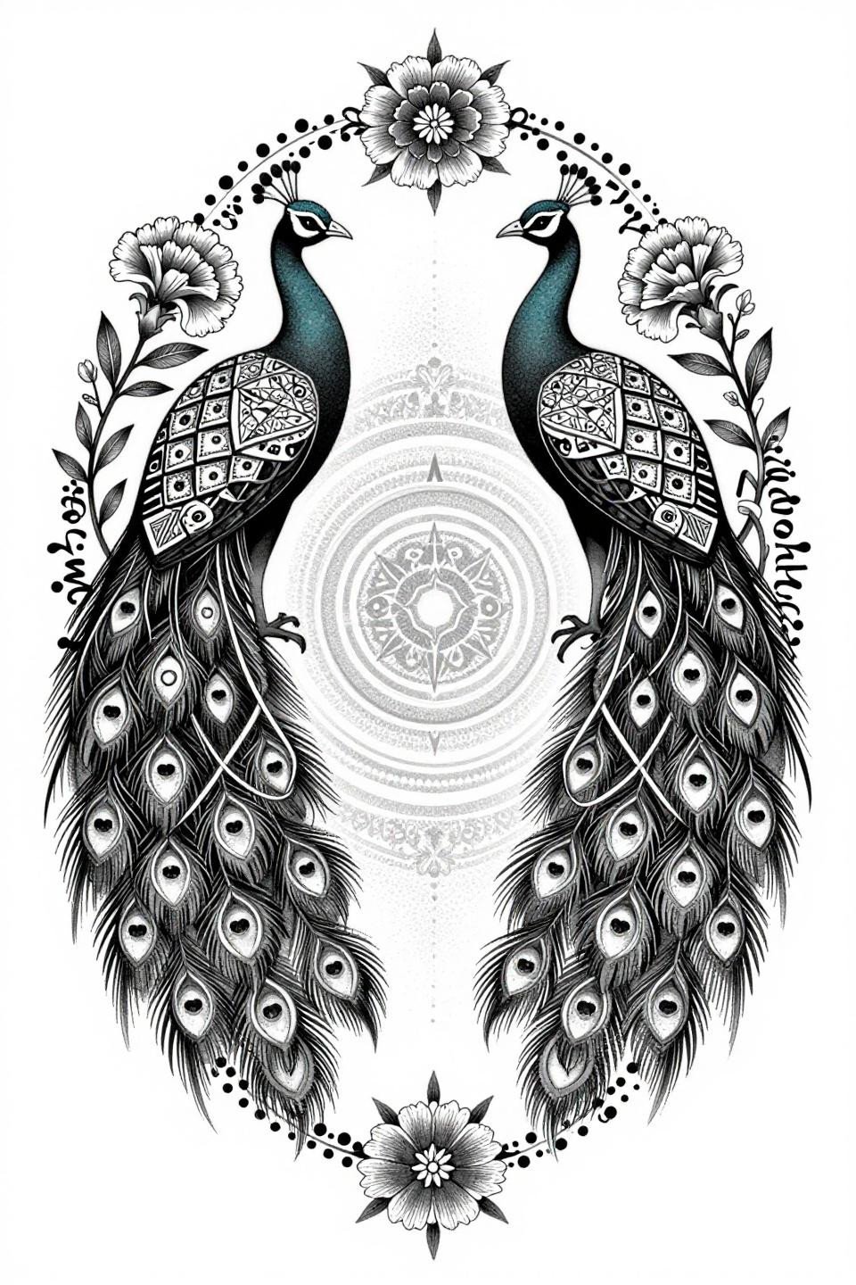
Bilateral peacock silhouettes with interlocking tail feathers build the stipple dot gradient from dense at center to open at the outer edge, a technique that gives circular mandala compositions visual weight without relying on solid fill fields.
Look for consistent dot size across the full gradient when vetting artist portfolios. Irregular dot size at the transition zones is the first sign of speed cuts.
American Traditional Mango Leaf: Bold Outlines as Longevity Insurance
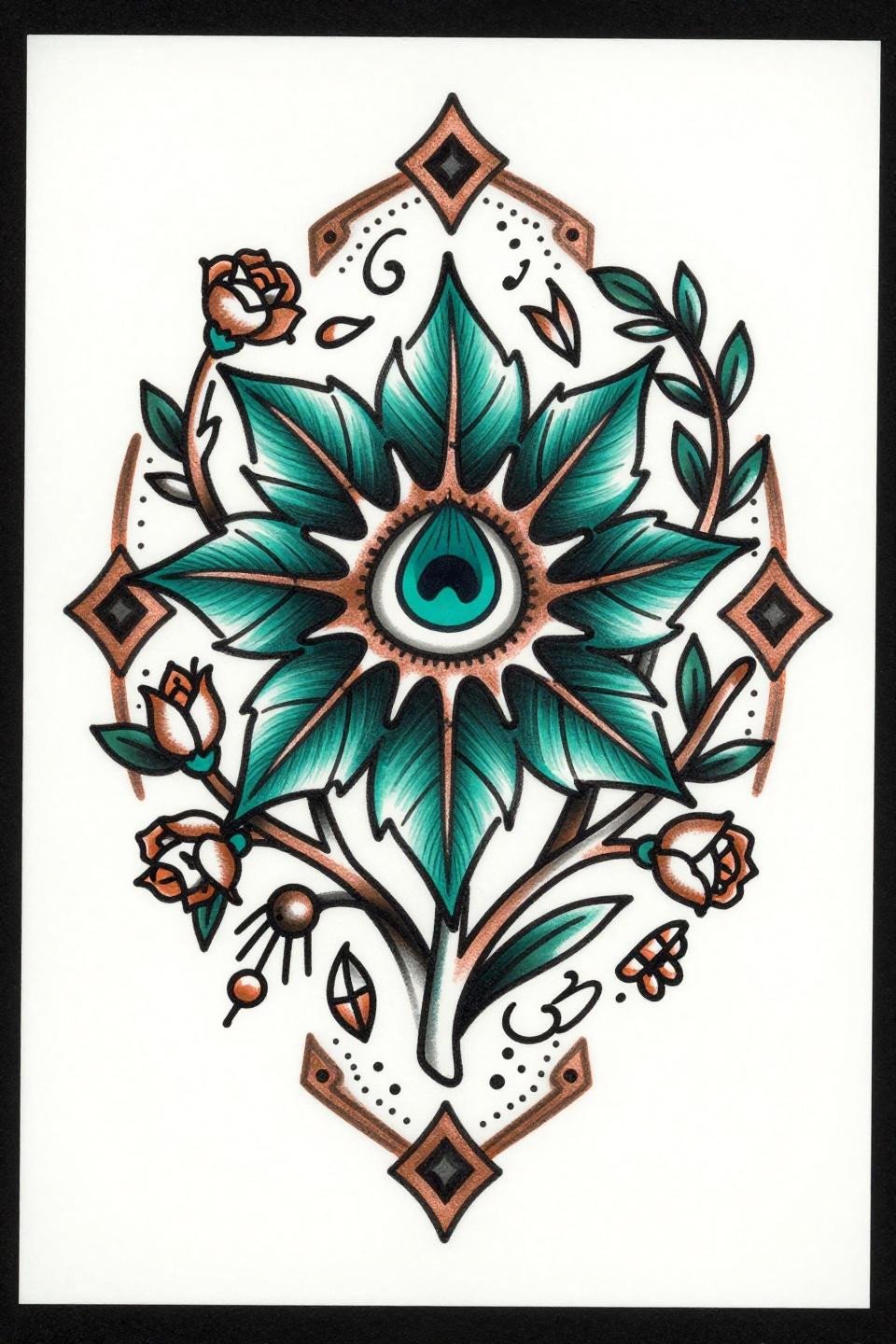
Traditional American execution on a bridal mehndi motif works because bold 3pt outlines are the longevity signal, this design reads identically at year one and year ten because the linework carries the structure independent of fill.
Deep teal with copper metallic accent is a smart color pairing for warm skin tones. The contrast ratio stays high without needing saturated reds or yellows.
Single Needle Mandala: What Hairline Work Costs at Year Three
Single continuous line execution at 0.5mm with zero pen lifts is a technical flex, but hairline 1RL linework at this density needs a protected placement to age without blur. Hands are not that placement.
As a flash reference for henna designs for special occasions, this works perfectly as a composition study before scaling line weight for real skin application.
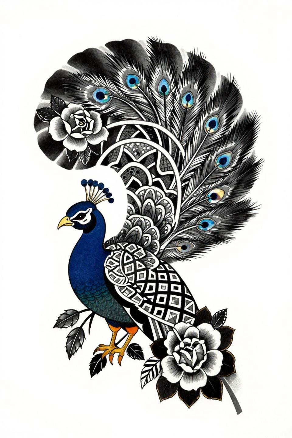
Peacock Engraving: Crosshatch as Tonal Fill
Engraving-style crosshatch at 0.5mm ruled lines replaces conventional grey wash here, giving the peacock tail feathers tonal depth through parallel line density rather than ink dilution.
This technique signals an artist who understands tonal control without needing a shading machine. The transition from dense hatching at the peacock body to open hatching at feather tips is where skill shows.
Full-Hand Dotwork Mandala: Photorealistic Depth on Flat Flash
Micro realism stipple here builds photorealistic tonal depth across a circular mandala by running dense dot clusters at the bindi center and bleeding out to near-open negative space at the ring border.
Grey wash dilution in the midtone zones is what separates this from flat dotwork. On olive skin, this midtone range reads cleaner than solid black fields at every healing stage.
Ignorant Style Peacock: Why Crude Lines Work in Bridal Context
Ignorant style applied to a bridal mehndi motif is a deliberate statement. The 4pt uneven outline weight with flat black fills and zero grey wash forces the peacock silhouette to read purely through shape, no detail work to carry it.
This is the reference for a bride who wants something that reads as intentional, not decorative. Check healed work portfolios for this style specifically, fresh shots hide edge blowout that shows at 60 days.
Trash Polka Mango Leaf: When Chaos Needs an Anchor Motif
Trash polka works on bridal mehndi flash when the central mango leaf medallion stays structurally tight while the ink splatter zones break symmetry outward. Without that anchored center, the composition collapses into noise.
Grey wash dilution in the gestural brushstroke zones is what keeps this readable. A flat black smear without midtone transition reads muddy, not raw.
Art Deco Geometric: When Vector Precision Replaces Hand Wobble
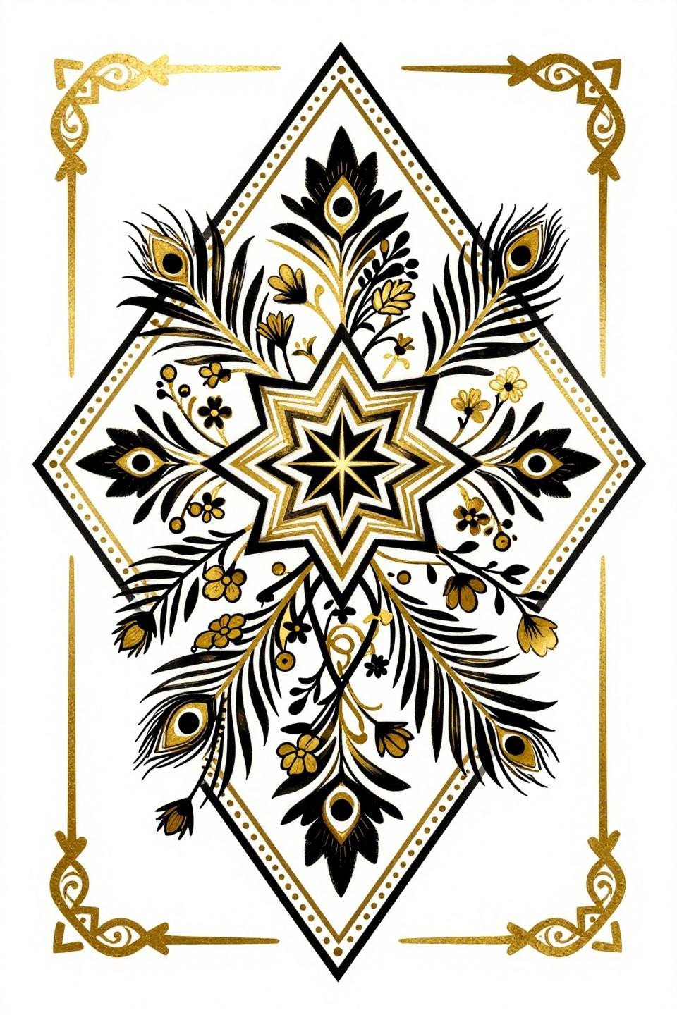
Art deco execution locks every line to compass-drafted precision, the diamond frame composition with flat gold metallic and solid black fills gives this design the kind of bilateral rigidity that traditional bridal mehndi motifs rarely achieve.
The tell is the curves: no wobble at direction changes in the vine chain lattice. Any deviation reads immediately at this level of geometric formality.
Celtic Knotwork Mandala: Continuous Band Logic Borrowed Right
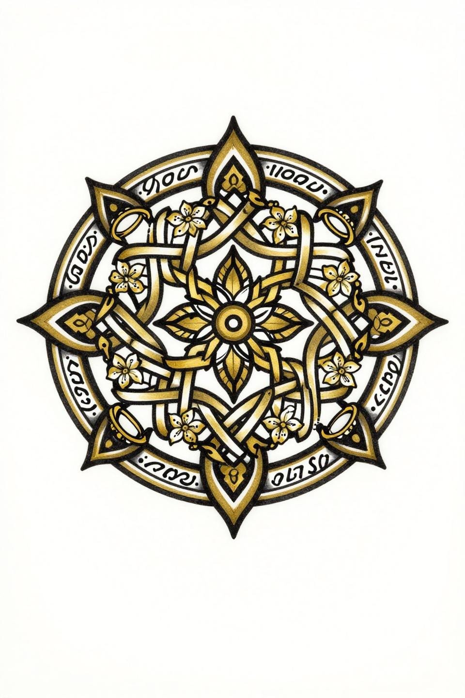
Celtic continuous knotwork bands translate well into bridal mandala composition because the interlocking band logic creates visual density without requiring additional fill motifs. The jasmine florals woven into the lattice zones soften the geometry.
Bold 2-3pt outlines with flat gold fills give this a decade of readability. Protected placements, like sternum or upper back, give the fine lattice zones their best shelf life.
Mirror Cobra Composition: Neo-Traditional Structure on a Bridal Motif
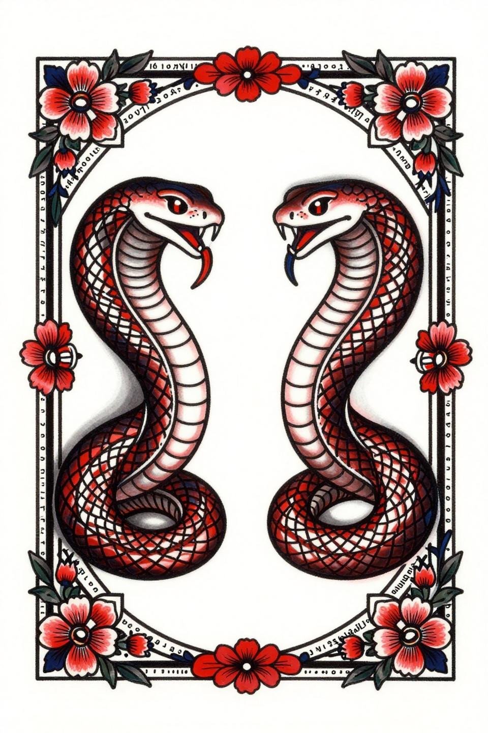
Mirror-image cobras with flared hoods anchoring a diamond lattice composition is a neo-traditional structure that reads bold in reference and translates cleanly to skin with any artist who can hold bilateral symmetry through scale detail.
Deep indigo and crimson is a tight two-color restraint that keeps the flash from competing with itself. Two-color traditional palettes age more predictably than complex fills.
Sketch Raw Paisley: Variable Weight Lines as the Design Statement
Rough gestural linework with deliberate variable weight outlines is not lack of control. The concentric diamond frame keeps the paisley centered while the sketch quality makes the vine lattice read as organic rather than mechanical.
For simple mehndi patterns for brides who want character over precision, this sketch approach gives the finished work movement that ruler-straight linework never achieves.
Old School Mango Medallion: Crimson Accent as the Only Color Decision
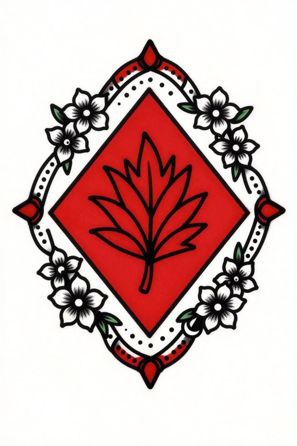
Sailor-style execution on a bridal mehndi motif works because the bold 2-3pt outline weight at this scale holds clean for ten-plus years, and the single crimson accent on solid black eliminates every color mixing decision at consultation.
Bilateral symmetry along the diamond axis is the structural anchor. Any drift in the sunburst geometry reads immediately at this level of formality.
Chicano Grey Wash Lotus: Whip Shading at Mandala Scale
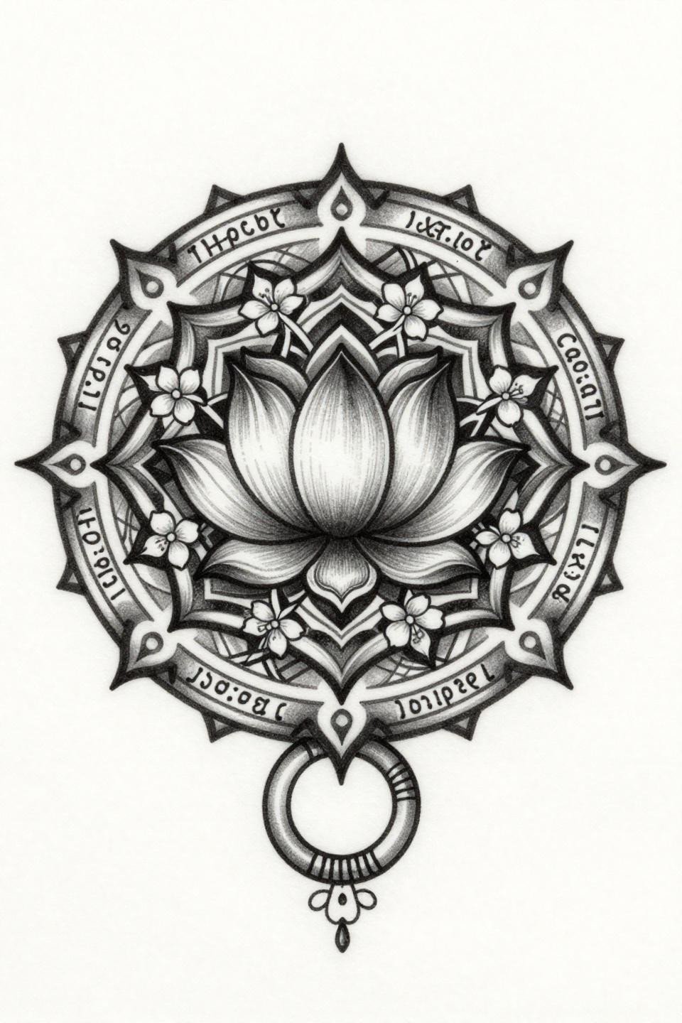
Chicano grey wash execution builds tonal depth through whip shading curved strokes running from dense at the lotus core to open midtones at the bangle border, no solid fill fields, all gradation.
Fine 0.5pt outlines at this scale require an artist who controls machine speed precisely. Check their healed work portfolio specifically for grey wash pieces, fresh shots don’t show muddy midtone collapse.
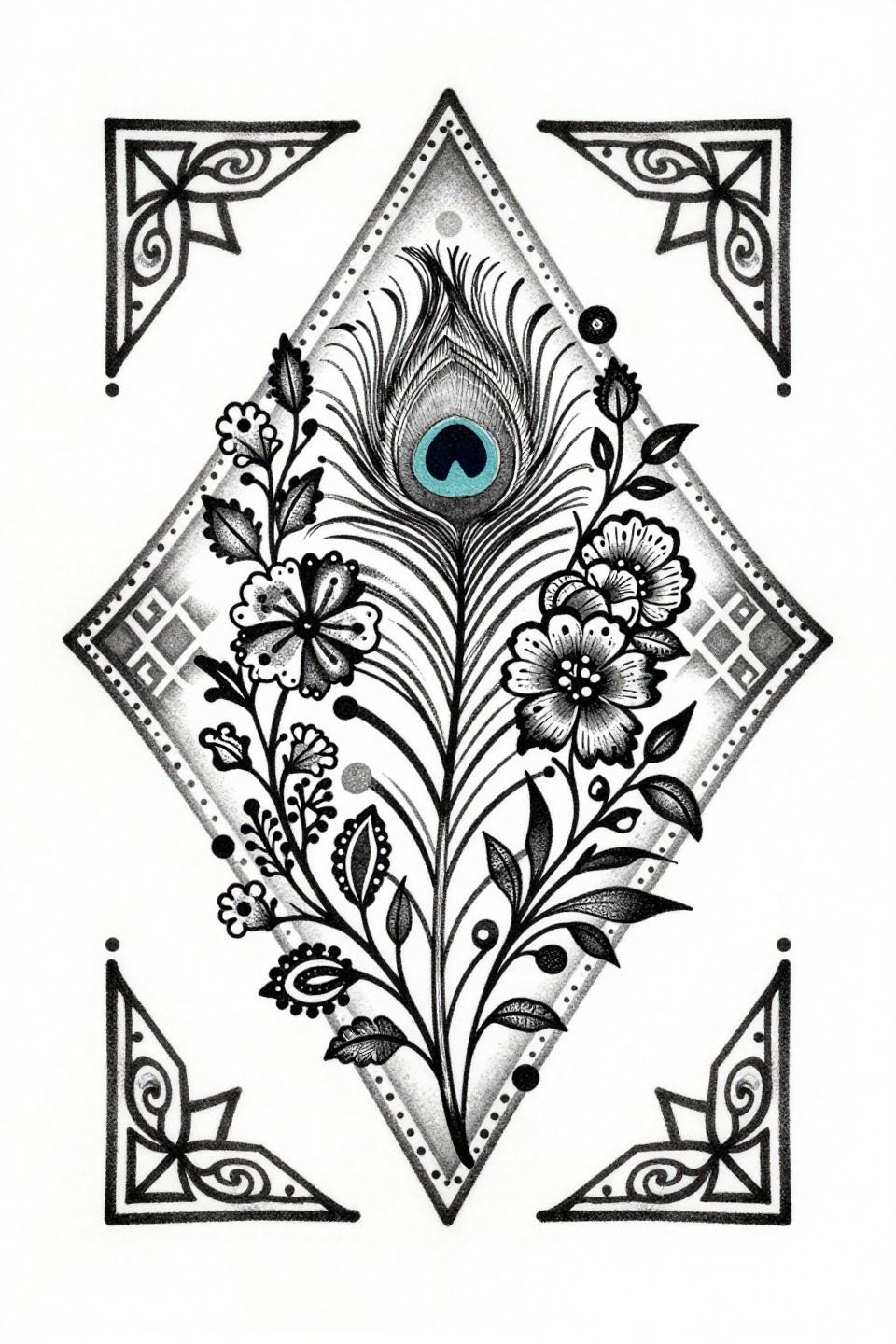
Watercolor Peacock: Why Teal Bleeds Need Copper to Read
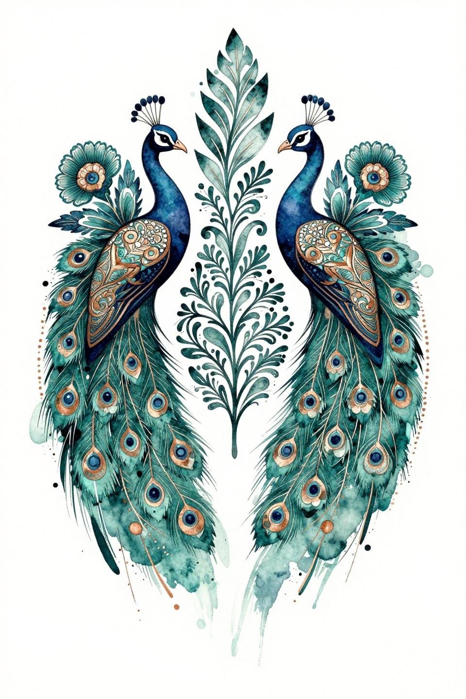
Watercolor bleeds without a hard anchor line blur by year three to five. Here, the copper metallic accent linework over deep teal bleeds gives the bilateral peacock profiles a structural edge that survives the inevitable ink migration.
Calligraphic brushstroke marks with wet ink quality are a composition signal, not just stylistic. The gajra flower clusters at cardinal points use dense mark-making to hold the corners where watercolor wash tends to fade fastest.
Etching Woodcut Full Hand: Parallel Lines Doing the Work of Shade
Woodcut block print execution on a full-hand bridal layout uses parallel rail patterns cascading from palm to finger tips as the tonal fill structure, zero grey wash, all depth achieved through line spacing alone.
Dense black ink with zero grey wash on a stacked vertical composition gives this the best skin contrast across all tone ranges. This is the reference to bring when clarity at arm’s length is the priority.
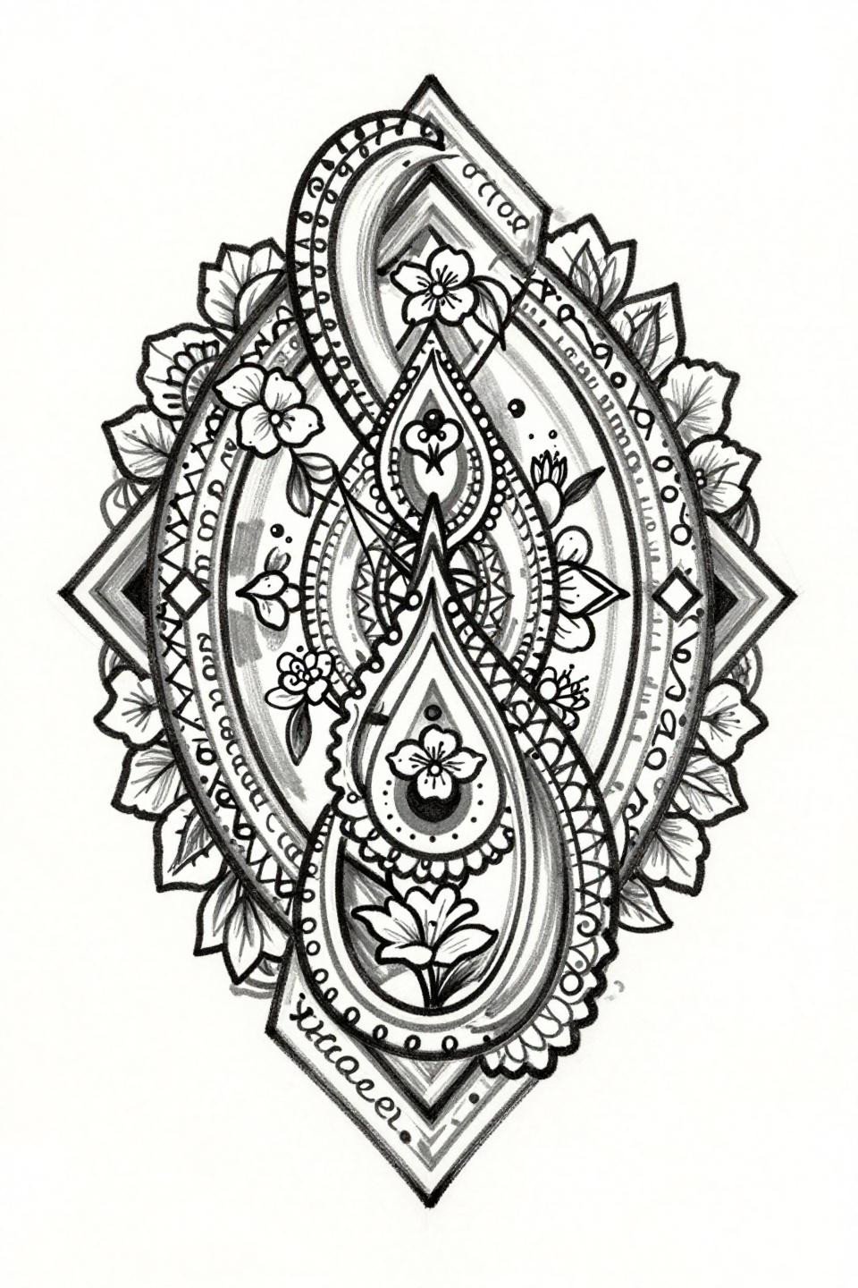
Fine Line Lotus Mandala: Open Negative Space as the Design Decision
Hairline 0.5mm continuous linework with open negative space is the highest-risk approach in a bridal mehndi context. Single-continuous-line strokes unbroken through the full mandala composition read as technical confidence, but any wobble in the geometric sunburst reads permanently.
On lighter skin tones, this fine line weight maintains contrast well. On olive and darker tones, the line needs to step up to 1RL minimum to hold readable definition past the first six months.
Irezumi Peacock: Japanese Negative Space Logic on a Bridal Motif
Irezumi execution applied to a bridal peacock motif uses negative space carving inside the feather tail to build pattern without additional linework, the geometric chevron band rows create rhythm that Western tattoo flash rarely achieves at this scale.
As modern mehndi inspiration for weddings, this asymmetric flowing composition is the strongest reference for brides who want coverage with visual movement rather than static symmetry.
Tribal Geometric Gajra: Carved Negative Space as Fill Logic
Tribal geometric execution places the Rajasthani gajra flower cluster at center and builds the lattice outward through carved negative space rather than added fill, giving the palm zones density without visual weight competing with the border detail.
Bold outlines with flat color fills age predictably at any placement. This is a low-maintenance reference compositionally, the negative space does work that would otherwise require annual touch-ups.
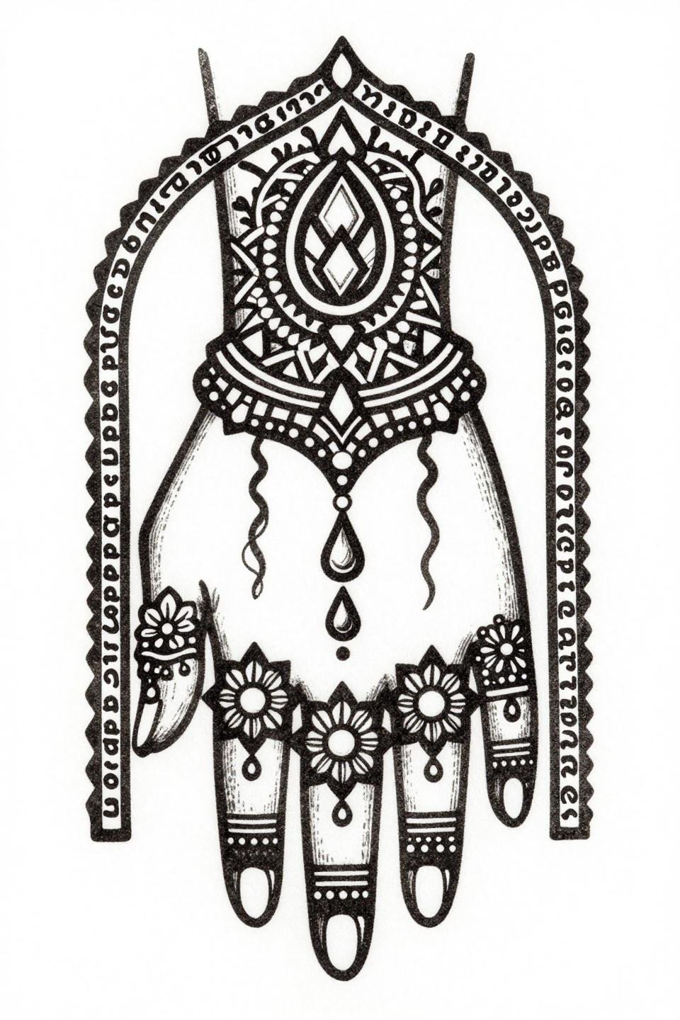
Sak Yant Structure: Sacred Script as Architectural Frame
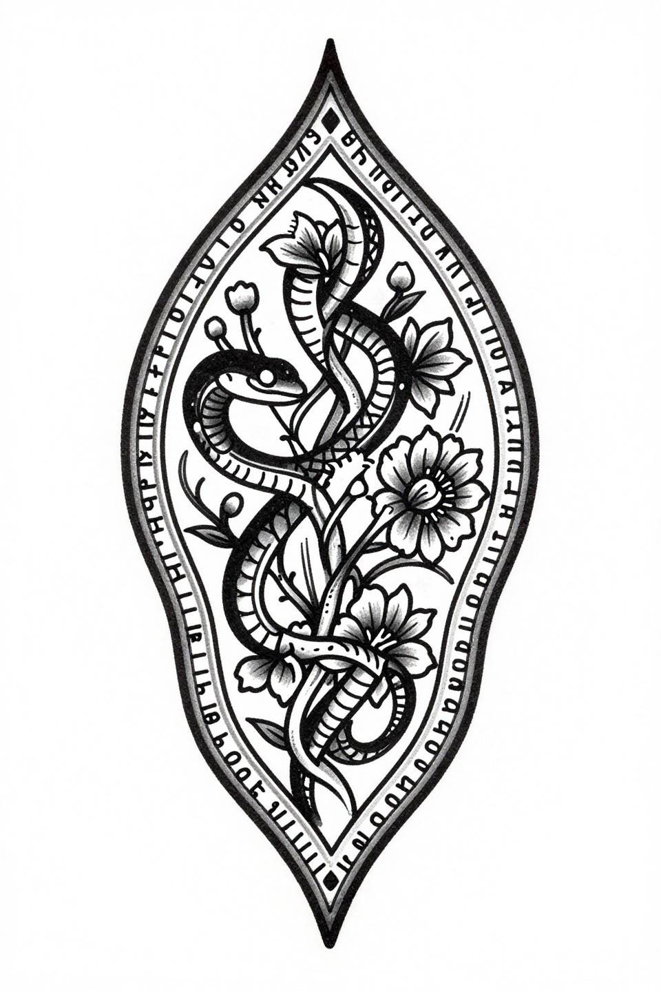
Sak Yant structure borrows sacred linear script rows as an architectural frame, not decoration. The gota patti geometric border bands contain the serpentine vine lattice and prevent the asymmetric vertical composition from dissolving at the edges.
Dense black ink with bold 2-3pt outlines on a vertically flowing layout gives this the best legibility on any skin tone. Asymmetric vertical compositions read differently in motion than static references suggest, confirm scale with the artist before committing to placement.
Art Nouveau Mandala: Finger Zone Lattice as a Technical Differentiator
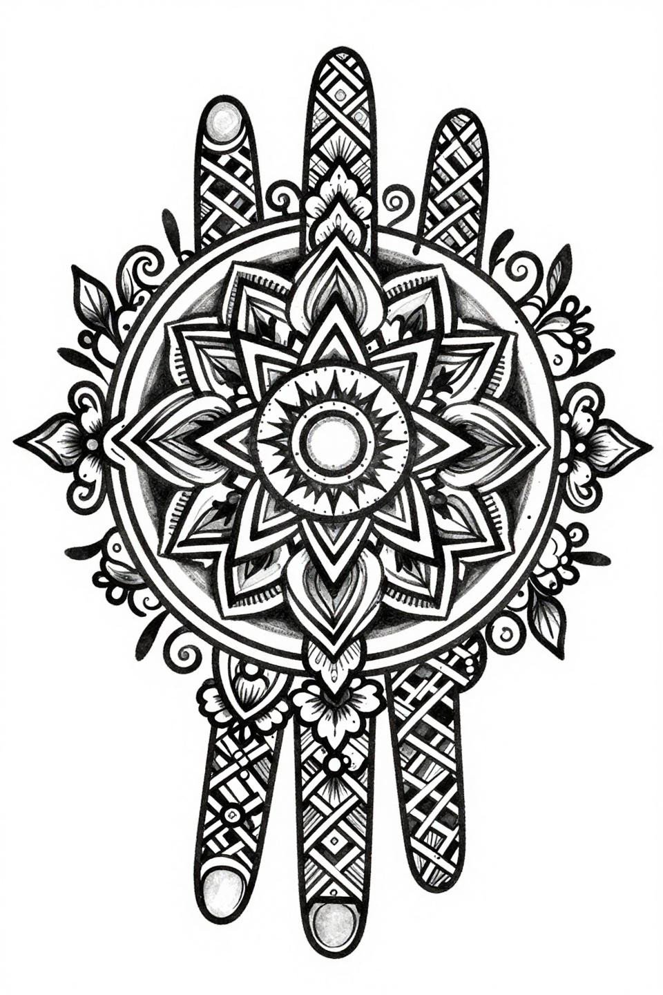
Art nouveau execution on a full-hand mandala differentiates itself by running floral chains through individual finger zones, most bridal mehndi compositions treat finger coverage as secondary to the palm, this one builds it into the structural logic from the start.
Vine spirals at the boundary edge keep the composition contained without a hard script border. Bold 2-3pt outlines with flat color fills give this design decade-range durability at any protected placement.
Botanical Peacock Dotwork: Stipple as Pattern, Not Shade
Botanical scientific style uses hairline stipple dotwork as structural pattern rather than tonal shade, the dot density in the peacock feather center and open negative space at the paisley corners creates a gradient that reads as texture, not shadow.
Grey wash midtones in the vine tendril zones bridge the dot field and open space without muddying the transition. This is the technically cleanest of the dotwork references in this collection.
Narrow the selection to three references based on placement and skin tone before the consultation. A single-needle design brought to an artist who works heavy might become an entirely different piece than what’s shown here. Match the reference style to the artist’s documented strength, not their willingness.
Screenshot the sections that stopped you. Use those as the brief.