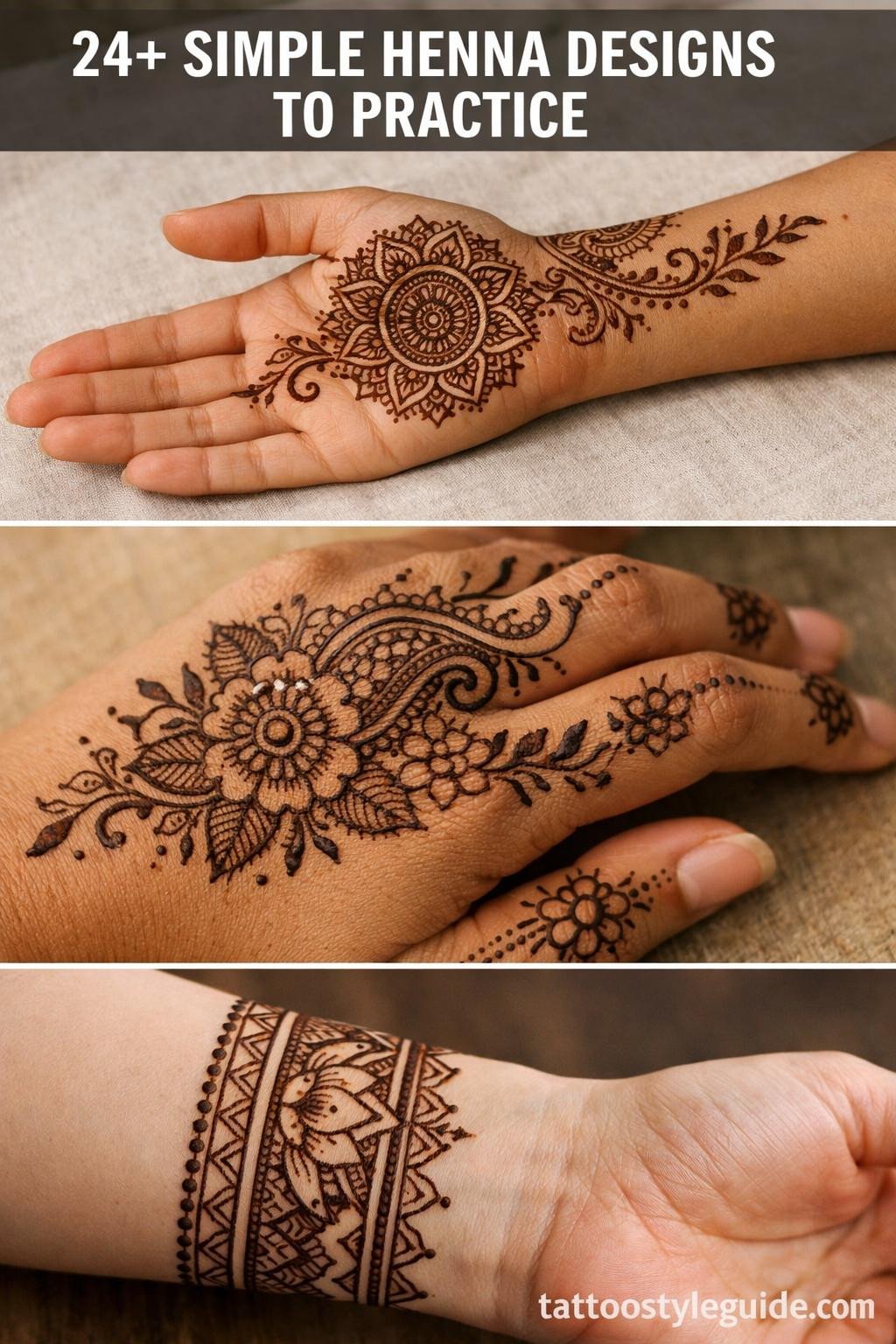
Simple henna designs are harder to execute well than complex ones. Negative space does the work, and any hesitation in the line reads immediately. The margin for error shrinks when there are fewer elements to hide behind.
What separates a clean practice reference from a vague sketch is structural logic: every curve should have a reason, every dot a counterpart. The 24 flash references below are organized by style and technique so you can match the right reference to your skill level before committing to skin.
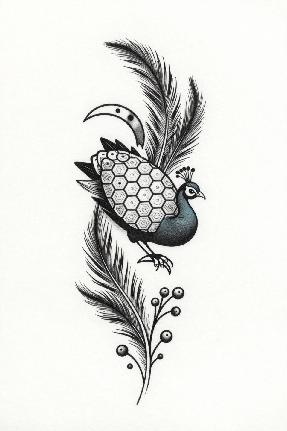
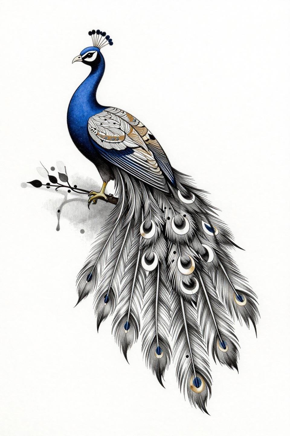
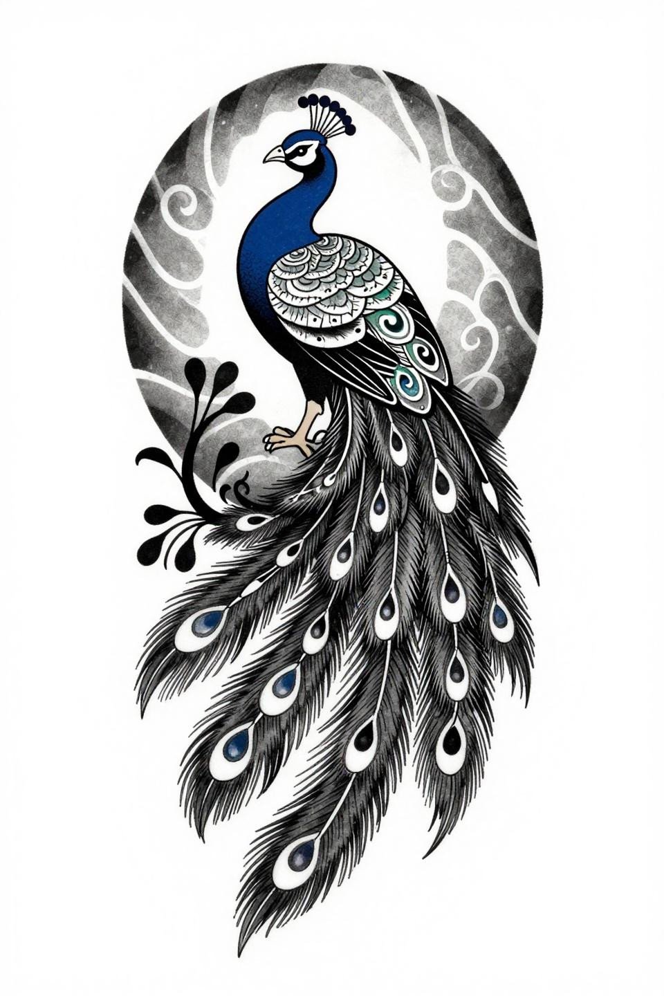
Why the Peacock Honeycomb Body Outlasts Busier Compositions
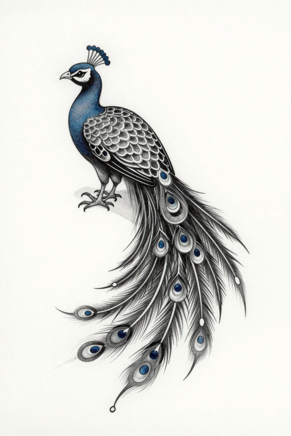
This peacock uses hairline 0.5mm single-needle strokes throughout, with the honeycomb lattice on the body creating density without weight, and the asymmetric teardrop tail keeping the eye moving.
On lighter skin tones, this reads crisp at any scale. On olive or deeper skin, the fine lines need careful spacing to maintain contrast as the skin settles around them.
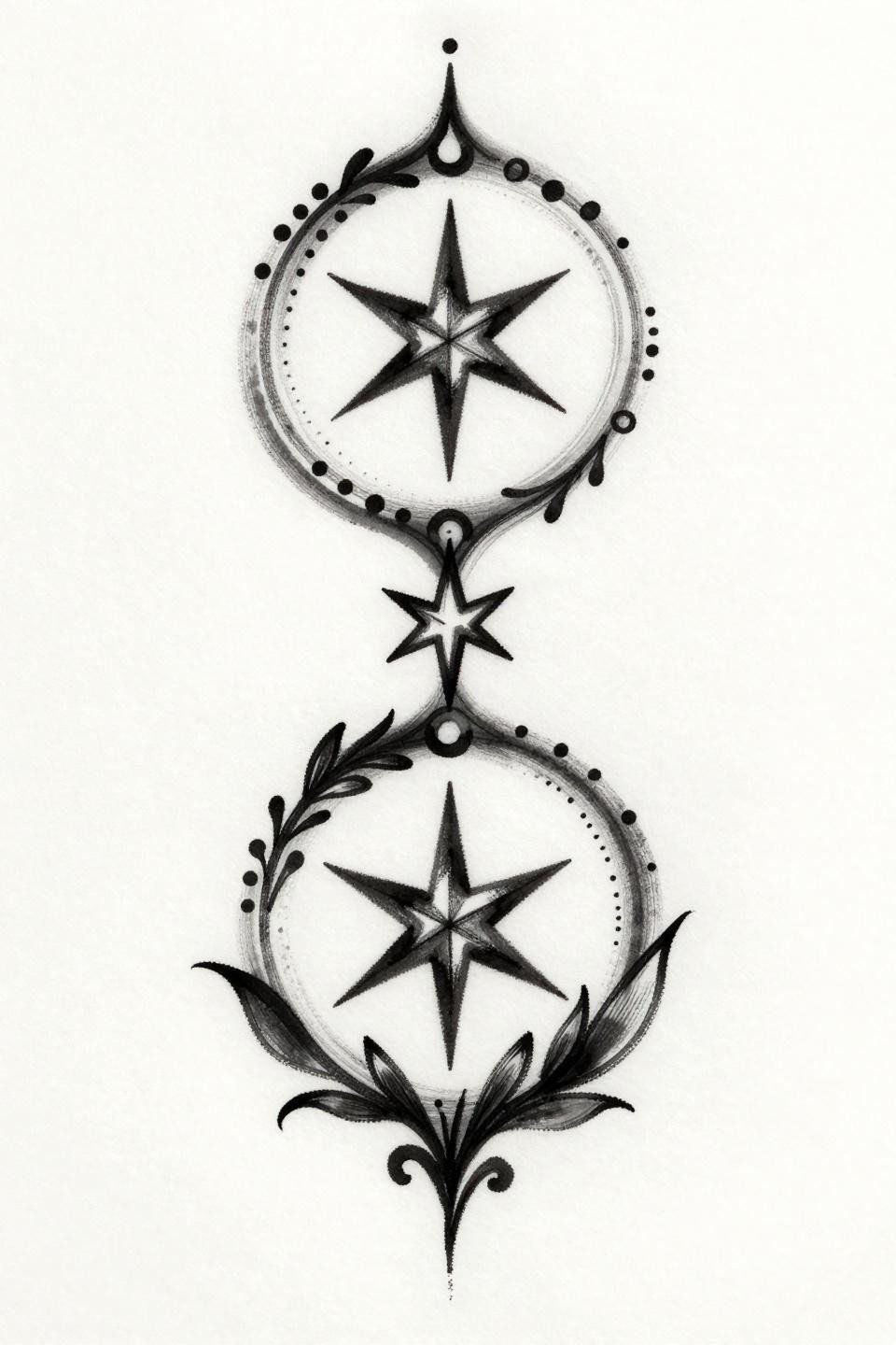
Geometric Engraving and the Case for Zero Grey Wash
The geometric torso built from hexagon fills and three stacked crescent tail feathers gives this a structural economy rare in peacock flash. Parallel ruled line engraving at 0.4pt creates tonal depth without a single grey wash pass.
This is a strong reference for artists practicing clean ruler-free linework. The tell is whether those horizontals stay consistent across the curved torso sections, which is where most beginners drift.
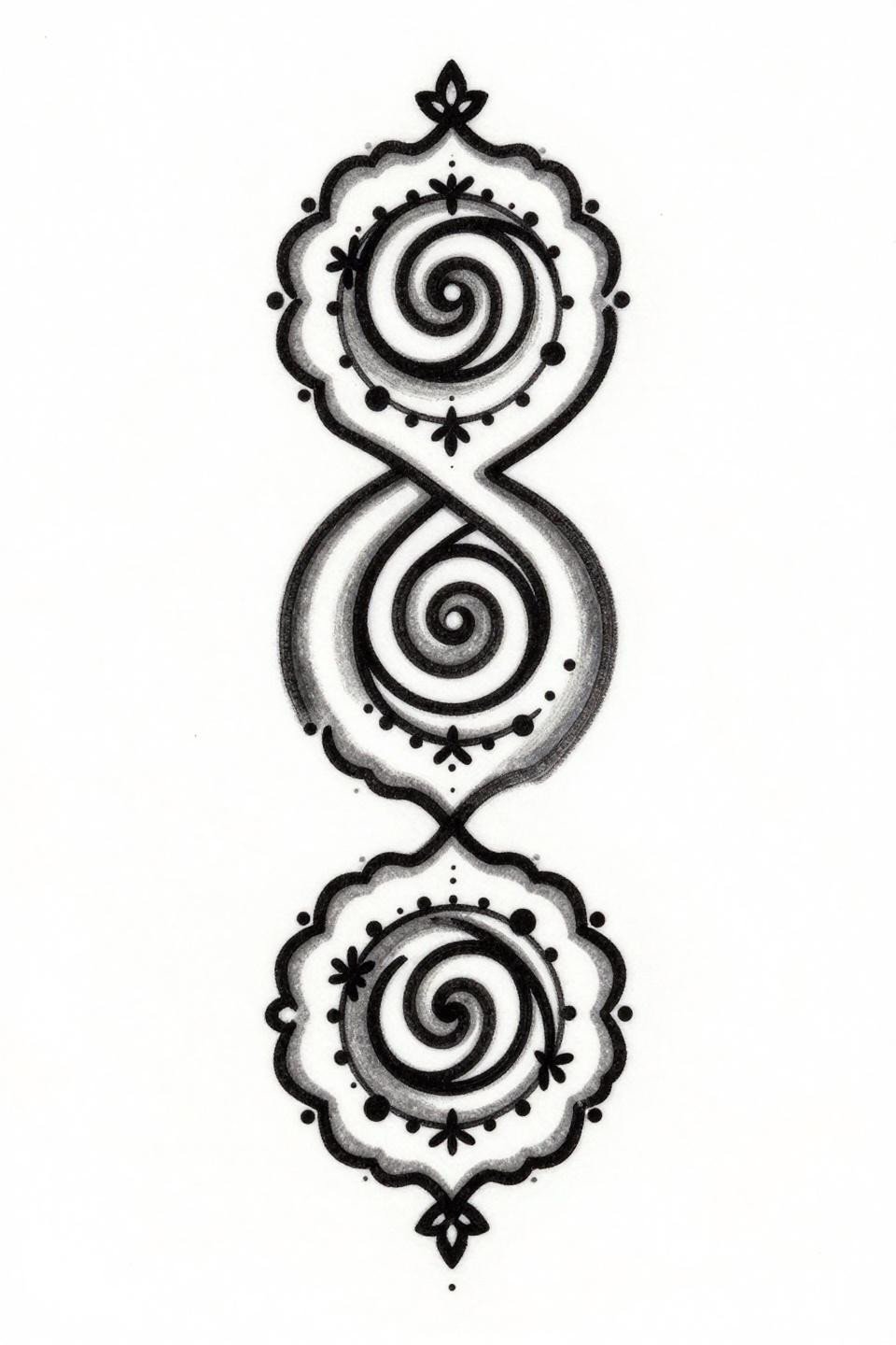
Calligraphic Brushwork and Why Spiral Terminations Hold
Three interlocking spiral loops terminating in four-point geometric stars give this composition a wet ink calligraphic weight that holds visual rhythm from top to base without needing filler elements.
Designs built with this kind of stroke variation, thick on the pull, thin on the lift, age better than uniform-weight linework because the thicker strokes anchor the design even as fine details soften over time. Pair this reference with henna designs for everyday wear to see how calligraphic motifs translate off the festival context.
Old School Weight in a Traditional Peacock Profile
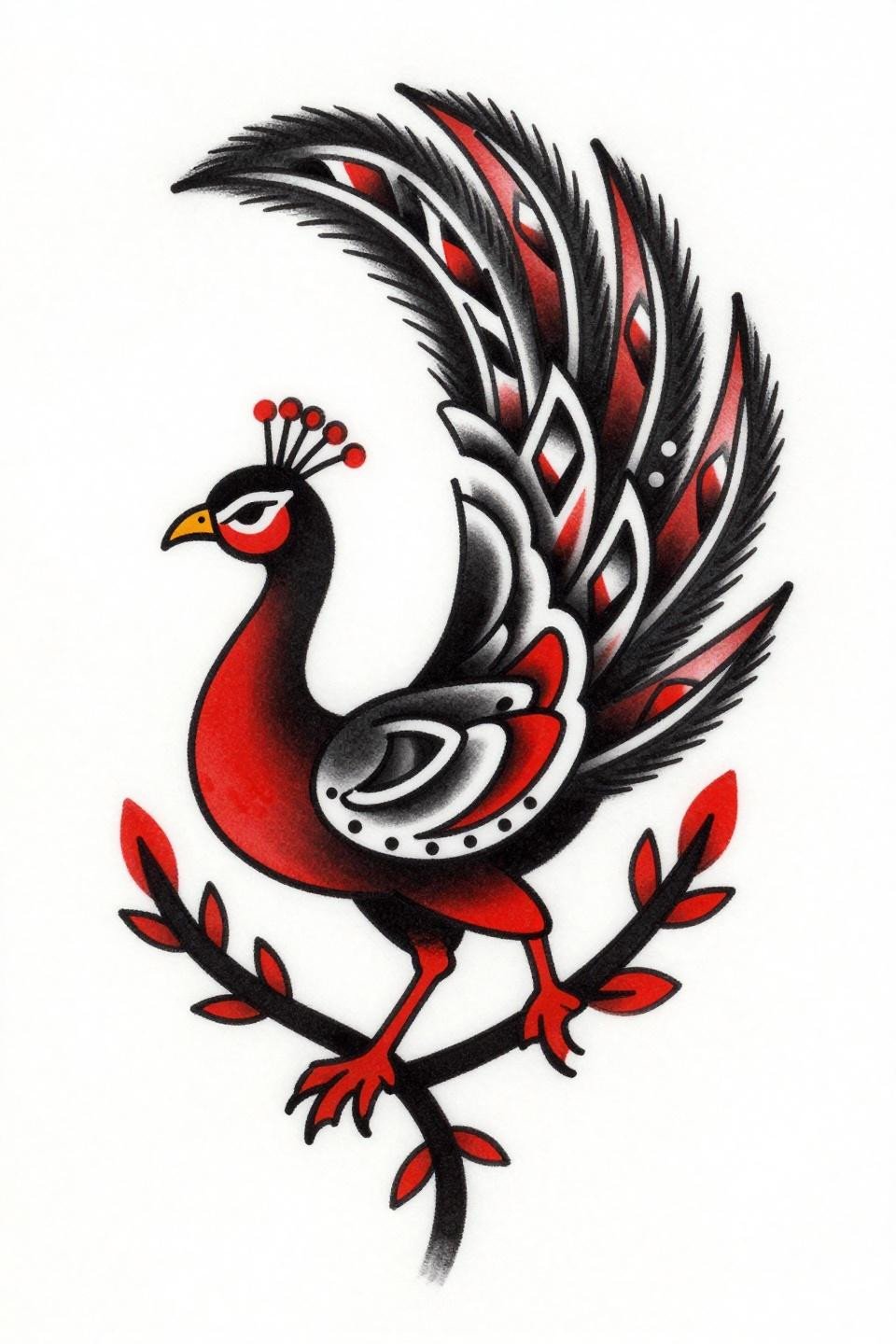
Left-facing profile with a chevron-patterned tail fan and a flat crimson red accent fill: this reads as traditional American flash borrowing mehndi vocabulary. Bold 3-4pt outlines at this weight hold clean for a decade on protected placements like the upper arm or sternum.
The crimson accent is used sparingly here, only on select fill zones, which is the correct call. Over-accenting in a two-color design flattens the hierarchy the linework is trying to build.
Trash Polka Logic Applied to a Minimal Palm Motif
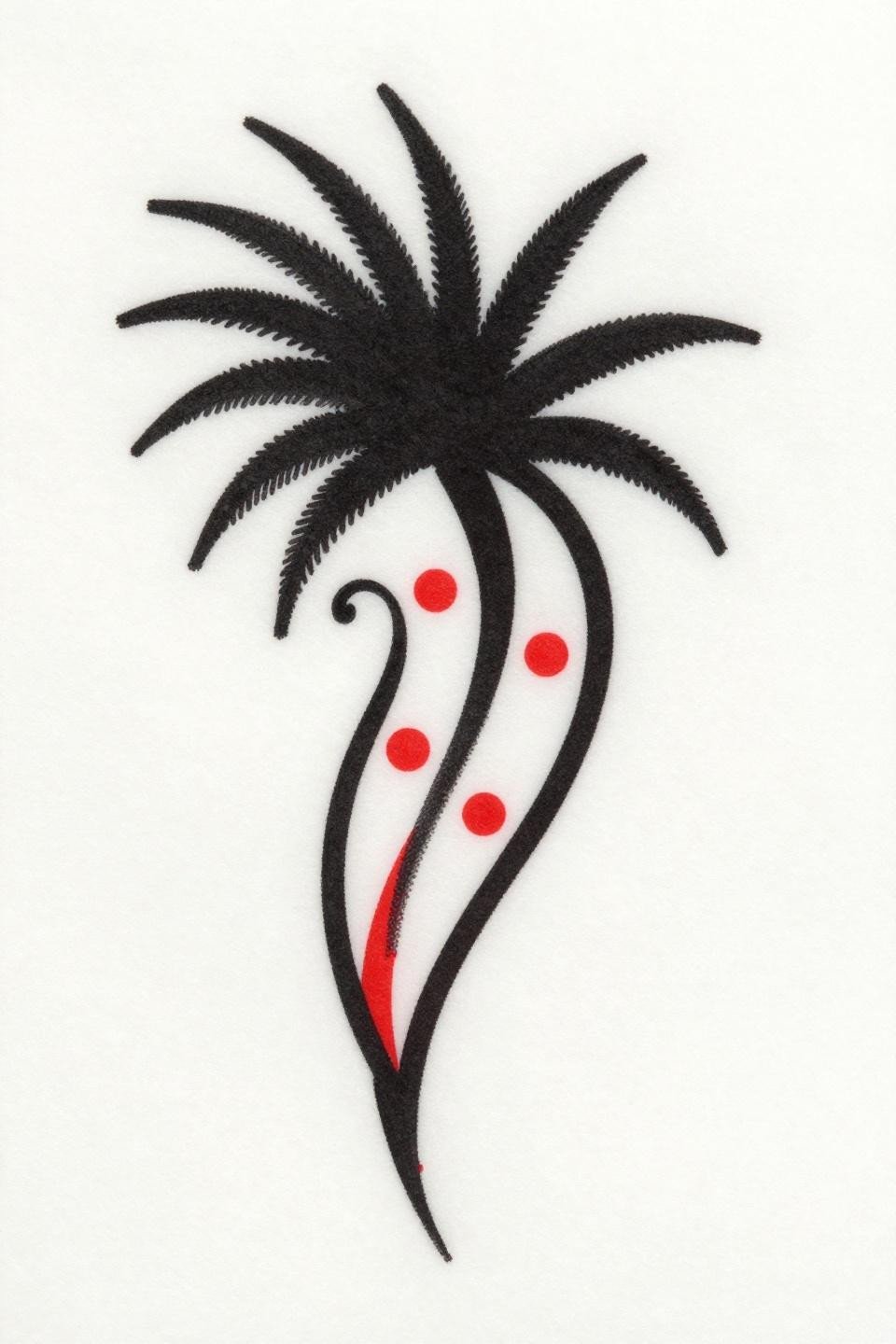
A single palm line with dot clusters and a geometric diamond at the fold junction gives this reference its tension. Trash polka placement logic works here because the negative space is doing structural work, not just framing.
The crimson accent on the diamond reads well at small scale, which most red fills do not. Red fades faster than black, so the design stays legible even as the accent softens over years.
Linocut Moon and Why Bold Fills Beat Fine Line for Small Placements
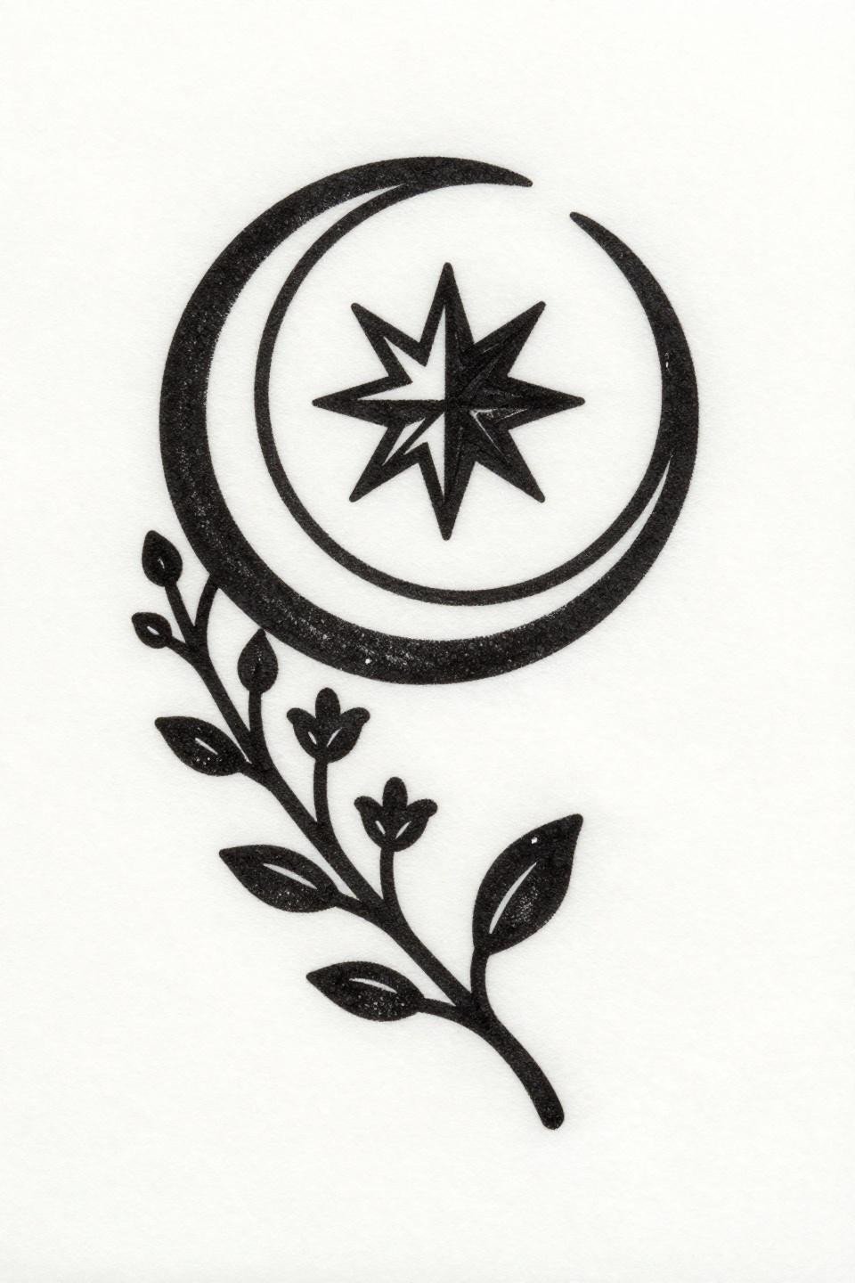
A crescent moon with a geometric star center, rendered in woodcut block print weight with zero grey wash, flat black fills only. This is the right approach for wrist or ankle placements where fine lines blur within five years.
Linocut-style henna references are underused as tattoo flash. The forced simplification removes the elements that age poorly and leaves the structural skeleton that lasts.
Micro Realism Precision on a Diamond Lattice Palm Shape
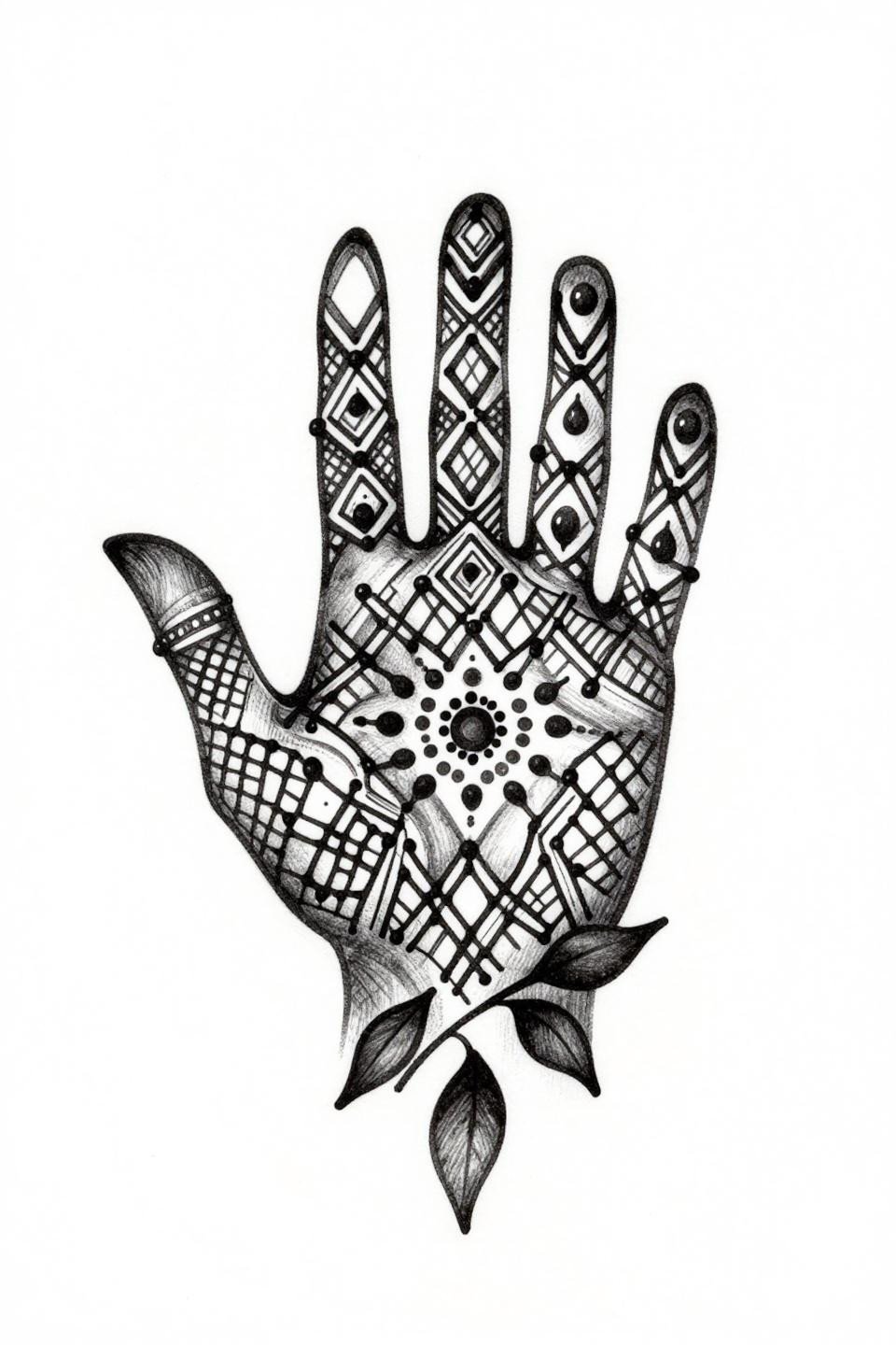
The diamond lattice fill inside a palm-shaped negative space, anchored by a central dot cluster, is a precision linework test that separates artists who can hold consistent line weight from those who vary under pressure.
Grey wash midtones give the lattice depth without adding tonal passes, which is efficient. Check the healed work portfolio before booking this one. Fresh lattice looks clean in anyone’s hands. Settled lattice shows the truth.
Chicano Grey Wash and the Diagonal Peacock Composition
Diagonal asymmetric flow combined with whip shading grey wash diluted from dense midtones to open negative space: this is a Chicano technique applied cleanly to a henna-origin motif.
Grey wash dilution from dense to open reads well on lighter and medium skin tones but needs bolder anchor lines on olive and deeper skin to maintain contrast as the grey softens with time. This is where artist speed control during whip shading matters most.
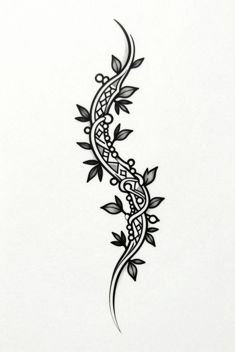
Neo-Traditional Vine and the Asymmetric Diagonal That Works
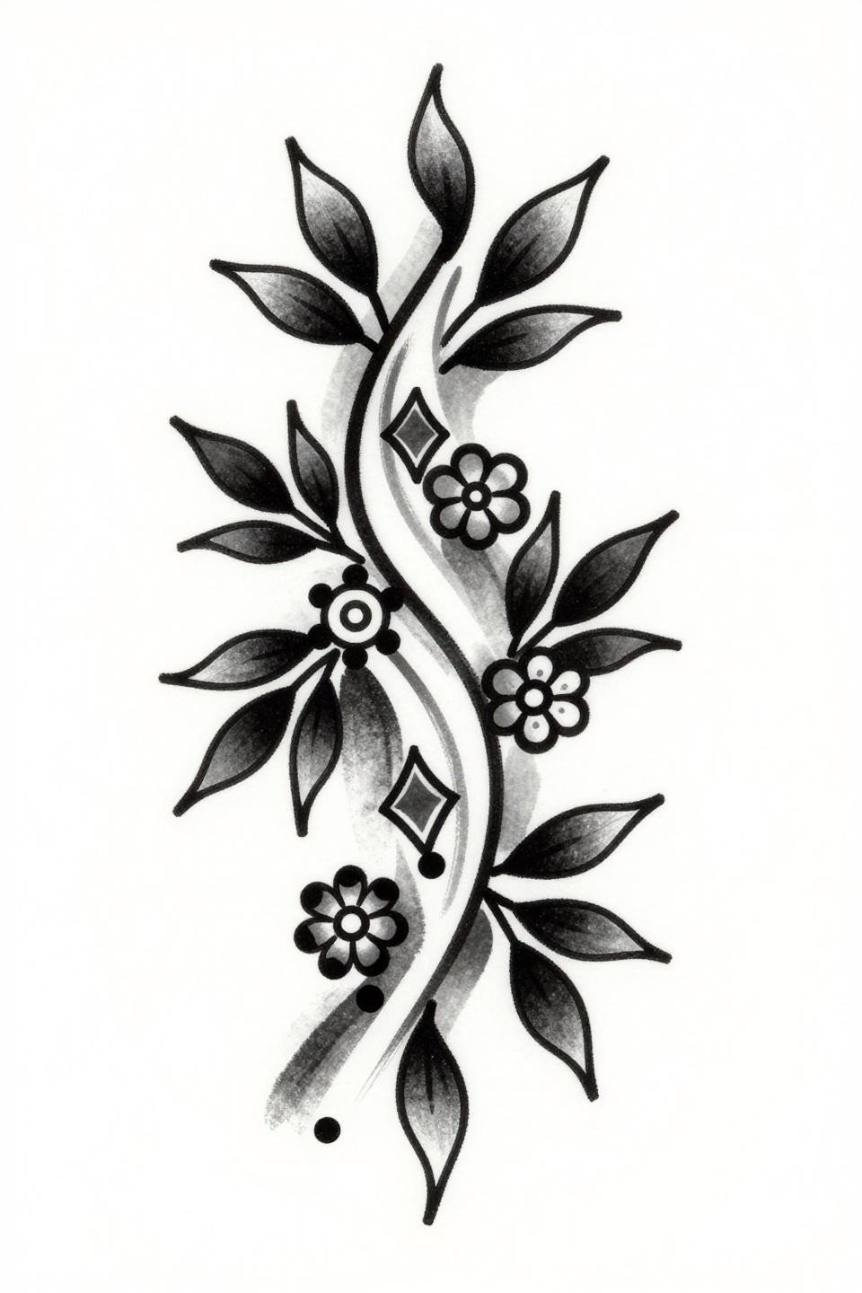
Three circular floral nodes on an asymmetric diagonal vine, with geometric diamond fills between curves, demonstrate how neo-traditional outline weight at 2-3pt gives simple mehndi forms their longevity signal.
For latest simple mehndi collections, this diagonal flow structure appears repeatedly because it adapts cleanly to forearm and collarbone placements without forced symmetry.
Sacred Geometry Stacking and the Four-Petal Terminal
Three ascending spiral loops terminating in four-petal flower clusters, connected by dot-accented tendrils: Sak Yant compositional logic applied to a henna vocabulary, centered on a strict vertical axis.
Vertical axis designs like this suit the forearm, shin, or spine. The stacking rhythm reads at distance, and the individual terminal florals reward close inspection. That dual-scale legibility is what makes this placement-flexible.
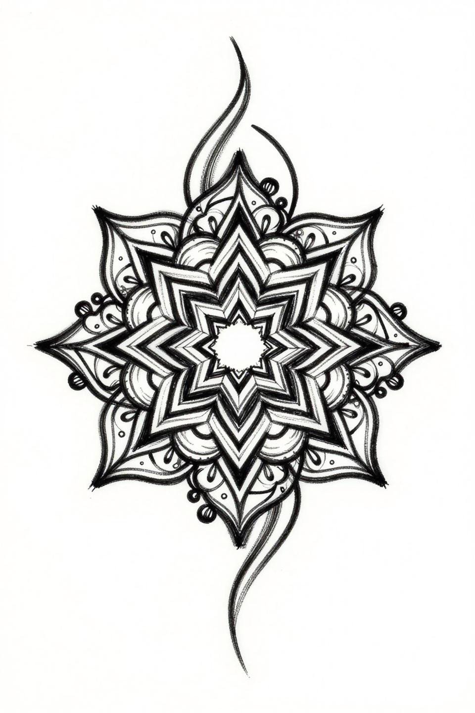
Traditional American Lotus and the Concentric Petal Ring
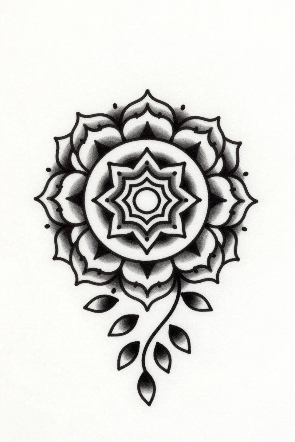
Concentric petal rings around a geometric diamond seed pod, anchored by a trailing teardrop vine. The traditional American mandala structure forces discipline: every ring has to read as a complete element, not just a border for the next.
No stipple here is the right call. Stipple inside mandala rings blurs faster than flat fills on skin, and on a circular composition, blurred stipple loses the petal separation that makes the whole form legible. Explore more context in modern mehndi design inspiration.
Ignorant Style Radiating Lines and Why Intentional Wobble Holds
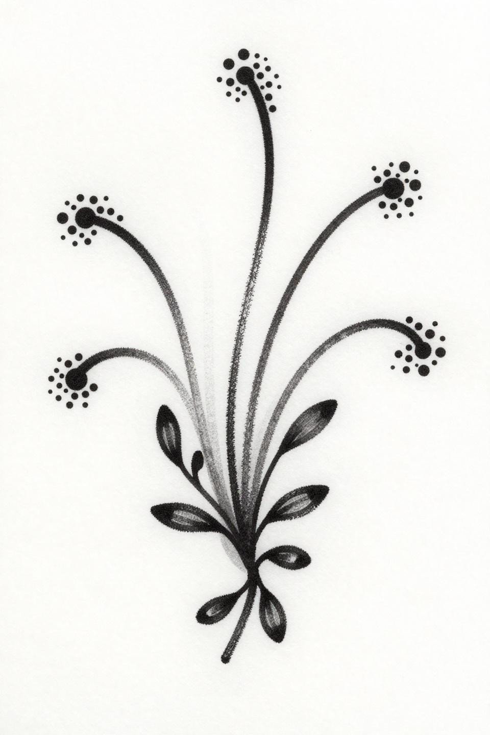
Five curved lines radiating from a central base, each terminating in a dot cluster, rendered in intentionally unpolished 2pt outlines. Ignorant style works here because the henna vocabulary is loose enough to absorb the rawness without looking like a mistake.
The ornamental vine wrapping the lower composition is the anchor that keeps this from reading as unfinished. Without it, the radiating lines float. With it, there is a clear compositional base.
Blackwork Dotwork Peacock Mandala and the Stipple Density Rule
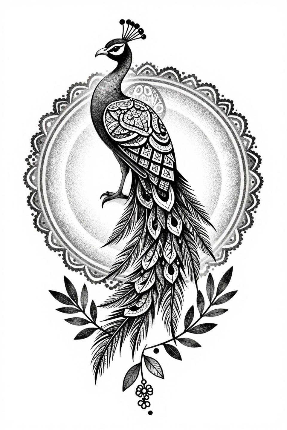
A peacock centered in circular mandala form, with a stipple dot gradient running from dense crosshatch at the torso core to open negative space at the tail feather edges: this is the correct application of dotwork to a radial composition.
Look for consistent dot size across the full gradient. Artists who rush stipple leave irregular dot clusters in the transition zones, which read as patchiness once healed. That patchiness only gets more visible over time, not less.
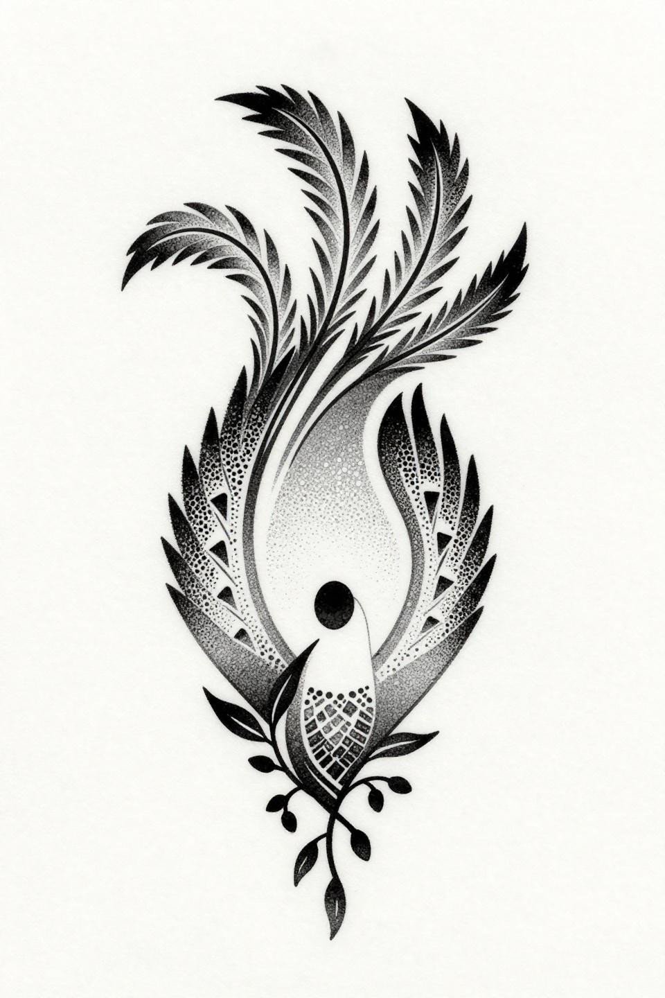
Irezumi Oval and the Coiled Tail That Holds Its Shape
Horizontal oval composition with tail feathers coiling into interlocking spiral loops: this borrows directly from Japanese Irezumi silhouette logic, where the contained form creates maximum contrast against open background.
Flat dense black fills at this saturation level require multiple passes from the artist. A single pass looks solid in the photo. The settled skin tells you if they committed to layering. Check healed examples before booking any design with large flat black zones.
Art Nouveau Vine and the Clean Asymmetric Diagonal
Three circular floral clusters on an asymmetric diagonal vine with art nouveau organic curve logic and geometric dot accents at even intervals along the main stem. No shading, flat fills only.
Protected placements on the upper arm or inner forearm give this style its best shelf life. The flat fills without shading hold longer than grey wash on the same motif because there are no tonal transitions to soften into each other.
Etching Crosshatch and the Butterfly Wing That Reads Geometric
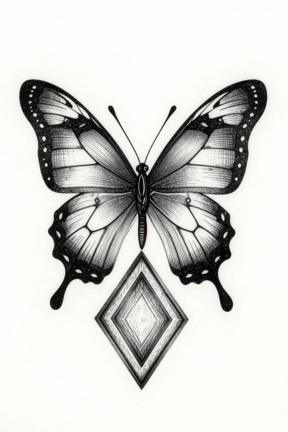
Geometric wing segments filled with ruled parallel horizontals, a body built from stacked diamonds, antennae with circular node terminals: crosshatch etching technique applied to a butterfly form creates tonal depth without a single wash pass.
The diamond frame composition gives this reference a built-in border, which makes it adaptable to placement at any orientation. Rotate it 45 degrees and it suits the shoulder cap as cleanly as the sternum.
Celtic Knotwork Rose and Why the Interlocking Pattern Replaces Organic Curves
A rose bud with interlocking knot patterns replacing the organic petal curves: this is structurally clever because Celtic knotwork geometry locks the composition together in a way that organic curves never do.
Bold 2-3pt outlines with flat black fills on a centered vertical silhouette give this longevity on almost any placement. The geometric simplification removes the fine-detail elements that fade fastest on skin.
Sketch Raw Mandala and the Radial Line That Needs a Reason
A central mandala radiating three curved lines to floral bud terminals, with geometric triangle fills between curves: the raw hand-drawn 2pt outline style requires that every radiating line justify its direction or the composition reads as accidental asymmetry.
This one justifies it. The triangle fills between the curves create a visual rhythm that tells the eye these angles were chosen, not guessed. That is the difference between raw style and unfinished work.
Continuous Line Vine and the Visual Rhythm Test
One unbroken 1pt line tracing interlocking circular loops on a diagonal, with geometric diamond fills and trailing leaf sprigs: single continuous line discipline is the hardest technical constraint in simple henna flash because the path must resolve without an obvious restart.
Grey wash midtones inside the loops prevent the design from reading as flat outlines at smaller scales. At wrist scale without those midtones, the loops collapse into each other visually.
Peacock Feather Watercolor Wash and the Whip Shading Gradient
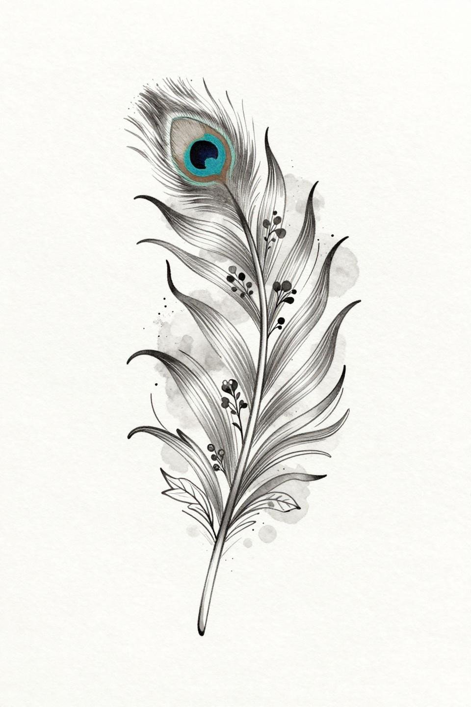
A single peacock feather with a clean outlined spine, organic curved barb strokes, and floral clusters along the shaft: the soft grey wash bleed behind linework is what separates this from a flat botanical illustration.
Watercolor-style backgrounds without solid outline anchors blur by year three to five on most skin. This design avoids that problem because every element has a clean black outline underneath the wash, which holds the form even as the wash softens.
Art Deco Lotus and the Bilateral Symmetry That Demands Precision

Bilateral mirrored symmetry along a vertical axis, with geometric petal segments filled by parallel line hatching at 0.5pt and a concentric ring seed pod at center. Art deco structure demands that the mirrored halves match at every point.
Any drift in the ruled hatching lines reads immediately on a symmetrical design. This is the reference to use when testing an artist’s ruler-free precision. Uneven hatching on one side is the tell.
Tribal Dotwork Peacock and the Stipple Silhouette Rule
A teardrop peacock body built entirely from dense stipple dotwork, tail feathers from triangular dot clusters, the whole composition resolved without a single outline stroke: tribal dotwork silhouette logic at its most reduced.
Stipple without an outlining container requires the densest dots at the core to be genuinely dense, not spaced at 70% and called complete. The open-to-dense gradient from edge to center is where this technique either holds or falls apart.
Botanical Vine Calligraphy and the Variable Stroke Weight
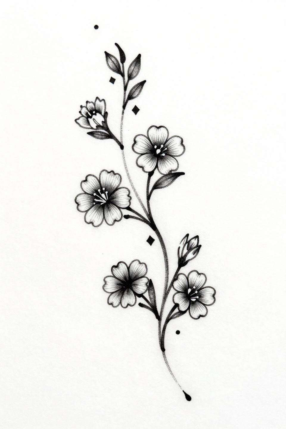
A minimalist vine with three clustered flowers, geometric diamond spacers, and delicate tendrils in a single continuous diagonal line: variable stroke weight from wet brush calligraphy gives this reference its energy without adding compositional elements.
No grey wash is the correct choice here. Adding wash to a calligraphic brushwork piece muddies the contrast between the thick pull strokes and the thin lift strokes, which is the only tonal information this design needs.
Fine Line Mandala and the Single-Needle Spiral Petal
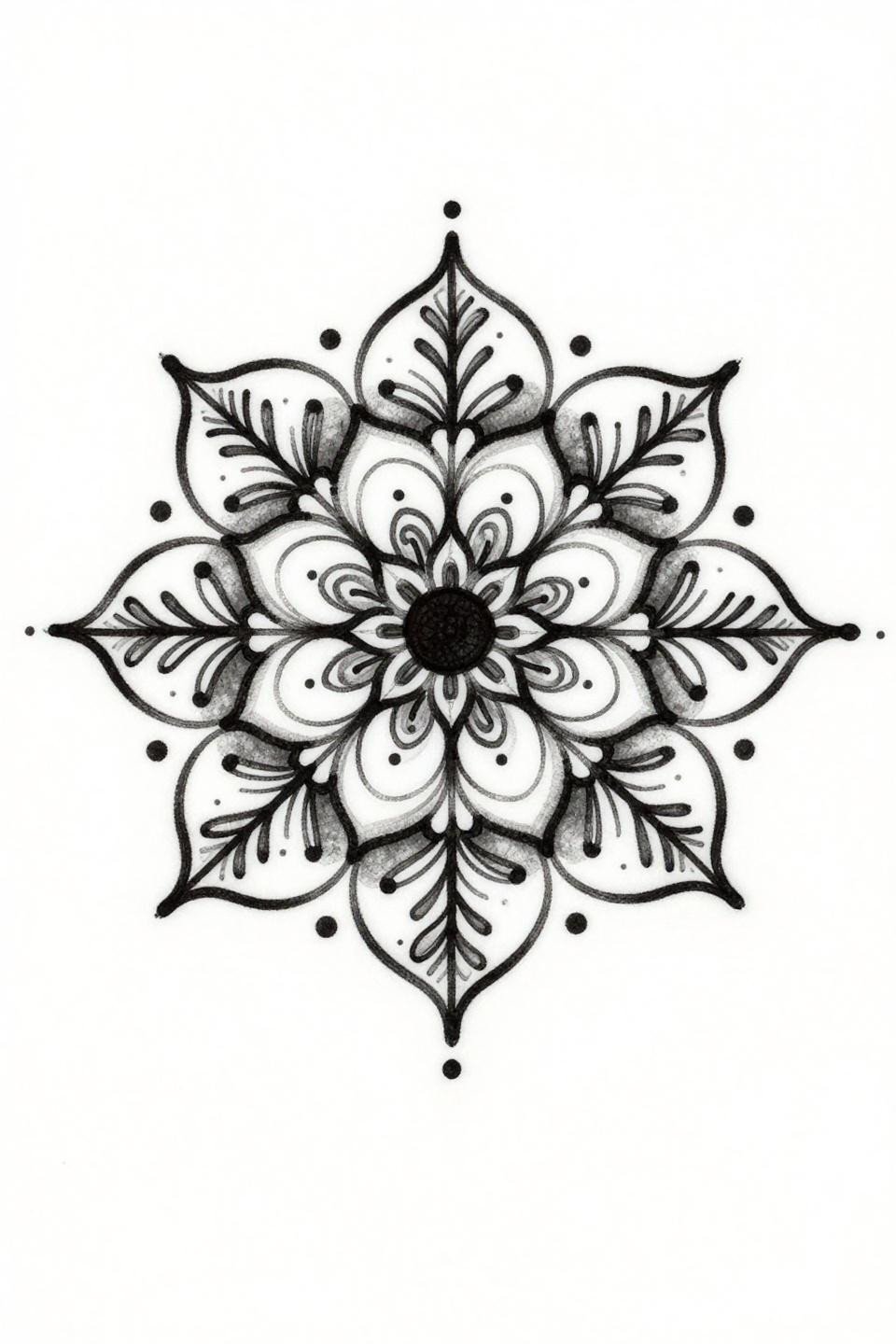
Spiraling petals from a central dot, leaf tendrils extending from the core, and scattered perimeter dots: hairline 0.5mm single-needle work on a mandala this open relies entirely on the negative space to give the composition weight.
Fine line mandalas on sun-exposed placements like the wrist or hand need an honest conversation about touch-up cycles. Plan for two to three years between sessions minimum if the placement sees regular UV exposure.
Pull three to five references from this collection, specifically the ones where the style and placement match what you are actually planning. Send those to your artist before the consultation. A focused reference set tells an artist more about your direction than a folder of thirty mixed images.