Minimalist tattoos punish lazy linework harder than any other style. There’s no shading to hide a wobble, no color to draw the eye away from an inconsistent stroke. Every line is load-bearing.
The failure mode is almost always scale. Artists underestimate how much a 1RL hairline closes up on skin, especially in high-movement zones. The designs below are sized and structured to survive that reality.
Why the Hourglass with Droplets Works at Wrist Scale
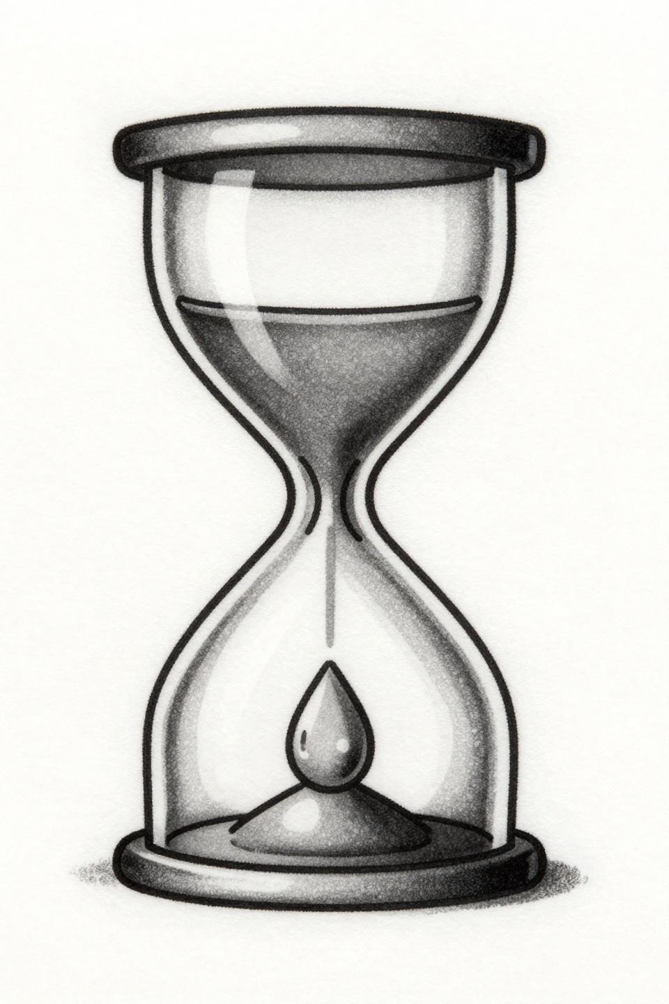
A geometric hourglass form with three descending droplets inside the lower chamber, each shrinking toward the base. Hairline 0.5mm single-needle strokes carry the whole composition on open negative space alone.
Single needle 1RL work like this needs an artist who controls speed precisely. On lighter skin tones this reads crisp at small scale; on olive and darker skin, the hairline weight risks losing contrast by year three.
Compass Rose: When Radial Symmetry Becomes the Whole Point
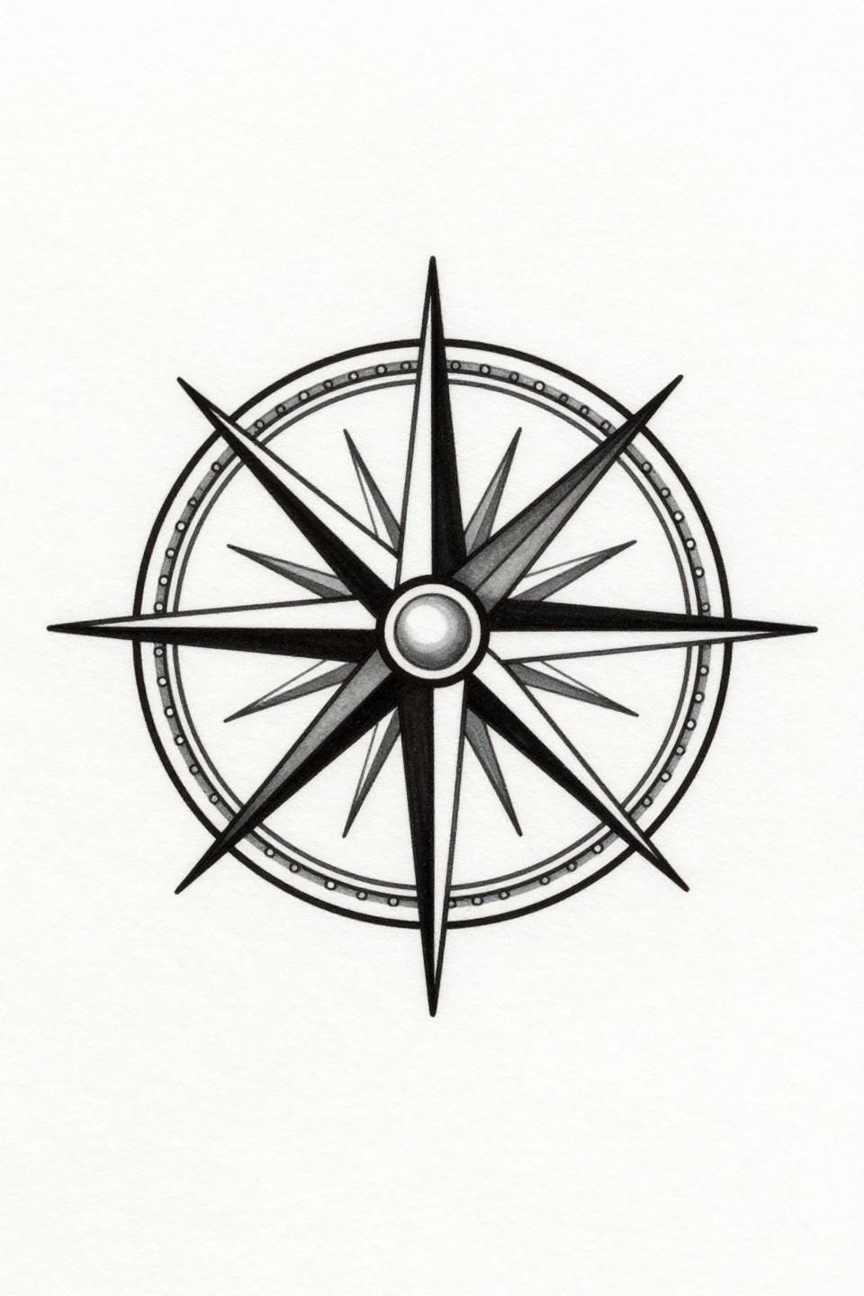
Four cardinal spokes radiate from a filled center dot, the outer circle built from alternating dashes and gaps. Compass-drafted geometry keeps the radial symmetry locked even at thumbnail scale.
The filled center dot is the longevity anchor here. It holds readable form even if the hairline spokes soften slightly with age, which they will on wrist or finger placements within two to four years.
The Bold Key: Where Flat Fill Beats Fine Line for Small Formats
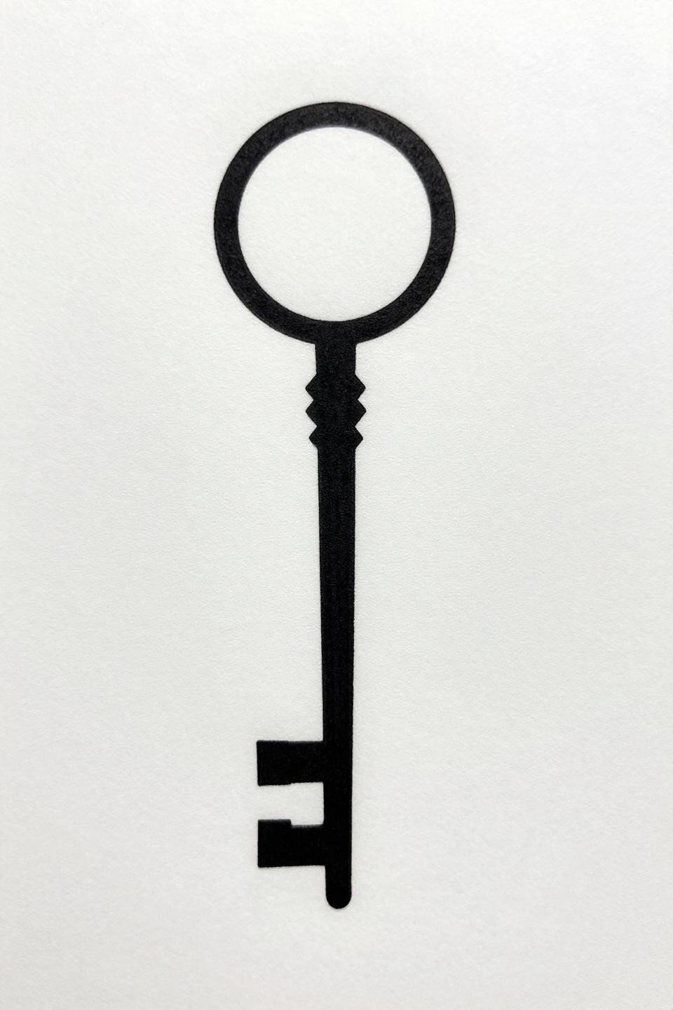
A single key with a circular head, rectangular shaft, and two square teeth at the base. Bold 2-3pt outlines with flat black fills give this motif structural integrity that hairline work cannot match at small scale.
Bold outlines at this weight hold clean for ten-plus years. This is the right call for a piece under 3cm: fine line keys blur; this one stays readable. That choice signals an artist who thinks about longevity.
Moth in Negative Space: The Continuous Line That Has to Be Exact
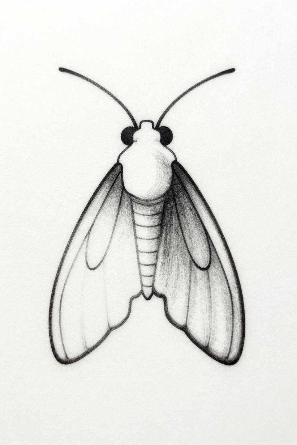
Two overlapping circles form the body; wing silhouette exists entirely through negative space. No fills, no closed loops beyond the body geometry. The form reads because of what surrounds it, not what defines it.
The tell is the curves: any wobble at the direction changes in the body circles will read immediately on healed skin. Check the artist’s healed work portfolio, not just fresh shots, before committing to this approach.
Geometric Snake: Dotwork Without an Outline Is a Long-Term Gamble
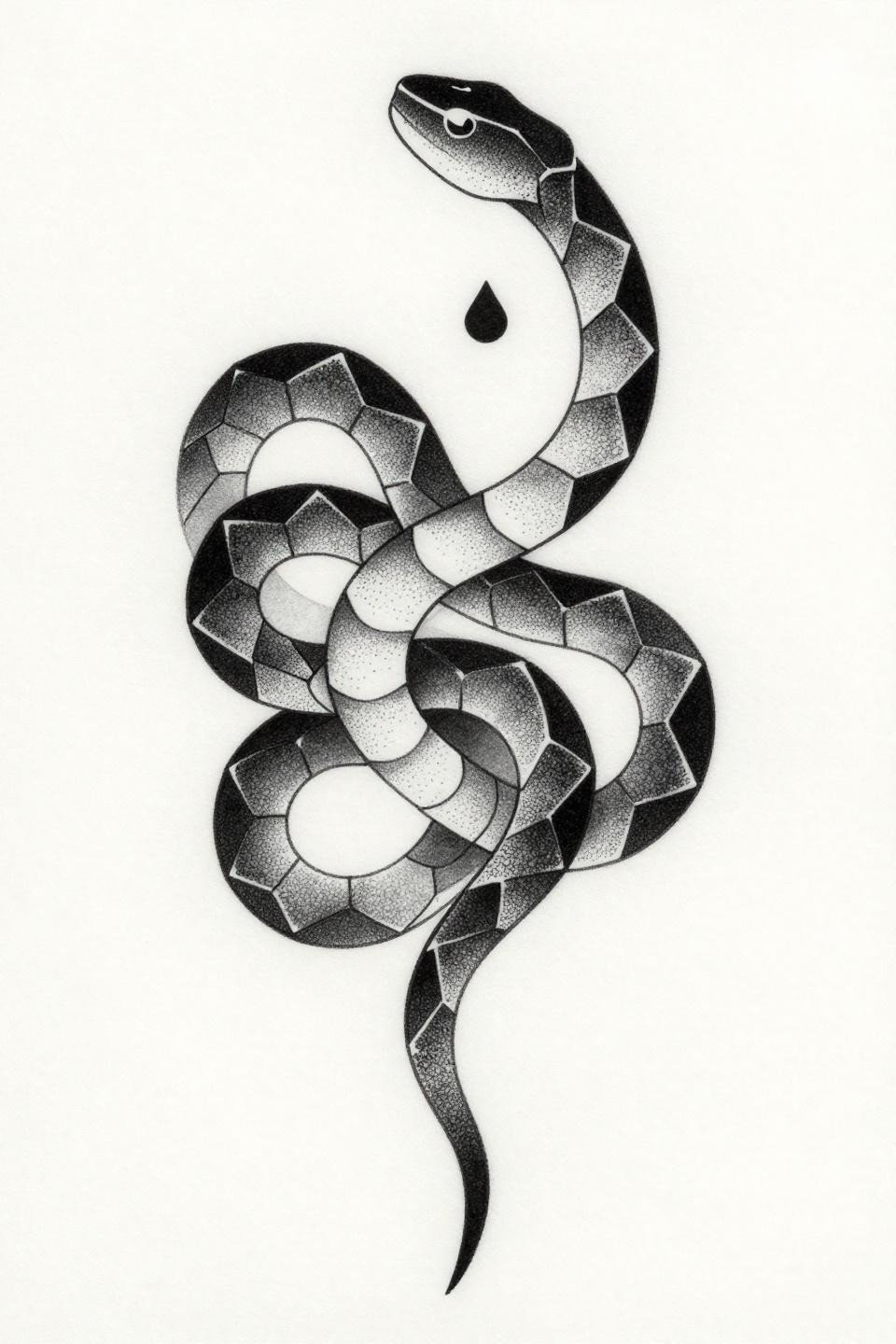
A diamond-shaped head and cascading hexagonal segments taper to a hairline point tail, all built from stipple dotwork with no solid outline. The stipple density runs from roughly 90% at the core segments to open at the edges.
Dotwork without an anchoring outline like this tends to blur at the segment boundaries by year five, particularly on olive and darker skin tones where contrast between dot clusters compresses faster. Protected placements like the sternum or upper back give it its best shelf life.
Cicada Geometry: Bold Fills at Minimal Scale Still Hold Decades
Three stacked circles build the body; angular wing segments use closed geometric forms with negative space between each section. Bold 2-3pt outlines and flat black fills make this design punchy well beyond what its small footprint suggests.
Flat fills with no patchiness separate veterans from beginners on a piece like this. A patchy fill reads immediately under UV light and in photographs, and it only gets harder to correct on healed skin.
Continuous Line Hourglass: One Stroke, Zero Margin for Error
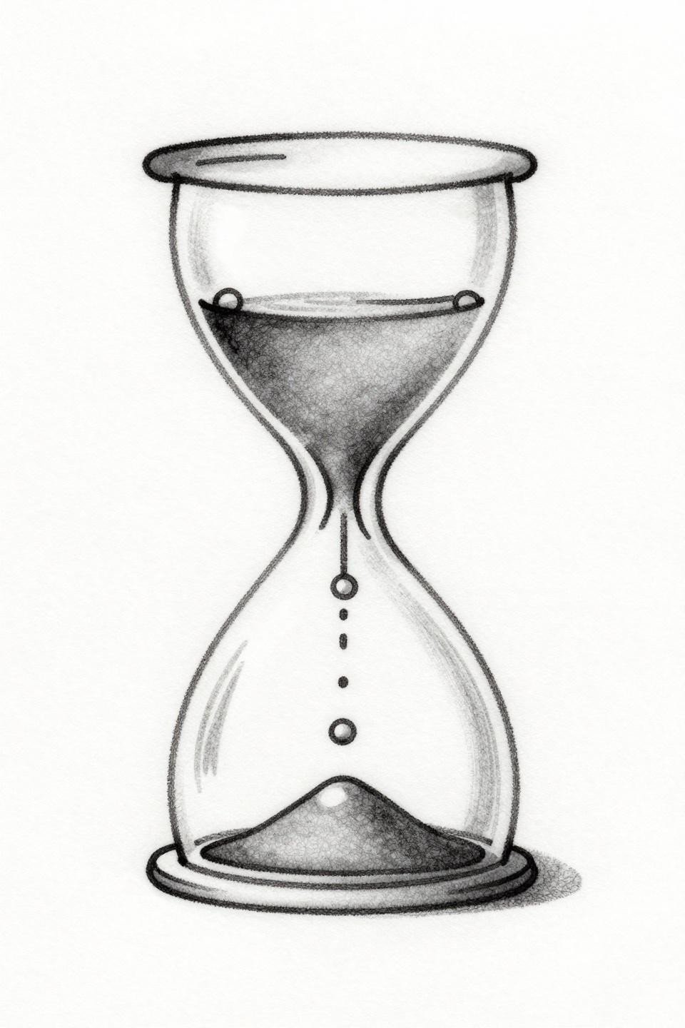
One unbroken hairline stroke forms the entire hourglass, with alternating tiny circles and dashes descending the central axis to suggest temporal flow. Open negative space carries all the visual weight.
This is the hardest technical execution in this collection. A continuous line piece has no correction point once the needle lifts. Artists who do this well have it dialed into their hand speed, not their stencil.
Single Line Mountains: Negative Space Above the Horizon Does the Work
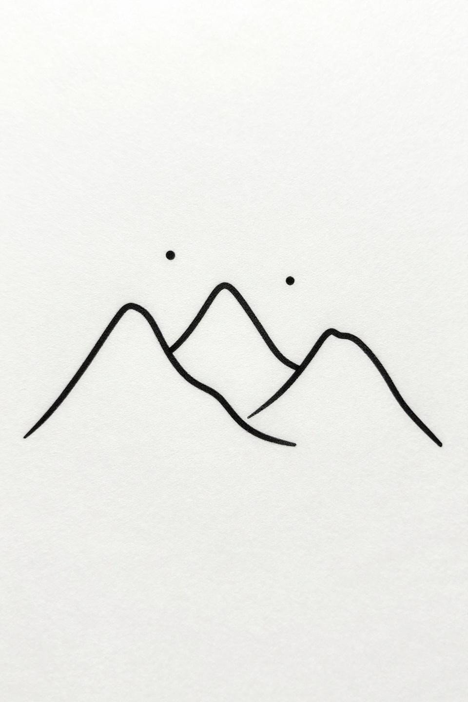
Three abstract mountain peaks formed by one unbroken hairline path, a straight horizon at the base, and three isolated star points scattered in the negative space above. Triangular composition, perfectly centered.
On lighter skin, this reads as clean graphic work for years. The isolated star points are the vulnerability: at under 5mm, those tiny marks can spread into indistinct dots within three to five years on high-movement placements like the wrist or forearm.
Two Triangles and Five Circles: Geometry as Personal Shorthand
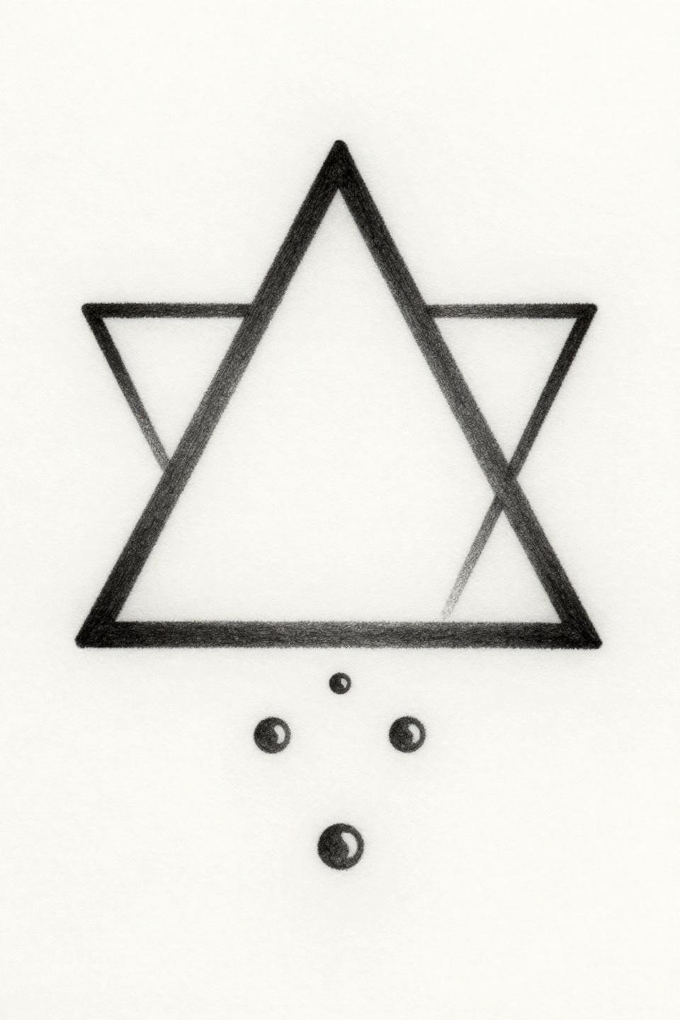
Two equilateral triangles meeting apex to apex, with five tiny circles descending the central axis to represent falling sand. Hairline 0.5mm strokes and compass-drafted precision keep the bilateral symmetry exact.
The five circles on the vertical axis are the meaning carrier: that number can be personal. Collectors use this format to encode years, people, or moments without any visible text. That’s why this motif keeps appearing in fine line collector work.
Single Feather: Asymmetric Forms Demand Confident Freehand Control
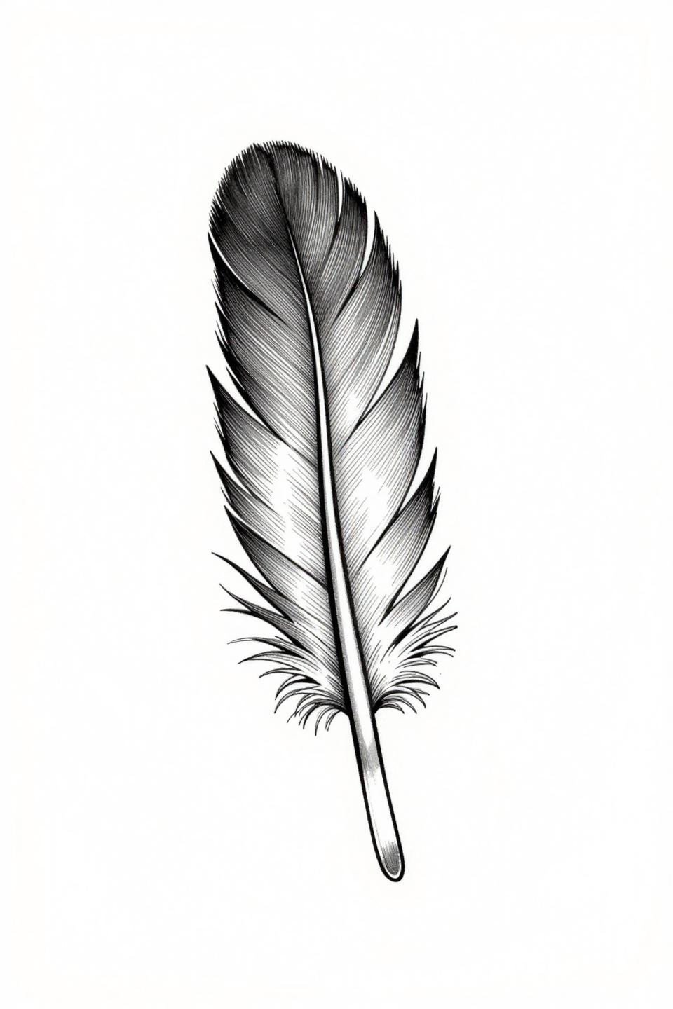
A single feather with a central shaft and five to seven barbs tapering to hairline points. No fill, no symmetry axis: the whole form floats in open negative space as an asymmetric natural shape.
Asymmetric organic forms like this expose inconsistent needle pressure immediately. Look for consistent barb weight across the full length of the shaft, from the base barbs to the tip. Any thickening at the base barbs means the artist is dragging rather than pulling.
Art Deco Mandala: Line Weight Variation Is the Only Texture Tool Here
Concentric circles alternate thin and thick line weights around a central hexagon with radiating triangular petals. Grey wash dilution fills the midtone zones between the geometric forms.
Grey wash at this scale needs to be diluted cleanly with no muddy midtones, or the whole center reads gray by year two. On olive skin, grey wash mandala work compresses in contrast faster than on lighter tones: the artist needs to go slightly denser on the wash to compensate.
Botanical Stem: Vein Branching as Technical Proof of Skill
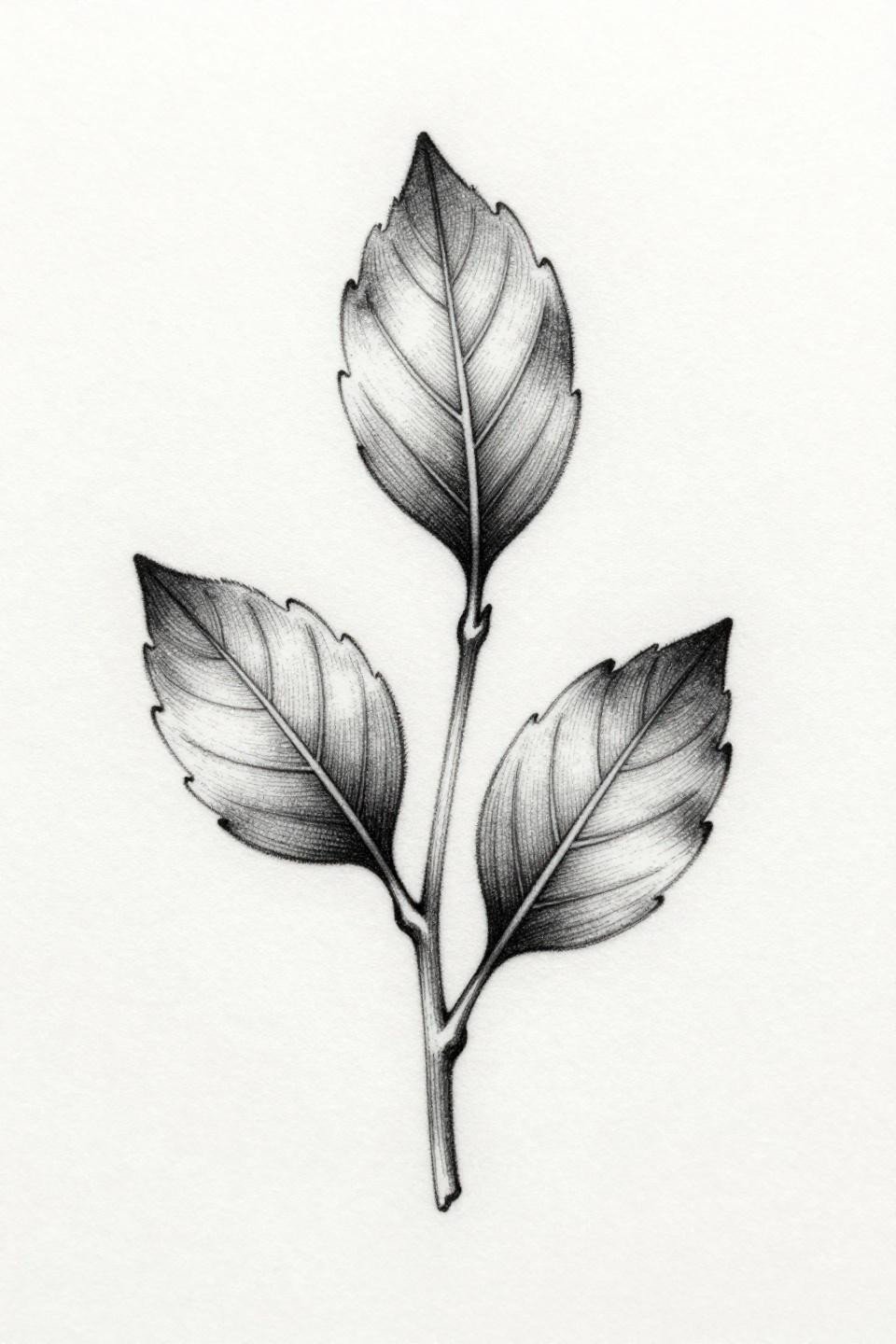
A single upright stem with three leaves arranged vertically, each showing fine vein branching from midrib to margin. Weight variation on the leaf edges adds a botanical illustration quality that flat linework cannot achieve.
The vein branching is the artist skill signal on this design. Consistent hairline strokes through every branch, with no pooling at the junctions where veins meet the midrib, tells you the artist controls ink flow at low speed. That control transfers directly to healed line quality.
Crescent Moon and Stars: Asymmetry That Has to Be Intentional
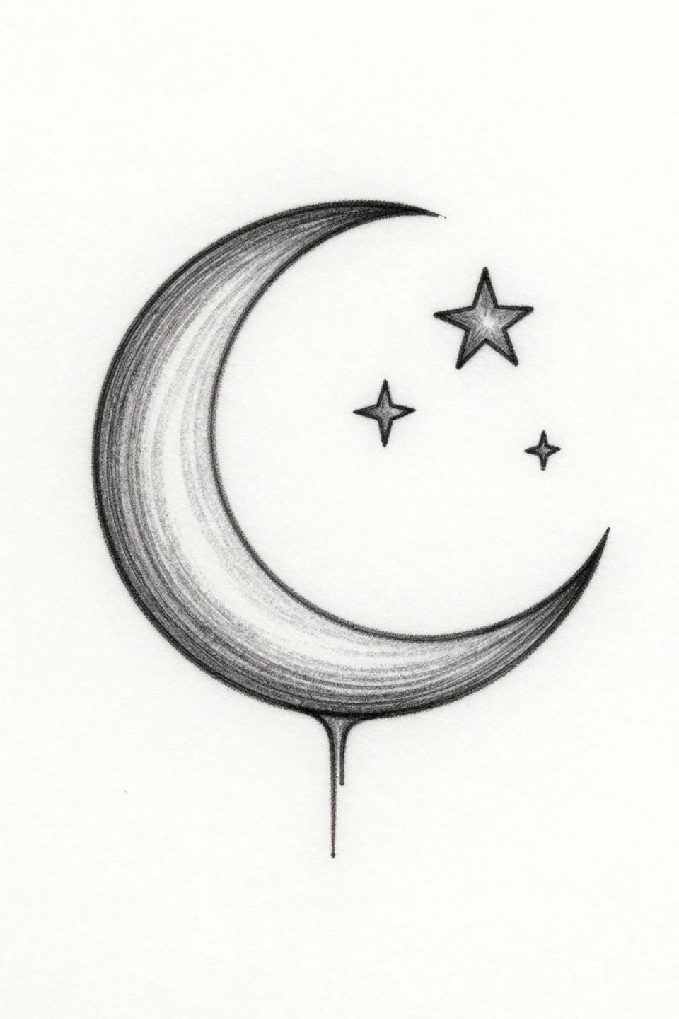
One unbroken hairline stroke forms the crescent, with three stars placed asymmetrically above and beside it. No line breaks, no closed loops: the composition reads as intentional asymmetry, not imprecision.
Placement on the inner wrist or collarbone gives this the negative space it needs to breathe. Tucked into a dense sleeve, the asymmetric scatter reads as lost. Scale matters as much as placement: this needs at least 4-5cm of clear skin around it.
Narrow these references down to three at most before reaching out to an artist. Scale note and placement intent should go with every reference you send. A specific brief gets a specific response, and that conversation decides whether the final piece ages well or closes up by year five.