Flower tattoo designs fail collectors most often not because of the subject, but because of style mismatches. A fine line rose on a hand placement is a two-year tattoo. The same subject in traditional American flash with bold 2-3pt outlines? A decade-plus with minimal touch-up.
The 14 references below cover everything from single-needle botanical work to tribal blackwork, organized by style logic, not trend. Use them to narrow your direction before the consultation, not during it.
Celtic Knotwork Converts the Bleeding Heart Into Geometry
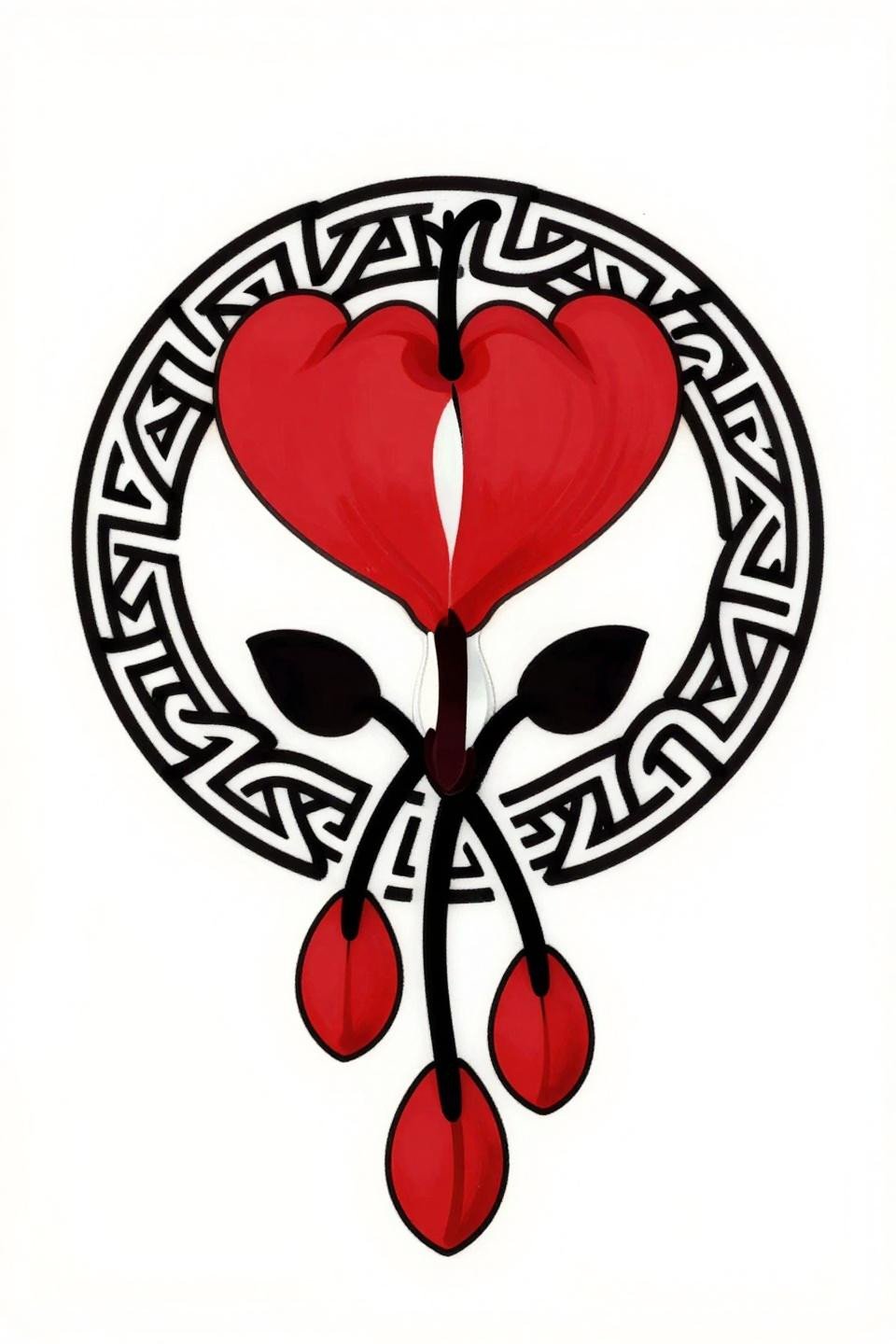
A bleeding heart rendered as interlocked Celtic knot patterns inside a circular mandala frame, with bilateral symmetry along the vertical axis and flat crimson fills against solid black linework.
The bold 2-3pt outline weight here is the longevity signal. On any skin tone, this reads clean at year ten because the line structure carries the design, not color saturation.
Surrealist Distortion on a Prairie Flower That Actually Holds
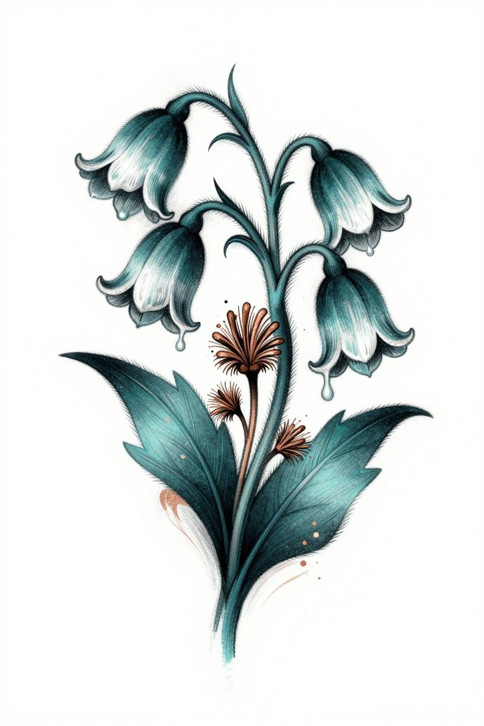
A pasque flower with drooping, melted petals and dreamlike distortion, executed in whip shading strokes with deep teal ink and copper metallic accent shadows spiraling from the form.
Teal ink ages darker than black on warm and olive skin tones. Artists need to account for that shift when setting the initial saturation, so ask to see healed teal work in their portfolio specifically.
Sketch Raw Hibiscus: Where Loose Line Meets Controlled Wash
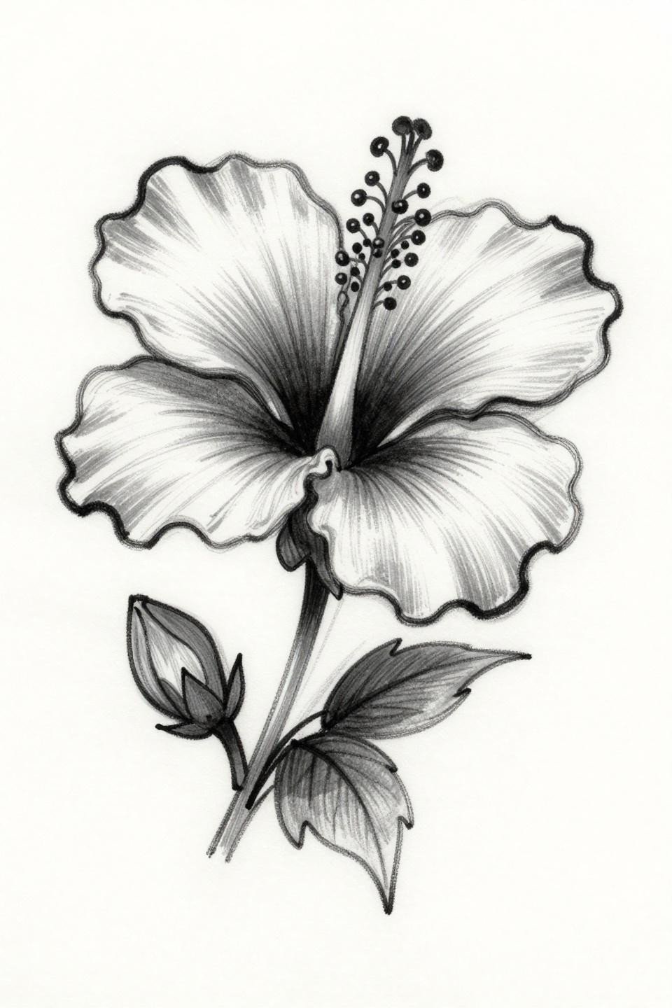
A hibiscus in sketch raw style with loose gestural linework and grey wash dilution from dense to open, no muddy midtones, carrying the volume through value shifts rather than fill weight.
This style signals an artist who controls machine speed, not just pressure. Uneven whip strokes in the shading arcs are the tell that separates a strong flash reference from a weak execution.
Woodcut Magnolia: Black Mass Architecture for Upper Arm Placement
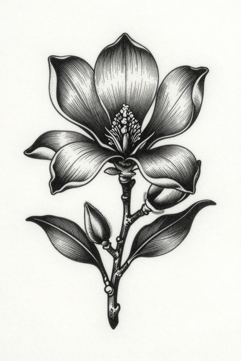
A magnolia bloom in etching woodcut style with dense parallel line engraving building black masses, and white carved negative space creating the sculptural form.
The stacked vertical composition maps cleanly to the upper arm or shin. Both placements give the parallel line structure room to breathe without wrapping awkwardly around muscle contour.
Single Continuous Line Orchid: The Skill Test Most Artists Avoid
A slipper orchid rendered as a single unbroken calligraphic stroke, the cascading aerial root tangle and three-bud cluster resolved without lifting the line, wet ink quality throughout.
Zero fill means zero room for error. The tell is the direction changes: any wobble at the curve reversals means the artist lost speed control. Request to see this style healed before committing.
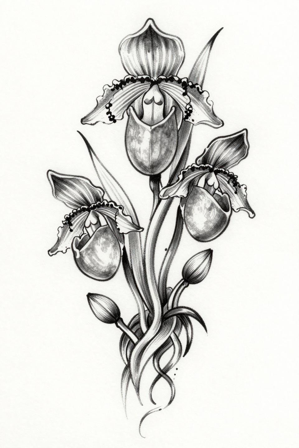
Tribal Frame Turns an Orchid Into a Placement-Ready Panel
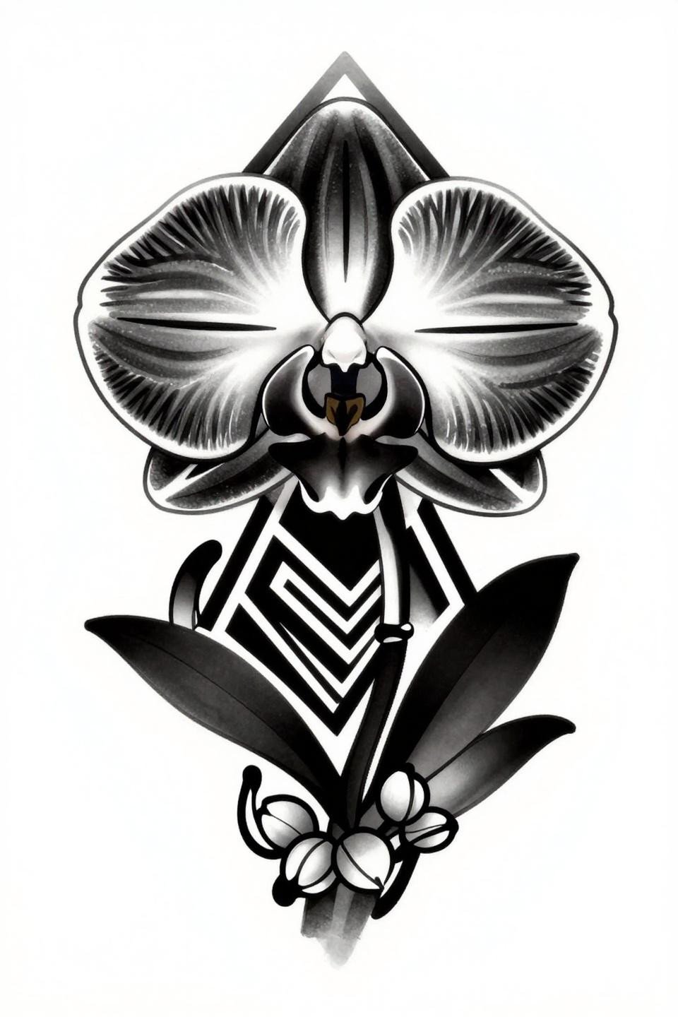
A Cattleya orchid locked inside a bold diamond frame with angular tribal negative space fills, the botanical form and geometric container holding equal visual weight.
Blackwork at full saturation like this holds density indefinitely if the artist commits to layered passes. On darker skin tones, the negative space geometry does more compositional work than the orchid itself.
Dahlia in Dotwork: Fibonacci Structure as Tattoo Architecture
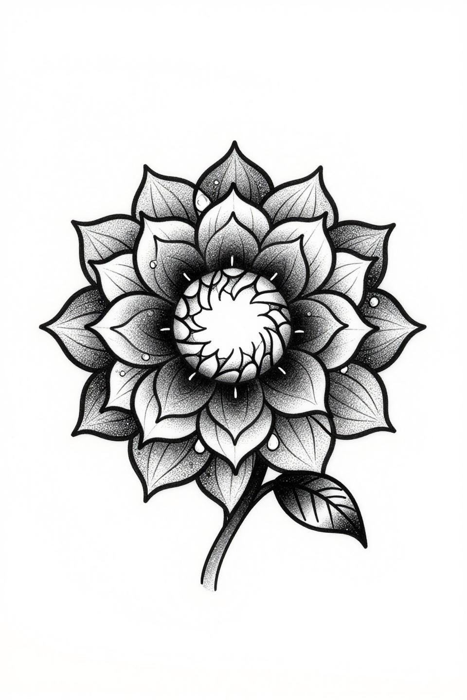
A dahlia with petals arranged in a true Fibonacci spiral, shaded entirely through stipple dot gradient running from near-solid black at the disc center to open negative space at the petal tips.
Look for consistent dot size across the full gradient. Inconsistent dot weight, especially at the outer petal edges, signals an artist who rushed the placement stage rather than mapping the gradient first.
Fine Line Jasmine Cascade: The Placement Window Is Narrow
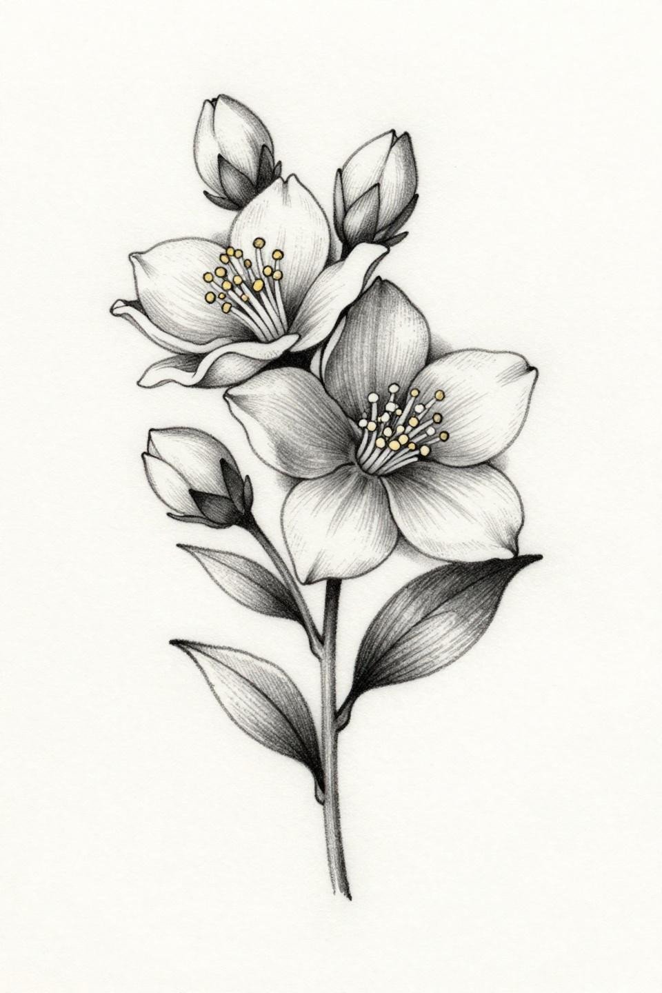
Single stem jasmine in fine line minimal style, using hairline 0.5mm single-needle strokes with deliberate weight variation at petal edges to suggest form without fill.
Fine line at this scale needs a protected placement. Sternum, upper back, or inner upper arm. Wrist and forearm exposure will blur this within three to five years regardless of aftercare quality.
Neo-Traditional Peony: Why Indigo Outlasts Every Other Petal Color
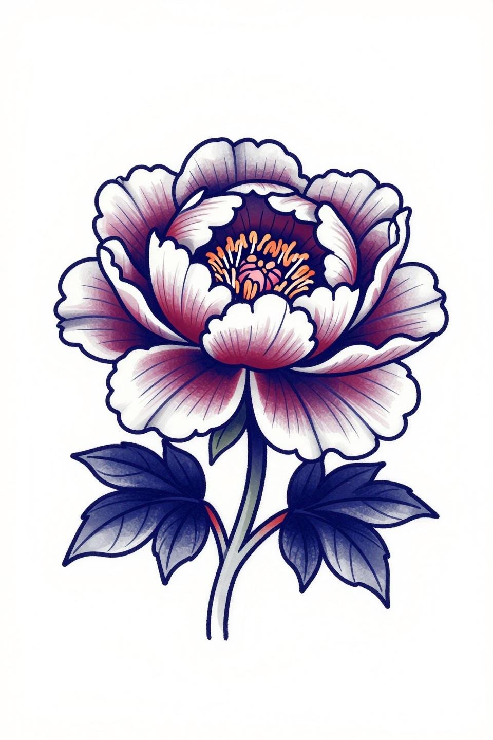
A peony in full bloom with layered ruffled petals, executed in neo-traditional style with bold 2-3pt black outlines and flat deep indigo fills accented by crimson at the stamen cluster.
Indigo holds pigment density longer than true purple because it sits closer to the blue spectrum. On olive skin specifically, this color choice reads cleaner at year five than violet-based alternatives.
Traditional American Lily: Two Colors, No Compromise on Longevity
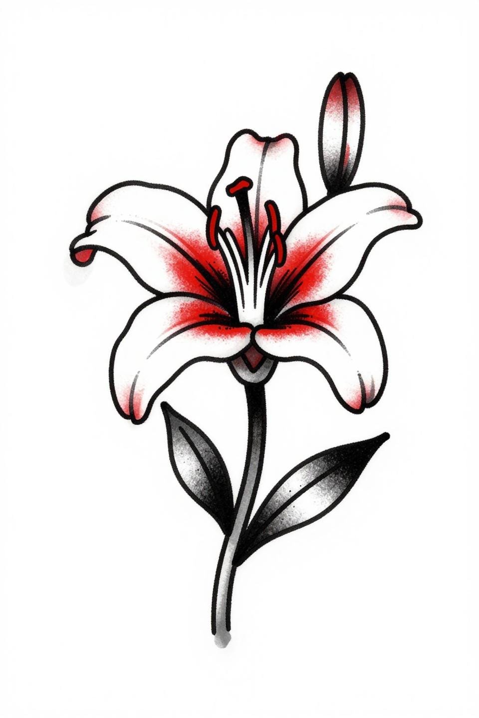
A recurved lily in traditional American style, flat crimson red against solid black, with bold 2-3pt outline weight anchoring the six petals and lateral bud at centered placement.
Two-color traditional flash like this ages better than any multi-color floral. The black outline holds the read even when the red shifts warm over the years. Classic reason the style survives every trend cycle.
Watercolor Wildflower Cluster: The Anchor Problem, Solved Halfway
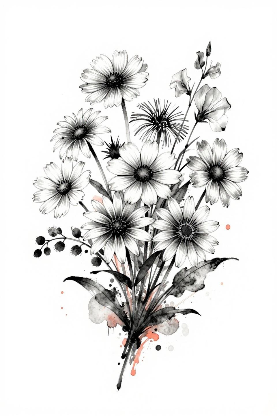
A wildflower cluster of black-eyed susan, coneflower, cosmos, and sweet pea tendrils rendered in watercolor splash style with wet-edge coral washes pooling into charcoal ink stems.
The charcoal ink stems are doing the structural work here. Pure watercolor without an anchoring line blurs by year three to five. This reference has enough ink presence to hold the composition past that window.
Art Nouveau Lotus: Gold Ink and the Mandala Format That Ages Flat
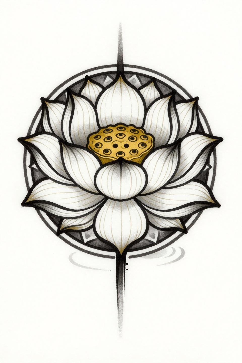
A lotus in full frontal bloom inside a circular mandala composition, rendered in art nouveau style with flat gold and solid black palette and 2-3pt outline weight throughout.
Gold ink fades faster than any pigment in the spectrum. If this reference goes to skin, the artist should overpack the gold on the first session. Faded gold reads muddy yellow, not warm, within four years.
Botanical Crosshatch Orchid: Scientific Accuracy as Style Signal
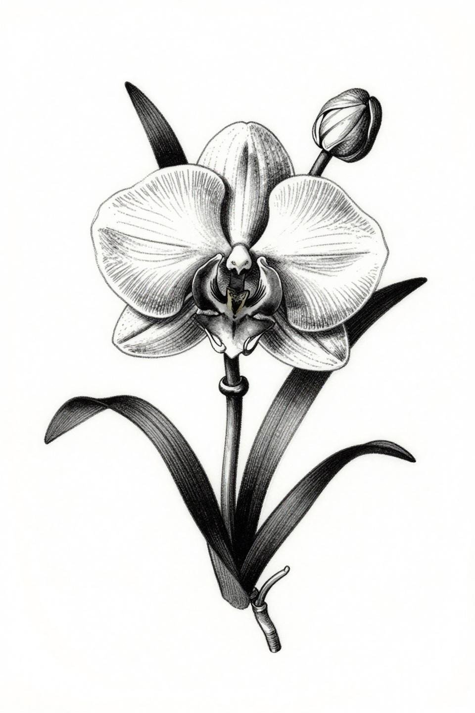
An orchid in three-quarter bloom with aerial roots and unfurling bud, shaded entirely through crosshatch etching with parallel line shadows and dense black fills at the petal centers.
The crosshatch build requires an artist who maps line direction before touching skin. Parallel lines that drift angle mid-shadow collapse the read entirely. Check the consistency of line spacing at the petal-to-root transition specifically.
Irezumi Cherry Blossom Branch: Ink Wash Logic Meets Japanese Structure
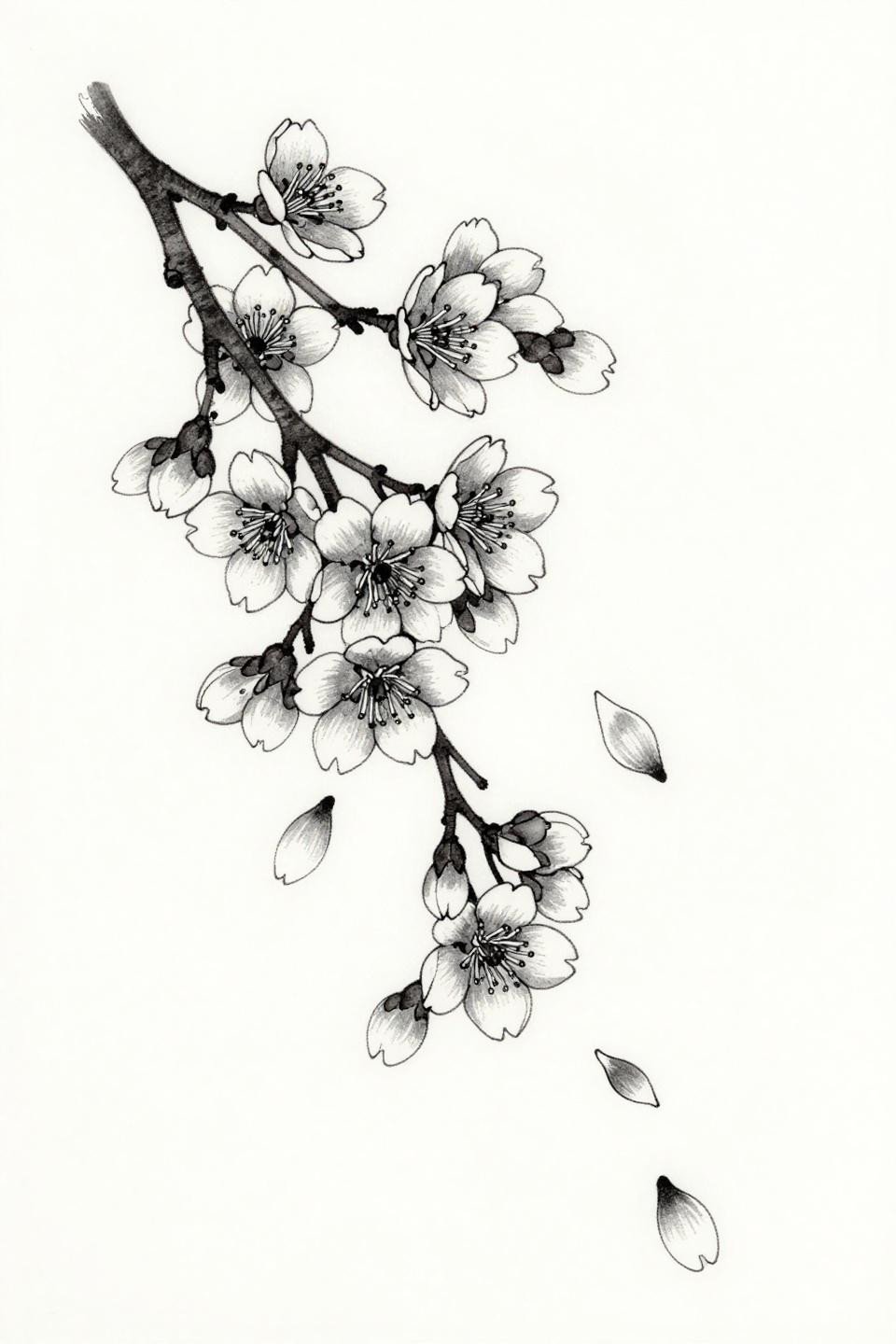
A cherry blossom branch in Japanese irezumi style with twelve scattered falling petals and ink-wash grey dilution for petal shadow, executed in hairline single-needle strokes with open negative space.
The asymmetric branch flow maps to the shoulder and upper arm wrap better than any symmetrical format. Irezumi composition logic was developed specifically for body curvature, and this reference reflects that placement intelligence.
Pick three references from this collection, not fourteen. Give your artist a style range, not a catalog. The references above cover enough technical ground that three picks will communicate direction, scale preference, and line weight expectations without overwhelming the consultation.