Spiritual tattoos fail when the symbol is borrowed without weight. The design looks fine fresh, but five years later it reads as decoration, not conviction. The pieces in this collection are built differently: specific deities, sourced iconography, and compositions that give an artist somewhere to go technically.
What separates the reference-quality work here from the generic moon-and-lotus scroll is structural commitment. Each design has a defined style, a defensible composition, and symbols that carry documented lineage.
Yemaya in Ignorant Style: When Ocean Deity Flash Actually Holds
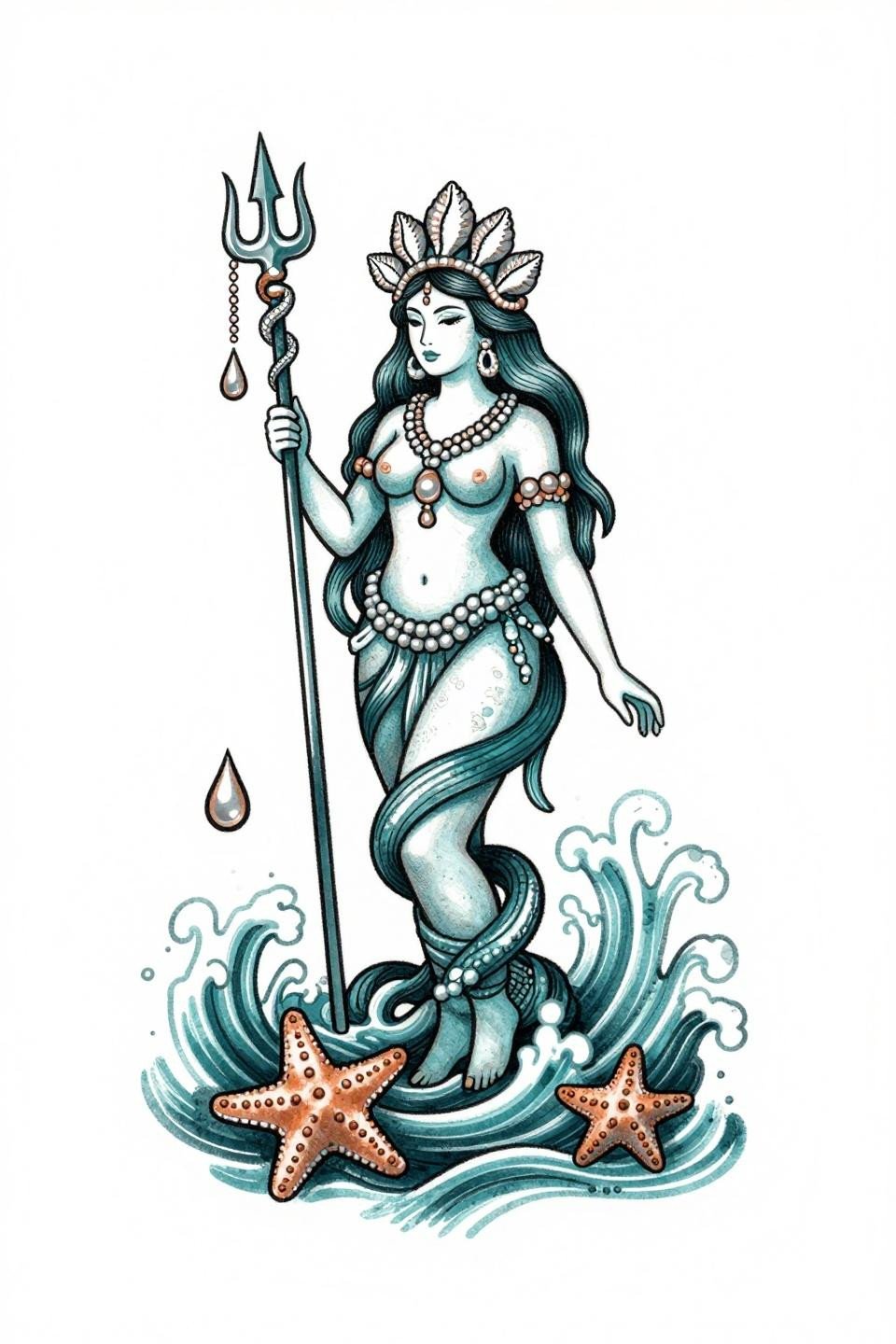
This Yemaya flash uses ignorant style line weight at 2-3pt, with intentional wobble that reads as handmade rather than clumsy. The deep teal and copper palette locks the Yoruba ocean deity into something visually specific, not generic mermaid territory.
Flat color fills at this weight hold on most skin tones without patchiness, but copper metallics in ink can oxidize on warmer undertones over time. Confirm your artist has healed metallic-adjacent work in their portfolio before committing.
Aphrodite in Trash Polka: Controlled Chaos Around a Sacred Figure
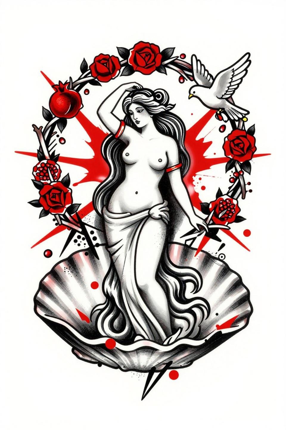
Trash polka works here because the crimson slash geometry creates tension against the classical Aphrodite figure, making the composition feel argued rather than assembled. The collaged text fragments read as ritual annotation, not filler.
This style is one of the harder reads on darker skin tones. The red-on-black contrast compression requires an artist who works in trash polka regularly, not one who has done it twice. Check the healed portfolio, not just the fresh shots.
Hecate Triple-Face in Grey Wash: Radial Symmetry as Protective Logic
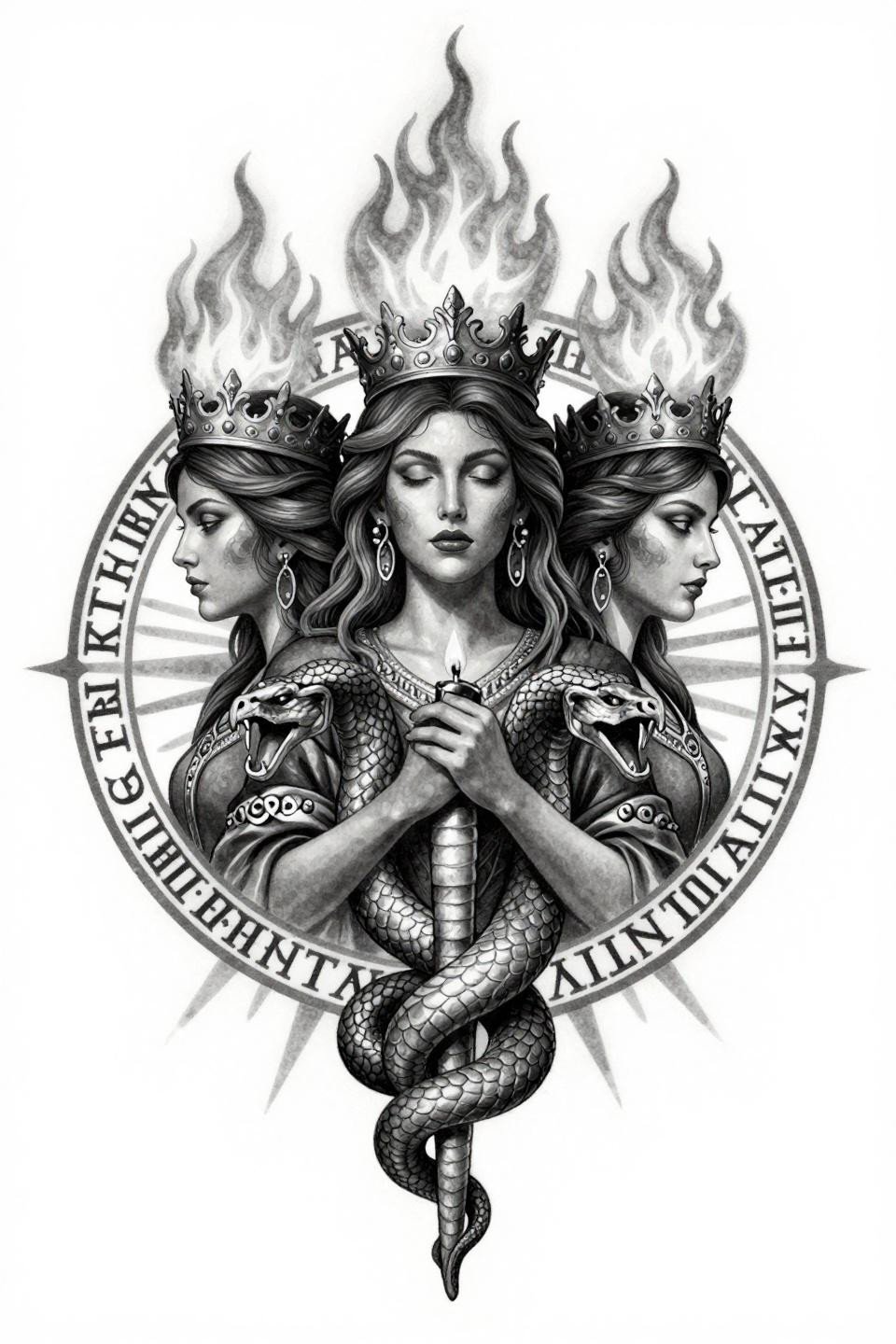
Chicano grey wash on a radially symmetric composition like this lives or dies on grey wash dilution control, specifically the gradient from dense black midtones to open pale wash at the outer runic border. No muddy transitions allowed.
Protected placements like the sternum or upper back give this style its best shelf life. Stretch zones will pull the sigil circle out of round within a few years, collapsing the visual logic of the design entirely.
Selene Moon Goddess: Sketch Raw Energy With Structural Discipline
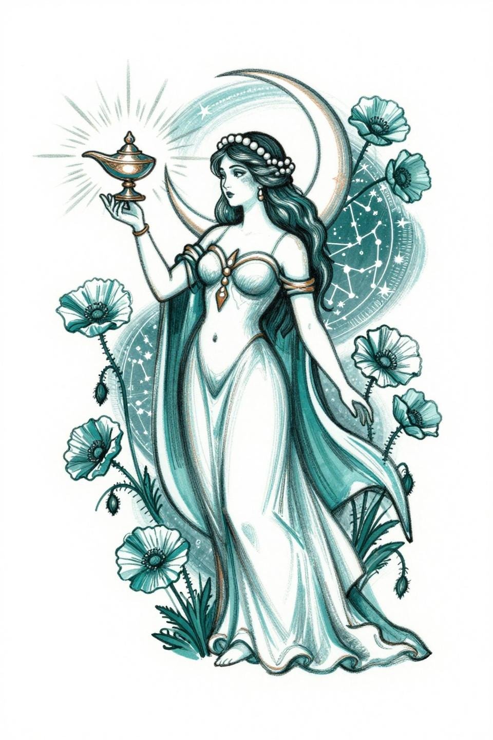
The loose gestural linework here is deceptive. Sketch raw style requires more technical control than it looks like, because every visible correction reads as a flaw rather than intentional texture.
The constellation map backdrop gives the artist measurable negative space to work with, which keeps the composition from collapsing under the poppy and cloud density. Good reference for spiritual back placement inspiration at larger scales.
Hecate Triptych in Old School: Three Moon Phases, One Structural Argument
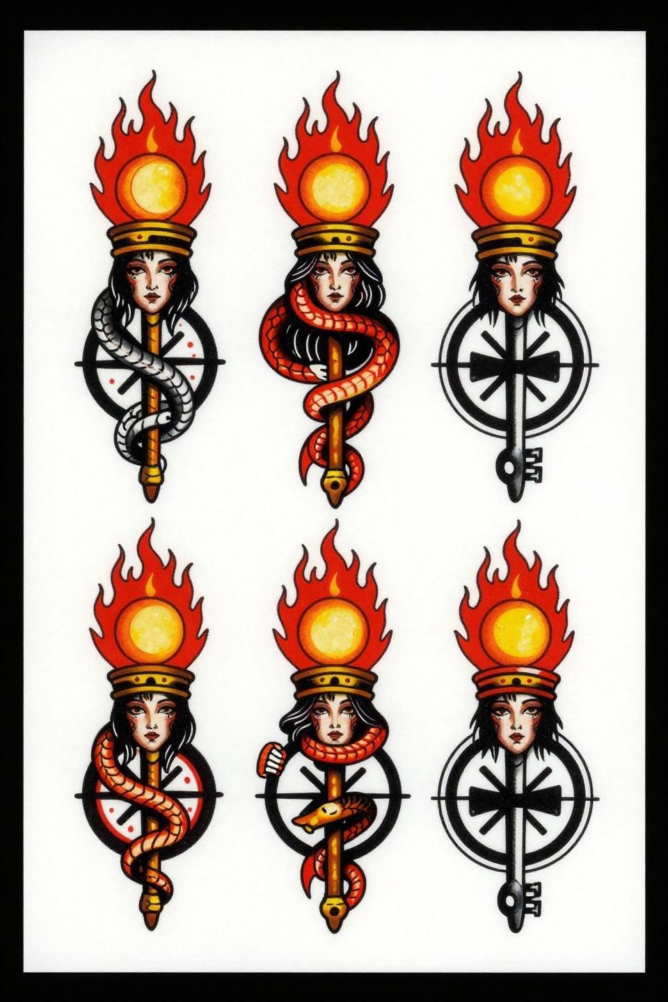
Three-panel triptych compositions work in old school sailor flash because the bold 3pt outlines give each panel visual independence while the crossroads frame holds them together as a single read. Crimson and black flat fills are the longevity signal here.
Bold 2-3pt outlines at this weight hold clean for 10 or more years on most placements. This design is built to age, not just photograph well fresh out of the wrap.
Gaia in Celtic Knotwork: Earth Deity Rendered in Interlaced Engraving
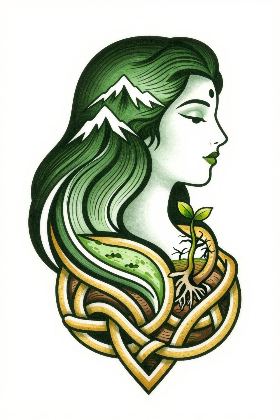
The hair-to-mountain-range transition is the compositional anchor here, and the parallel line engraving technique defines the form without relying on filled fields. Forest green and gold hold well on lighter skin tones but need bold outline weight to maintain contrast on olive and deeper tones.
Celtic knotwork bordering is technically demanding. Consistent knot spacing across curves is the skill signal. Any drift in the interlace rhythm reads immediately on a circular composition like this. Check the artist’s knotwork close-ups, not wide shots.
Art Deco Mystical Stack: Three Symbols That Earn Vertical Placement
Stacked vertical compositions suit the spine and sternum better than most formats, and this art deco design earns that placement through vector-precision geometric linework that keeps each of the three symbols visually distinct under movement.
For collectors interested in modern spiritual symbol designs, this stacked format is a lower-commitment entry point than a full sleeve. The design scales cleanly between 3 inches and 8 inches without losing detail.
Triple Moon With Eye of Horus: Single Needle Spiritual Work Done Right
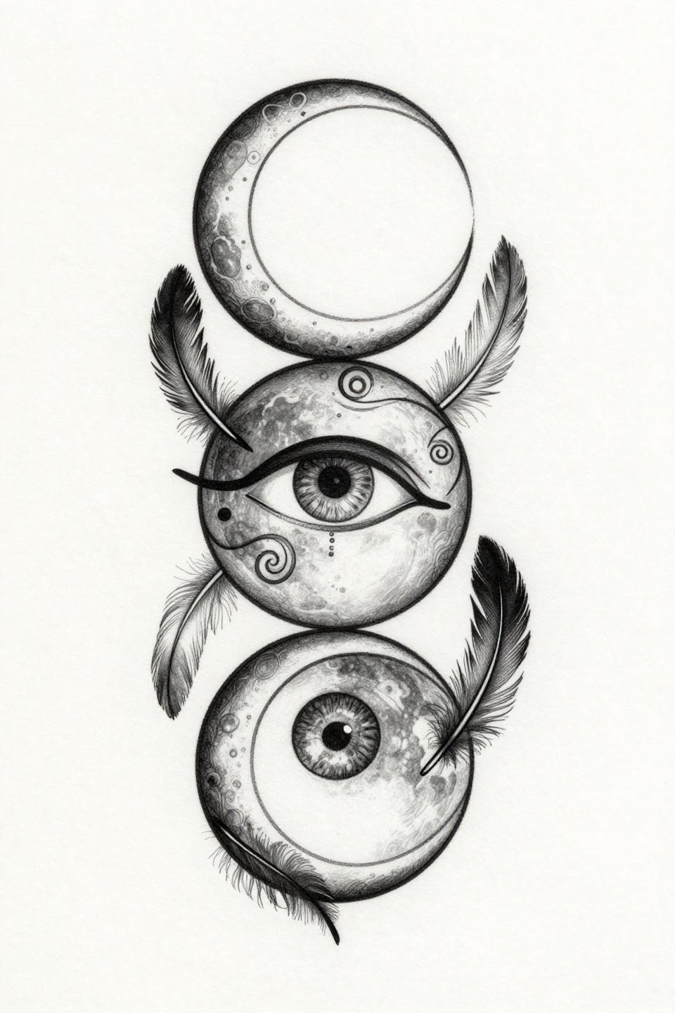
This is 1RL single needle work at its structural limit. Hairline strokes at 0.5mm carry the entire design, and the grey wash dilution for midtones needs to stay crisp or the Eye integration reads as smudge rather than symbol.
On lighter skin, this reads sharp for 3 to 5 years before the finest lines start to soften. On olive and darker tones, go up in line weight now. A heavier 3RL version of this same composition would outlast the original by a decade.
Fine Line Spiritual Tattoos and the Placement Problem Nobody Mentions
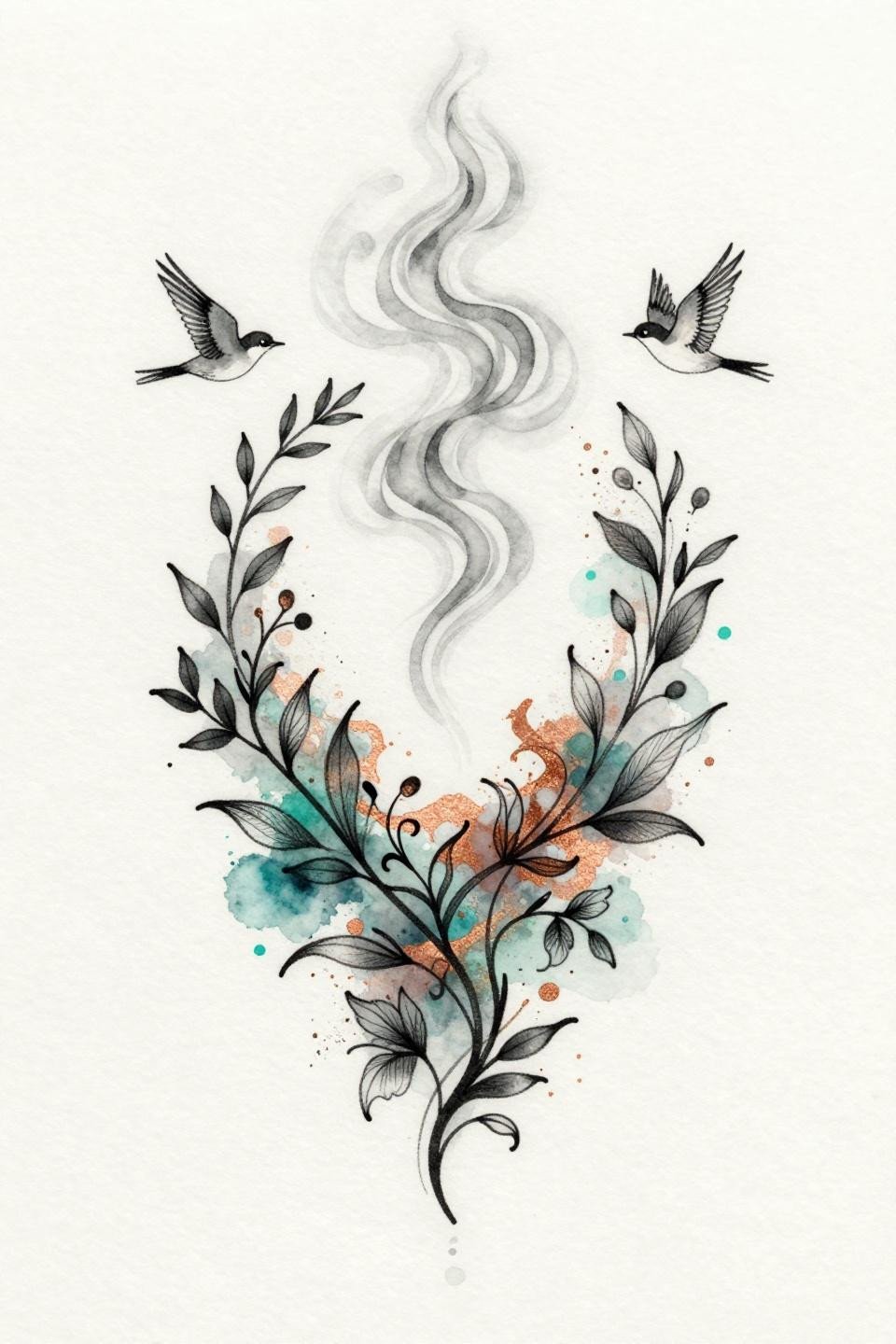
Watercolor bleed behind clean linework is a two-session commitment, not a single sitting. The structural ink lines need to be fully healed before the wash layer goes in, or the bleeds follow the trauma channels and the edges go soft immediately.
Without a defining outline holding the botanical vine network, this style blurs by year three to five. The copper metallic splashes are decorative, not structural. Confirm the artist builds the line layer first and treats the color as secondary.
Phoenix Mandala for Healing: Botanical Etching That Ages Like Printmaking
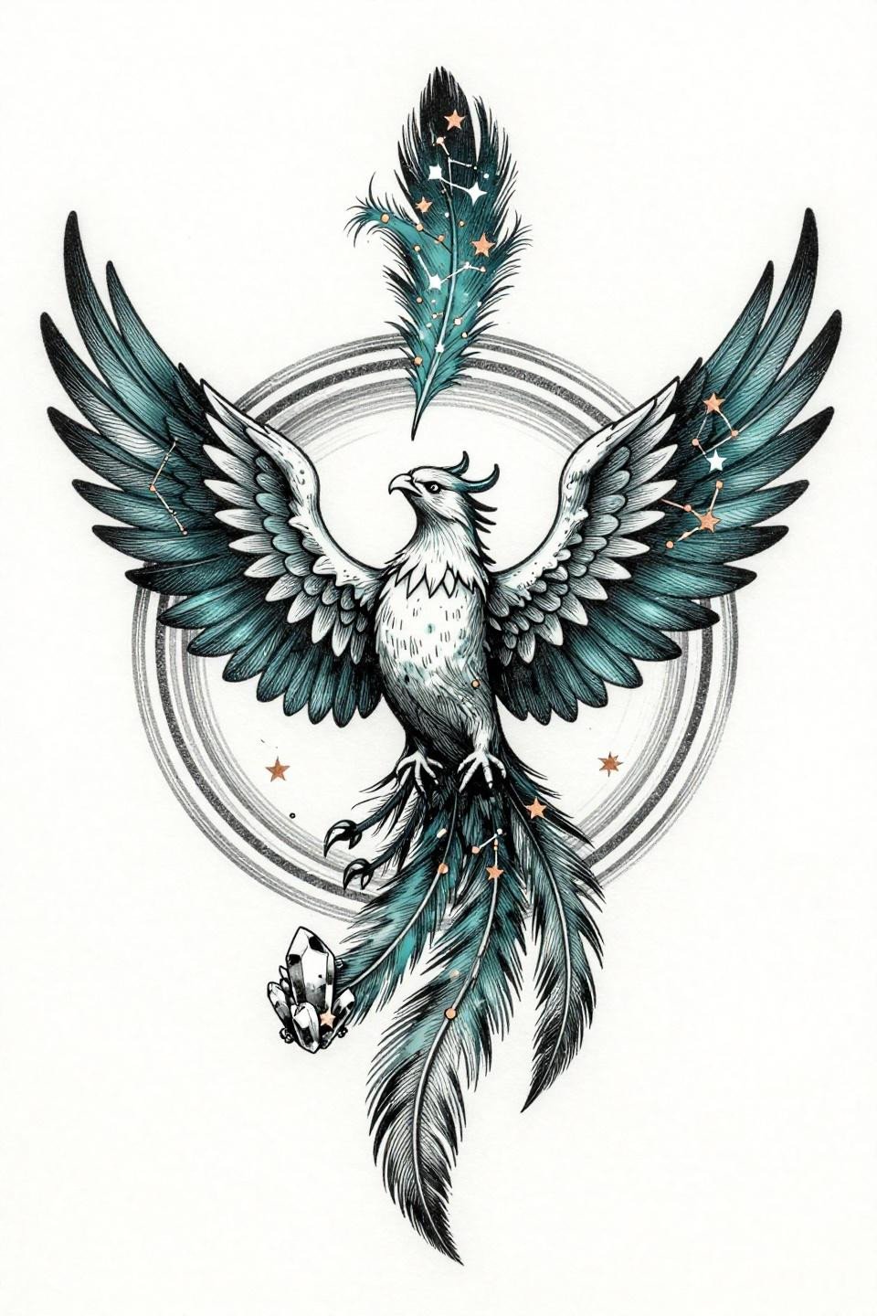
Crosshatch etching on a bilateral mandala reads like printmaking on skin, and this phoenix design uses woodcut block precision strokes to define the wing spread without relying on fill density. The constellation tail is where the technical risk sits: plotted star points need consistent spacing or the map reads random.
This references the same structural logic as meaningful henna and spiritual art traditions where geometric repetition carries the symbolic weight. Protected chest or upper back placement gives the bilateral symmetry the best chance of staying locked over time.
Ouroboros Mandala: Surrealist Rendering of a Symbol That Already Has Weight
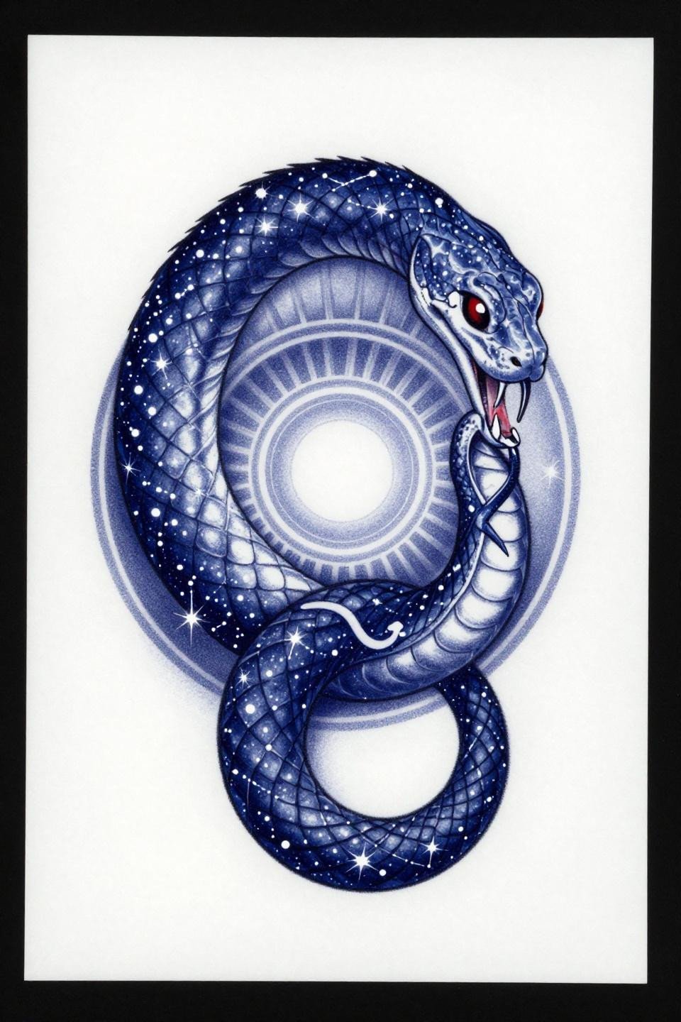
The constellation scale rendering is what separates this ouroboros from every generic version on the market. Whip shading with curved strokes inside the coil bodies creates the galaxy fill without going solid black, which keeps the circular form readable at smaller scales.
Deep indigo ages differently than pure black on skin. It can shift slightly warm over years, which actually works here. The crimson accent at the mouth-tail junction is the only place the color does compositional work, and that restraint is the right call.
Kali in Irezumi: Six-Armed Deity With Japanese Structural Discipline
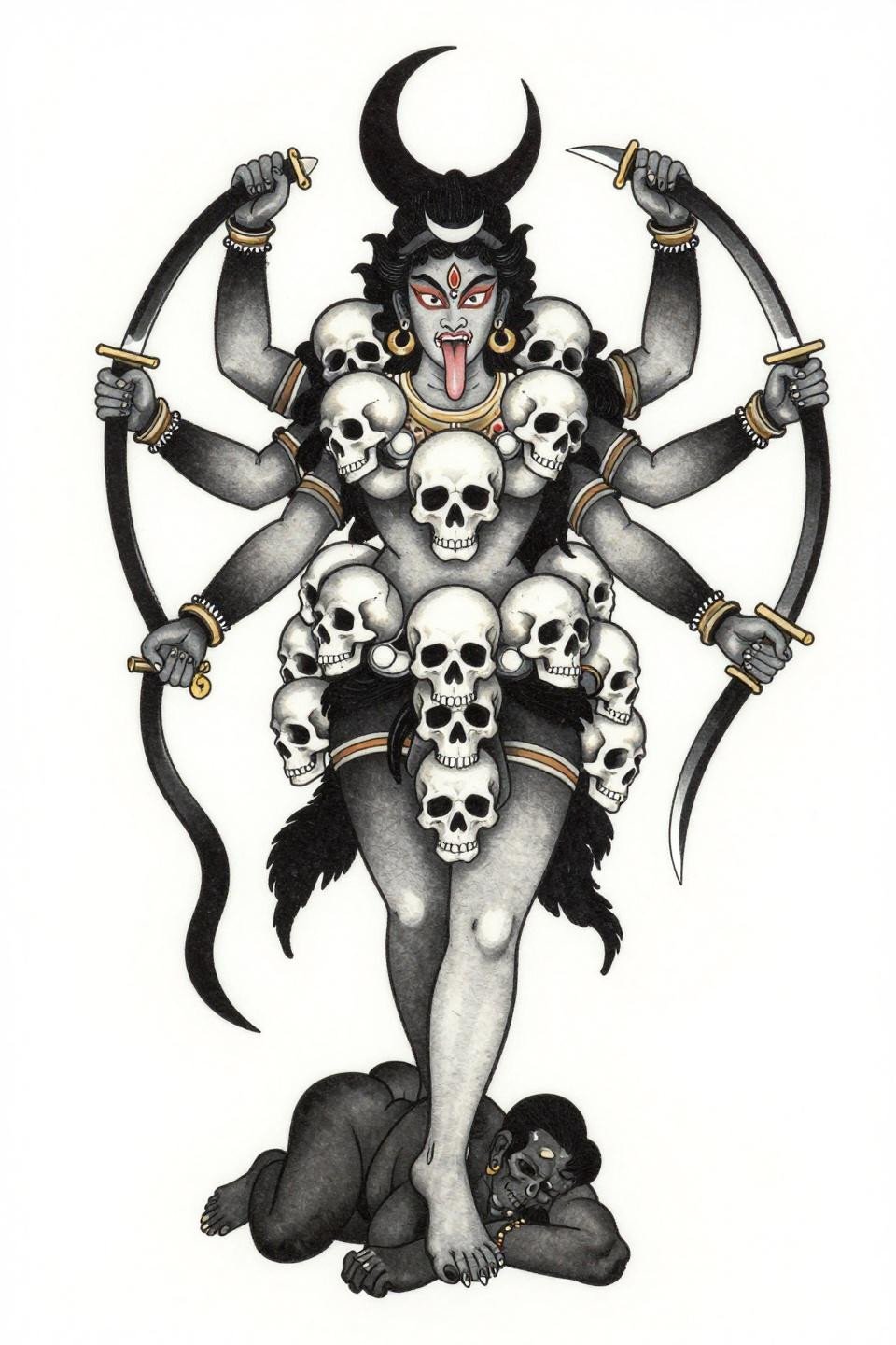
Irezumi structure applied to Kali is a cross-cultural compositional choice that works because both traditions share bold outline discipline and flat fill logic. The six radiating arms demand an artist who can hold consistent 2-3pt weight through direction changes without wobble.
The tell on this design is the curves at the weapon tips. Any wobble at those direction changes reads immediately in a centered vertical silhouette. This is not a design for an artist who has only done Irezumi fish and waves.
Hamsa in Tribal Geometric: Palmistry Grid as Sacred Architecture
The palmistry line grid inside the hamsa palm is doing double duty: it fills the hand form and references divination lineage simultaneously. Dense linear patterning at this scale needs an artist who works in blackwork tribal regularly, because line compression at small sizes turns grid into mud fast.
Flat black fills at this weight hold indefinitely when the artist commits to multiple saturation passes. Single-pass blackwork looks fine fresh but shows patchiness within two years, especially on textured skin areas.
Lakshmi in Art Nouveau: Peacock Frame as Compositional Weight
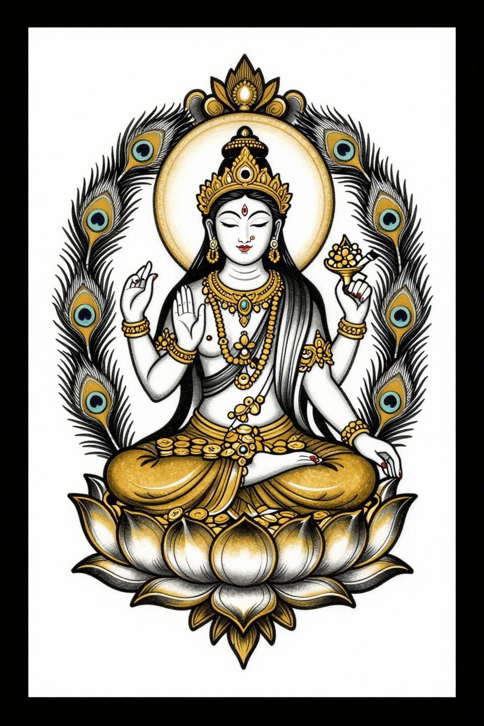
Art nouveau framing on a seated deity figure works because the mirrored peacock feather border gives the composition a built-in symmetry anchor that survives placement on curved surfaces. Gold and black flat fills read high contrast on all skin tones when the outline weight is held at 2-3pt.
This design suits the thigh or upper arm better than the ribs. The bilateral feather frame needs a flat surface to maintain its visual balance. Curved placement compresses one side and the symmetry logic collapses.
Moon Seedling in Continuous Line: Minimum Detail, Maximum Placement Flexibility
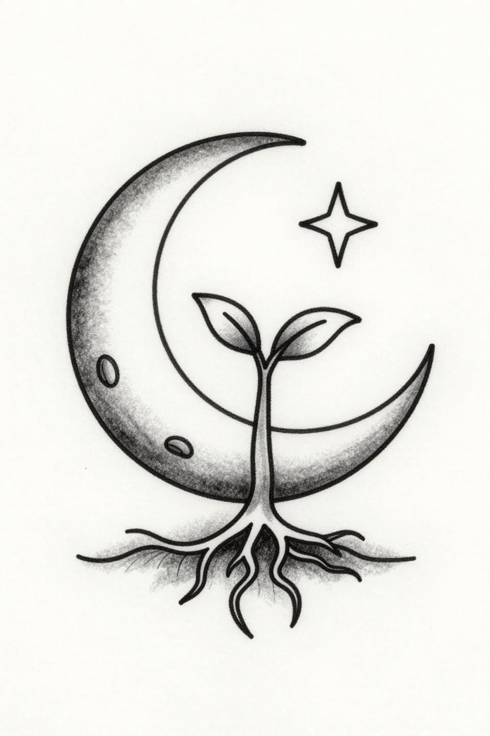
Continuous line work at 0.5mm is one of the most technically demanding formats because there are no corrections possible without a visible restart. Single unbroken hairline strokes like these require an artist who controls both machine speed and hand pressure across the full stroke.
This scale and simplicity make it a strong candidate for wrist or inner forearm, but friction placements mean touch-up every two to three years minimum. The open negative space is intentional compositional breathing room, not laziness.
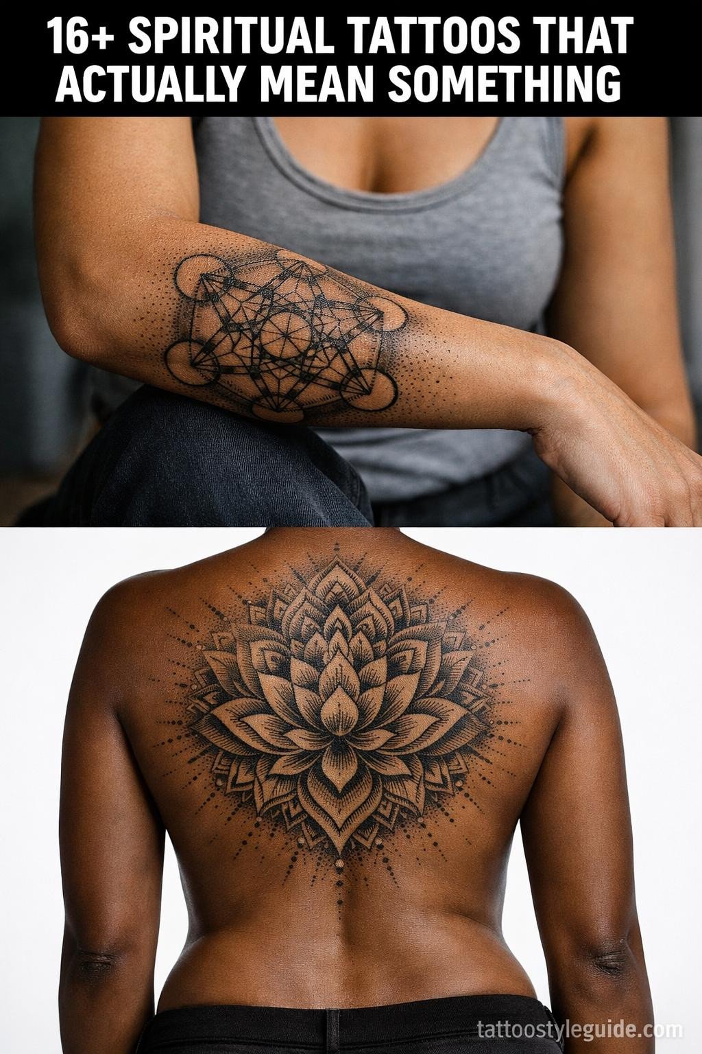
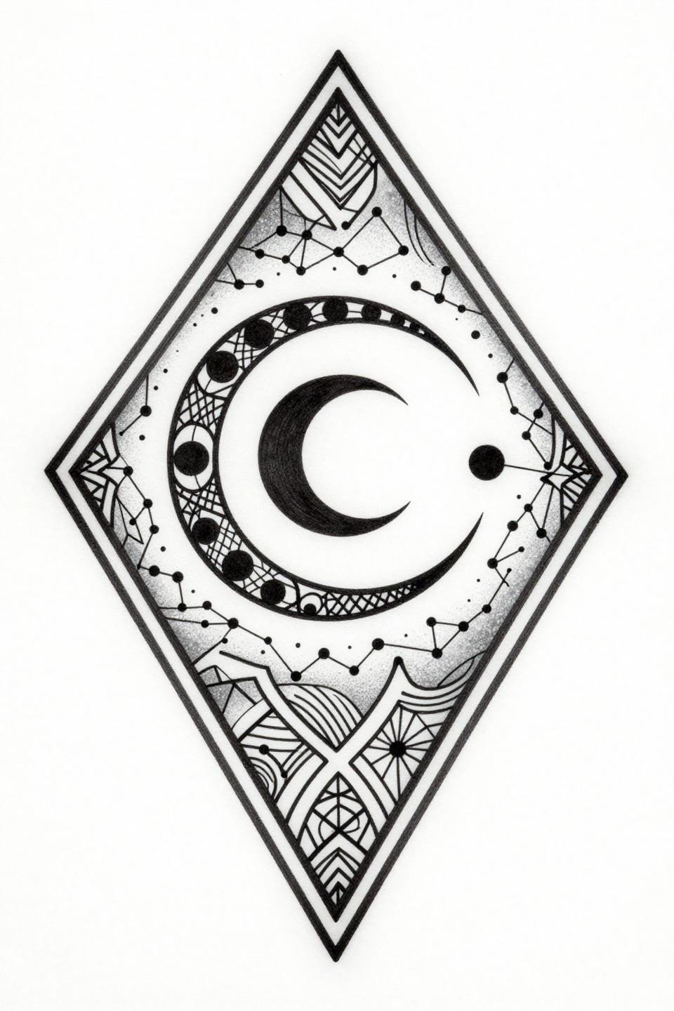
Dotwork Mandala Lotus: Stipple Density as the Durability Signal
The stipple density gradient here runs from 90 percent coverage at the third eye center to open white space at the outer petal edges. This is the technical range that makes a dotwork mandala read at distance and hold detail up close simultaneously.
Look for consistent dot size across the full gradient in the artist’s portfolio. Uneven dot sizing in the midtones is the beginner signal, and it reads clearly at year two when the ink settles. This design rewards an artist who has done sustained dotwork, not dabbled in it.
Filter these references down to three, maximum five, before sending them to your artist. Match the style to your artist’s documented strength, the placement to the composition’s symmetry requirements, and the scale to what the design needs to read correctly. These references do the brief. Use them that way.