Tattoos with deep meaning fail most often not from poor symbolism, but from weak execution. A concept that matters to you deserves linework that holds. Vague subject matter and thin outlines age into the same blur.
The designs that last share one technical trait: the symbolism is locked into a composition that works on its own, even stripped of context. Meaning carried by structure, not explanation.
When the Quill Becomes the Message
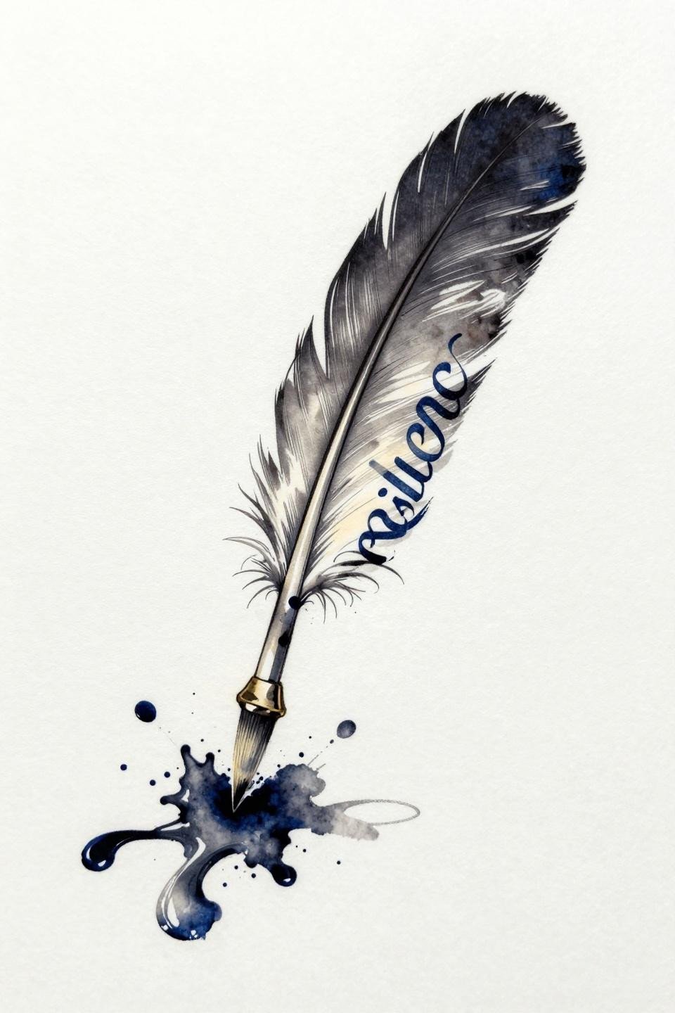
An art deco quill dissolving into ink splatter, its stem transitioning into cursive script spelling resilience, the lettering bleeding into scattered droplets at the edges. The diagonal composition handles the natural flow of forearm and rib placements without forcing symmetry.
The calligraphic bleed technique here requires an artist who works wet, not dry. Check their lettering portfolio specifically, because script control is a completely separate skill from figure work.
The Script That Runs Out of Ink on Purpose
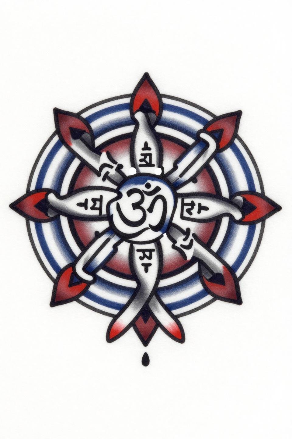
An infinity knot rendered in old school flash weight, a micro Sanskrit Om inscribed at the intersection point, concentric rings expanding outward into a circular mandala frame. The bold 2-3pt outline weight is what separates this from trend-chasing: it holds clean for a decade on most skin types.
Deep indigo with crimson accent reads well on both fair and medium skin tones. On olive or deeper skin, that outline weight is doing critical contrast work, and anything lighter would disappear within five years.
Botanical Anatomy as a Permanence Argument
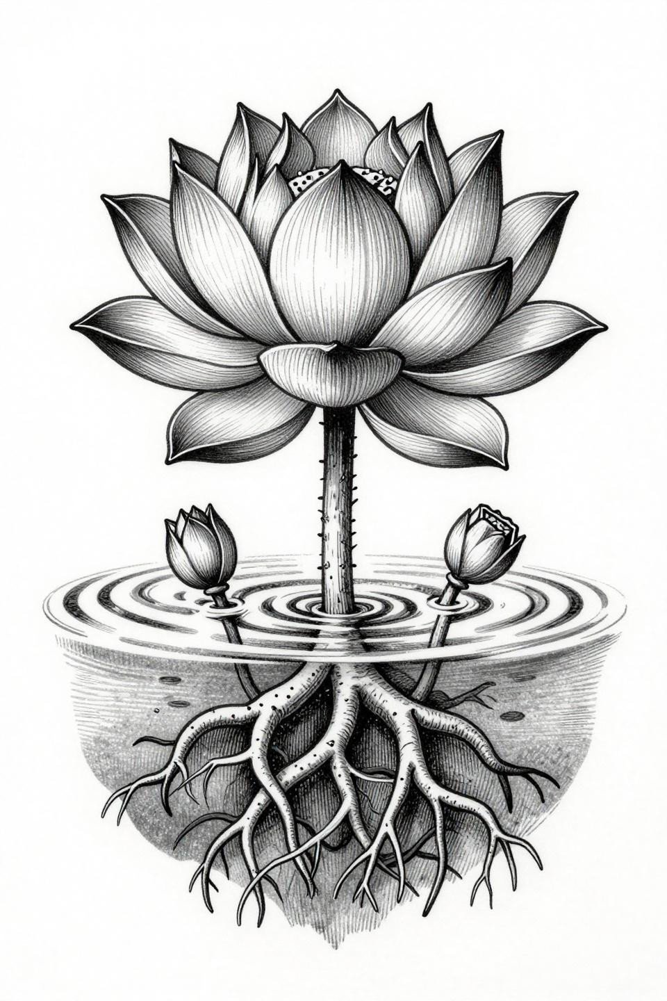
A lotus rendered as a botanical cross-section, roots tangled below the waterline and the bloom progressing from closed bud to full open in one vertical frame. The woodcut etching treatment uses dense crosshatch parallel-line engraving to build dimensional shadow that reads as scientific illustration, not decorative symbol.
This is a strong candidate for back placement, where the vertical botanical frame maps directly onto the spine without distortion. Protected placement gives the crosshatch linework its best shelf life.
Trash Polka Handles Fragility Without Softening It
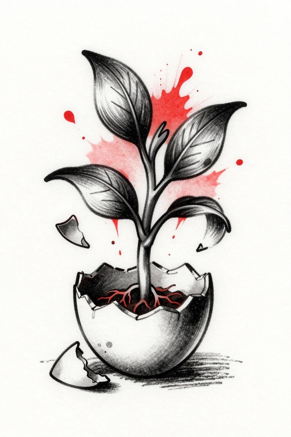
A seed sprouting through a fractured eggshell, shell fragments curling asymmetrically outward while ink splatter elements collide against the organic forms. Trash polka’s signature collision of aggressive brushwork and organic linework makes rupture the visual language, not the exception.
The two-color discipline, crimson and black only, keeps this readable at scale. Any artist proposing additional colors on this concept is missing the point of the style entirely.
Dotwork Phoenix Built for the Long Read
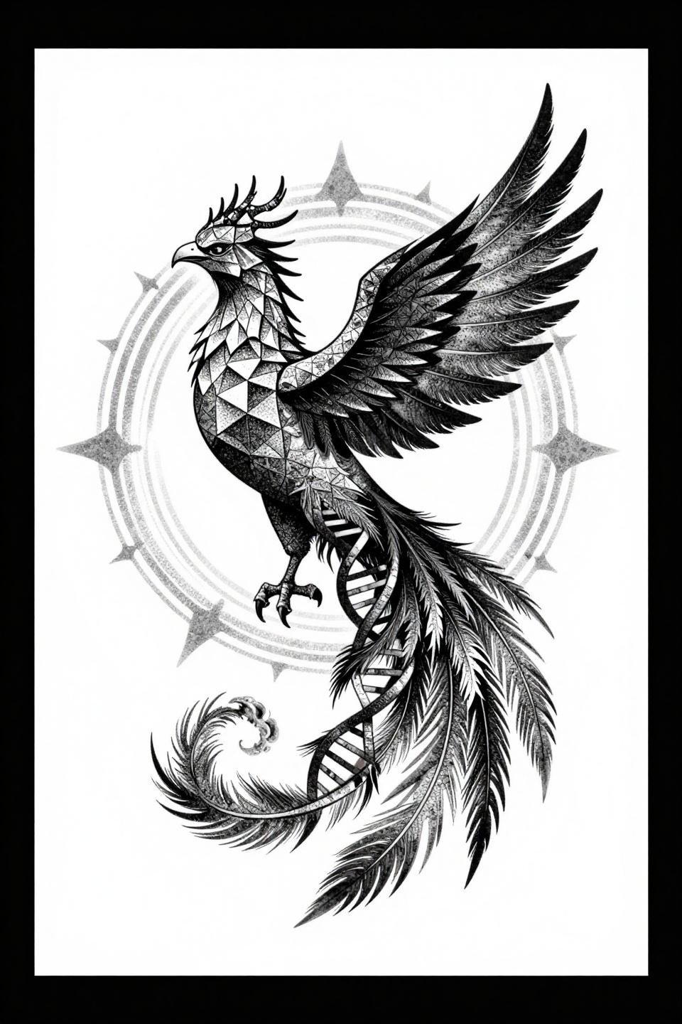
A blackwork phoenix in sideways profile, geometric crystalline plumage and a DNA double helix forming the tail feathers, ashes clustered at the base within a circular mandala frame. The stipple dot gradient runs from 90% density at the core shadows to open at feather edges, a range that requires consistent dot size control across the full piece.
Look for that consistency in healed work portfolios, not fresh shots. Fresh stipple always looks sharper than it will at the six-month mark. For more on sigil tattoos with personal spiritual meaning, the dotwork tradition carries over directly.
Small Format, No Forgiveness: The Labyrinth Case
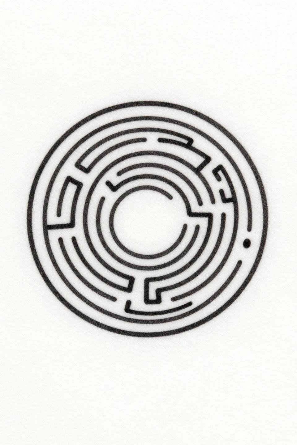
A single circle containing one continuous labyrinth path coiling inward to an open central void, executed entirely in hairline 0.5mm single-needle 1RL strokes with no fills and consistent path width throughout. The restraint is the concept.
Wrist or sternum placement gives this its best chance. Finger or hand placement means touch-up every two to three years minimum, and the tight path spacing will bleed together faster than any other design in this collection.
Celtic Knotwork With Something to Prove
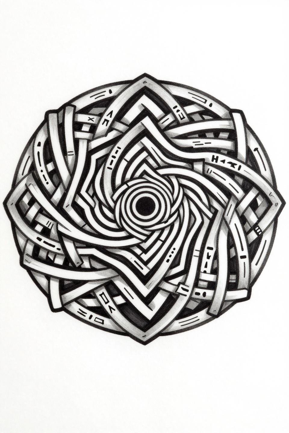
A geometric spiral labyrinth built from Celtic interlocking knotwork, concentric rings and nested triangular segments alternating solid black and open white fields, mirrored rune-like symbols inscribed throughout. Vector-precision linework at this density signals an artist who designs in geometry, not just traces it.
The alternating positive-negative field structure holds contrast on most skin tones without added color. At year ten, the white fields will have softened slightly, which actually improves the piece by reducing visual noise. See mehndi patterns with symbolic tradition for comparable geometric density in a different lineage.
Crescent Moon Carries More Than It Looks
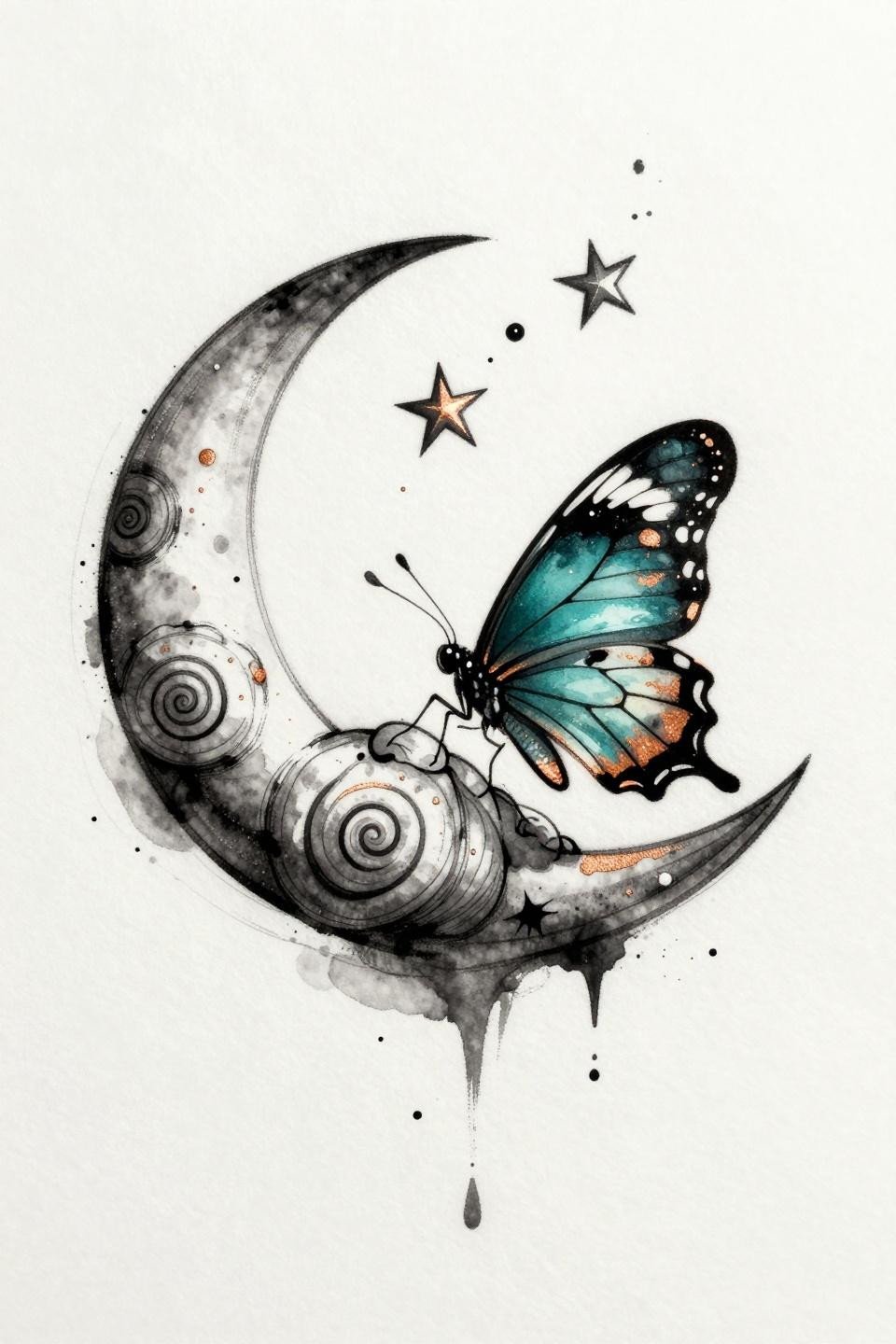
A crescent moon cradling a butterfly mid-emergence from chrysalis, spiral shell motifs woven into the wing patterns, three ascending stars trailing in diagonal flow, rendered in watercolor-style teal and copper bleeds over black linework. The black linework anchor is what prevents this from becoming a five-year blur.
Watercolor without anchoring outlines blurs by year three to five on most placements. The black linework here is structural, not decorative, and any artist who proposes removing it to make the piece “softer” is optimizing for the photo, not the tattoo.
The Iris That Watches Itself
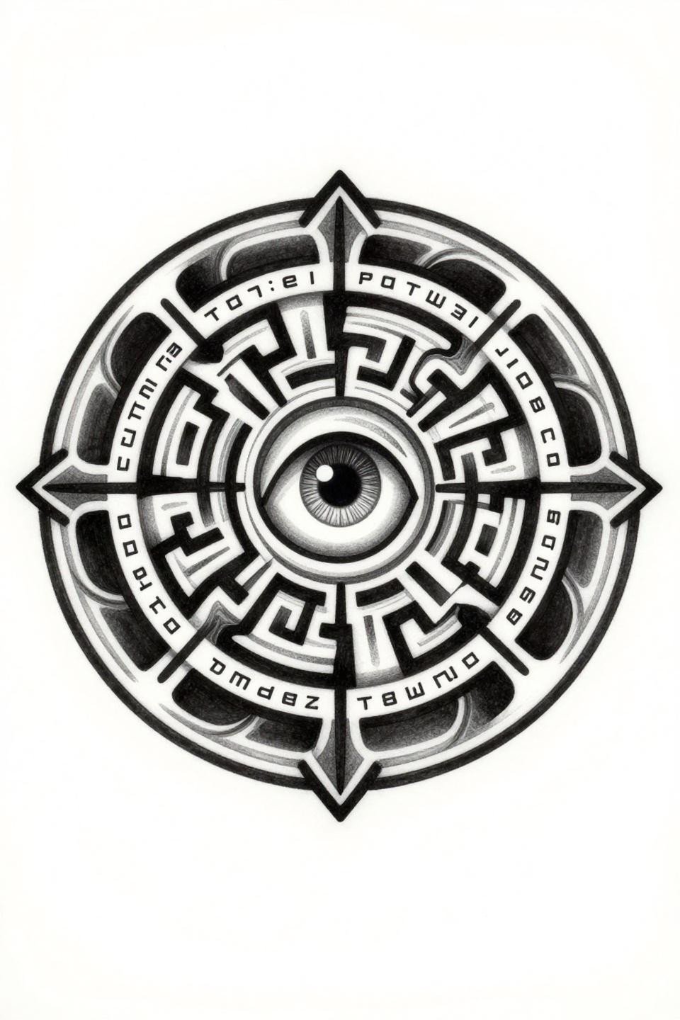
A tribal geometric labyrinth mandala with a central iris pupil, concentric circular paths rotating inward, bold tribal fill segments alternating solid and open, mirror-reversed text inscribed on the outer ring. The bilateral symmetry at this scale is a real skill test: any wobble on the circular paths reads immediately from a distance.
Upper arm or thigh gives a circular design this size room to breathe. Forcing it into a tight joint placement breaks the symmetry under movement and compresses the outer text into illegibility.
Mountain Silhouette With Interior Detail That Earns Attention
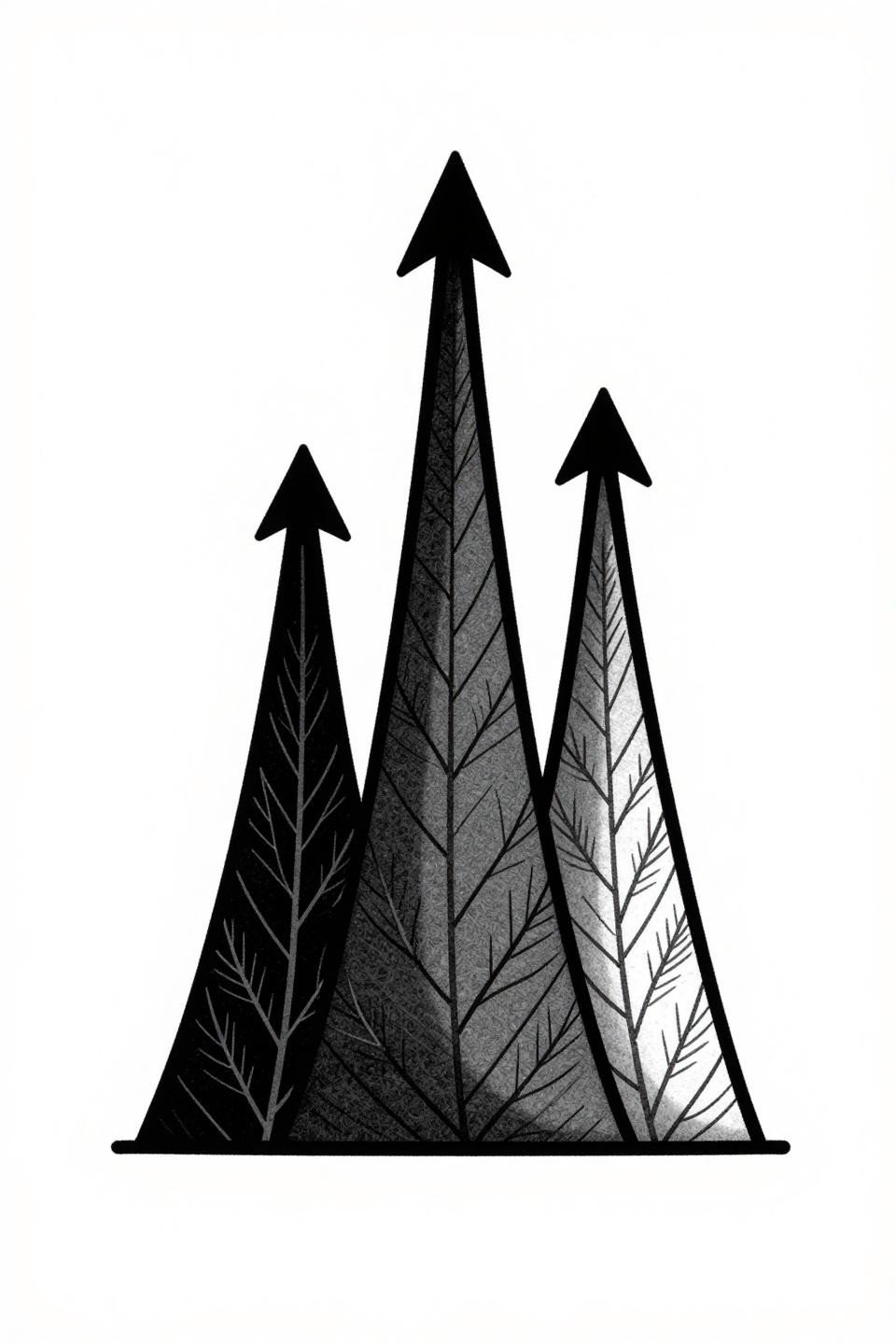
Three ascending triangle peaks forming a mountain silhouette, solid black fills with interior negative space revealing hairline botanical vein patterns. The contrast between 2pt border outlines and 0.5mm interior hairlines is what makes this read at both distance and close inspection.
On olive or deeper skin tones, those interior hairlines need a confident artist hand. Fine interior lines in solid black fields lose contrast faster than standalone linework, and the effect collapses if the artist plays it safe with the fill saturation.
The Hourglass That Frames Time as Growth
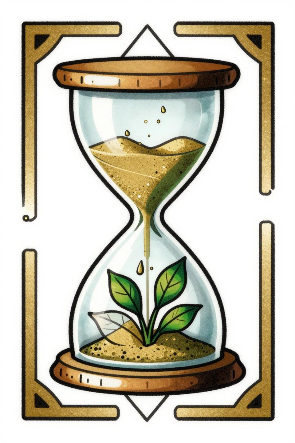
An art nouveau hourglass in diamond frame composition, sand cascading from the upper chamber into a lower chamber cradling a seedling, a single diagonal crack across the glass face. The forest green and gold flat fill palette is classic art nouveau restraint: two colors doing the work that lesser designs need five colors to attempt.
Diamond frame compositions work cleanly on the forearm or sternum, where the elongated vertical axis aligns with the body’s natural line. The crack detail is what gives it weight over a standard hourglass, and any artist who tries to remove it to simplify the piece is misreading the concept.
Scientific Illustration as Emotional Shorthand
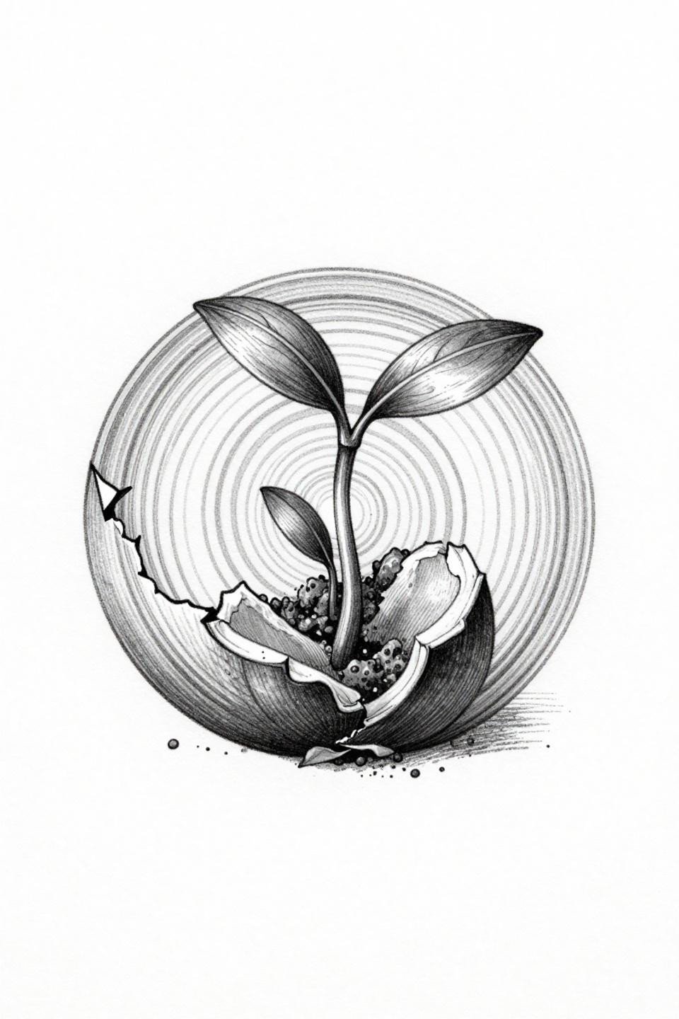
A cracked seed pod split horizontally, a seedling with unfurling cotyledon leaves emerging from the breach, concentric growth rings visible in cross-section, rendered in botanical scientific etching style. The crosshatch etching shading with parallel line shadows builds dimensional depth that flat linework cannot approach.
This is a strong self-healing tattoo reference because the symbolism is embedded in biological fact, not metaphor. For collectors interested in henna designs rooted in cultural significance, the botanical tradition intersects here.
Half Root, Half Branch: The Heart Split by Function
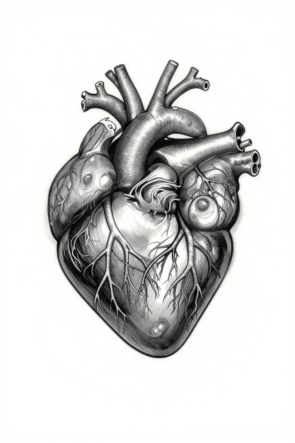
An anatomical heart divided vertically: the left half holding intricate root systems spreading downward, the right half carrying upward-reaching branches with delicate leaves, subtle growth rings visible in the cardiac tissue. Bilateral symmetry along a vertical axis at this detail level is the hardest execution in the botanical scientific style.
The grey wash dilution for midtone depth requires an artist who mixes wash ratios deliberately, not by feel. On lighter skin tones, this reads with full tonal range. On deeper skin, the midtones compress and the piece reads closer to pure linework, which still works given the crosshatch density.
Geode Interior as a Metaphor That Doesn’t Need Explaining
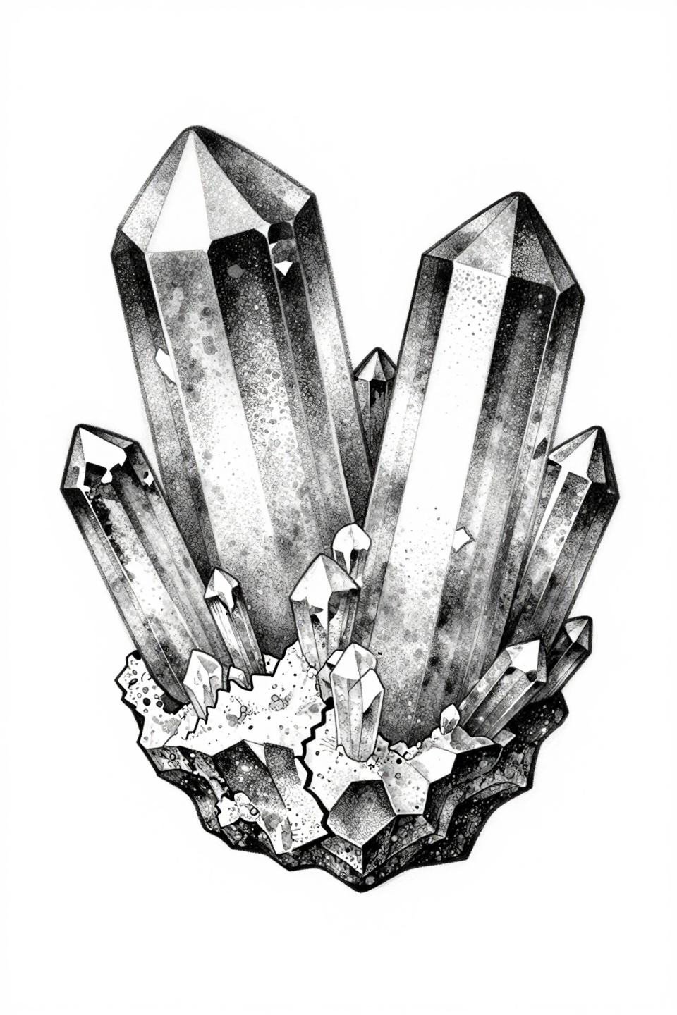
A cracked geode split into asymmetrical halves, faceted quartz crystal formations of varying heights emerging from the interior, layered mineral striations visible in cross-section, executed in stipple dotwork from dense clusters at crystal facets to open stipple at the outer edges. The stipple density gradient here does the same work as grey wash but with better long-term clarity.
Asymmetrical compositions like this read better on curved placements, shoulder cap or outer thigh, where the organic split follows the body’s contour rather than fighting it.
Neo-Traditional Phoenix, Two Colors, No Compromise
A neo-traditional phoenix in mid-ascent, wings fully spread, tail feathers dissolving into upward-pointing triangles, geometric angular flames at the base, a crown of stars above. Two colors only: crimson and black, bold 2-3pt outline weight throughout, flat fills with no patchiness.
Flat fills with no patchiness are the veteran signal here. A beginner oversaturates to compensate. A seasoned artist gets even coverage in one or two passes and moves on, and the difference shows in healed photos at six months.
One Line, One Loop, Nothing Wasted
An ouroboros serpent rendered in one unbroken continuous line, encircling a sprouting seedling with two unfurling leaves at center, hairline single-stroke linework with no fills and no grey wash. The continuous line constraint means the entire design lives or dies on speed consistency: any pause in needle movement creates a visible weight change in the stroke.
This is the kind of design where portfolio vetting matters more than the consultation. Find an artist whose single-line work shows no wobble at direction changes, because the serpent’s coil has several, and they will all be visible forever.
Pick three from this collection based on placement first, symbolism second. A design that maps badly to its location will undercut its meaning every time you see it. Scale, body contour, and skin tone narrow the real shortlist fast.
Send those three references together. A strong reference set gives your artist a direction to design from, not just an image to copy. That difference shows in the final piece.