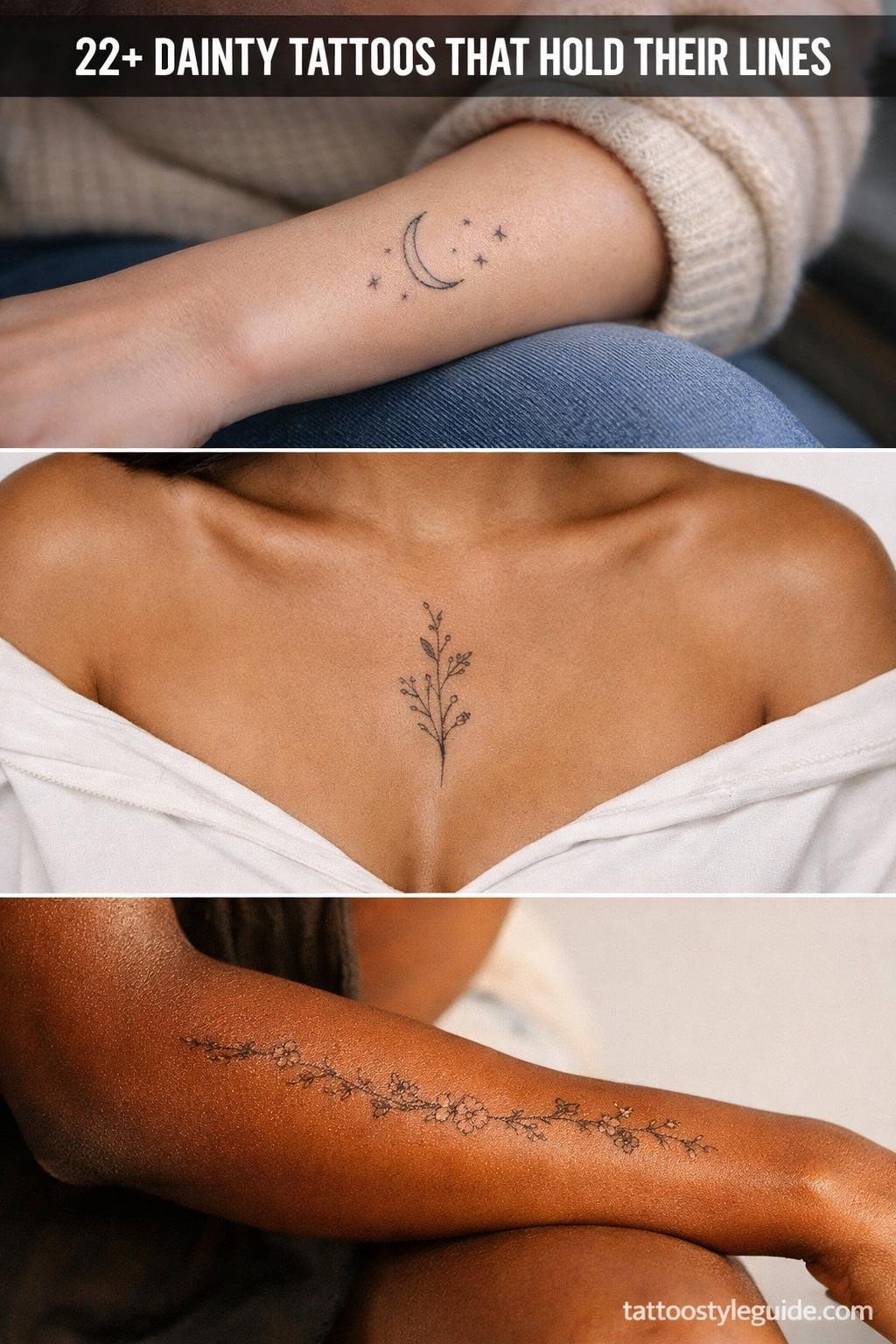
Dainty tattoos fail when artists treat “small” as permission to skip structure. Fine line work at this scale demands more technical control than a traditional sleeve, not less. A 1RL single-needle line has no margin for speed variation.
The designs that hold their character past year five share one trait: deliberate weight contrast. Even a hairline botanical sprig needs one slightly heavier anchor stroke to keep it readable as skin matures.
When the Letter Carries the Whole Design
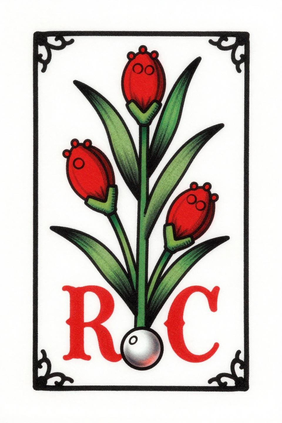
Old school sailor flash structure applied to a botanical initial: the letter C anchors a sage stem with clustered seed pods, framed in a vertical rectangle with corner flourishes and a single pearl at base.
Bold 2-3pt outlines at this scale are the longevity signal. The crimson flat fill holds contrast as skin relaxes, where hairline-only versions of the same concept blur into grey smears by year seven.
Art Nouveau Lines at Wrist Scale: What Actually Survives
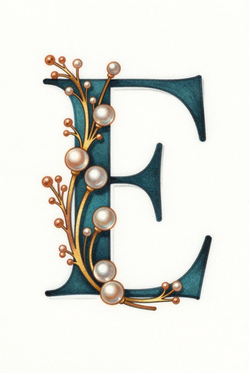
Art nouveau letter E with goldenrod sprigs and graduated pearl beads, framed by hairline side flourishes in a stacked vertical composition with flat copper and deep teal fills.
On olive and darker skin tones, the copper and teal fill combination maintains visual separation where all-black fine line work tends to flatten. Placement on the inner wrist accelerates fading though, plan for a touch-up pass at year three.
Celtic Structure Gives Botanical Work Its Backbone
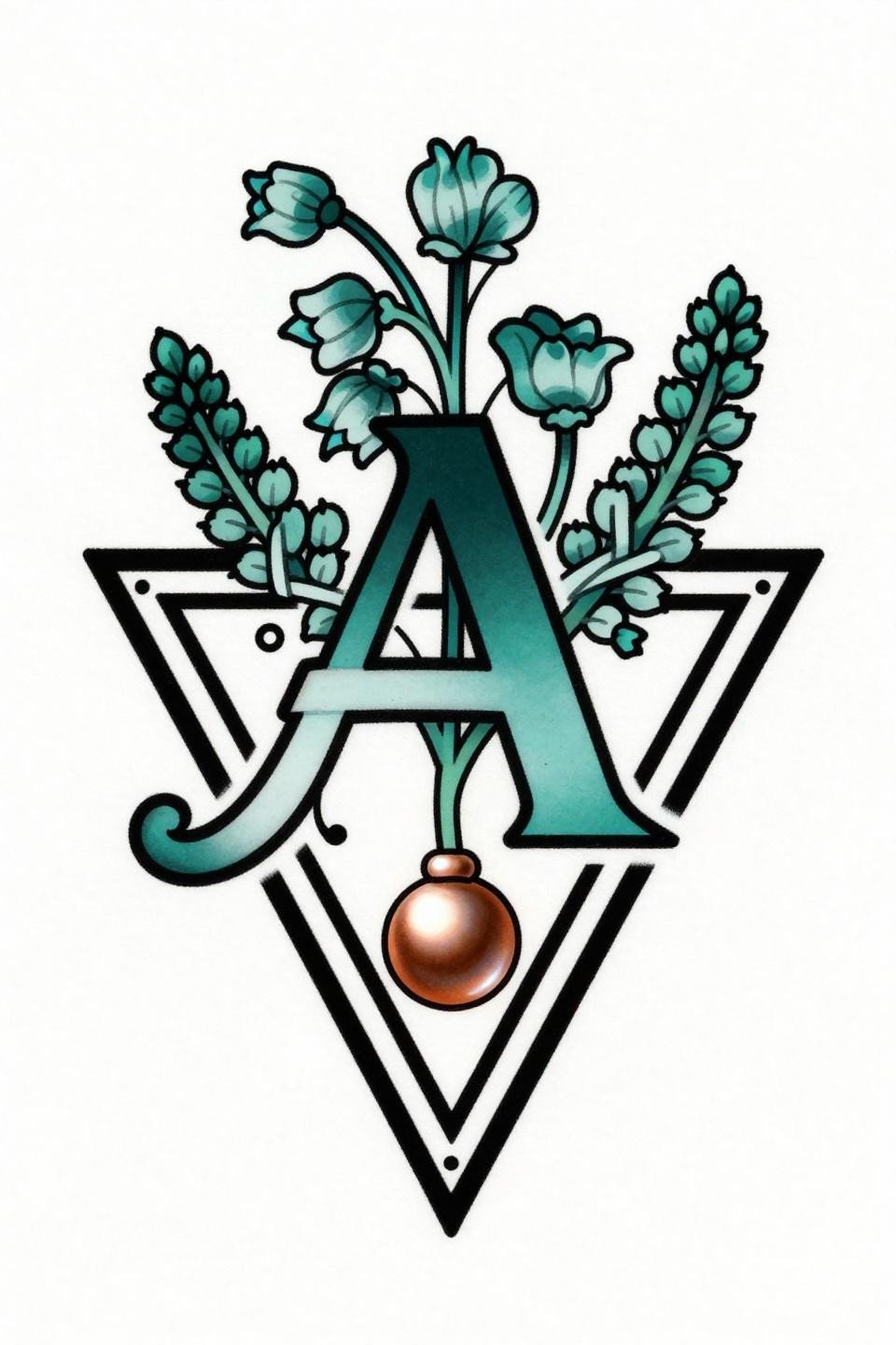
Letter A set inside a bold triangular frame with Celtic interlaced knot borders, heather sprigs bearing bell-shaped blooms, and a copper pearl suspended at the base.
The triangular frame does structural work that botanical-only designs skip: it gives the artist a hard geometric boundary that keeps composition readable at small scale. Interlaced knotwork borders also age more gracefully than open vine work because the line density supports itself.
Ignorant Style Is Not an Excuse for Weak Drawing
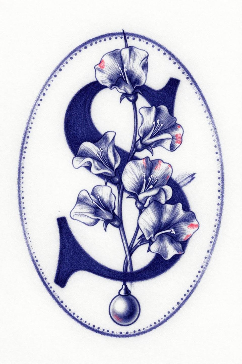
Letter S woven through a sweet pea vine with four clustered blooms, enclosed in an imperfect hand-drawn circular frame with loose border dots and deep indigo and crimson fills.
Ignorant style demands a draughtsman, not a beginner. Gestural raw strokes that read as intentional on paper become muddy on skin if the artist lacks the line control to fake imperfection with precision. Check their healed portfolio, not just fresh shots.
Grey Wash Hatching That Holds Without Muddying
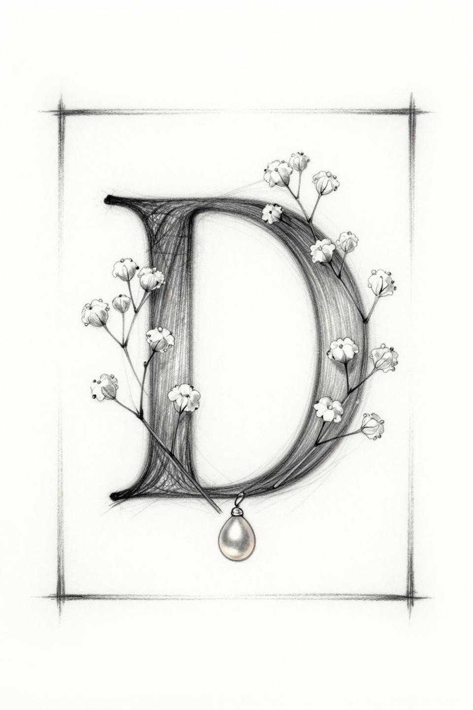
Sketch-style letter D with baby’s breath florets and a suspended pearl, framed horizontally, rendered in loose pencil linework with open hatching and grey wash midtones.
Grey wash dilution from dense to open is what separates a readable sketch tattoo from a smudge. No muddy midtones means the artist controlled their dilution ratios, a skill that shows in healed work within eighteen months.
Watercolor Bleeds Need an Anchor or They Drift
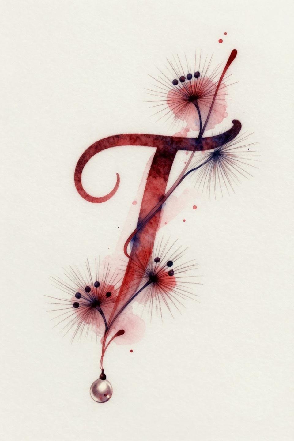
Letter T interwoven with a milkweed vine and seed pods, flowing in a diagonal right-leaning composition, with crimson watercolor bleed sitting behind clean deep indigo outlines.
Watercolor without an anchoring outline blurs by year three to five. This design works because the indigo outline structure stays legible even as the color wash softens, the vine and letter retain their form independently of the color layer.
When the Poppy Frame Makes the Letter Secondary
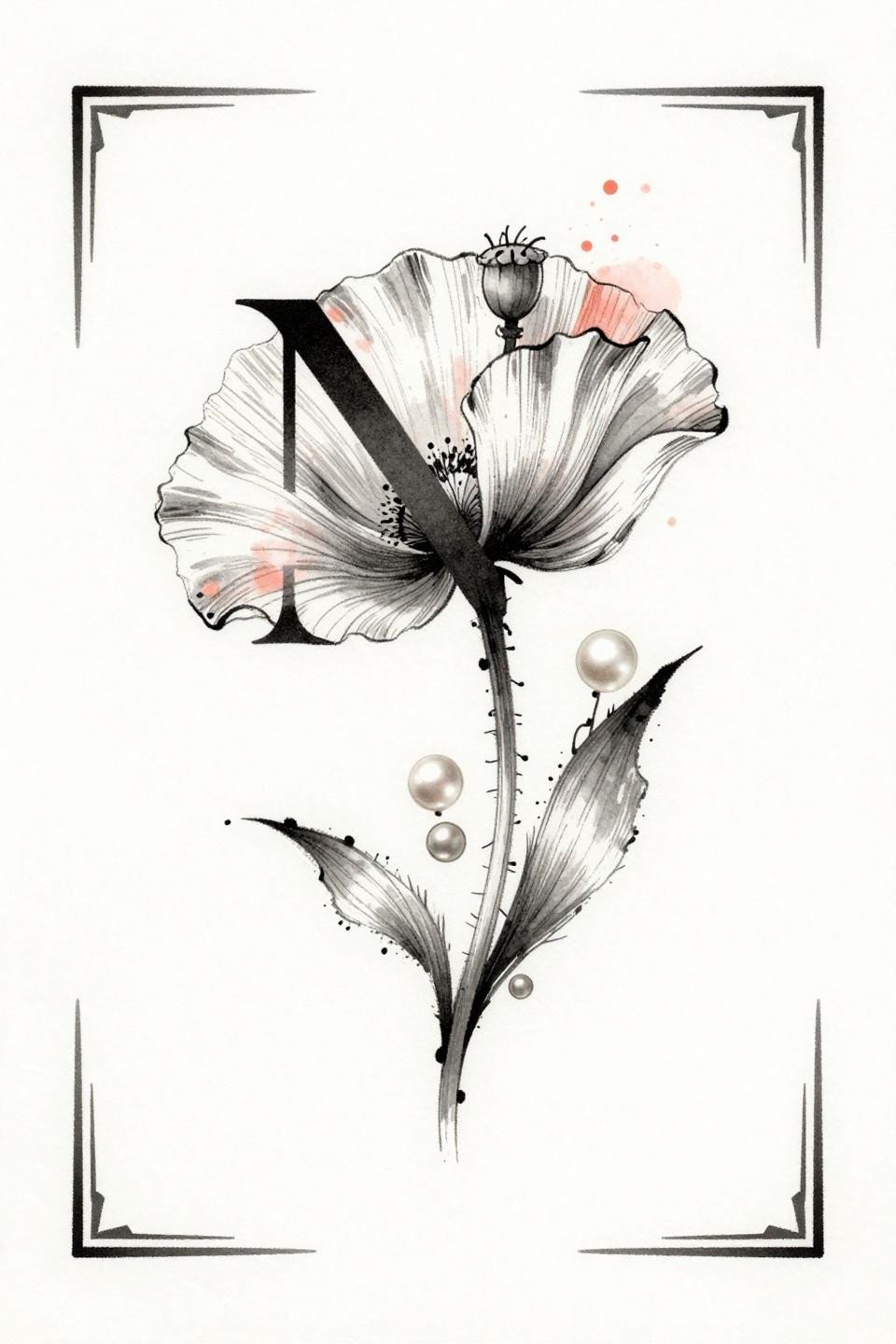
Letter N with a nodding poppy seedpod stem and three graduating pearl beads down the right margin, framed minimally with corner flourishes and a coral watercolor bleed behind charcoal linework.
The pearl bead cascade is a visual weight anchor on the right margin, balancing a composition that would otherwise tip left with the letter mass. This kind of compositional thinking is what separates flash-quality design from filler work.
Navy Wash Over Clematis: Reading on Lighter Skin
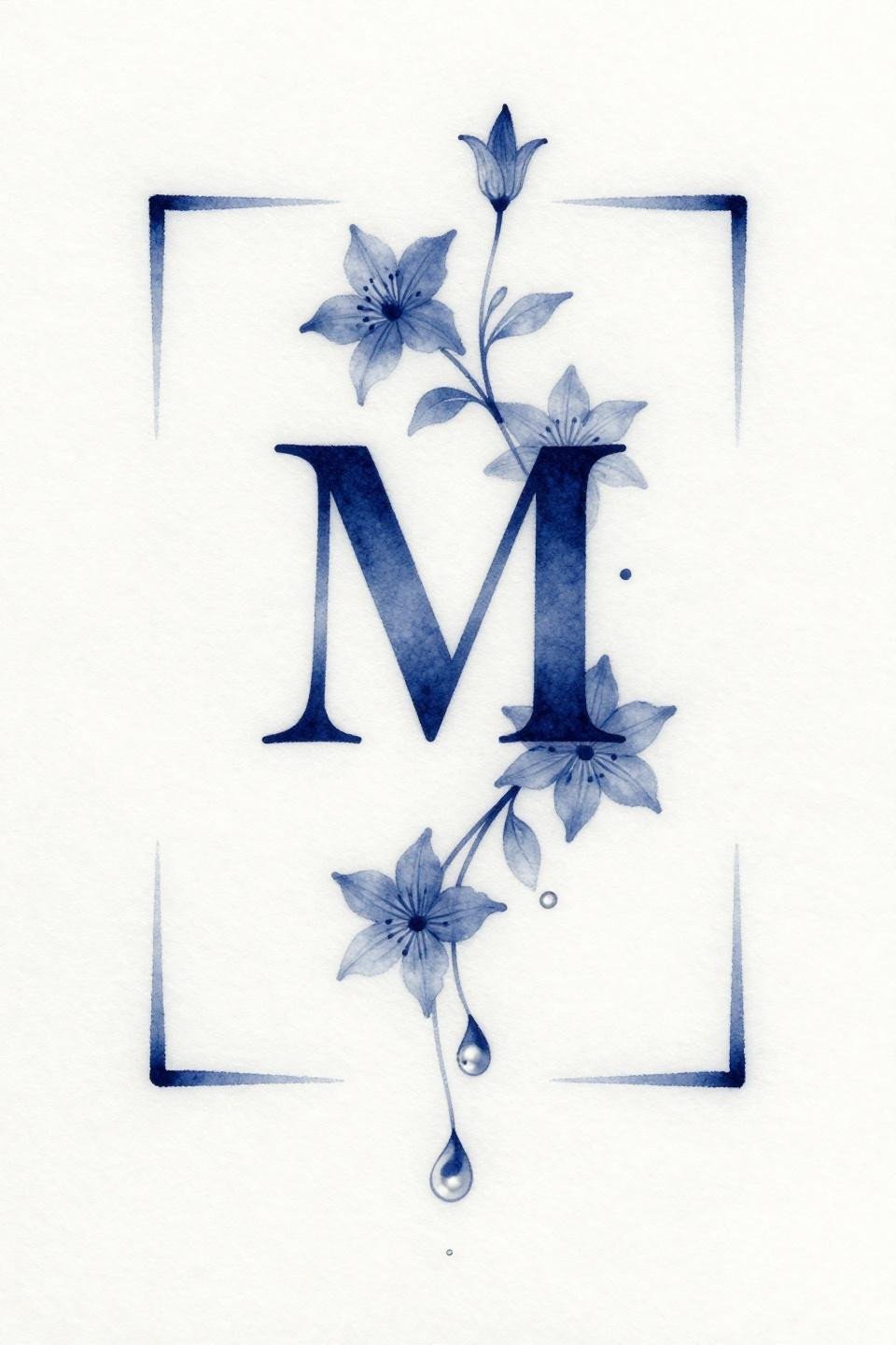
Letter M with a clematis vine bearing three star-shaped blooms and a pearl teardrop base, framed in a minimalist square with a soft navy watercolor wash bleeding through the linework.
On lighter skin tones, this navy wash reads as a cool-toned haze that flatters the botanical linework. Single-needle 1RL work at this scale needs an artist who controls needle speed precisely, any hesitation in the stroke shows immediately at this weight.
Teal and Copper on Jasmine: High-Risk Color Pairing Done Right
Letter P with a jasmine vine bearing three star blooms with visible stamen marks, a suspended pearl at base, framed in a minimalist square with teal watercolor bleed and warm copper metallic accents on the pearl and corners.
Copper metallic ink fades faster than standard pigments, most artists will tell you it reads well for two to three years before requiring a refresh. The teal and copper contrast is worth it on protected placements like the inner forearm, where sun exposure is manageable.
Irezumi Brushwork Applied to a Scale It Was Never Designed For
Letter B woven through a clematis vine with four star blooms in a circular mandala frame, rendered in brush and ink calligraphic marks with grey wash dilution for midtones.
Applying Irezumi brushwork economy to a design this small is a technical flex, the style demands that every stroke carry structural weight with no filler marks. A grey wash that reads cleanly at two inches across means the artist knows their dilution ratios cold.
Hexagon Frame Plus Stipple: The Placement Tells You Where This Lives
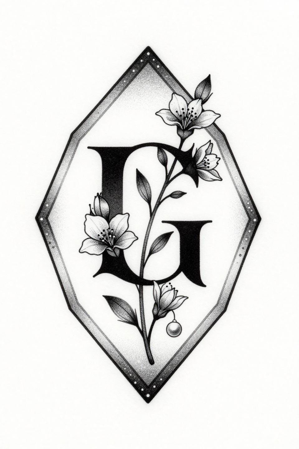
Letter G with a jasmine vine in a hexagonal frame, bordered by stipple dot accents, with dot density mapping from open at the edges to denser at center in a diamond composition.
This is a protected placement design: the stipple gradient needs consistent dot size across the full field to read correctly, and that requires skin that stays stable, think sternum, upper back, or inner arm rather than hands or fingers.
Art Deco Geometry at Thumbnail Scale: The Precision Problem
Letter R with a threadlike botanical tendril bearing three daisy blooms, framed in a circular tondo with hairline decorative border dots, rendered in 0.5pt vector-precision linework with bilateral symmetry.
Compass-drafted geometry at this scale is the tell: look for consistent spacing between radiating elements and no wobble at direction changes. Any deviation in the border dots reads as sloppiness in art deco work specifically because the style demands mechanical exactness.
Single Continuous Line: What the Butterfly Silhouette Hides
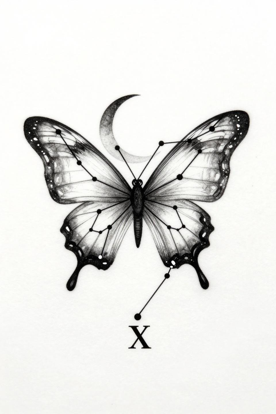
Constellation points connected by one unbroken hairline path forming an abstract butterfly silhouette, with a crescent moon between the upper wings and Roman numeral IX at the lower apex in a diamond orientation.
The single continuous line format hides a problem: where the path crosses itself, the artist must maintain consistent stroke weight through direction changes without lifting. On skin, a speed variation at any crossing reads as a node, and nodes break the illusion.
The Ampersand as Anchor: Fine Line at Its Most Stripped Back
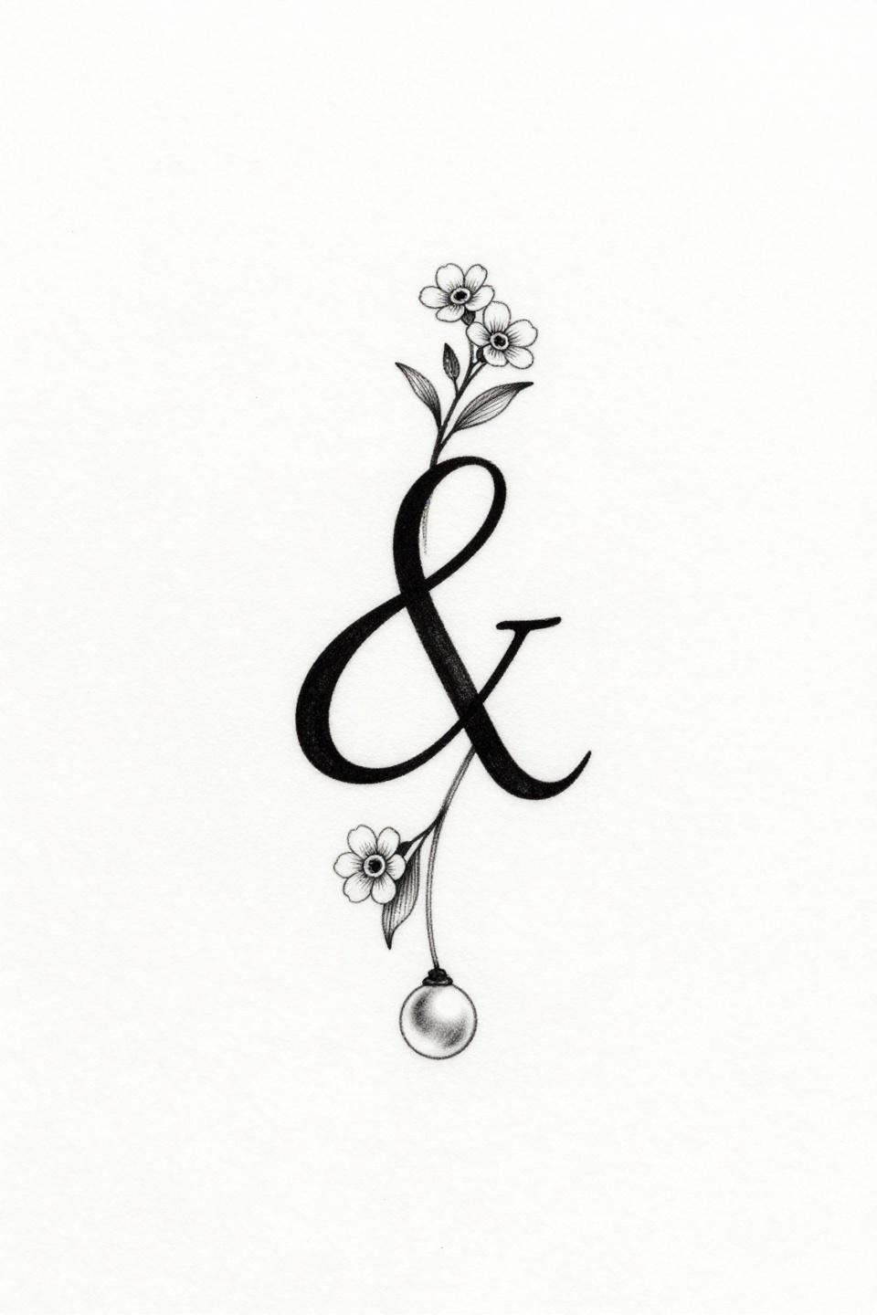
A lowercase script ampersand with hairline serif flourishes, a suspended pearl beneath the loop, and a threadlike botanical vine bearing two forget-me-not blooms, centered with open negative space and zero grey wash.
Zero grey wash means this design lives or dies on pure line contrast alone. On lighter skin that works for fifteen-plus years in a protected placement. On darker skin tones, the hairline strokes need heavier weight to maintain readable contrast long term.
Tribal Diamond Frame Changes a Moon Motif Entirely
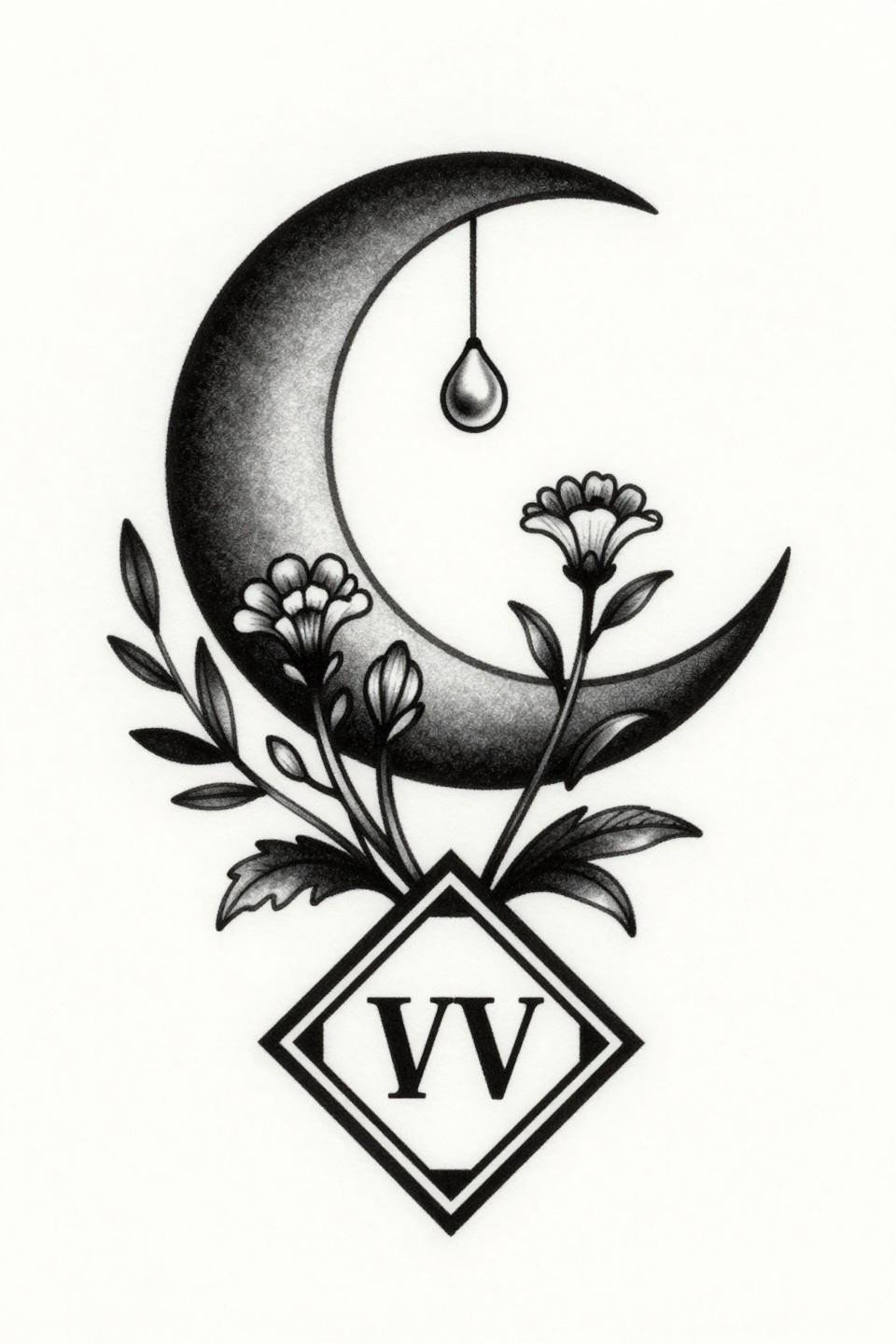
Crescent moon with a botanical vine bearing three wildflower buds and a suspended pearl teardrop, framed in a bold diamond with tribal angular border accents and Roman numeral IV at base, rendered in flat black fills.
The bold 2-3pt outline weight here is what gives this design its decade-long readability. Tribal geometric structures hold because the line mass is substantial enough to survive skin movement and the natural spreading that happens over years.
Neo-Traditional Grey Wash on a Symbol That Has to Earn Its Complexity
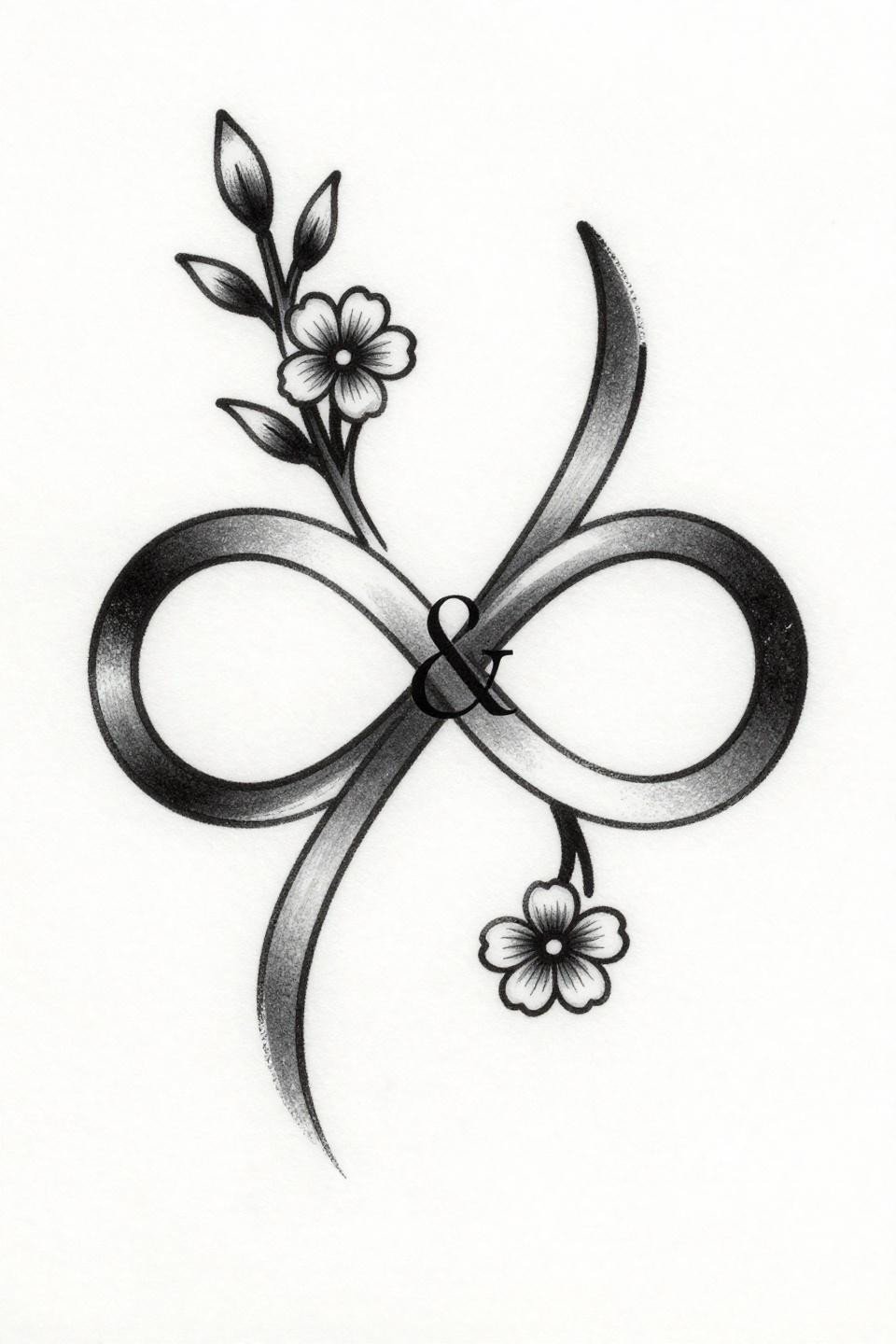
An infinity symbol woven through a botanical stem bearing two five-petaled flowers, with a serif ampersand nested inside one loop, rendered in 2pt black outlines with grey wash interior midtones.
Neo-traditional grey wash at this size needs soft shaded interior forms that transition cleanly without banding. Banding here reads as the artist using too few tonal passes, and at small scale there is no room to blend it out after the fact.
Etching Crosshatch in a Circle: The Density Has to Be Consistent

Crescent moon cradling a six-pointed star, encircled by a botanical laurel wreath with paired leaf clusters and a hairline serif numeral 8 at base, rendered in parallel line engraving with crosshatch shadows.
Parallel line crosshatch density is the artist signal here: look for ruled strokes that maintain consistent spacing across curved forms, not just straight runs. Where the crosshatch follows the laurel leaf curves without compressing, you are looking at someone with real technical patience.
Botanical Scientific Linework: Weight Variation Does All the Work
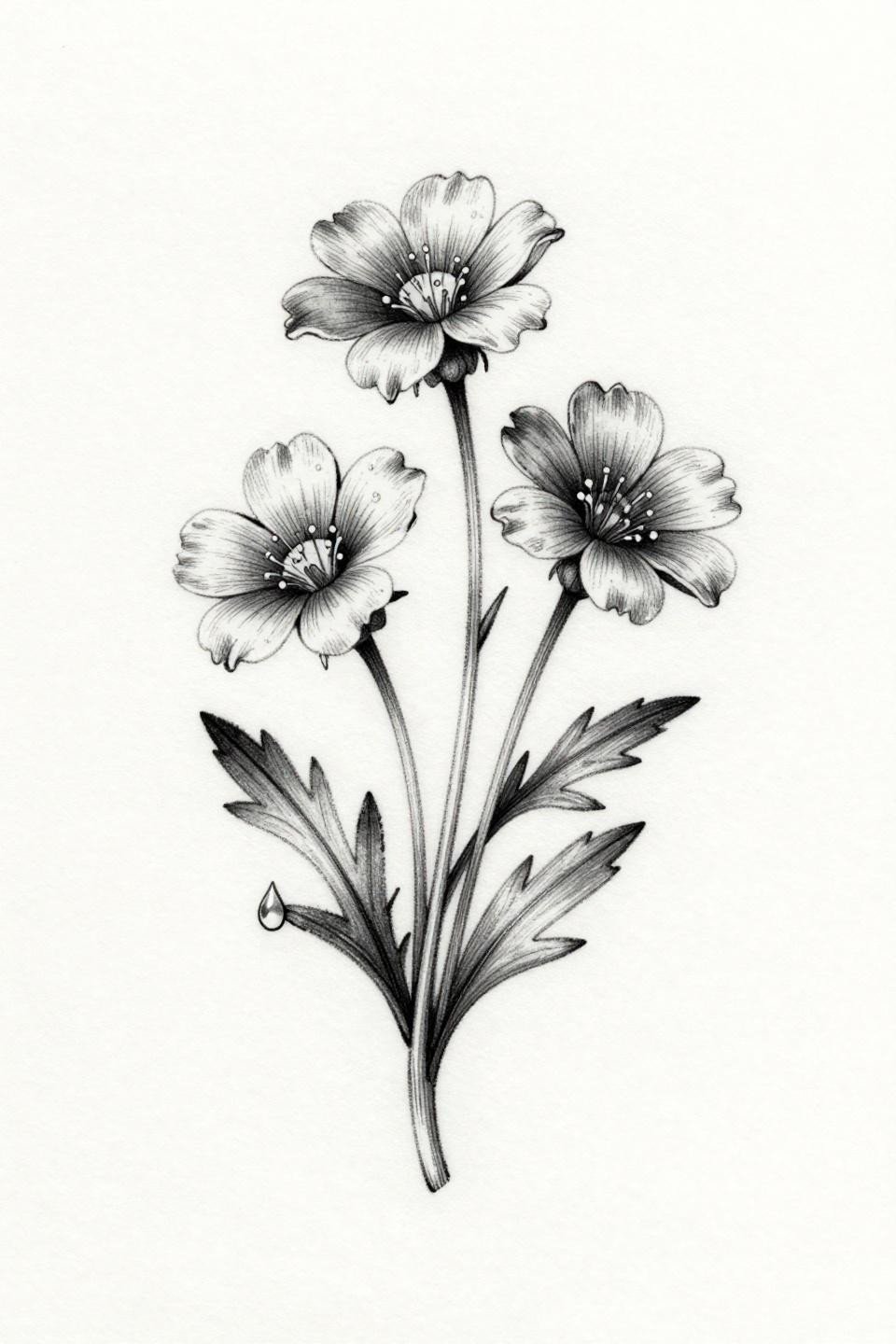
A wildflower sprig with three tiny blooms, threadlike stems with serrated leaves, and a single dewdrop suspended from the lowest petal, rendered in hairline strokes with zero fills and precise weight variation.
The dewdrop is the technical flex in this design. A suspended liquid form needs weight variation from thick to thin in the teardrop outline to read as three-dimensional, without any fill or shading, just line pressure control at 0.5mm width.
Art Nouveau Locket: When Filigree Needs to Read at Jewelry Scale
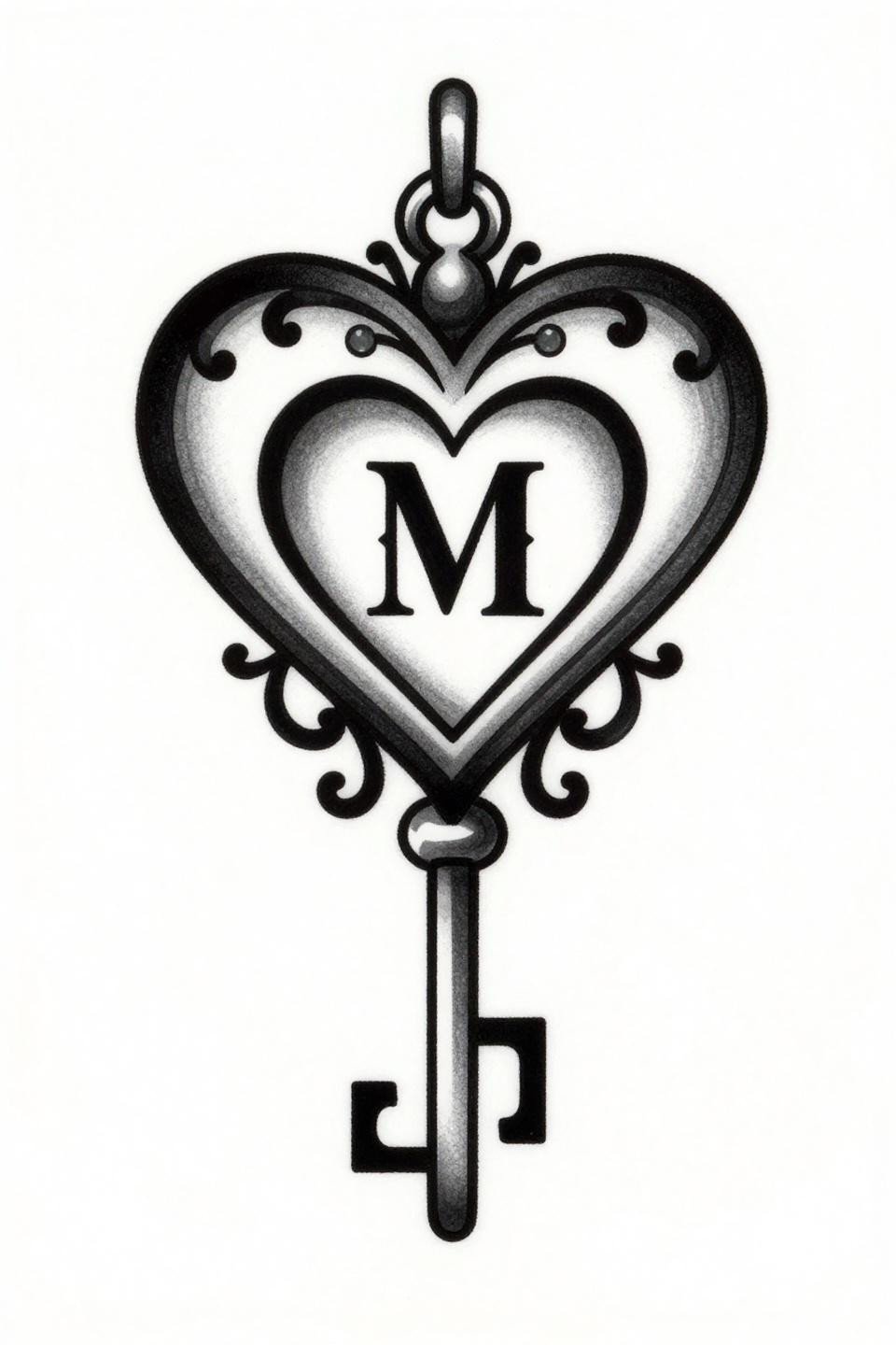
An ornamental locket with flowing asymmetric filigree curves, heart-shaped keyhole, serif initial M in low relief, and a single chain link suspended at base, rendered with flat black fills and open white detail channels.
White detail channels cut into flat black fills are what keep filigree readable at this scale. If the channels are too narrow, they close during healing. The artist has to size the negative space channels at roughly 1.5x what looks right on paper to account for ink spread.
Stipple Mandala Where Dot Density Replaces Every Line
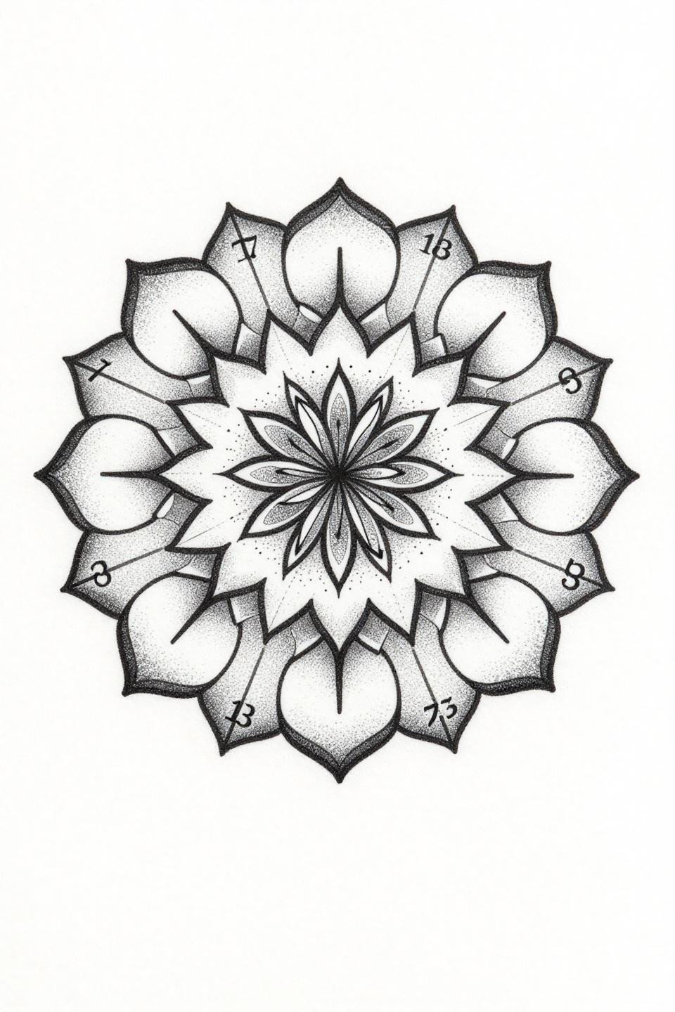
A geometric mandala with interlocking petals, hairline spokes radiating outward with stipple dot accents at each termination point, and numerals 7 and 13 at cardinal points, built entirely from stipple dotwork with no solid fills.
Grey midtones achieved through dot density variation alone demand consistent dot size across the full gradient field. Any size inconsistency reads as texture error, not tonal transition. This is the design to show your artist when you need to assess their dotwork precision.
Hidden Placement Changes How Much Technical Error You Can Hide
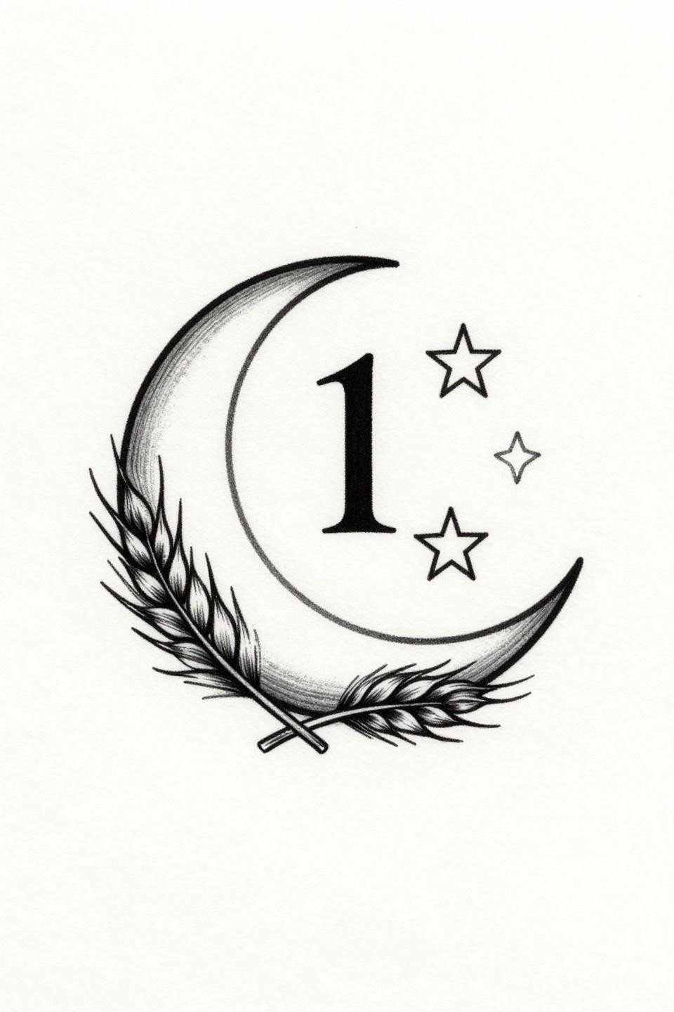
Crescent moon with three descending stars, serif numeral 11 below, and botanical wheat sprigs flanking with feathered grain detail, in a vertically stacked composition with zero fill and hairline 0.5mm strokes.
Hidden placements like the nape, behind the ear, or inner ankle give fine line work its best shelf life: low sun exposure, minimal friction, and skin that moves predictably. The wheat sprig grain detail only survives long term in a protected spot.
Single Line Constellation Animal: Reading at Year One Versus Year Ten
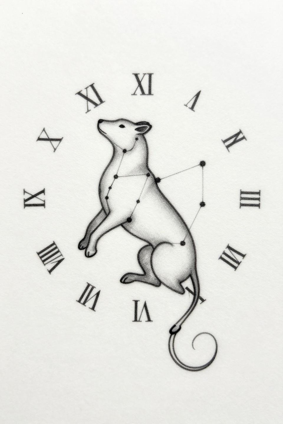
A minimalist constellation map forming an abstract animal silhouette, one unbroken hairline path connecting stars into creature form, with serif Roman numerals at cardinal points in a circular mandala composition.
At year one this reads as graphic and sharp. At year ten, hairline 0.5mm single-needle paths in open negative space compositions tend to soften and widen slightly, which on well-chosen placements actually makes the constellation form read more like a natural night-sky scatter. Plan for that evolution.
Narrow this collection to placement first, then skin tone, then style. A design that works as a nape tattoo fails as a finger tattoo. Match the technical demands of the flash to the reality of where it lives on your body, and send your artist three references, not thirty.