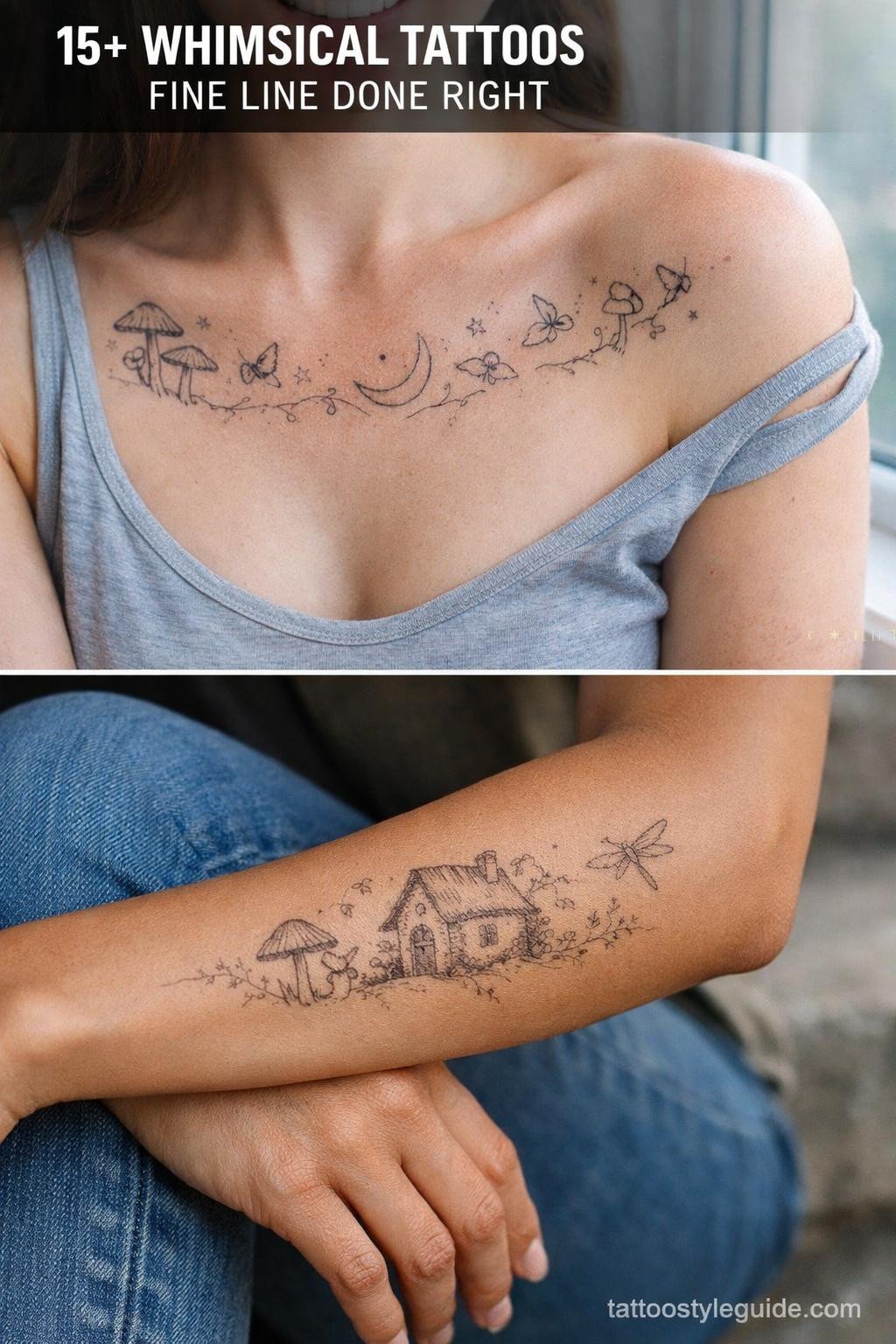
Tiny tats with meaning fail most often not from the design itself, but from scale miscalculation. Compress a complex symbol to under an inch and the internal linework merges within three years. The designs that hold are the ones built with that constraint in mind from the first sketch.
Single-needle work at this scale demands an artist who controls machine speed precisely. Too fast and the ink sits shallow. The references below are selected for technical longevity, not just concept.
Celtic Knotwork at Tiny Scale: Where the Weave Either Holds or Dies
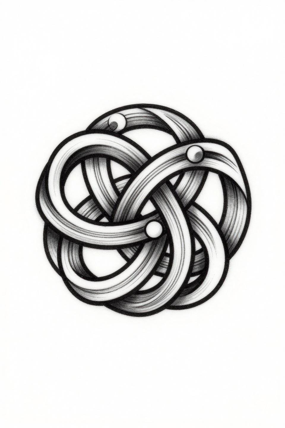
This trinity knot uses parallel engraved hatching across each ribbon strand to define the over-under crossings, with a bold 2pt outline holding the circular composition together at small scale.
At wrist or inner forearm placement, the negative space does most of the reading work. The hatching will soften with age, but the outer outline keeps the form legible for a decade if the artist commits full saturation on that perimeter pass.
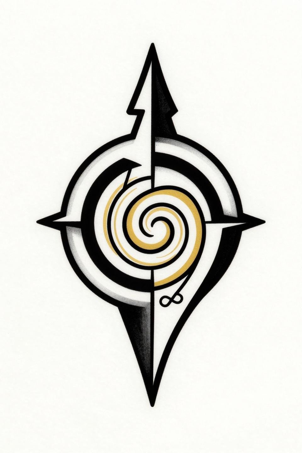
The Arrow and Om Combination That Actually Earns Its Symbolism
![]()
Angular fletching at the base and a clean linear shaft make this arrow read as geometric rather than decorative, with the Om symbol integration mid-shaft giving the design a second focal point without breaking the vertical axis.
Flat black fills at this weight hold clean for 10 or more years on protected placements like the upper arm or sternum. Avoid finger or wrist placement for this one: the fine shaft line thins under friction and sun exposure.
Phi and the Golden Ratio: Precision That Punishes a Shaky Hand
The logarithmic spiral nested inside the phi counter form requires compass-drafted precision geometry, and any deviation from the mathematical curve reads immediately at this scale.
This is a collector’s piece for people who understand what they’re asking for. Check the artist’s healed portfolio for geometric work specifically. Fresh photos hide a lot of wobble that shows up at three months.
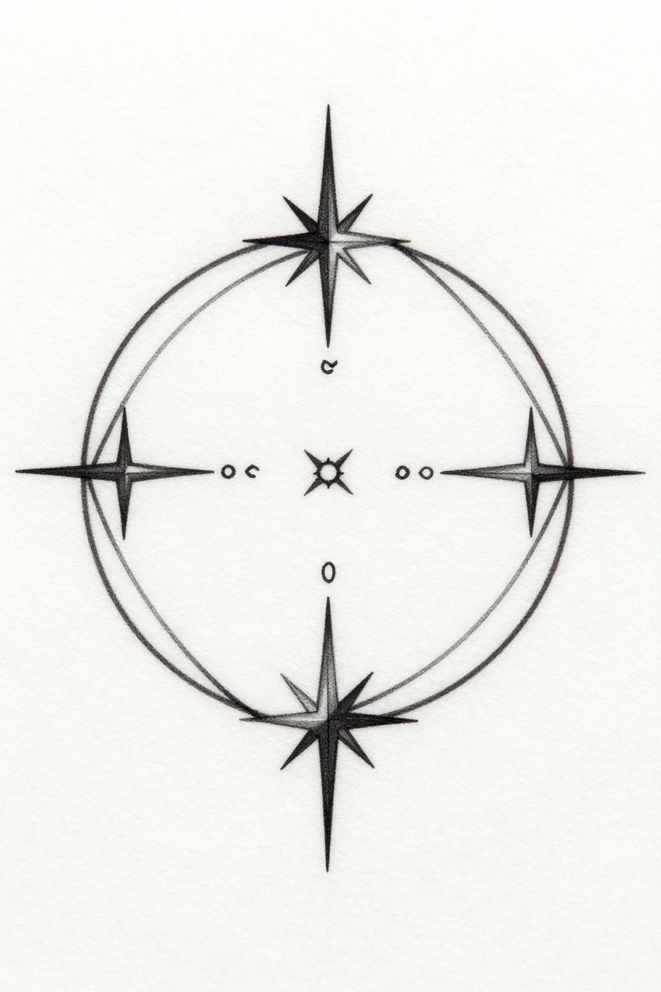
Compass Rose With a Bird: Navigation Symbols That Need Room to Breathe
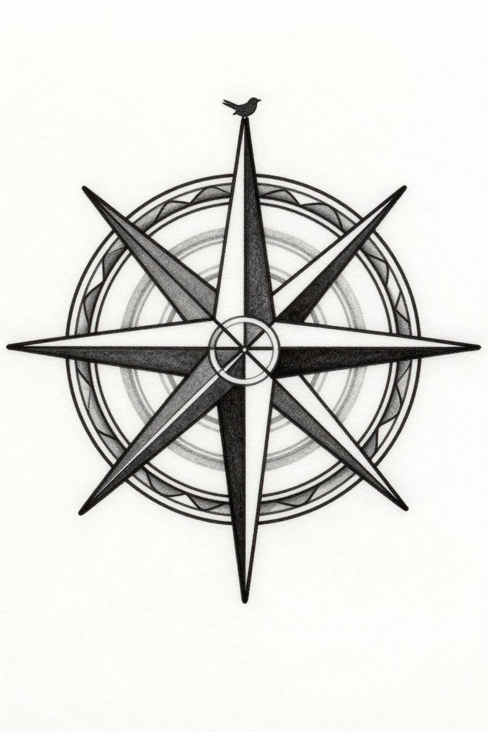
Four cardinal points rendered in hairline strokes with a bird perched on north, framed by art nouveau flourishes: this is a radial composition that depends on open negative space to keep each element distinct at small scale.
On olive or darker skin tones, hairline strokes at this weight lose contrast faster than on lighter skin. A skilled artist will advise bumping the cardinal point lines to 1pt minimum to maintain readability past year two.
Crescent Moon and Gemstone: When Watercolor Splash Needs an Exit Strategy
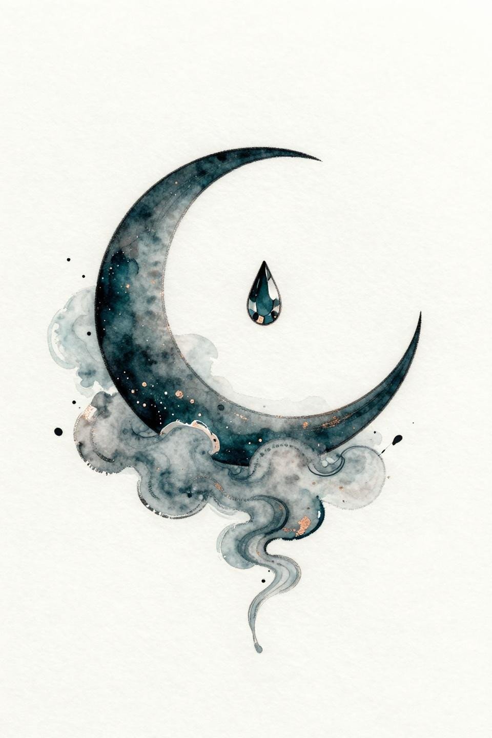
Deep teal ink with copper accent washes give this crescent moon piece its color identity, with loose watercolor bloom technique creating the celestial cloud wisps around the central stone.
Watercolor without an anchoring outline blurs by year three to five, and this design sits right on that edge. Request a fine black outline on the crescent and gemstone forms specifically, even if it slightly changes the aesthetic. It doubles the lifespan.
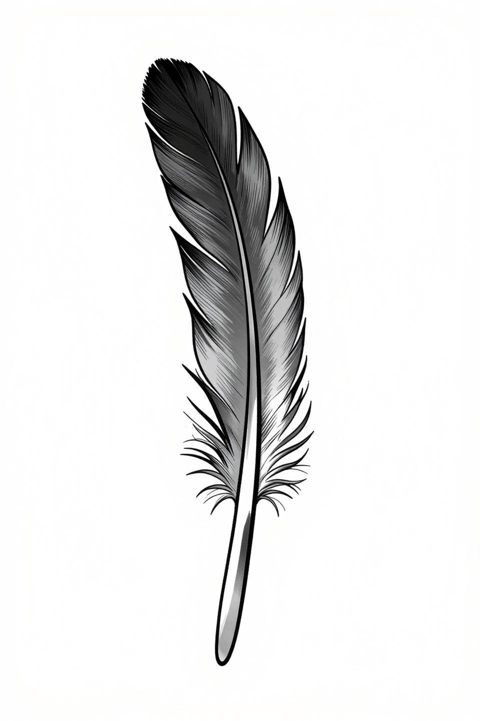
Sketch-Style Feather: Deliberate Imperfection as a Technical Demand
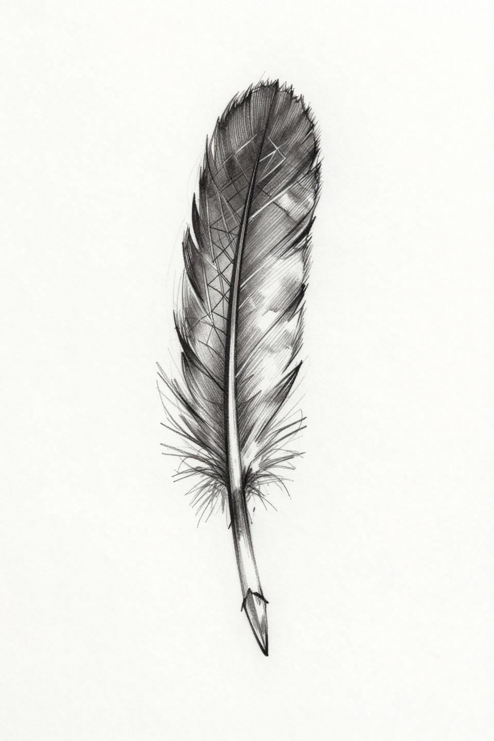
Irregular barb strokes and a visible internal grid structure make this feather read as drawn rather than rendered, with deliberate gestural line weight creating depth without shading fills.
Sketch style is harder to execute than it looks. The lines need to be intentionally inconsistent, not accidentally so. The tell is in the quill shaft: a confident artist draws it in one pass with controlled pressure variation. A hesitant one redraws it twice and the overlap shows healed.
DNA Helix in Dotwork: Science-Based Symbolism With Real Longevity Risk
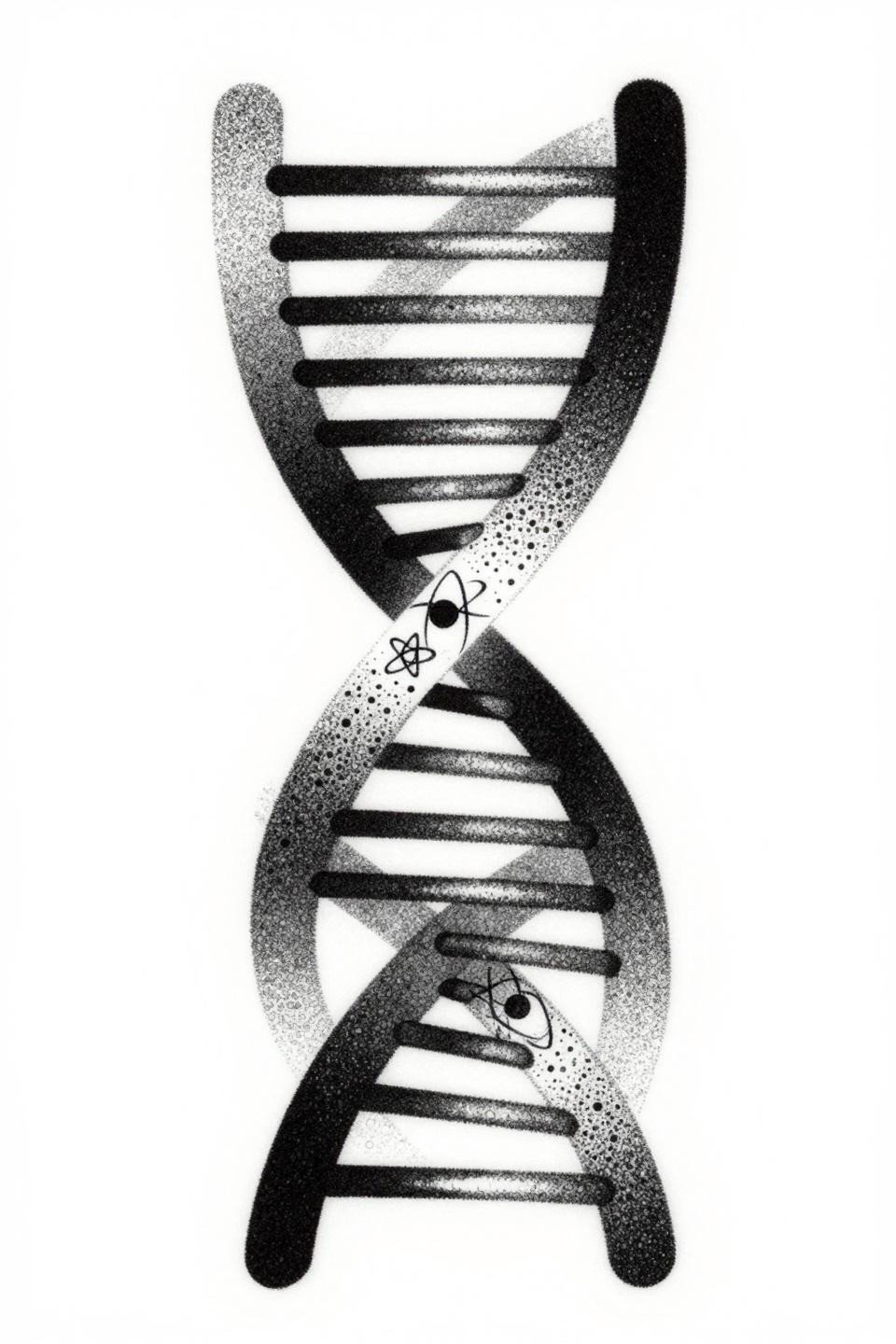
Base pair rungs rendered in stipple dot clusters, graduating from dense at the core to open at the outer edges, give this double helix its dimensional read without any solid fills.
Dotwork at small scale migrates slightly as the skin moves over years, and fine stipple gradients are the first casualty. Look for an artist whose healed dotwork shows consistent dot separation at two or more years out, not just fresh studio shots. See how this compares to larger-format symbolic tattoo designs with deeper meaning that use similar geometric language at a scale where aging is more forgiving.
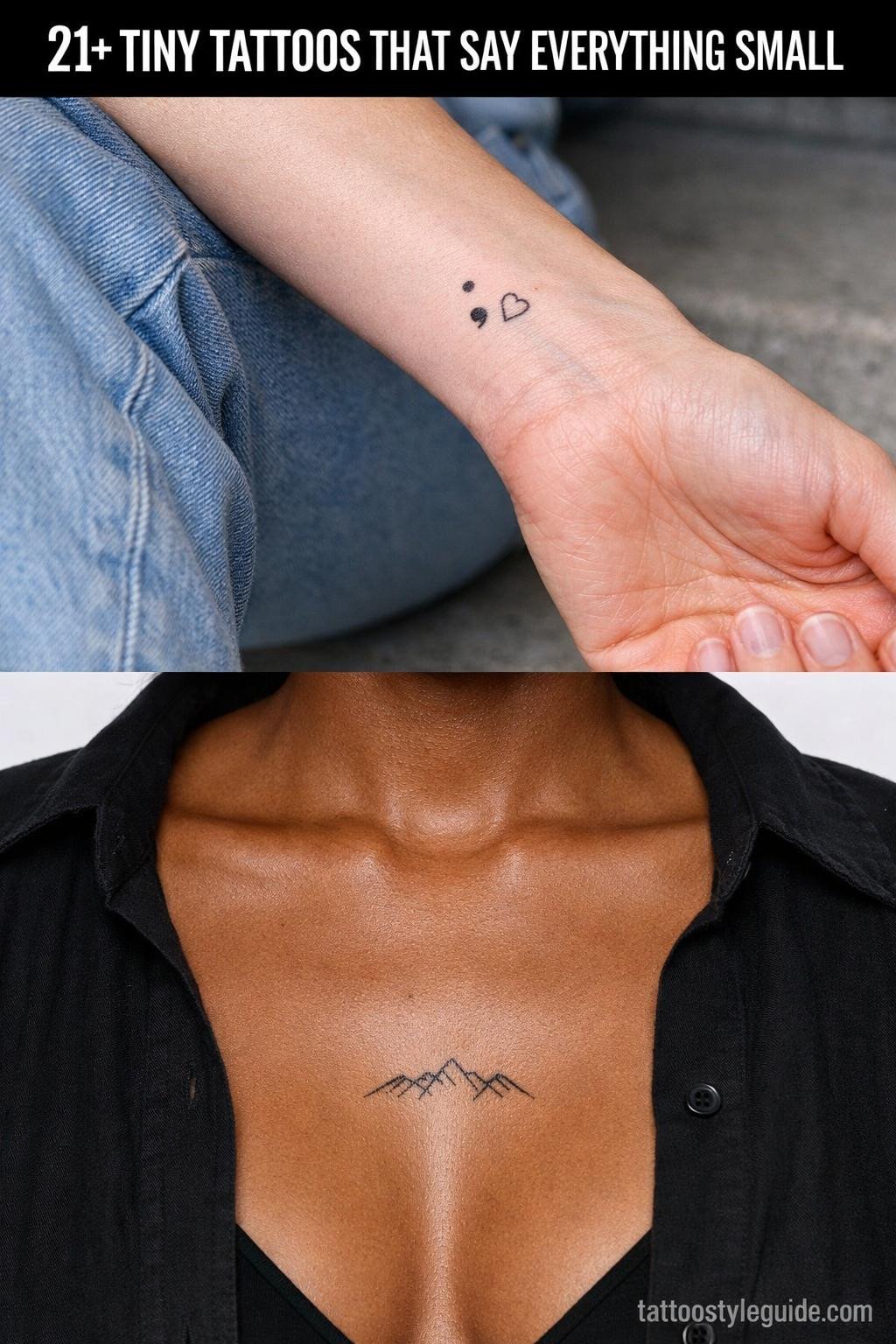
The Semicolon at Tiny Scale: Etching Technique Where Placement Is Everything
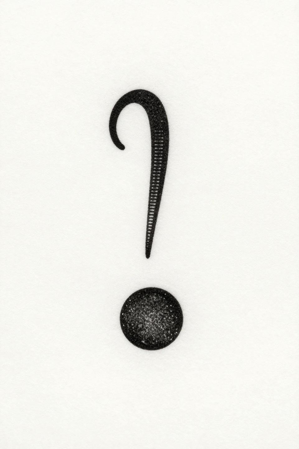
Fine serif details and 0.3mm hatching lines define this semicolon using pure parallel line engraving technique, no fills, no gradients, all structure from line spacing alone.
This design carries well-documented meaning in mental health communities and is one of the most requested small pieces in studios. Wrist and forearm placement are common, but both locations mean touch-up every two to three years minimum due to sun exposure and friction.
Anchor With Rope Coils: When Japanese Outline Weight Outlives Trend Cycles
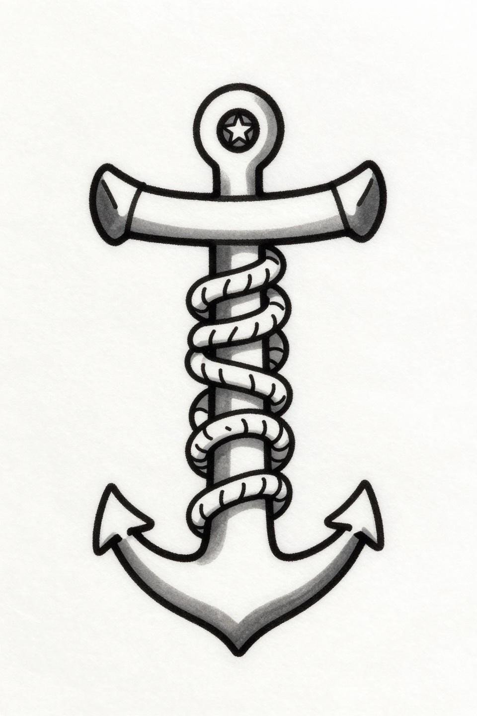
Three nautical rope coils around the shaft and a star at the crown apex, held together by bold 2 to 3pt black outlines with flat grey wash fills in the irezumi tradition.
This outline weight is the longevity signal. Bold outlines at this scale hold clean for a decade or more, and the flat fill sits stably under them without patchiness. Flat fills with no patchiness separate veterans from beginners, so ask to see healed anchor or similar flash from the same artist.
Script Word Tattoos: Why “Breathe” in Fine Line Needs a Specific Artist Profile
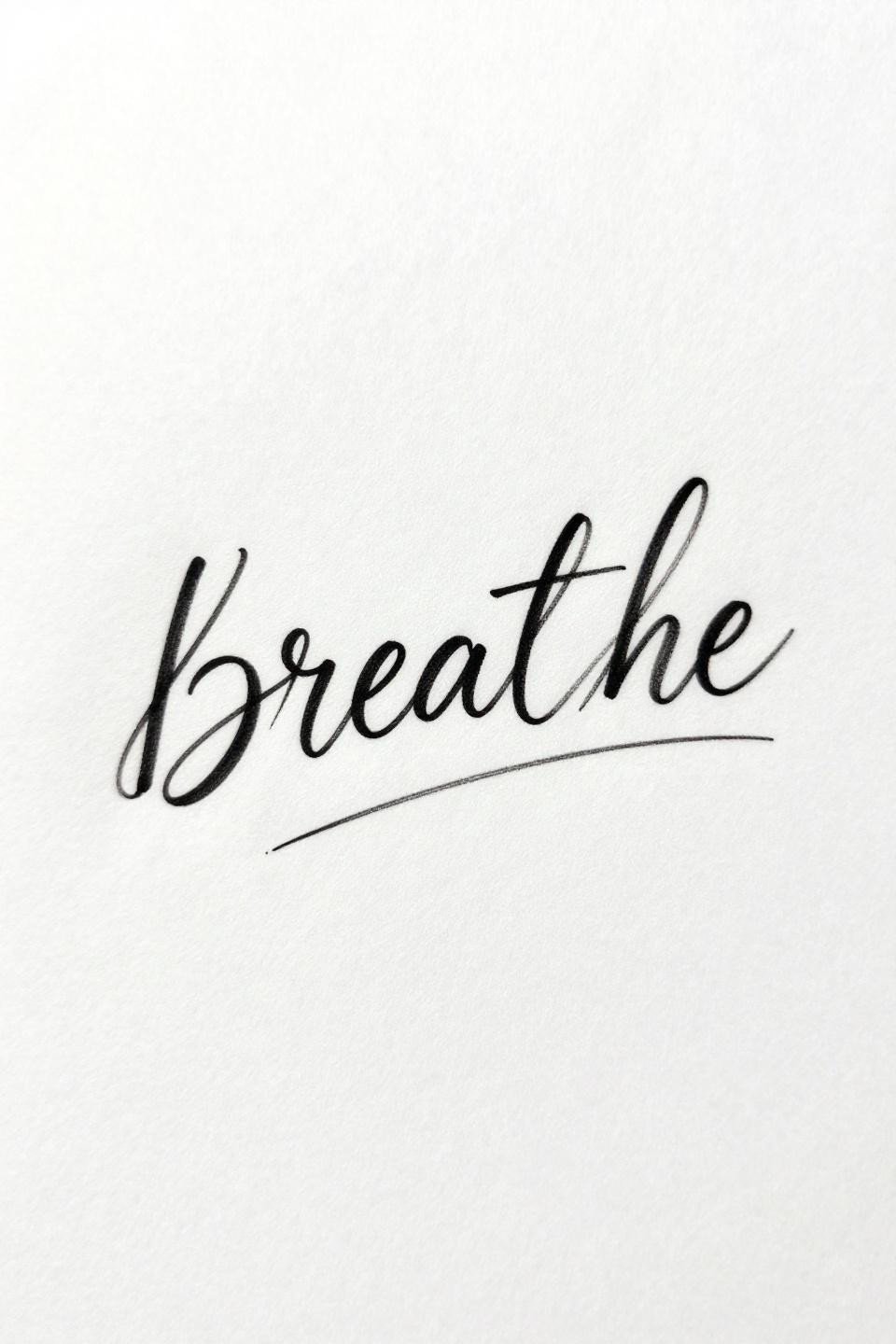
Lowercase cursive script with a tapering exhale line extending from the final letter: this is single-needle 1RL work that lives or dies by the artist’s hand speed and consistent pressure through curved letterforms.
Single needle script at this scale needs an artist who controls speed, because any hesitation creates a dot buildup in the curves that heals as a blob. On lighter skin tones, this reads crisp for years. On olive and darker skin, the hairline strokes need slightly bolder weight to maintain contrast past year one.
Neo-Traditional Feather: Three Lines Below the Quill Change Everything
Defined barb texture along the quill shaft with three clean parallel descending lines at the base: the neo-traditional outline weight here gives the design a structural solidity that the sketch-style version above intentionally avoids.
Grey wash dilution from dense at the quill core to open at the barb edges creates dimension without color. This version ages more predictably than watercolor or fine line alternatives, and the bold perimeter outline keeps the silhouette readable even as interior wash softens over years. Collectors considering both a small piece and a larger canvas should check meaningful back tattoo ideas for women that use similar grey wash technique at full scale.
Geometric Mountain: Three Lines That Carry More Weight Than Their Scale Suggests
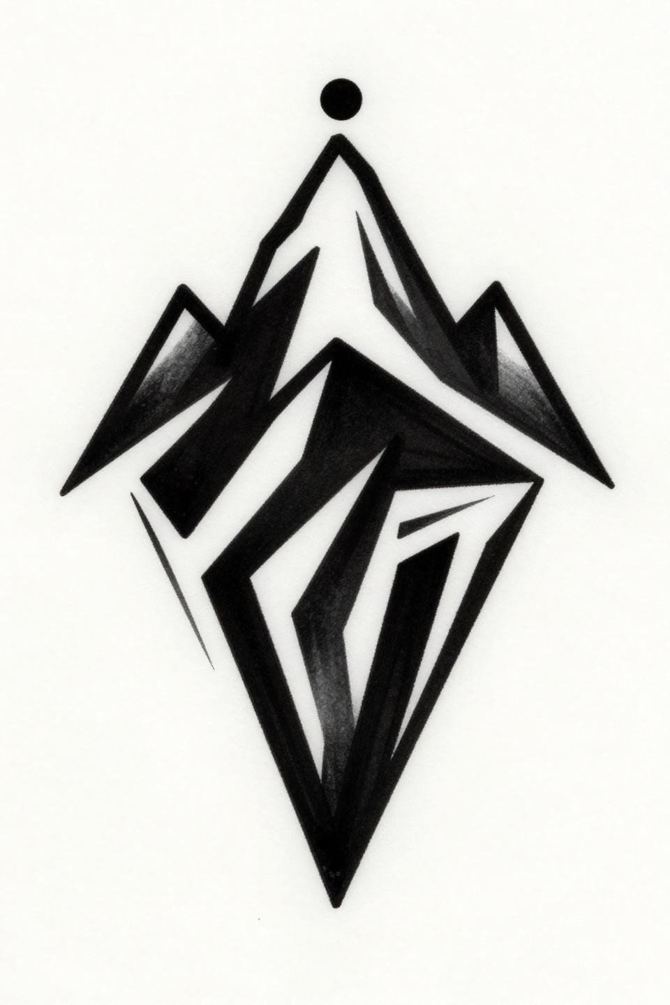
Three bold angular lines forming a peak with a summit dot and flat black filled base sections: tribal geometric reduction at its most functional, stripping the mountain to its structural minimum.
Flat black at this density holds indefinitely if the artist commits to layered passes. A single pass often looks saturated fresh but shows patchiness by six months. Ask specifically about their saturation method on solid black fills before booking.
Personal Asterism: Custom Star Groupings Outscore Generic Constellation Tattoos
Three stellar points with compass-drafted connecting geometry and a small floating glyph: this is a custom asterism format that outperforms generic constellation references because it belongs to the wearer, not a star chart.
Hairline 0.5pt strokes in a circular mandala composition are vulnerable to blowout on loose skin. Inner wrist, sternum, and collarbone placements give this style its best shelf life. Avoid ankle and foot placement entirely.
Infinity Loop With Heartbeat: Single Continuous Line at Its Most Technically Exposed
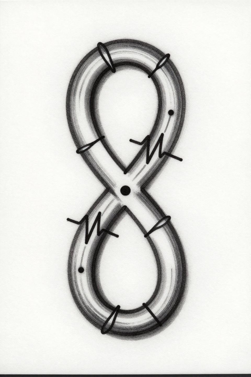
An infinity loop formed by two overlapping circles with a heartbeat pulse woven along the upper curve, executed as one unbroken calligraphic stroke with deliberate thick to hairline weight variation through the circuit.
The weight shift is the technical challenge. Most artists stabilize their hand at consistent speed and lose the taper. The tell is the curves: no wobble at direction changes, and the transition from thick to hairline should read as intentional, not accidental.
Open Book With Bookmark: Negative Space Is the Design Here

Fanned pages, a bookmark ribbon from the spine, and a floating star above: this open book design uses unfilled outline construction entirely, letting the white of the skin carry the page interior.
No-fill designs at small scale depend on precise 0.5pt outlines that hold their separation. Over time, outlines this thin can migrate toward each other on stretchy skin placements. Upper arm and sternum keep the page negative space cleanest long-term.
Heartbeat Pulse Line: The Medical Diagram Aesthetic That Ages Cleanest
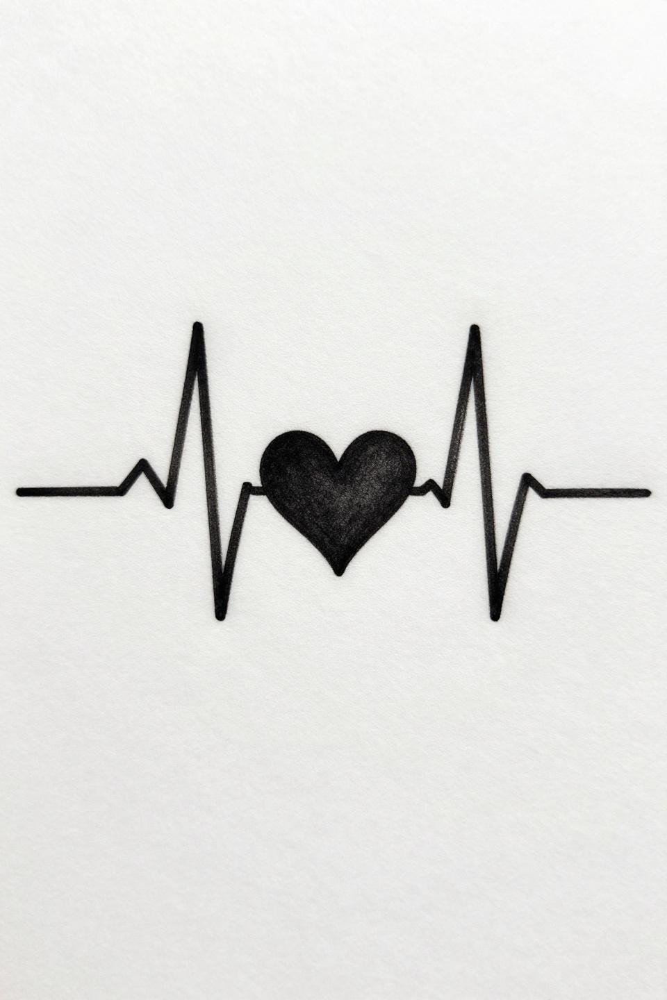
A flat horizontal pulse line with one solid filled heart at the peak: medical diagram rhythm as tattoo language, clean and direct with no decorative additions diluting the concept.
The solid filled heart anchors the design visually and provides a saturated focal point that holds even as the hairline pulse strokes soften with age. Protected placements like the inner arm or behind the ear extend the crispness of those fine lines significantly.
Roman Numerals in Art Deco: Date Tattoos That Outlive the Relationship Debate
Bold serif Roman numerals stacked vertically with geometric diamond flourishes at top and base: art deco letterform weight gives this date tattoo enough visual mass to read clearly without large scale.
Bold 2 to 3pt outlines on serif letterforms at this weight hold clean for a decade. The flat black fills between stroke transitions are the quality indicator. Patchy fills mean the artist rushed the saturation passes.
Bisected Triangle: Minimal Geometry With Maximum Symbol Density
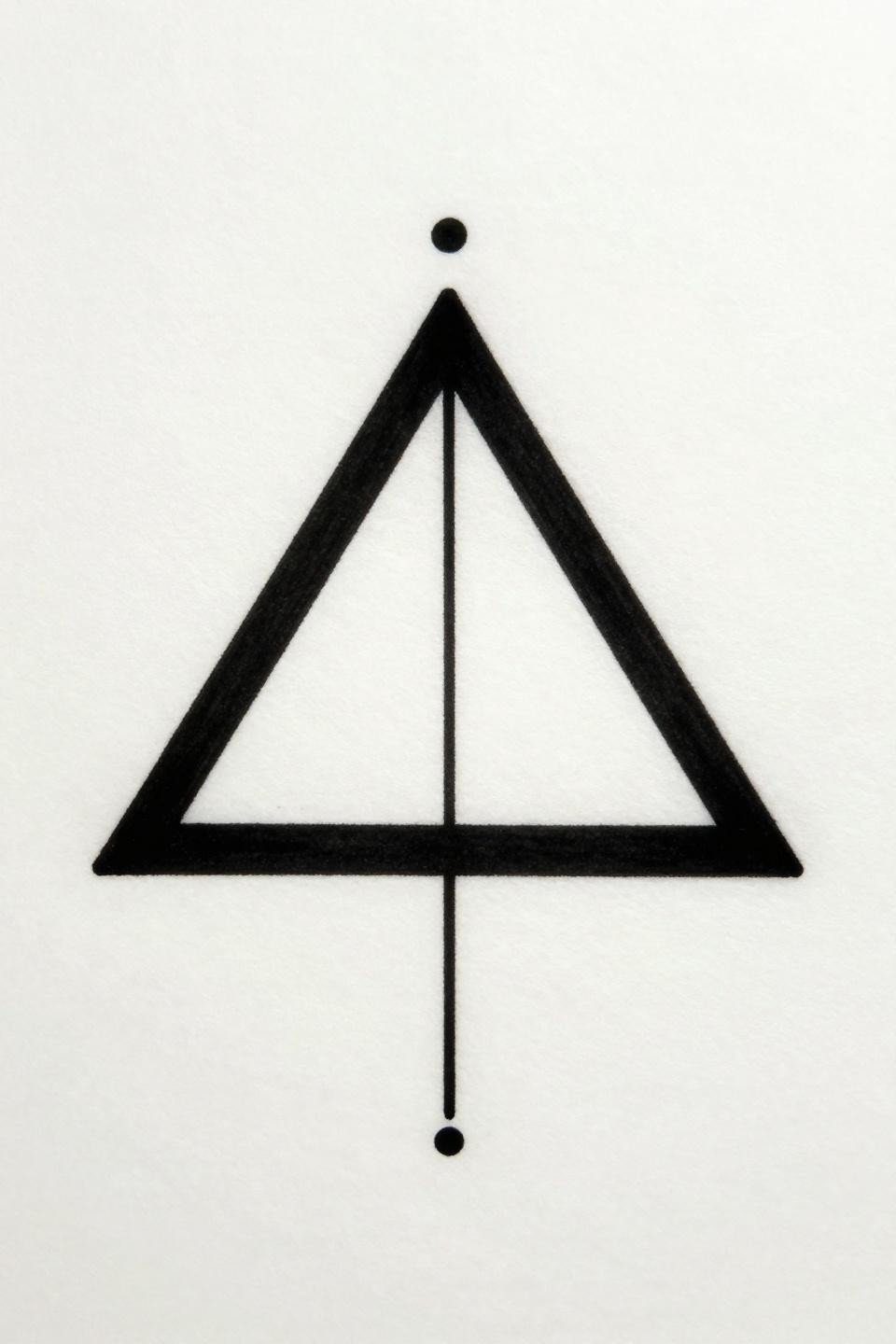
An equilateral triangle bisected by a single vertical line from apex to base, with a filled dot at the top point: compass-drafted bilateral symmetry that codes differently depending on what the wearer brings to it.
This design holds its meaning precisely because it does not announce itself. The bold 2 to 3pt outline and flat fill ensure it reads at a distance without needing scale. Any wobble in the bisecting line is visible immediately, so this is a technical test for geometric artists.
Fine Line Lotus With Moon Insert: Spiritual Iconography That Needs Controlled Placement
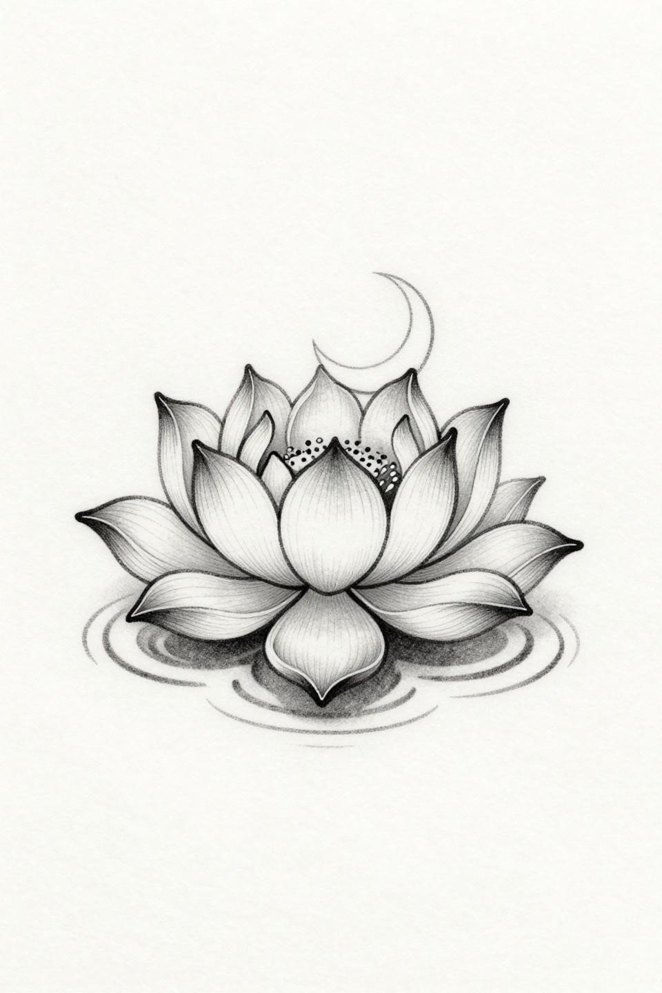
A lotus emerging from concentric water ripples with a crescent moon nested in the central bloom: layered symbolic iconography executed in 0.5mm single-needle hairlines that require an artist working at very controlled speed.
This design is popular in the small girly tattoo category and executed poorly far more often than well. Sternum and upper back placements give these fine lines the best protection. Wrist placement on this specific design means noticeable softening by year two.
Sanskrit Dotwork: When Script Requires a Specialist, Not Just a Willing Artist
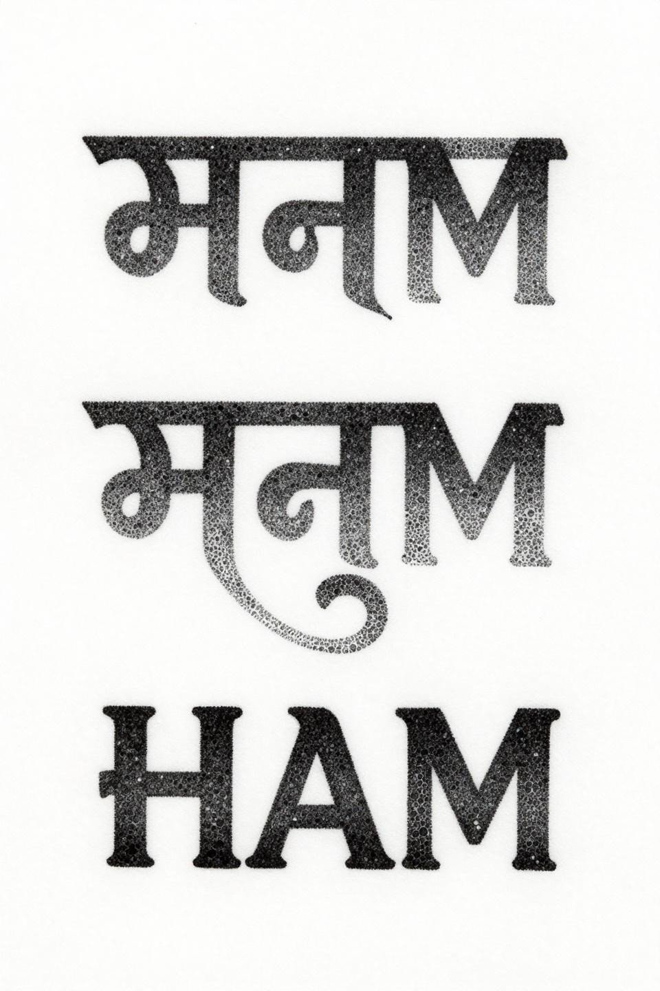
Devanagari script constructed entirely from stipple dot clusters with no outlines, the letterforms emerging from dot density variation alone, running dense at stroke centers and open at the edges.
This technique requires an artist who can read the script or has mapped every stroke before touching the machine. Misformed Devanagari characters are a category of tattoo regret that shows up consistently in correction consultations. Verify the artist’s reference accuracy before the appointment, not during.
The Enso Circle: One Brushstroke That Exposes Every Technical Weakness
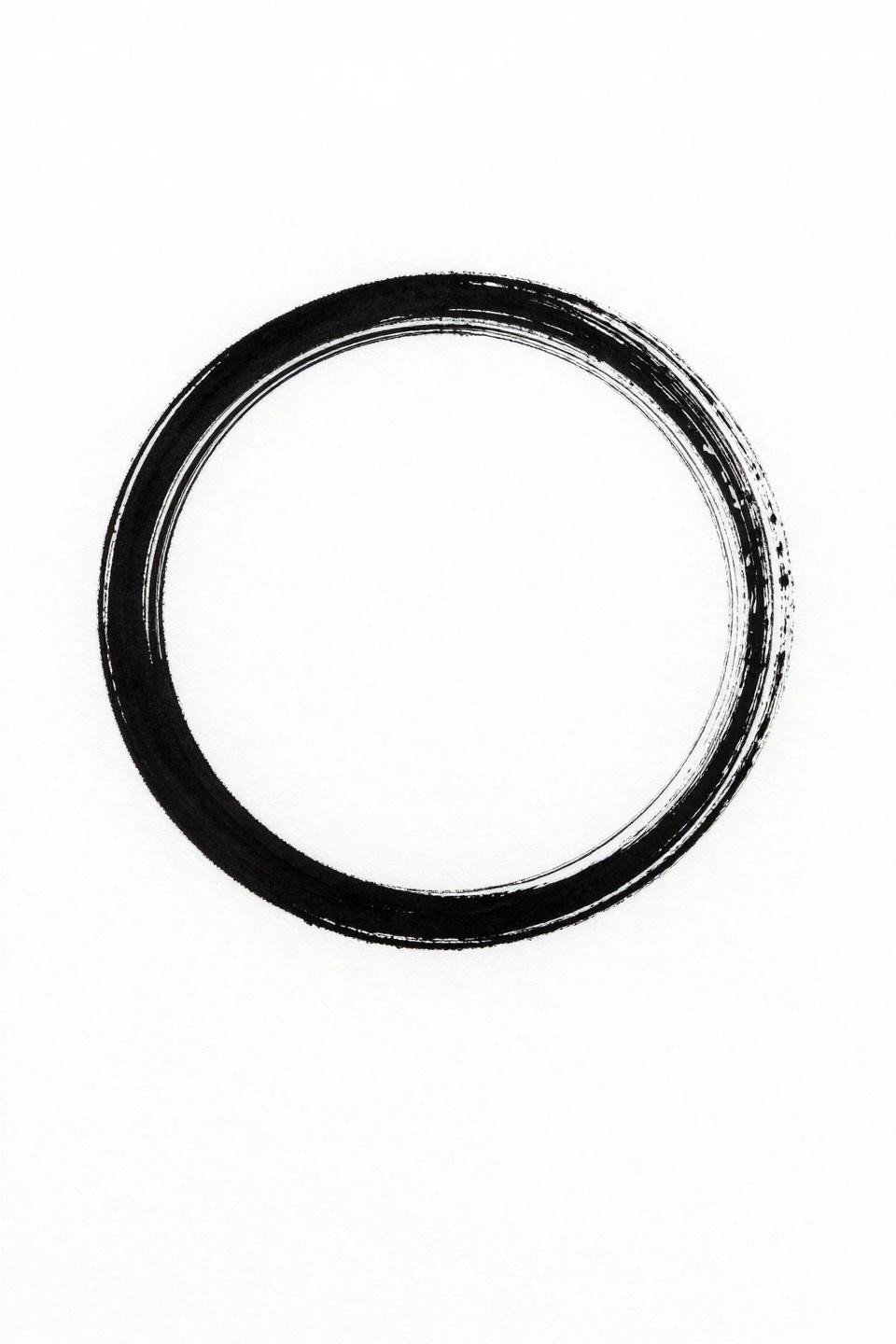
An open circle drawn as one unbroken calligraphic brushstroke with a deliberate gap: the enso’s weight variation from thick entry to hairline exit communicates imperfection and resilience in the same mark.
This is the design that exposes the most about an artist’s line confidence, because there is nothing else in it to look at. A hesitant artist produces an even, mechanical circle. The right execution has visible pressure shift through the stroke arc. Request to see their previous enso work specifically, not just general fine line. This sits alongside the broader range of symbolic tattoo designs with deeper meaning that use reduction and restraint as the primary design language.
Take the three designs that stopped you longest and use those as your reference set. One image gives an artist a target. Three gives them a direction and enough context to make smart decisions about scale and placement for your specific body. Send the flash references directly, not screenshots of screenshots.