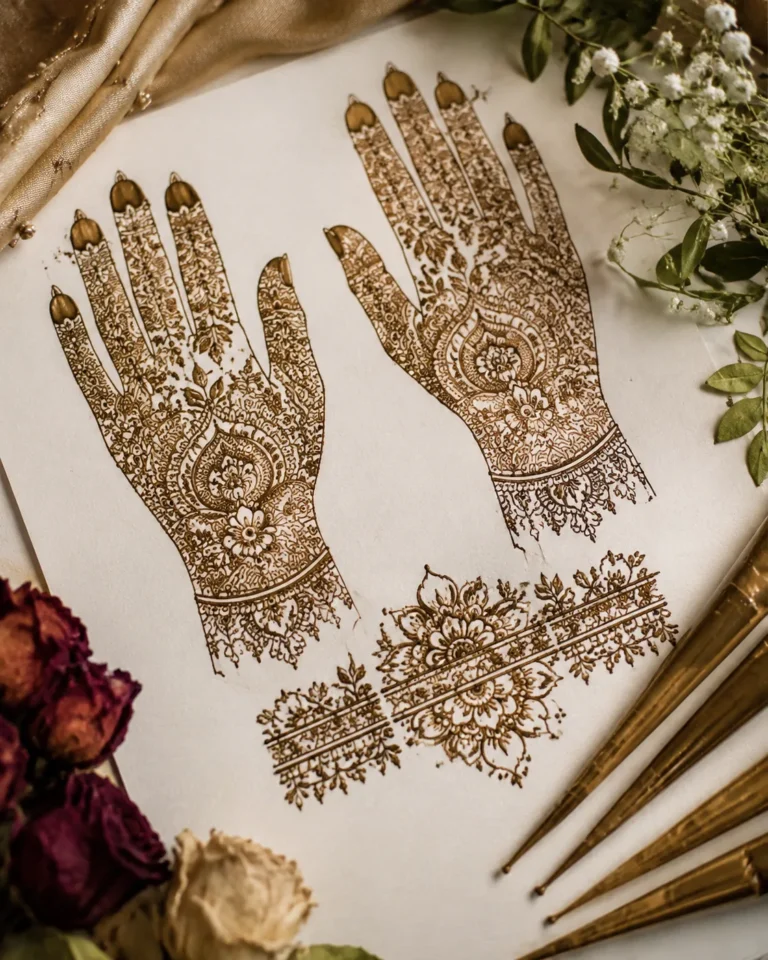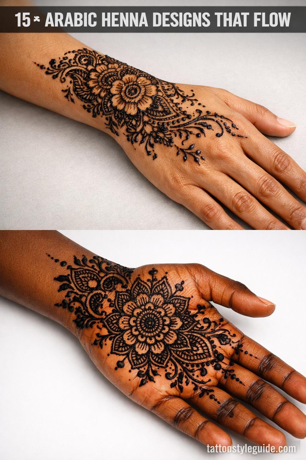
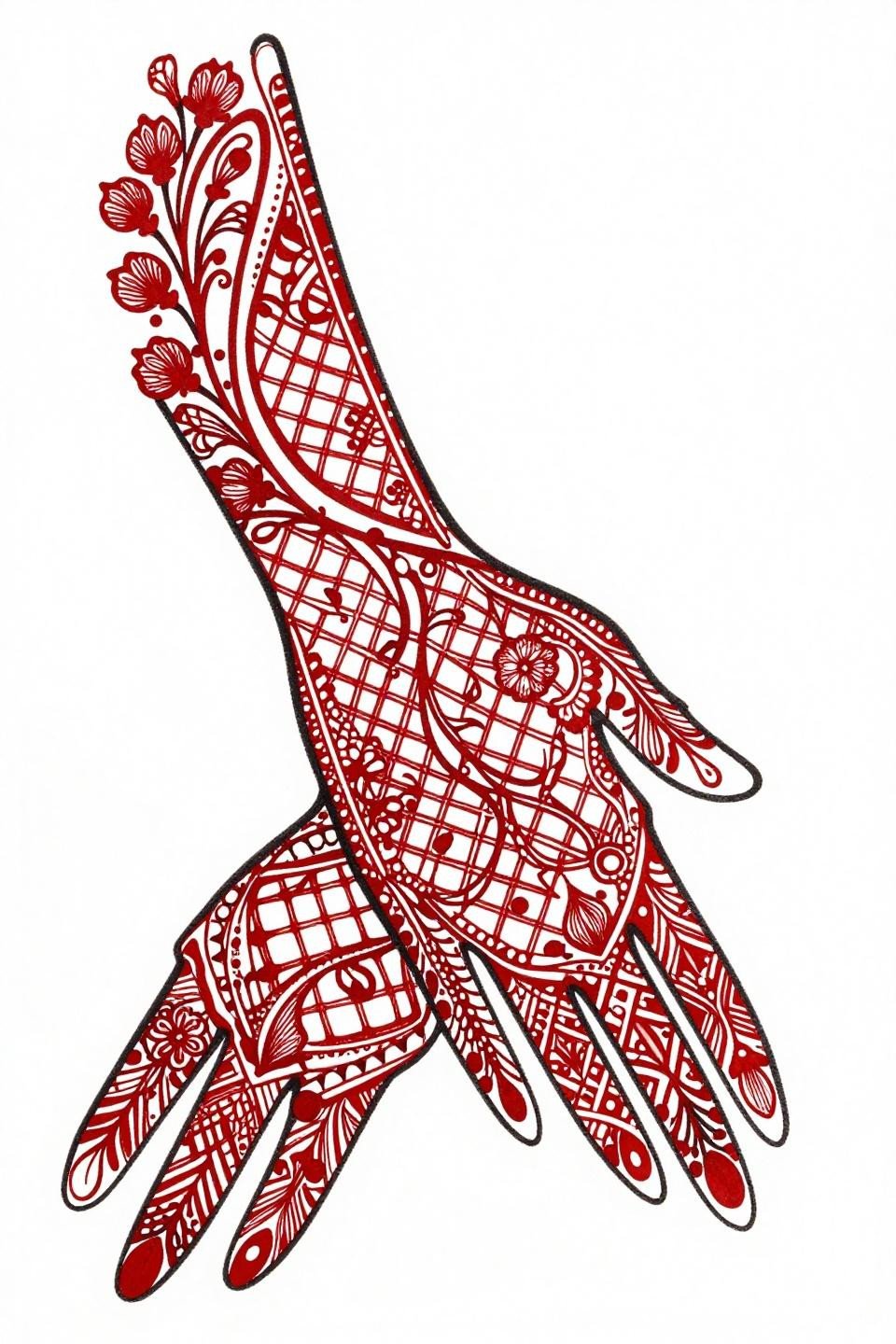
Arabic henna designs work because they respect the hand’s architecture. The flow of vine scrollwork follows tendon lines, the medallions anchor at the palm’s center, and the negative space gives the paste room to stain without bleeding into adjacent detail. Most failed henna references ignore that logic entirely.
What separates a design that photographs well from one that actually reads on skin: line weight and spacing. Hairline work disappears on warmer skin tones unless the artist controls paste consistency and dwell time. The references below are chosen with that constraint in mind.
Elephant Dotwork That Earns Its Place on the Palm
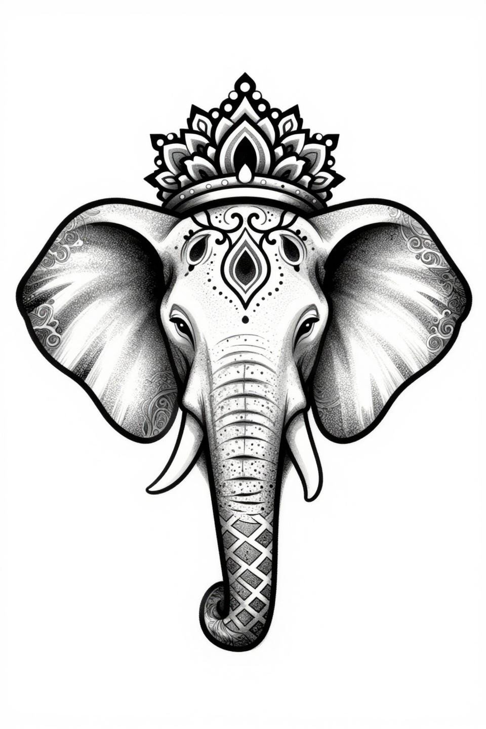
A forward-facing elephant head with a mandala crown and flanking vine scrollwork, executed in stipple dot gradient that runs dense at the figure’s core and opens toward the edges.
On olive and deeper skin tones, the open dot perimeter reads cleaner than solid fill because the skin’s warmth fills the negative space optically. The bilateral symmetry also catches any placement drift immediately, so the artist needs a precise center axis before starting.
Geometric Border Stripe With Interlocking Chain Logic
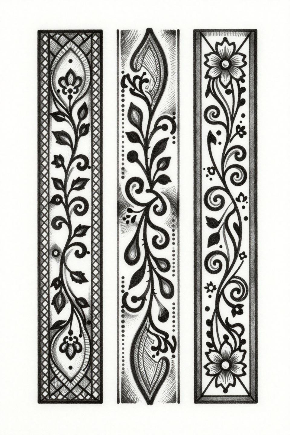
A stacked vertical border composition built from interlocking geometric lattice chains, teardrop vine buds, and crosshatch shadow blocking that mimics woodcut engraving.
This format translates directly to forearm or wrist placement, where the linear rhythm follows the limb’s axis. For henna designs for special occasions, this stripe format is one of the cleanest options because scale adjustments don’t break the composition.
Octagonal Mandala Hub With Cascading Vine Palmettes
A central octagonal mandala with bilateral vine scrollwork cascading downward, nested teardrop palmettes, and chain lattice weaving between floral clusters at the quadrant corners.
The bold 2-3pt outline weight here is the longevity signal. On skin, that outline weight holds form long after the fill has faded, which matters most with henna paste applied over textured palms.
Watercolor Vine Lattice Where the Wash Does the Work
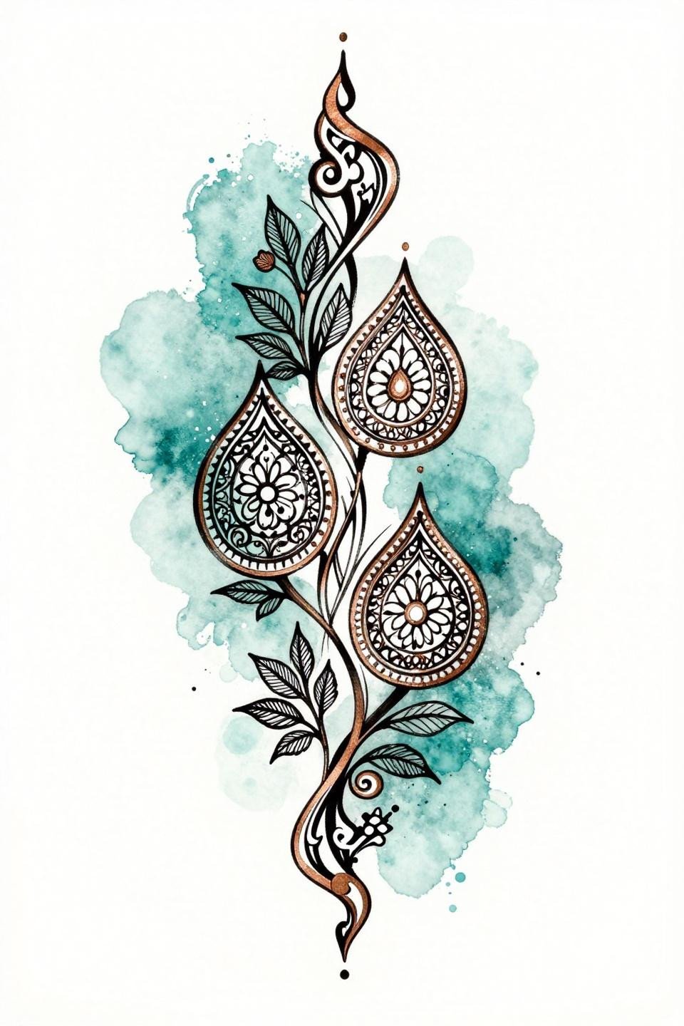
An asymmetric diagonal composition with vine lattice, teardrop medallions, and lace filigree infill, the teal watercolor wash bleeding behind the clean linework with a copper metallic accent.
Watercolor references like this one work best when used for the linework structure only. The wash element is a henna paste choice, not a drawing instruction, so share this with context about which parts you want in traditional stain versus glitter or metallic paste overlay.
Peacock Side Profile Built From Geometric Feather Panels
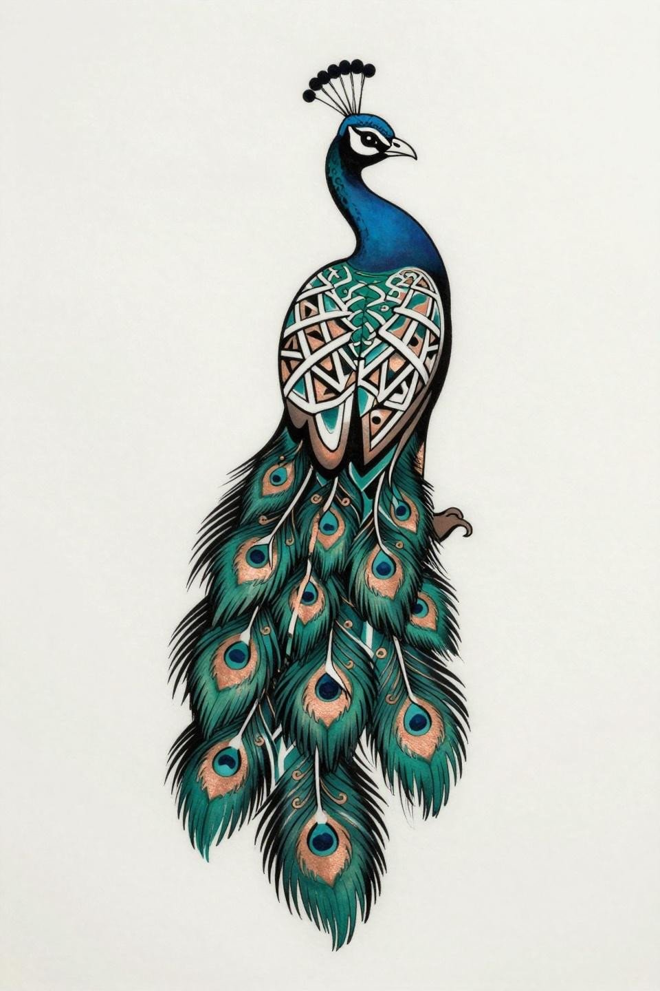
A side-profile peacock in art deco style, each tail feather section filled with geometric lattice panels, vine scrollwork threading through the plumage, and a crescent moon anchoring above the crown.
The deep teal and copper palette reads most clearly on lighter skin tones where color contrast is highest. On medium to deeper tones, scaling up the outlined motifs by 20-30% maintains readability without losing the detail.
Dotwork Crescent With Zero Grey Wash, All Contrast
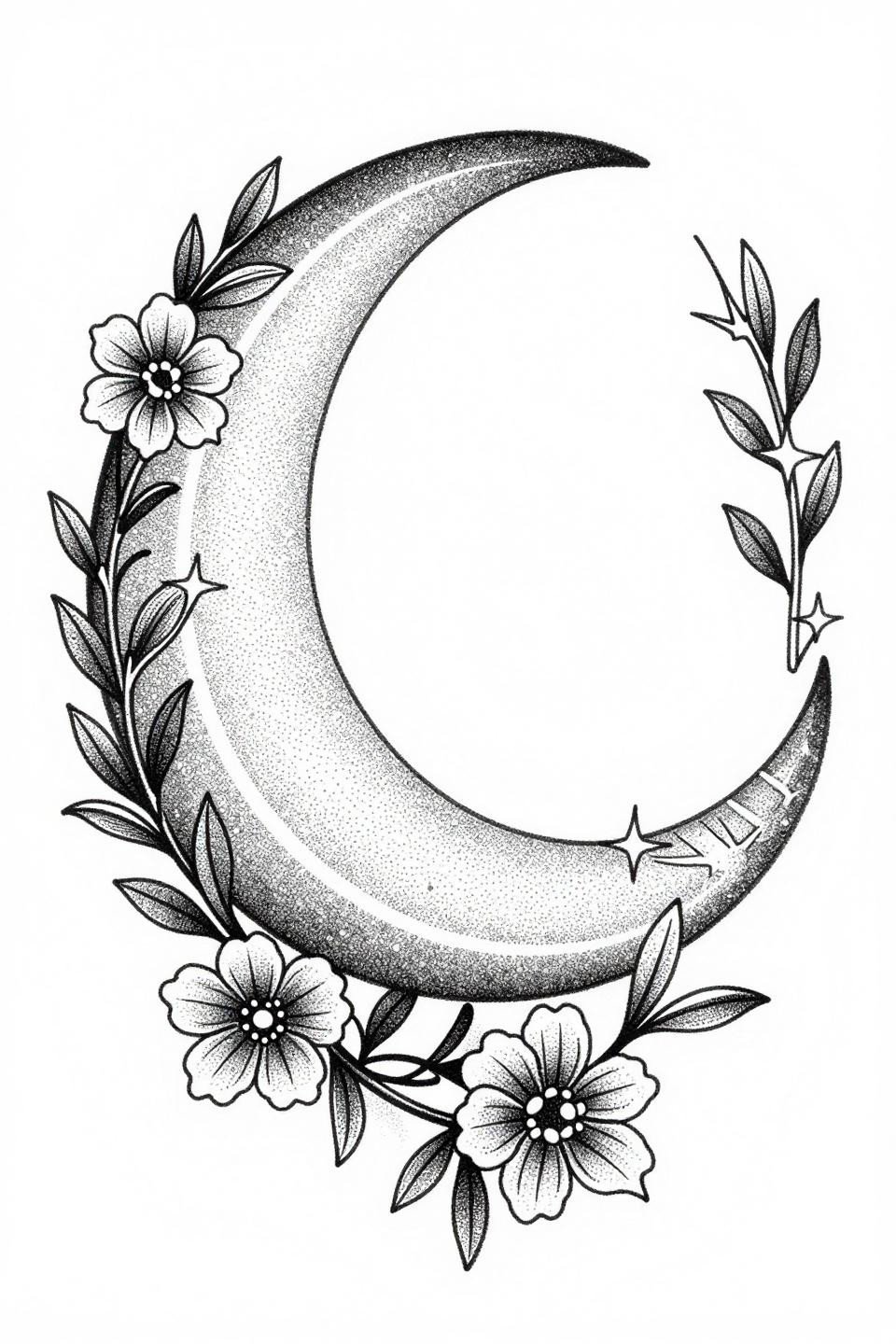
Nested concentric crescents filled with fine dot lattice, flanked by bilateral floral vine scrolls, built from pure stipple dotwork with no grey wash at all.
The density gradient here goes from tight cluster at the crescent’s core to open negative space at the perimeter. This is the technique to reference for modern mehndi design inspiration when the goal is high contrast with minimal paste volume.
Fine Line Palmette Flow That Reads Asymmetric on Purpose
Cascading teardrop palmettes along asymmetric vine stems with hairline 0.5mm single-needle strokes, chain lattice connecting geometric diamond nodes, and parallel line infill for optical density.
This asymmetric vertical composition is designed for the back of the hand or inner forearm, where the flow direction aligns with natural arm movement. Consistent dot size at the intersection clusters is the signal that the artist has real control over this format.
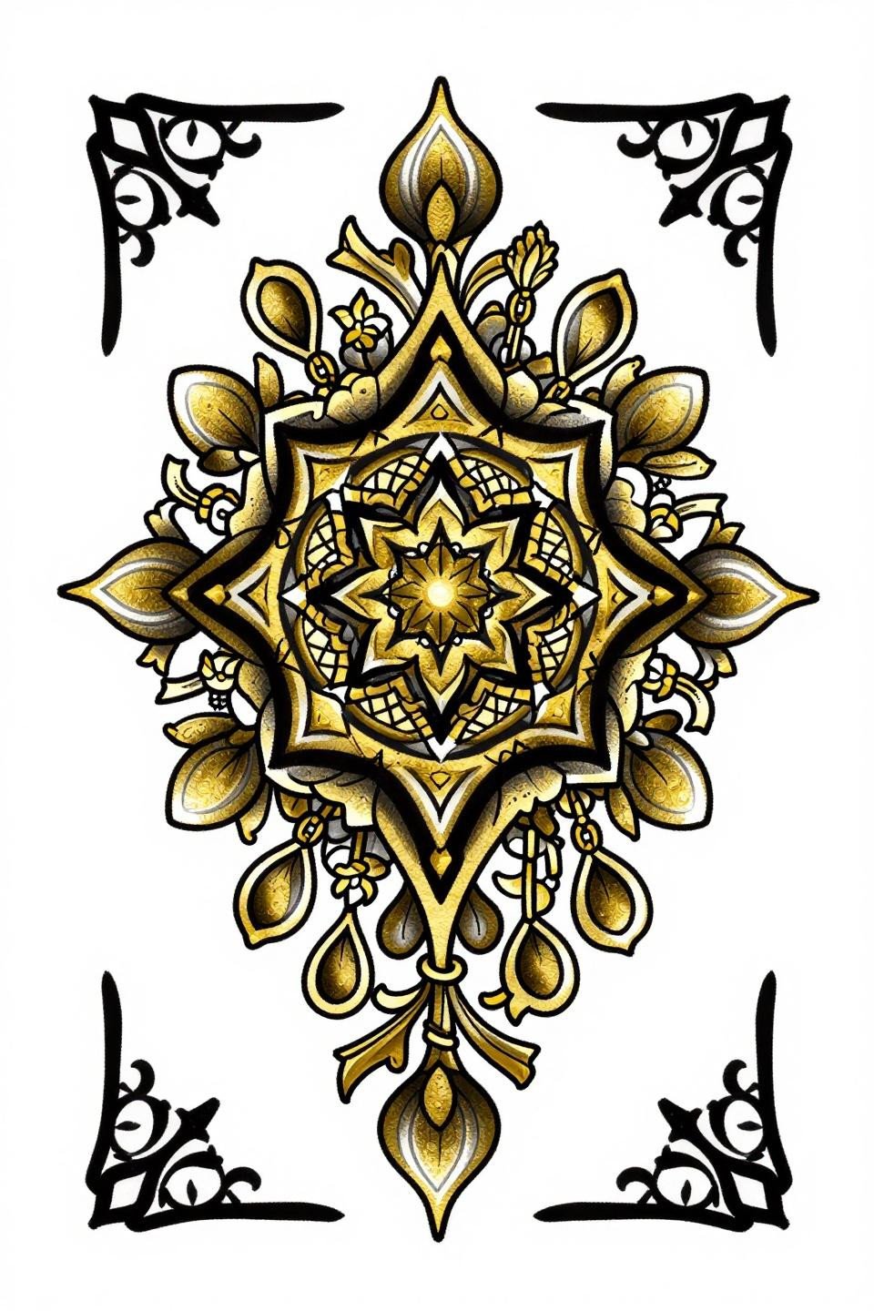
Geometric Starburst Built From Nested Diamond Logic
An octagonal star hub with nested diamond lattice infill and radiating triangular petals, composed in a diamond frame symmetry with bold 2-3pt outlines and flat gold fills.
This format sits best at the palm center, where the hand’s natural cup shape mirrors the geometric frame. Check the artist’s healed work portfolio specifically for flat fills with no patchiness. That consistency separates veterans from beginners.
Palm Tree Motif Where Negative Space Carving Does the Shaping
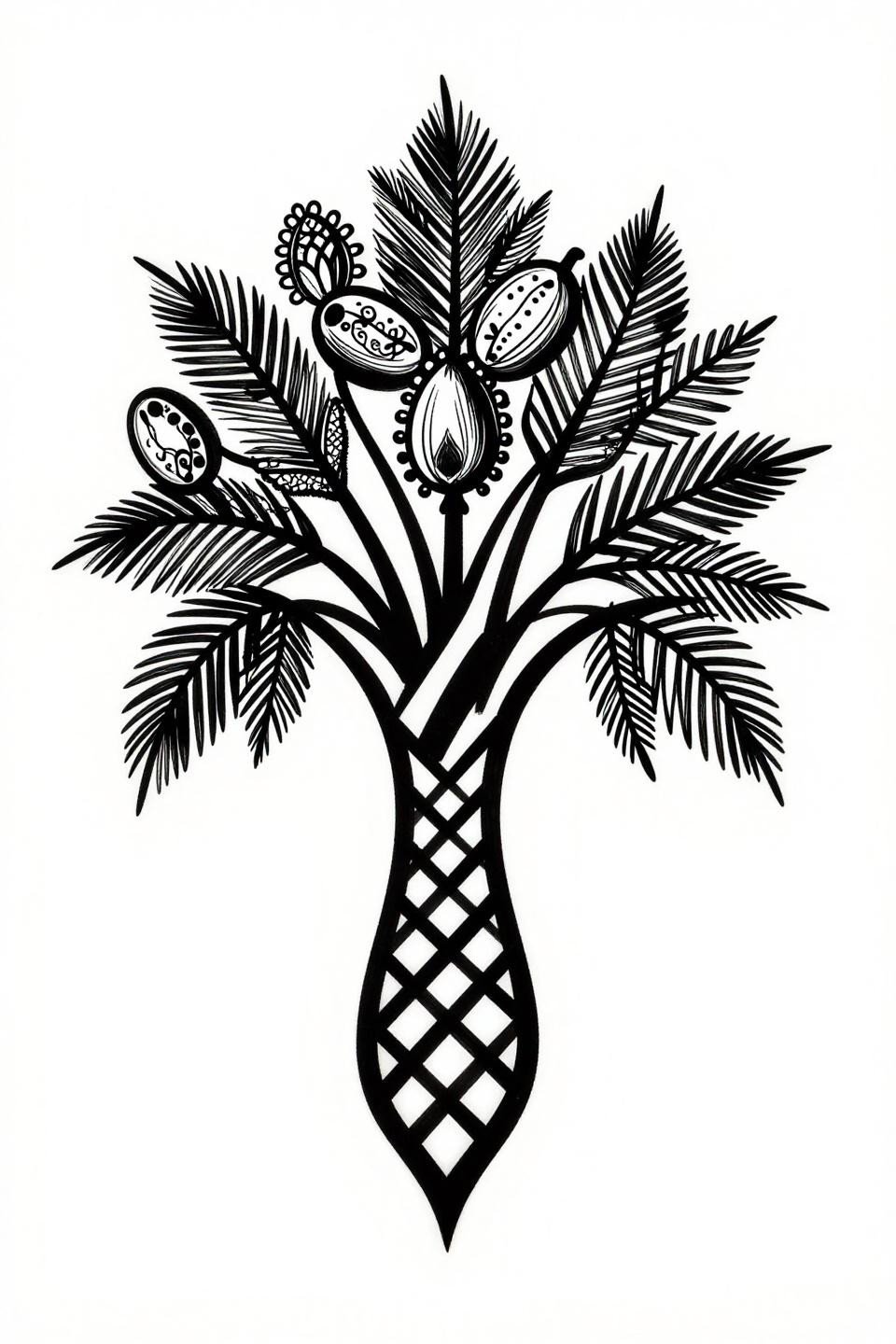
A centered palm tree with a geometric lattice trunk, radiating frond arcs, and lace filigree throughout, shaped entirely by hard negative space carving against dense black fills.
This is a collector’s pick for dorsal hand placement, where the trunk axis aligns with the middle finger metacarpal. For simple mehndi patterns and techniques, the palm tree format is one of the most structurally forgiving because it scales cleanly.
Art Nouveau Lace Grid With Crimson Accent Breaks the Monotone
An interlocking hexagonal grid with vine tendrils weaving through negative space, floral buds at intersection points, and flat crimson red accent fills punctuating the black linework.
The asymmetric diagonal flow makes this format adaptable to forearm, ankle, or shoulder placement without feeling forced into a rigid frame. The crimson accents function as visual anchors, so their placement needs to be deliberate, not scattered.
Botanical Floral Spray Where Etching Lines Build Volume
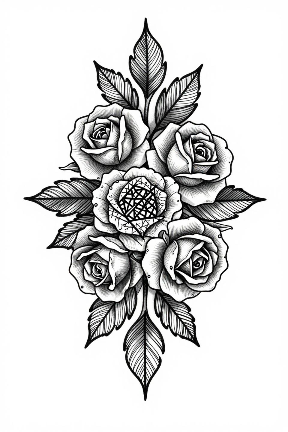
Nested rose blooms with geometric crosshatched centers, asymmetric stem lattice, and crosshatch etching shading that builds volume through parallel shadow lines rather than flat fill.
The grey wash midtones add depth that reads well on lighter skin but tends to flatten on deeper tones, where increasing the contrast between the darkest fills and the open negative space compensates for the reduced tonal range.
Concentric Mandala Built on Stipple Density Control
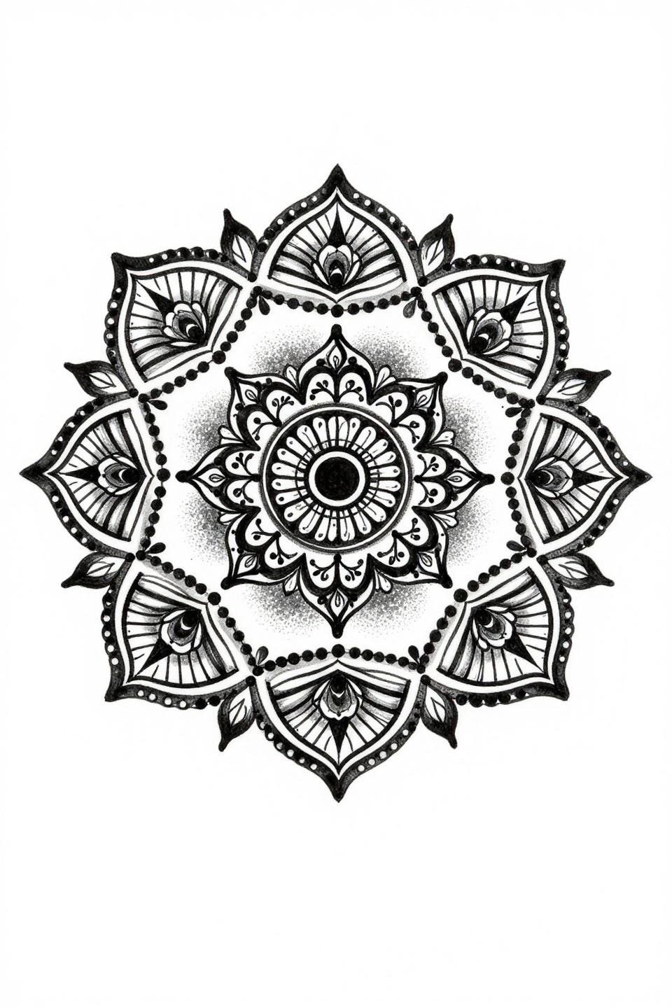
Nested concentric circles with floral teardrop motifs radiating outward and geometric lattice fills, the stipple density gradient running tight at center and opening toward the perimeter.
The Sak Yant influence here shows in how each concentric ring uses dot cluster logic rather than continuous fill, which means the design reads clearly even when scaled down for wrist or inner arm placement.
Full-Display Peacock in Hairline Etching, No Grey Wash Needed
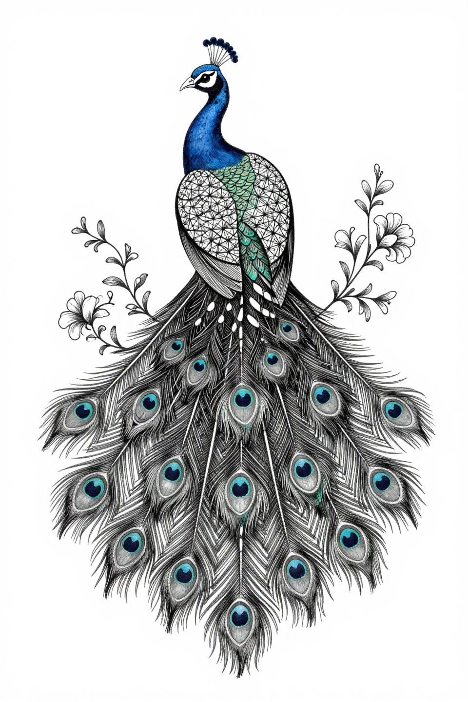
A full-display peacock with paisley-filled eye spots, floral vine tendrils along each quill shaft, and geometric diamond lattice integrated into the plumage, all in hairline 0.5mm single-needle etching.
Zero grey wash forces every tonal value to come from line density alone. This is the hardest format to execute consistently, so the tell is the quill shafts. Any wobble at the direction changes signals the artist isn’t comfortable at this scale.
Pick three references from this collection that match your placement and take them to your consultation. Not the full set. A tight selection tells the artist exactly where your head is, which means less back-and-forth and a cleaner final design.