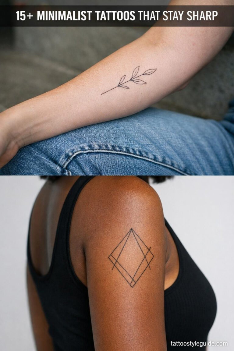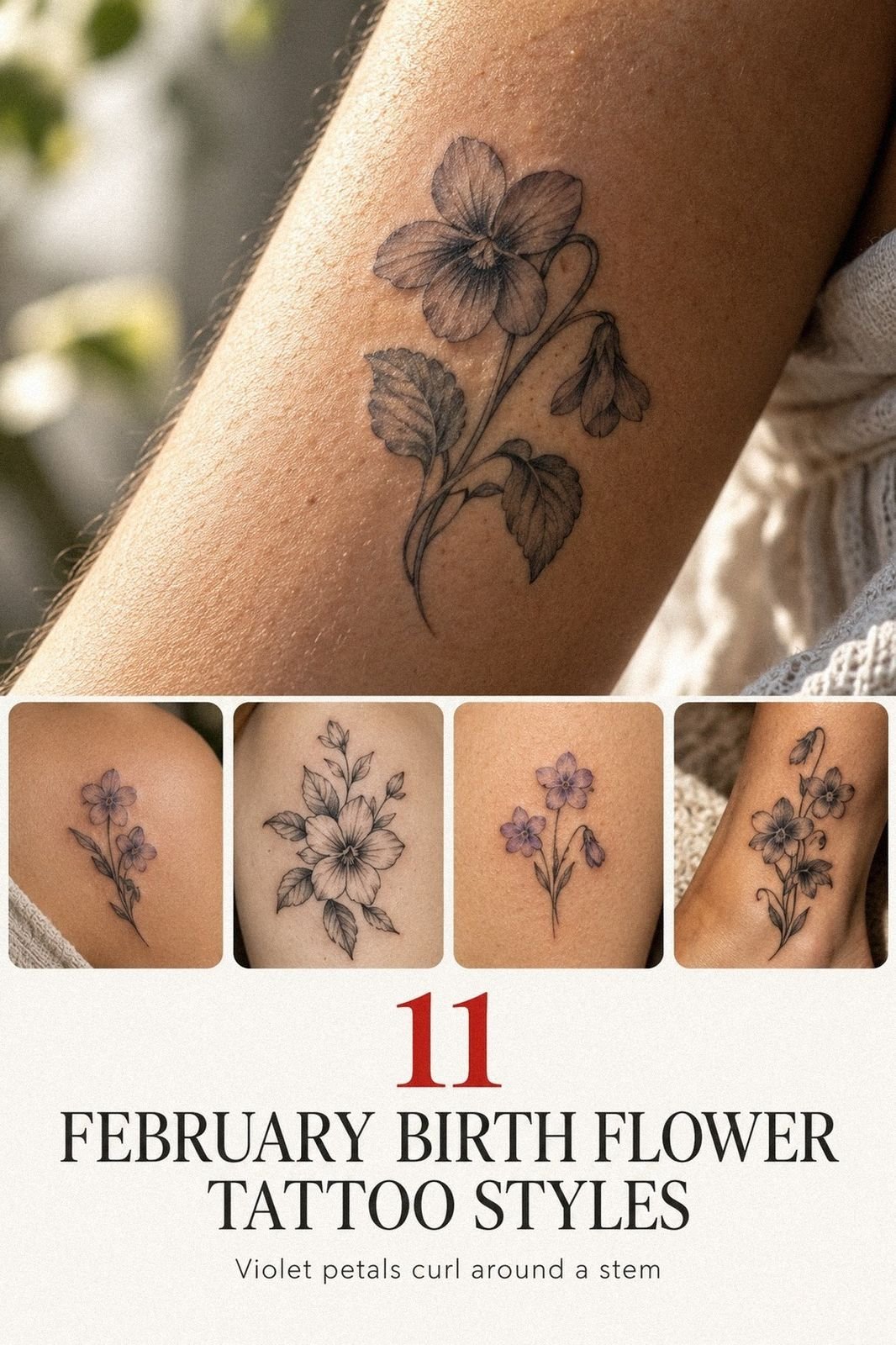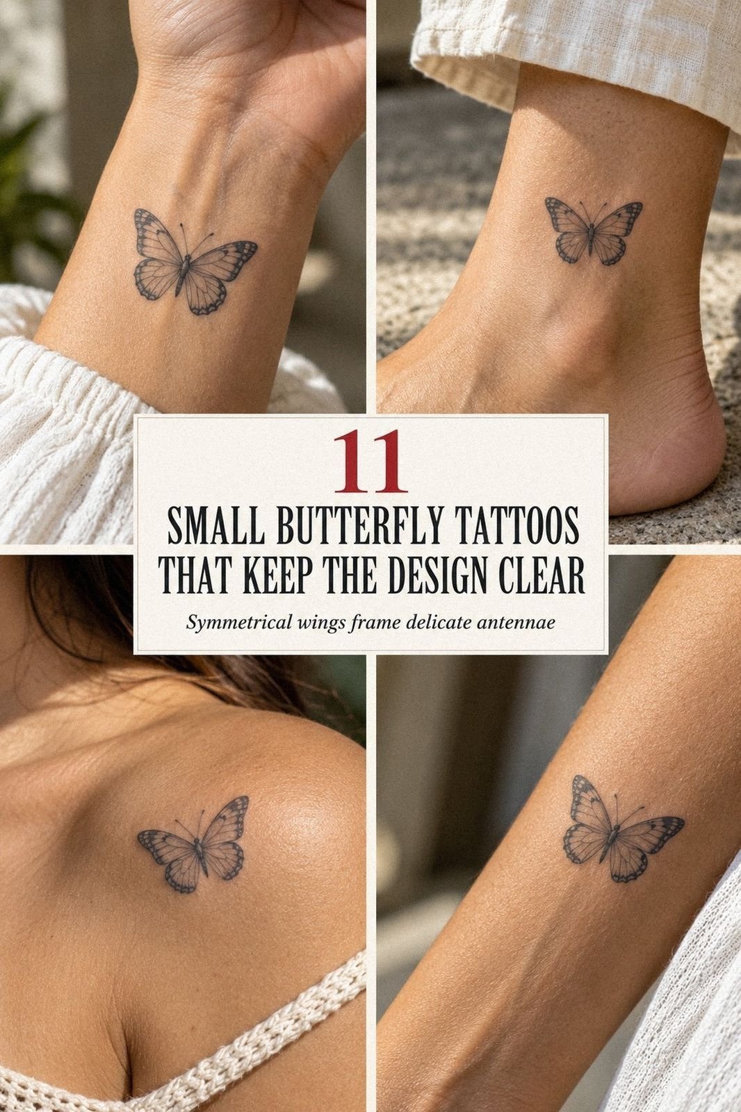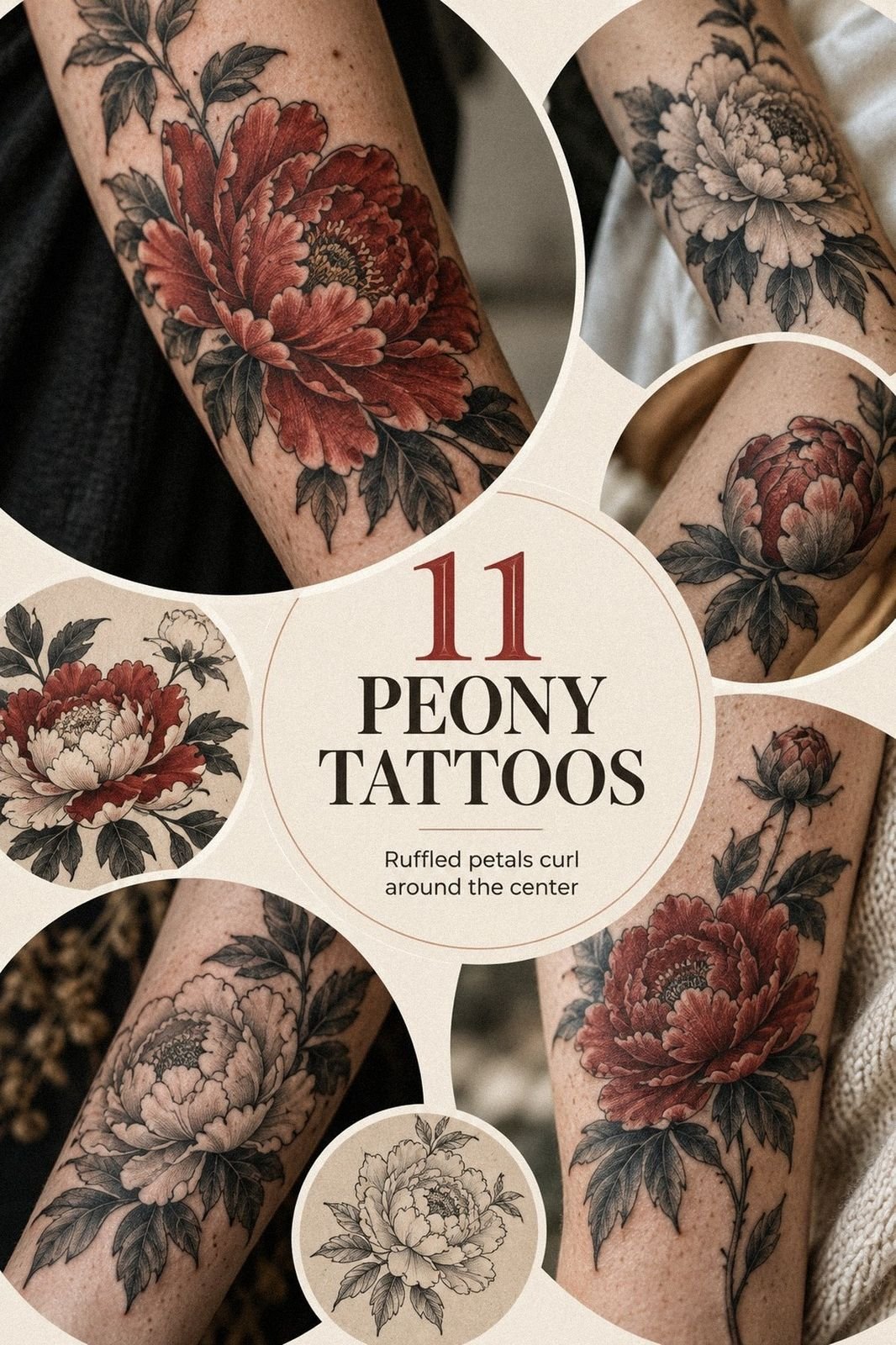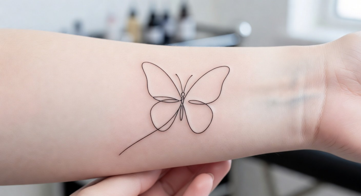
Minimalist tattoos age well when they respect three non-negotiables: enough line weight to survive years of spread, enough negative space so lines never merge, and placement away from constant friction and sun. Get those right and a tiny design still reads clean a decade later.
What actually ages well versus what blurs
Every healed tattoo softens. Ink spreads slightly under the skin over the years, so the question is never whether a minimalist design changes. It is whether you can still recognise it from across a room.
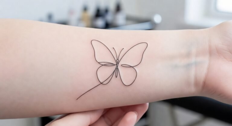
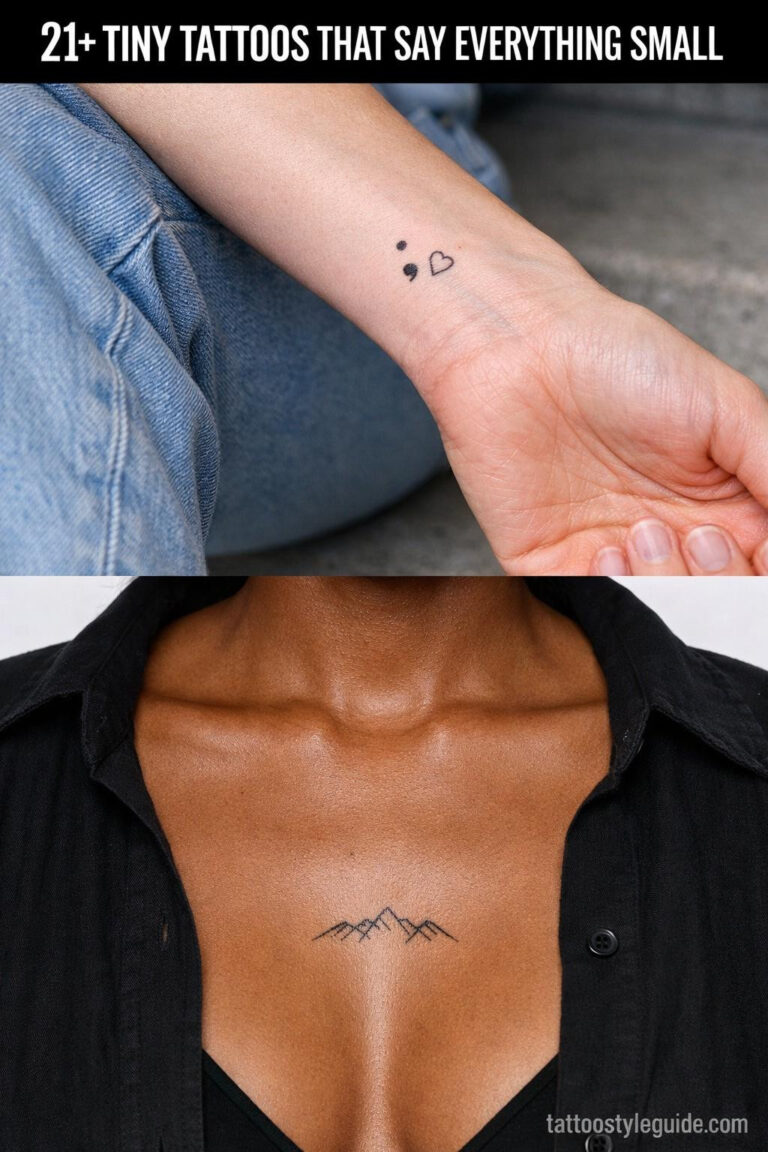
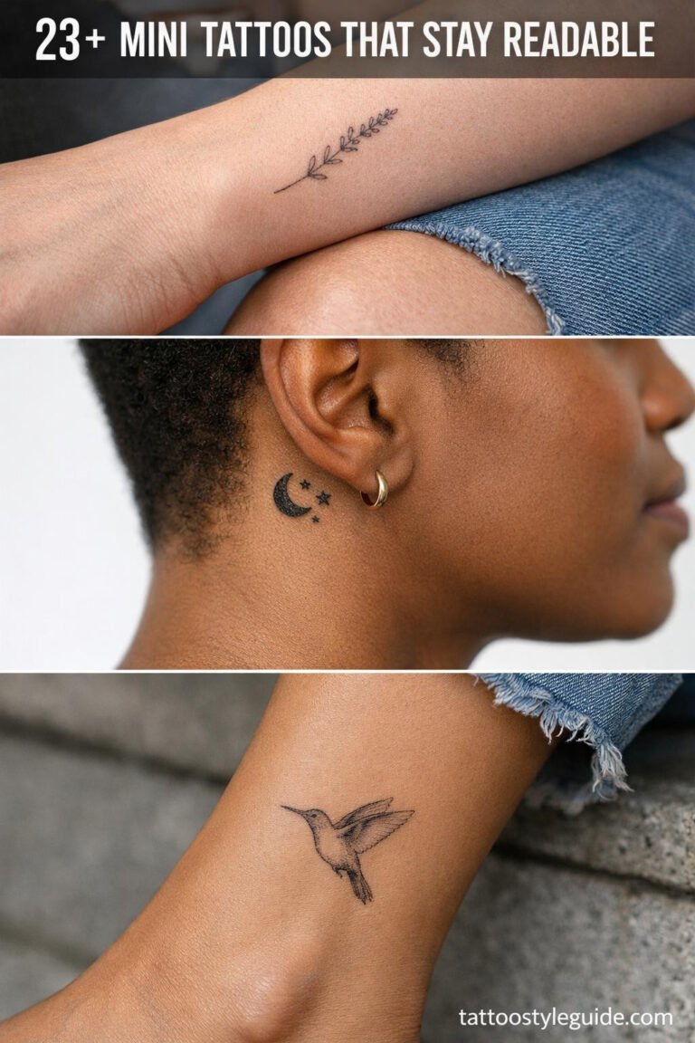
The pieces that survive tend to share one quality: they work as silhouettes. A single continuous line forming a mountain, a wave, a bird in flight, these hold because they have few edges that can merge into mush. Simple blackwork shapes, like a solid ring, a filled circle, or a clean band, are often the most stable of all. Black pigment is the most durable in the skin, and solid saturation leaves no internal gaps to close.
Controlled dotwork gradients soften but usually stay readable. Discrete dots spread without forming one continuous blur, which is why stippled shading ages more gracefully than tight hatching inside a tiny piece.
The designs that fade fastest are the ones people most often request. Micro-script or tiny cursive letters blur within three to five years as hairline strokes and tight letterforms fill in. Micro-realism and tiny portraits lose definition even faster, detail thinner than a pen line cannot survive the natural spread of pigment under healing skin. If a design only works because of strokes finer than a ballpoint line, the honest choice is to scale it up or simplify it. There is no third option that holds up over time.
Line weight and the real limits of fine
Why the thinnest possible line is a trap
Fine line does not mean the thinnest line your artist can pull. A hairline outline around 0.2 mm looks incredible the day you get it and can fade to almost nothing within a few years, especially on hands and wrists. The durable sweet spot for a healed minimalist line sits around 0.3 to 0.5 mm depending on your skin type and where the tattoo sits.
That weight still looks delicate. It simply carries enough pigment to survive softening instead of disappearing into it. Over-working a thin line to make it darker risks a blowout, where pigment spreads sideways under the skin and the line goes fuzzy immediately. Even saturation with light, consistent passes beats brute force every time.
Negative space as a structural requirement
Negative space matters as much as the line itself. Aim for at least 2 to 3 mm of bare skin between parallel lines, small shapes, or letters. Tight hatching inside a tiny piece is the classic way to end up with a grey patch in five years, because the gaps close before the lines do. The space between elements is what keeps them reading as separate forms.
How small is too small
The floor for recognisable icons
People consistently underestimate how small is too small. For a recognisable icon, a heart, a star, a single word, roughly 1.5 to 2 cm on the smallest dimension is a safer floor. Once you drop under about 1 cm with multiple internal details, you enter territory where the design can flatten into a blob within three to five years.
Experienced artists often size up minimalist designs slightly from what a client first requests, because fine lines and negative space compress visually on healed skin. A piece that looks spare and airy fresh can feel cramped once it settles. Building in that extra breathing room from the start prevents the shape from collapsing inward.
Why packing more ink backfires
There is a common instinct to ask for darker, heavier saturation in a tiny tattoo to make it last. This usually does the opposite. Over-saturated fine lines blow out or heal patchy. The skin can only hold so much pigment in one pass; pushing past that limit damages the tissue and creates uneven settling. A lighter, more controlled application heals more evenly and ages more predictably.
Placement: the hidden variable
The zones that hold clarity
Placement decides more than design once five or ten years pass. Low-friction, low-movement, low-sun zones keep minimalist work crisp. High-wear areas turn it soft no matter how skilled the artist.
The upper outer arm above the elbow, the shoulder and shoulder blade, the upper and mid back, the outer thigh and hip, and the dorsal or outer forearm age best for clarity. These areas see less rubbing, fewer extreme stretches, and are easy to keep out of direct sun. The skin is relatively stable, and the daily wear is minimal.
The middle ground
The inner forearm and collarbone sit in an honest middle category. The skin is fairly stable, but constant motion and sun exposure mean ultra-fine lines drift toward a softer, more watercolour appearance after five to ten years. These spots work well for simple linear pieces with clean geometry. They are less forgiving of dense micro-detail or lettering that relies on tight spacing.
The fast-faders
Fingers, sides of fingers, knuckles, hands, feet, and the inner wrist crease blur fastest. Constant washing, abrasion, shoe pressure, and rapid skin turnover can soften fine line work within one to three years. If you want the delicate look in one of these brutal spots, budget for periodic touch-ups or accept a hazier end state as part of the design.
The sides of the feet and the Achilles area are often overlooked as high-wear, but shoe friction and sock abrasion make them nearly as punishing as the hands. The inner wrist crease folds dozens of times daily; even a well-executed line there will spread faster than the same line two inches higher on the flat outer wrist.
The timeline of change
A clean idea of how minimalist tattoos evolve helps you set expectations. In the first year, lines lose that ultra-crisp fresh edge as the epidermis regenerates. This is completely normal and not fading. Between years one and five, lines soften slightly and may look a touch more watercolour, a phase plenty of people prefer. From years five to ten, a piece on the upper arm, back, or thigh stays clearly readable, while friction-heavy and sun-exposed spots show more grey blur.
Two protective habits carry most of the weight. Consistent long-term sun protection, with SPF and clothing, has an outsized effect on line clarity. And careful initial healing, no picking, no soaking, no early sun exposure, prevents the patchy fade that comes from uneven scarring. Healthy, well-hydrated skin ages every tattoo more evenly.
What to ask for in the chair
Tell your artist you care more about ten-year readability than maximum fineness. Ask for a healed line weight near 0.3 to 0.5 mm, at least 2 to 3 mm between elements, and a smallest dimension no under 1.5 cm. Let them push the weight slightly on any high-friction placement. A good artist will not be offended by this request; they have seen too many tiny tattoos blur and will likely volunteer similar guidance.
Bring reference images that show healed work, not just fresh photos from Instagram. Fresh tattoos are misleadingly sharp. Healed work, photographed two or more years later, shows you what the artist’s lines actually become. If an artist’s portfolio only shows pieces under six months old, ask to see older healed examples or look elsewhere.
Before You Decide
Minimalist tattoos can age beautifully, but the design alone does not determine the outcome. Line weight, negative space, and placement together decide whether a small piece reads as intentional art or as a soft grey mark a decade later. The most common regret is not choosing the wrong image; it is choosing the right image at the wrong scale, in the wrong spot, with lines too fine to survive.
Start with placement, then scale, then design. A simpler icon slightly larger than you first imagined, on skin that sees little friction and less sun, will almost always outlast a more intricate piece squeezed into a high-wear zone. The restraint is in the planning, not just the artwork. A minimalist tattoo that ages well is one that was drawn for the future, not just for the mirror on the day you leave the shop.
Frequently Asked Questions
What is the ideal line weight for a minimalist tattoo that will age well?
A healed line weight around 0.3 to 0.5 mm is generally the most durable for minimalist work. Lines thinner than this can fade significantly within a few years, especially on high-wear areas like hands and wrists.
How small can a minimalist tattoo be before it starts to blur?
For a recognisable icon with clean edges, roughly 1.5 to 2 cm on the smallest dimension is a safer minimum. Below about 1 cm, details tend to flatten into a blob or grey patch within three to five years.
Where should I place a minimalist tattoo for the longest clarity?
The upper outer arm, shoulder, shoulder blade, upper and mid back, outer thigh, and outer forearm age best. Avoid fingers, hands, feet, and the inner wrist crease if you want minimal fading without frequent touch-ups.
Does fine line tattoo ink fade faster than bold blackwork?
Fine lines with less pigment density fade faster than solid black shapes, but the difference is less about ink type and more about line weight and saturation. Solid blackwork is generally the most stable form because it contains the most pigment and has no internal gaps to close.
Can I get a minimalist tattoo on my finger and still have it look good long-term?
Finger tattoos almost always fade and spread faster due to constant use, washing, and skin turnover. If you want fine line work there, expect to need touch-ups every one to two years, or choose a design that will still look acceptable as a softer, hazier version of itself.