Simple goth tattoos can stay crisp for years if you give the design enough breathing room. I got my first tiny black piece the week I turned 30, after sitting on the idea way too long. It wasn’t loud. It still felt like mine.
- I Chose a Tiny Black Bat Outline
- I Tested Crescent Moon Linework First
- I Matched the Design to My Wrist
- I Sketched a Minimal Gothic Cross
- I Added One Sharp Thorn Detail
- I Compared Fine Line and Blackwork
- I Built a Small Gothic Cat Silhouette
- I Placed a Spiderweb Behind My Ear
- I Chose Symbols With Personal Meaning
- I Checked How Ink Would Age
- I Simplified a Victorian Graveyard Motif
- I Balanced Darkness With Negative Space
- I Considered Pain Around Bony Placements
- I Reviewed Healing Needs Before Booking
- I Found an Artist for Clean Linework
- I Requested Stencil Changes Before Tattooing
- I Set a Realistic Price Range
- I Followed Aftercare for Crisp Details
- I Planned My Next Simple Goth Tattoo
1I Chose a Tiny Black Bat Outline
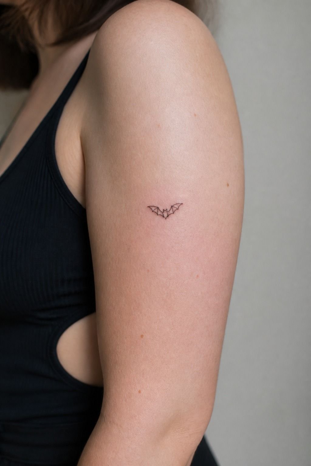
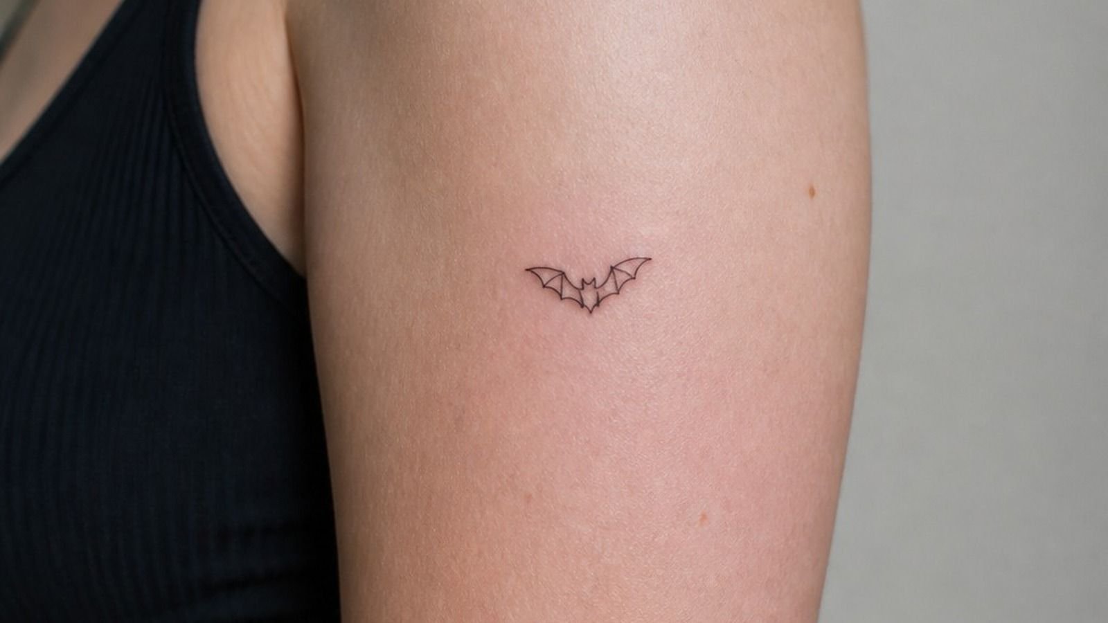
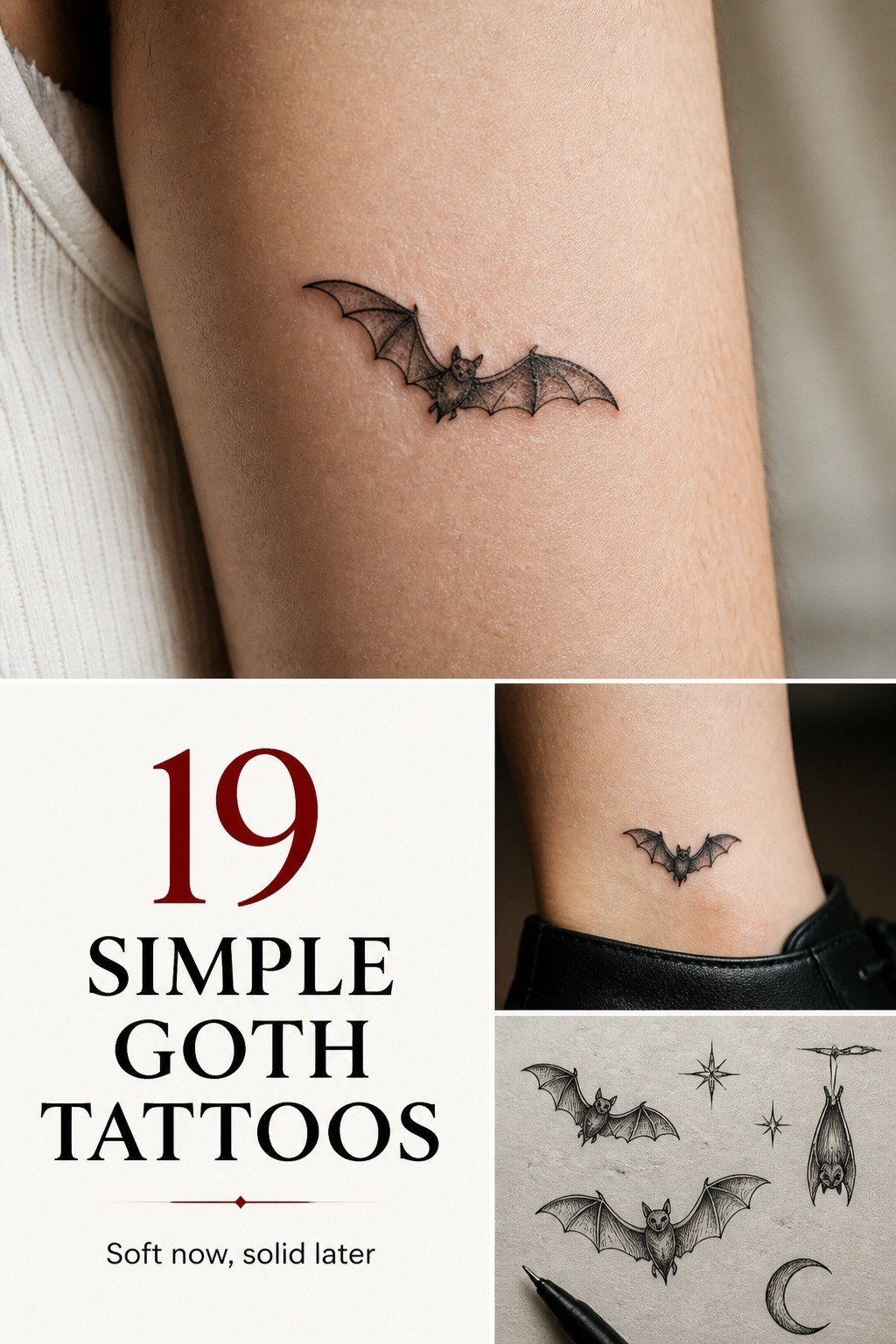
My upper arm was the right call for a tiny black bat outline because the skin is low-wear and the curve lets its wings read clean. You can keep a bat around 1.5 to 2 inches and still give each wingtip room. I’d skip adding little stars, faces, and ornate veins here.
That’s how a clean goth-tattoo-design turns into soup later.
The fine line needs to be crispy, not faint. On fair cool-pink skin, black ink gives you a moody silhouette without fighting your undertone.
Your artist should use a controlled single-needle or tight round liner pull, then leave the body mostly open. Small, sharp, and a little dramatic!
2I Tested Crescent Moon Linework First
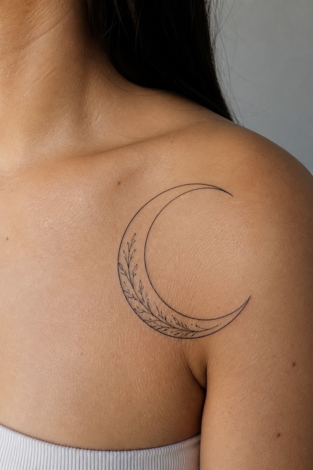
A crescent moon on the shoulder gave me a soft way into simple-dark-tattoos without committing to a heavy blackwork block. The shoulder cap has enough surface that you can make the moon about 2 inches tall and still preserve the inner curve. You’ll see every small wobble in a moon, so clean stencil placement matters.
I chose black linework over white ink. White can look subtle at first, but it often heals warmer or fades into your skin tone. A thin black crescent with two or three intentional details holds better, especially when your artist pushes just enough contrast for it to read across the room.
3I Matched the Design to My Wrist
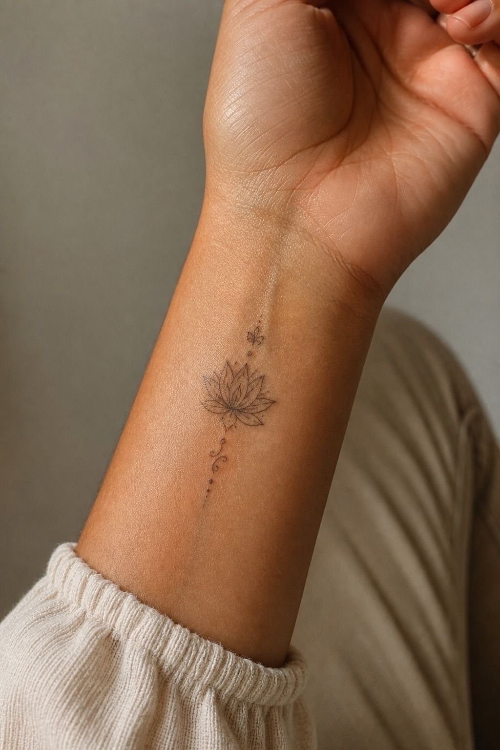
Your wrist is visible, personal, and a little high-wear. I kept mine narrow, following the length of the wrist instead of trying to cram a full gothic scene into a 1-inch strip. That size on a wrist is gonna mush out, so bump it up the forearm if your idea needs lettering, filigree, or a tiny figure.
A healed wrist tattoo needs a simple shape and confident lines. I’d take a clean dagger, moon, or thorn stem over a Pinterest-exact micro collage every time. If you’re debating finger-adjacent placement, these simple hand tattoos show why touch-ups are part of the deal.
4I Sketched a Minimal Gothic Cross
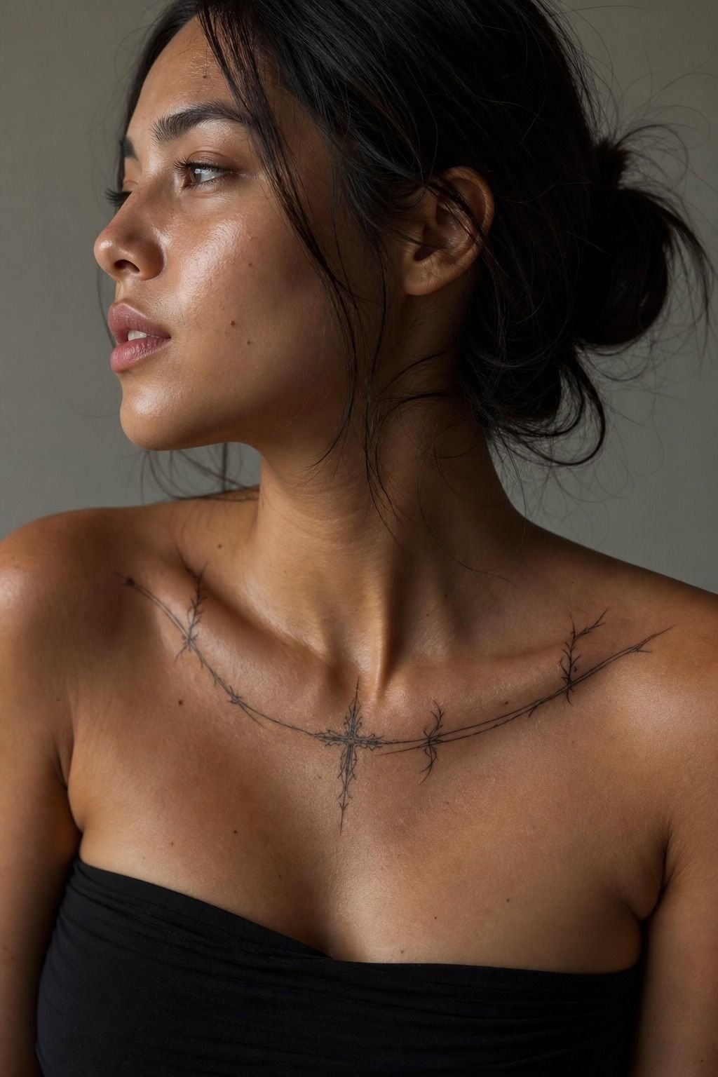
The collarbone made a minimal gothic cross feel intentional instead of costume-y.
5I Added One Sharp Thorn Detail
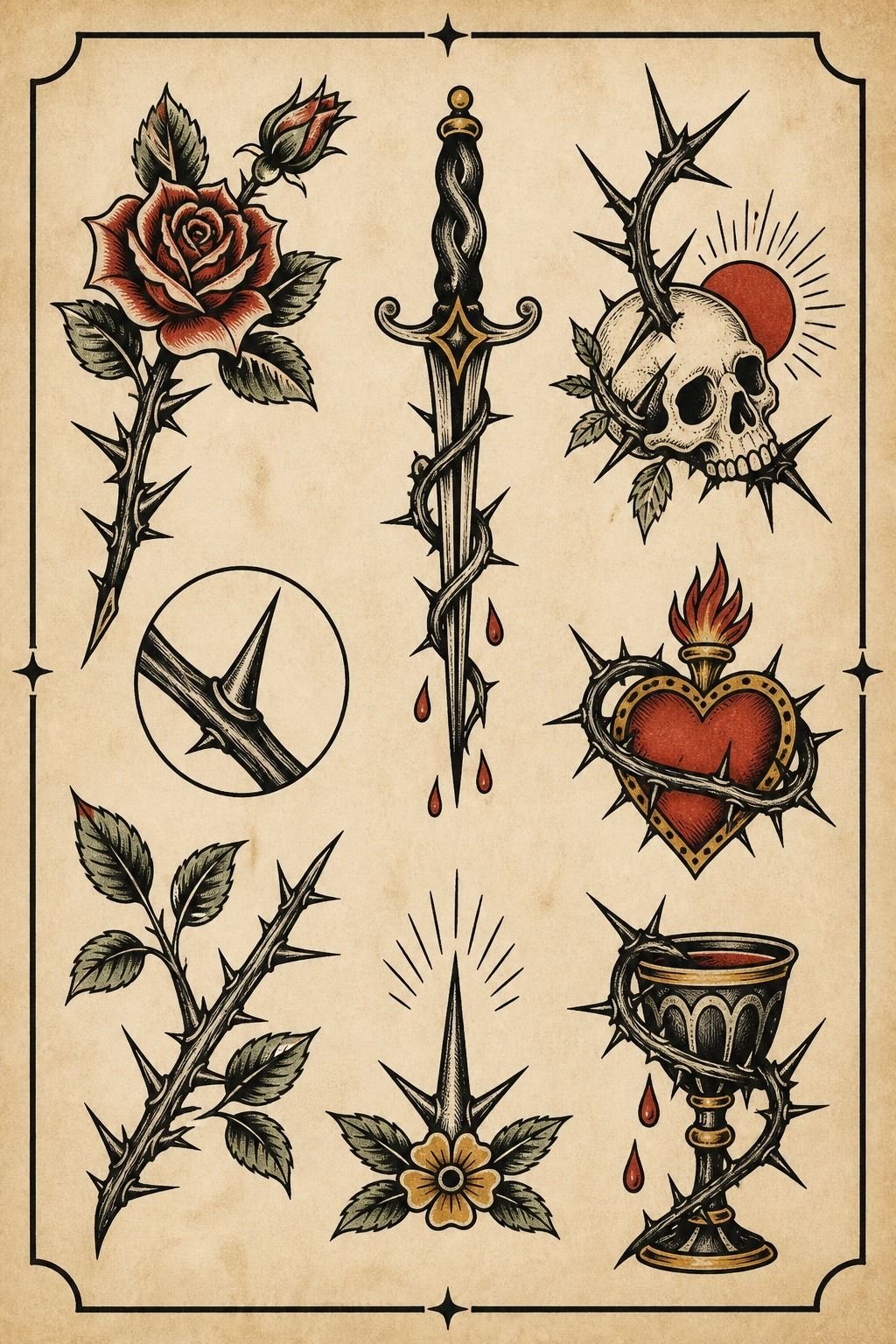
I drew thorn references on an aged flash sheet before choosing the final version. One sharp thorn cluster has more bite than a whole bracelet of fussy vines. Your eye needs somewhere to rest, even in alternative-tattoos-grunge work.
The part I kept was the direction of the thorns. They should travel with your arm or collarbone, never look pasted across it. I’d skip perfectly symmetrical barbed wire because it can feel stiff fast.
A thorn stem with a few uneven points looks organic, moody, and more like real tattoo flash.
6I Compared Fine Line and Blackwork
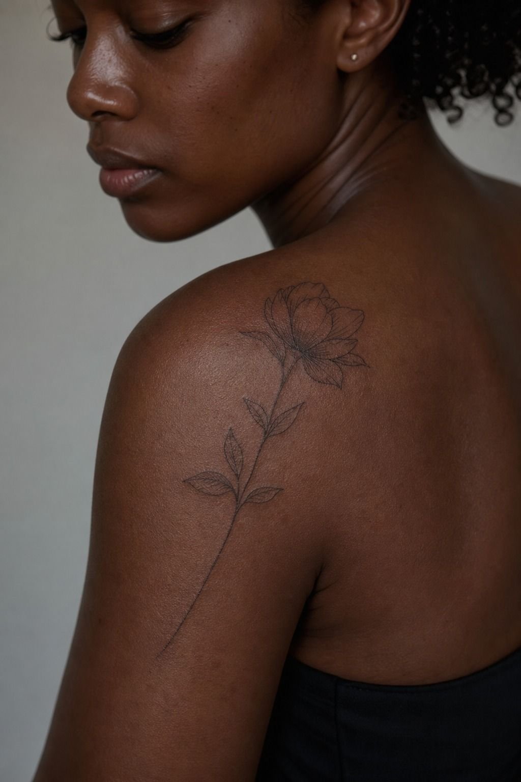
Fine line and blackwork aren’t enemies, but you should pick the one that fits how you want your tattoo to age. On a deep ebony shoulder, a fine line moth can look soft and refined, while solid blackwork fill gives a bolder read from farther away. Both can be solid choices.
I went fine line for the small details, then used selective black fill in the body. That contrast is the whole move. You don’t need every area dark to make goth tats feel dark.
And if an artist promises hair-thin lines with no consideration for your skin, I’d keep looking.
7I Built a Small Gothic Cat Silhouette
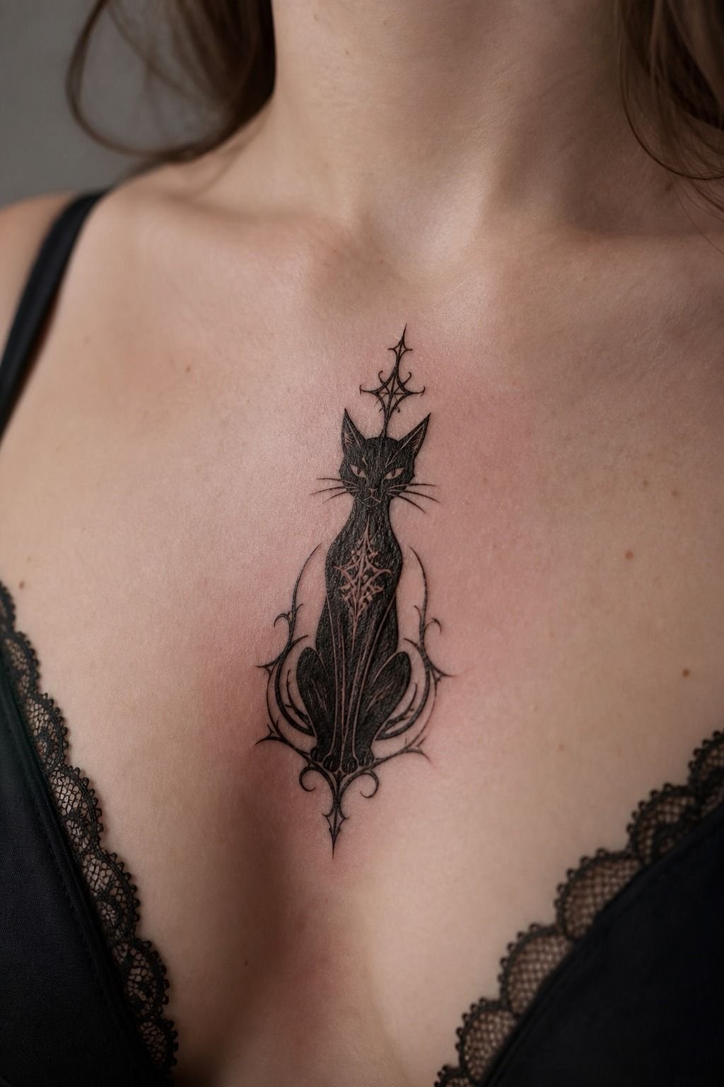
A sternum cat silhouette sounded easy until I saw how much the placement changes the drawing. Your sternum is not a flat page, and the center line can make a symmetrical cat look crooked if the stencil isn’t adjusted carefully. I made the cat about 2.5 inches wide, with the tail simplified into one clean curve.
Use solid black ink for the silhouette, then leave the eyes or a tiny moon unfilled. That little break gives you a captivating detail without turning the whole thing into a dense blob.
Lines feel sharper here, and color packing is the spiciest part, so take a break if you need one. No medals for passing out on me.
8I Placed a Spiderweb Behind My Ear
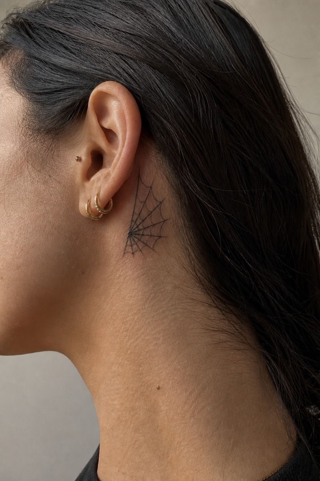
A spiderweb behind the ear is small, visible when you want it, and spicy enough that you should choose it on purpose. I kept the web open, with fewer rings than most reference photos. Your hairline and ear curve already create visual activity, so the tattoo doesn’t need to work overtime.
A healed behind-the-ear tattoo can fade faster from hair products, sun, and friction. I’d choose black linework over grey wash here because black is your best friend for longevity. For a small-emo-tattoo, it’s a strong pick if you accept that this placement may need maintenance.
9I Chose Symbols With Personal Meaning
I stopped treating symbolism like a quiz with one right answer. Your bat can mean night, protection, a favorite album, or nothing beyond “I like bats.” That’s valid. The tattoo has to live on your skin, not satisfy someone else’s mythology.
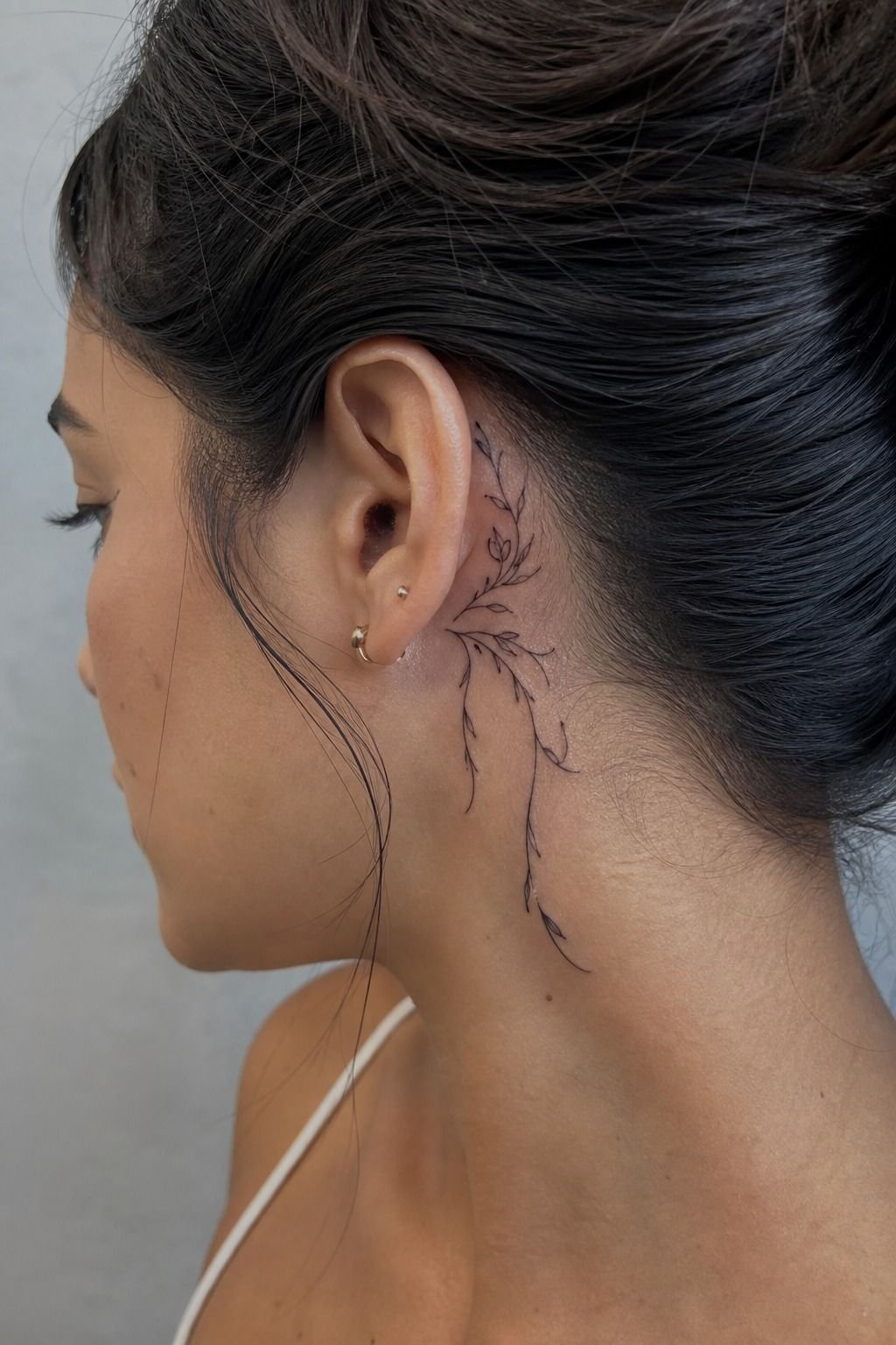
For this placement guide, I paired a small sigil-style mark with the shape behind the ear instead of adding a paragraph of symbolism into the design. I’d skip borrowed symbols you can’t explain.
Pick a personal date, a flower with a memory, or a symbol that still hits when the trend moves on. That’s what makes a simple goth tattoo feel timeless.
10I Checked How Ink Would Age
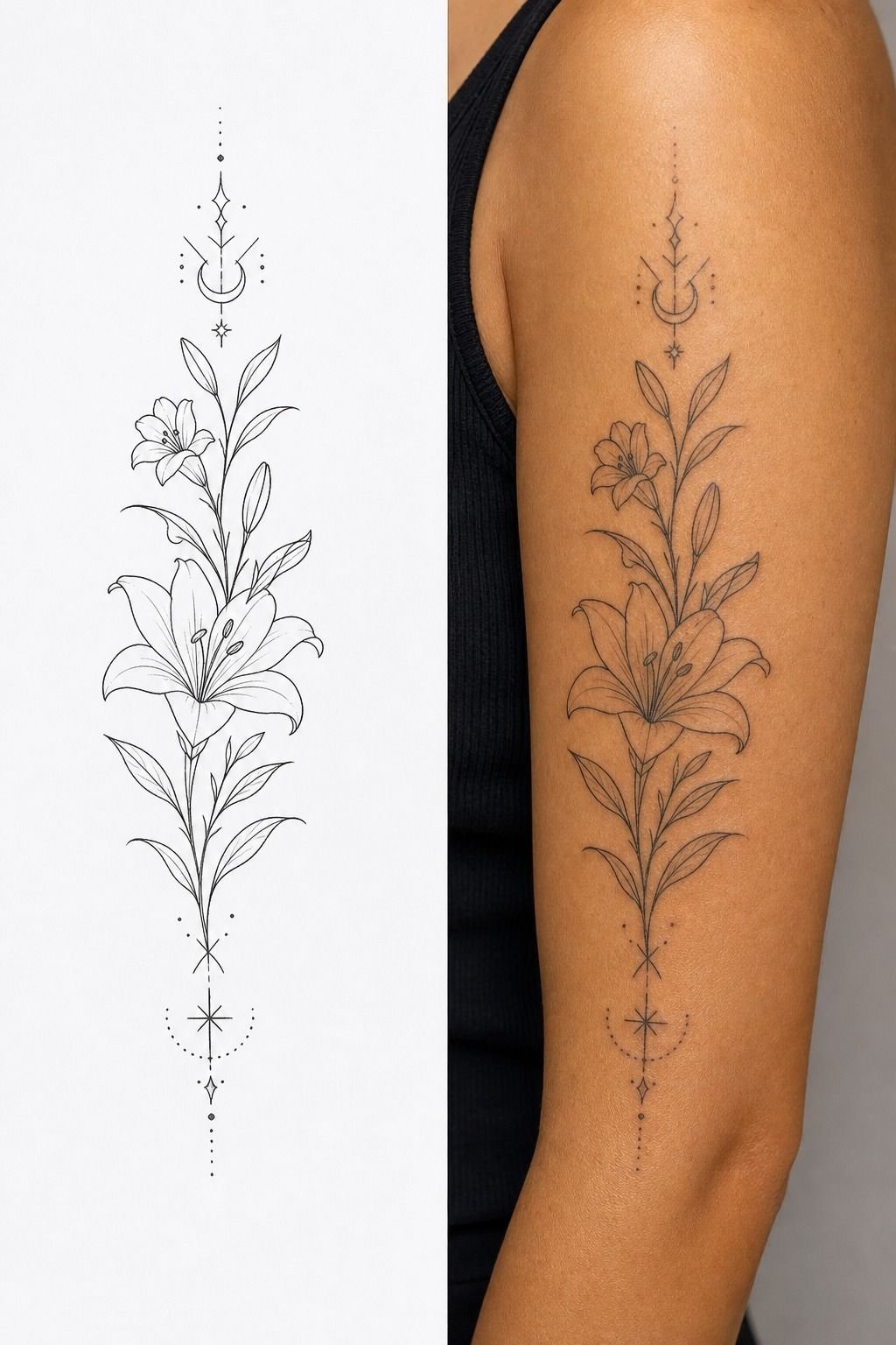
I compare the fresh stencil to the healed result before I book anything. Fresh fine lines look razor-thin, but skin isn’t paper. Over time, lines can widen and edges can soften, especially where your skin bends, rubs, or sees a lot of sun.
The Two-Stage Read Rule is simple: your tattoo should look good close up and still make sense from a few feet away. A healed black outline with clear gaps beats microscopic lacework every time. Read why tattoos blur over time before committing to a detail-heavy design, because you’ll make better size choices after that.
11I Simplified a Victorian Graveyard Motif
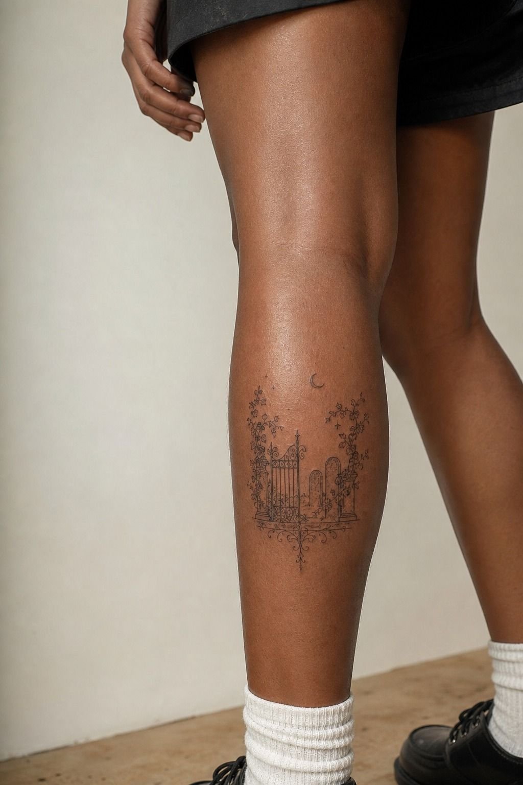
A calf gave this Victorian graveyard motif enough real estate to breathe.
12I Balanced Darkness With Negative Space
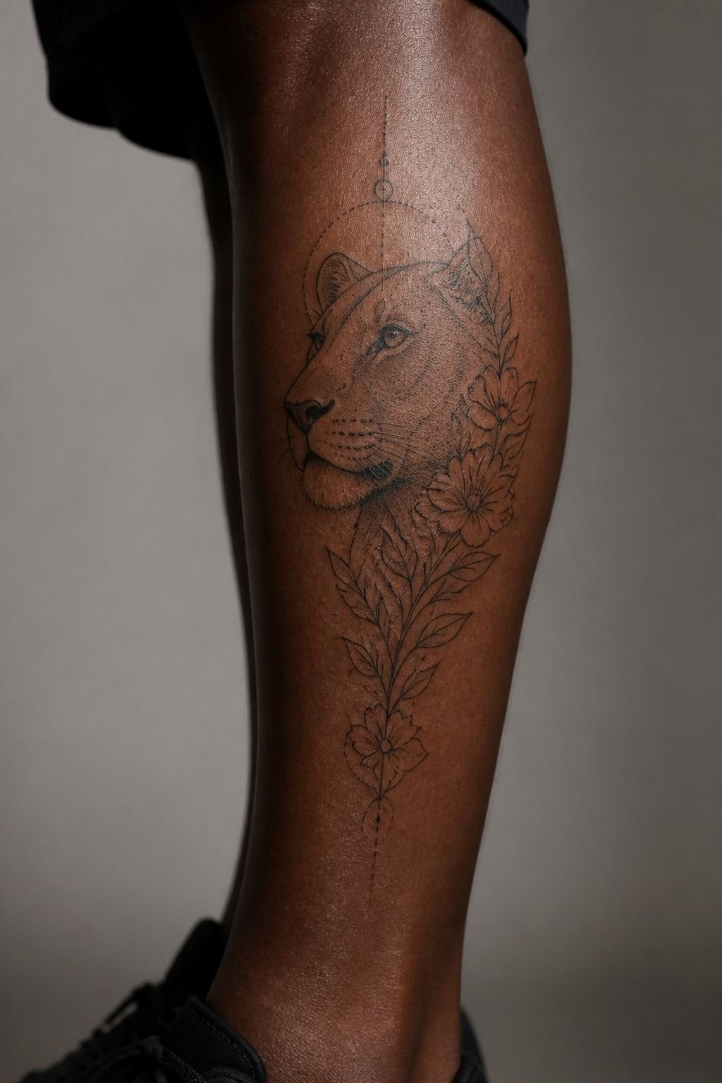
Negative space is what stopped my black designs from looking flat. On deep ebony skin, the open skin between a web, thorn, or moon shape gives the tattoo a calm, readable edge.
You don’t need pale skin for contrast. You need smart contrast.
The Black-Window Method means leaving clear, deliberate gaps between the dark sections. I asked for pepper shading around the main linework instead of solid fill everywhere. It keeps the image soft so it heals velvety, not patchy.
But don’t confuse soft shading with weak shading. It still needs enough density to survive healing.
13I Considered Pain Around Bony Placements
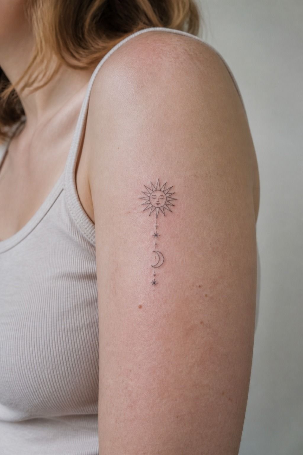
Pain is real, and your placement choice should account for it.
14I Reviewed Healing Needs Before Booking
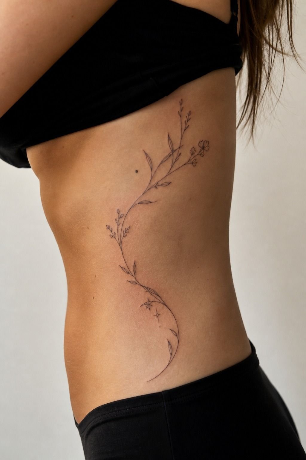
I booked my rib tattoo only after I could protect it from workouts, pools, and tight waistbands. Your first few days are an open wound, so treat them like that. A rib piece under a sweaty sports bra is not a relaxing healing plan.
Wash with gentle unscented soap, pat dry, then use a thin layer of fragrance-free ointment. Don’t suffocate it. Surface healing usually takes about 2 to 3 weeks, while the deeper healing process can take 2 to 3 months.
It’ll peel like a sunburn, and you don’t pick the flakes unless you want to pull color out.
15I Found an Artist for Clean Linework
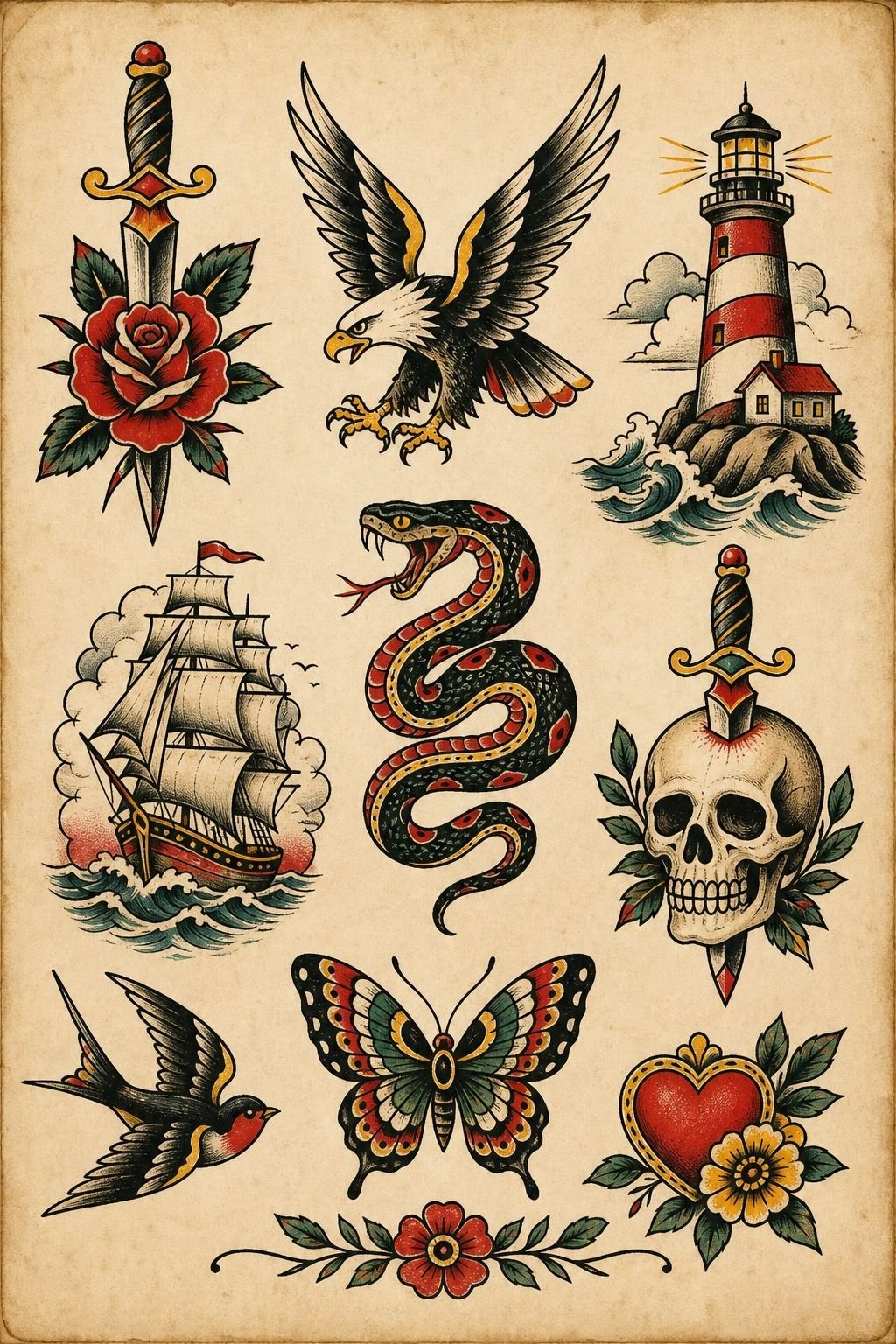
I looked for healed photos first, not just fresh tattoos under perfect studio lighting. Your artist’s portfolio should show crispy and confident lines on different skin tones, plus work that’s several months old. Fresh work can hide a scratchy hand.
Healed work tells the story.
Bring your saved tattoo flash references, but don’t ask for an exact Pinterest copy. I’m firm on that.
References are for vibe, scale, and placement, not tracing somebody else’s tattoo. If you want witchy imagery with a similar clean approach, these witchy tattoos are useful reference territory.
16I Requested Stencil Changes Before Tattooing
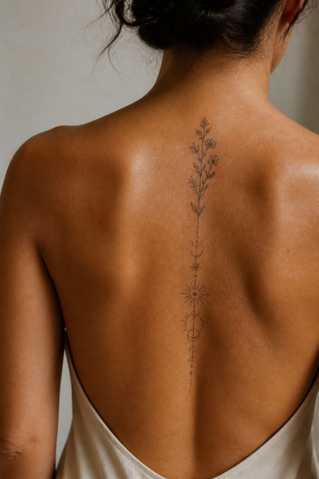
I asked to move the upper-back stencil twice. Good thing I did.
A centered design can look centered in the mirror, then pull sideways the minute you relax your shoulders. Your artist should let you check it standing naturally before the machine starts.
The Stencil Walkaround is my rule here: front view, side view, arms relaxed, then one photo. A purple transfer stencil is cheap to redo and permanent ink is not. I’d rather spend ten extra minutes adjusting the placement than spend years noticing one tilted wing.
And yes, you’re allowed to be picky.
17I Set a Realistic Price Range
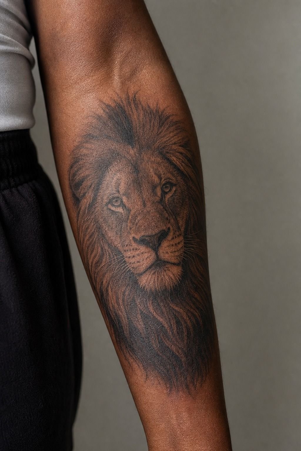
Tiny doesn’t always mean cheap. A shop minimum in the US is typically around $50 to $100, and many artists charge roughly $100 to $250 per hour depending on experience, city, and demand. You’re paying for setup, sterile supplies, drawing time, placement, and a clean procedure, not just the minutes the needle touches skin.
I’d put your money toward an artist with strong healed fine-line portfolio photos instead of chasing the lowest quote. Cheap tattoos can become expensive cover-ups. That’s not drama, it’s math.
18I Followed Aftercare for Crisp Details
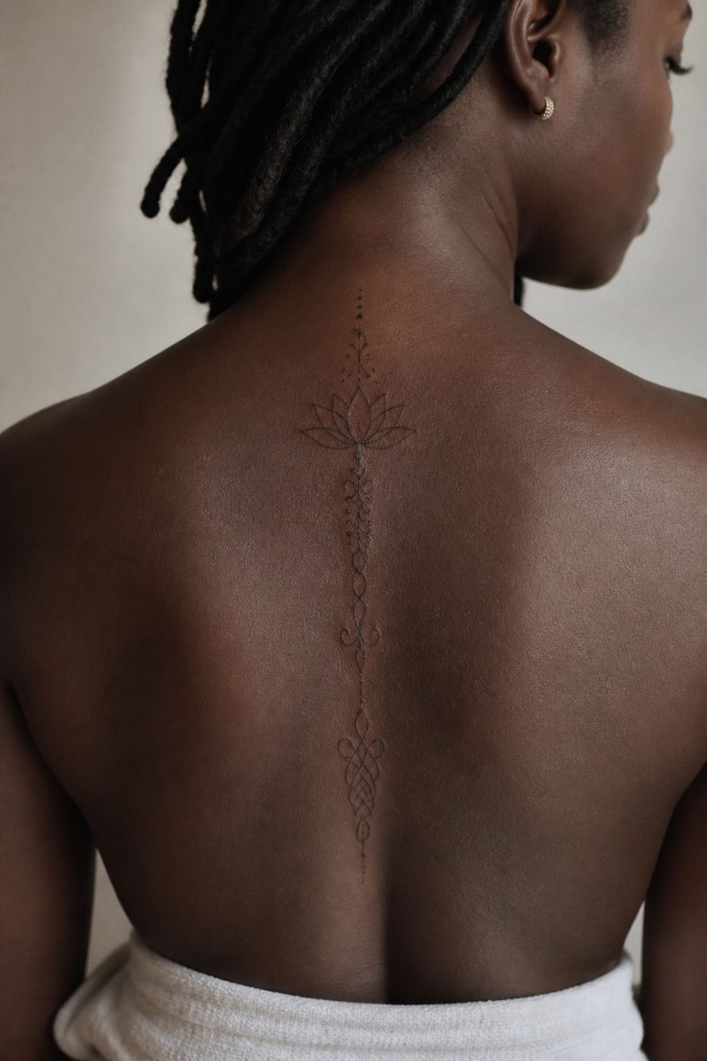
Aftercare is boring until you see what poor healing does to a crisp detail.
19I Planned My Next Simple Goth Tattoo
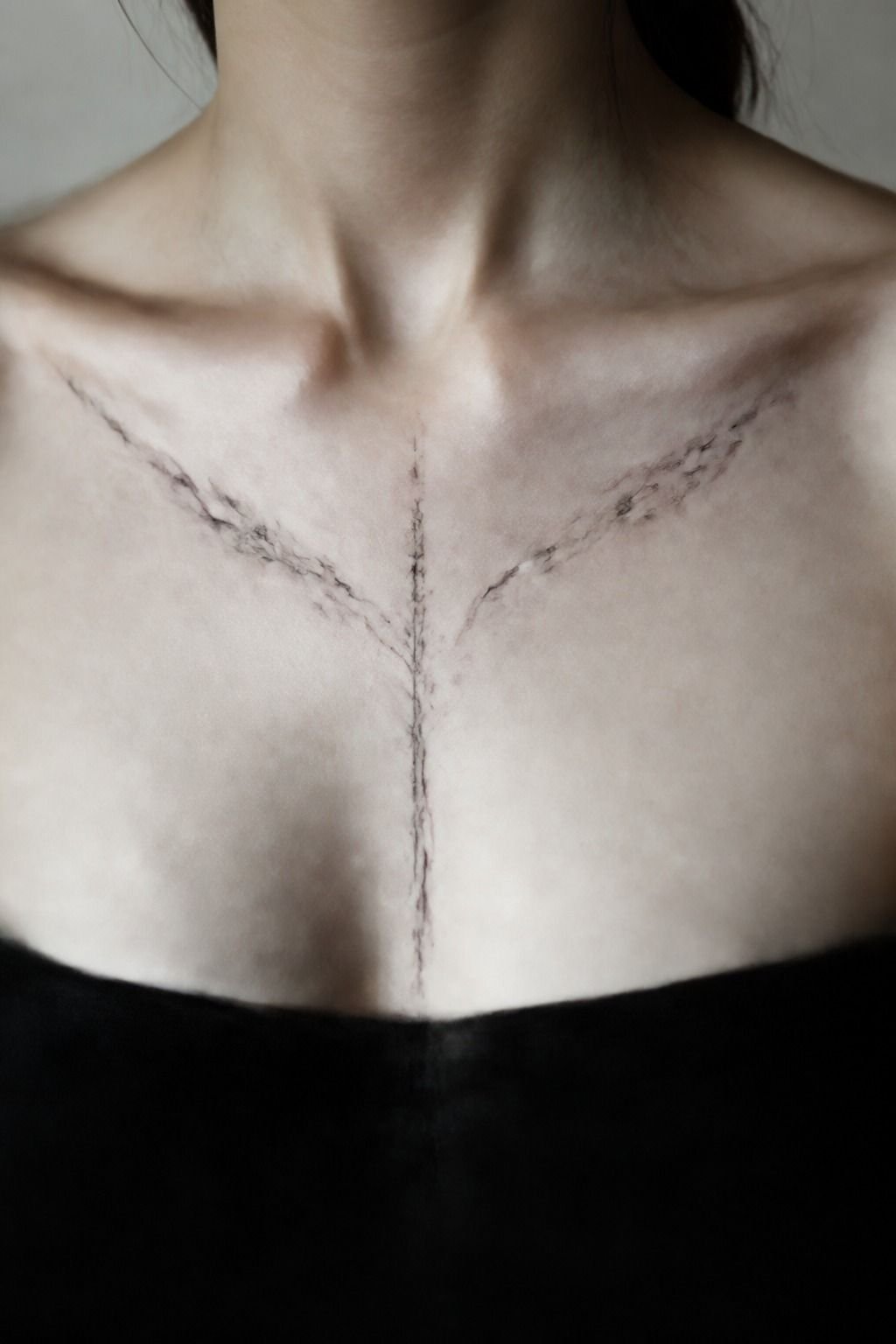
My next sternum piece will be simpler than the sketch I first wanted. That’s the lesson. I’m keeping one central moon, two thorn branches, and enough negative space that the design can move with my breathing instead of fighting it.
You don’t need to build a whole collection in one appointment. Start with one black moon motif, see how you live with it, then let the next placement respond to it.
I like a body map that feels collected over time, not assembled in a weekend. For more restraint-first inspiration, see 15 simple tattoos that prove less ink lasts longer.
What I Learned From Going Smaller First
I used to think a meaningful tattoo had to explain everything at once. A bat had to include the moon, the stars, the quote, the flower, and maybe a whole haunted landscape because I was scared a simple image would seem shallow.
It was the opposite. The more I edited, the more the tattoo sounded like me.
A small black bat on the upper arm gave me a feeling I could recognize instantly: moody, personal, a little playful, and not trying too hard.
That changed how I advise you when you bring in a packed reference board. I’m not here to flatten your idea into something generic.
I want to find the part with the pulse. Maybe it’s the thorn shape.
Maybe it’s the sharp cathedral arch. Maybe it’s the placement that makes you feel like the tattoo belongs there. Keep that part, then remove the decorative clutter until the lines can breathe.
I’ve also learned that “simple” does not mean careless. It means every line earns its place.
A clean black outline needs a steadier hand than a messy cloud of shading, and a tiny wrist design needs more planning than a big thigh piece. You should be able to ask why a line is there, why the gap is that wide, and why the artist chose that placement.
If nobody has an answer, pause.
And honestly, the best goth tattoos don’t need strangers to get them. They’re intimate.
They can be bold, quiet, funny, sad, or all four. Your skin gets the final vote.
A Few Things Worth Answering
How much does a Simple Goth Tattoos usually cost?
Most simple goth tattoos cost about $100 to $300, though shop minimums can be $50 to $100 and hourly rates often run $100 to $250. A clean artist is worth the rate. Your placement, custom drawing time, and local market change the final total.
Are Simple Goth Tattoos a good idea for a first tattoo?
Yes, simple goth tattoos can be a strong first tattoo if you choose a forgiving placement and a readable design. Clear black linework ages well. Your outer arm, calf, or forearm usually gives you a calmer session than ribs, feet, or sternum.
How do I choose a tattoo artist for Simple Goth Tattoos?
Look for healed examples of the exact style you want. Crispy healed linework matters most. Your artist should show clean black outlines, solid hygiene practices, and custom work that doesn’t look copied. Ask about their stencil process before you book.
How much do Simple Goth Tattoos hurt?
They can be pretty manageable on the shoulder, outer arm, forearm, thigh, or calf. Bony zones feel spicier. Your ribs, feet, hands, sternum, and collarbone usually hurt more because there’s less padding and more movement.
How long does a Simple Goth Tattoos take to heal?
The surface usually settles in about 2 to 3 weeks, while complete healing can take 2 to 3 months. Gentle aftercare protects detail. Your routine should be mild soap, a thin layer of moisturizer, no picking, and no pool time while it’s fresh.
What’s the best placement for Simple Goth Tattoos?
Outer arm and calf are my first picks for most small goth designs. They offer better wear and visibility. Your lines get more room than on fingers or wrists, and you can still make the tattoo visible whenever you want.
Where I’d Start First
If I had to pick one, I’d start with the tiny black bat outline. It has enough open skin around it to stay readable, while still giving you that dark little spark every time you catch it in the mirror. Pin the bat idea, then book the artist whose healed lines you trust.