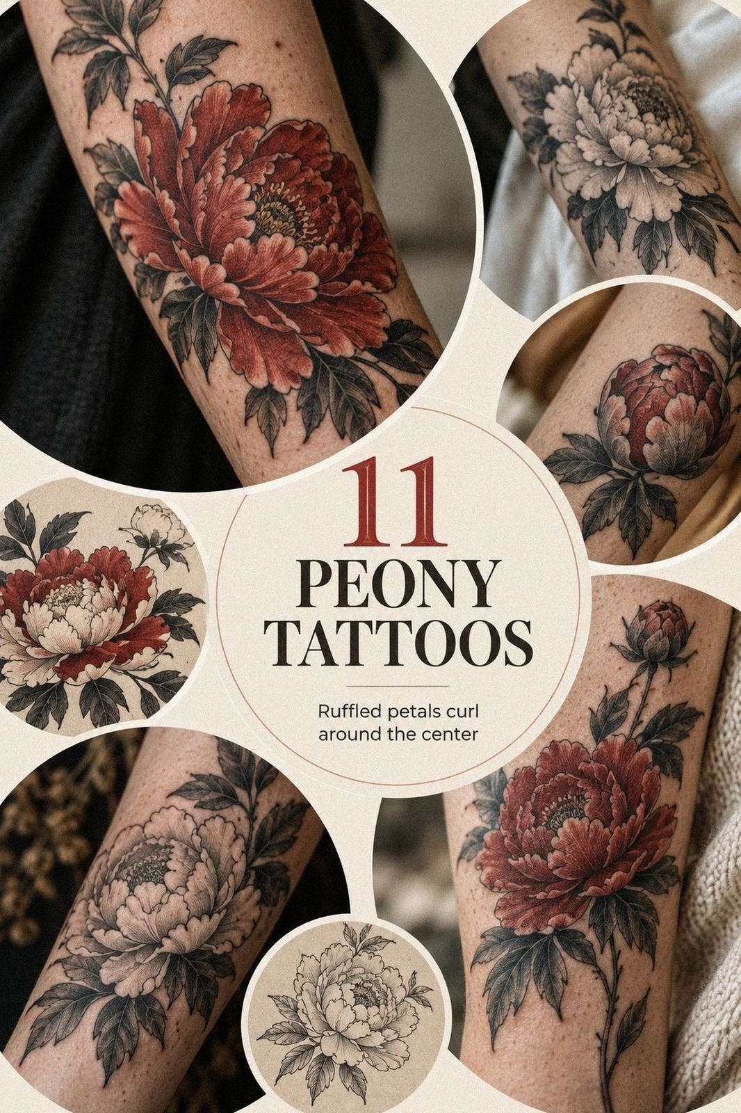
A peony tattoo can fit a real budget when you price the placement, size, and linework before booking. I wanted a personal floral piece without guessing at the quote, so I compared sketches, asked about hourly rates, and chose a crisp design that still felt expressive. The decision was easier than I expected!
Before booking, I had a blank patch of skin saved for the right idea. It wasn’t dramatic. It was simply unused, and every bold concept I considered felt too loud for me.
I wanted something delicate, meaningful, and recognizable without making the design feel crowded.
I kept returning to peonies because the petals can look soft or fierce depending on the linework. My first references ranged from ornate blackwork to minimal single-needle studies. You could tell I hadn’t decided yet, and my saved ideas looked like three different people had chosen them.
The turning point came when I measured the area and stopped asking whether the design was trendy. I asked whether I’d still want to see it on my skin years from now. That question narrowed everything down quickly around the long-term design.
- I Chose a Japanese Peony for My Forearm
- What Changed When I Tested Several Sketches?
- Fine-Line Work Kept the Petals Expressive
- Why I Tested the Ankle Before Committing
- The Leaf Detail That Made It Feel Personal
- Color or Black Ink?
- I Gave the Peony One Private Meaning
- Would the Design Follow the Curve of My Ribs?
- Soft Shadows Separated the Petals
- Before the Needle, I Priced the Real Appointment
- Healing Changed How I Judged the Tattoo
1I Chose a Japanese Peony for My Forearm
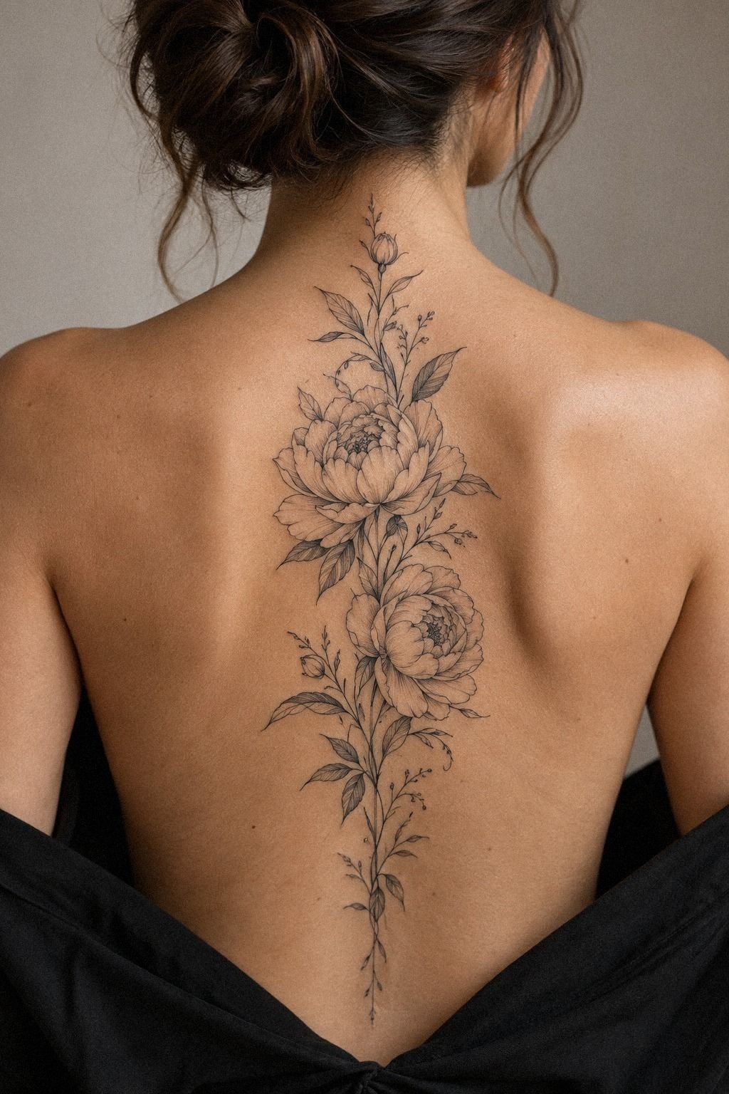
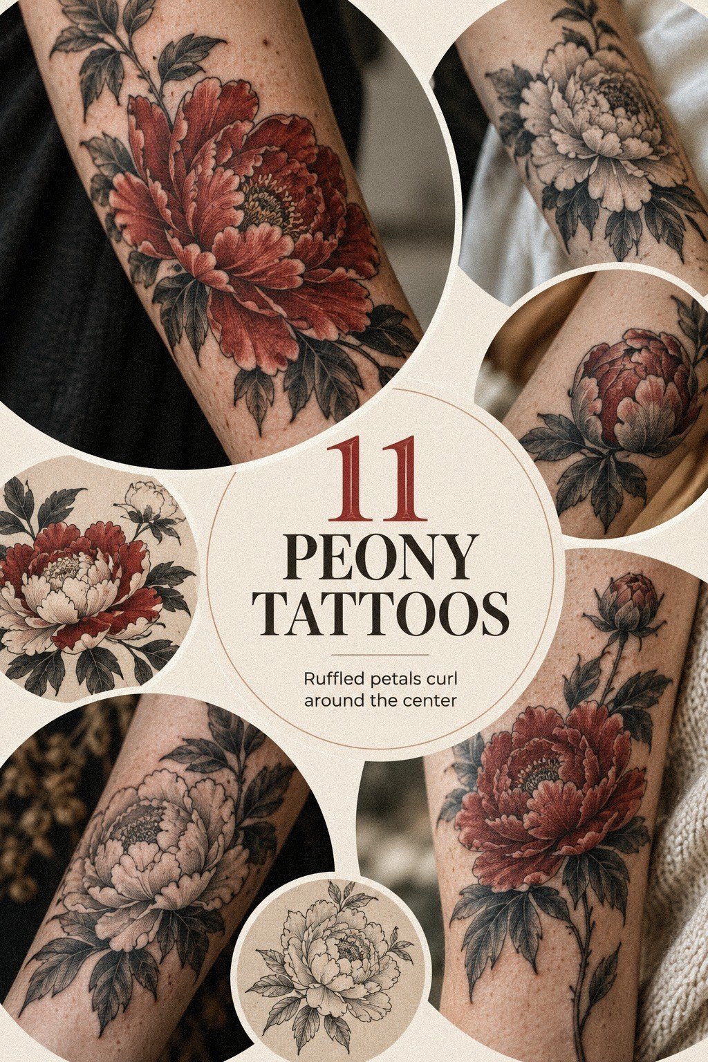
I chose a Japanese peony tattoo for my forearm because I wanted a visible design with enough flat skin for crisp lines. I liked the balance between delicate petals and a quietly powerful outline. The result felt expressive without becoming overly ornate.
My first sketch was too small. At roughly 2 inches, the inner petals crowded together, and the center became a gray knot instead of a readable flower. I asked for a slightly larger version, and the single-needle linework finally had space to breathe.
You’ll want to judge the negative space, not only the flower’s outer shape. I’d skip a tiny peony if you’re hoping to keep every fold visible. Fine lines can spread as they age, so your artist needs enough fine-line spacing to separate the petals.
A 3-inch design gave me a more striking result without making the forearm placement feel oversized. I brought a printed reference, but I didn’t ask for an exact copy. I wanted the artist to redraw the flower for my arm, with the stem following my natural direction.
That small adjustment made the piece feel personal rather than borrowed. The personal redraw mattered more than copying every detail. If you’re weighing symbolism too, compare it with this yellow rose tattoo meaning guide before you settle on a flower.
2What Changed When I Tested Several Sketches?
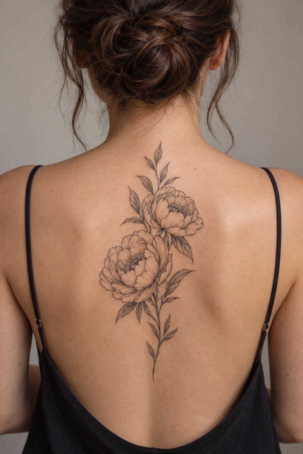
I tested several peony sketches before choosing the final design.
3Fine-Line Work Kept the Petals Expressive
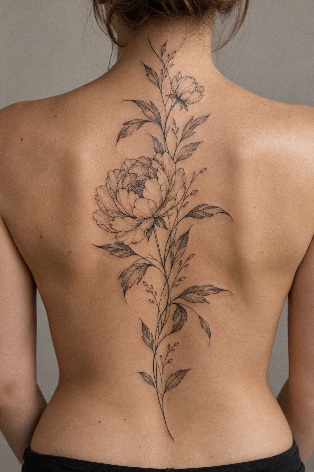
I selected expressive linework because I wanted the petals to feel graceful rather than heavy. The lines weren’t identical throughout the design. Some contours stayed crisp, while others softened slightly inside the folds.
That variation kept the flower from looking stiff. I asked for the outer petals to remain sharper than the inner folds because the silhouette matters first. The fine-line tattoo style looked polished only because the artist resisted filling every open space.
My first instinct was to request more shading. I thought extra detail would make the peony feel richer, but the test stencil looked busy. I chose fewer lines instead, and the minimal design became more timeless and understated.
You don’t need every petal represented to understand the flower. The outer petal contour carried most of the visual weight, while the interior marks added just enough structure.
The shoulder was another option, but I preferred the forearm because it gave the bloom a sleek vertical direction. For a different symbolic idea, I looked through this yin yang tattoo meaning reference and borrowed the idea of symbolic balance, not the imagery.
4Why I Tested the Ankle Before Committing
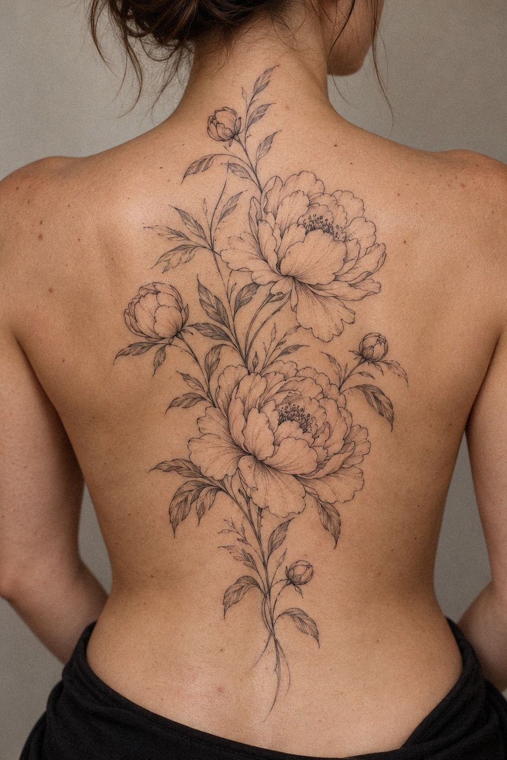
I considered the ankle placement before settling on my forearm because I liked the idea of petals moving around a curved area. A flower can look graceful from one angle and awkward when the body turns, so I tested the proportions carefully.
The ankle doesn’t offer the same flat skin as a forearm. A wide bloom can wrap quickly around the ankle bone, and the center may become difficult to read. I kept the fine-line stencil narrow enough for the petals to stay distinct.
I’d avoid placing the darkest section directly over the ankle bone if you’re sensitive to sharper sensations. Bony areas such as the feet, hands, sternum, ribs, and ankles can feel more intense than the forearm or thigh.
The final ankle test position gave me a sharper silhouette and a more manageable appointment. I still kept one leaf angled upward, so the design wouldn’t look stamped onto my skin.
That small angle made the flower feel more flowing when I moved. If you’re comparing symbolic placements, yantra tattoo meaning helped me think about how direction changes the feeling of a design.
5The Leaf Detail That Made It Feel Personal
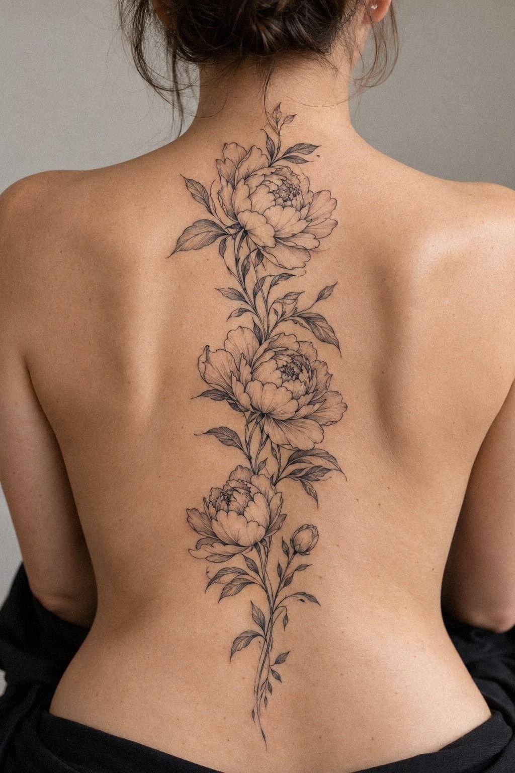
I added deep blackwork leaves only after the main flower felt right.
6Color or Black Ink?
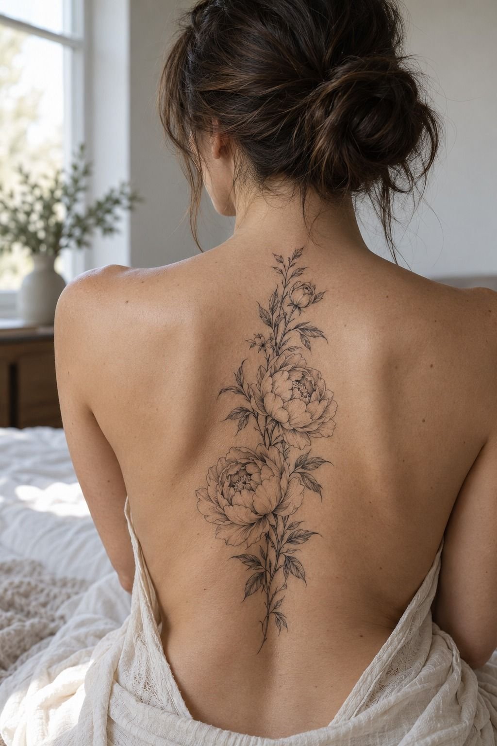
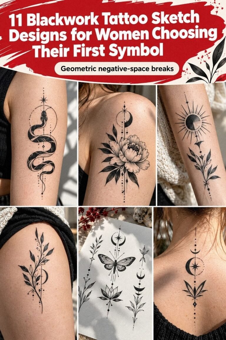
I compared a colored peony with black ink before making the final choice. Color can feel vibrant, romantic, and playful, while blackwork contrast usually creates a more understated silhouette.
I loved the daring energy of a muted red center, but I knew it would change the maintenance conversation. The black ink outline matched my quieter style and gave the leaves more authority.
I asked about adding a small amount of red, then changed my mind. The test color looked lovely, but it pulled attention away from the petal structure. The black version felt more classic and easier to pair with future pieces.
Still, I wouldn’t call color a bad choice. It can be bold, whimsical, and deeply personal when the artist understands how pigment will sit on your skin. You should ask to see healed color work, not only fresh work.
For a different symbolic contrast, I also read about Zeus tattoo meaning and noticed how strong black contrast can change a design’s emotional weight. It looked fierce!
7I Gave the Peony One Private Meaning
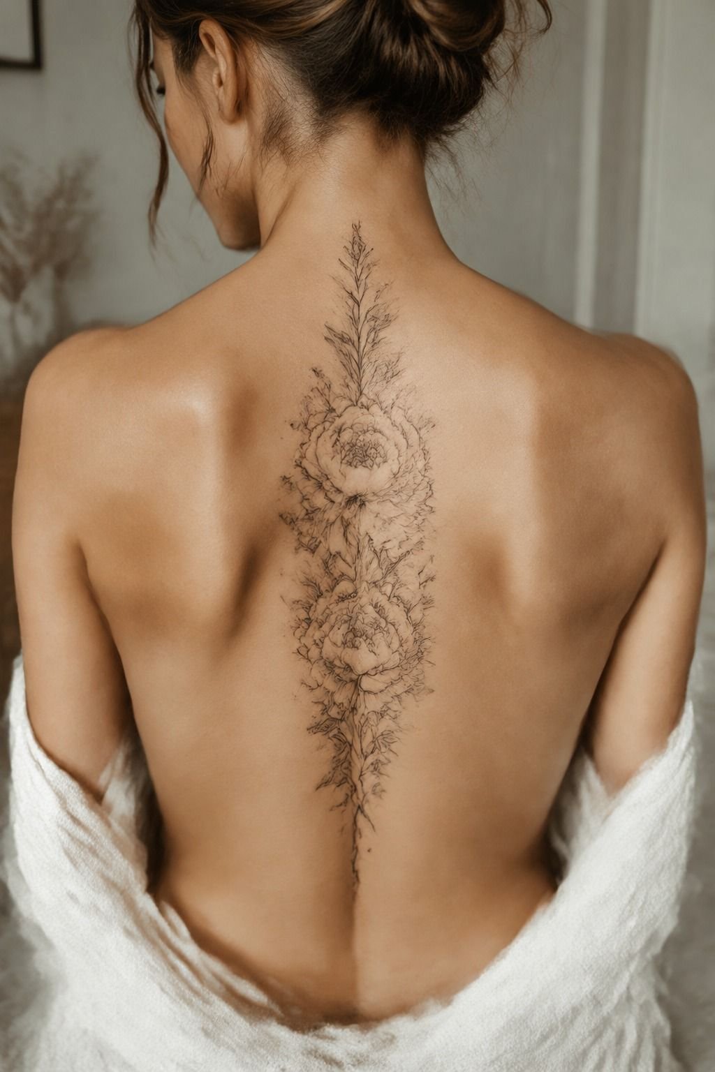
I connected the flower to a private meaning before approving the final drawing.
8Would the Design Follow the Curve of My Ribs?
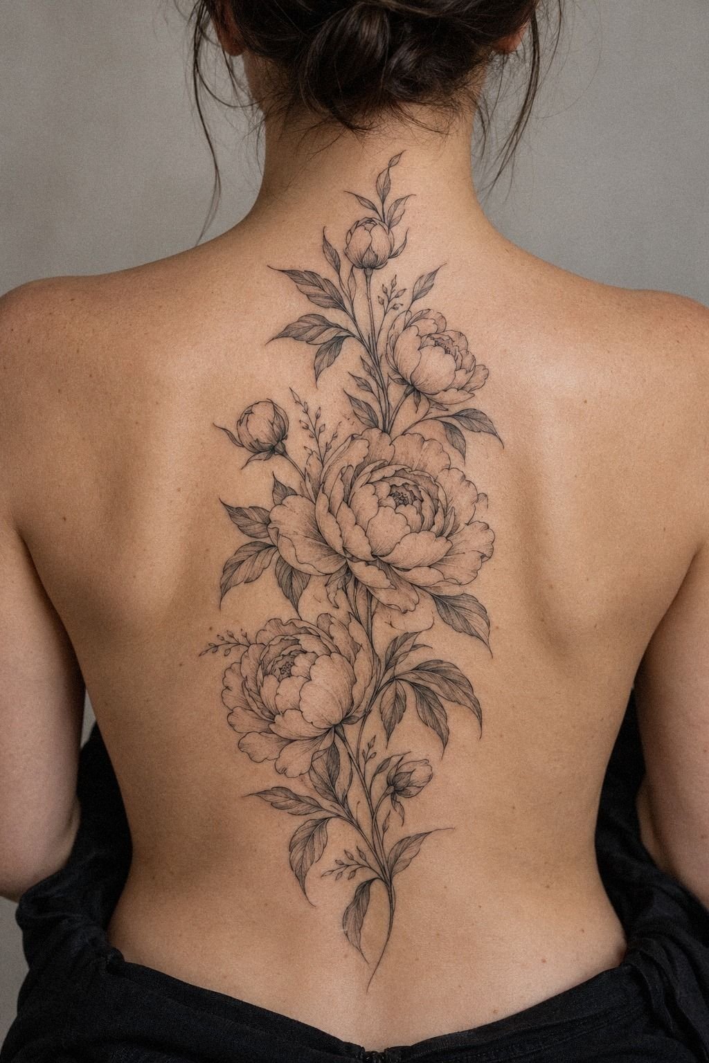
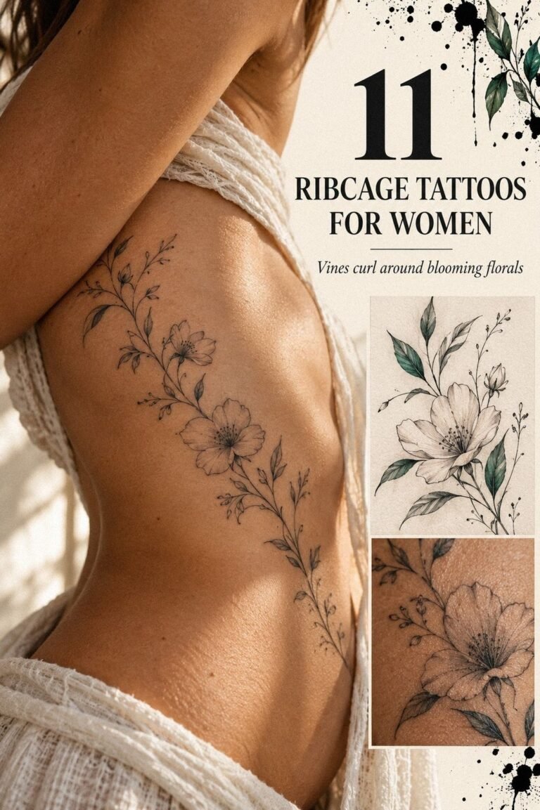
I adapted the drawing to the rib placement even though I ultimately placed my own version somewhere more tolerable. The lesson was about body movement: a design should follow your shape instead of fighting it.
The rib sketch was longer and more flowing than the forearm version. Your ribs create a narrow vertical path, so the petals need to open toward the side rather than spread evenly in every direction. I liked the vertical composition.
I liked the curved floral composition, but I knew the placement could feel more intense. Ribs, feet, hands, and sternum are commonly reported as more painful areas because there’s less cushioning near bone.
I didn’t choose that location for my first tattoo placement. You can still borrow the shape language and place it on the thigh, upper arm, or forearm for a gentler experience.
I asked the artist to rotate the rotated leaf by a few degrees. That adjustment stopped the stem from looking rigid when I bent. YHWH tattoo meaning gave me another example of how symbols can follow the body’s natural curve.
9Soft Shadows Separated the Petals
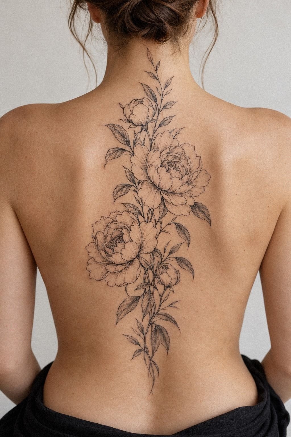
I asked for restrained shading between the petals because I didn’t want solid fills or a completely flat flower. The artist used restrained shading inside only a few folds.
Your eye can still understand depth when the soft gray shading stays controlled. That mattered to me because fine-line work can look elegant when it breathes, yet muddy when every gap receives ink.
I’d skip heavy gray packing in a small peony. It may look dramatic when fresh, but it can blur the delicate structure as the tattoo settles. A few controlled shadows gave me a sharper and more timeless result.
The design stayed expressive without becoming gritty. The tattoo structure remained clear. I also asked to see healed work with a similar skin tone because fresh ink can look darker and crisper than the final result.
I saved Yant tattoo meaning as a reminder that fine marks can feel sacred without needing dense shading. Seeing healed examples helped me trust the choice.
10Before the Needle, I Priced the Real Appointment
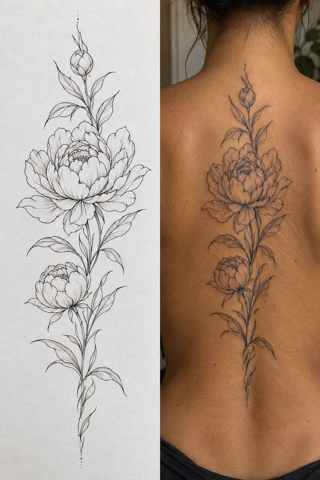
I thought about pain before the needle, but I eventually understood that discomfort wasn’t the only thing to price. The tattoo appointment also included the consultation, drawing adjustments, stencil placement, and aftercare conversation.
11Healing Changed How I Judged the Tattoo
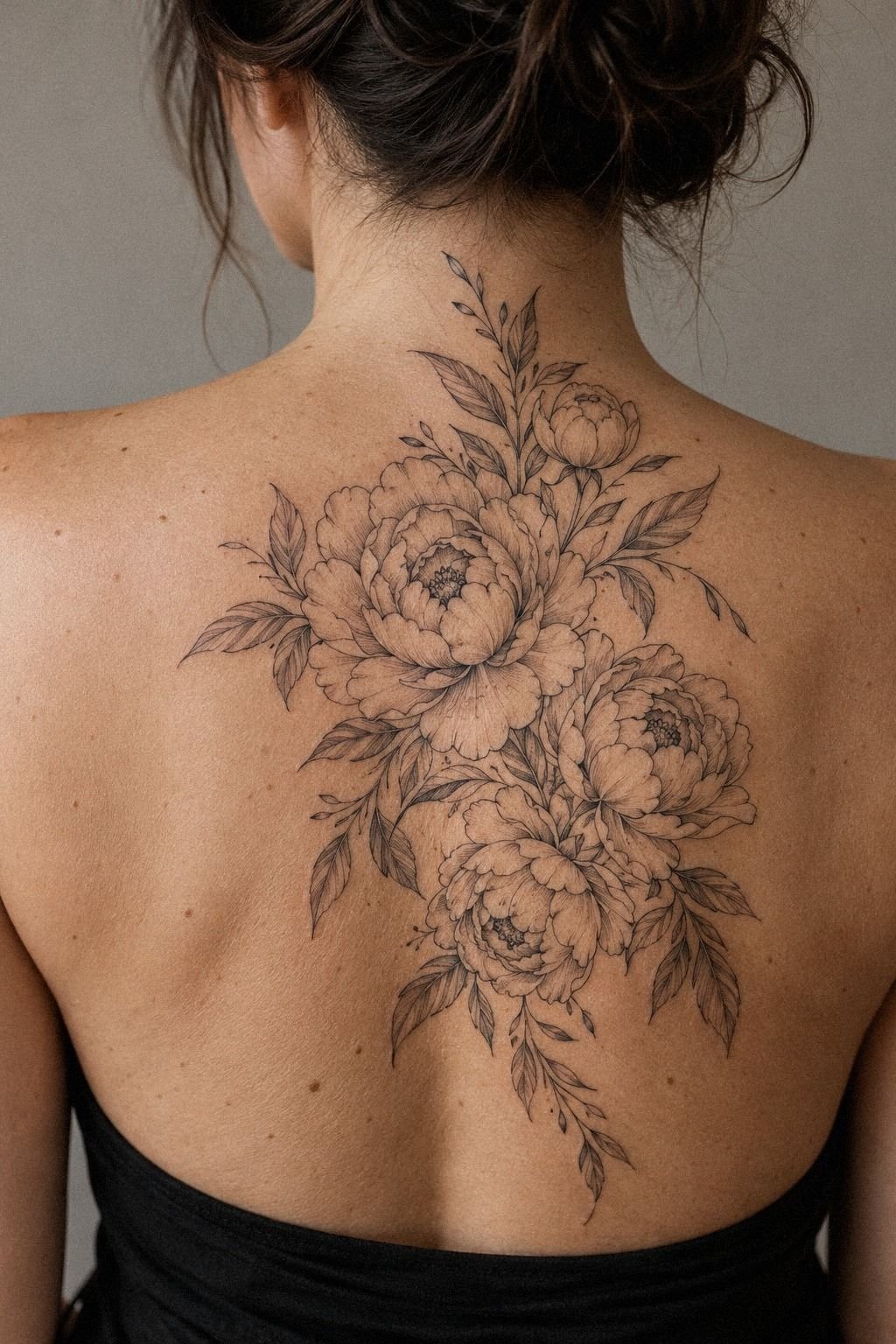
I followed the healing process with realistic expectations. The fresh version wouldn’t be the final version, and I knew the lines might look darker, drier, or slightly uneven while the skin settled.
The surface healing usually takes about 2 to 3 weeks, while complete settling can take around 2 to 3 months. I washed gently, moisturized as directed, and avoided swimming and strong sun exposure.
The healed fine-line tattoo is the version I care about most. Very fine lines can widen over time, while solid black and sensible placement tend to hold their structure better.
You’ll protect the result by limiting UV exposure, especially once the skin no longer feels tender. I took weekly photos in the same light instead of checking every hour.
That made the changes easier to notice and kept me from picking at dry skin. When the tattoo settled, the settled peony looked softer but still crisp. That felt like progress!
For another elaborate symbolic reference, I reviewed XXXTentacion tattoo ideas and kept only the lesson that a healed tattoo should still feel like your choice.
How Much Did It Cost?
My $300 budget cap was exact, so I priced the peony before booking instead of choosing a design first and hoping the quote worked. The typical US figures below helped me understand the conversation. They’re general ranges, not a promise of what every artist charges.
I asked for the estimate before approving the final size. A 2-inch version looked cheaper on paper, but it lost the petal separation I wanted. The larger 3-inch sketch gave the artist more space, and the quote still fit my cap.
The tattoo cost estimate also included time for adjusting the stencil, discussing placement, and preparing the linework. I’d rather pay for thoughtful clean linework than rush into a lower number.
Your region, artist, style, placement, and shop minimum can all shift the total. I didn’t assume the cheapest option was the smartest one. Clean linework requires control, and a poor decision can cost more to correct later.
I compared healed portfolio photos, asked about aftercare, and booked only once the price and design both felt right. That saved me from treating budget as the only measure of value.
Which Details Were Worth Keeping?
I ranked the details before booking so I’d know what to protect if the quote rose. My petal priorities were recognizable petals first, followed by clean outer lines, one meaningful leaf, and enough size for the design to age well.
Color came later. Extra symbols came after that.
Decorative filler was last. The tattoo size mattered less to me than preserving the structure.
My artist also explained that a smaller tattoo wouldn’t automatically be cheaper if it required more precision. That changed how I thought about size. A slightly larger design can sometimes make the work more efficient and more readable.
The readable center stayed minimal without feeling empty. It was intricate enough to hold my attention, but not so elaborate that the main flower disappeared.
Where Did My Budget Actually Go?
The largest part of the quote covered the artist’s time and control, not just the amount of ink. I was paying for session time, drawing adjustments, stencil placement, the tattoo session, and aftercare guidance.
The artist’s hourly rate made more sense once I saw how many decisions happened before the needle touched my skin. A polished result depends on preparation as much as execution.
I also paid for a design that could age reasonably well. The design scale mattered because shrinking the flower to save money might have created tighter folds, weaker contrast, and a less readable center.
I didn’t want to save $50 and spend much more later correcting a rushed tattoo. The investment felt worthwhile because the final design stayed crisp, personal, and balanced.
Why I Chose a Peony Before Booking
I didn’t choose a peony because it was the easiest flower to find online. I chose it because the peony form can hold several moods at once. A single bloom can look delicate in fine linework, fierce in blackwork, romantic with color, or understated when the artist leaves more skin open.
I also liked that the flower didn’t need a large composition to read clearly. You can keep the design minimal and still show the overlapping petals, curved stem, and small leaves. I went back and forth between a bold shoulder piece and a quieter forearm design, but the forearm won because I’d see it often without feeling watched by it.
The peony’s symbolic meaning made the decision feel more personal. It could represent resilience, love, remembrance, or a private turning point without forcing me into one fixed interpretation.
The budget question made me more decisive. Instead of asking for every feature, I ranked what mattered and removed what didn’t. When the quote approached my budget ceiling, I knew what could leave.
My advice is simple, though it took me too long to accept it. Don’t price a tattoo by the number of details alone. Price the artist’s time, the redraw, the placement, the expected healing, and the skill needed for that style.
A crisp, polished, timeless peony is worth more to me than a crowded sketch that looks impressive for one week.
Blackwork or Color: Which Would I Choose Again?
I’d choose blackwork finish again because it gave the flower a classic and powerful outline. The decision wasn’t about color being wrong. It was about which finish matched my personal style and long-term expectations.
A blackwork peony tattoo can feel edgy, symbolic, and sharp without requiring a large composition. Color might have made my version more vibrant, but black ink kept the focus on the petals and stem.
If you prefer a daring, playful result, healed color could be worth considering. Ask about healed examples, pigment changes, touch-ups, and how the artist approaches your skin tone before deciding.
I’m glad I compared both options instead of assuming the cheaper one would automatically feel less expressive. The black ink version still feels bold.
What Should You Ask Before Paying a Deposit?
I’d ask five prebooking questions before sending money:
– What’s the estimated total price? – Is the quote hourly or flat-rate? – Does the minimum include the consultation and stencil? – How many redraws are included? – What aftercare products and instructions will I receive?
The tattoo deposit policy matters because plans can change. Ask when the deposit becomes nonrefundable, whether rescheduling is allowed, and what happens if the artist needs to adjust the appointment length.
You should also ask to see healed work, especially if you’re choosing fine lines or subtle shading. Fresh tattoos can look dramatic, but healed results tell you much more about consistency.
I’d bring your budget limit up early. A good artist can help you protect the most meaningful parts of the design without making you feel embarrassed about the number.
Which Placement Would I Choose Again?
I’d choose the forearm placement again for a first peony because it gave me visibility, readable lines, and a generally manageable sensation. The upper arm and thigh would also work if you want more space or less daily exposure.
The forearm tattoo placement let the stem follow my natural direction without forcing the flower around a sharp curve. It also made the stencil easier to evaluate before booking.
Ribs can create a graceful, flowing composition, but they may feel more intense. Rib placement, feet, hands, and sternum can also be more sensitive, especially when the design sits close to bone.
If symbolism matters to you, placement can change the emotional tone. A private design can stay hidden, while a visible tattoo can become a daily reminder. I’d choose based on both meaning and comfort.
What People Always Want to Know
How much does a peony tattoo usually cost?
A peony tattoo commonly starts around the studio minimum of $50 to $100, while many artists charge about $100 to $250 per hour in the US. Your final quote depends on size, placement, detail, region, and the artist’s experience, so ask before booking.
Is a peony tattoo a good idea for a first tattoo?
Yes, a peony can be a meaningful first tattoo because you can choose a tolerable placement and a clear silhouette. Your forearm, upper arm, thigh, or shoulder may feel easier than ribs, feet, hands, or sternum.
How do I choose an artist for a peony tattoo?
Choose an artist with a clean healed portfolio, not only fresh photographs. Look for consistent linework, floral studies, suitable skin-tone examples, clear hygiene practices, and a style that matches your reference. You can also compare symbolic ideas through yin yang tattoo meaning.
How painful is a peony tattoo?
Pain varies, but ribs, feet, hands, and sternum are often more intense than the forearm, thigh, or shoulder. A tolerable placement can make a first session easier, though your skin sensitivity and session length still matter.
How long does a peony tattoo take to heal?
The surface commonly heals in about 2 to 3 weeks, while complete settling can take roughly 2 to 3 months. Wash gently, moisturize as directed, avoid swimming, and protect the area from strong sun while it heals.
What’s the best placement for a peony tattoo?
The forearm and upper arm offer readable linework with generally more tolerable sensation. Your thigh can provide more space for a larger bloom, while the ribs create a graceful curve but may feel more painful.
Where I’d Start First
If I had to pick one, I’d start with the 3-inch forearm peony. It gives the petals enough space to stay readable, and the placement is usually easier than ribs or feet.
My $300 cap made me edit the design instead of losing its shape. I’d save the reference, ask for a written estimate, and confirm the healed-work portfolio before paying a deposit. Start there!