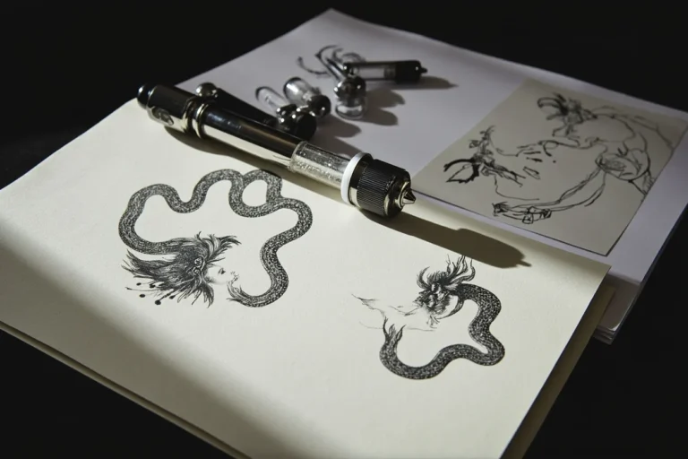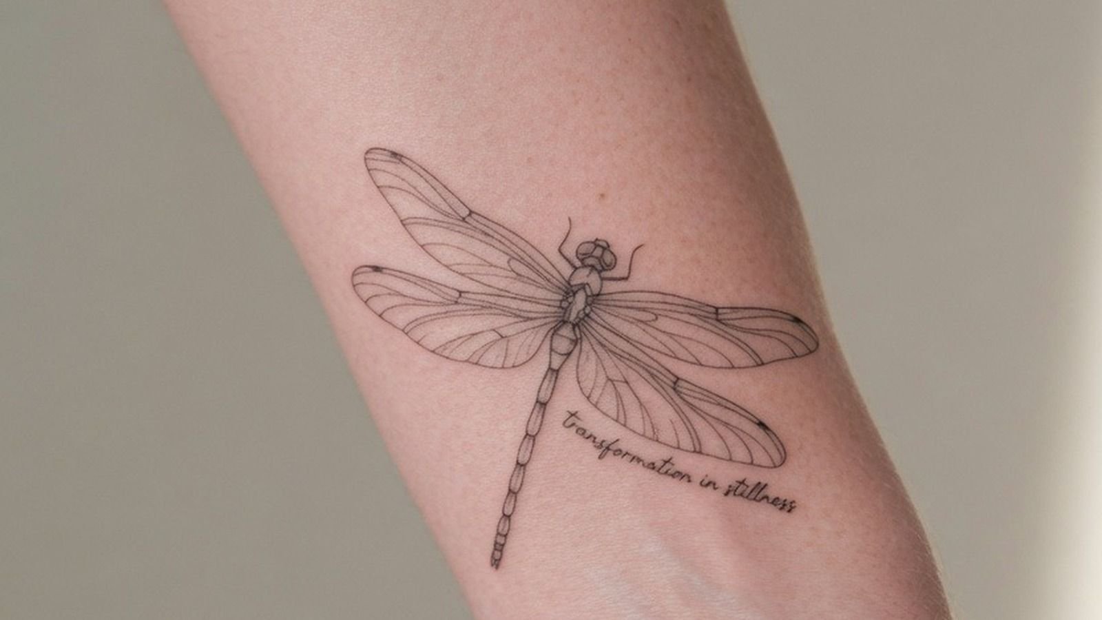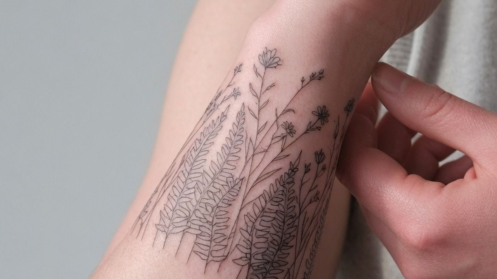
Dragonfly tattoos fail when the wings read flat. The subject’s entire visual power comes from perceived translucency, and that requires an artist who understands negative space as a tool, not an afterthought. Get the wing treatment wrong and the whole piece collapses into a generic insect outline.
The designs below cover 12 distinct approaches, from single-needle fine line to Irezumi to tribal geometric. Each one solves the translucency problem differently.
The Feathered Antenna Detail That Separates Flash from Filler
This moth flash uses hairline 0.5mm single-needle strokes with open negative space carrying the wing structure, letting vein weight variation do the shading work without a single grey wash pass.
Single needle work at this scale needs an artist who controls machine speed precisely. On lighter skin tones this reads crisp at year five; on olive and darker tones, the line weight needs to be bumped slightly to maintain contrast as healing compresses the finest strokes.
Crosshatch Engraving on a Crescent Moon Frame
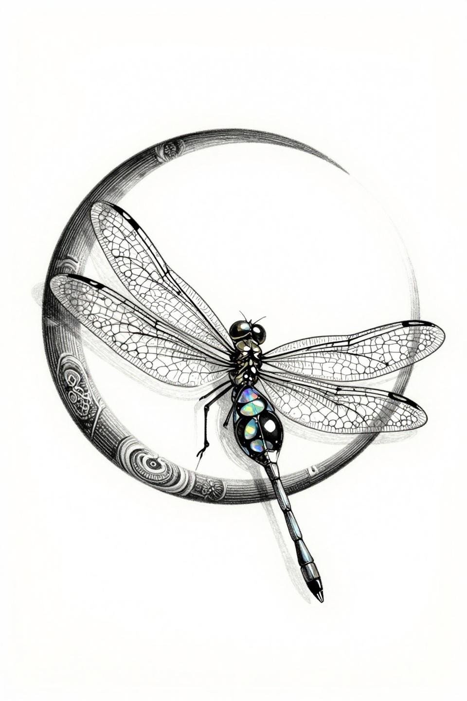
A woodcut-etching dragonfly suspended above a crescent moon, framed in a radiating mandala, with parallel-line crosshatch engraving building tonal depth across the wing surfaces instead of conventional shading.
Crosshatch-heavy pieces like this telegraph an artist’s drafting discipline immediately. Check their healed work portfolio specifically for line spacing consistency, because uneven crosshatch muddles into grey wash blur by year three.
Stipple Gradient Wings That Read Like Stained Glass
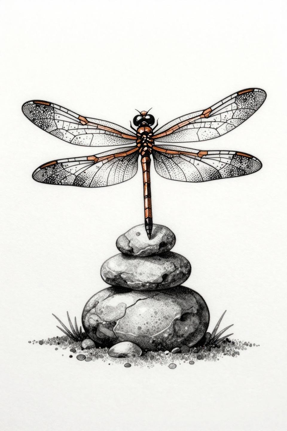
Blackwork dotwork with a dragonfly perched on a stacked stone cairn, wings divided into geometric stained glass panels rendered through stipple dot gradient running from 90% density at center to fully open at the outer edges.
The tell in dotwork is consistent dot size across the full gradient. Irregular dot sizing creates muddy midtones instead of the clean tonal shift this composition depends on for the stained glass illusion to hold.
Why Red Watercolor Bleeds Beyond the Outline on Purpose
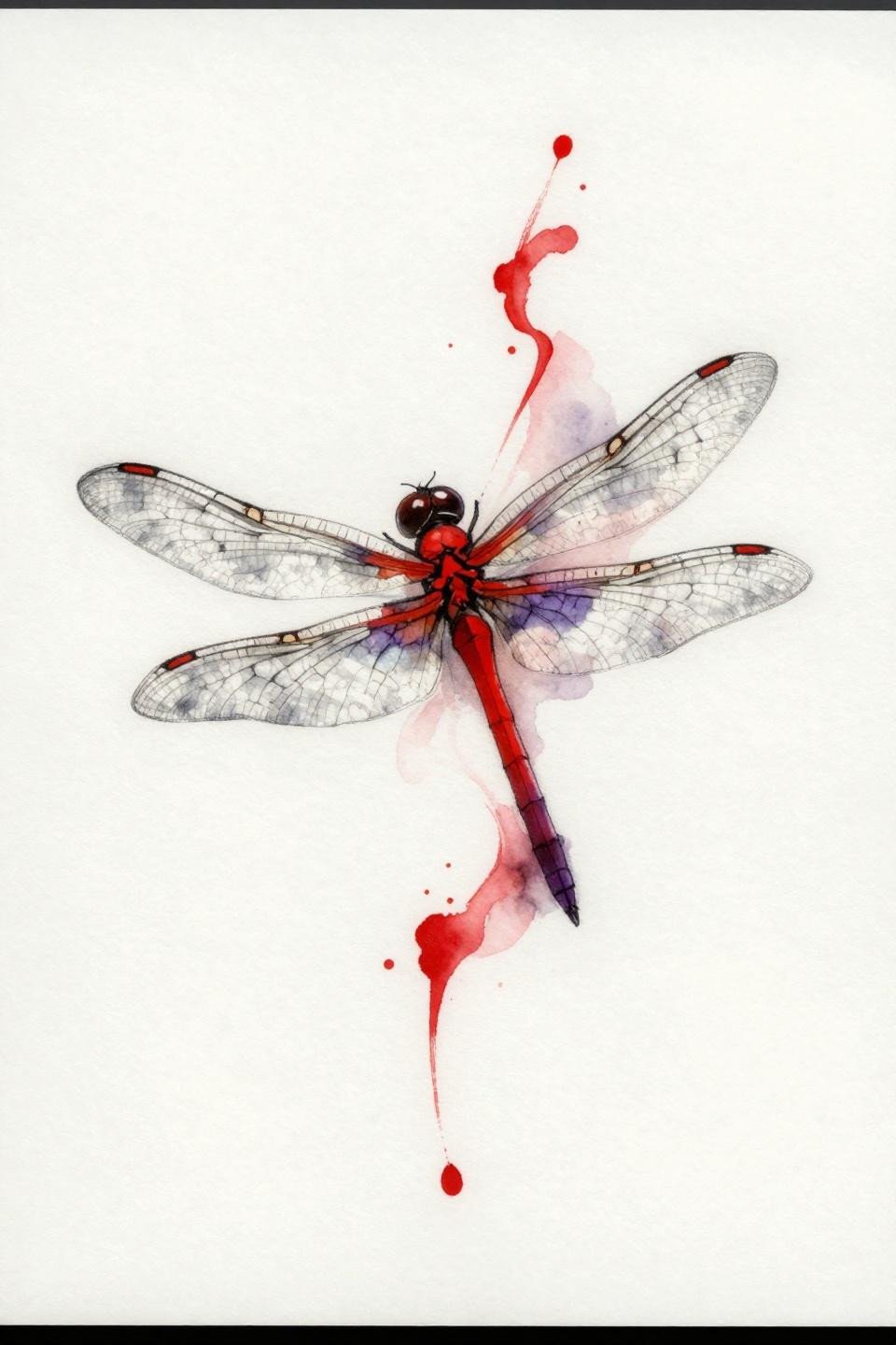
A horizontal mid-flight dragonfly in crimson and deep plum, wings rendered as ink-washed petal forms, with calligraphic brush mark diffusion intentionally bleeding past the black outline to simulate watercolor wet-on-wet behavior.
Watercolor ink without a solid anchoring outline blurs noticeably by year three to five on most placements. The black linework here is structural. Without it, the red diffusion has nothing to hold its shape over time.
Forest Green and Gold on a Floating Seed Pod Composition
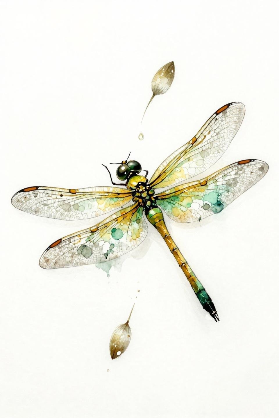
Opalescent wings, a forest green to warm gold abdomen gradient, and drifting seed pod silhouettes build an asymmetric organic composition using wet color bleed brush technique as the primary structural element.
Protected placements like the upper back or sternum give watercolor work its best long-term shelf life. Folding joints and high-friction areas will compress this style’s color separation within a few years of the initial heal.
Irezumi Silk Wings Over a Lotus Bud
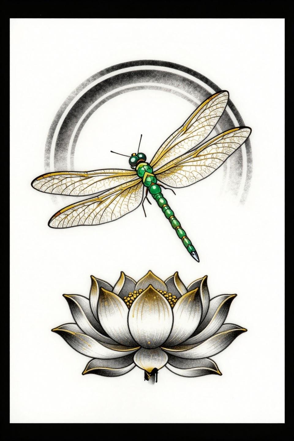
Japanese Irezumi treatment with emerald jeweled abdomen segments, gold leaf vein mapping across silk-textured wings, and a circular mandala frame containing the lotus base, all held by bold 2-3pt black outlines with flat fills.
Bold 2-3pt outlines are the longevity signal in traditional and Irezumi-adjacent work. This outline weight holds clean for 10 or more years regardless of placement, while the flat gold fills may need a single refresh pass around year eight on sun-exposed skin.
Negative Space Wings That Let Skin Do the Work
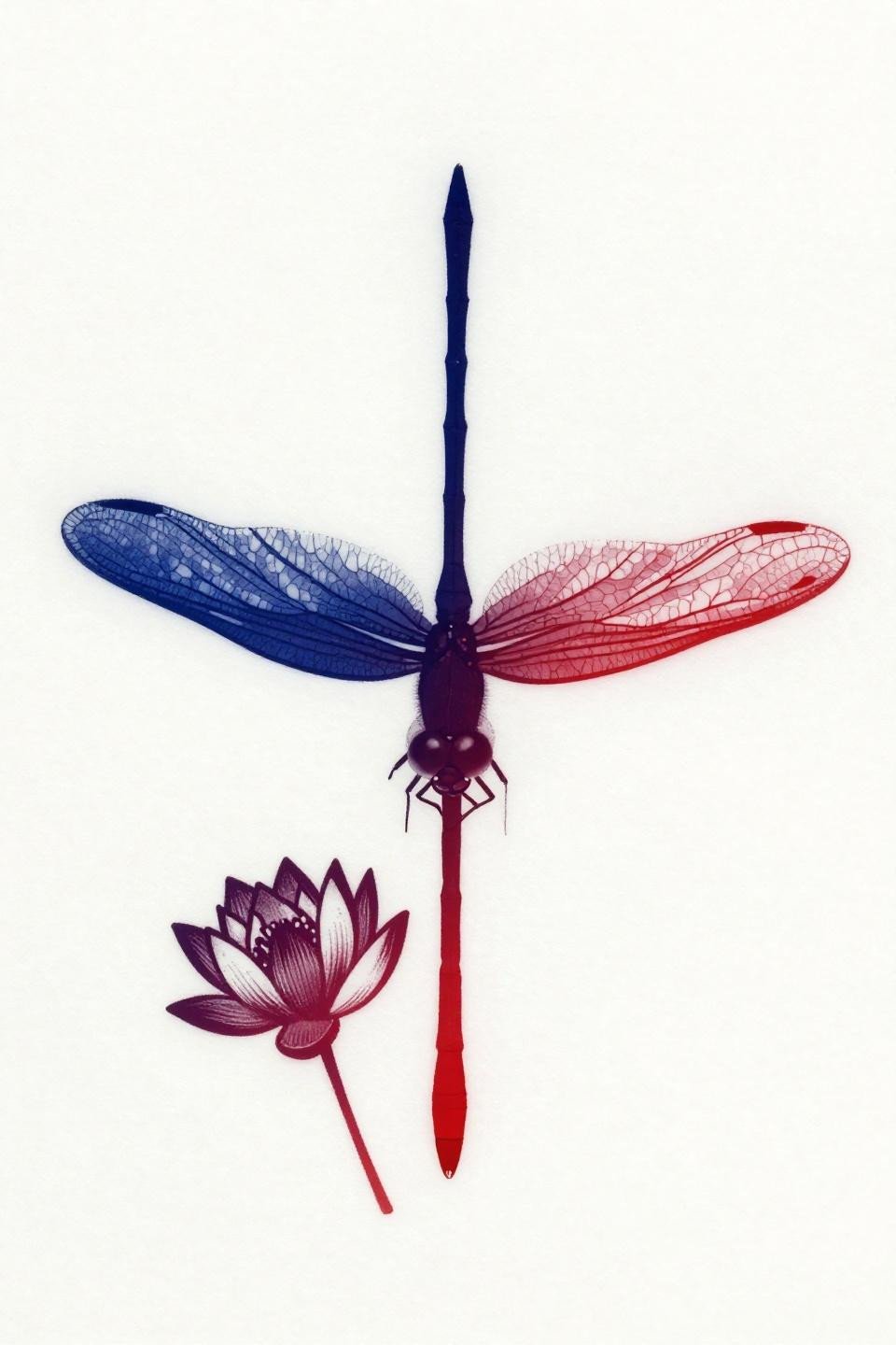
A vertically composed dragonfly with wings rendered entirely as open negative space, the skin itself carrying the wing form, anchored by a deep indigo-to-crimson abdomen and a single water lily in profile below.
Negative space designs read completely differently depending on skin tone. On lighter skin the open wing reads as translucent glass; on deeper skin tones the contrast drops and the vein suggestion lines need slightly heavier weight to maintain legibility.
One Unbroken Line Captures a Bee in Profile
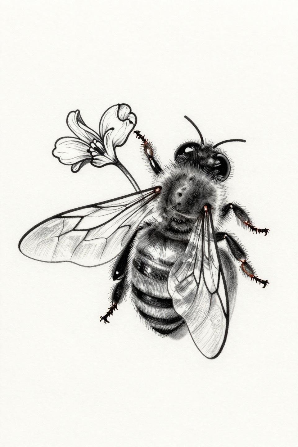
A bee gripping a wildflower petal, drawn as a single continuous gestural stroke with no fills and no shading, the hairline single-line technique carrying the full structural weight of the composition through line direction alone.
Single continuous line work signals serious hand control from the artist. The tell is the curves: no wobble at direction changes, no hesitation marks at the compound eye or wing root where most hands slow and stiffen.
Art Deco Stained Glass at Wrist Scale
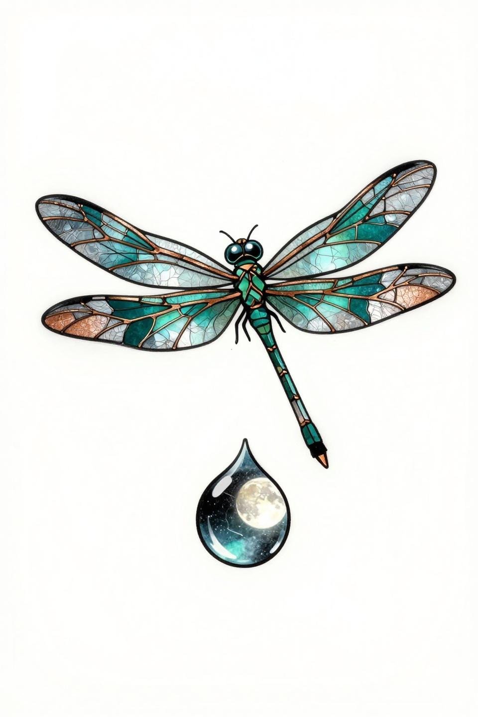
Art deco treatment with hard geometric lead-line wing panels, deep teal gradient abdomen segments, and copper metallic vein detailing throughout, centered horizontally above a single water droplet reflecting moonlight.
At wrist or forearm scale, the geometric panel structure in this design holds better than organic linework because hard edges resist the minor blurring that comes from sun exposure and skin movement in that placement zone.
Tribal Symmetry Built Around Concentric Ripple Rings
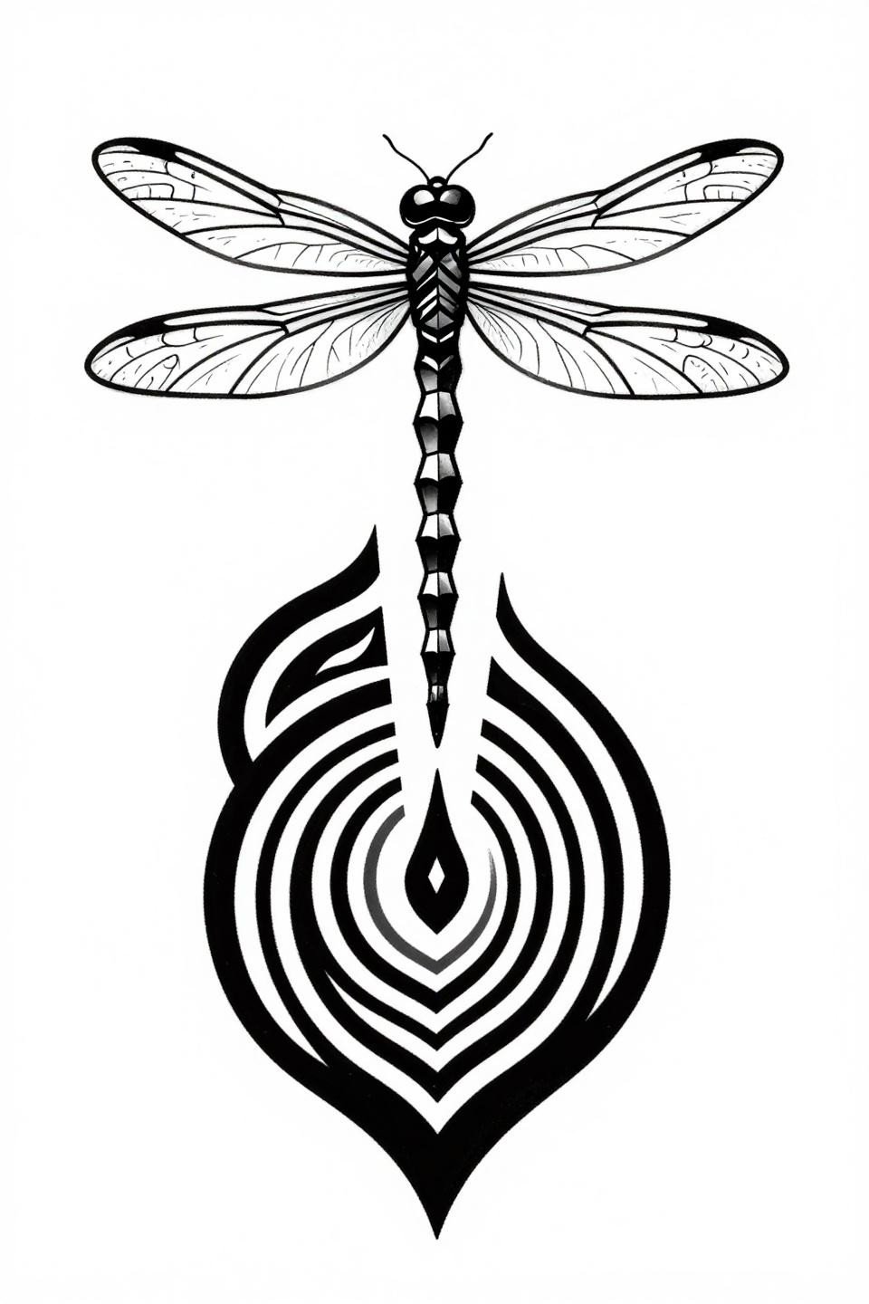
Tribal geometric with a perfectly mirrored wing structure, bold flat black fills, angular vein tracery, and concentric ripple rings around a stylized lily pad forming a bilateral symmetry anchor at the base of the composition.
Blackwork at full saturation holds density indefinitely when the artist commits to layered passes. The flat black fields here are the low-maintenance choice. No color to fade, no grey wash to shift, just saturation depth over time.
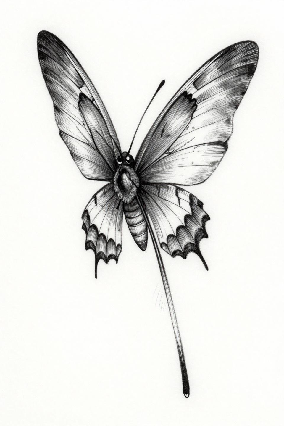
Art Nouveau Split Wing: Detail on One Side, Geometry on the Other
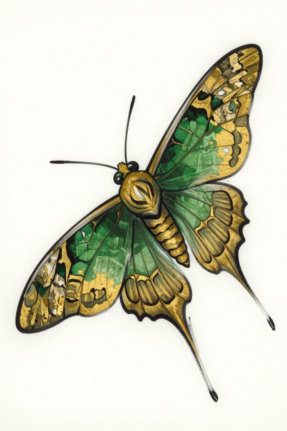
An art nouveau moth with a split composition: one wing carrying full vein mapping detail, the opposing wing abstracted into geometric faceted planes, both held in forest green and flat gold fills with a bold black outline.
The asymmetric wing treatment is a deliberate design risk that pays off at scale. Smaller than four inches and the geometric-versus-organic contrast compresses into visual noise. This composition needs room to breathe.
Botanical Scientific Line Density on an Aquatic Stem
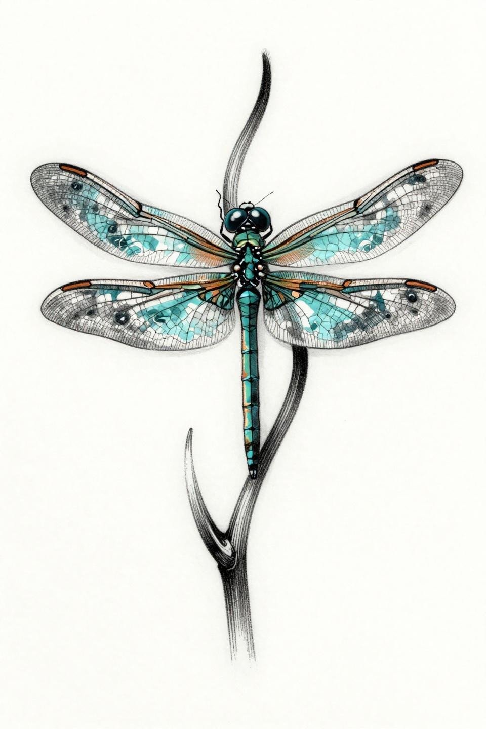
A botanical scientific-style dragonfly perched on a curved aquatic stem, transparent veined wings displaying water ripple patterns, rendered entirely in hairline etching strokes and fine crosshatch density with no solid fills.
This style works best on artists who come from illustration or printmaking backgrounds. The crosshatch shading here mimics copper plate etching, and that level of line control at tattoo scale is a legitimate skill differentiator.
Pick three references from this set based on your placement first, style second. A fine-line botanical on a wrist ages differently than the same piece on a shoulder blade. Match the line weight to the placement’s friction and sun exposure, then bring those three to your consultation.