Meaningful tattoo ideas for female collectors get muddied fast by symbolism that looks good on Pinterest but carries no personal weight on skin. The designs that hold their charge long-term are the ones with compositional logic: negative space used deliberately, linework scaled to placement, and subject matter that doesn’t require explanation to the wearer.
The difference between a meaningful tattoo and a decorative one is usually scale and restraint. Smaller, tighter compositions on protected placements age with more dignity than sprawling pieces on high-friction zones.
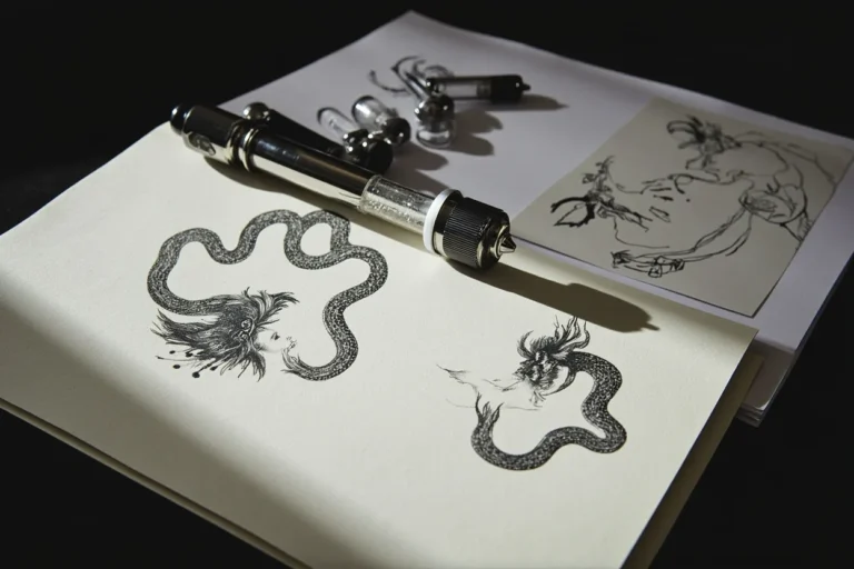
When the Book and Feather Share a Single Axis
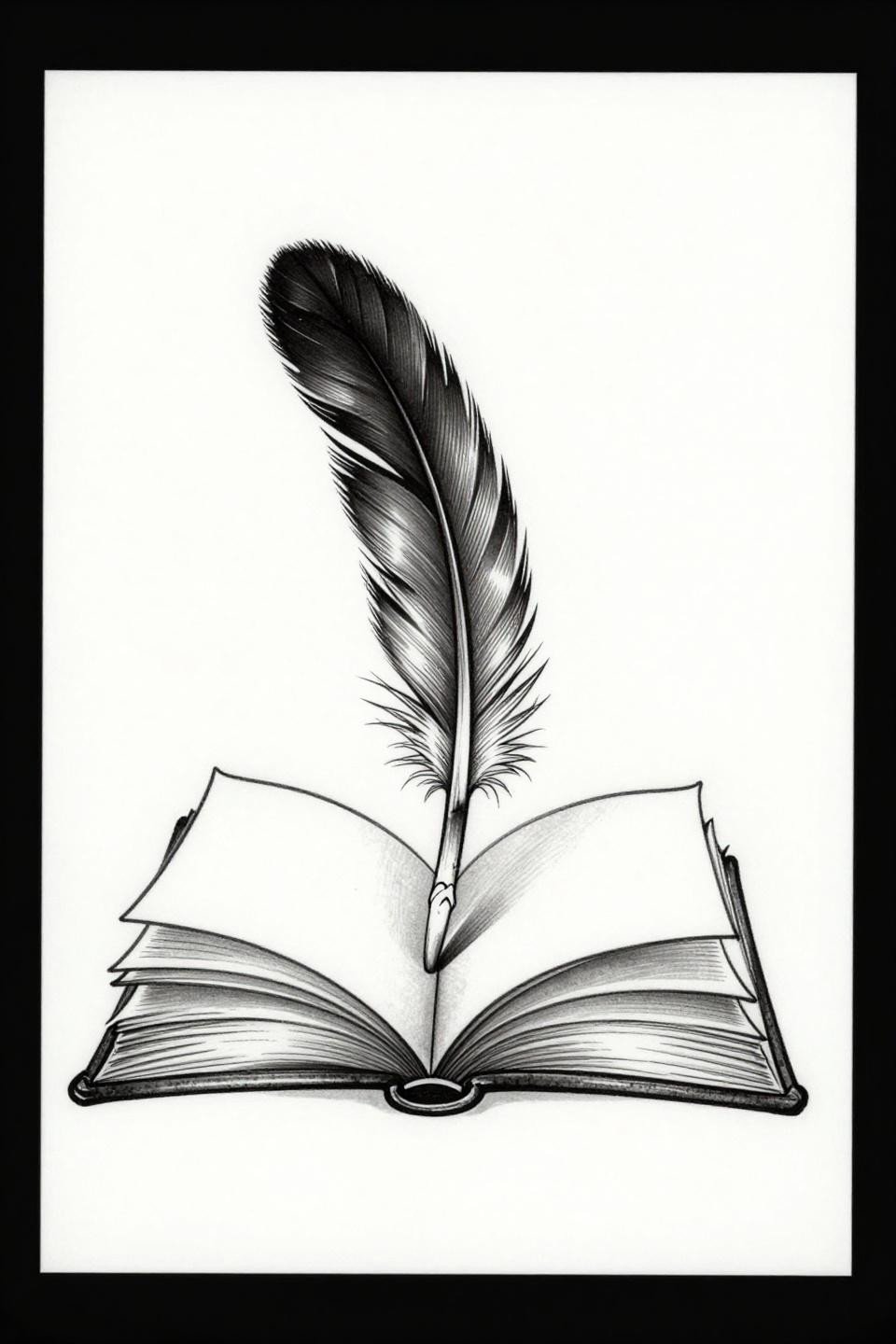
An open book with a feather rising from the spine, rendered in hairline single-needle linework, works because both elements share a vertical axis that reads cleanly at small scale on the wrist or sternum.
Single needle 1RL work like this needs an artist who controls hand speed precisely. Any hesitation shows as line weight variation, and at this scale, that variation is the first thing to blur by year three.
The Crescent Moon That Works Precisely Because It Does Nothing Extra
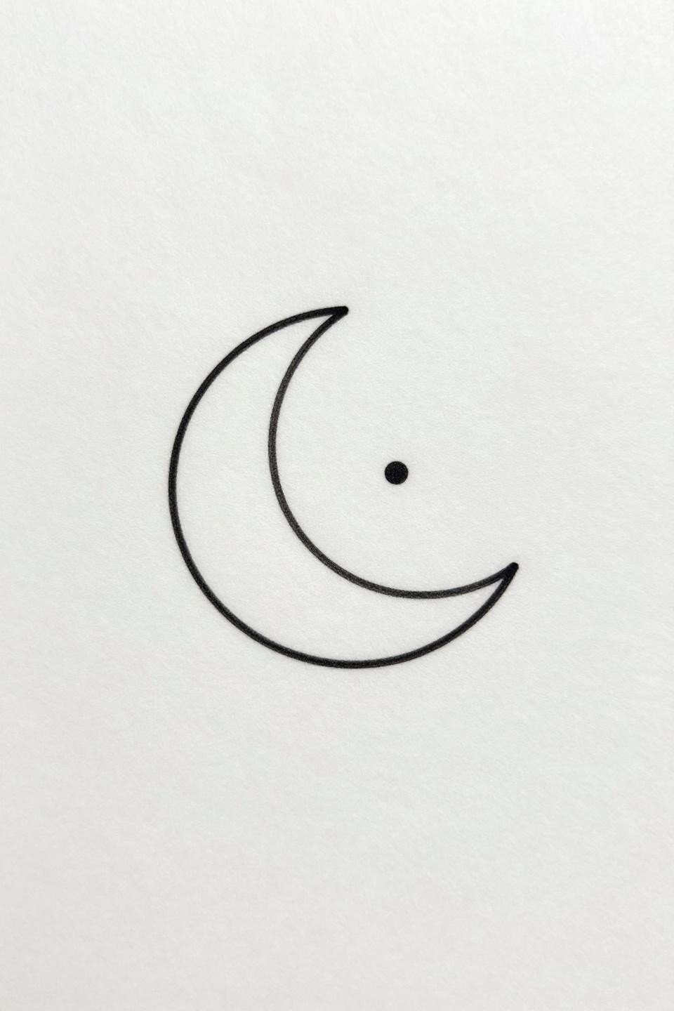
A crescent moon in one continuous hairline stroke with a single interior dot is a finger tattoo composition that succeeds by reducing the form to its minimum readable unit.
Finger placement means touch-up every two to three years minimum. The friction and sun exposure on knuckle and side-finger placements degrade fine lines faster than almost any other zone on the body.
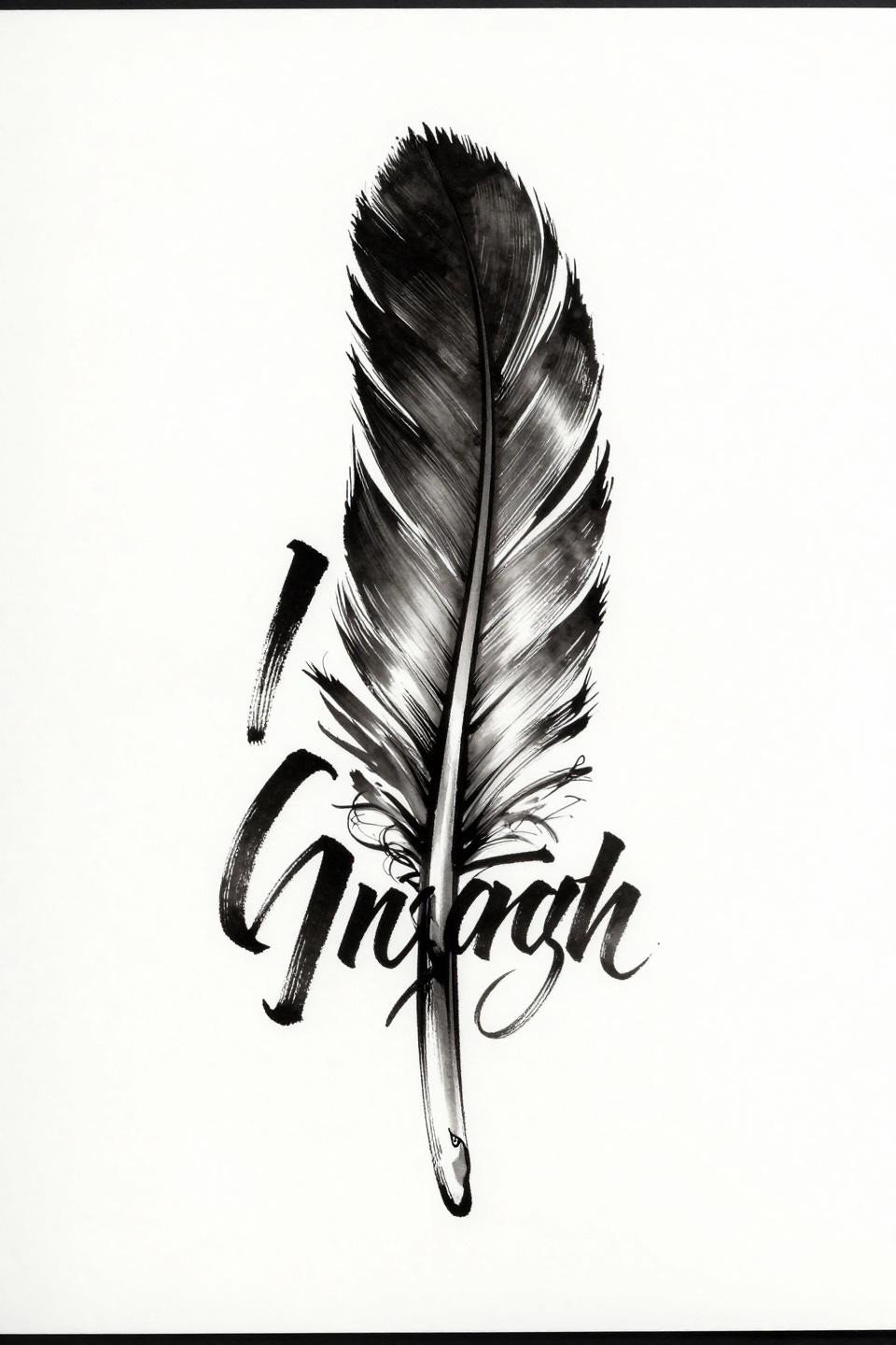
Feather Into Music Staff: Where the Metaphor Earns Its Keep
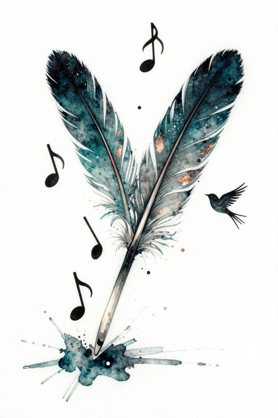
The feather-to-music-staff concept works here because the transformation is mechanical, not symbolic: barbs fragment into ascending notes, the structure of one object literally becoming the structure of another. Diagonal asymmetric flow keeps the composition from reading as static.
Watercolor technique without an anchoring outline blurs by year three to five. The teal and copper washes in this piece need a fine line structure beneath them to hold definition past that window.
Phoenix Infinity: Bilateral Symmetry as the Actual Point
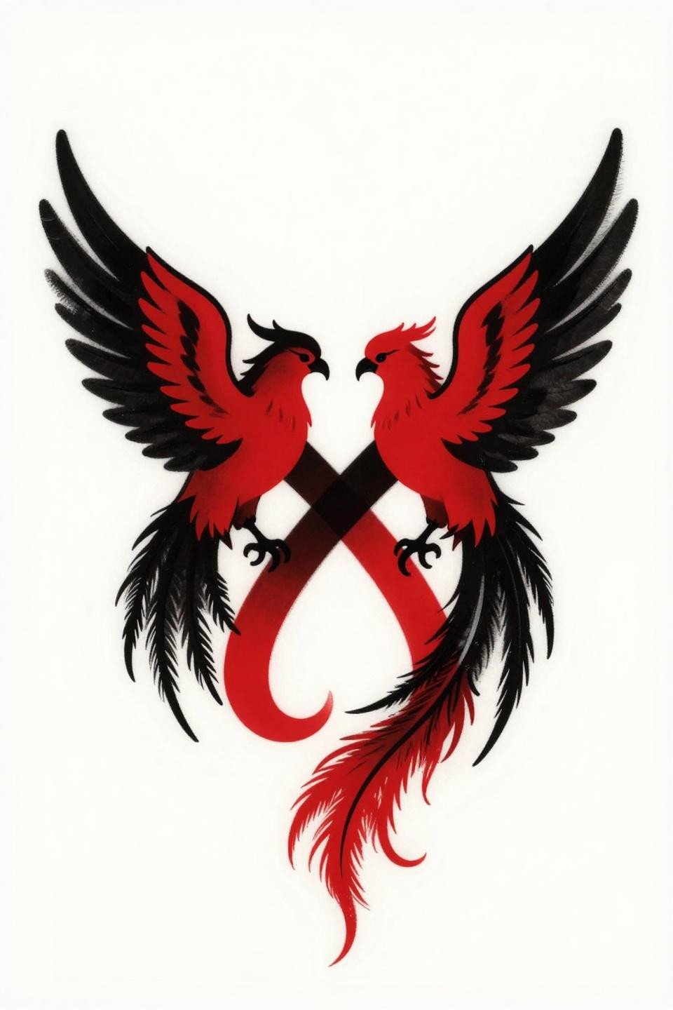
Two phoenix silhouettes feeding into a continuous infinity loop is a tattoos with deep meaning concept that earns its complexity: the bilateral mirror symmetry along the vertical axis is the structural argument, not decoration.
Bold 2-3pt outlines at this weight hold clean for ten or more years, and the flat crimson fill reads on most skin tones without the color shift that more complex palettes develop over time.
Moon and Star Flash That Commits to Engraving Line Density
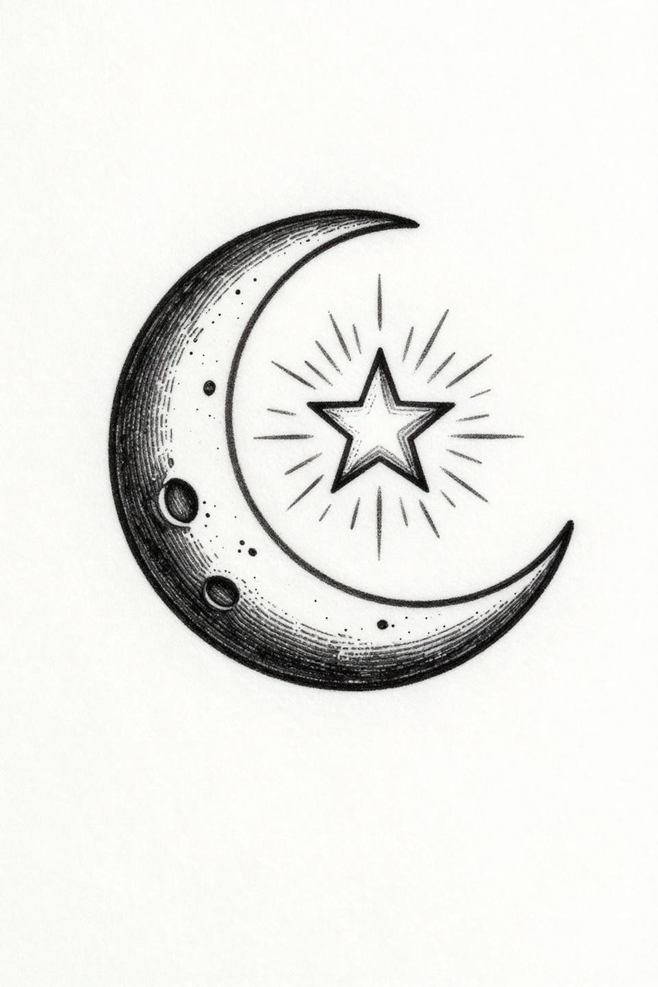
An etching-style crescent and star rendered in crosshatch parallel line engraving inside a circular tondo composition is a first tattoo choice that scales down to wrist or ankle without losing its structure.
Crosshatch density like this on protected placements, inner wrist or upper back, gives this style its best shelf life. On lighter skin tones, the line contrast reads crisp for years without touch-up.
When Negative Space Does the Compositional Work
A mountain silhouette with a facial profile integrated at the apex uses figure-ground reversal as the core concept: one bold angular line reads as landscape and face simultaneously depending on viewer focus.
This is a meaningful back tattoo design for women that scales to upper back or shoulder blade without needing adjustment. The high contrast graphic shapes hold under the distortion that curved placements create.
Moon Phase Dotwork: Stipple Density as the Skill Signal
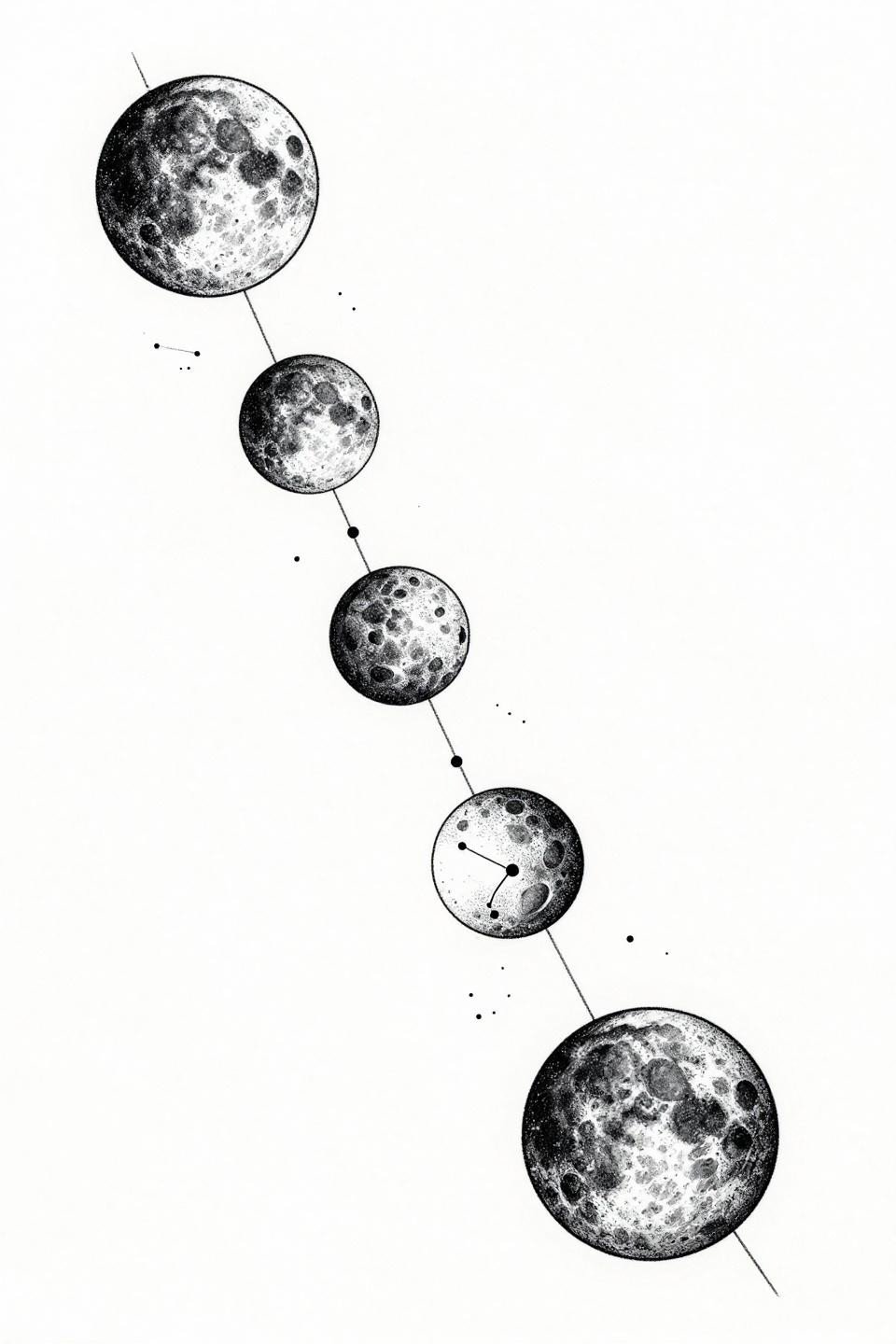
A moon phase cycle in descending arc rendered in stipple dotwork, with crater mapping and shadow topography on each phase, is a dotwork gradient execution that separates artists who understand density mapping from those who scatter dots evenly.
Look for consistent dot size across the full gradient from core density to open edge. Inconsistent dot sizing is the tell that an artist learned dotwork from reference images rather than from understanding how the technique ages.
Hourglass and Birds: Continuous Line Work With a Vertical Flow
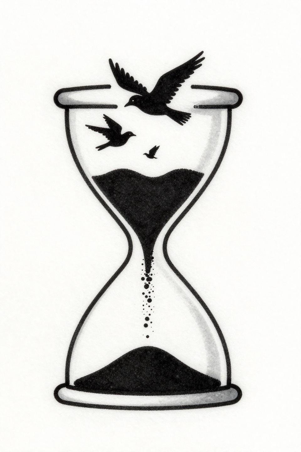
An hourglass drawn in a single continuous line, sand grains dissolving into ascending bird silhouettes, is a tiny meaningful composition that communicates time and transformation without requiring any text annotation.
At small scale, the bold 2-3pt outlines here are the longevity signal. Fine line versions of this same concept lose the bird silhouettes to blowout within five years on most placements.
Calligraphic Feather Text: When Typography and Motif Merge Structurally
A feather where the quill spine becomes the central letter stem and barbs become serif flourishes is a typographic and motif integration that works because the two elements share structural logic rather than being layered over each other.
Thick 3-5pt calligraphic brush stroke weight on a piece like this reads on olive and darker skin tones where fine line versions of word tattoos lose contrast within the first few years of healing.
Script and Botanical Line: The Restraint That Keeps It Readable
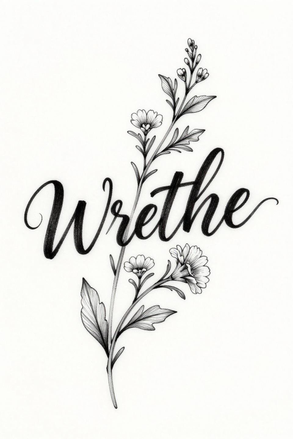
Lowercase cursive script with vine tendrils woven between characters and a single wildflower at the terminal letter is a meaningful word tattoo where the botanical elements do compositional work rather than decorative padding.
Hairline 0.5mm single-needle strokes at this complexity need a protected placement, inner forearm, collarbone, or ribcage, to maintain the botanical linework detail past the five-year mark without touch-up.
Lotus Mandala With Sanskrit Center: Circular Geometry as Structure
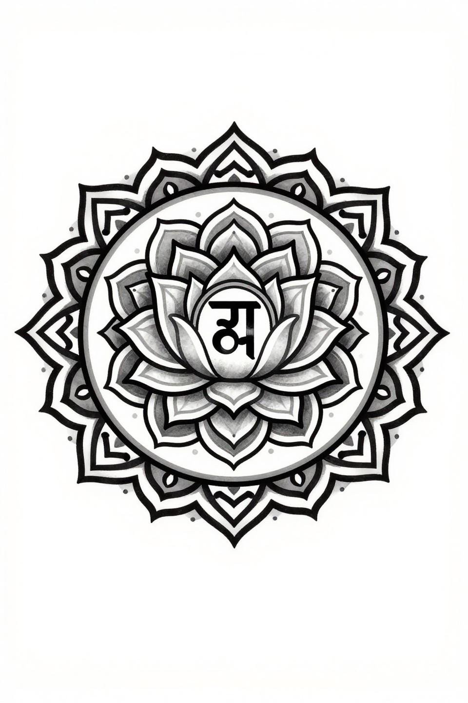
A lotus mandala with a Sanskrit character at center, moving from geometric inner structure to organic outer petal curves, is a composition where bilateral symmetry precision is the only technical standard that matters.
Grey wash midtones on olive skin need heavier dilution ratios than on lighter skin to read as distinct tones rather than a muddy middle value. Check the artist’s healed portfolio work, not just fresh shots, for this specific detail.
Constellation Map Where the Figure Hides in the Chart
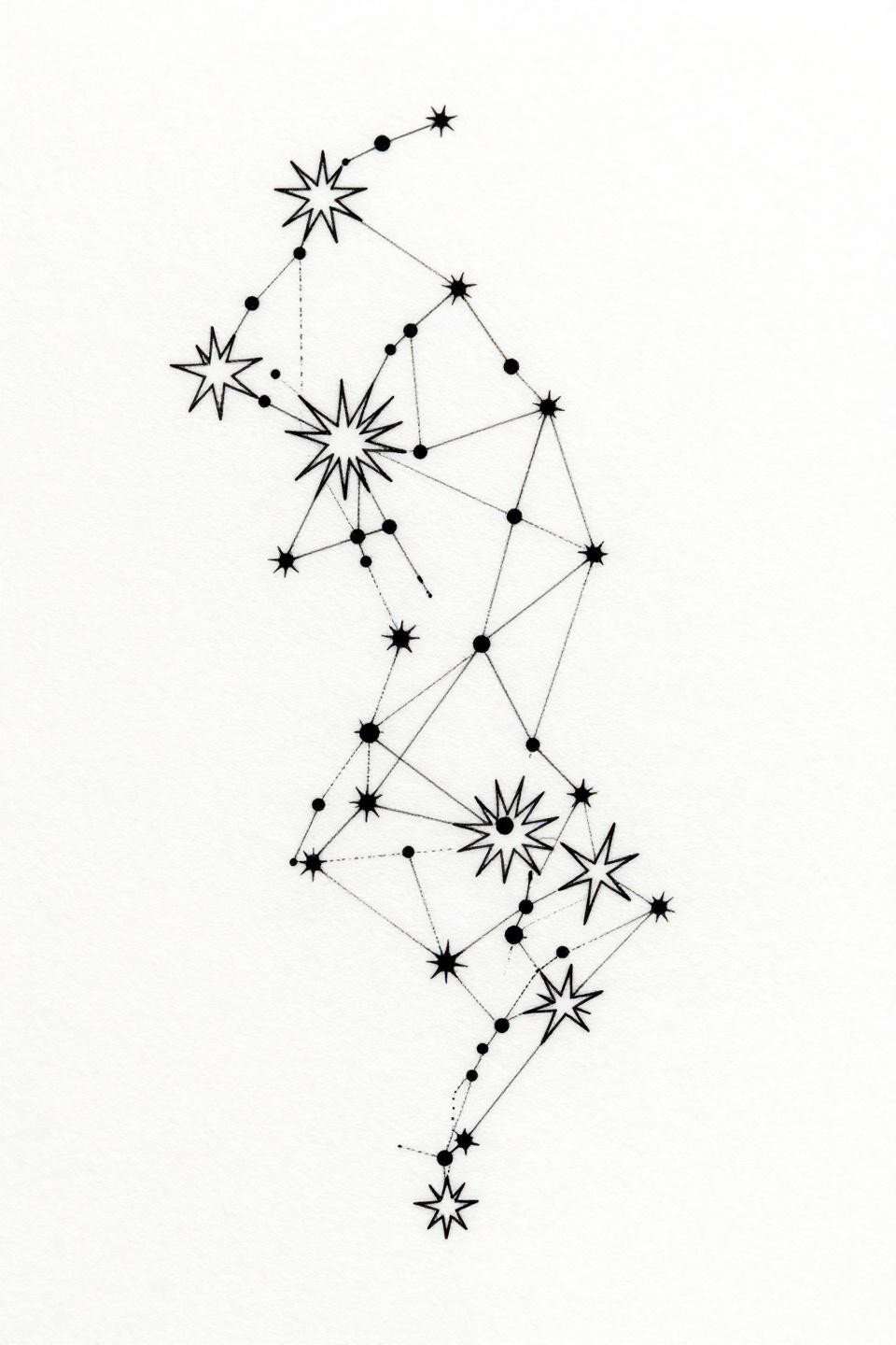
A constellation map that implies an abstract figure through strategic star point placement reads as pure star chart at distance and as something personal at close range. That dual-reading negative space structure is rare and harder to execute than it appears.
On finger placements, zero-fill hairline work like this fades to near-invisible within three years without touch-up. This composition belongs on the inner upper arm or sternum where sun exposure and friction are minimal.
Take three to five of these references into your consultation, not the full set. Match each one to your placement before the appointment: scale it against your wrist or forearm with a printed copy to confirm it reads at the size you actually want.
The designs here range from single-needle fine line to bold blackwork. Decide which technique suits your skin tone and your touch-up tolerance before you commit to a style.