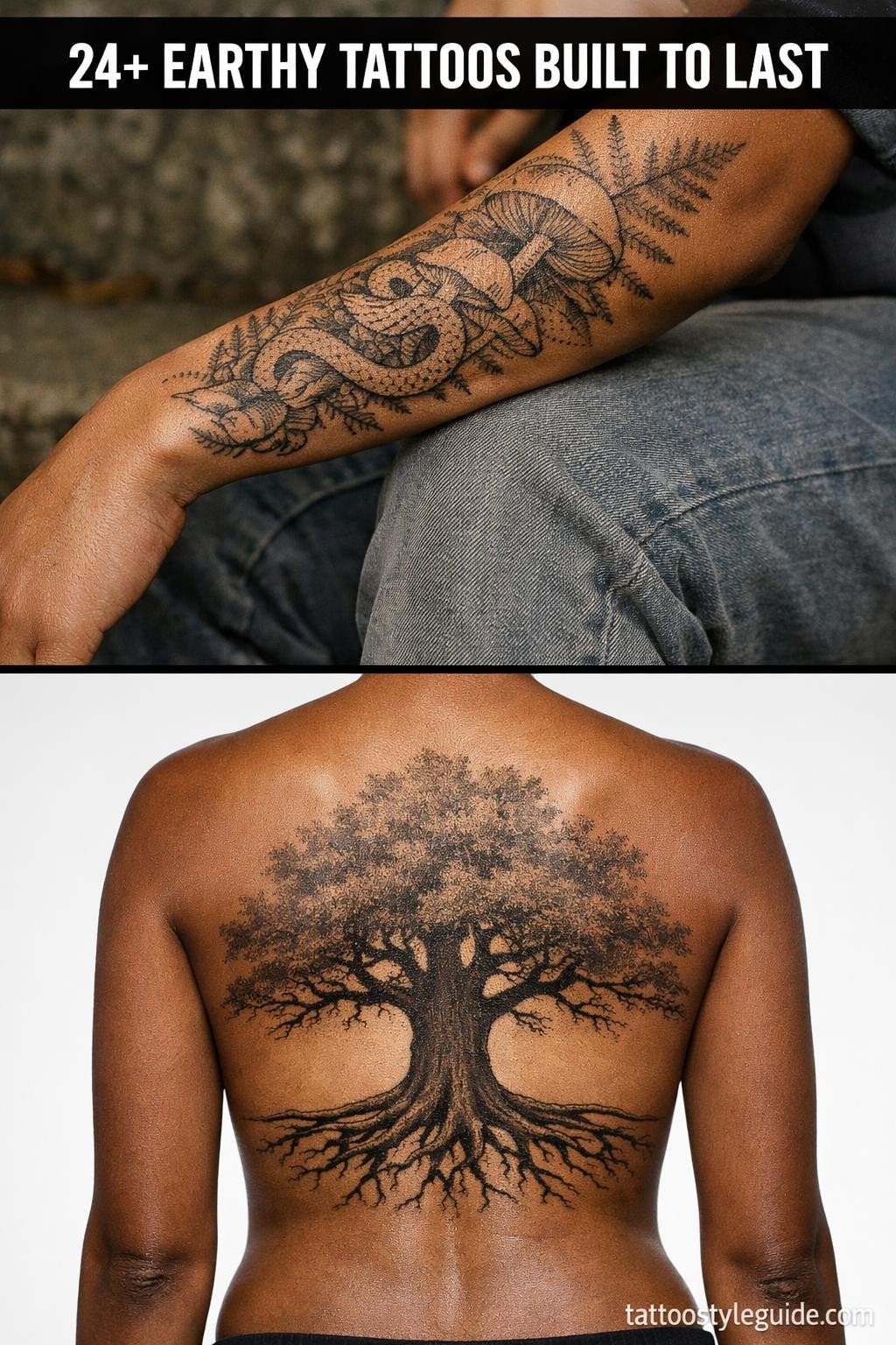
Earthy tattoos fail when the color palette does the work instead of the composition. Muted sage and warm amber read natural on paper, but without clean linework or controlled wash technique, they turn muddy on skin within three years.
The designs that hold are the ones built on structure first. Color second. The 24 flash references below cover the full range of earthy aesthetics, from botanical fine line to whimsigoth forest imagery, each with a different technical approach worth understanding before you book.
When Toadstool Circles Work Better Than a Single Focal Point

A circular mandala of spotted toadstools with carved doors, orbiting fireflies, and drifting dandelion seeds, all held by bold 3pt black outlines with flat cadmium red, golden yellow, and forest green fills in classic American traditional structure.
Traditional flat fills at this outline weight hold clean for 10 or more years, and the radial symmetry means any future fading reads evenly across the whole piece rather than pulling to one side.
Fine Line Botanical at This Scale Is a Commitment, Not a Shortcut

A vintage mortar with asymmetrically spilling chamomile and lavender, copper measurement markings, and crystalline pestle detail, rendered in hairline 0.5mm single-needle strokes with open negative space and deep teal and copper ink.
Single needle work at this density needs an artist who controls machine speed precisely. On olive and darker skin tones, these hairline strokes require heavier weighting to maintain contrast past year two.
Fairy Ring Compositions Only Work With Tight Wash Control

Toadstool houses in circular mandala formation with gossamer-winged fairy silhouettes, scattered dewdrops, and interwoven bell-flower vines, executed in calligraphic brush and ink with soft sage, dusty rose, muted ochre, and pale lavender washes.
Watercolor wash without an anchoring outline structure blurs by year three to five. The wet ink calligraphic linework here is load-bearing. Request to see the artist’s healed wash work before committing to this one.
The Apothecary Cabinet Format Holds More Than You Think

A vintage apothecary cabinet rendered in botanical scientific illustration style, shelves holding dried herb bundles, cork-stoppered bottles, a terracotta succulent, and a propped feather, in a centered circular mandala with muted sage, dusty rose, and amber watercolor over fine linework.
The circular mandala format distributes visual weight evenly, making this scale well on the upper back or shoulder blade where the skin stays relatively flat and the composition won’t distort under movement.
Sacred Geometry Structure Under Botanical Content Is a Longevity Move

Three stacked floating shelves with glass jars, copper measuring spoons, brass botanical labels, climbing ivy, and corner succulents, built on a Sak Yant-influenced vertical stacked structure with bold 2 to 3pt outlines and deep teal and copper flat fills.
The geometric stacking logic here is what separates this from a generic shelfie tattoo. Protected placements like the sternum or upper back give this vertical composition its best shelf life, away from sun and friction.
Grey Wash Botanical Jars Read Differently at Year Five

A vintage apothecary jar with visible layered herbs, scattered peppercorns, a brass botanical label, and curling root tendrils at the base, set in a diamond frame with chicano-style whip shading graduating from dense black to open midtones.
Smooth grey wash graduation at this density holds its tonal range well on lighter skin, but on olive complexions, the midtones compress over time and the piece reads darker and flatter by year five.
Trash Polka and Organic Subject Matter Is a Rarer Combination Than It Looks

A mortar filled with moonstone crystals and dried calendula, a copper-wrapped pestle, amethyst geode chunks, and botanical root tendrils, in an asymmetric trash polka composition with geometric voids, ink splatters, and flat crimson and black fills.
The tension between soft organic subject matter and the aggressive geometric splatter geometry is what makes this concept unusual. It requires an artist with experience in both styles, check their portfolio for clean negative space control specifically.
Linocut Weight Outlines Outlast Every Delicate Alternative

A mortar and pestle with layered dried herbs, scattered peppercorn berries, cross-hatched interior grinding marks, and asymmetric herb sprigs, built in full linocut woodcut relief style with chunky bold outlines and high ink density shadow fields.
Woodcut-weight outlines at 3pt or heavier hold their edge definition the longest of any line style. This is the version of an earthy botanical tattoo that looks the same at year ten as it does fresh off the needle.
Traditional American Format Applied to Apothecary Content Is Underused

A vintage amber apothecary bottle with a cork stopper, ornate brass botanical label, visible dried chamomile and calendula inside, and root tendrils at the base, rendered in traditional American flat fill format with bold 2 to 3pt outlines and cadmium amber, forest green, and golden yellow.
Flat fills with zero patchiness are the artist skill signal here. Uneven saturation in a piece this color-dense looks rough at six months when the ink settles. Request healed photos of their traditional color work specifically.
The Ignorant Style Compass Forces You to Accept Imprecision as the Point

A brass compass rose tilted slightly off-axis, cardinal runes at each point, pressed botanical sprigs radiating outward, constellation map overlay, and acorn seeds at the perimeter, drawn in full ignorant style with intentional imprecision, wobbly outlines, and irregular flat fills.
Ignorant style only reads as intentional when the artist has obvious technical skill underneath it. The wobble has to be controlled wobble. A weak artist doing ignorant style just looks like a weak artist.
Celtic Knotwork Underneath Botanical Content Adds Structural Depth

A moss-covered acorn centered in concentric Celtic knot mandala rings, with an underground root system woven into the knotwork below and dewdrops on leaf tips, executed in calligraphic brush and ink with sage, ochre, and dusty mauve watercolor fills.
The root system integrated into the knotwork below the surface is the detail that earns this design its complexity. On the forearm or calf, the bilateral symmetry along the vertical axis will hold its alignment as the skin ages.
Tribal Geometry as Botanical Abstraction Has a Different Logic Than Decorative Tribal

Pressed wildflower forms abstracted into angular tribal shapes, stacked in a vertical bookmark composition with geometric border frames and botanical margin notes rendered as linear tribal glyphs, in bold outlines with flat coral and charcoal fills.
The vertical format maps cleanly onto the inner forearm or outer shin, placements where narrow vertical compositions track with the body’s natural long axis and stay readable at arm’s length.
Art Deco Structure Under Whimsigoth Content Is the Right Call

An anthropomorphic mushroom cottage with a round door, geometric root pathways, a hanging lantern, wildflowers, and a crescent moon above fog, built with art deco structural geometry under the organic whimsigoth content, in deep teal and copper flat fills.
The copper metallic accent color is a palette choice that ages differently from standard ink. Copper-toned pigments shift warmer over time on lighter skin. Know that going in, it reads gold by year three.
Irezumi Compass Mandala Is a High-Commitment Format for a Reason

An antique compass rose with cardinal runes, dried clover at each point, a constellation map overlay within the circle, and acorn seeds at the perimeter, structured in Japanese Irezumi mandala format with bilateral symmetry and deep indigo and crimson flat fills.
The two-color restriction of deep indigo and crimson is what gives this design its authority. More colors would dissolve the geometric clarity. This is a piece where the constraint is the concept.
Botanical Sketch Style Lets the Negative Space Do the Heavy Lifting

Dried yarrow and Queen Anne’s lace specimens scattered asymmetrically with root tracings, handwritten Latin binomial annotations, and small illustrated butterfly and bee details, in sketch raw style with hairline 0.5mm strokes and grey wash midtones.
Look for consistent linework weight across the full piece. The tell in botanical fine line is the curves: any wobble at the direction changes in the stem work signals speed inconsistency, and that shows more as the piece ages.
Micro-Realism Resin Sphere Needs a Specific Skin Tone to Land

A pressed four-leaf clover sealed inside a translucent amber resin sphere, with golden light rays, suspended air bubbles, and visible root structure at the base, rendered in micro-realism with whip shading and smooth gradient transitions in amber, gold, and deep black.
The translucency effect in micro-realism depends entirely on the contrast between the lightest highlights and the deepest blacks. On darker skin tones, this effect compresses significantly. The design requires lighter skin to read as intended.
Continuous Line Goddess Format Is Harder to Execute Than It Looks Clean

A goddess silhouette formed entirely from intertwining grape vines, with clustered grape bunches as flowing hair, a third eye at the forehead, and shoulders suggested by a single unbroken continuous line stroke with bilateral mirrored symmetry.
Single continuous line work signals machine control and planning ability. An artist who delivers this without correction strokes or re-traced lines has earned a higher day rate. That skill costs what it costs. Pay it.
Pressed Wildflower Etching Grid Uses Placement Logic Most People Ignore

Four pressed wildflower specimens in a stacked vertical botanical grid, with delicate stem structures, translucent petal cross-sections, and a vintage handwritten specimen label at the base, executed in parallel line engraving and crosshatch shadow technique with 0.5mm ruled hatching.
The vertical stacked grid maps directly onto the sternum, the inner forearm, or the outer shin. Those placements stay flat, stay protected, and keep the even negative space from collapsing under movement or sun exposure.
Neo-Traditional Key Format With Botanical Overgrowth Is a Collector Signal

An antique skeleton key with dried baby’s breath blooming from the key head, flower stems woven through the shaft opening, and a moss-covered patina surface with crystalline salt deposits, in neo-traditional asymmetric organic flow with bold outlines and a forest green and gold palette.
Bold 2 to 3pt outlines at this weight hold definition clean for a decade or more. The organic overgrowth on a geometric object is a compositional move that collectors recognize as intentional design thinking, not clipart assembly.
Dotwork Stone and Fern Without Outlines Is the Riskiest Earthy Format

A moss-covered river stone with sprouting fern fronds, dewdrops on leaf tips, stippled moss patches, and curling roots beneath the edge, rendered in pure stipple dotwork with zero linework outlines, density shifting from dense clusters to open spacing for highlights.
No-outline dotwork is the format most susceptible to blurring in the first two years if the dots are placed too close together. Look for consistent dot size across the full gradient, not size variation or gaps that look accidental.
Art Nouveau Acorn With Spore Particles Is a Confined Composition Done Right

An acorn cap with an emerging oak leaf, floating mushroom spore particles, a spider web thread connecting to the base, and pinecone scales at the bottom, framed in an ornate diamond border in art nouveau structural format with deep teal and copper metallic fills.
The diamond frame contains the particle scatter and keeps the spore detail from reading as compositional noise. Without it, floating particle elements in small-scale pieces tend to look like mistakes at healed viewing distance.
Sage Bundle Watercolor Without a Clean Ink Foundation Lasts Three Years, Not Ten

A sage bundle bound with dried lavender and twine, organic smoke wisps spiraling upward, and three small stones at the base, in a vertical centered composition with loose watercolor wash color bleed behind clean calligraphic linework in sage, lavender, taupe, and soft grey.
The calligraphic ink linework is doing all the structural work here, the watercolor is atmosphere only. Versions of this design that skip the ink foundation and rely on wash alone bleed into formless color fields by year four.
Single Line Moon and Wildflower Works Because the Subject Is Already Minimal

A crescent moon cradling three wildflower stems, clover blooms, yarrow clusters, and open buttercup petals, with celestial dots along the moon curve, all rendered in one unbroken continuous line in a centered circular format with bold outlines and flat black fills.
The crescent moon format is forgiving for continuous line work because the natural curvature of the subject allows the line direction to change without reading as a mistake. This is a smart subject choice for the technique.
Botanical Mushroom Fine Line Is Where Ink Chemistry Starts to Matter

A mushroom cluster with spotted caps, fern fronds weaving between stems, and wildflower blooms at the base, in an asymmetric organic arrangement using fine line etching with 0.5mm hairline strokes and crosshatch shading in forest green and gold ink.
Forest green tattoo ink is one of the more variable pigments across brands. Ask your artist which green they use and what their healed green work looks like. Some forest greens shift to olive or grey-green within three years on certain skin tones.
Sort these references by technique first, then by subject. Pick one from the structural formats if you want longevity, one from the fine line or wash category if you want refinement and can accept a shorter sharp window. Send your artist one reference, not twelve.


