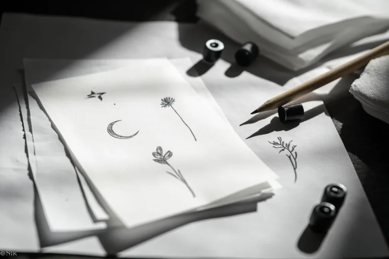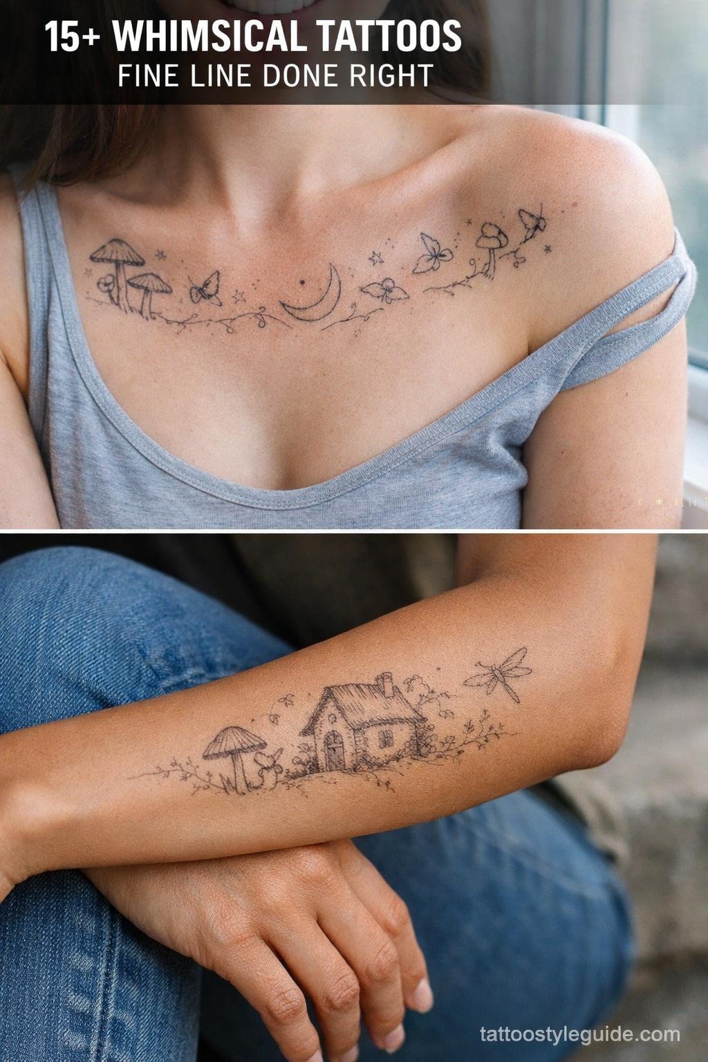
Whimsical tattoos fail when artists treat them as an excuse to go loose. The style demands precise linework underneath all that dreamy subject matter, and the best pieces hold their readability because the artist committed to clean structure first, atmosphere second.
What separates a lasting piece from a blurry mess at year five is usually outline weight. Airy compositions need anchoring lines or the negative space collapses as skin ages and shifts.
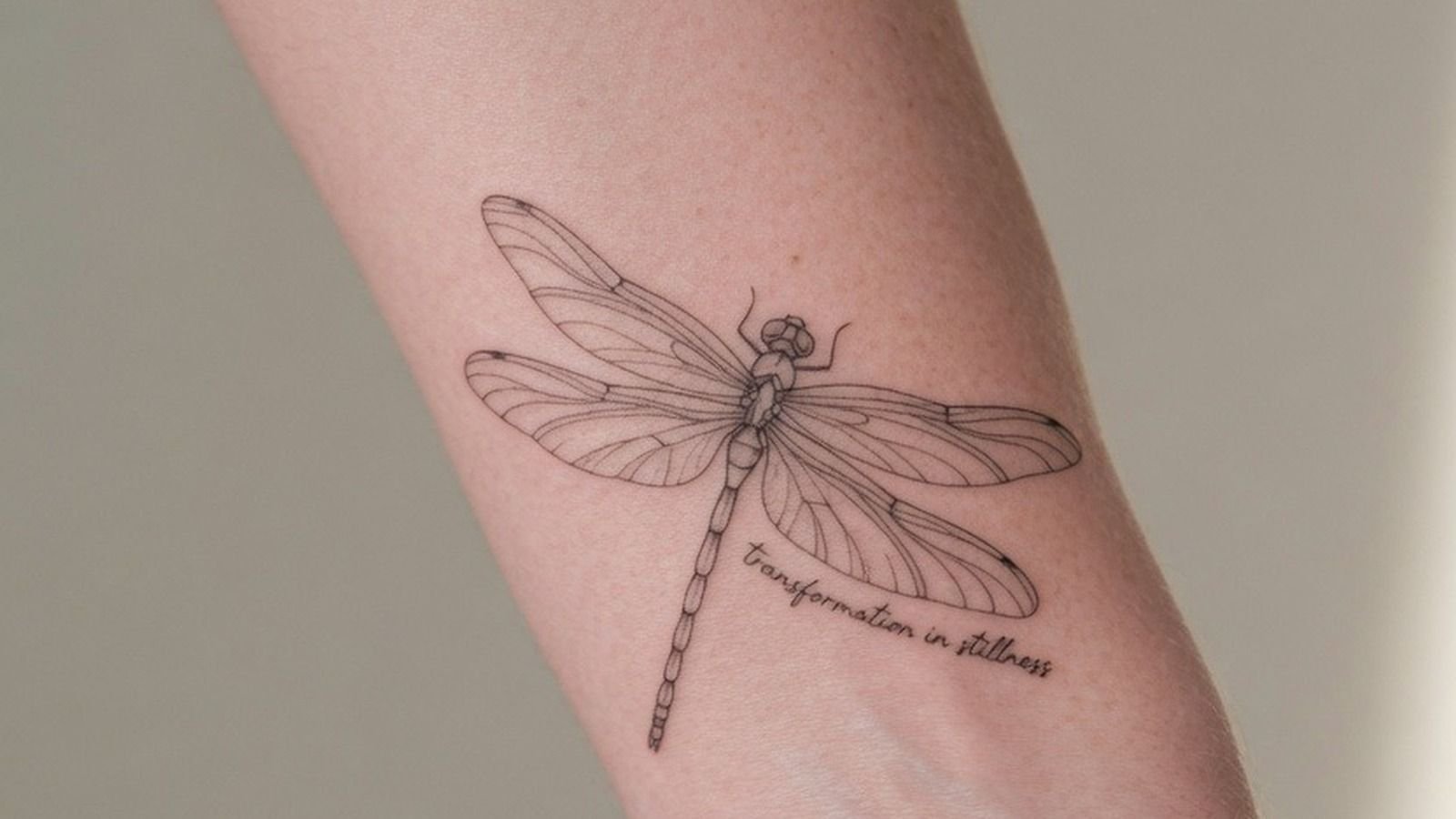
Dragonfly Wings and Morning Glory: Where Surrealism Meets Technique
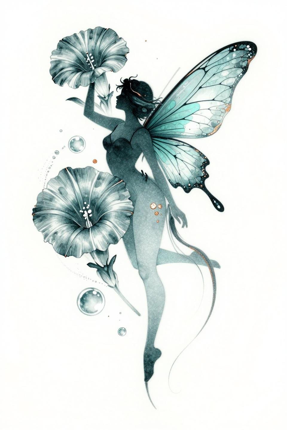
This flash places an ethereal fairy silhouette atop an oversized morning glory, with dragonfly wings rendered in whip shading motion strokes that trace vein tracery in deep teal and copper accent.
The copper metallic ink reads differently under healed skin than fresh, often shifting warmer over time. Confirm your artist has worked with metallic pigments before, and ask for healed references specifically.
Gothic Mirror Symmetry With an Actual Structural Spine
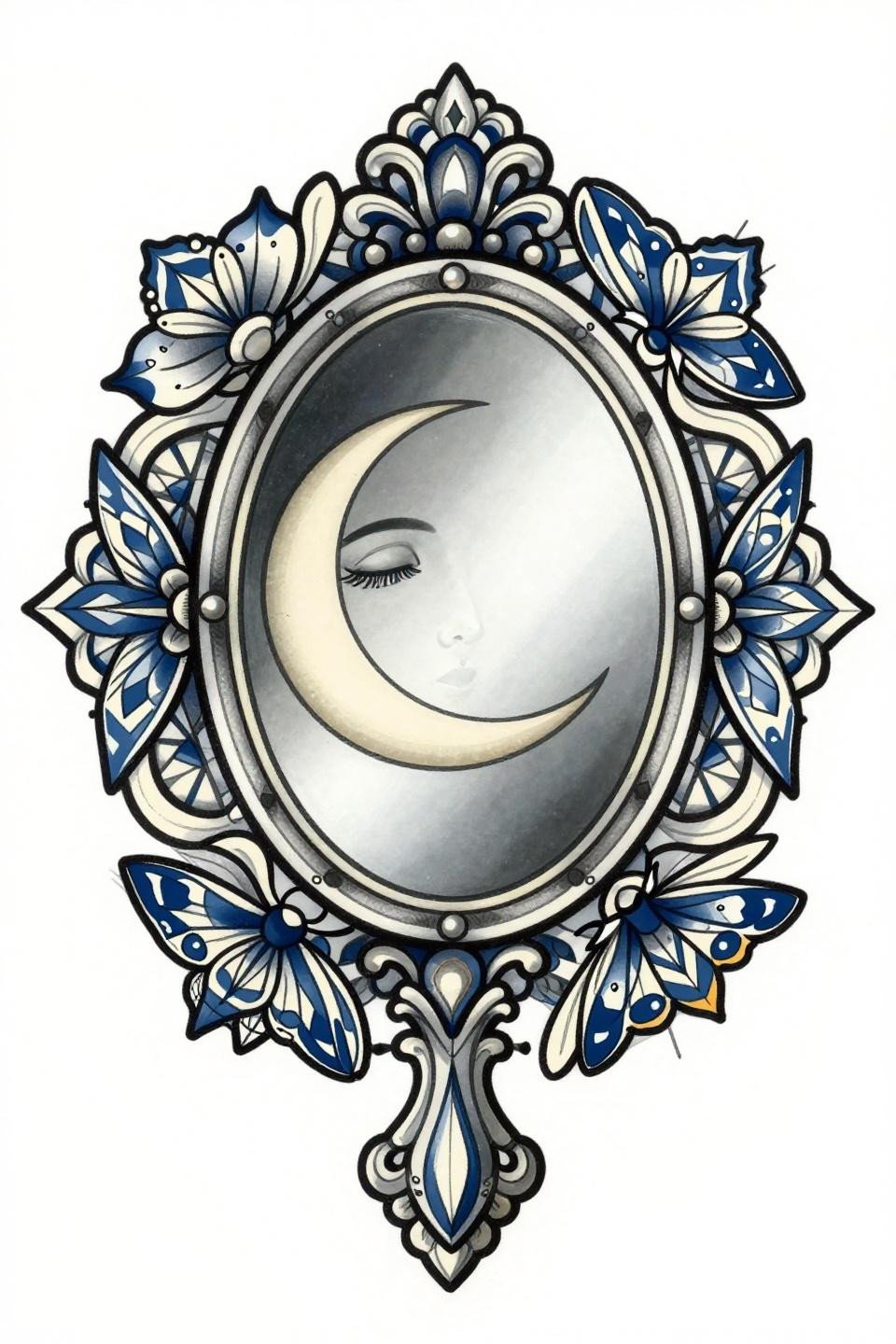
A filigree-handled vintage mirror frames a crescent moon face, flanked by geometric moths in compass-drafted bilateral symmetry with navy and cream flat fills inside bold black outlines.
Bold 2-3pt outlines at this weight hold clean for 10 or more years, which is exactly why the whimsigoth aesthetic benefits from the geometric border structure rather than soft edges.
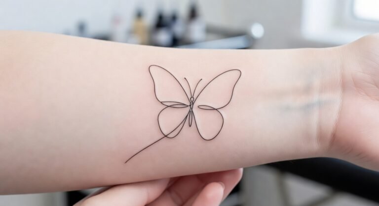
Single-Line Ladybug: The Restraint Is the Whole Point
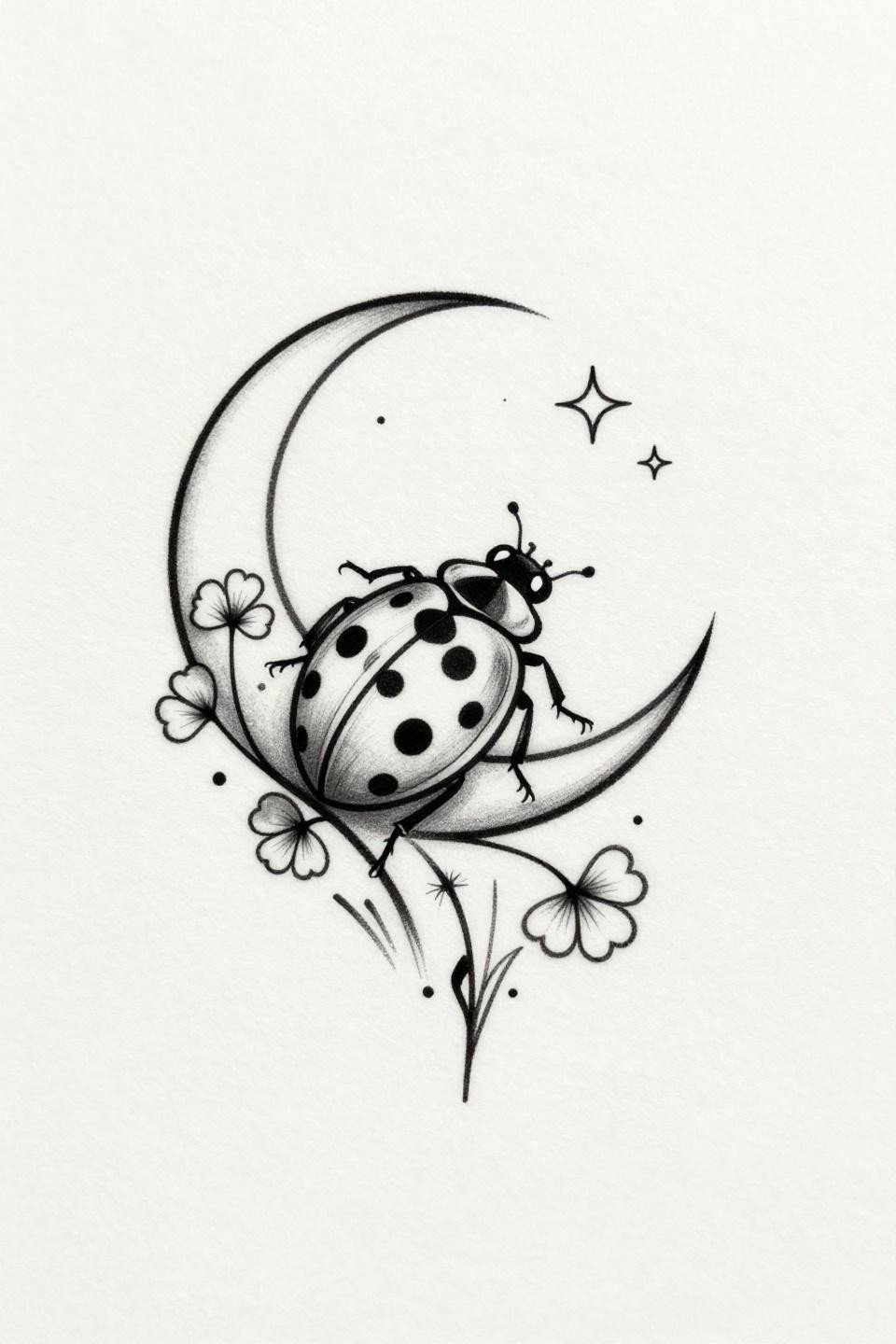
A ladybug perches on a crescent moon in a single unbroken hairline stroke with no fills, relying entirely on open negative space composition to carry the design.
Single-needle 1RL work like this needs an artist who controls machine speed precisely. On lighter skin tones this reads crisp at placement, but the fine lines need bolder weight on olive and darker skin to maintain long-term contrast.
The Melting Pocket Watch That Actually Uses Dotwork Correctly
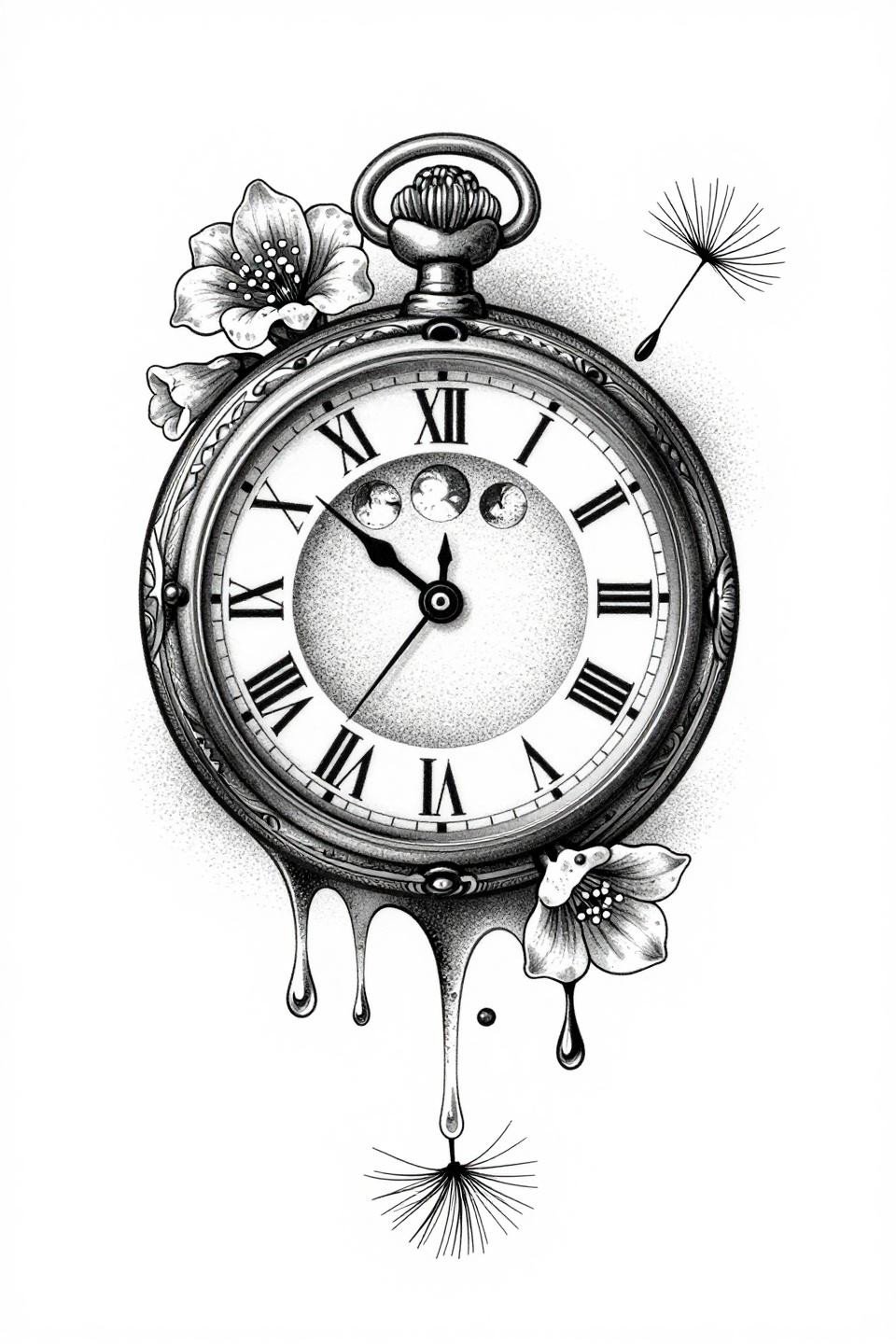
A wax-dripping pocket watch with Roman numerals anchors this cottagecore piece, foxglove blooms emerging from chain links while stipple dot density runs from tight at center to open at the design edges.
The grey wash dilution for midtones here avoids muddy transitions, which is the mark of a dotwork artist who understands tonal range rather than just texture.
Irezumi Logic Applied to a Two-Centimeter Ladybug
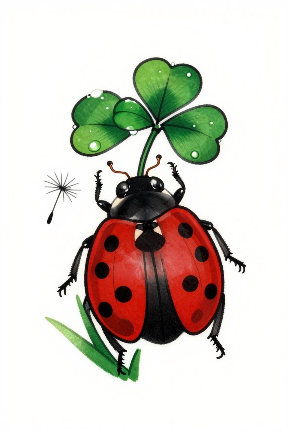
Japanese Irezumi structure applied to a small-scale fairycore subject: bold outlined ladybug on clover with crimson red flat fills and dewdrop linework along leaf edges that reads clean at any size.
The flat fill approach with no blending means this ages without patchiness, which is a longevity signal worth noting when placement is somewhere high-friction like a wrist or ankle.
Neo-Traditional Key Where the Vine Does the Work
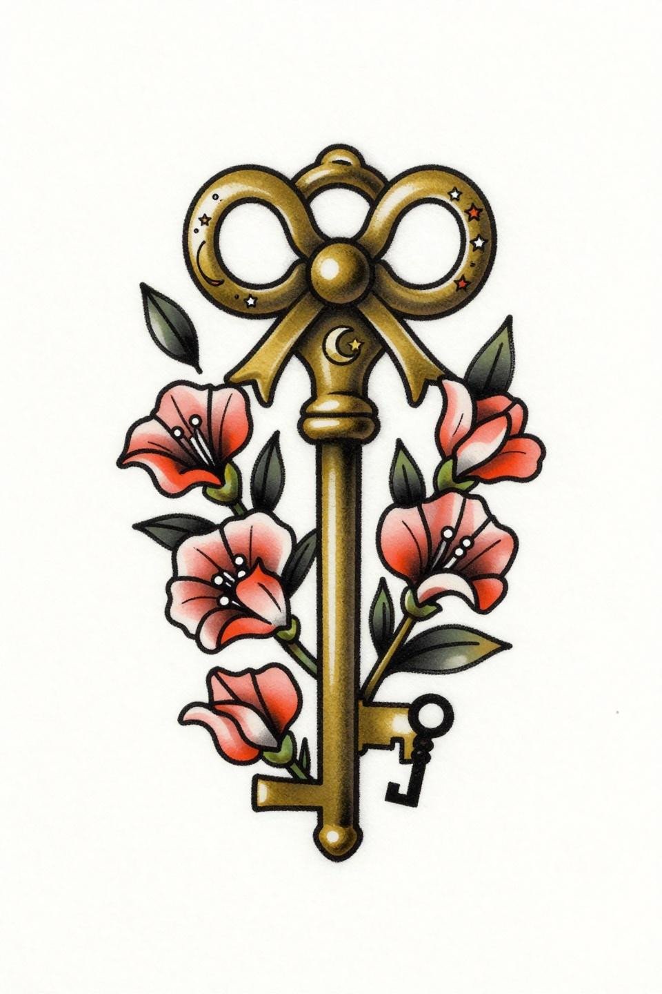
A brass key with a crescent moon bow transforms along its shaft into morning glory and sweet pea vines, rendered in neo-traditional coral and charcoal fills with consistent bold outlines throughout.
The vertical composition makes this purpose-built for forearm or shin placement, where the design length runs with the limb rather than against it.
Apothecary Bottles in Woodcut: Crosshatch That Ages Clean
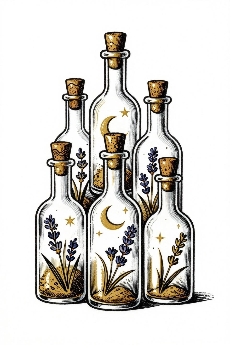
Vintage apothecary bottles with dripping wax seals and suspended botanicals rendered in woodcut crosshatch shading, flat gold ink catching the crescent moon reflection in the curved glass.
Parallel-line engraving at consistent spacing ages better than stipple on areas prone to stretching, making this style a smart call for rib or outer forearm placements.
Fine Line Teacup: What Hairline Strokes Cost You Long-Term
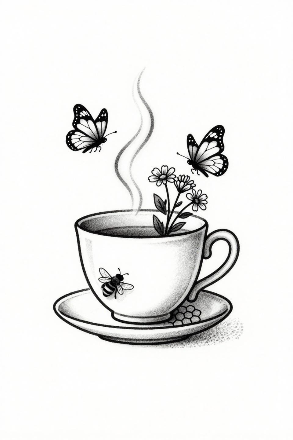
A ceramic teacup with steam curling into butterfly silhouettes and wildflowers sprouting from the rim, executed in 0.5mm single-needle hairline strokes with zero grey wash and no fills.
Protected placements like the sternum or upper back give this style its best shelf life. On wrists or hands, expect the fine lines to spread within three years and plan touch-ups accordingly.
Mushroom Mandala Where Bleeding Edges Are the Technique
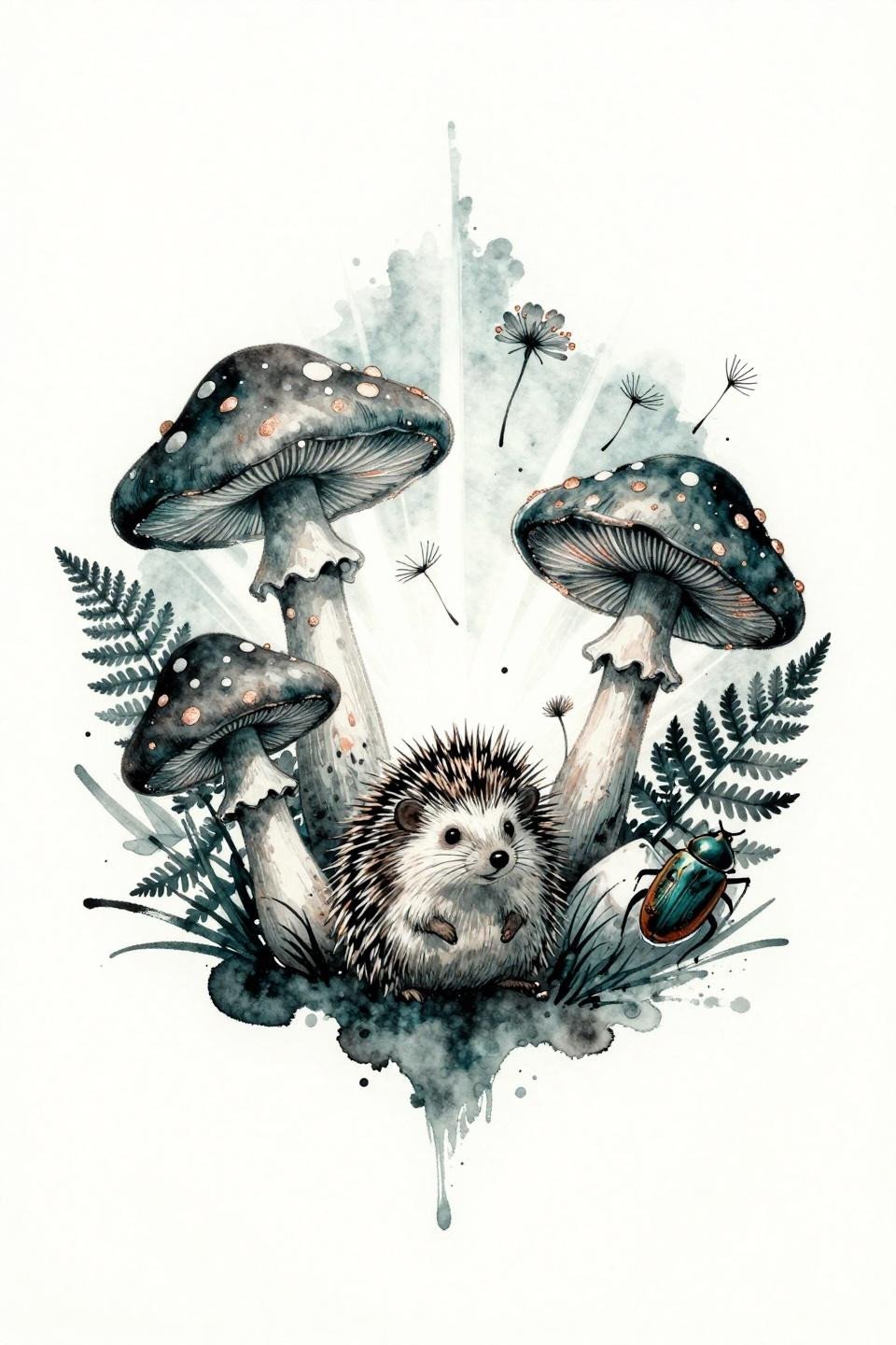
A radially balanced fairy ring of mushrooms contains a hedgehog, dormouse, and beetle, rendered with wet ink diffused bleeding edges in deep teal with copper metallic accents.
Watercolor-style work without an anchoring outline blurs by year three to five, so the question to ask any artist showing this reference is how they plan to keep the outer forms readable as the ink settles.
Art Nouveau Sprite: When the Outline Weight Earns Its Keep
![]()
A woodland sprite on an oversized toadstool throne with calligraphic brush ink marks creating gossamer wing detail, forest green and gold fills contained by bold black outlines that define the art nouveau structure.
The bold outline perimeter here is what makes this readable as a larger piece. Scale it below three inches and the interior detail compresses too much to survive long-term.
Toadstool Fairy Ring: Botanical Precision in a Circular Frame
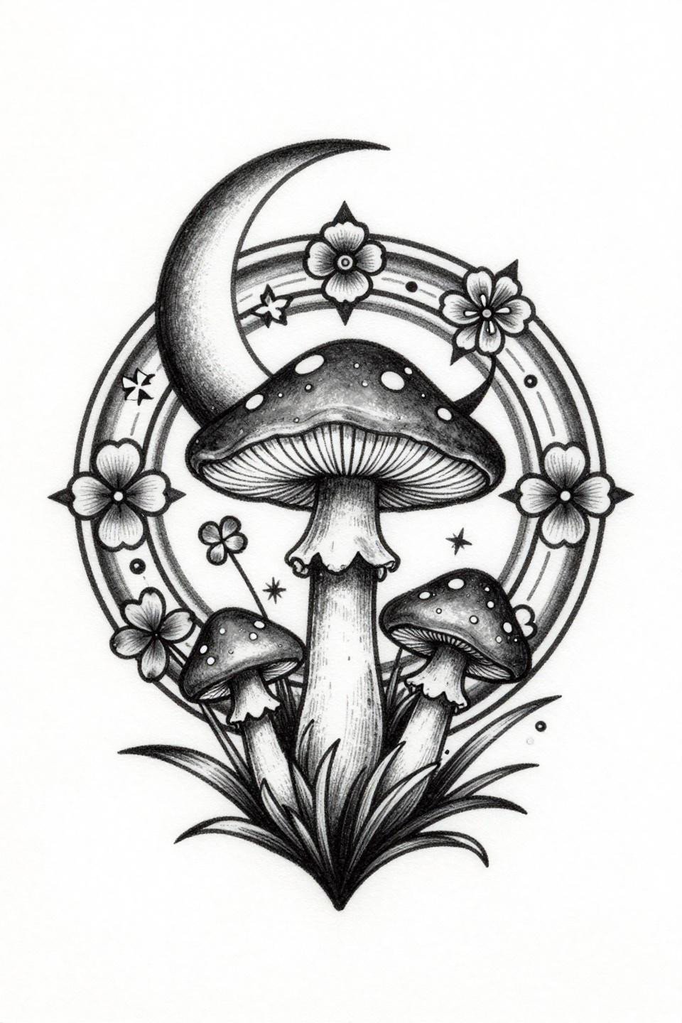
A circular fairy ring of toadstools in botanical scientific style, crescent moon cradled in the largest cap, spore wisps and forget-me-nots filling gaps with four-point starburst accents between stems.
The grey wash midtones and open negative space give this piece its tonal range without relying on color, a smart choice for collectors who want longevity without committing to color touch-up cycles.
Pick three of these that match both your placement and your artist’s demonstrated style range. Send the flash reference alongside a healed photo from their portfolio, not just a fresh shot. That combination tells you more about the outcome than any consultation without it.