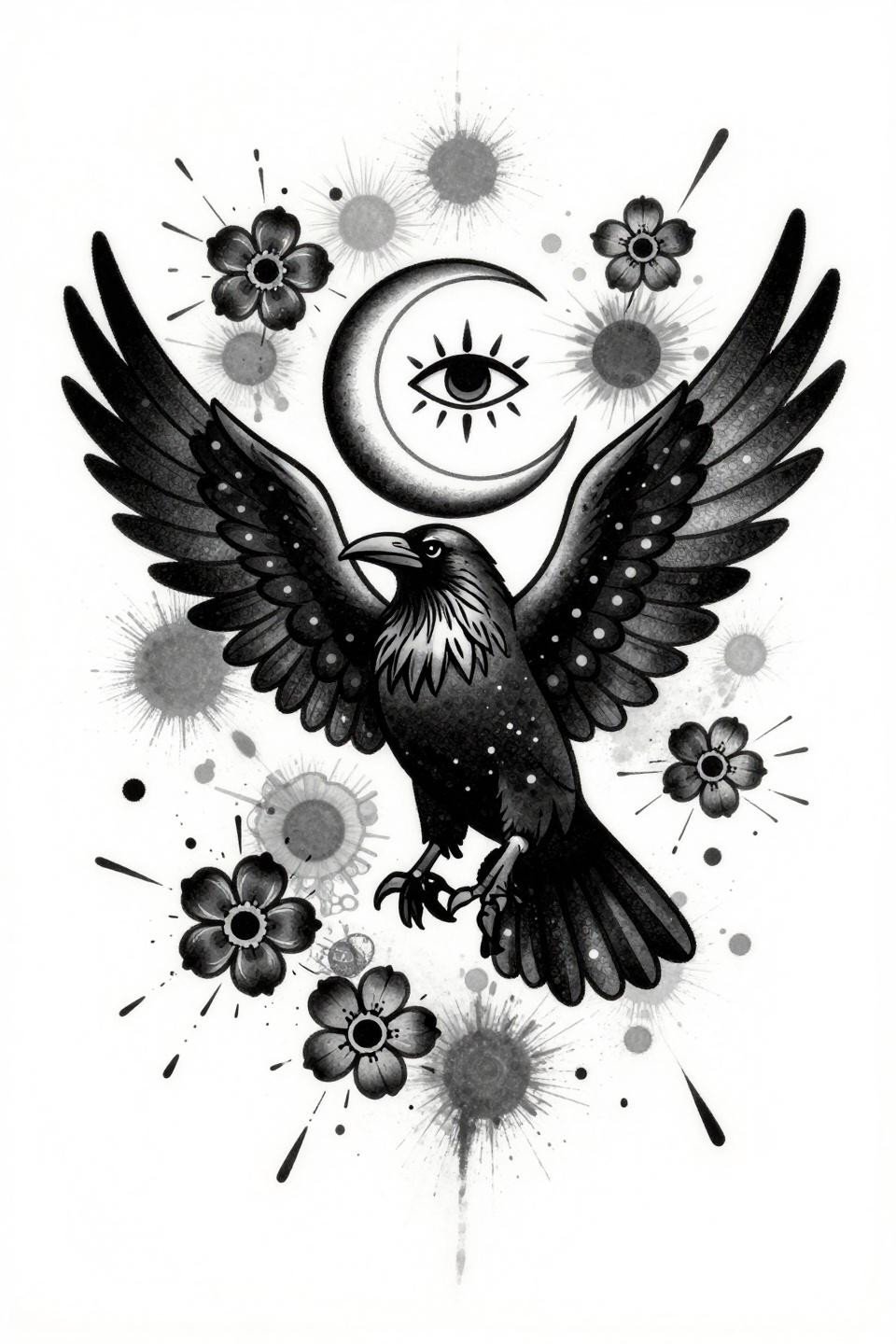
Raven tattoos punish lazy execution harder than almost any other subject. The all-black subject means every design decision lives or dies on linework weight and grey wash contrast, with zero color to hide muddy technique or inconsistent saturation.
The difference between a raven that reads as intentional dark-feminine work and one that just looks like a smudged bird comes down to composition and negative space. Too tight, and the feather detail collapses at scale. Too loose, and the silhouette loses its menace.
Smoke and Filigree: When the Raven Dissolves Into Something Else
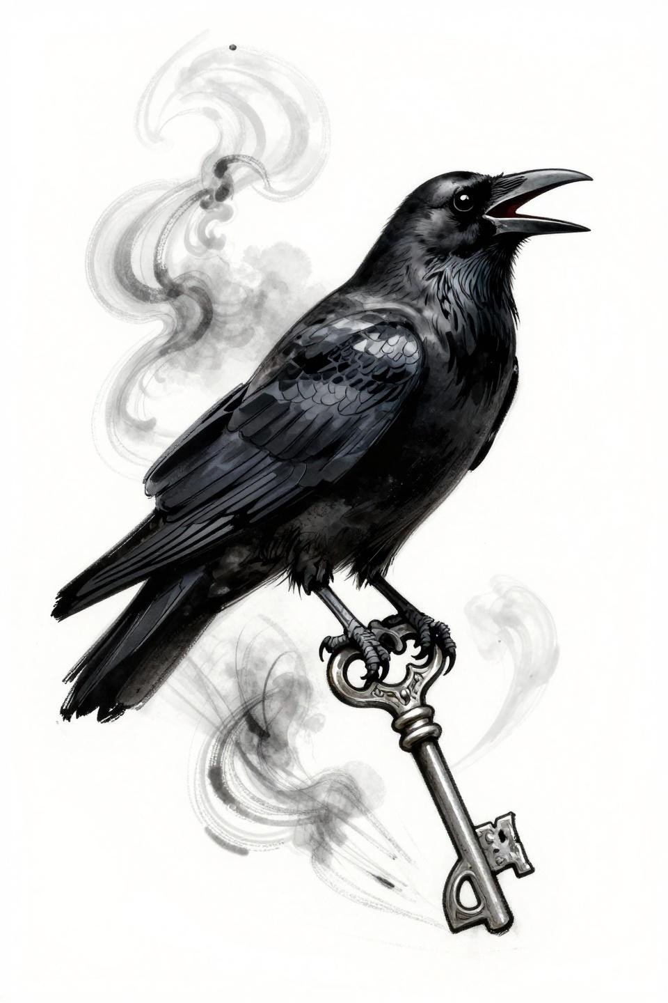
This design pairs a void-black mirror eye with feathers that break apart into spectral smoke, anchored by an antique filigree key below. The stacked vertical composition reads cleanly on forearm or sternum without needing a frame to contain it.
Loose gestural linework like this requires an artist with confident freehand speed. Hesitation shows immediately in the smoke wisps, where broken outlines need to look intentional, not uncertain.
What a Ribcage-Visible Raven Signals to the Collector
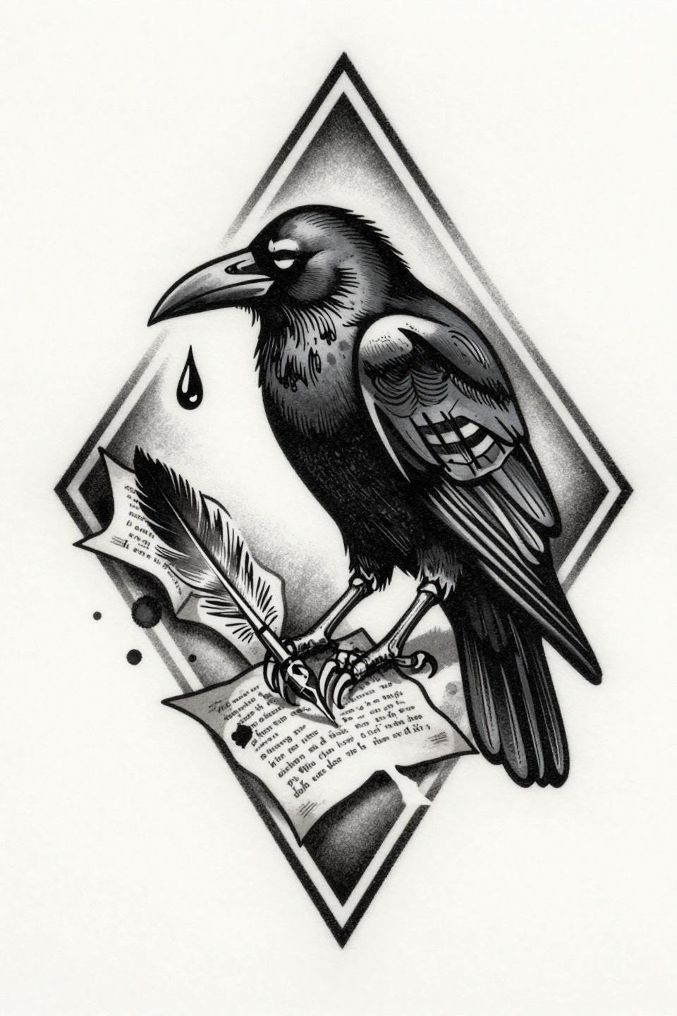
The woodcut etching approach uses parallel line engraving and crosshatch shadow depth to render a mourning raven, skeletal ribcage showing through the torso, talon gripping a quill over scattered manuscript pages. The diamond frame holds the asymmetric grief-imagery tight.
Crosshatch-heavy designs on pale skin read sharp for years. On olive and darker skin tones, the line spacing needs to open slightly to maintain contrast as the skin fills in around the ink over time.
Single Needle Occult Geometry Needs One Kind of Artist
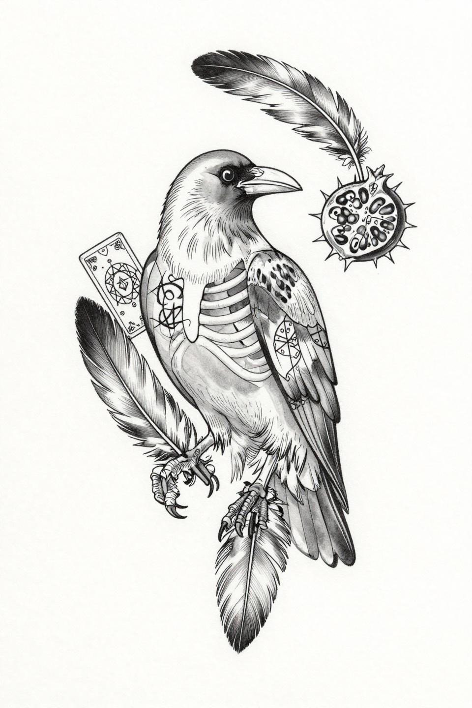
Hairline 0.5mm single-needle work renders each feather as a botanical quill stroke, with tarot card geometry orbiting the central figure and a thorned pomegranate gripped in the talons. Centered negative space does as much work here as the linework itself.
Single needle 1RL work at this density needs an artist who controls machine speed precisely. Check healed portfolio shots specifically, not just fresh work, because this style either ages cleanly or ghosts out within three years depending on technique.
Indigo Wash and Constellations: Color That Earns Its Place
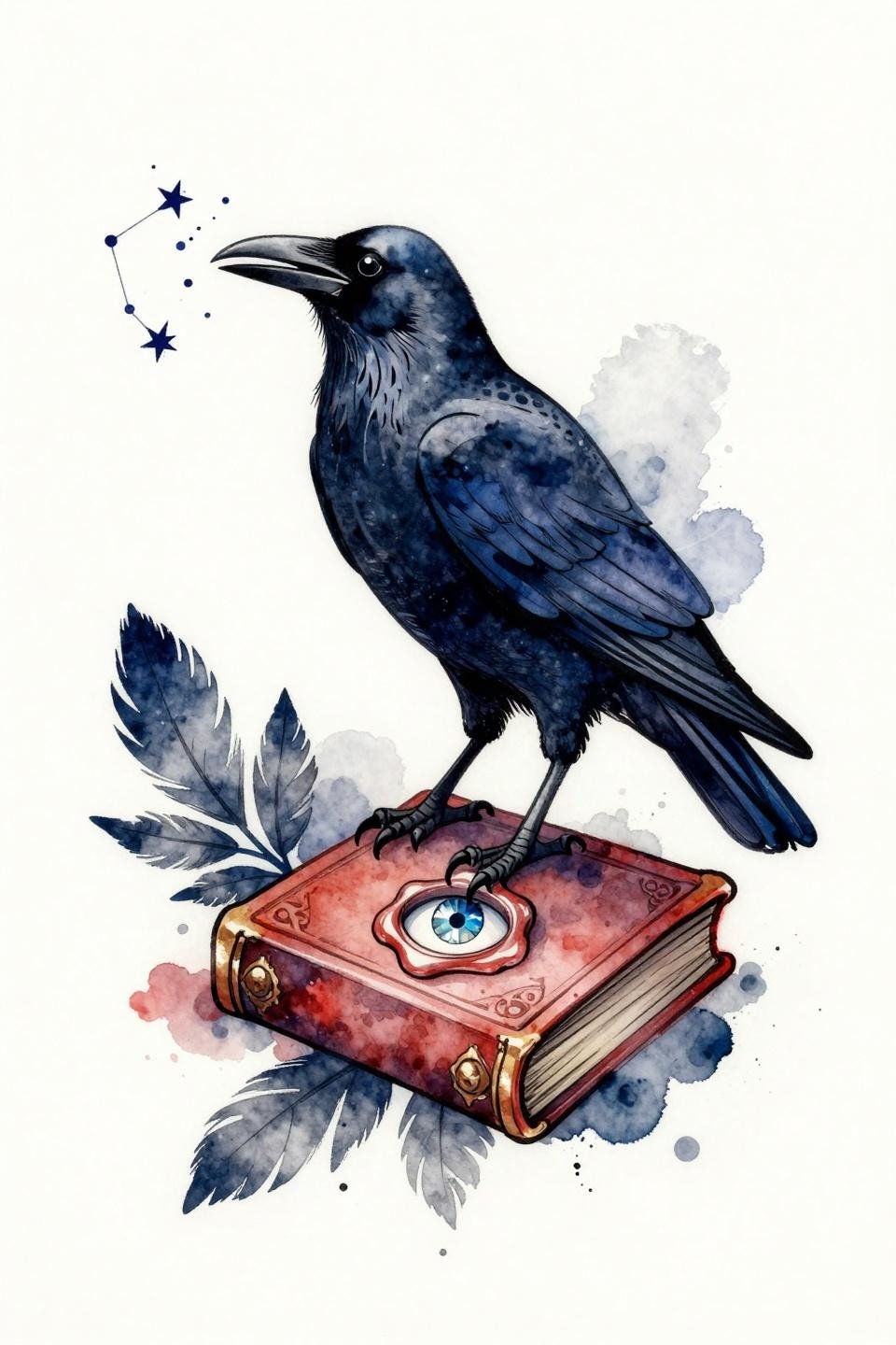
Deep indigo and crimson watercolor washes sit behind a clean line skeleton, with the raven releasing constellation stars from its open beak and perching on a wax-sealed grimoire. The calligraphic brush mark quality at the feather edges is what separates this from standard watercolor flash.
Watercolor without a bold anchoring outline blurs by year three to five on most placements. This design needs that clean line foundation executed at a weight heavy enough to hold the composition as the wash fades.
Nordic Flight Silhouette and Why Angular Geometry Holds
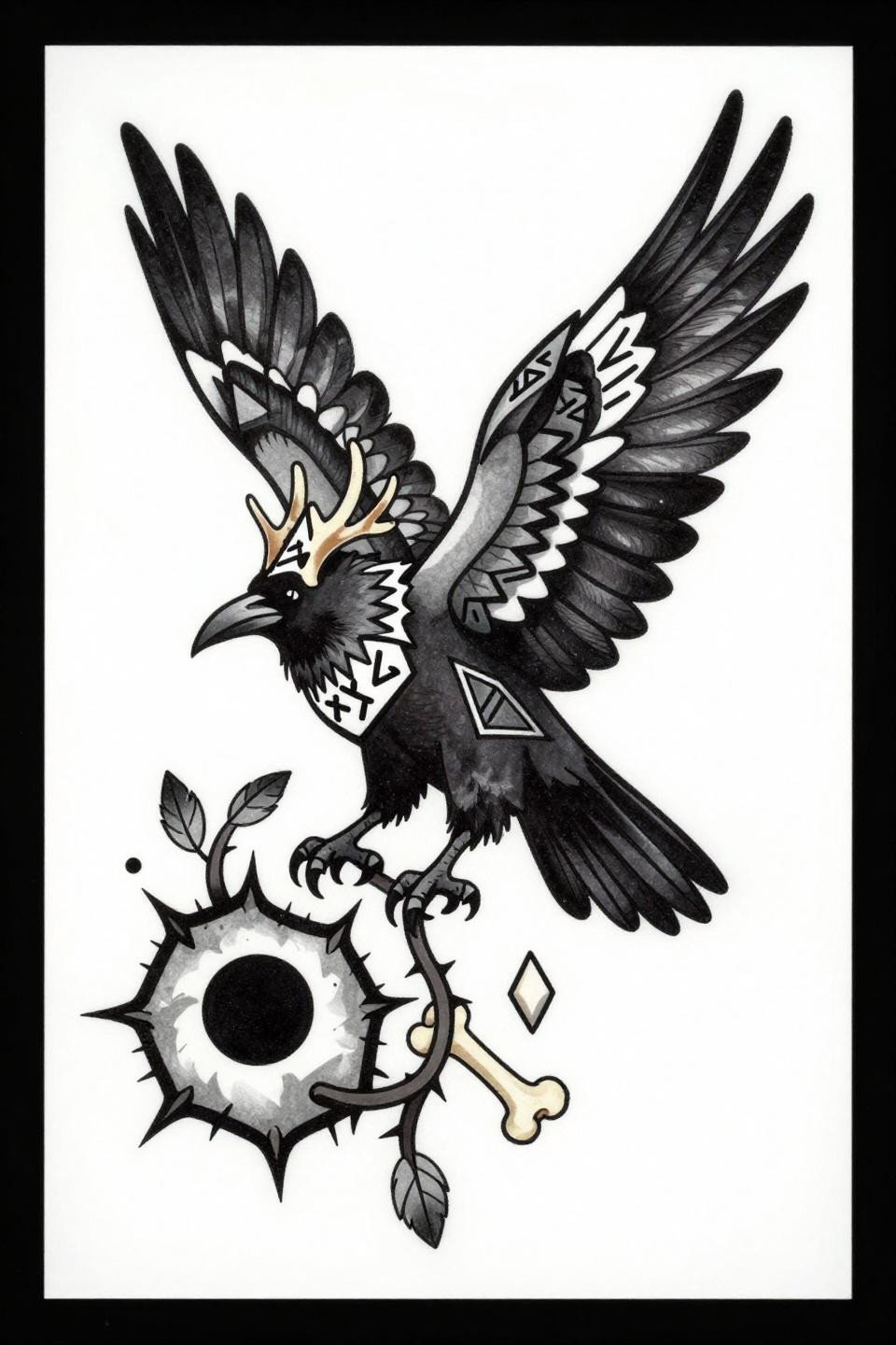
This ascending flight composition uses bold 2-3pt black outlines with flat fills and angular rune symbols crowning the head like antlers. The aggressive upward silhouette maps well onto upper back, shoulder blade, or outer thigh without the design losing its read at a distance.
Bold outlines at this weight are the longevity signal in tribal-adjacent work. The flat fills stay saturated indefinitely if the artist commits to multiple layered passes, making this one of the longer-lasting raven formats on this list.
Moon Phase Eyes in a Bilateral Frame: The Irezumi Crossover
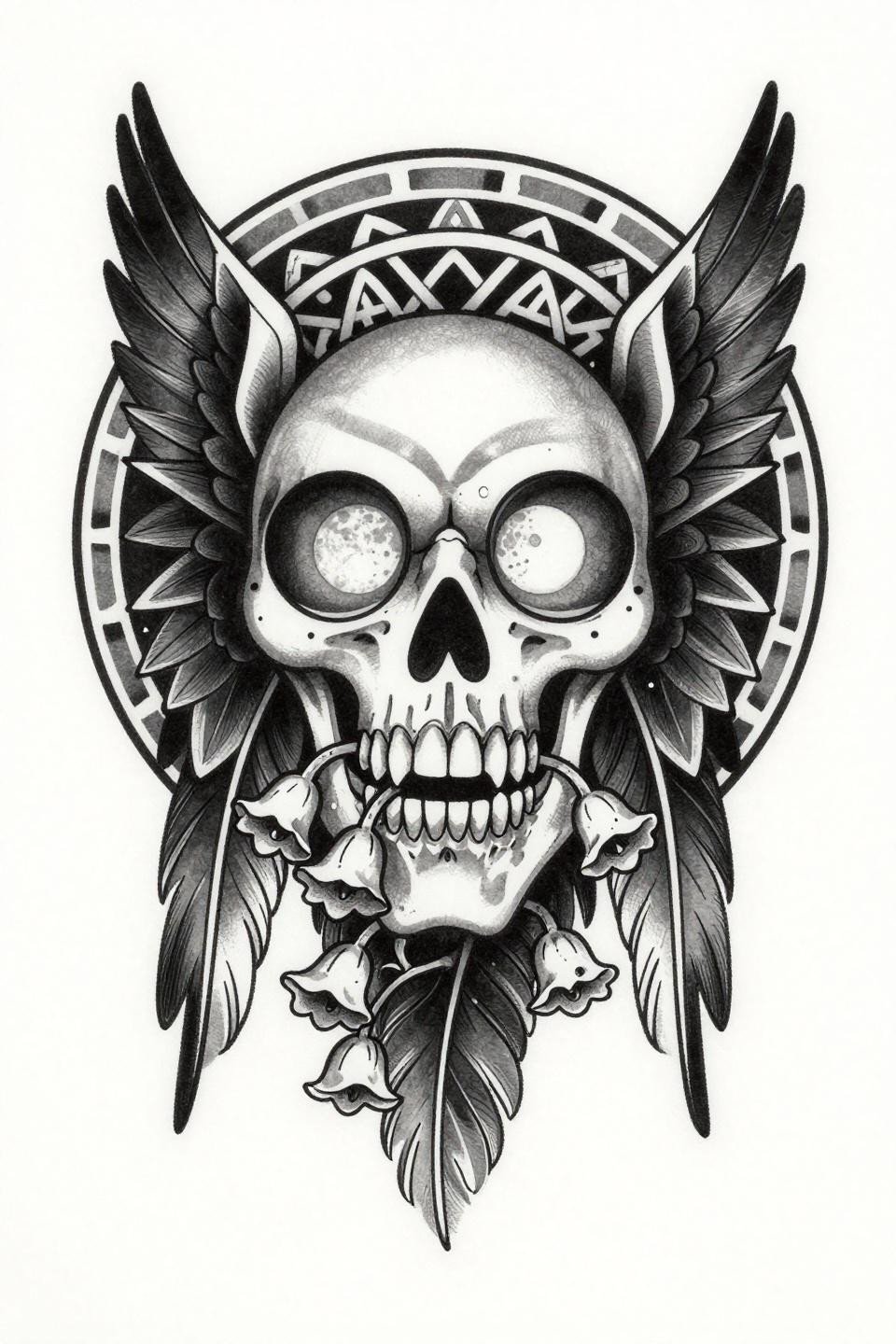
Bilateral symmetry locks this design into a circular mandala frame, with each hollow eye socket housing a moon phase sequence and nightshade vines pushing through the skeletal jaw. The irezumi wave-pattern feather rendering gives it structural weight that pure blackwork versions lack.
Symmetrical facial designs on the sternum or upper chest demand an artist whose linework doesn’t drift at direction changes. The tell is the outermost frame: any wobble at the curve points reads as amateur execution immediately.
Trash Polka Splatter Against a Crescent Hold: Controlled Chaos
Wings fully wrapped around a crescent moon anchor this trash polka composition, with a third eye centered on the forehead and explosive ink splatter marks creating visual tension against the structured figure. The asymmetric layout needs room, making upper back or thigh the natural placement calls.
Splatter elements in this style age unpredictably on textured skin or high-movement placements. Rib cage and sternum give it the best shelf life because the skin stays relatively flat and protected from daily friction.
Art Nouveau Calligraphy and the Two Colors That Work Here
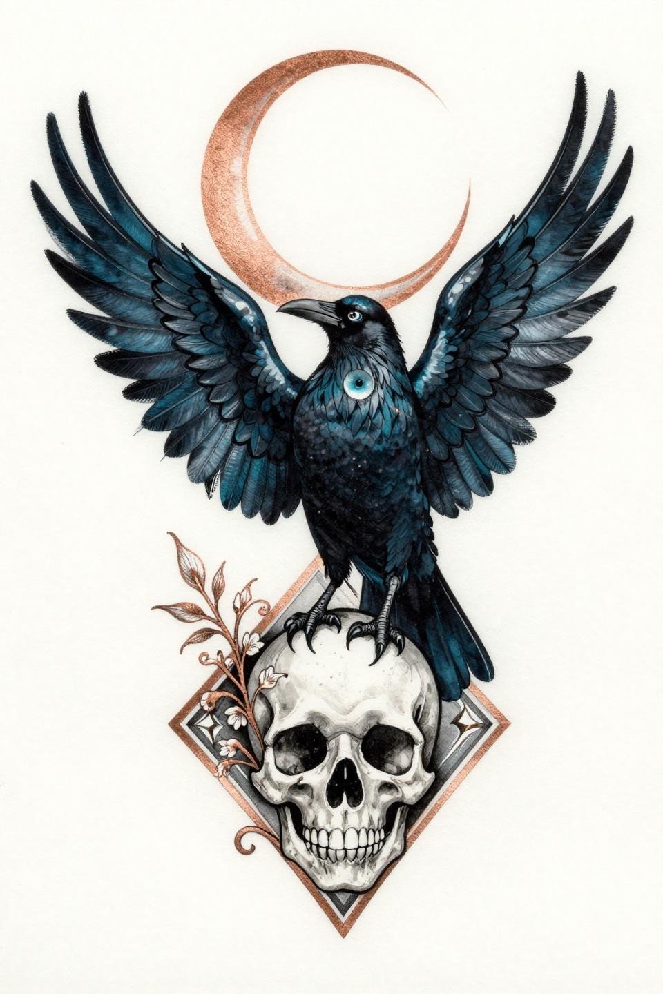
Art nouveau structure gives this design its calligraphic brushstroke feather quality, with a crescent moon halo above and a flowering skull perch below. Deep teal with copper metallic accents is a controlled two-color palette that reads as intentional rather than decorative.
Teal ink on darker skin tones tends to shift green within two to three years without a strong black outline to contain it. Confirm the artist uses a high-pigment teal formulation and plan for a refresh on the color passes around year four.
Crow Versus Raven in Single Continuous Line: Why Silhouette Decides
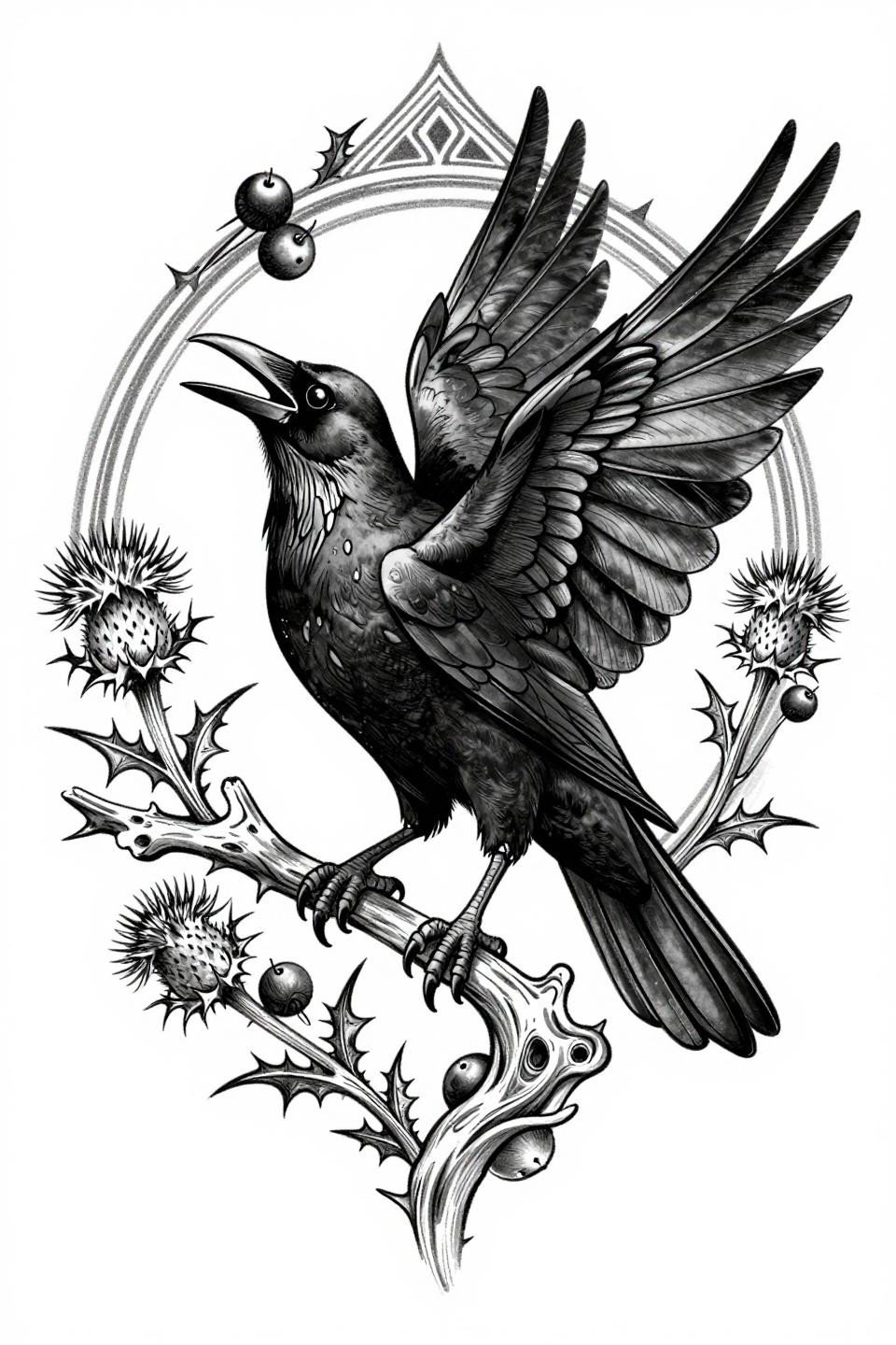
A single unbroken 0.5mm hairline traces the entire figure, from gnarled branch perch to geometric void interior at the open beak, with thistle and nightshade botanicals orbiting the circular frame. Open negative space carries the composition in places where the line alone couldn’t hold volume.
Crow and raven silhouettes are distinguished primarily by tail shape and beak mass. This design reads as corvid rather than committing to either, which is a legitimate choice for collectors who want the symbolism without the ornithological debate.
Descending Flight on the Arm: Dotwork Density and Where It Goes
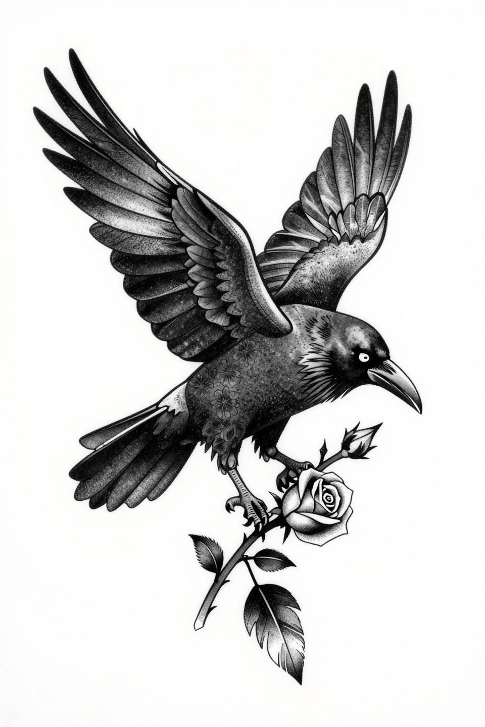
This descending flight composition flows diagonally, wings fully spread with the head turned backward and a thorned rose stem gripped in the beak. The stipple dot gradient runs from 90% density at the body core to open negative space at the wingtip edges.
Diagonal descending compositions on the outer forearm track with the arm’s natural taper and stay readable as the design ages. Consistent dot size across the full gradient is the quality signal here: uneven stippling collapses into grey mud by year five.
Neo-Traditional Profile With Runic Branch: When Gold Belongs
Strict left-facing profile with parallel line feather detail, a glowing amber eye, and a crystalline geometric branch with runic carvings gives this design its neo-traditional Nordic structure. Gold metallic accent on the eye and rune marks is the only departure from a standard blackwork read.
Gold ink requires commitment: it needs consistent touch-ups every three to five years to stay legible, and it performs better on lighter skin tones where the warm undertone contrast is strongest. On deeper skin, consider a warm ochre over pure gold.
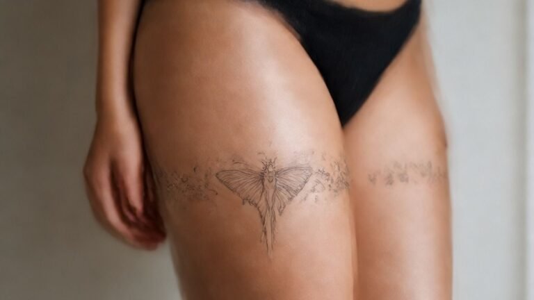
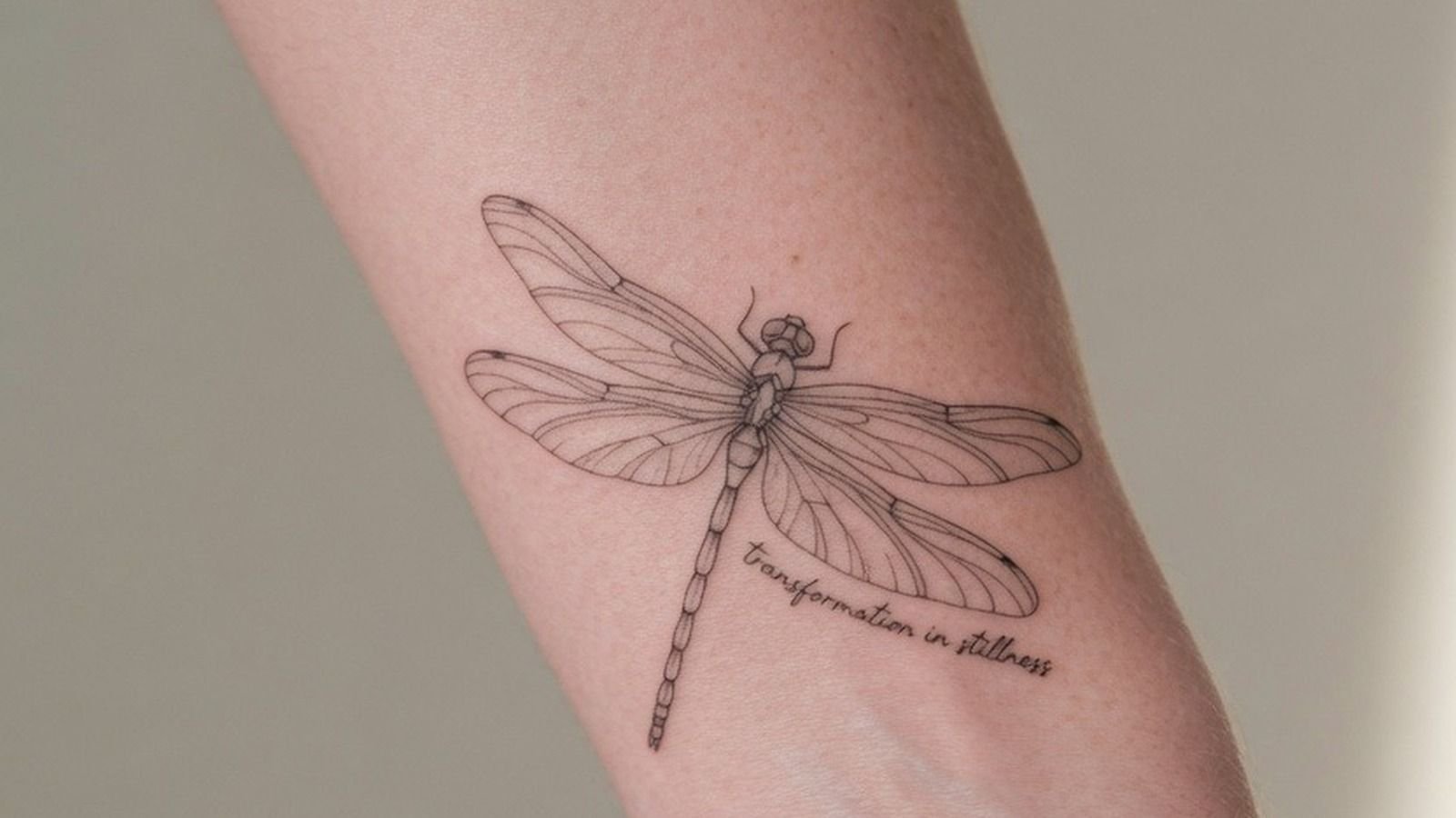
Pull three to five of these based on placement first, style second. Arm designs need different composition logic than sternum or back work, and sending your artist a reference that’s sized wrong for the placement wastes the consultation. Match the scale before you send anything.