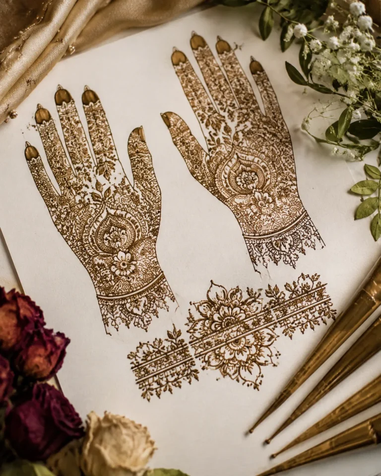
I pulled together 17 modern mehndi designs that feel clean, current, and easy to wear without losing that hand-done magic. If you want something that looks sharp in photos, stains well, and still feels like you, this is the lane I’d stay in.
What makes mehndi look modern right now
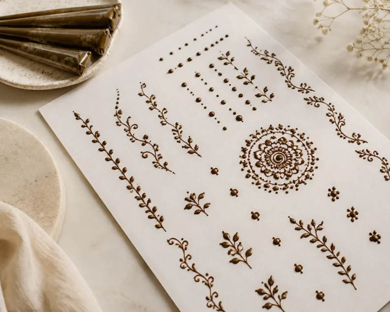
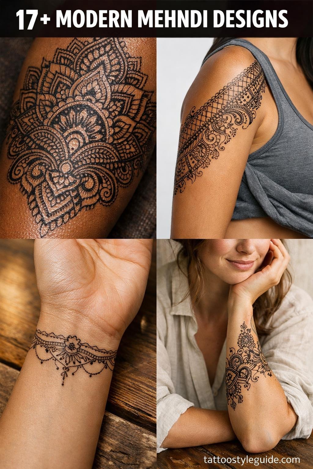
Modern mehndi usually comes down to spacing, shape, and restraint. I’m seeing less packed-in fill and more breathing room between motifs, cleaner curves, and designs that read fast from across the room. Think fine vines, sharp fingertip details, negative space through the palm, and pattern breaks that keep the whole thing from feeling heavy.
That doesn’t mean plain. A modern piece can still be rich if the layout is solid. I like mixing one hero element, like a floral cuff or a bold mandala, with softer trails that move across the hand. It photographs cleaner, stains prettier, and ages nicer over the week than dense work that turns muddy as the top layer starts to fade.
Minimalist mehndi that still reads pretty
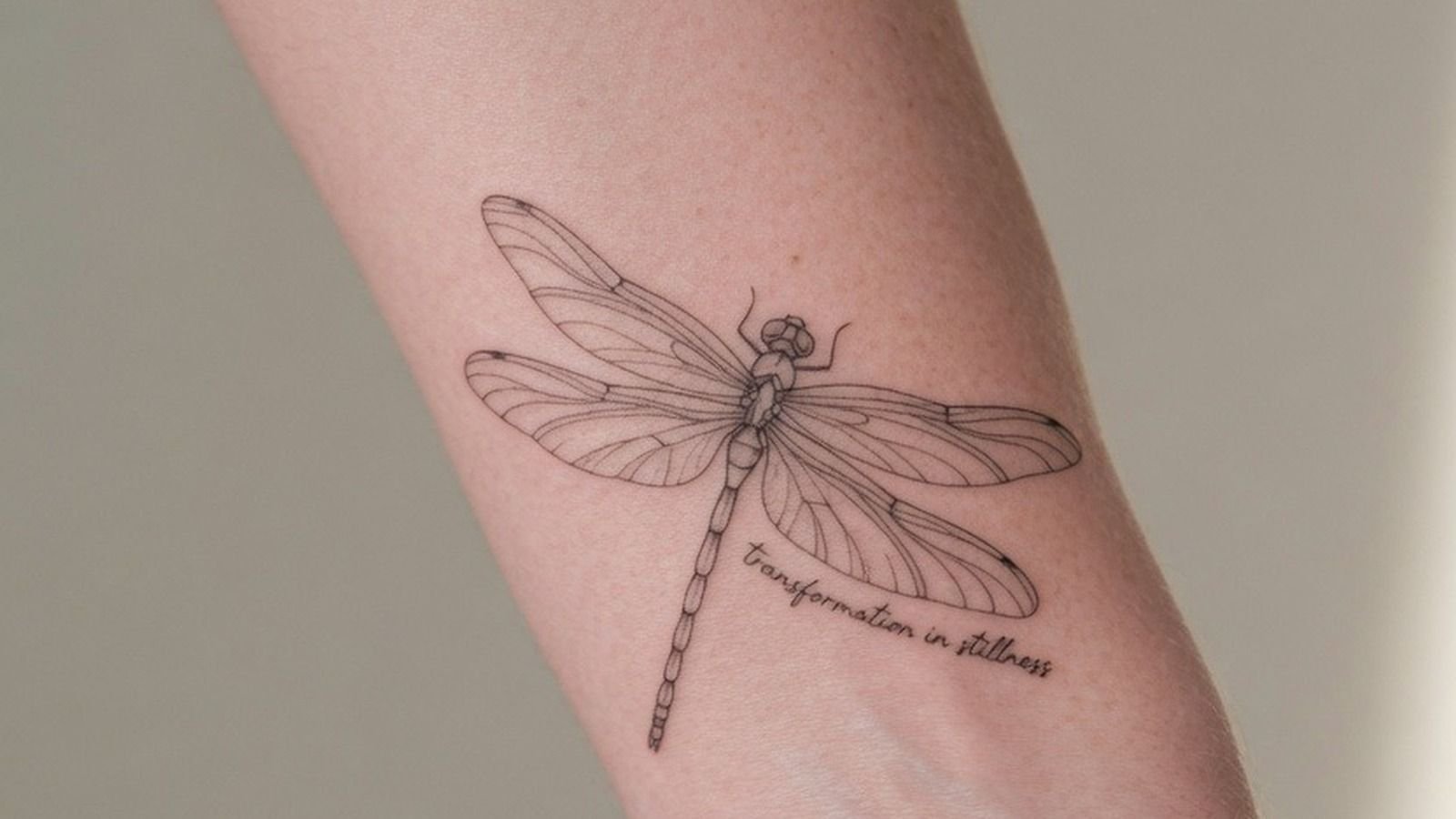
Mehndi in ink is permanent patience, the detail that took henna an hour takes a needle three.
Minimalist mehndi is for the person who wants a little detail, not a full glove. Tiny leaf trails, a fingertip accent, a wrist band, or a half-moon palm detail can look really polished when the lines stay crisp and the spacing is smart. If every line is fighting for attention, it stops looking minimal and starts looking busy.
This style works especially well for everyday wear because it doesn’t clash with rings, watches, or long nails. I usually tell people to keep the smallest details off high-friction spots if they want a cleaner fade. Super tiny dots and ultra-fine mesh can break up fast on hands. A simpler motif with a little contrast lasts prettier and still feels soft, modern, and easy.
Front-hand designs that look clean in photos
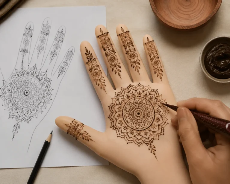
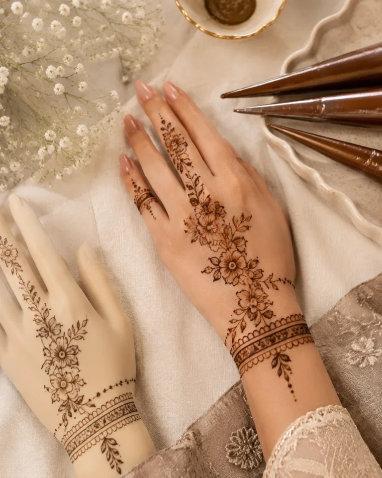
Front-hand mehndi gets the most attention, so placement matters. The prettiest modern layouts usually start with one focal point on the back of the hand, then stretch into the fingers with balanced spacing. A diagonal flow from wrist to index finger is flattering on almost everybody. It makes the hand look longer and keeps the design from feeling stuck in one block.
If you want that clean Pinterest look, don’t overcrowd the knuckles. A few intentional details read better than stuffing every inch. I like mixing airy florals with thin geometric trails or a soft checker pattern near the fingers. That contrast gives the design a current edge. It also helps the stain look more deliberate once it settles into that warm brown or deeper reddish-brown tone.
Wrist, finger, and palm placements that make sense
Different placements wear differently. Fingers fade fastest because they get washed, rubbed, and bent all day. Palms usually stain the darkest because the skin is thicker there, but they can also peel and flake unevenly if you overdo moisture too early. Wrists are a sweet spot for everyday mehndi because they hold detail well and don’t get chewed up as fast.
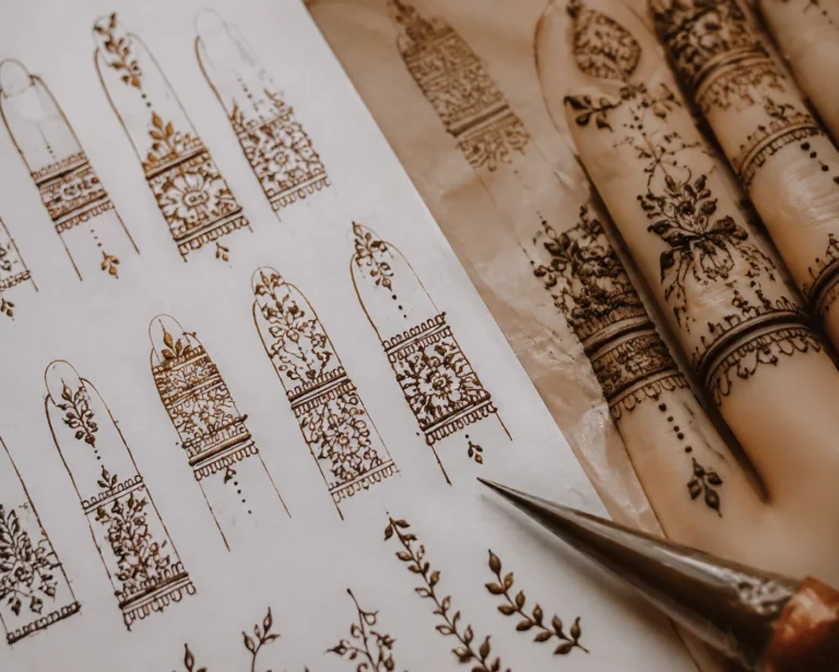
For a cleaner result, match the detail level to the area. A finger design looks best with bold little shapes, not fussy micro lines. Palms can carry denser motifs like a modern mandala or lattice because the stain tends to come in stronger. If you want a balanced set, I’d place the boldest element on the palm or back hand, then let the fingers stay lighter.
Bridal mehndi versus everyday mehndi
Bridal mehndi usually runs fuller, more symbolic, and more layered. You’ll see denser coverage, mirrored symmetry, hidden initials, paisleys, lotuses, peacocks, and pattern work that wraps farther up the arms. Even in a modern bridal set, the key is structure. I’d rather see strong flow and clean spacing than a pile of details that blur together by day three.
Everyday mehndi is lighter on purpose. It’s quicker to wear, easier to style, and feels less formal with jeans, sandals, or a simple dress. A good everyday set might only hit the fingers, wrist, or one side of the hand. If you’re choosing between the two, think about the event, the outfit, and how much attention you want the design to pull.
Trends I’d actually recommend right now
The trends I like are the ones that still look good once the stain settles. Fine botanical trails, negative-space arches, cuff-style layouts, half-hand compositions, and mixed modern-traditional patterns are all strong right now. I’m also seeing more asymmetry, which I love when it’s done on purpose. One hand can carry the heavier feature while the other stays lighter and cleaner.
What I’d skip is anything too packed with trendy filler just because it looks dramatic fresh. Dense checkerboard, super tiny lace, and overload on fingertip fill can start reading muddy once the design wears in. Better trend choices are the ones with contrast and shape. Clean petals, open grids, and repeating motifs with room to breathe always hold up better than visual soup.
How stain depth changes with skin tone and aftercare
Henna reads beautifully on every skin tone, but the stain won’t look identical on everyone. On lighter skin, it often shows up as a warm orange first, then deepens into brown over 24 to 48 hours. On medium to deep skin, the contrast can look softer at first, especially with delicate linework, but a rich stain still comes through when the paste is good and the aftercare is solid.
The real key is not chasing a fake “darkest possible” result with random internet nonsense. Leave the paste on long enough, keep it dry, and let oxidation do its job. Most mehndi lasts about 1 to 3 weeks depending on placement, skin type, and friction. Palms can stain darker but fade patchier. Outer hands and wrists often fade prettier, even if they start a touch lighter.
Application tips so modern mehndi lasts and looks clean
Good application starts with clean, dry skin. No lotion, no oil, no sunscreen sitting on the area. If the skin is slick, the paste won’t grab right and your lines can blur before they even dry. I like people to stay still while the first layer sets because one accidental smear can wreck a clean modern design fast, especially with minimalist work.
Once it’s on, let it dry fully and baby it a little. Keep it away from water as long as you can, avoid rubbing, and don’t slather on thick products too soon. When the paste comes off, the stain may look light at first, then deepen over the next day or two. Pools, dishwashing, gym friction, and constant hand sanitizer will fade it faster. If you want it to look crisp longer, placement and aftercare do half the job.