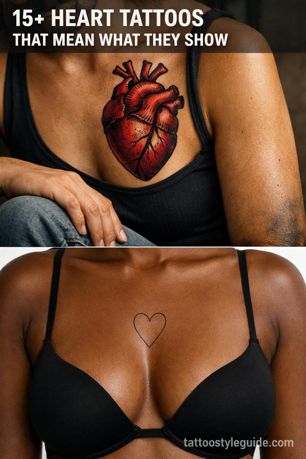
Heart tattoos fail most often at scale. Collectors go too small, the linework crowds, and within five years the form reads as a blob instead of a shape. The designs that hold are the ones where the artist built in enough open negative space to survive skin movement and ink spread.
Style choice matters more than most people expect. A calligraphic heart and an anatomical heart require completely different skill sets, different needle configurations, and age on different timelines. What follows covers the full range, with the technical reasoning for each.
Calligraphic Sweep: When One Brushstroke Defines the Form
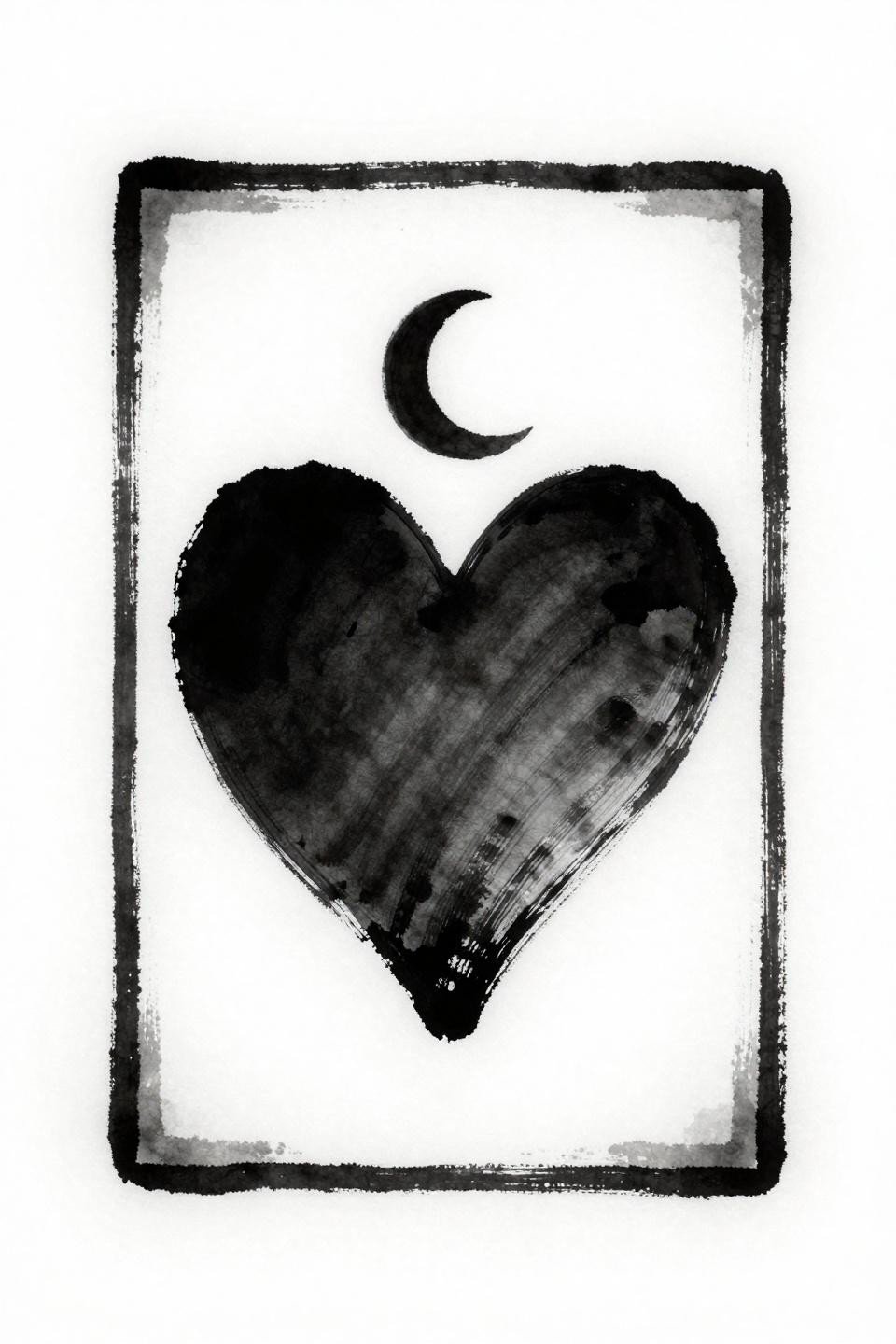
This flash pulls from Japanese Irezumi’s calligraphic tradition, where a single fluid ink sweep forms the heart shape and a crescent moon sits nested in the upper chamber. The grey wash dilution from the dense center to open edges does the tonal work that most designs would assign to hatching.
Consistency of stroke speed is what separates a clean execution from a muddy one. Uneven speed during the long outside curves creates visible weight changes that read as mistakes, not style.
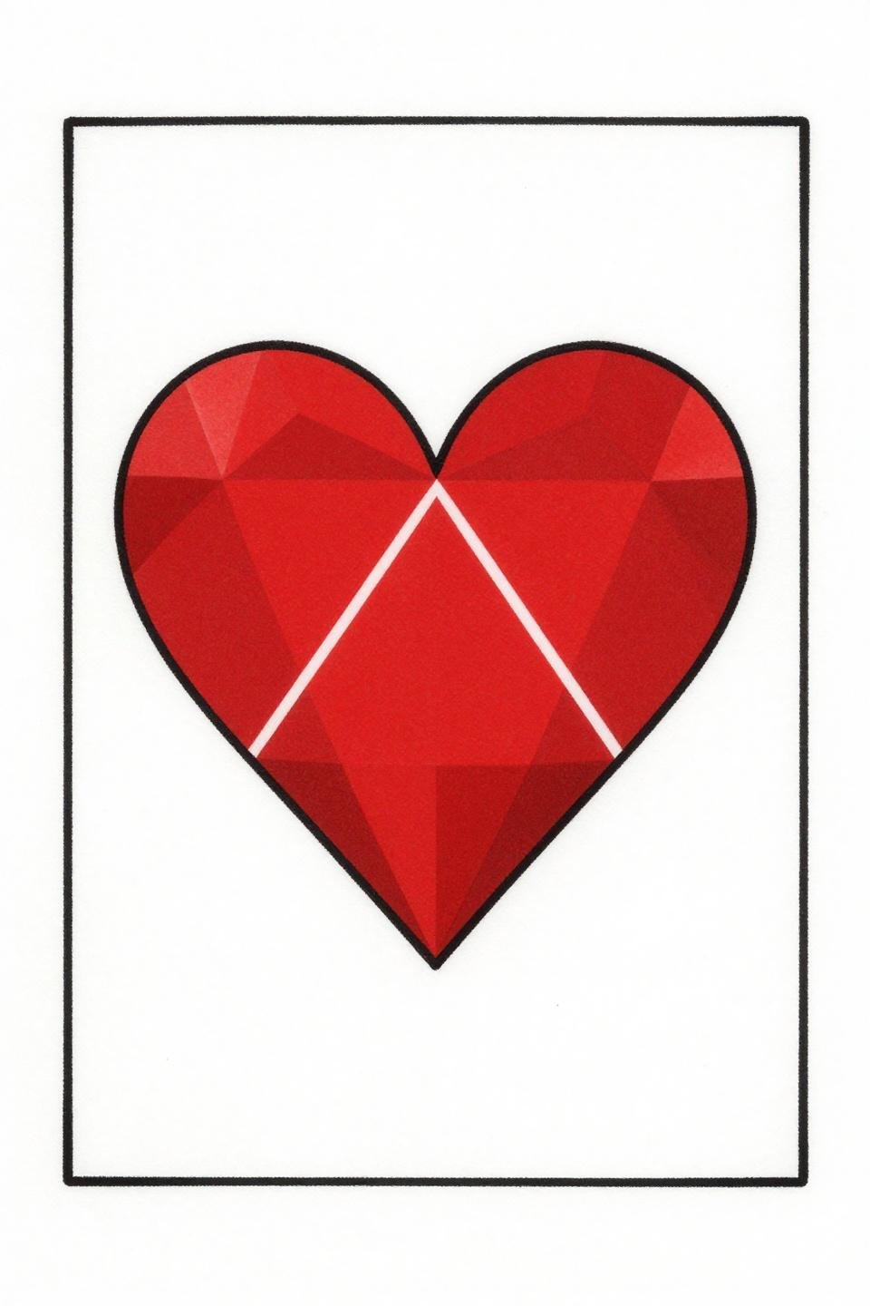
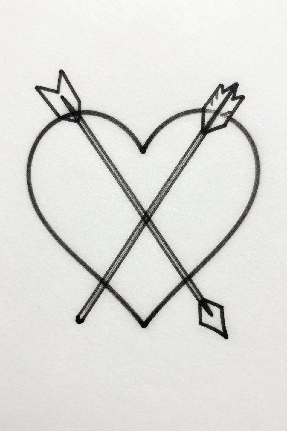
Tribal Arrow: Why Bold Outlines Outlast Every Fine Line Heart
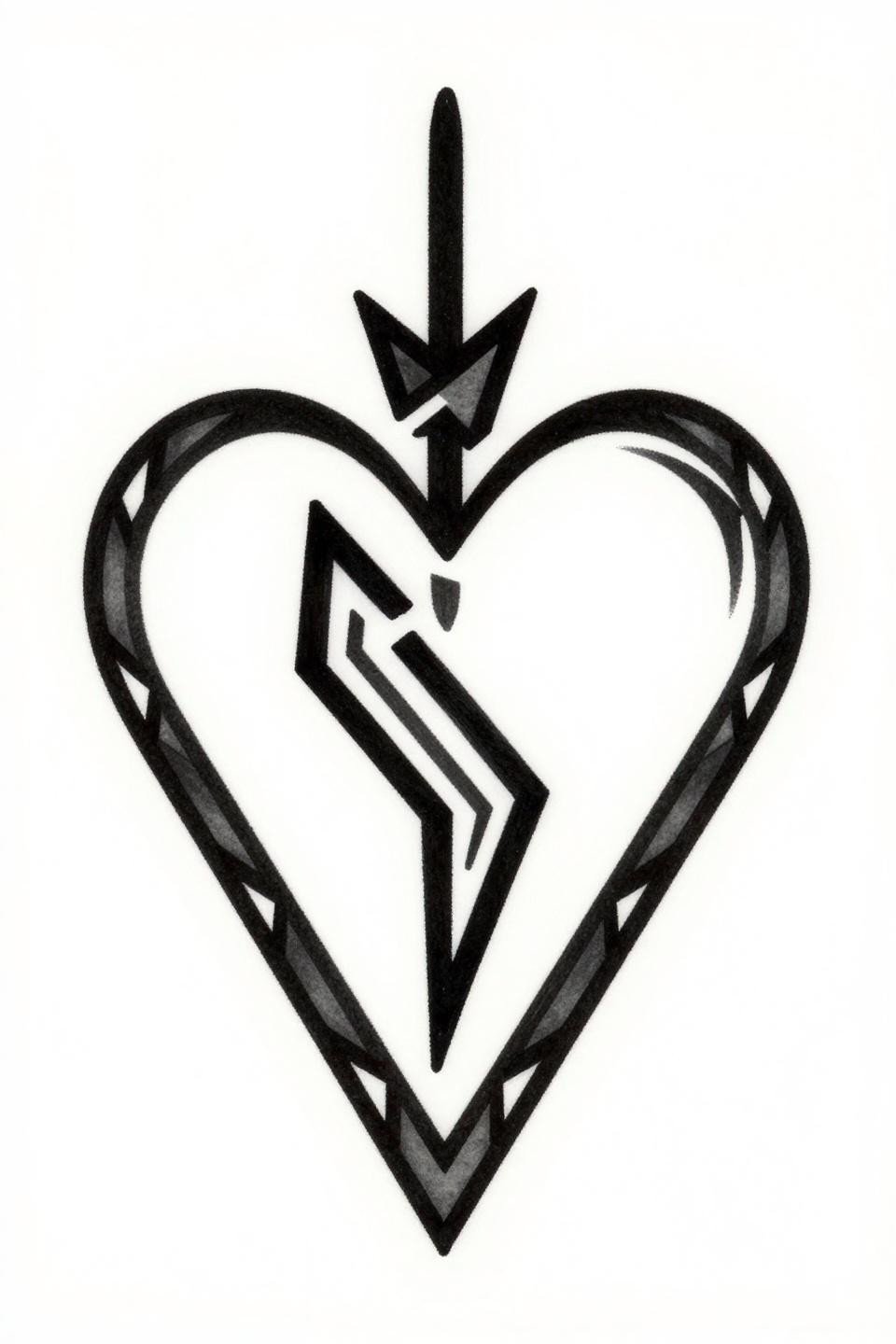
Tribal geometric execution here: bilateral symmetry, flat black fills, a diagonal arrow through the heart’s center, and an angular crown above the apex, all enclosed in a diamond border. Bold 3pt outlines at this weight hold their edge for ten-plus years without any touch-up.
On olive and darker skin tones, this design is the right call over fine line alternatives. Solid black at full saturation reads clean regardless of undertone, where hairline work fades into the skin by year three.
Anatomy Meets Geometry: The Design That Reads as Both Art and Argument
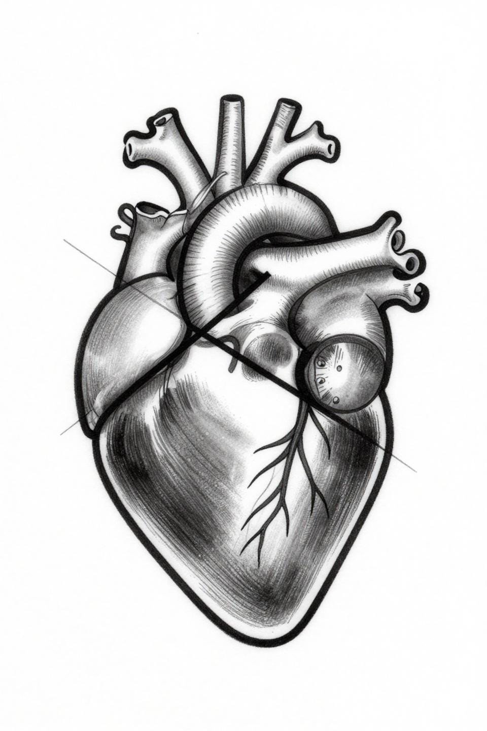
A fine line anatomical heart with accurate ventricular structure sits behind intersecting triangle geometry, all rendered in hairline 0.5mm single-needle strokes with zero fill. The open negative space is structural, not decorative: it is what keeps the two systems visually separate.
This style demands placement in a protected zone. Ribs, sternum, or upper back give it the best shelf life. Wrist or forearm placement means the fine lines need a touch-up within three to four years.
Traditional American Anatomy: The Valve Detail That Signals Craft
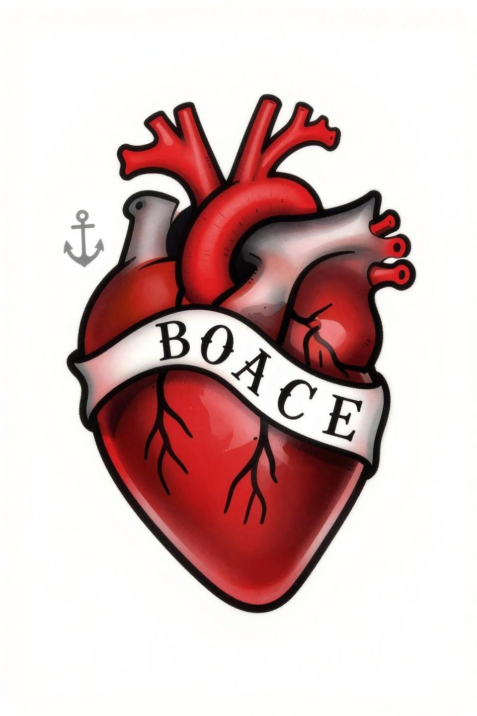
Traditional American framing around a fully rendered anatomical heart, with visible internal valve chambers, flanking anchors, and a serif ribbon banner. The crimson red flat fill against dense black outlines is the classic two-color contrast that reads at distance and ages without muddying.
Flat fills with zero patchiness are the veteran signal here. Check healed photos in an artist’s portfolio before booking. Patchiness in red fields is the most common failure point in traditional work, and it only becomes more visible over time.
Off-Center Art Deco: Hidden Placement Needs Clean Geometry
Art deco geometry applied to a minimalist heart: diamond facet inlay pattern across the fill, thin serif line border, and an off-center placement within the frame that creates asymmetric tension. The diamond facet pattern gives the flat crimson fill a dimensional read without any shading.
Off-center flash like this translates well to hidden placement spots, inner wrist, behind the ear, or collarbone, where the asymmetry reads as considered rather than accidental. Scale it no smaller than 4cm or the facet lines close up under ink spread.
Botanical Crosshatch: When Vascular Structure Earns Its Detail
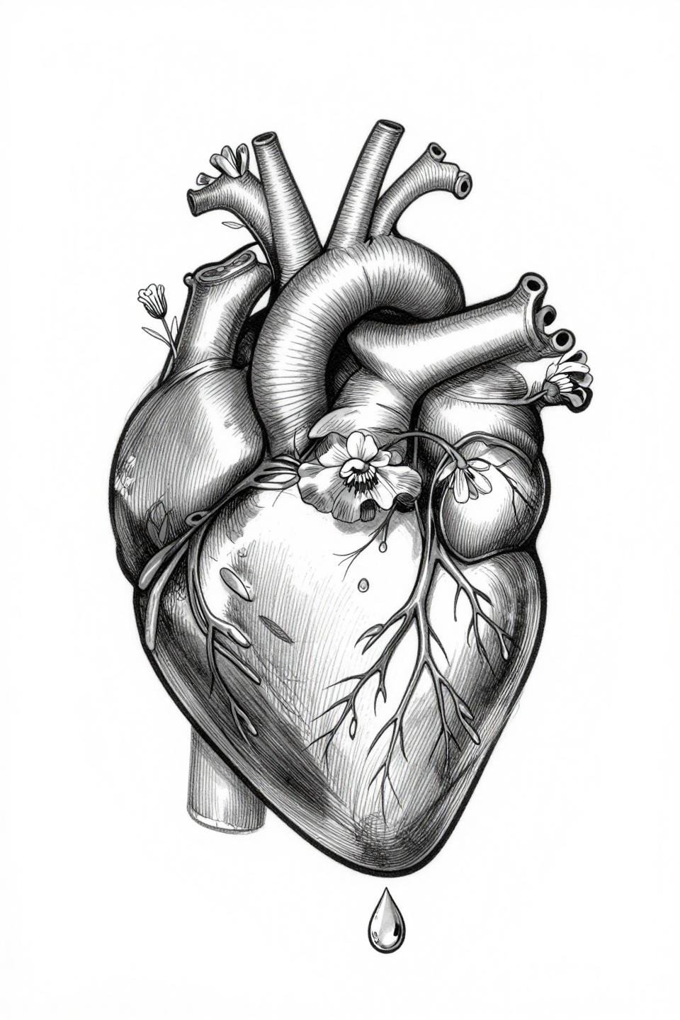
Crosshatch engraving technique applied to an anatomical heart with visible vasculature, wildflower stems rising from the ventricles, and a single suspended water droplet below the apex. The parallel hatching shadow system builds tonal depth without any solid fills, which is the defining quality of the scientific illustration tradition.
This is a high-skill-signal design: consistent parallel line spacing across a curved organic form is harder than it looks on flat paper. Ask to see healed crosshatch work specifically before committing.
Sacred Heart in Gold and Black: Mandala Framing Changes the Read
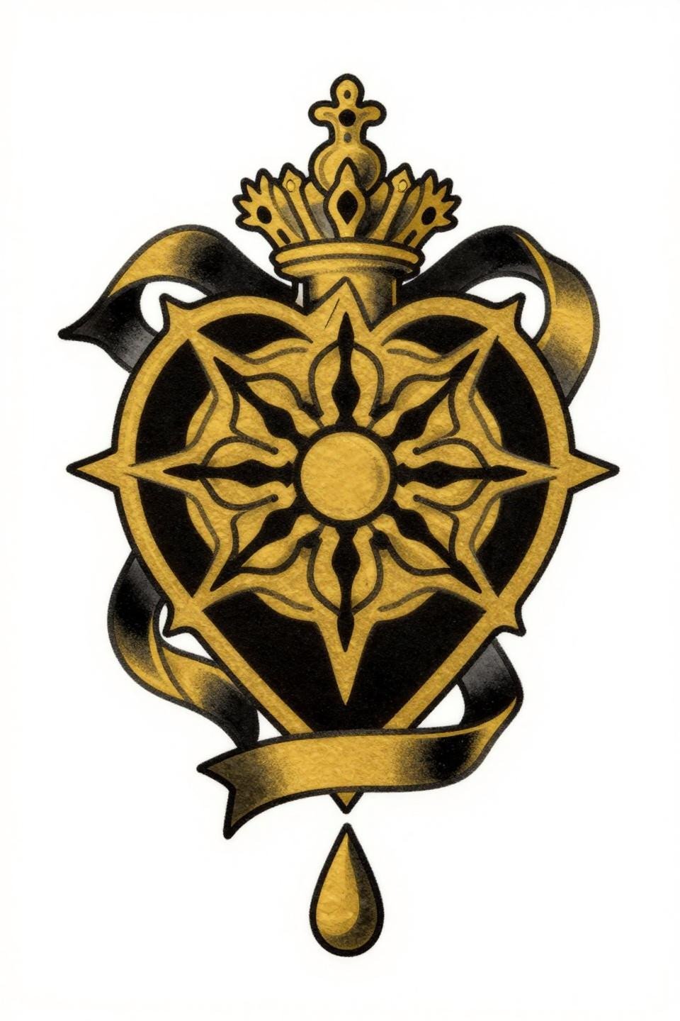
Art nouveau sacred heart with ribbon banner, crown above, teardrop below, and bilateral symmetry anchored within a circular mandala radiating frame. The 24-karat gold flat fill paired with solid black is an unconventional two-color call that reads warmer than the standard red-and-black sacred heart.
On wrist placement, the mandala frame needs to be sized to wrap the curve correctly, which means the artist has to account for how the circle distorts on a cylindrical surface. This is a placement conversation to have before finalizing scale.
Dotwork Sacred Heart: Stipple Density as the Only Shading Tool
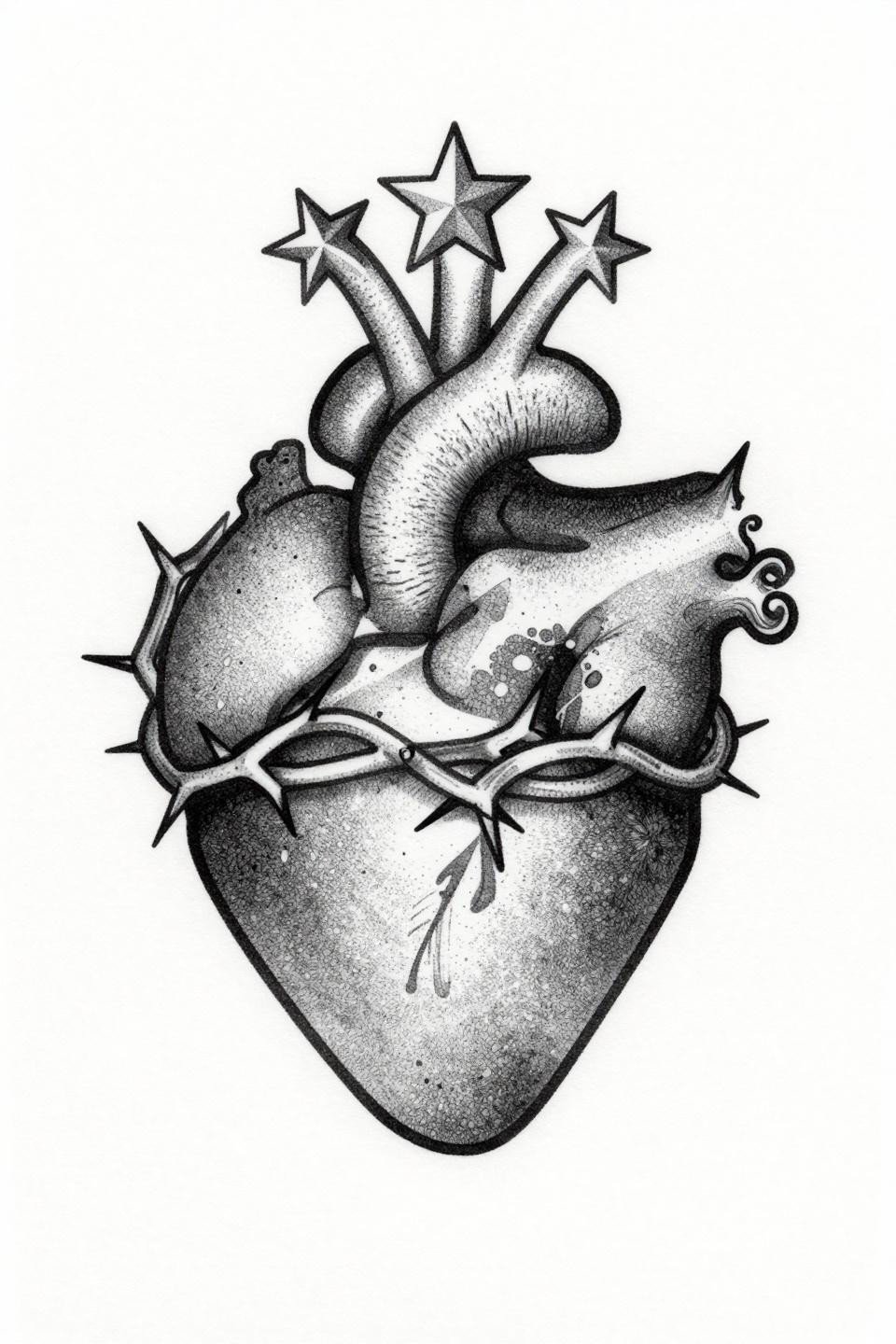
Blackwork dotwork execution on a sacred heart with thorn crown at the base, central flame rising from the apex, and a three-pointed star halo above. The stipple dot gradient runs from dense at the core to open at the edges, with no solid fills anywhere in the design.
Look for consistent dot size across the full gradient range. Uneven dots, where the artist’s speed varied, create muddy patches that do not fade out over time. This is the technical tell that separates dotwork specialists from artists who dot-shade occasionally.
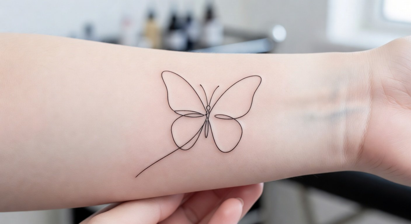
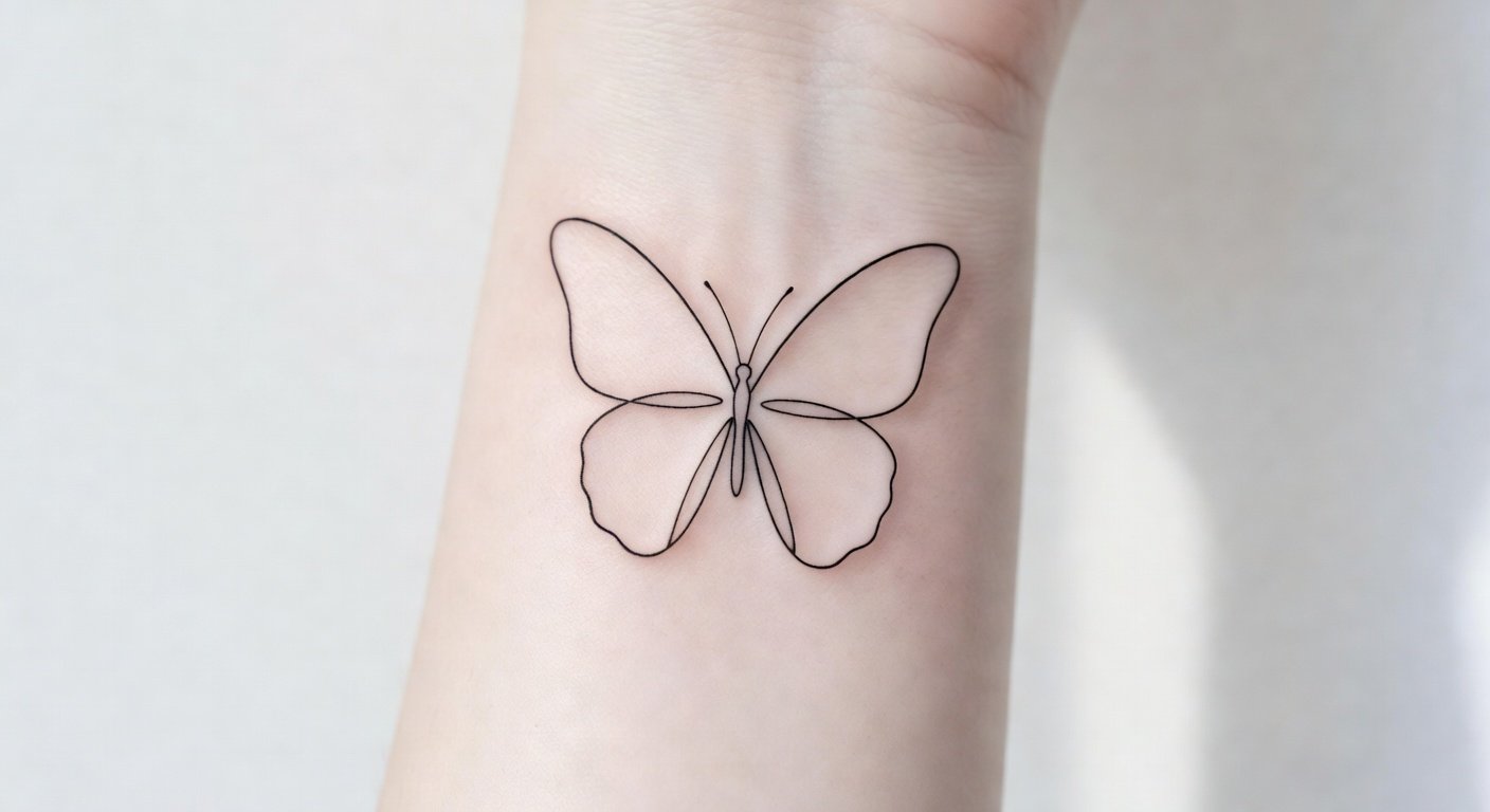
Continuous Line: How One Stroke Becomes a Placement Flex
Single continuous line heart, one unbroken 0.5mm hairline stroke with zero fill, pierced by a geometric arrow on a diagonal axis. The entire design is open negative space: the skin itself is part of the composition, which is what makes it scale down to mini placement without losing legibility.
Finger and inner wrist placement will need a touch-up every two to three years minimum. The single line needs to stay clean or the whole concept falls apart. Placement in a lower-friction zone is the smarter long-term decision.
Neo-Traditional Anatomy: Latin Banner as Compositional Anchor
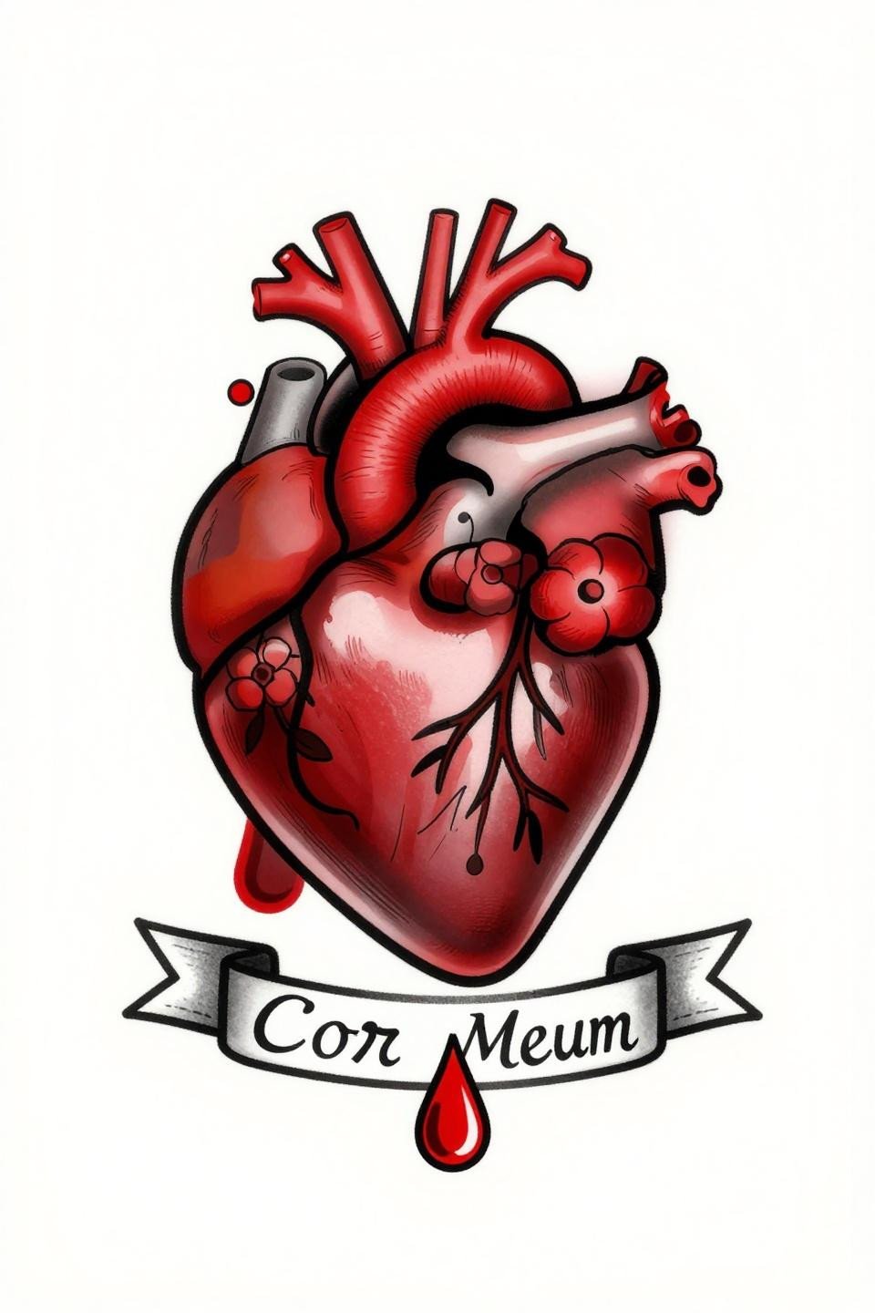
Neo-traditional anatomical heart with accurate ventricular and aortic structure, flowering vines coiled around the chambers, a blood drop at the apex, and a Latin banner reading “Cor Meum” below. The 2-3pt bold outline weight holds the organic vine detail together without the composition going soft at the edges.
The banner functions as a compositional base here, not just typography. It grounds the vertical flow of the design and prevents the blood drop from reading as floating. That structural logic is what makes this flash work at chest, forearm, or thigh scale.
Pick two or three of these references, not the full set. Your artist needs a clear style direction: choose between anatomical or silhouette, between open linework and filled color, before the consultation. Bring the ones where the technical approach matches your placement zone.
If you are placing this on a high-friction area, the tribal or neo-traditional builds are the practical call. Fine line and continuous line work belong on protected placements. That filter alone narrows the field.