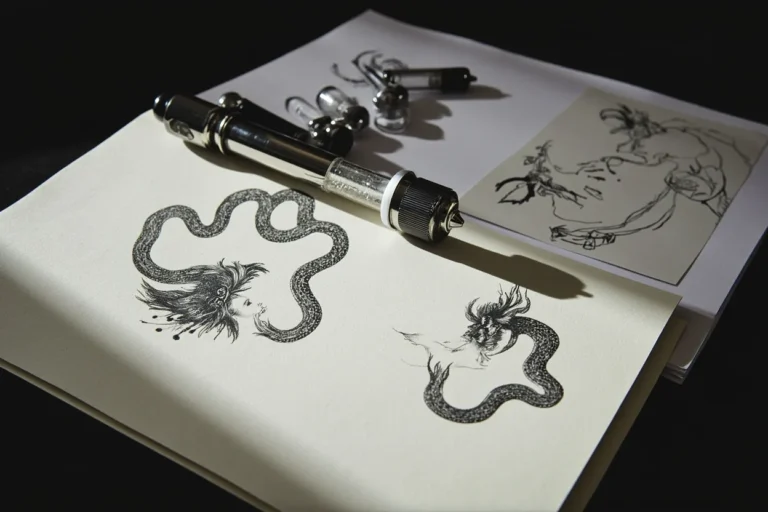
Lotus flower tattoos get over-chosen and under-executed. The symbol is loaded, the form is forgiving on paper, but the placement and style execution separate a meaningful piece from a studio catalog filler.
The technical problem most collectors miss: the lotus reads differently depending on render style. Fine line versions need protected placement to hold. Bold traditional fills survive anywhere. Know which you’re looking at before you commit.
Grey Wash Lotus: Where Chicano Technique Earns Its Reputation
This chicano grey wash lotus uses whip shading technique, pulling black ink from dense outlines into open diluted grey, building petal depth without color.
On olive skin, grey wash at this dilution ratio can lose separation in midtones within five years. The artist needs to push contrast harder at execution, not rely on fresh-ink pop.
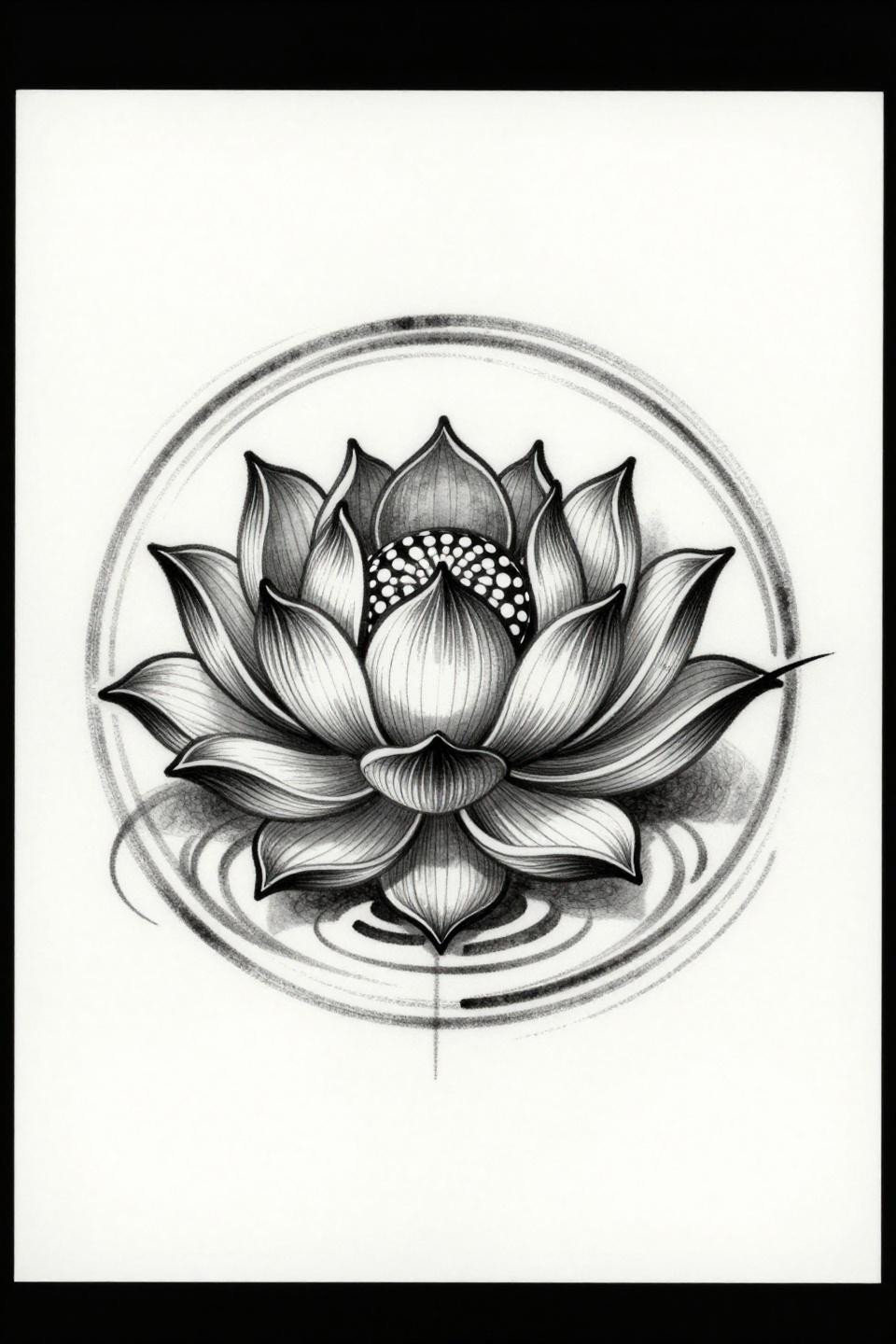
Fine Line Om Lotus: The Mandala That Has to Be Dead Accurate
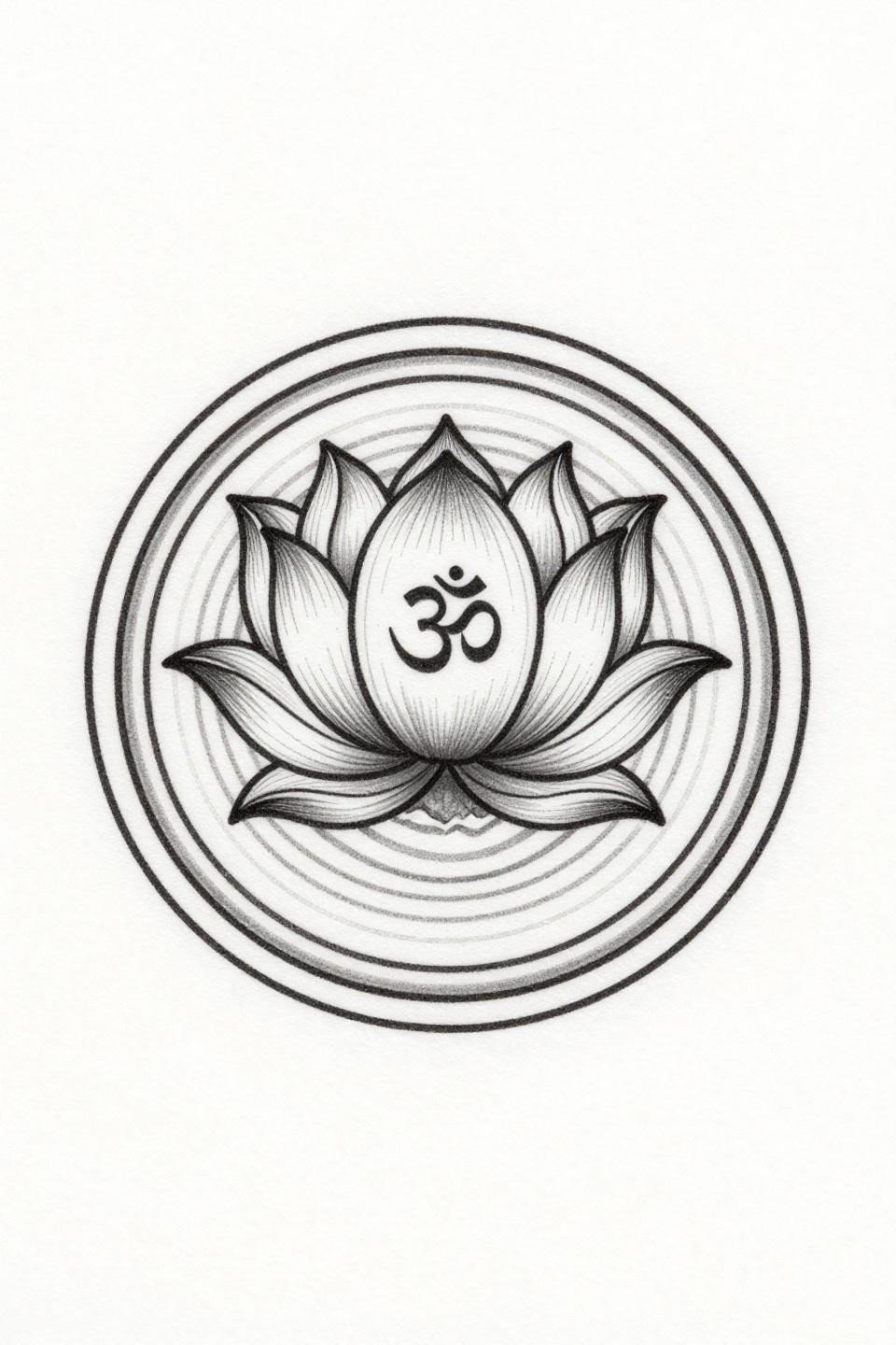
A closed-bud lotus rising from geometric wave crests, with an Om symbol positioned above the bloom center, all executed in single needle 1RL hairline weight.
This is a placement-sensitive design. Sternum or upper back gives it a decade of legibility. On a wrist or forearm, those hairlines begin migrating inside three years.
Sak Yant Orchid: Sacred Geometry Does the Heavy Lifting
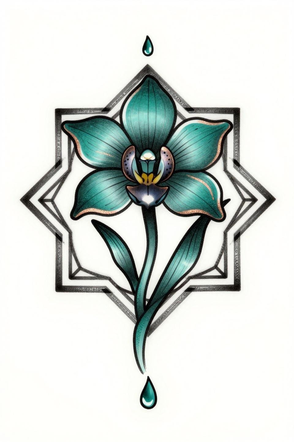
An orchid with spiral asymmetric petal arrangement sits inside a diamond yantra frame, the border script functioning as structural containment for the botanical form.
The teal and copper palette reads sharp on lighter skin tones. On deeper skin, teal can shift green without sufficient pigment saturation, so confirm your artist uses high-load ink in that range.
Traditional American Lotus: Bold Fills That Age Without Apology
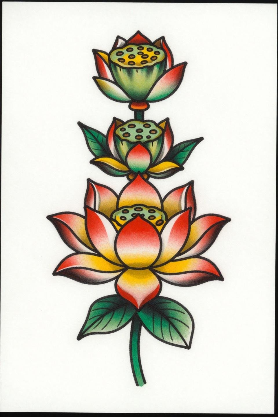
Eight bilateral petals, a central seed pod with embryonic chambers, and three ascending buds in a vertical stack, rendered in flat cadmium red, forest green, and golden yellow with bold 2-3pt outlines.
This is the format that holds. Traditional outlines at this weight stay readable at year ten on almost any placement, any skin tone. The fills may soften, but the structure survives.
Celtic Dragonfly on Lotus: Two Systems of Symbolic Line in One Frame
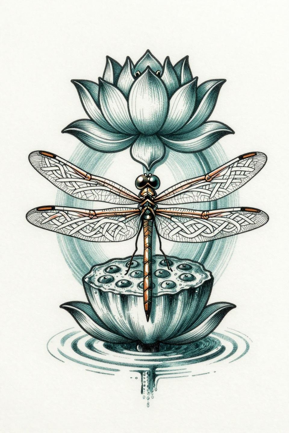
A dragonfly perched on a lotus seed pod, wings rendered as interlaced Celtic knot segments, the compound eye functioning as the focal anchor of the whole composition.
Celtic knotwork requires consistent line spacing through every curve turn. The tell is the interior intersections: any wobble at direction changes signals the artist lost control of needle speed. Check healed reference before committing.
Art Deco Cherry Blossom: Geometric Petal Segmentation Changes Everything
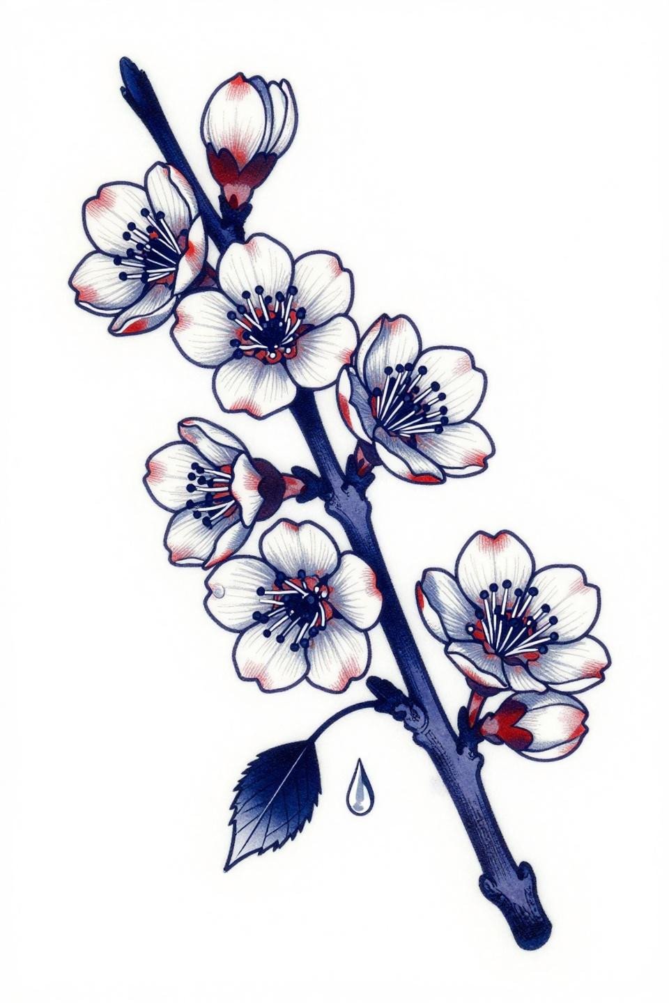
Nine cherry blossom blooms at varied opening stages with geometric petal segmentation and flat indigo and crimson fills, the art deco framework converting an organic form into architectural line.
For collectors considering back placement options for larger floral designs, this asymmetric diagonal composition translates well across a shoulder blade or upper back panel.
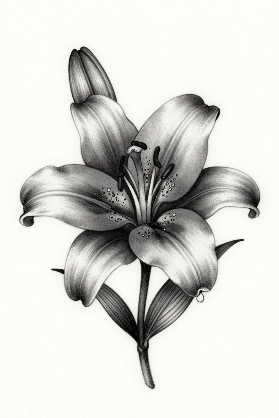
Botanical Sketch Lily: Raw Line That Demands Artist Confidence
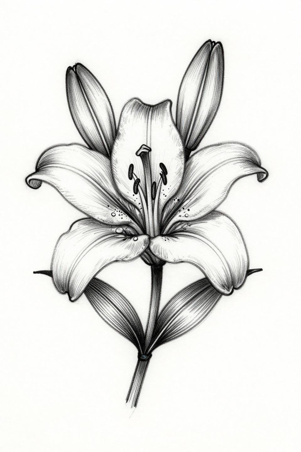
A botanical lily rendered in gestural sketch quality, six petals with mapped stamens and pollen grain detail, executed in flat open fills with zero grey wash, the rawness intentional.
Sketch style with no fill depends entirely on outline consistency. Varied line weight is the technique. Uncontrolled line weight is the failure. Those two look similar in fresh photos and completely different in five years.
Trash Polka Lotus: Red Slash Marks Are Not Decoration
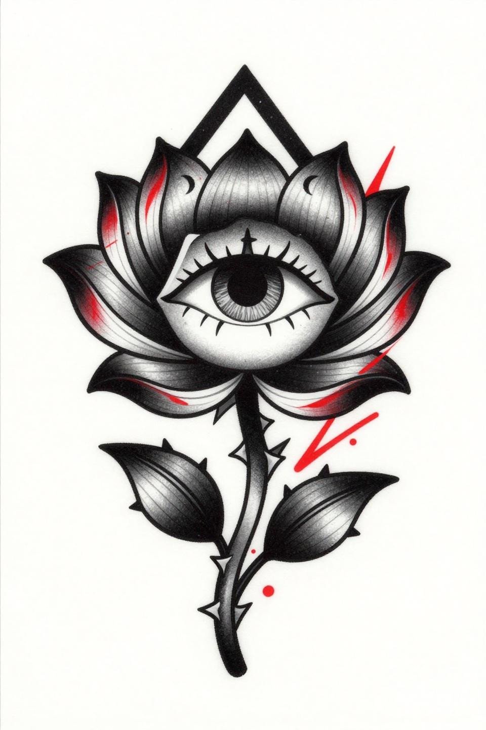
Petals curling inward, a floating eye at the center void, three crescent moon phases in orbit, and crimson red slash marks cutting across solid black, the visual chaos is the structural logic of trash polka.
This style polarizes collectors and that is the point. The red ink in trash polka needs to be placed in low-sun exposure zones, since crimson fades faster than black and the contrast ratio is what holds the whole design together.
Ignorant Style Cherry Blossom: Uneven Line Weight as a Feature
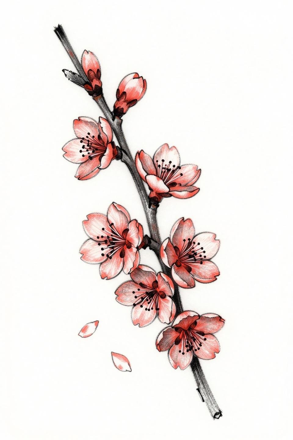
Seven cherry blossom blooms on a diagonal flow, coral fills over charcoal ink, with intentionally uneven 3pt line weight treated as a design decision, not a technical shortfall.
The ignorant style only reads as deliberate when the artist controls the irregularity with consistency. A good reference for this is the spacing between blooms: even accidental-looking work has underlying compositional logic.
Dotwork Inverted Lotus: Stipple Density Tells the Whole Story
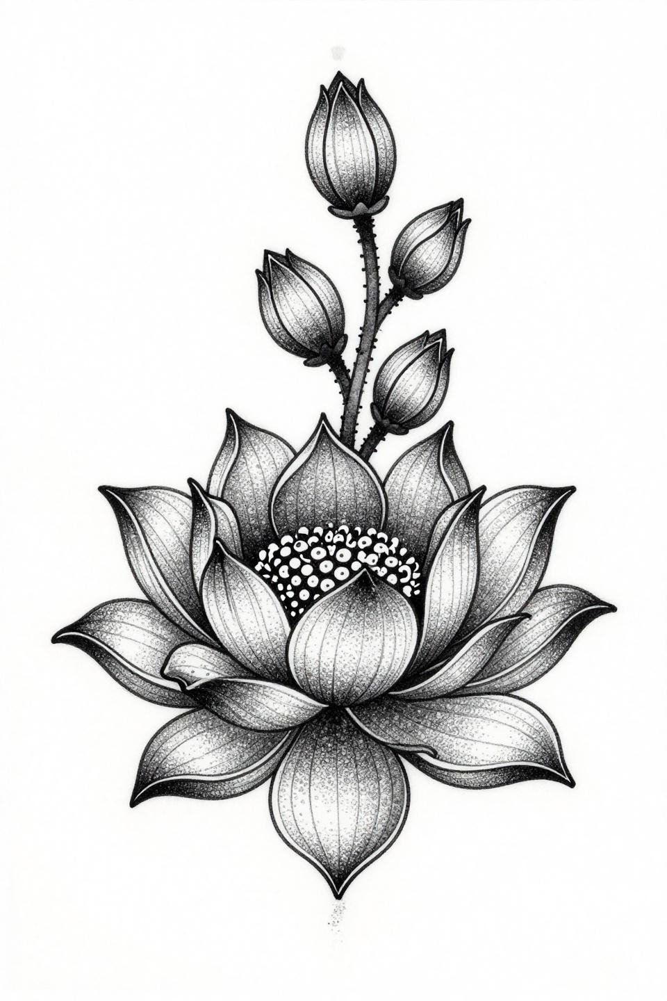
An inverted lotus with downward-folding petals, the form defined by stipple dot gradient running from 90% density at the core to open negative space at the petal edges.
Dotwork ages differently than solid fill. The gradient reads cleaner at year five than heavy black fields would, because individual dots hold their edges while solid fill can expand. Look for consistent dot sizing across the whole gradient in the artist’s healed portfolio.
Continuous Line Lotus: One Stroke Cannot Hide a Mistake
A closed-bud lotus emerging from concentric ripple rings, composed in a single unbroken calligraphic ink ribbon stroke with no lifts, the structural discipline of continuous line work made visible.
This style signals technical control more clearly than almost any other format. Any hesitation in the stroke shows in the line quality. Ask to see your artist’s continuous line work specifically, not just general fine line.
Woodcut Lotus Cross-Section: Anatomy as the Symbolic Statement
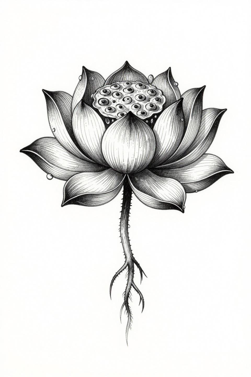
A lotus rendered in anatomical cross-section, seed pod chambers exposed, petals with water droplets at the edges, the parallel line engraving and dense crosshatch doing the work of both texture and shadow.
The conceptual weight here lands harder than a standard bloom view. Showing the interior structure of the lotus, growth chambers included, shifts the design from symbol to argument. That kind of layered reference earns its placement on visible skin. For a related approach to symbolism-driven body art, henna designs with spiritual symbolism use botanical structure in similarly direct ways.
Art Nouveau Orchid Lotus Hybrid: Two Forms, One Compositional Logic
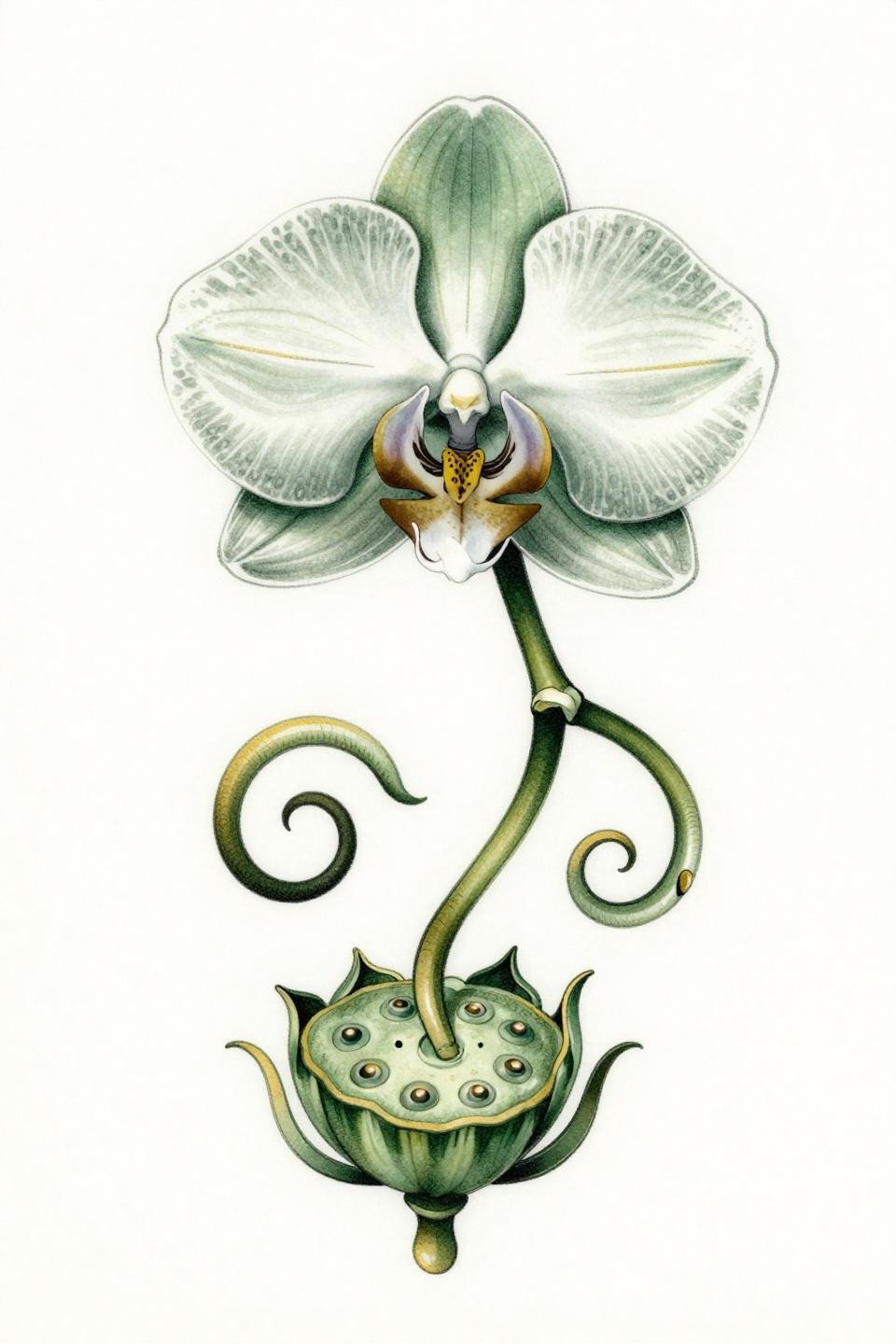
An orchid with spiral asymmetric petals and spotted labellum throat above a lotus seed pod base, the sinuous art nouveau curves unifying two botanically distinct forms into a single fluid composition.
Forest green and burnished gold age cleanly on protected placement. On areas with consistent sun exposure, green ink shifts toward yellow over time, so this palette works best on the sternum, ribs, or upper back.
Neo-Traditional Lotus and Koi: Movement Through a Static Frame
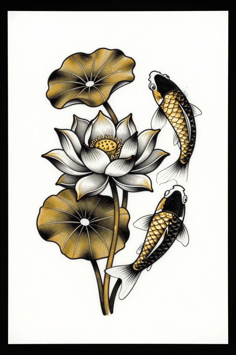
A lotus emerging from murky water with a koi spiraling the stem, the whip shading gradient arcs building depth across petals in staggered bloom stages, the flat gold and black palette keeping the palette tight.
Neo-traditional koi and lotus is a collector-recognized pairing with deep Japanese iconographic roots. The diagonal flow composition here maps well onto a thigh or calf panel, where the koi’s spiraling motion follows the muscle contour.
Geometric Dragonfly Lotus: Tribal Weight Meets Mandala Symmetry
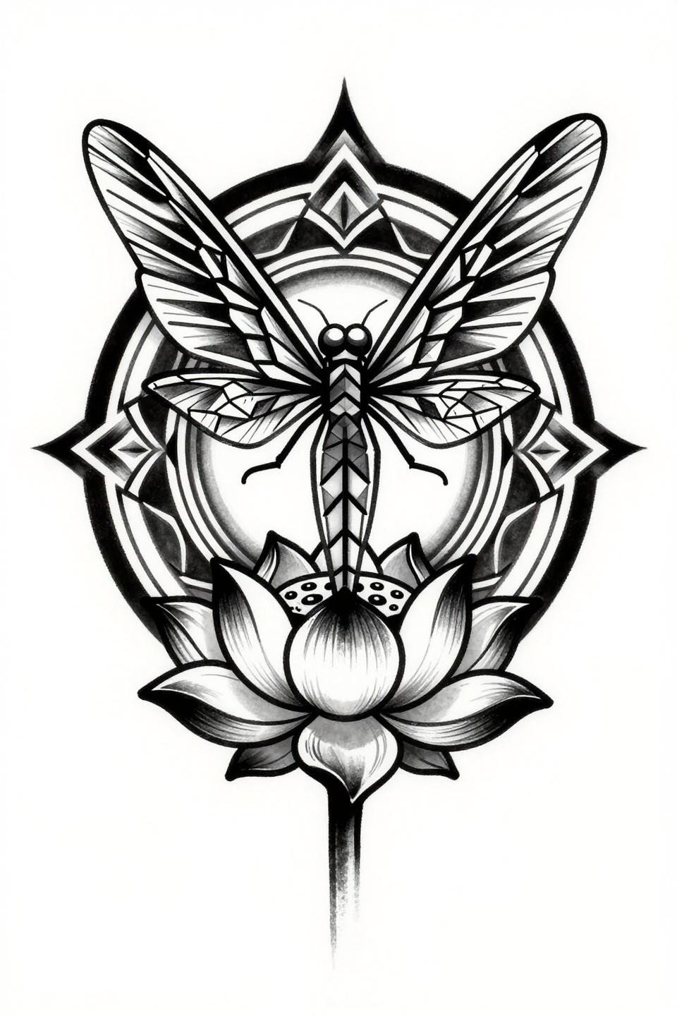
A dragonfly centered over a lotus seed pod, wings in angular geometric vein lattice, the lotus petals angular and rising from ripple rings in mandala symmetry, all executed in flat black fills at maximum contrast.
Bold flat black at this density holds indefinitely if the artist commits to multiple saturation passes. The risk is undertreated skin: patchiness shows immediately in flat fields, and no amount of touch-up fully corrects the first pass.
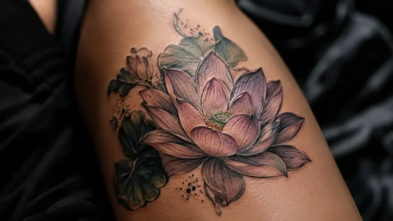
Watercolor Lotus at Dawn: What the Outline Actually Does
A single lotus bloom with six asymmetrically unfurling petals, wet watercolor bleeds behind a clean line skeleton, the teal and copper metallic accents reading as light on water.
Watercolor without an anchoring outline blurs at year three to five. This design avoids that failure by keeping a defined line structure underneath the wash. The line is what survives. The color is secondary.
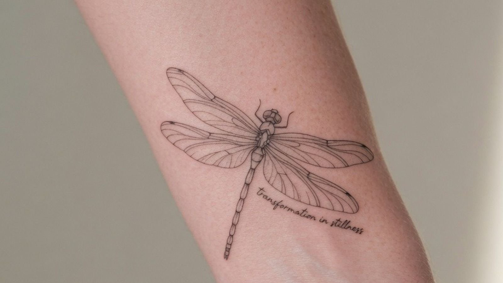
Fine Line Botanical Lotus: Side Profile Changes the Symbolic Read
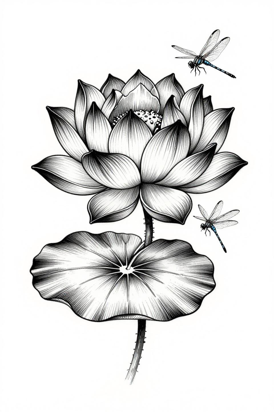
A lotus in strict side profile with anatomical petal layering, a lily pad beneath with radiating veins, and a dragonfly hovering above with full wing membrane tracery in 0.5mm single needle.
Side profile changes everything about how the lotus reads symbolically. The upward reach of the bloom becomes the focal axis rather than the radial symmetry of a front-facing view. For collectors working with mehndi patterns inspired by botanical motifs, this profile orientation appears frequently in traditional botanical reference.
Japanese Irezumi Lotus: Compass Geometry at the Center Changes the Register
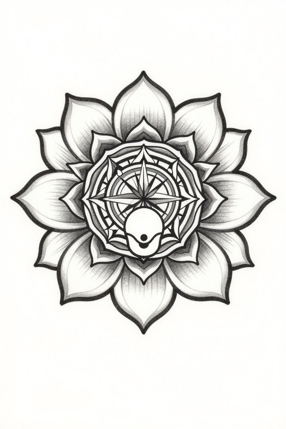
A full-bloom lotus viewed from directly above, eight petals in bilateral symmetry, with the seed pod filled by compass-drafted concentric circle geometry that shifts the design from floral to mandala.
Irezumi lotus overhead views are typically reserved for larger formats, since the radial symmetry requires enough scale to read each ring distinctly. On skin smaller than a palm, the center geometry compresses and the mandala logic collapses.
Pull three to five of these based on your actual placement, not just which image stopped you first. Scale and skin exposure change which render style survives long term. Send your artist one tight reference set, not a folder of twenty. The conversation goes faster and the result lands closer to what you actually want.