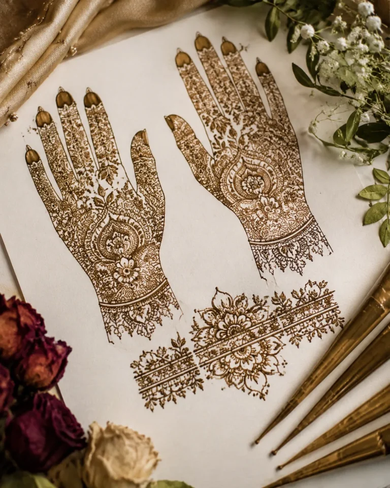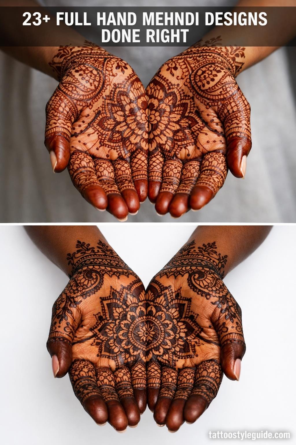
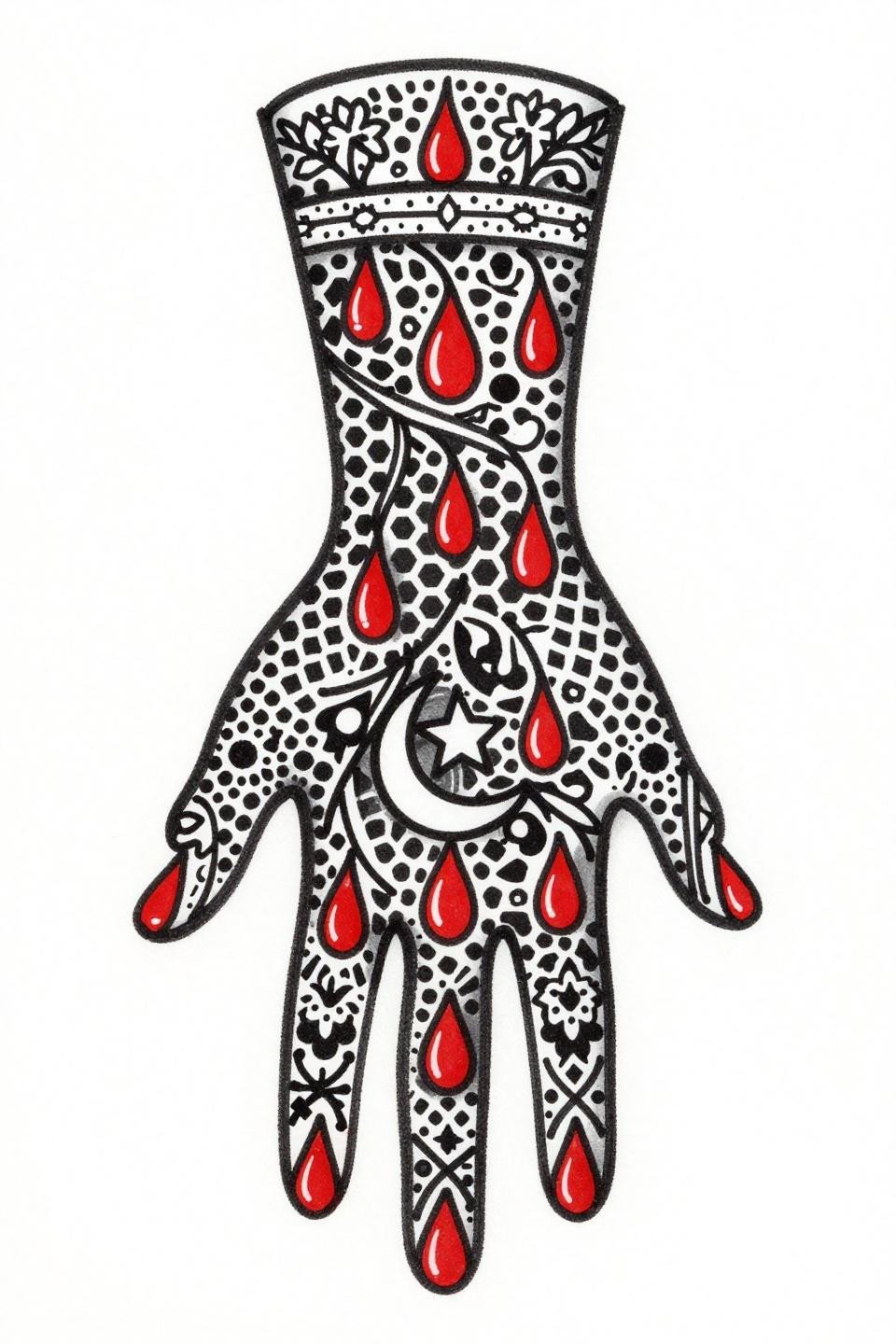
Full hand mehndi designs fail as tattoo references when artists treat them as flat decoration. The motif density, negative space ratios, and cuff-to-field transitions all carry placement logic that transfers directly to skin work. These 23 flash references isolate what makes each structure technically viable.
The collection covers Rajasthani, Arabic, and fusion interpretations rendered across distinct tattoo styles. Each one is drawn to show how the linework behaves at scale.
Front Hand Coverage That Actually Respects Negative Space
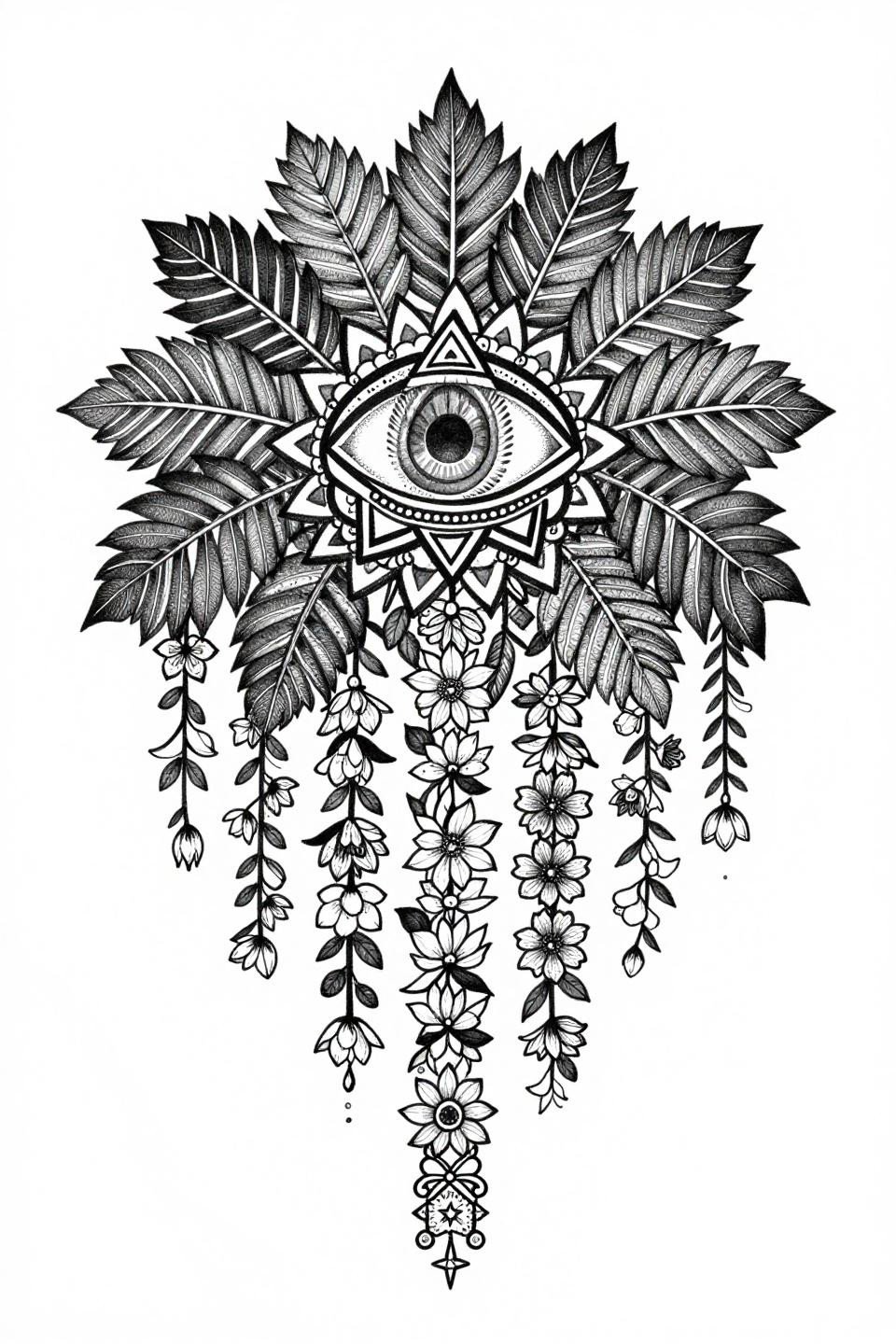
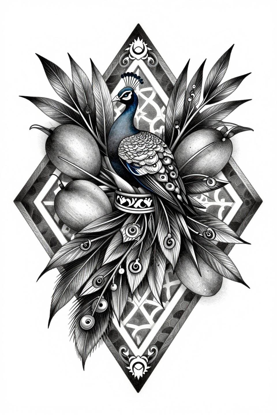
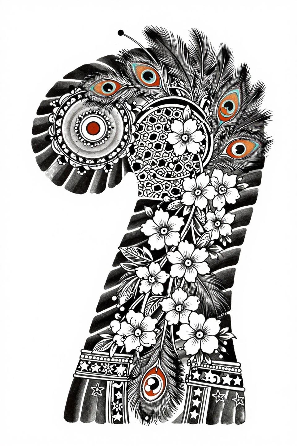
This botanical-style flash uses a stipple dot gradient running from 90% density at the peacock medallion core to open dot spacing at the vine edges, creating tonal depth without grey wash.
On lighter skin tones, the open stipple reads as midtone. On olive or deeper skin, the artist needs to compress the gradient toward denser coverage to maintain the same contrast ratio.
Crosshatch Engraving as a Mehndi Density Signal
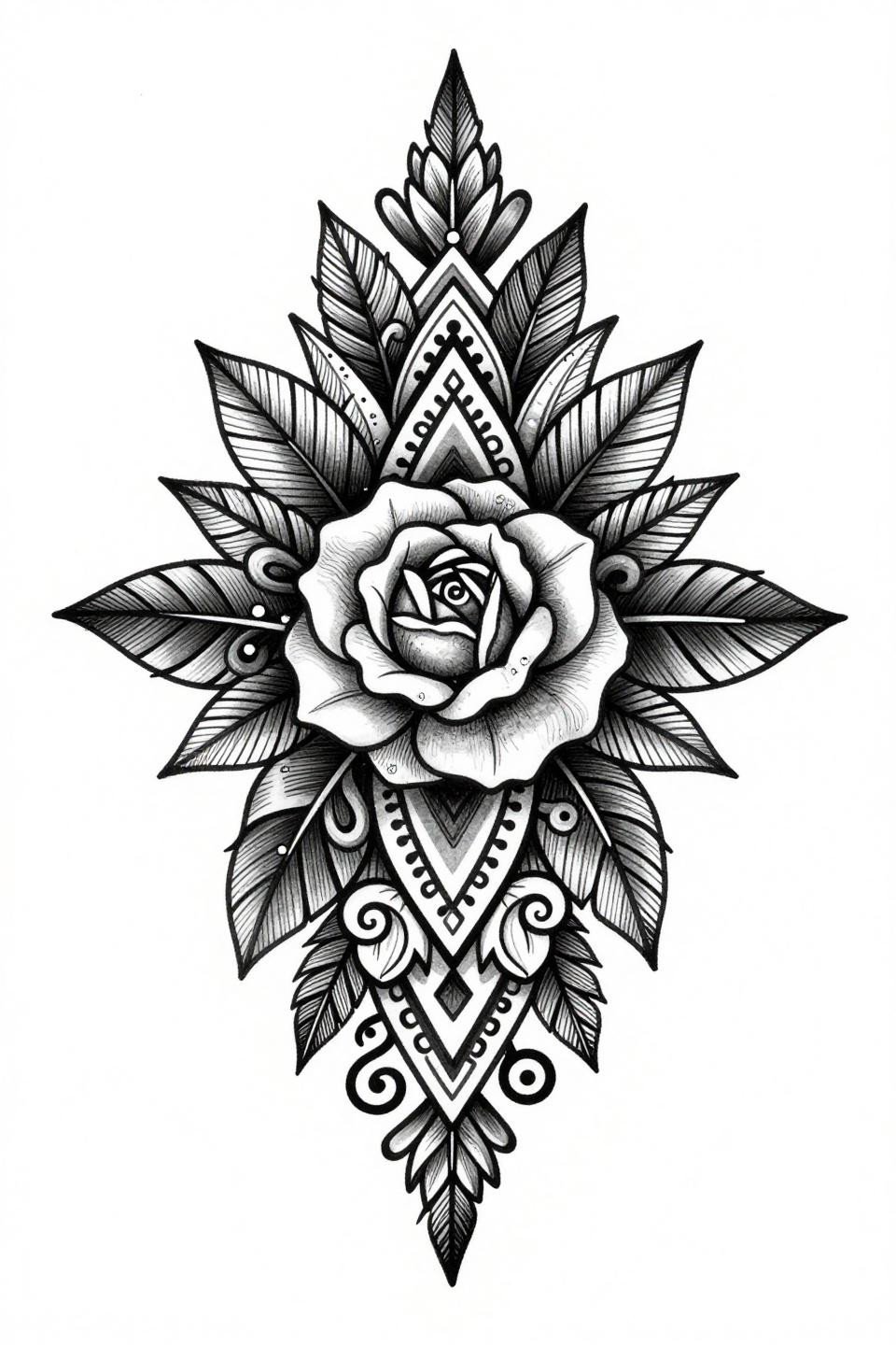
Bilateral symmetry locked by a parallel line crosshatch technique gives this ornamental piece its catalog-quality legibility. The rose medallion center uses denser line groupings to simulate the darkest henna stain zones.
This is the structural reference to pull when your artist asks how dark you want the fill panels. Crosshatch density here maps directly to ink saturation decisions.
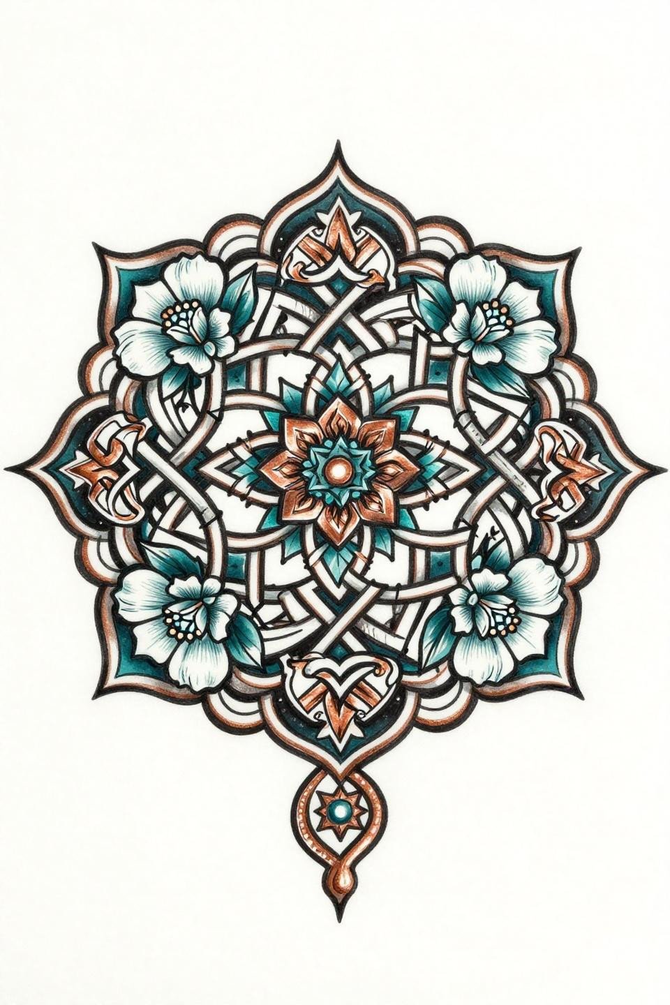
When Traditional American Outlining Serves Rajasthani Geometry
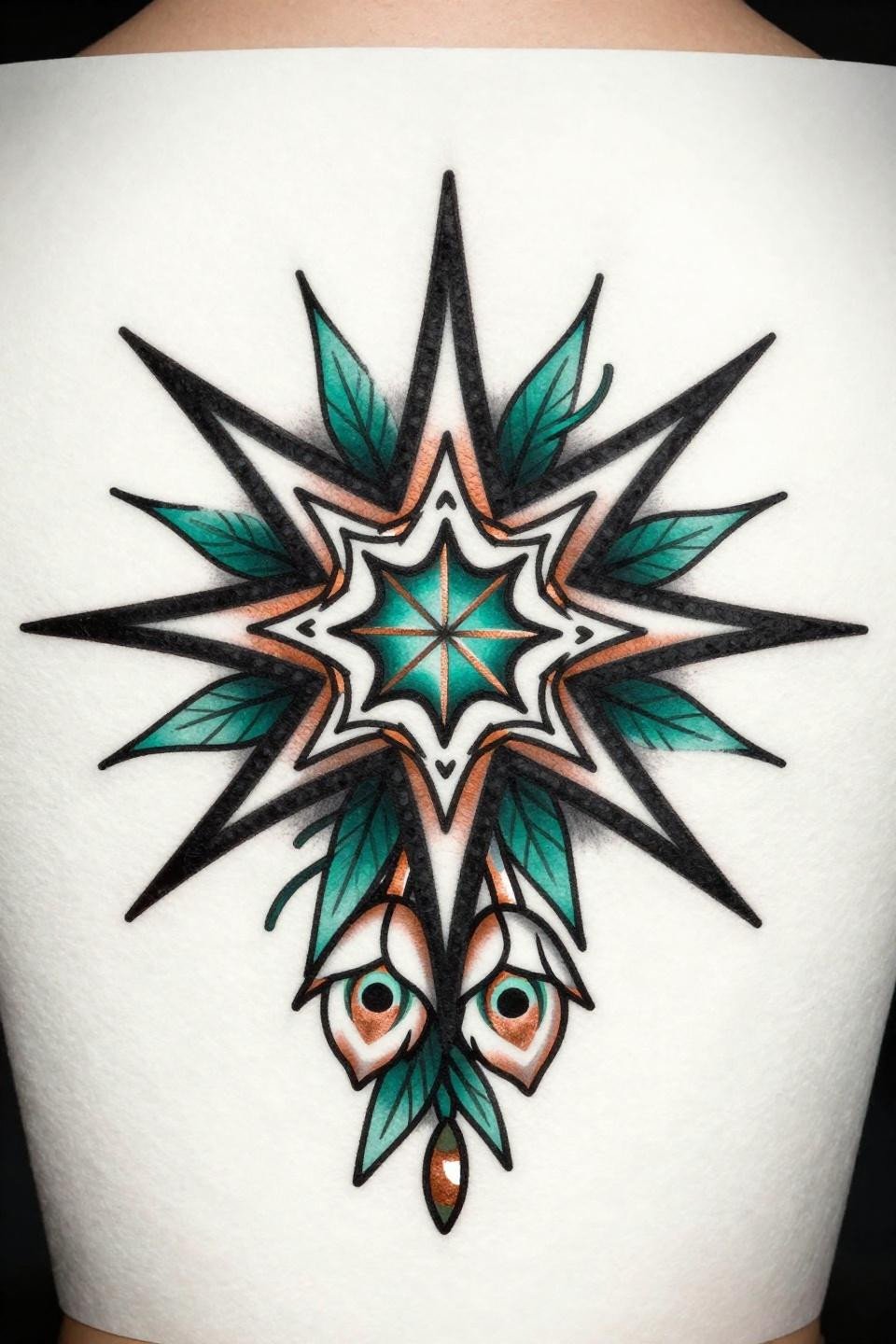
A bold 2-3pt outline weight borrowed from traditional American flash locks the stepped triangles and peacock eye border into shapes that hold a decade on skin without edge migration.
The deep teal and copper palette is the color signal here. It tells your artist which fills need the heaviest saturation passes to stay opaque through the first three years of fading.
Trash Polka Geometry Cuts Through Bridal Symmetry
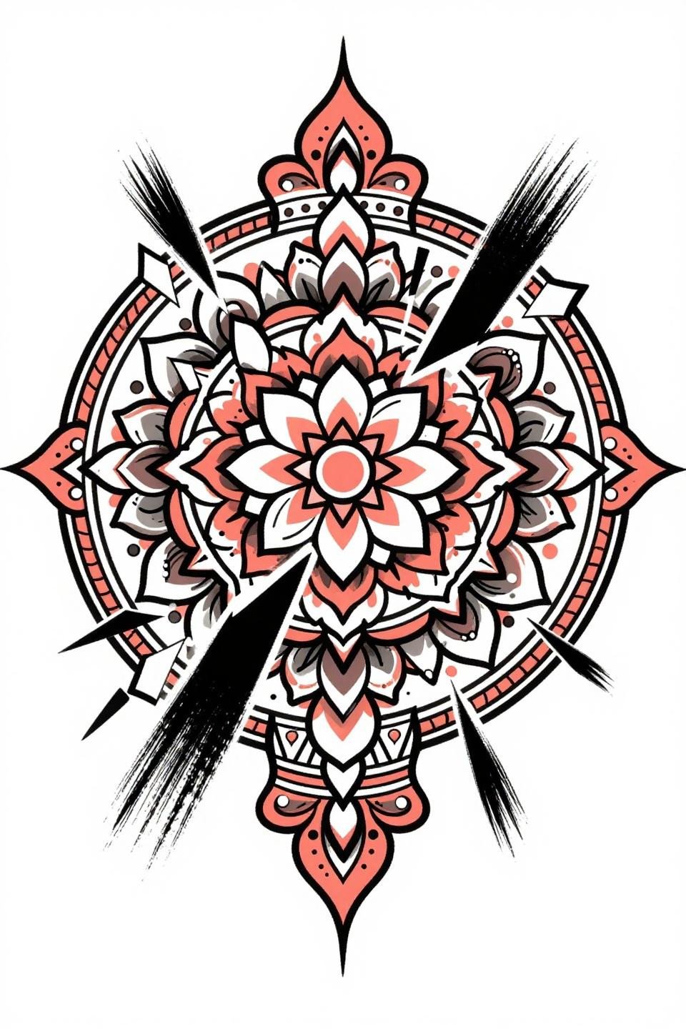
Angular shattering fragments slash through an otherwise symmetrical mandala layout, using aggressive brushstroke marks to break the mehndi grid and add contemporary tension to the bridal motif set.
For henna designs for special occasions, this is the reference that signals intention to go beyond traditional scope. Show it to your artist as a direction note, not a copy request.
Linocut Relief Cuts and the Mehndi Cuff Boundary
The linocut woodblock technique forces a specific decision: negative space as a design element, not as filler. Every lotus bud and chevron in the cuff band is defined by what the relief cut removes, not by outlines.
This reads cleanest on medium skin tones where the contrast between dense black and open skin holds without needing grey wash as a bridge value.
Peacock Grey Wash: What Chicano Style Tells You About Value Range
Chicano-style whip shading grey wash maps the full tonal range of a mehndi piece without color, running from dense black at the peacock body to open midtone at the mango leaf edges.
Grey wash dilution from dense to open with no muddy midtones is the longevity signal here. Ask to see your artist’s healed grey wash work, not just fresh shots, before committing.
Gestural Ink Pooling in an Arabic Front Hand Layout
Loose calligraphic brush strokes with visible ink pooling give this Arabic asymmetric layout its hand-drawn energy, contrasting the geometric hexagonal lattice panel at center with organic vine flow.
This style of reference works well for artists who specialize in modern mehndi design inspiration because the gestural marks give them room to interpret rather than replicate.
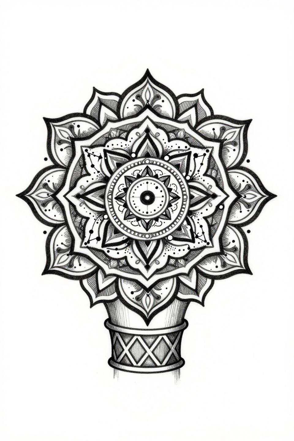
Dot Constellation Fill Inside a Geometric Cuff Frame
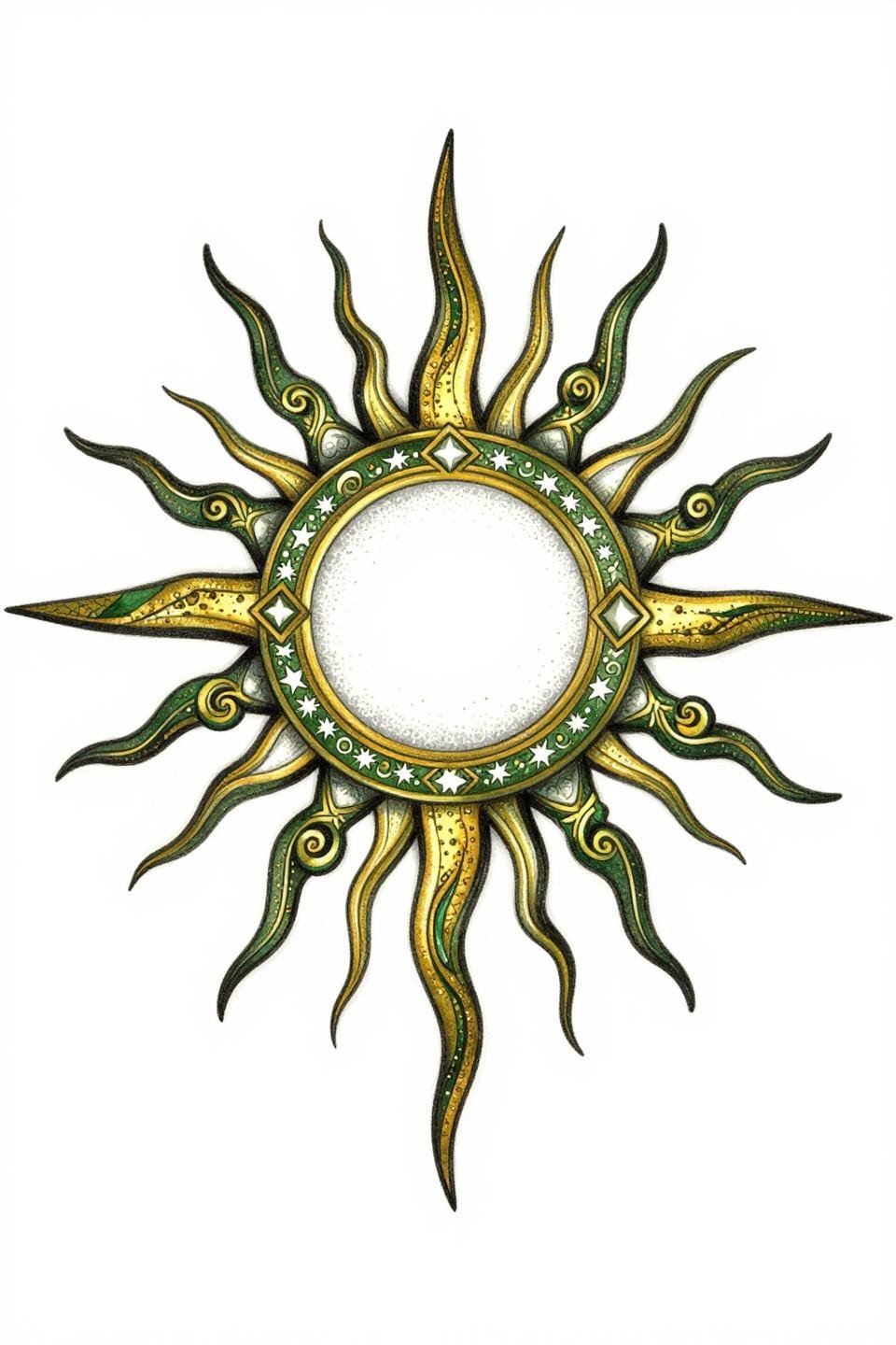
The dot-constellation fill technique inside the interlocking hexagon cuff creates a starfield effect, with dot density tightening toward the sunburst medallion center and opening at the crescent band.
Forest green and metallic gold reads differently across skin tones. On deeper skin, the green needs higher pigment concentration to avoid reading as grey wash after the first year settles.
Art Deco Outlines Lock Down the Lotus Medallion Grid
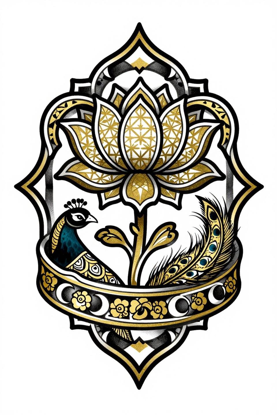
Art deco flat gold metallic fills with bold 2-3pt black outlines pull the lotus medallion and geometric star lattice into a cohesive diamond composition that reads at distance and up close.
The peacock side panel placement signals how the design should track across the hand. Protected placement on the back of the hand keeps this level of fine geometric infill stable over time.
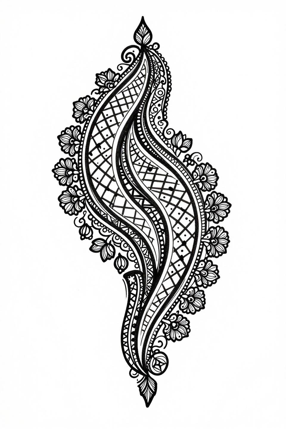
Single Continuous Line Proves Negative Space Density
One unbroken line forms the entire Arabic mandala structure, including the nested geometric rings and teardrop buta clusters, using vector-precision single-stroke linework with zero fill to prove composition strength.
This is the reference to show when an artist questions whether a full hand design can hold with minimal fill. Negative space at this density reads clean on most skin tones with a single needle 1RL pass.
Old School Outlines Meet Rajasthani Peacock Symmetry
Old school 3RL outline weight at this width gives the peacock medallion and hexagonal lattice the structural reinforcement to hold clean for 10 or more years on a well-protected hand placement.
The crimson red accent against solid black is a deliberate two-tone restraint. More than two colors on a design this dense creates optical noise as fills settle unevenly after healing.
Japanese Irezumi Flat Fill on a Bilateral Mehndi Frame
Irezumi-influenced flat color fills with zero grey wash reduce the ornamental mehndi motifs to pure form, with bilateral symmetry along the vertical axis acting as the primary structural logic.
Dense black ink on white with no midtone dilution is the aging-proof choice for hand placement. Flat fills with no patchiness separate veterans from beginners, check healed portfolio shots specifically.
Ignorant Style Geometry on Rajasthani Vine Structure
Thick irregular black outlines with intentional imperfect geometry give the hexagonal lattice and buta clusters a raw tactile quality that contrasts the precision of traditional Rajasthani grid work.
The crimson red accent hits harder against flat black when the outline weight is this variable. The uneven stroke width actually reinforces the color separation at the fill edges.
Neo-Traditional Peacock Tail Reads the Full Hand Canvas
Neo-traditional whip-shading arcs with flat gold fills give the central peacock and cascading jasmine clusters a dimensional quality that standard mehndi linework cannot achieve.
For bridal context, this asymmetric flowing composition sits better on the back of the hand than a centered mandala. The design follows the hand’s natural taper toward the wrist without fighting the anatomy.
Etching Line Weight Separates Iguana Scales From Lattice Fill
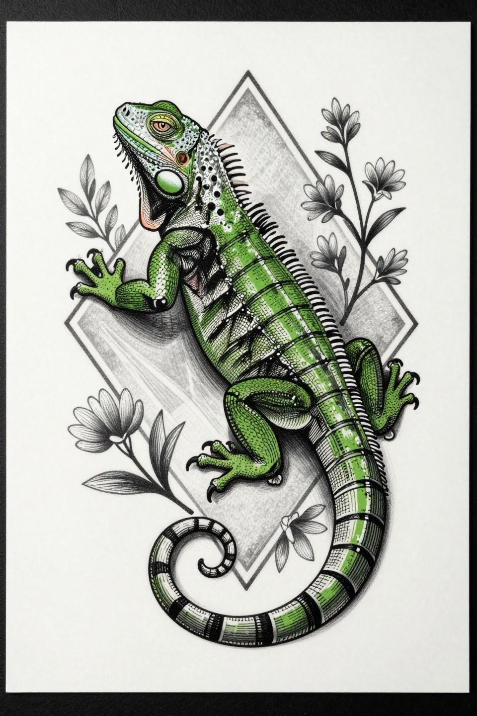
Parallel line engraving without crosshatch defines the iguana dorsal scales in distinct weight from the surrounding geometric diamond lattice and floral sprigs, creating clear visual hierarchy in a dense composition.
This piece is for collectors who want mehndi-adjacent structure without traditional motifs. The simple mehndi patterns for beginners contrast shows why this level of detail demands an artist with engraving-specific technique experience.
Celtic Knotwork Closes the Arabic Vine Loop
Interlocking Celtic knot chains enclosing jasmine and rose clusters solve the Arabic vine’s biggest structural problem: open-ended tendrils that lose direction at the edge of the hand composition.
Deep teal with copper metallic accent on black requires three ink types that behave differently across heal cycles. Confirm your artist uses lightfast pigment-based inks for the metallic layer specifically.
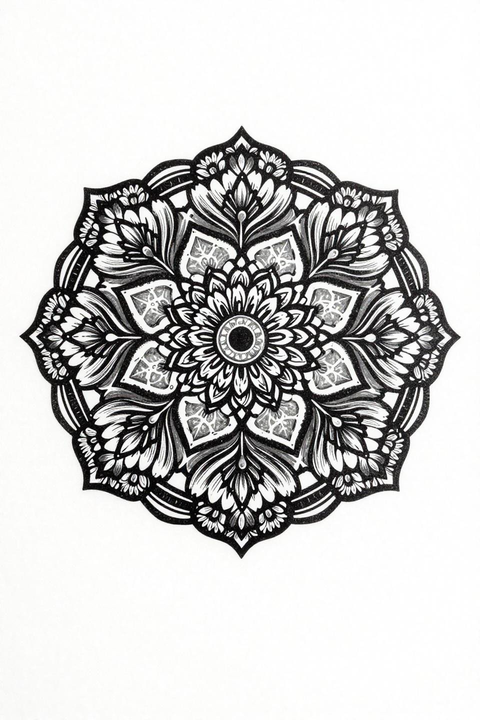
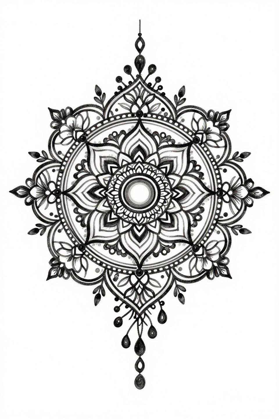
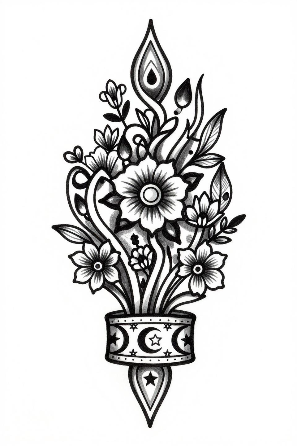
Dotwork Lotus Mandala at Full Stipple Saturation
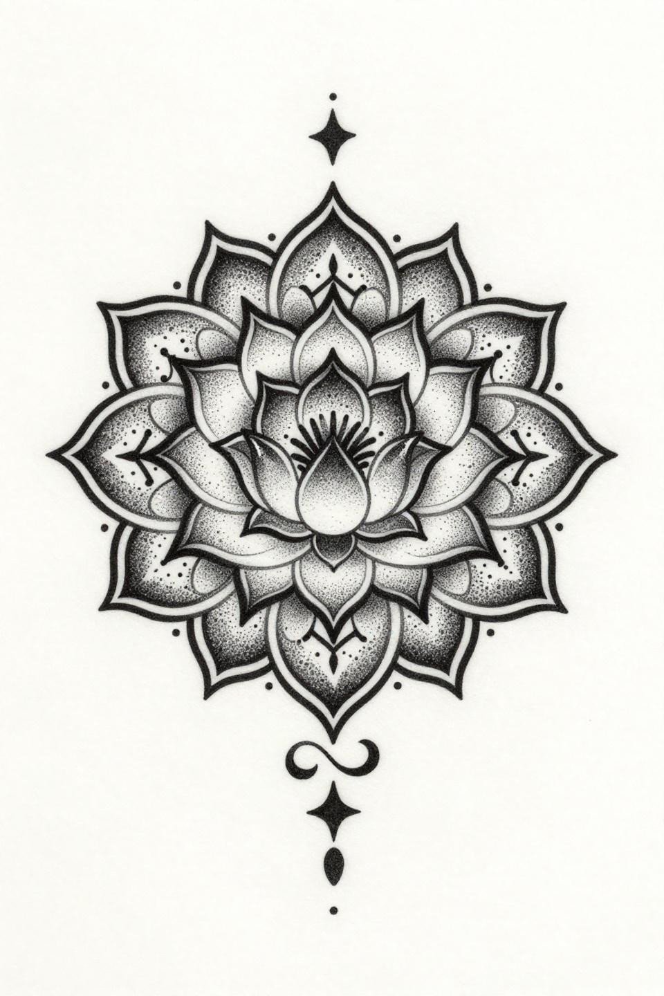
The stipple dot gradient at full center saturation mimics the darkest zone of a fresh henna stain on the lotus mandala, thinning to open spacing at the arabesques for a natural henna-to-skin fade logic.
Blackwork at full saturation holds density indefinitely if the artist commits to multiple layered passes. This reference shows exactly where those heavy passes belong versus where single-pass dot work is sufficient.
Fine Line Peacock Tail at the Geometric Limit
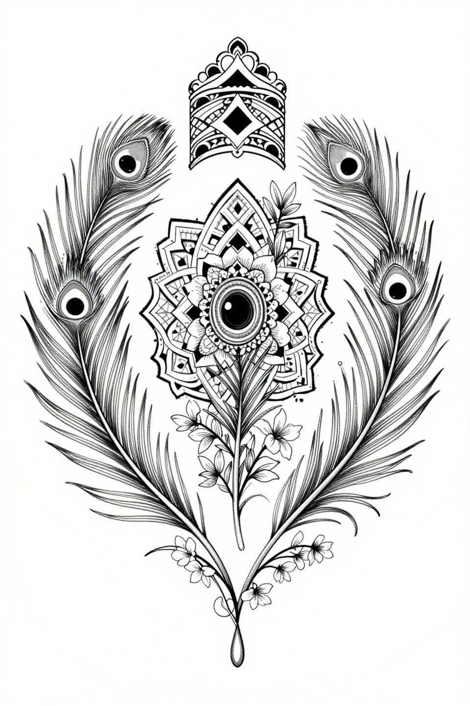
Hairline 0.5mm single-needle strokes with zero grey wash push the peacock tail feather eye motifs to the structural limit for front hand placement, relying entirely on clean flat black fills for longevity.
Single needle 1RL work like this needs an artist who controls speed. On the back of the hand especially, any hesitation reads as line wobble that compounds as the piece settles.
Watercolor Bleed as a Mehndi Lattice Accent
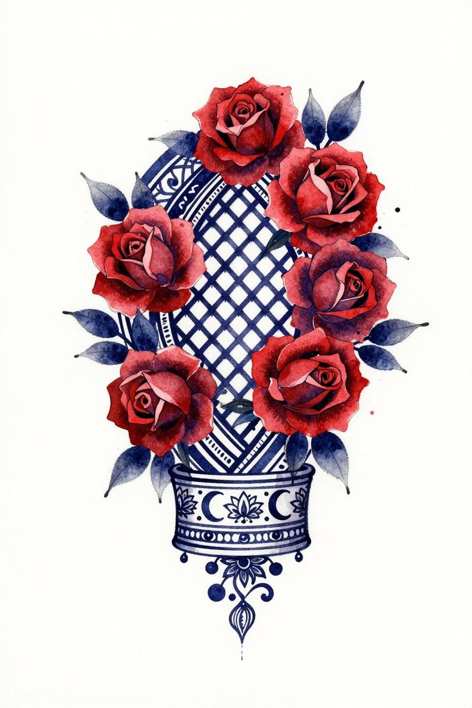
Deep indigo lattice with loose watercolor bleed at the diamond grid edges creates a controlled diffusion effect around the rose clusters without losing the geometric cuff band structure.
Watercolor without an anchoring outline blurs by year three to five on skin. This reference works as an inspiration tone, not a direct copy. The lattice lines need reinforced outlines before any artist should attempt this on actual skin.
Sak Yant Vertical Stack as Long Hand Composition Logic
A stacked vertical composition with bold 2-3pt outlines anchoring the Arabic vine arabesques and buta motifs gives this long hand reference its Sak Yant structural discipline, reading top to bottom without losing center focus.
Vertical stack compositions track the hand’s length better than radial mandala formats on narrower hand proportions. This is the layout to reference if your artist raises concerns about centering on your specific hand width.
Tribal Flat Fill and the Rajasthani Grid at Maximum Black
Tribal geometric treatment at maximum flat black fill density pushes the Rajasthani lattice grid to its darkest interpretation, using bold 2-3pt outlines and no grey wash to produce maximum graphic contrast.
No grey wash means no mid-tone aging ambiguity. This design either holds or it doesn’t, and the tell will be the fill patch consistency at year two.
Art Nouveau Etching Shadows on a Centered Mandala
Crosshatch etching with parallel line shadows at the petal junctions gives the nested circle mandala a dimensional depth that separates this art nouveau interpretation from flat ornamental mehndi flash.
The dot-work constellation fill inside the mandala ring shifts density from center to edge, a gradient structure that needs consistent dot size across the full field. Inconsistent dot sizing is the first quality failure to look for on this type of reference.
Botanical Peacock with Single-Needle Rajasthani Lattice
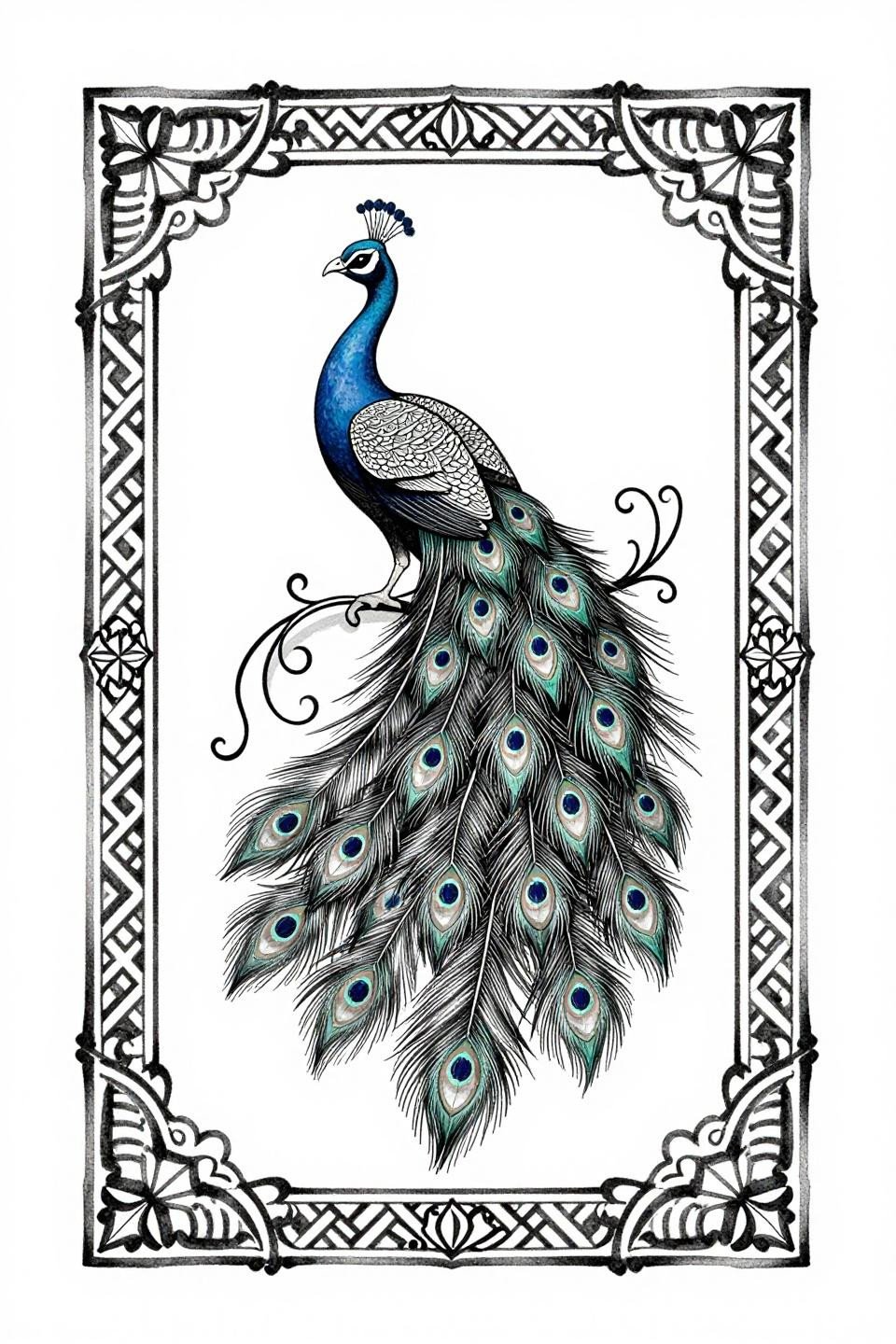
Hairline single-needle strokes on the fanned peacock tail feathers against open negative space show exactly how asymmetric organic flow works within a Rajasthani geometric lattice infill without crowding the composition.
This is the reference to bring when you want coverage that still reads light. The open negative space is structural, not unfinished, and any artist who suggests filling it is misreading the design intent.
Pull three to five of these references, not the full collection. Match them to your hand size and the placement zone you’re targeting, back of hand, wrist, or full coverage. A specific reference set tells your artist exactly what density, outline weight, and motif hierarchy you want. That’s the consultation half done before you walk in.