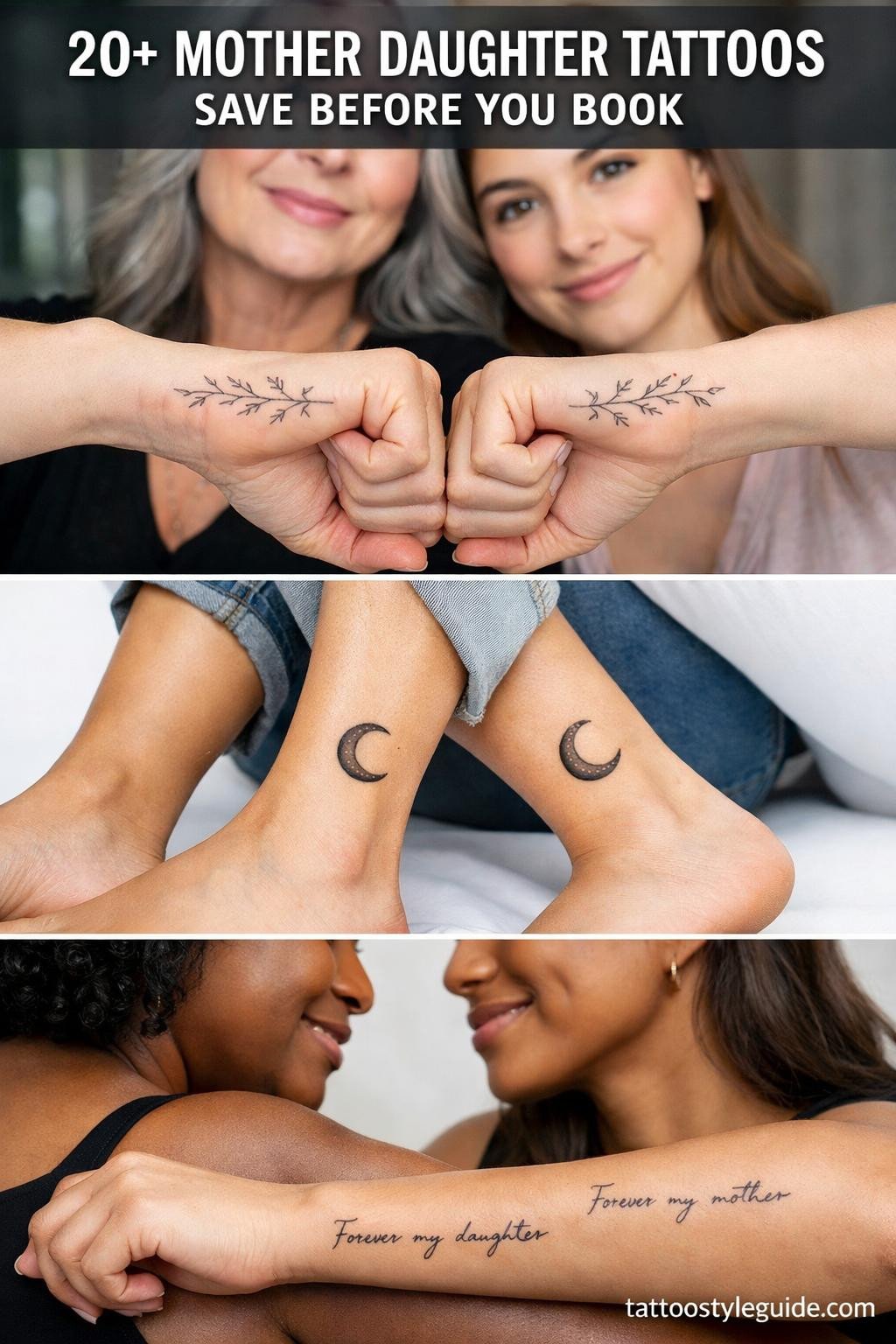
Mother daughter tattoos fail when both people get the same generic design with no structural relationship between the two pieces. The bond is the concept. The tattoo needs to carry that visually, through scale contrast, interlocking forms, or mirrored geometry that only makes sense when both pieces exist.
The designs that hold up long-term share one trait: clear compositional logic. Scale difference between the two elements, a physical connection point, or a shared negative space that reads instantly. Sentiment alone does not make a tattoo work on skin for decades.
Locket Pairs That Actually Read as a Set
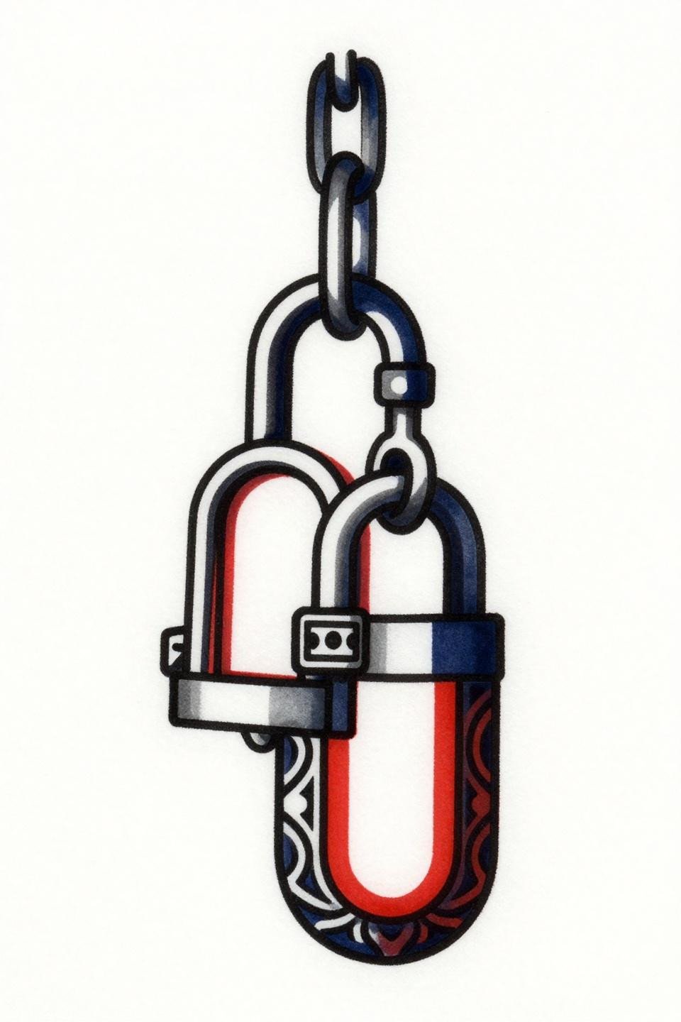
Two interlocking lockets in a stacked vertical format, the larger with ornate filigree borders and hinge detail above a smaller Art Deco panel version, connected by a single chain link at the apex. The scale contrast between lockets does the narrative work without any text.
Bold 2-3pt outlines at this weight hold clean definition for 10 or more years, and the flat indigo and crimson fills will not shift the way watercolor or diluted washes do. Placement on the forearm or upper arm keeps both pieces in the same visual field when worn side by side.
When Trash Polka Actually Earns Its Chaos
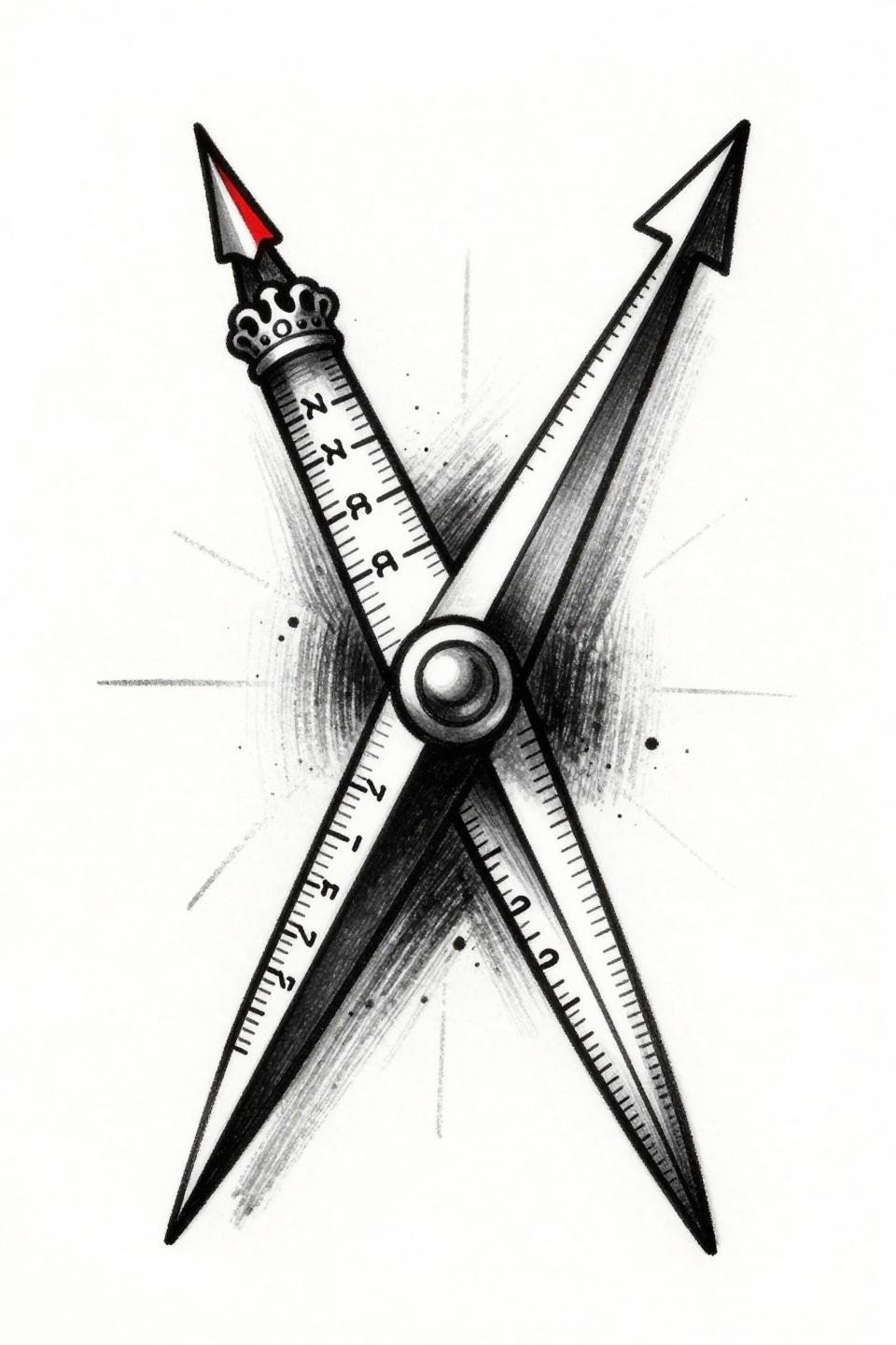
Two compass needles locked at a shared center bearing point, one with a full degree scale and ornate crown cap, the other a simplified point-to-tail form, set on an aggressive diagonal with gestural splatter marks framing the composition. Trash polka’s red-and-black restriction is a discipline, not a limitation, and this design respects it.
The asymmetric layout is intentional: one needle detailed, one stripped back, mirroring the parent-child relationship in weight and complexity. On lighter skin tones this reads with maximum contrast. On olive or deeper skin, the artist needs to push the black saturation heavier to hold that graphic edge.
Skeleton Keys and the Problem of Matching Tattoos
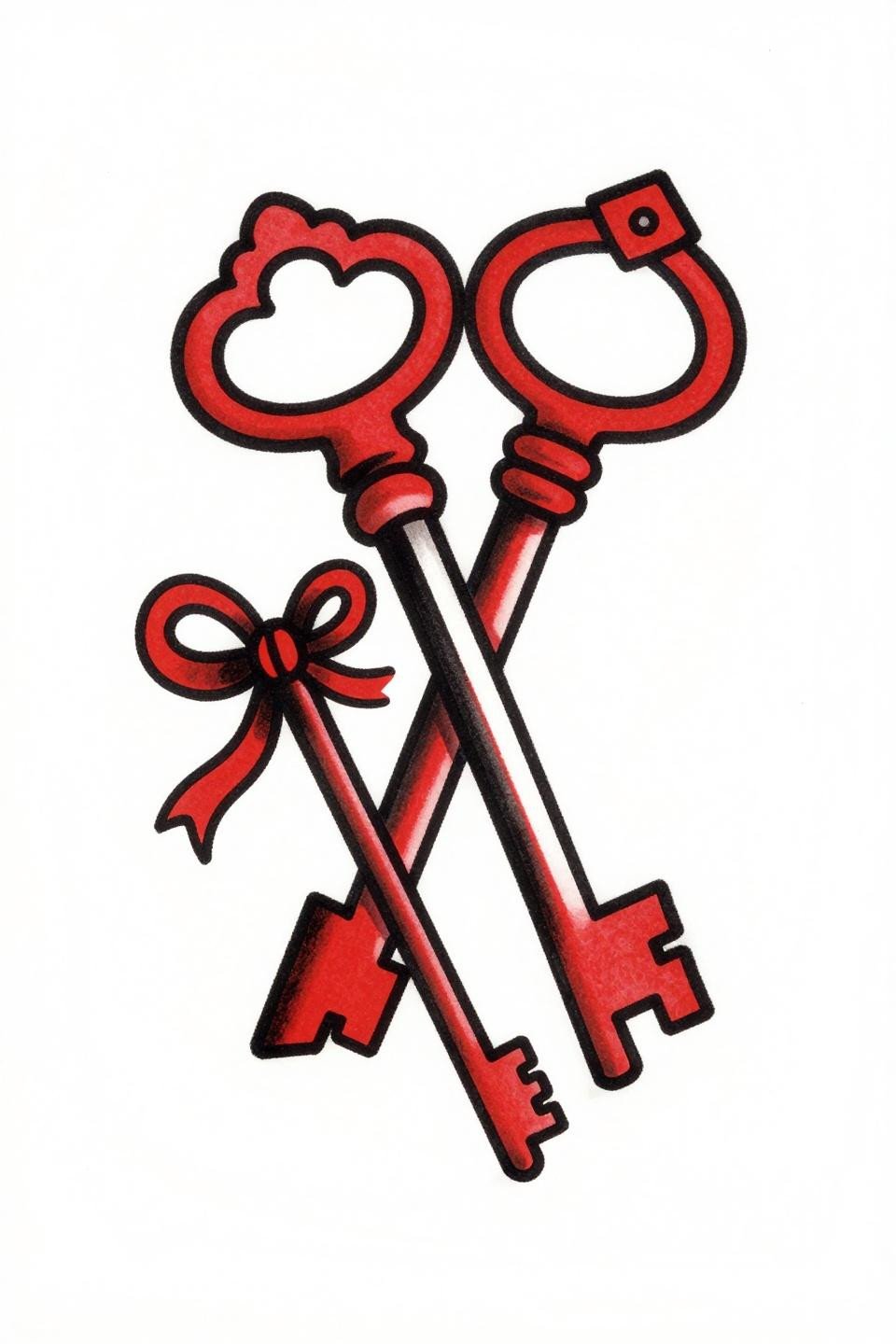
Two interlocking Victorian skeleton keys, larger with gear-tooth shaft and ornate crown, smaller with a smooth simplified shaft, a ribbon bow woven through both key rings simultaneously. The single ribbon thread connecting both keys is the design decision that separates this from two separate key tattoos worn near each other.
Old school outlines at this weight are the longevity standard. The ribbon element needs a confident hand at the weave points. Check healed portfolio work before booking, not fresh shots.
Fingerprint Geometry Built for the Long Game
Two interlocking whorl fingerprints, one large with complete ridge loops and dense center spiral, one smaller with minimal ridge lines, joined by a continuous thread at the base junction, enclosed in a circular mandala frame. Blackwork at full saturation holds density indefinitely when the artist commits to layered passes rather than a single heavy-handed session.
The grey wash midtones in the ridge lines are the technical risk here. Too diluted and they read muddy within three years. The artist needs to keep the wash tight, dense toward center and open only at the outer edges of the mandala frame.
DNA Helix: The Design That Justifies Itself Scientifically
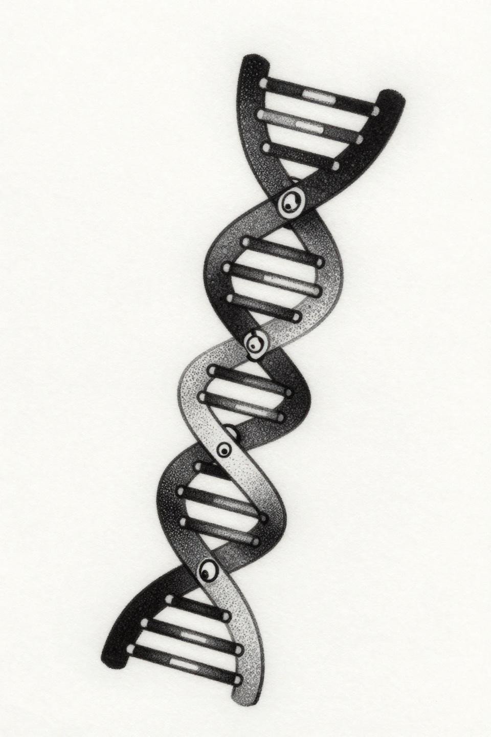
Two interlocking DNA double helix strands on a flowing diagonal, the larger with visible base pair rungs and complete spiral geometry, the smaller as a single-line outline, intertwined at three junction points sharing one phosphate backbone thread. The stipple dot gradient from dense core to open edge is the technique signal here: look for consistent dot size across the full range, not random scatter.
This orientation works exceptionally well on the forearm or along the inner bicep, where the diagonal follows the muscle line naturally. Dotwork on the inner arm fades faster than on the outer arm due to friction and moisture. Factor in a touch-up at the three-to-five year mark.
Birds in Flight and the Watercolor Aging Problem
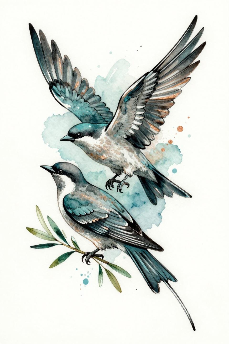
Two interlocking birds in flight, the larger with fully spread wings and detailed feather quills sheltering a smaller nestled bird, a single shared talon grip point, with a botanical olive branch woven through both forms and teal watercolor bleeds behind the linework. The copper metallic accent wash reads well fresh but is the first element to fade.
Watercolor without a solid anchoring outline blurs by year three to five on most skin types. This design carries linework underneath the washes, which extends its legibility. Still, collectors should expect the color to soften significantly and plan for maintenance accordingly.
Botanical Fine Line: Where Scale Difference Matters Most
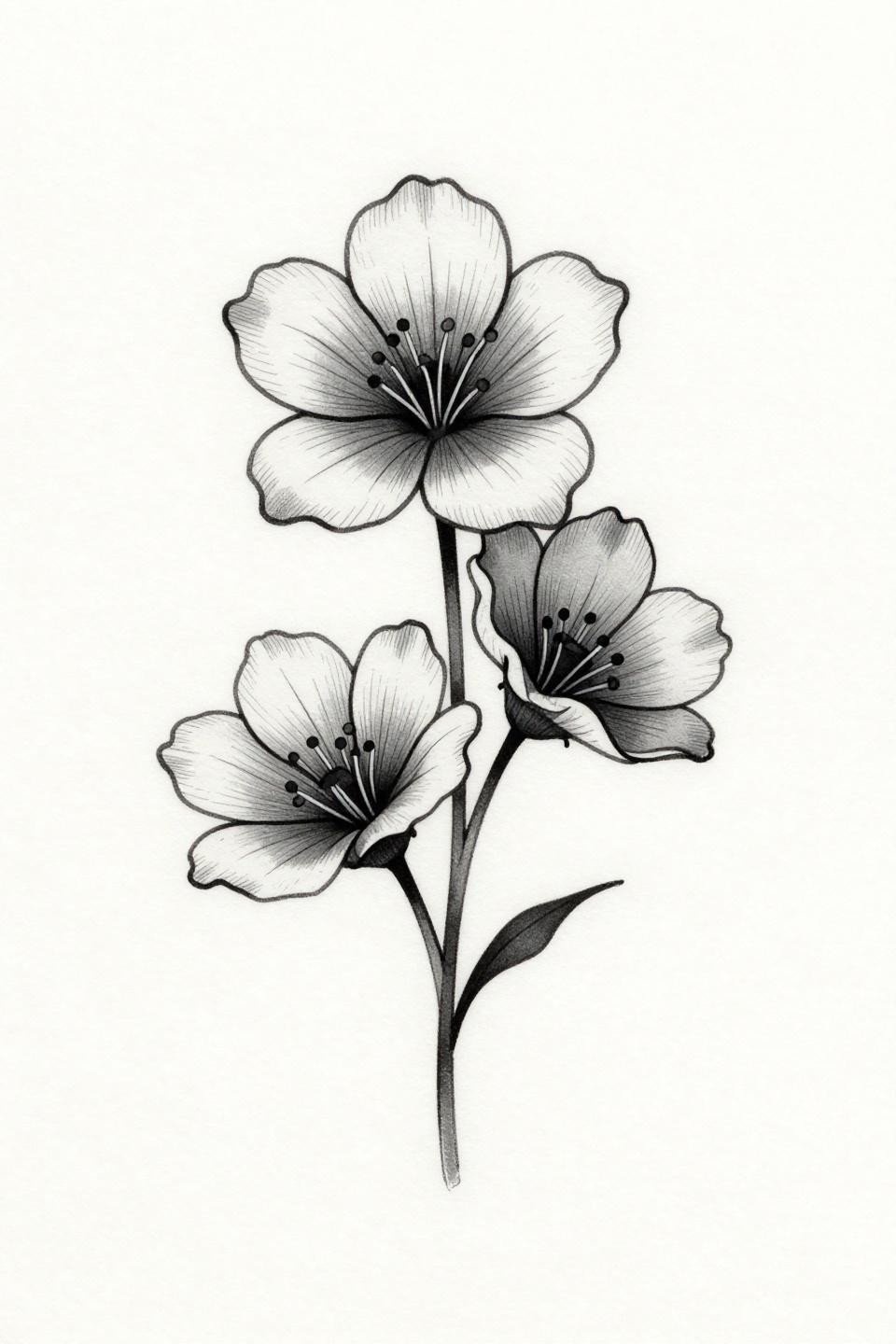
Two interlocking birth flower silhouettes in a vertical stack, the larger bloom with five detailed petals and a visible stamen cluster above a smaller three-petal simplified form, joined by a single delicate stem thread, executed in hairline single-needle strokes. Single needle 1RL work at this level of detail needs an artist who controls machine speed precisely, not just needle depth.
Protected placements like the sternum, upper back, or inner upper arm give this style its best shelf life. Wrist and ankle placement means the fine lines lose definition faster, typically within four to six years, and touch-ups on single-needle work are technically demanding to match.
Birthstone Crystals and the Case for Crosshatch Shading
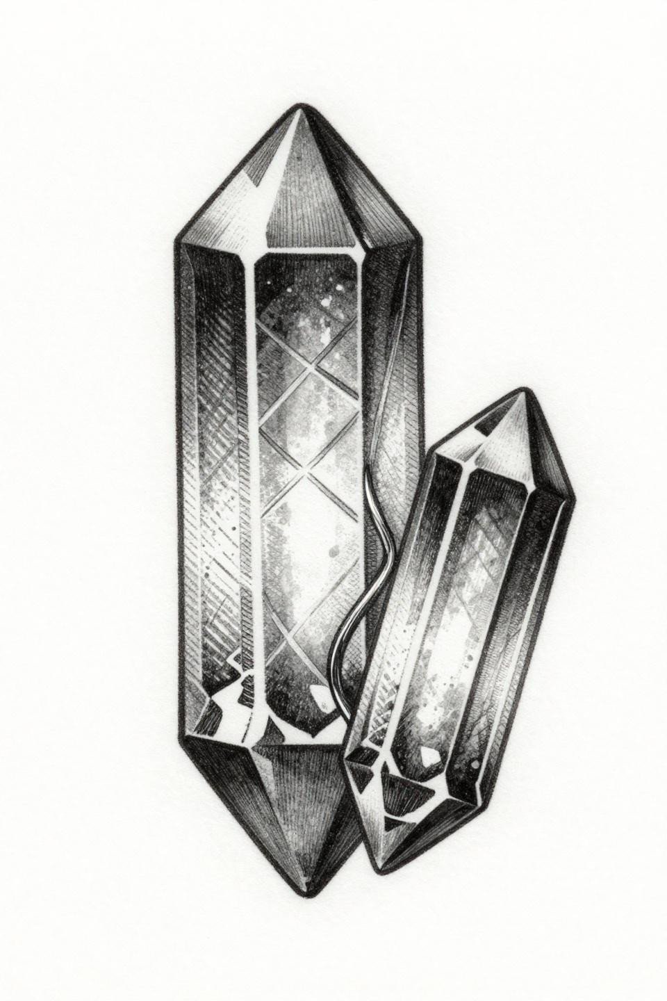
Two interlocking birthstone crystals in a vertical stack, the larger with eight geometric facet cuts and an internal lattice pattern, the smaller with four simplified facets, joined by a metallic thread loop, enclosed in a diamond frame, executed entirely in parallel line engraving and crosshatch shading. Crosshatch etching shading ages more predictably than stipple or wash because the lines hold their position in the skin without spreading into each other.
The diamond containment frame is a practical choice, not just compositional. It gives the artist a defined boundary to work within and prevents the design from expanding visually over time as the skin changes. Etching style reads particularly well on mid-tone skin where the contrast range is most forgiving.
Compass Roses and the Symmetry Test Artists Rarely Pass
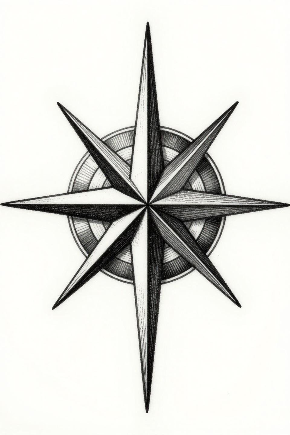
Two interlocking compass roses sharing one magnetic north needle, the larger with eight primary points and dense crosshatch shading, the smaller with four cardinal points only, locked in bilateral symmetry along a vertical axis. The vertical bilateral symmetry in this composition is unforgiving. Any wobble in the placement reads immediately on skin, which makes the stencil application more critical than the tattooing itself.
Woodcut and etching styles require an artist who works confidently with parallel line spacing. Uneven line intervals collapse the dimensional illusion faster than any other technical error in this style. Ask specifically to see healed etching work before booking.
Celtic Infinity Knotwork: Why the Continuous Path Matters
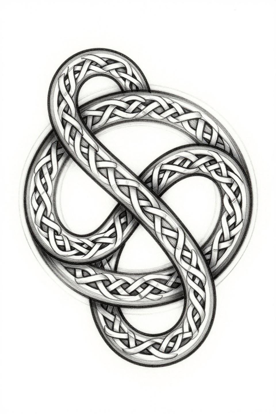
Two infinity symbols morphing into Celtic knotwork, the outer loop as a bold triple-line weave with dense interlocking grid, the inner loop as a refined single-needle continuous spiral path, sharing one central junction node, enclosed in a circular mandala frame. Compass-drafted geometry at this complexity level is the technical differentiator between a clean Celtic piece and one that reads as clutter at arm’s length.
The single-needle inner path next to the bold triple-line outer weave creates visible weight contrast that carries the parent-child scale relationship without any representational imagery. On darker skin tones, the inner single-needle path will lose definition faster. Consider bumping the inner line weight to a 3RL to maintain readable contrast.
Art Deco Padlocks and the Flat Fill Standard
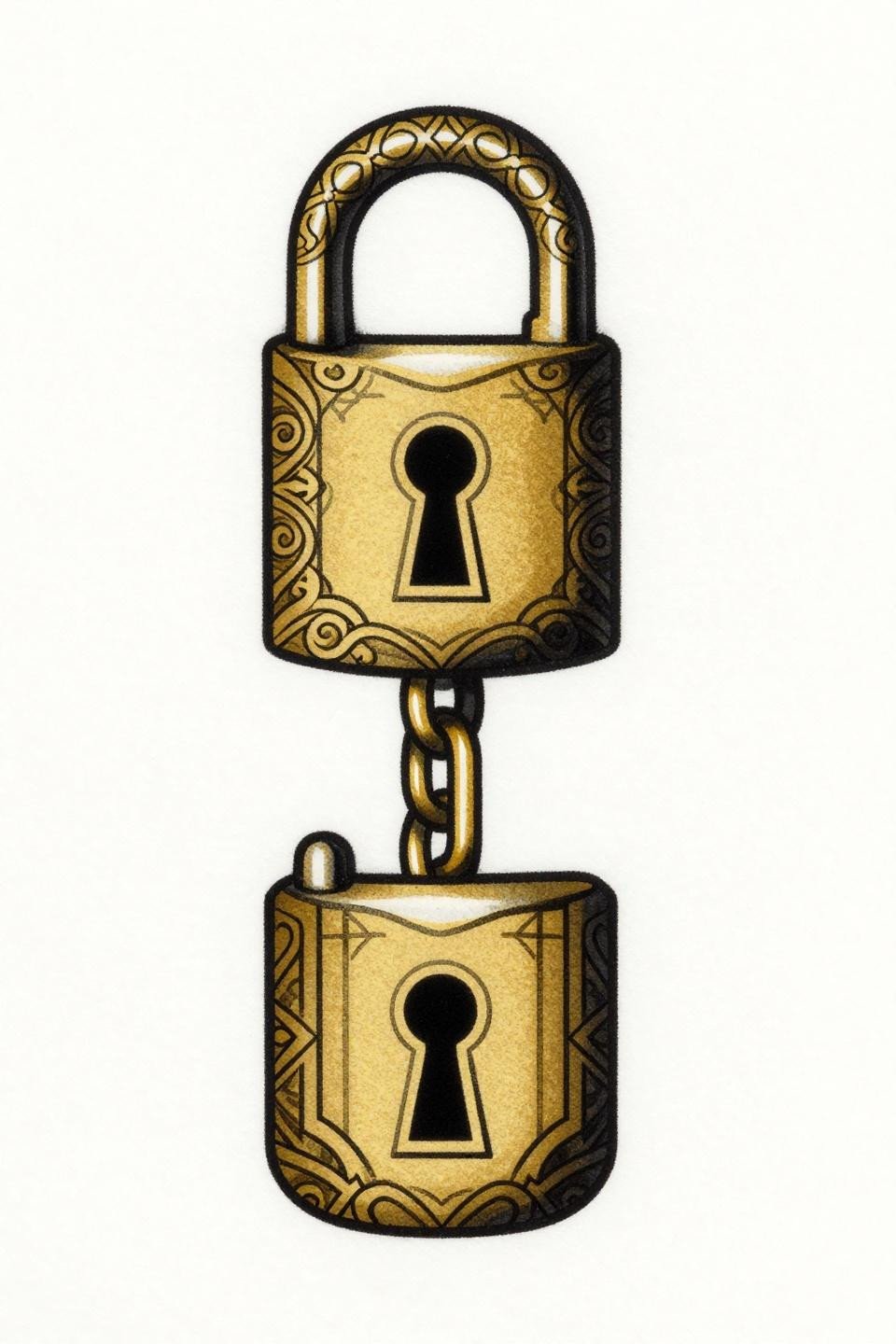
Two ornamental padlocks stacked vertically in Art Deco style, the larger with filigree swirl detailing and an ornate keyhole, the smaller with single-line geometric panels, connected by one shared gold chain link, executed in flat gold and solid black fills. Flat fills with zero patchiness separate veteran artists from beginners in Art Deco work, and this design has no room for streaky coverage.
Gold ink in tattoos is a gamble. It typically shifts warm-yellow to a faded tan within five to seven years, especially in sun-exposed placements. If longevity matters, ask your artist about substituting a saturated yellow-ochre black-shaded approach instead of metallic gold pigment.
Neo-Traditional Silhouette Profiles and Grey Wash Volume
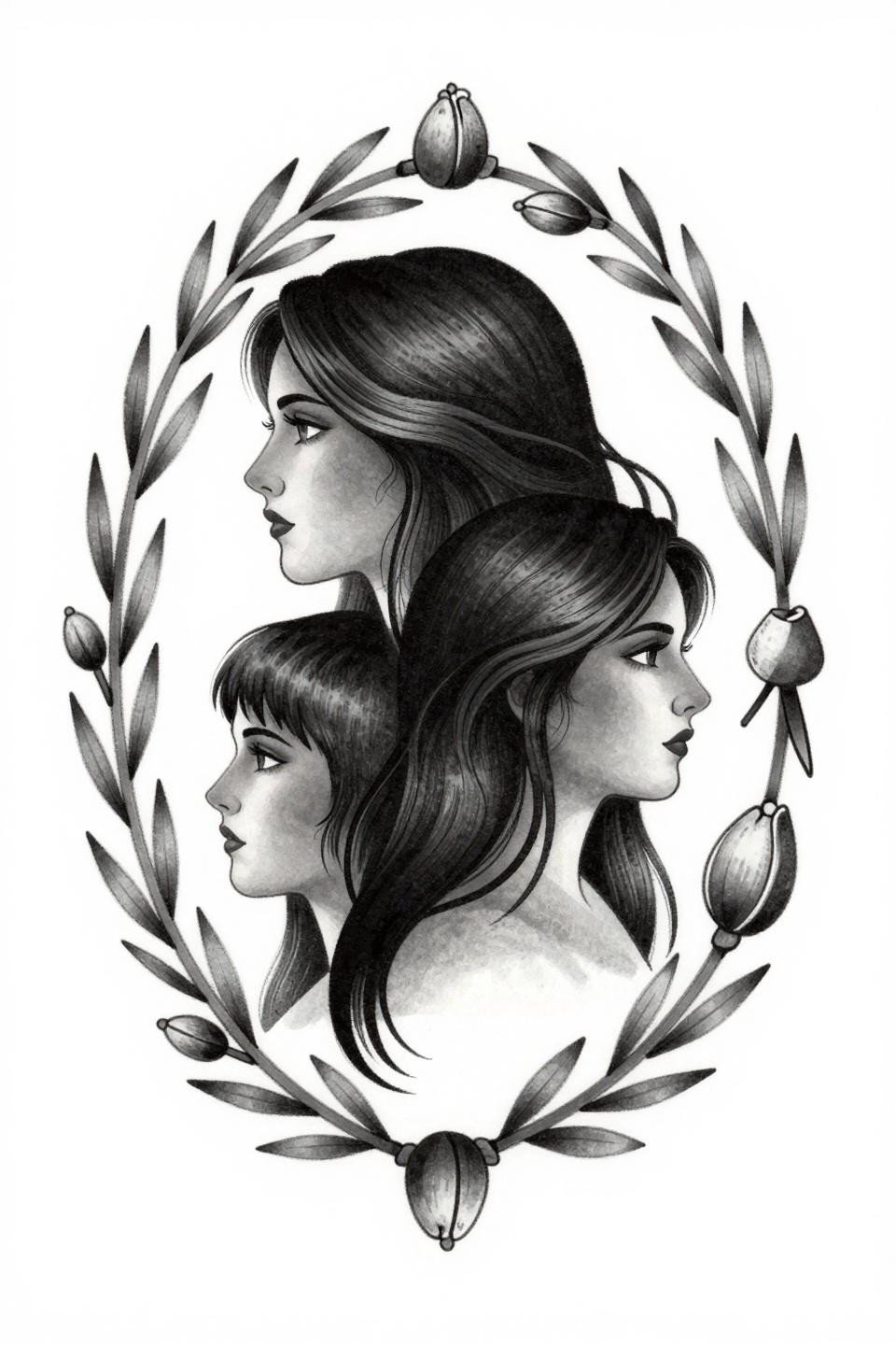
Two nested three-quarter view silhouette profiles side by side, the larger with flowing hair overlapping the smaller short-cropped figure, enclosed in an organic oval botanical frame with sprouting leaves and seed pods at cardinal points, shaded with grey wash whip technique for volume. The botanical oval containment frame is doing critical composition work, preventing the two profiles from reading as a generic portrait without context.
Grey wash dilution from dense to open with no muddy midtones is the artist skill signal in this style. A patchy wash inside the oval frame is hard to correct without going darker and losing the dimensional quality entirely. Request a consultation that includes reviewing specifically their grey wash healed results.
Blackwork Plant and Root: Negative Space as the Connection
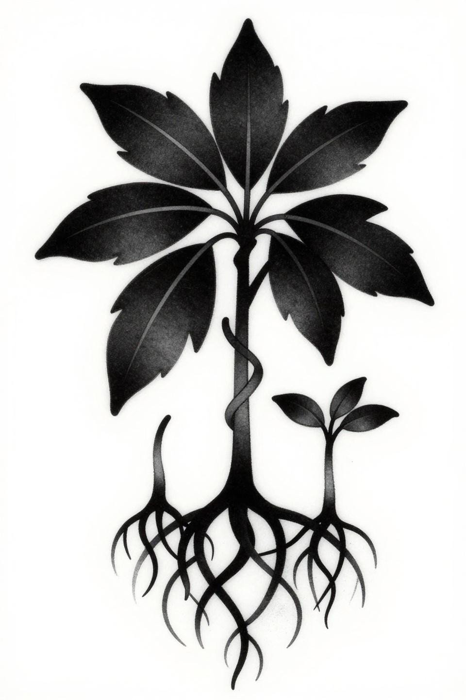
A large parent plant with full compound leaves and an exposed root system alongside a smaller seedling, connected by one intertwined root tendril, executed as solid black flat fills with zero internal line detail and high contrast organic silhouettes. The single shared root tendril is the compositional hinge. Without it, these are two separate plant tattoos placed near each other.
Solid blackwork silhouettes hold their edge definition longer than any other technique, making this an excellent choice for collectors who do not want to manage long-term maintenance. The asymmetric vertical composition works well on the calf, forearm, or along the outer shin where the narrow canvas suits the stacked plant forms naturally.
Paired Paperclips and the Case for Restrained Geometry
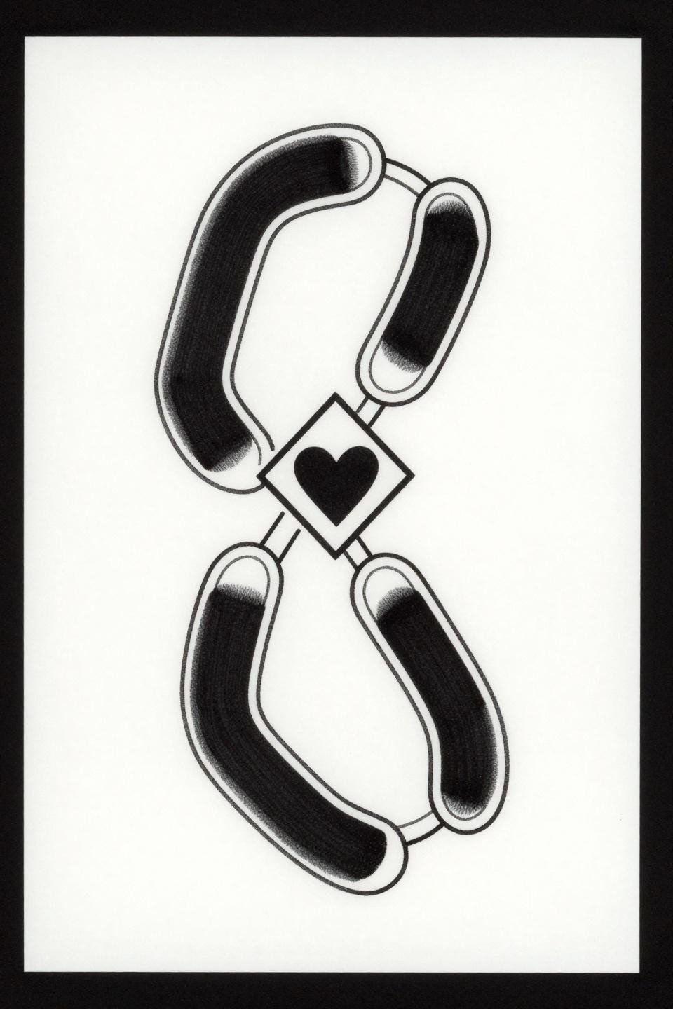
Two interlocked paperclips arranged vertically, one solid black geometric block form and one open outline only, sharing a centered pivot point with a small heart suspended between them, enclosed in a diamond frame. The solid-fill versus outline contrast between the two paperclips communicates the relational hierarchy without any additional imagery or text.
This is a strong choice for collectors who want a minimal footprint with high graphic impact. The diamond frame keeps the design contained at small scales, around 2 to 3 inches, where it reads cleanly on the wrist, inner ankle, or behind the ear without becoming unreadable over time.
Blackwork Silhouette Profiles Inside a Mandala Frame
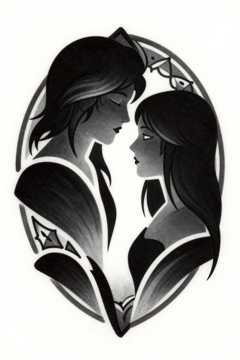
Two profile silhouettes facing inward, a larger figure with flowing hair swept back and a smaller figure with shorter hair, foreheads nearly touching, forming a shared negative space between them, enclosed within a circular mandala frame with bold 3pt outlines and flat solid black fills. The shared negative space between the profiles is the design’s core concept, directly referencing the classic figure-ground illusion format.
Zero grey wash in the fills is the right call. Grey wash inside a blackwork silhouette at this scale creates a muddied read that undermines the graphic punch. The circular mandala frame must be drafted precisely. Freehand circles read as off-balance immediately in a design built entirely on symmetry.
Parallel Arrows and the Stipple Gradient Skill Signal
![]()
Two parallel arrows pointing upward, one solid filled shaft with geometric fletching and one delicate outline only, bases aligned with a stipple dot cluster beneath in an asymmetric vertical composition. Consistent dot size across the stipple gradient is the artist skill test here. Uneven dot density at the base cluster creates visual noise that distracts from the clean arrow pair above.
Arrow tattoos work at a wide size range, but the filled-versus-outline contrast in this pair needs a minimum of 4 to 5 inches of height to read the distinction clearly. Smaller than that, the outline arrow loses its delicate quality and just looks underworked.
Fine Line Crescent Moons and the Placement Logic
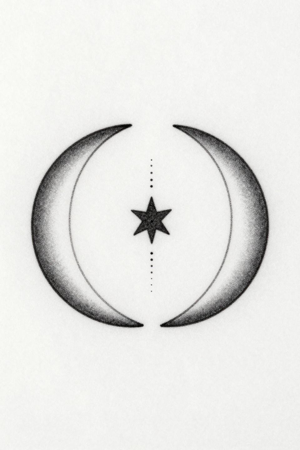
Two delicate crescent moons facing each other with tips nearly touching, a single shared five-point star centered between them, connected by a vertical stipple dot trail, executed in hairline 0.5mm single-needle strokes with mirrored vertical symmetry. The mirrored crescent composition reads as a matched set even when worn on two different people, which makes it one of the most placement-flexible formats in this collection.
Single needle work on the wrist or collarbone area fades fastest. On protected placements like the upper inner arm or sternum, this style holds its crispness for five to seven years before needing a refinement pass. Plan the placement before deciding on the design scale, not the other way around.
Art Nouveau Interlocking Hearts and the Tendril Problem
Two interlocking hearts in Art Nouveau style, the larger containing the smaller nested centrally, with ornamental filigree stems curling upward from the base in bilateral mirrored symmetry, executed in bold 2-3pt outlines and flat black ink fills. The filigree tendril density at the base is the execution risk. Tendrils packed too close together in the original design will merge into a black mass on skin within five years as lines spread slightly.
Designers and collectors should request that the artist add at least 1.5mm of negative space between each tendril before tattooing the stencil. That single adjustment is the difference between a design that reads at year ten and one that needs a cover-up.
Continuous Line Keys and the One-Stroke Discipline
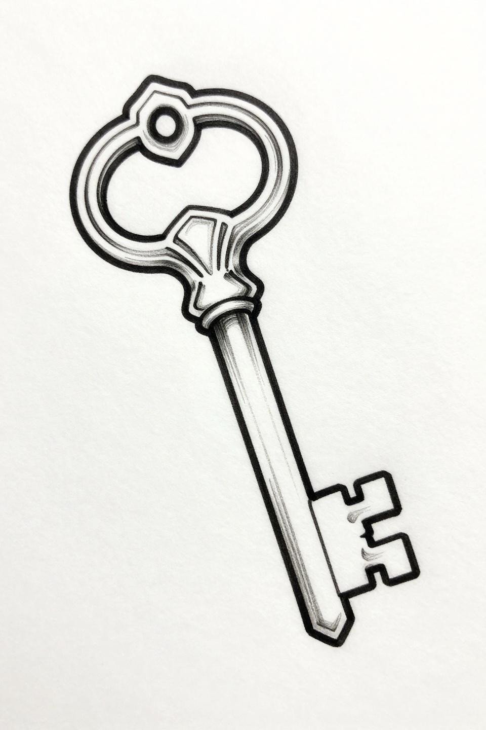
A matching pair of keys in a flowing asymmetric offset arrangement, the larger a skeletal key with geometric crown head and ornate shaft detail, the smaller drawn in one unbroken continuous stroke, bows positioned to interlock visually without physically touching. Continuous single-line discipline demands that the artist maintain uniform 1pt weight throughout without slowing at direction changes, which is where most single-line work loses consistency.
The no-grey-fill approach here is the right call for longevity. A pure line piece on protected placement ages with its original crispness far longer than the same design with wash fills. Upper arm or ribcage placement gives this the best shelf life of any option in this collection.
Fine Line Infinity Loops and the Weight Contrast Rule
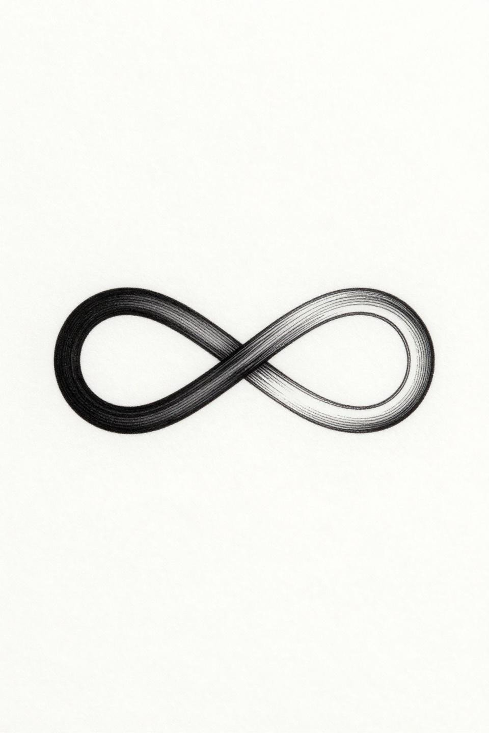
Two intertwined infinity symbols forming a continuous loop, one solid black with fine serif edge detailing and the other as a delicate single-line outline, sharing one precise common junction point, executed in hairline 0.5mm single-needle strokes with open negative space. The line weight variation between the solid and outline loop carries the entire visual meaning of this design. Flatten that contrast and it becomes a generic infinity symbol.
On olive and deeper skin tones, the single-line outline loop needs to be bumped to at least a 3RL to maintain readable contrast against the skin over time. The solid black loop holds indefinitely. The outline is the element to protect with placement and artist selection.
Pull the three to five designs from this collection that match your actual placement and skin tone, not the ones that look good on white paper. Send those specific references to your artist, not the full board. A focused reference set gets you a better consultation and a more accurate quote.
If the design does not have a clear physical or compositional link between the two elements, it is two separate tattoos, not a paired set. That distinction matters. Choose accordingly.