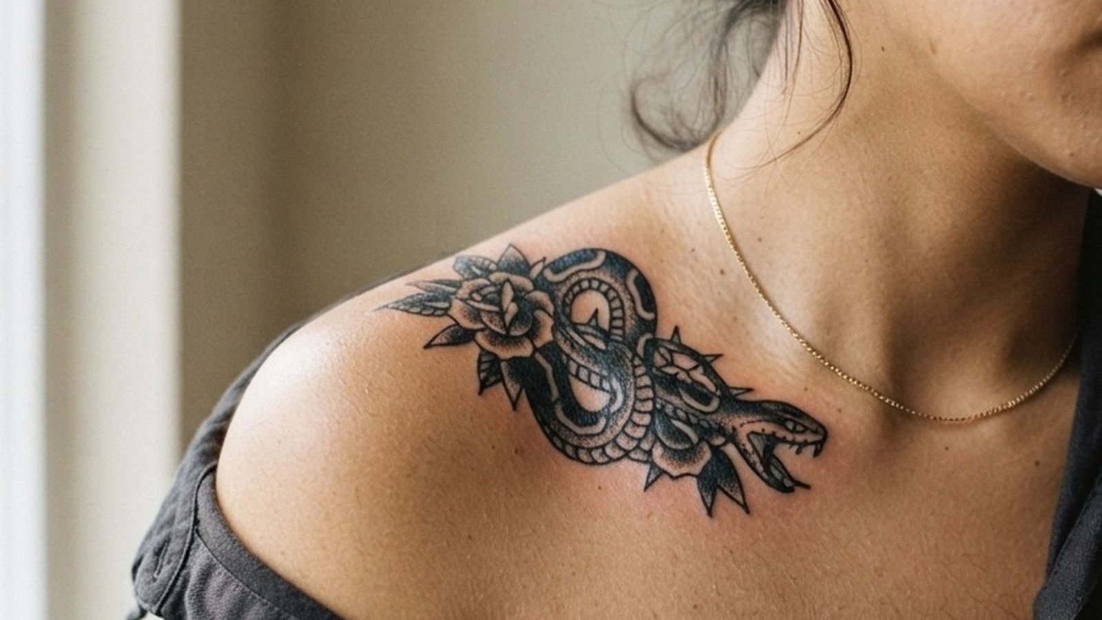
Japanese tattoo fails when the artist treats it like illustration. The style is architecture: every element, wave, cloud, petal, scale, exists to fill body contours and move with muscle groups, not sit flat against skin like a sticker.
The gap between passable and serious irezumi is visible in healed work. Flat fills that patched during healing, grey wash that muddied at year two, outlines that spread because the artist ran too shallow. These references show what correct execution looks like before it touches skin.
Noh Mask Grey Wash: Where Tonal Control Gets Exposed
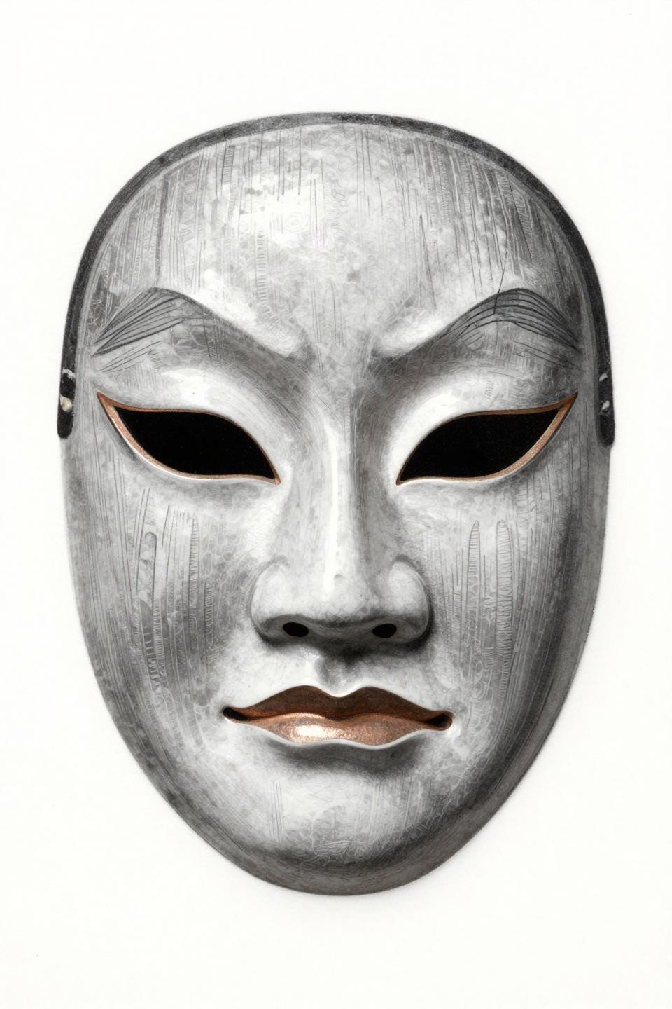
The Noh mask rendered here uses grey wash dilution from dense to open, pulling tonal depth across the porcelain face surface without relying on color saturation to do the work.
This is an artist skill signal: smooth tonal modeling with no muddy midtones requires controlled ink dilution ratios and consistent needle speed, things that only show up correctly in healed portfolio shots.
Geisha Profile: Why Asymmetric Flash Outperforms Centered Compositions
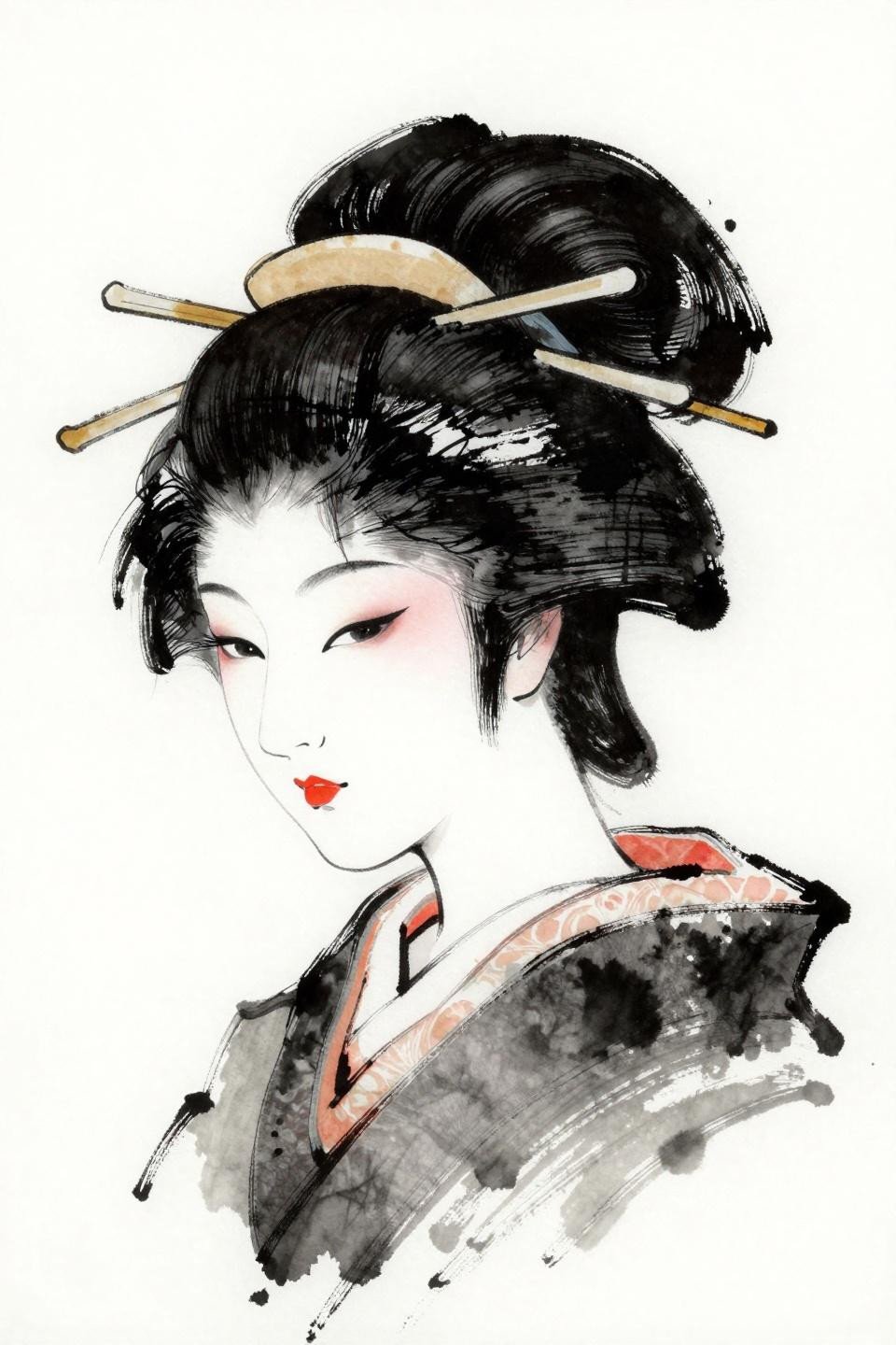
The Showa-era geisha profile uses a deliberately asymmetric, unfinished gestural quality that mirrors how traditional irezumi actually wraps a shoulder or thigh, following the body’s natural diagonal rather than fighting it.
Calligraphic wet-ink strokes like these age better than rigid mechanical linework because slight line variation during healing reads as intentional, where over-worked uniform lines can look brittle at year five.
Celtic Knotwork Meets Fukuro: A Cross-Style That Actually Holds
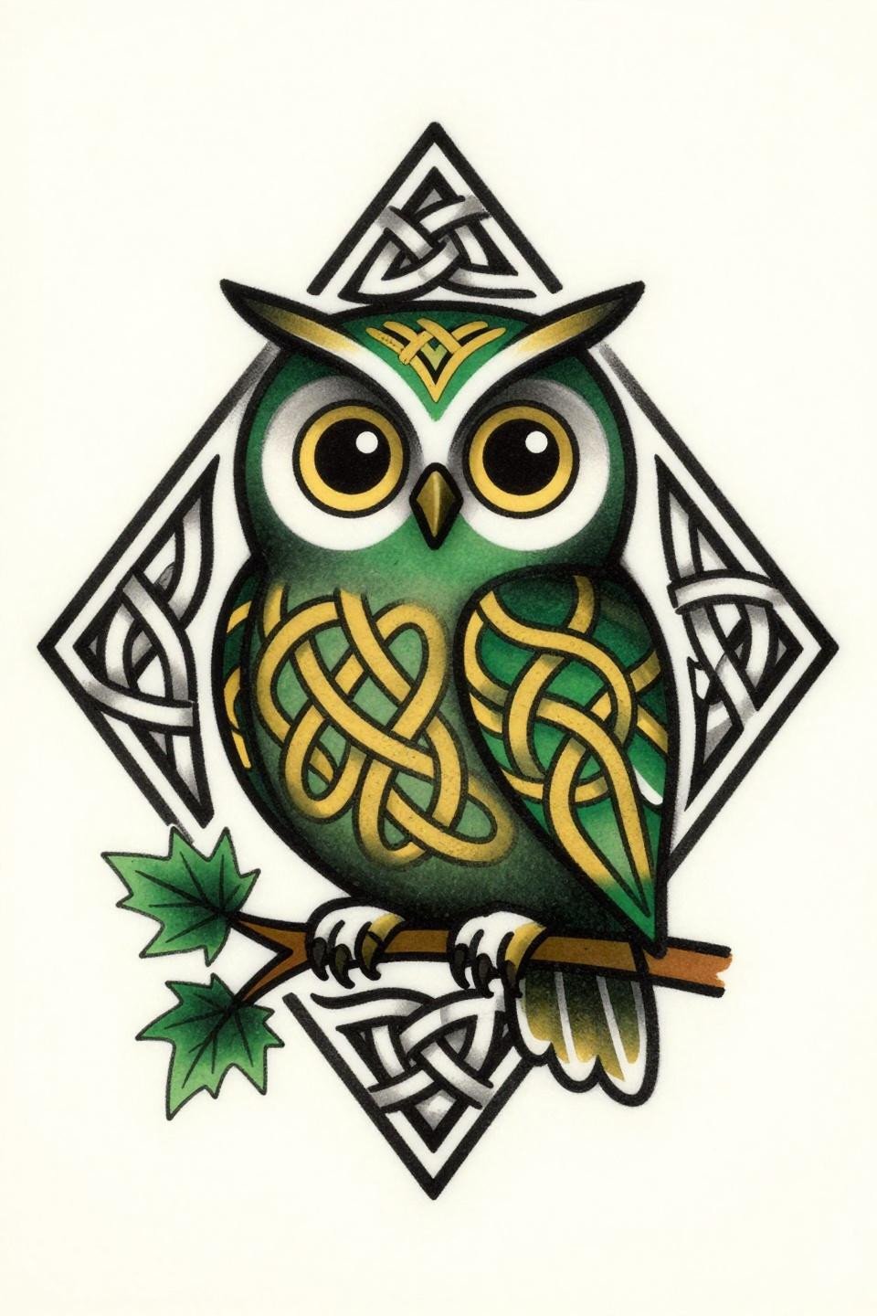
The fukuro owl body covered in Celtic knot feather patterns is a cross-cultural fusion that works because both traditions share the same structural logic: interlocking geometry with bold 2-3pt outlines that anchor flat color fills.
Forest green and gold on lighter skin tones reads with full contrast. On olive and darker skin, the gold needs to be pushed heavier in saturation, or it disappears against the warm undertone within two years.
Three-Tailed Kitsune: Circular Compositions and Upper Arm Placement
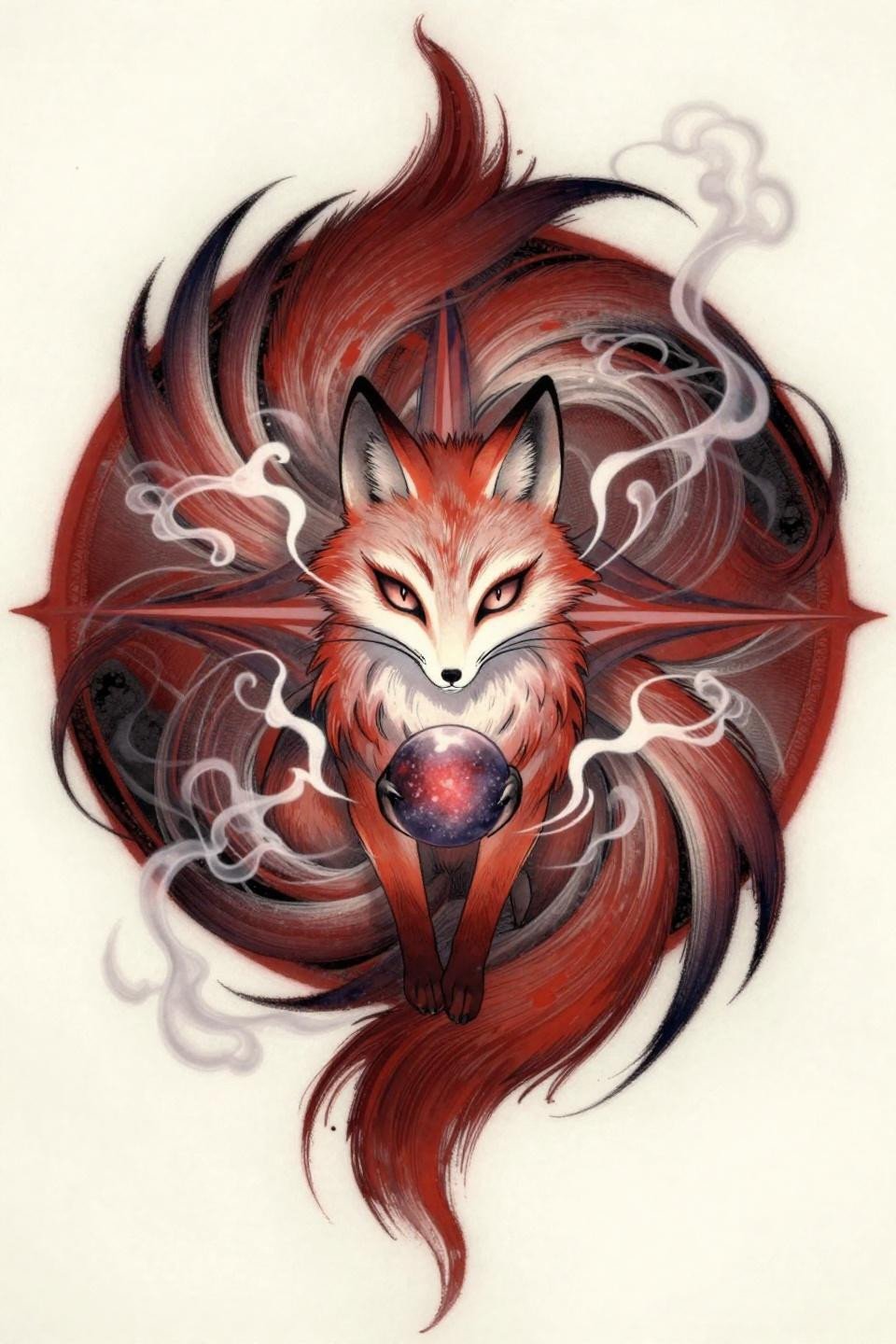
The three tails fanned into a circular mandala arrangement make this a natural upper arm or shoulder cap candidate, where the circular composition can follow the deltoid’s rounded muscle group without distortion.
Whip shading with fluid curved strokes creates the ghostly soft edges on the tail forms. The technique requires consistent needle lift speed, and uneven passes produce hard rings instead of soft gradient, visible in healed work immediately.
Side Profile Hannya: Why Bold Outlines Beat Detail at This Scale
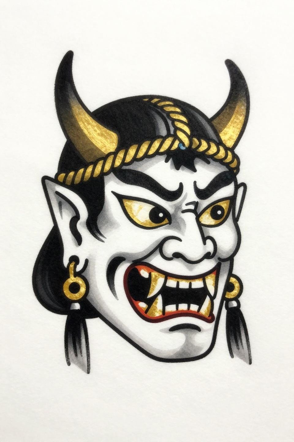
This Hannya in strict right-facing profile with bold 3pt outlines and flat black-and-gold fills follows the same structural logic as American traditional flash, designed to read clearly at distance and resist edge softening over decades.
Two-color execution, solid black plus flat gold, is a longevity move. More color channels mean more variables for patchiness during healing. Gold ink specifically needs a skilled hand for even saturation without overworking the skin.
Kabuki Mask in Traditional American Build: Red on Black Holds Its Edge
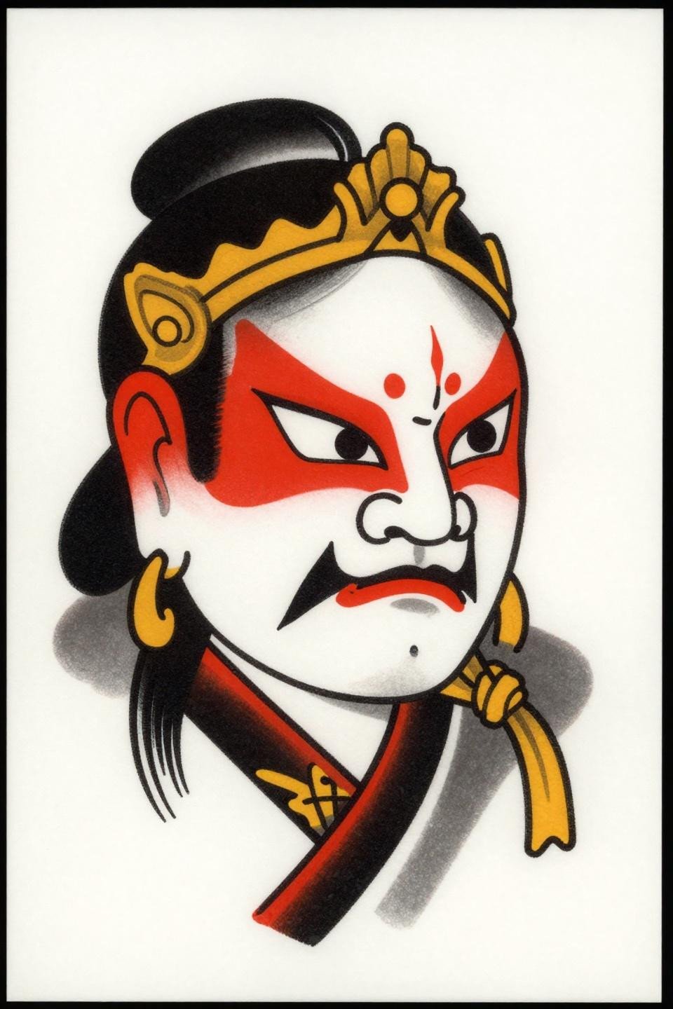
The Kabuki mask rendered in traditional American construction uses geometric red cheek patterns against solid black fields, a pairing where crimson red over black-adjacent skin maintains contrast longer than any other color combination in the spectrum.
Protected placements like the chest or upper back give this style its best shelf life. The flat fills need zero texture variation, and any patchiness signals the artist moved through the skin too fast on the first pass.
Wisteria Watercolor: The Risk Every Collector Needs to Know Upfront
The wisteria cascade in watercolor style uses loose teal washes behind calligraphic brush linework, a composition that works as reference but carries a specific aging risk the flash sheet does not show.
Watercolor fields without a solid anchoring outline blur into the surrounding skin by year three to five. The linework here may preserve the silhouette, but the wash areas will spread. Know that before committing to this execution style.
Samurai Kabuto in Woodcut Etching: The Scale and Placement Match
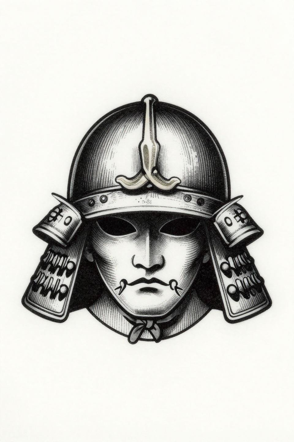
The kabuto helmet in a crosshatch etching approach uses parallel line shadow density to build form rather than solid fills, a technique that requires precise needle control to keep lines from merging into grey blobs at smaller scales.
Bilateral symmetry like this reads perfectly on the sternum or center-back placement. Any deviation in the crosshatch spacing under a magnifying glass tells you whether the artist’s hand speed is consistent. Check the healed portfolio first.
Chinese Dragon in Single-Needle: Where Fine Line Meets Its Limits
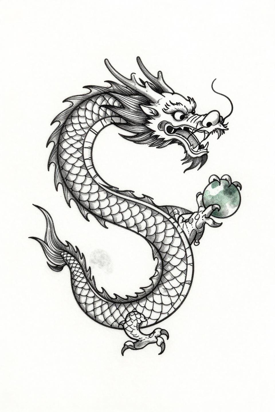
The Chinese dragon coiled in a figure-eight mandala frame uses hairline 0.5mm single-needle strokes with open negative space, a fine line approach that demands an artist who controls both machine speed and hand pressure simultaneously.
Single needle work like this ages fastest in high-friction placements. The wrist, forearm, and hand will show spread within three years. Protected placements, inner upper arm, sternum, give this style the five-to-seven year reading it deserves.
Sak Yant Dragon Build: Sacred Geometry Precision on an Organic Subject
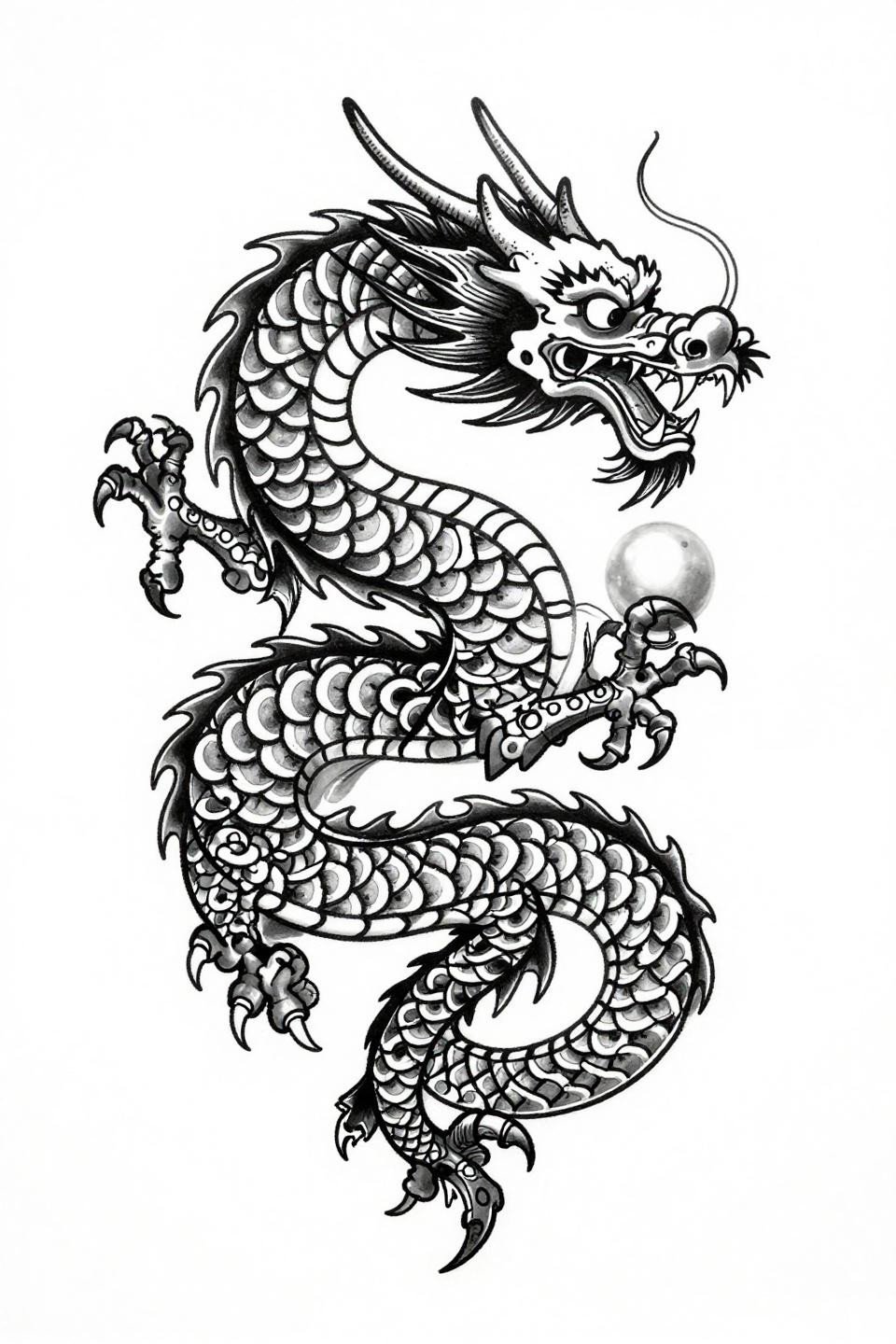
The ascending dragon in Sak Yant construction uses overlapping crescent scale geometry with bold 2-3pt outlines, a structural fusion where Thai sacred linework precision organizes the organic dragon form into a tightly controlled vertical composition.
This elongated S-curve is built for sleeve or thigh placement, where the design can follow the limb’s natural axis. The flat grey wash midtones here age cleanly because there are no soft watercolor edges to spread.
Daruma Dotwork: Stipple Gradient as a Skill Benchmark
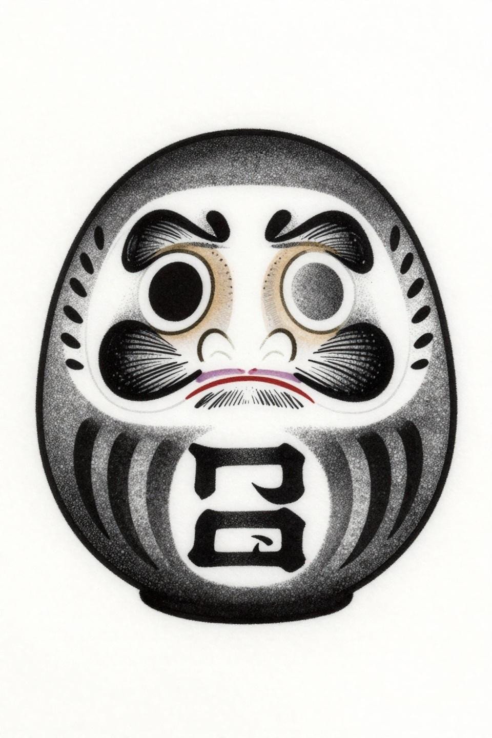
The daruma doll in dotwork uses a stipple dot gradient that runs from dense black at the center to open negative space at the edges, a technique where consistent dot size across the full gradient separates competent dotwork artists from experienced ones.
Look at the dot size uniformity in the transition zones specifically. Inconsistent dot size in the midtone range means the artist was working at uneven speed, and that inconsistency shows even more in healed skin than in fresh shots.
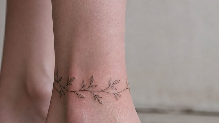
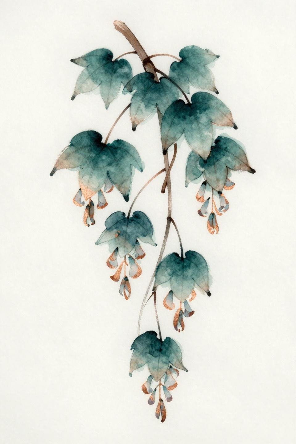
Irezumi Cherry Blossom: The Diagonal Flow That Survives Placement Stress
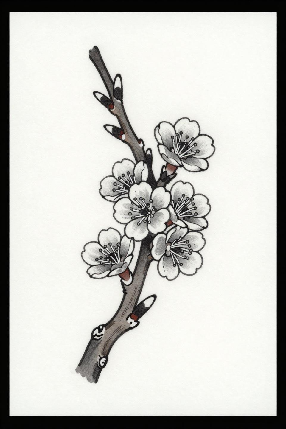
The diagonal asymmetric cherry blossom branch follows traditional irezumi composition logic, where the design is built to wrap a limb or follow a ribcage rather than sit flat as a centered panel.
The bold 2-3pt outlines with flat fills make this a decade-stable design. No soft gradients to spread, no fine lines to blur. This is the correct structural approach for anyone asking whether a floral will still read at year ten.
Maple Leaf in Art Nouveau Ink: Variable Line Weight as a Longevity Signal
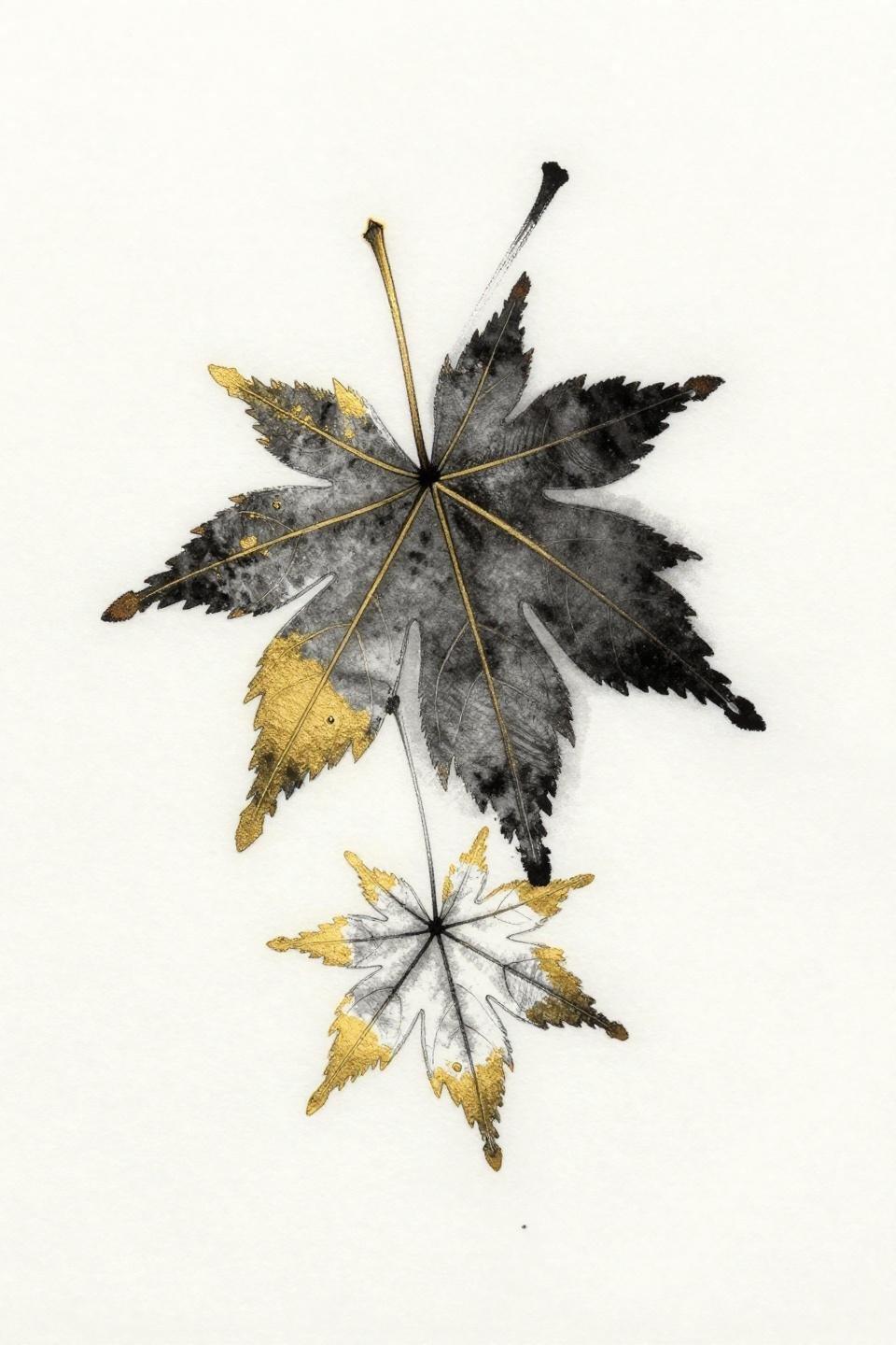
The Japanese maple leaf in Art Nouveau construction uses variable line weight through calligraphic brush marks, thickening at the vein base and tapering at the lobe tips, a structural choice that gives the single leaf more visual mass than its actual footprint.
Liquid gold ink on this design requires a skilled hand at saturation. Thin gold lines under-saturated will fade to a yellowish ghost within two years. Bold weight application is the only way this color reads long term.
Peony Fine Line Botanical: Why Scale Determines Survival Here
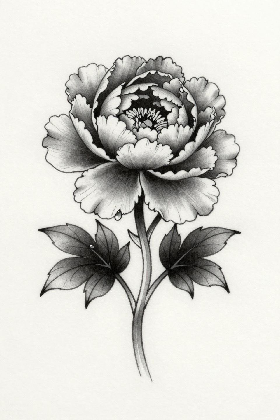
The peony in botanical scientific style uses 0.5mm single-needle strokes with weight variation along petal edges, a fine line approach that photographs sharply but demands a minimum scale to survive on skin.
Below fist-size, the petal layering collapses into grey noise within three to five years. This design needs real estate, minimum palm-size, on a low-friction placement to maintain the petal separation that makes it worth doing at all.
Geometric Koi in Tribal Build: The Ascending Diagonal That Never Ages Out
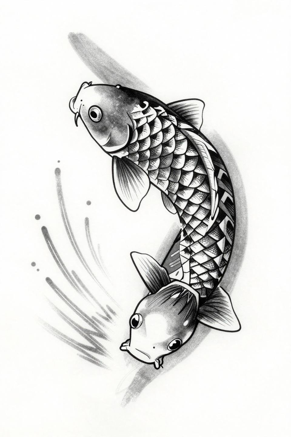
The koi mid-leap in tribal geometric construction replaces organic scale curves with overlapping triangle geometry and dense crosshatch fills, a blackwork approach where the design holds full saturation at year ten without the fading risk of color fills.
The upward diagonal motion maps directly to forearm or calf placement, where the fish ascending the limb follows muscle direction rather than cutting across it. This is placement logic that should drive the decision before the artist books the session.
Irezumi Oni Mask: Asymmetry as a Technical Commitment, Not a Style Choice
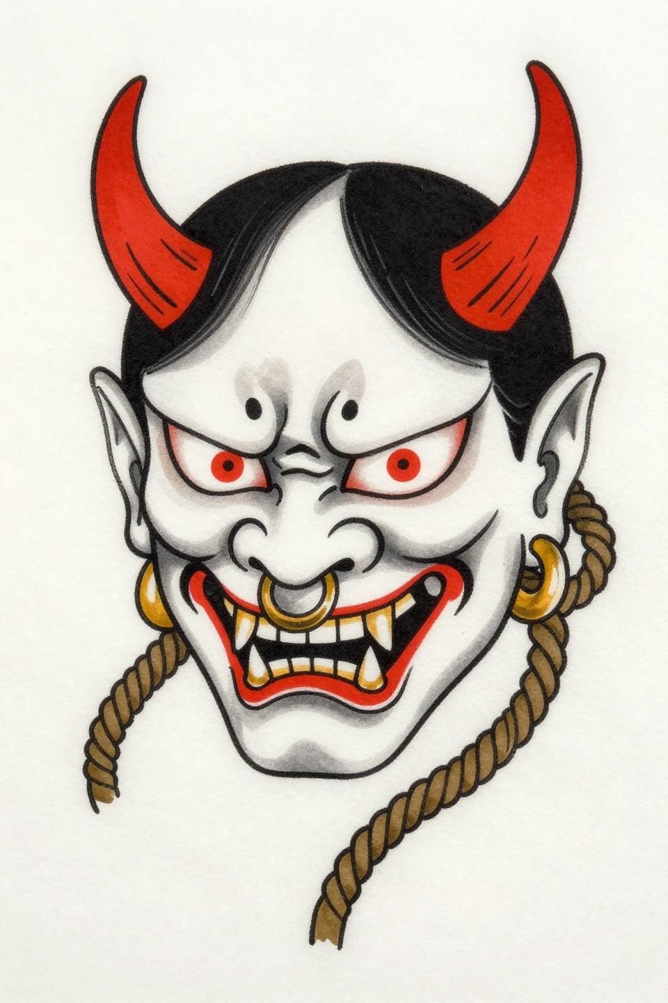
The Oni mask with asymmetrical horns and one eye wide, one narrowed, uses deliberate asymmetry to generate tension that a mirrored composition cannot produce. The rope-pattern cheek wrapping is a detail that signals irezumi literacy, not decoration for its own sake.
Crimson red fills against solid black fields are the most stable color pairing in Japanese tattooing. On any skin tone, this contrast holds. Artists who skip a second pass on the black fields produce patchy results that compromise the red’s impact within two years.
Narrow these references down to three based on your placement and skin tone before the consultation. That combination eliminates half the decision. The collector who walks in with a placement and a scale already chosen gets a better tattoo than the one who shows up with sixteen options and no commitment.