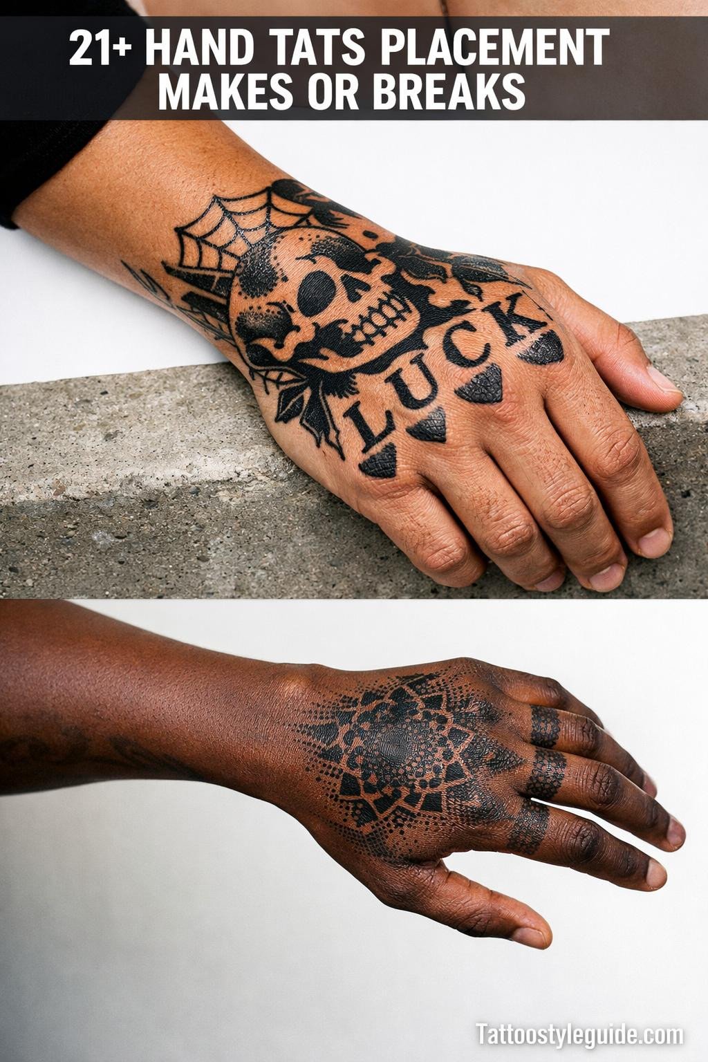
Hand tats fail at a higher rate than almost any other placement, and the reason is almost never the design. It’s the scale, the skin quality, and whether the artist accounted for constant movement and UV exposure. Most collectors learn this after the fact.
The palm creases, the knuckle folds, the sun-exposed dorsal skin. Each zone behaves differently under the needle and ages on its own timeline. Knowing which designs survive which zones is the difference between a ten-year piece and a two-year touch-up cycle.
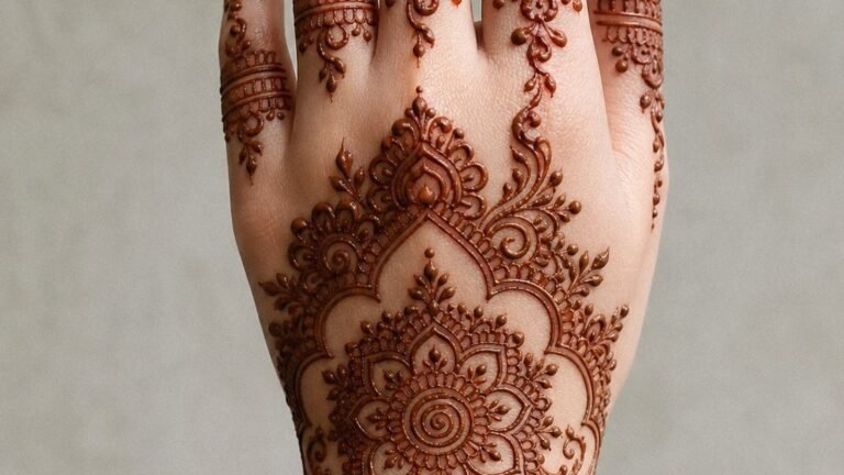
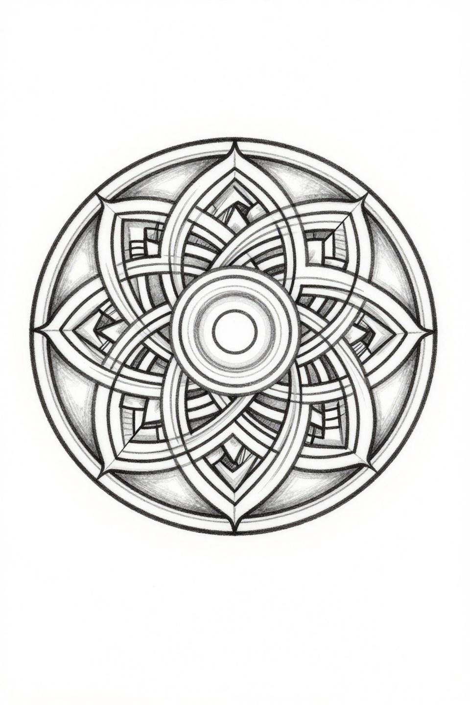
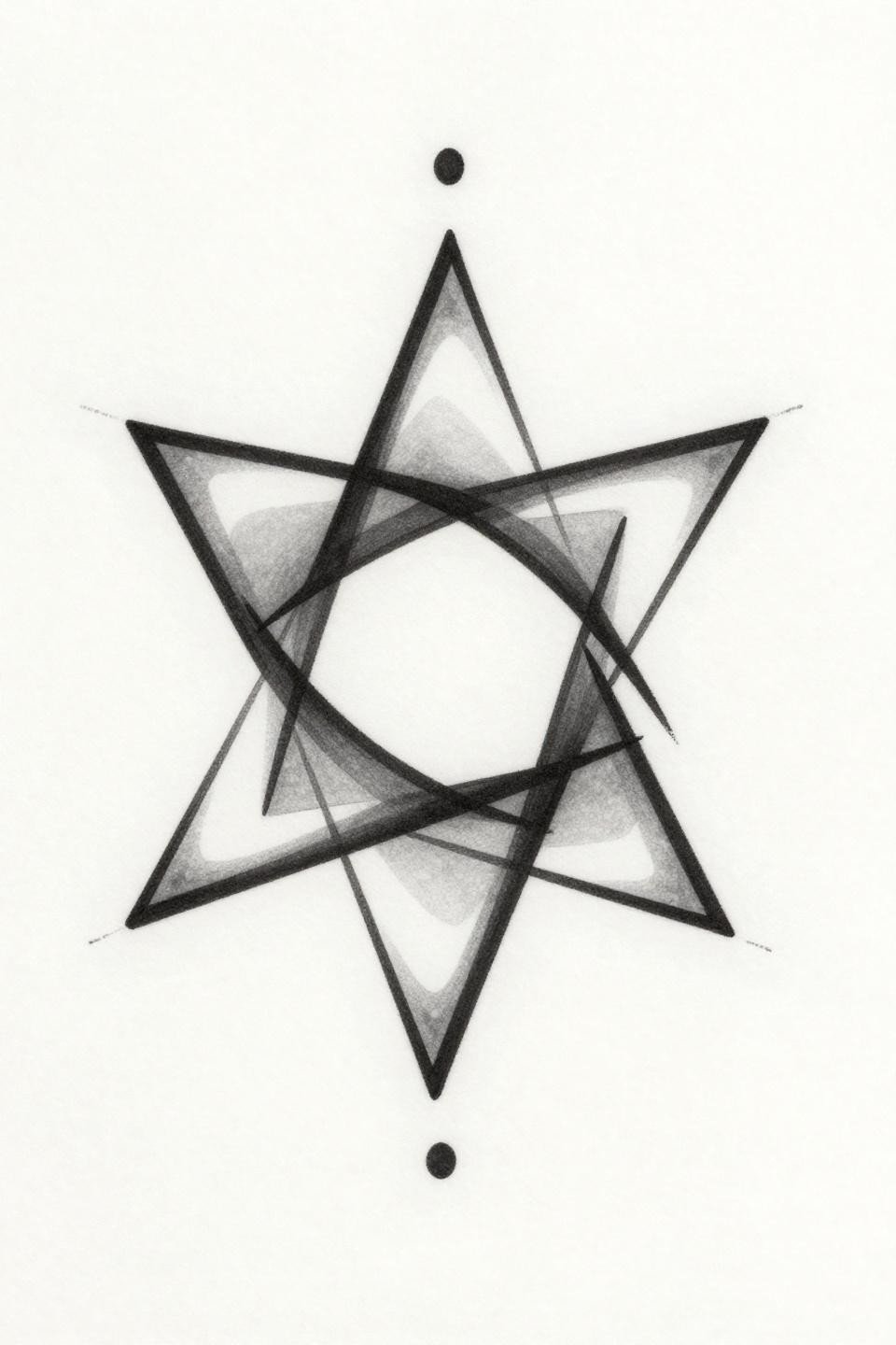
Sak Yant Geometry Built for the Hand’s Center Mass
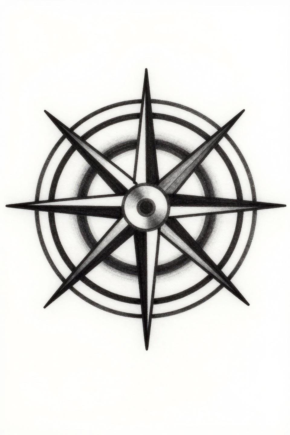
This Sak Yant-influenced compass mandala uses an eight-pointed star radiating from a tight central circle, with nested angular rings anchoring the cardinal marks. The bold 2-3pt outline weight is exactly what survives the back-of-hand environment over time.
Designs with this much density read best centered on the dorsal surface, where the skin is flatter and more stable. On olive and darker skin tones, the thick outline structure maintains contrast as the black softens over years.
Fine Line Lotus: Where Hairline Strokes Meet Their Limit
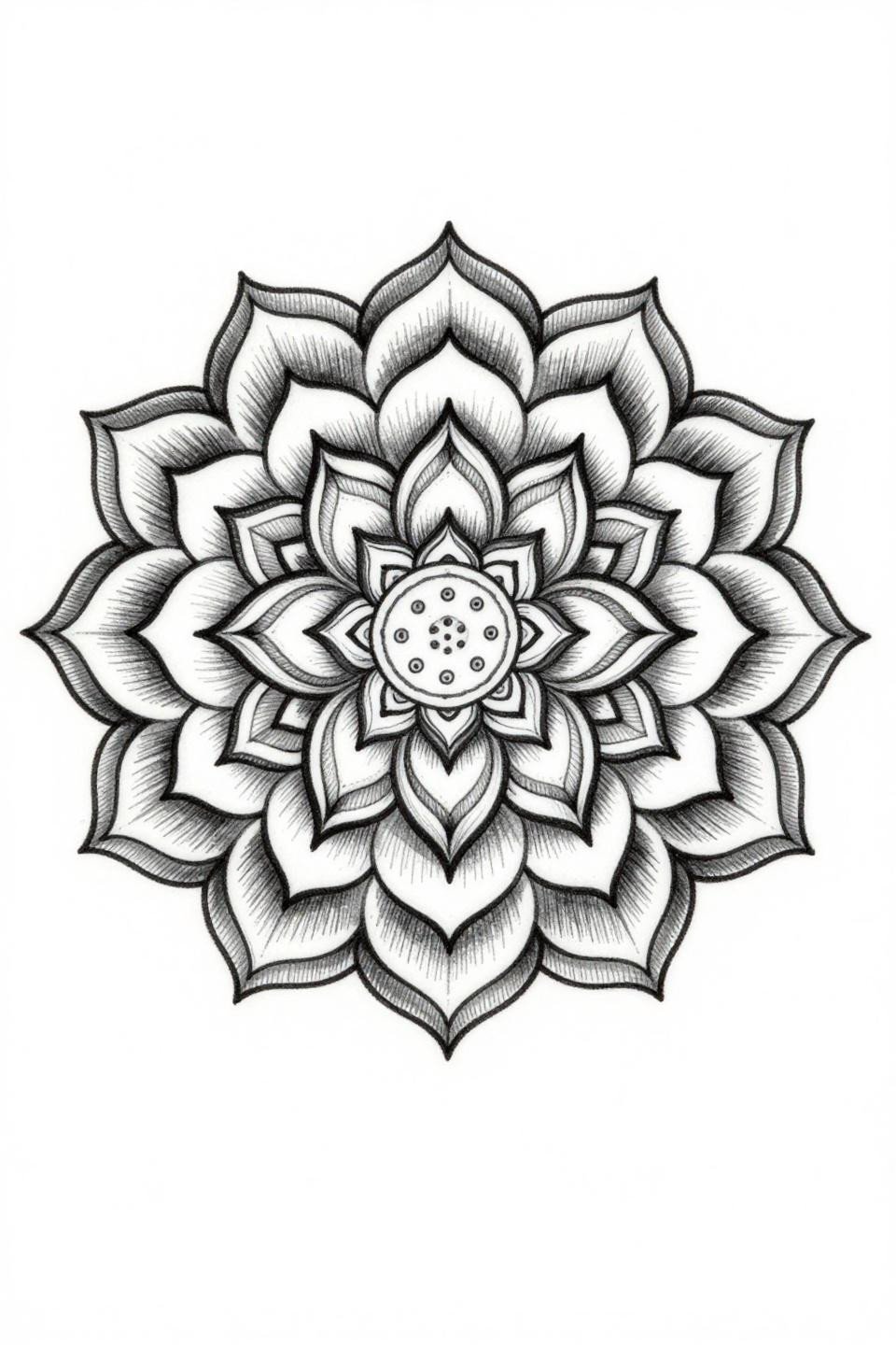
A nested concentric lotus mandala executed in single-needle 1RL work, with hairline tendrils extending from the outer petal ring. The grey wash dilution creates midtone depth without adding outline weight.
This is a high-risk design for hand placement. Single-needle strokes at this scale need a protected zone, ideally the inner wrist or sternum. On the hand, expect migration in the fine lines within three to five years without touch-ups.
Feather Flash That Earns Its Diagonal Angle
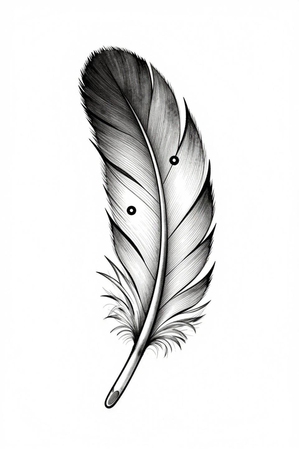
A fine line feather in asymmetric diagonal tilt, with geometric divisions nested along the central spine and three micro dots placed along the barbs. The taper weight variation along the quill is the technical signal that separates this from generic feather flash.
Diagonal orientation works on the back of the hand because it follows the natural angle of the metacarpal bones. Artists who understand hand anatomy orient the design with the structure underneath. Those who don’t center it vertically and regret it.
Celtic Knotwork in a Diamond Frame: Containment Logic
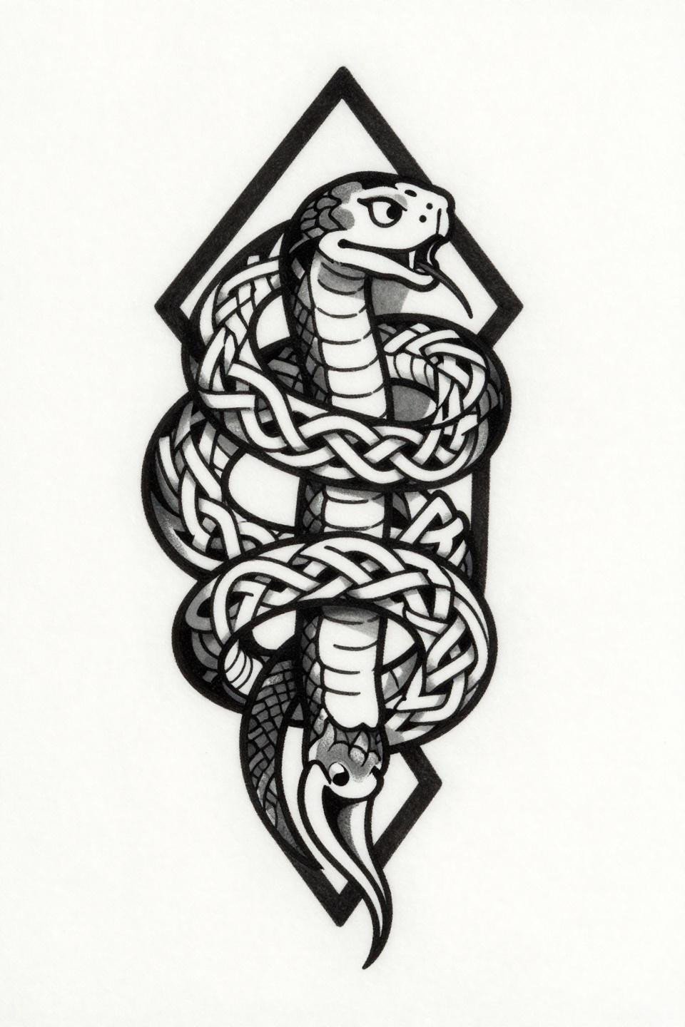
An angular Celtic serpent locked inside a bold vertical diamond frame, with interlocking knot patterning across body segments and a forked tongue pointing downward. The diamond containment frame is doing functional work here, keeping the design readable as the surrounding skin ages.
Framed designs hold their shape on the hand longer than unframed ones. The border gives the eye a fixed reference point when the fill begins to soften. Worth considering when browsing henna hand designs for inspiration, where this framing logic appears constantly.
Inner Finger Arrow: The Placement Is the Problem
![]()
A clean geometric arrow with nested parallel lines along the shaft and a single diamond at the apex, executed in single-needle 1RL precision work. The design itself is well-composed.
Inner finger tattoos are temporary tattoos that cost permanent tattoo money. The friction, flexing, and constant skin renewal in that zone means this needs a touch-up every two to three years minimum. Go in knowing that.
Trash Polka Serpent: High-Contrast, Short Window
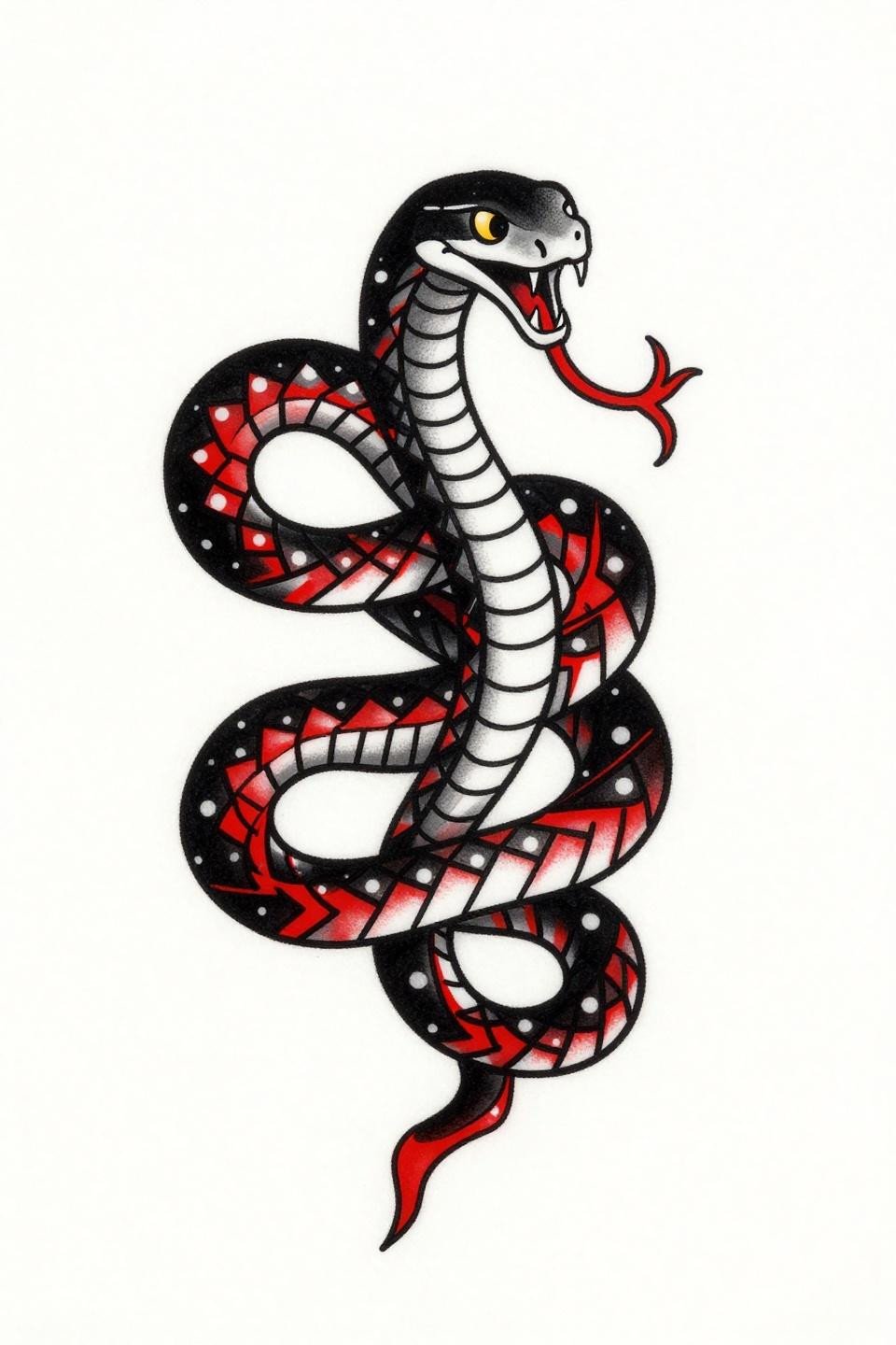
A geometric serpent coiled in a figure-eight loop with angular faceted scales, bisected by jagged crimson slash cuts in classic trash polka execution. The whip-shaded red slashes across solid black geometry create the style’s signature tension.
Trash polka on the hand reads aggressively fresh but the red pigment fades faster than the black structure around it, creating a two-speed aging problem. This design needs someone who commits to the retouch schedule.
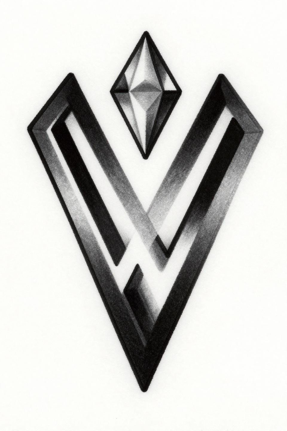
Ignorant Style Diamond: Why the Crude Line Is the Point
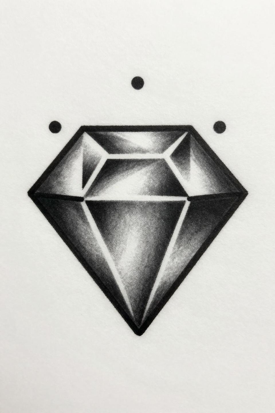
A crude bold-outlined diamond with nested triangular facets and three micro dots at cardinal points, drawn as a single unbroken stroke. Ignorant style’s thick 3pt outline is actually longevity-smart for finger placement, where line weight is the only thing that survives.
The rawness here is intentional and technically justified. Thin lines on fingers blur into grey suggestions within a few years. Bold closed-form designs like this one stay legible longer than anything with interior detail.
Geometric Rose With Watercolor Bleed: Know the Trade-Off
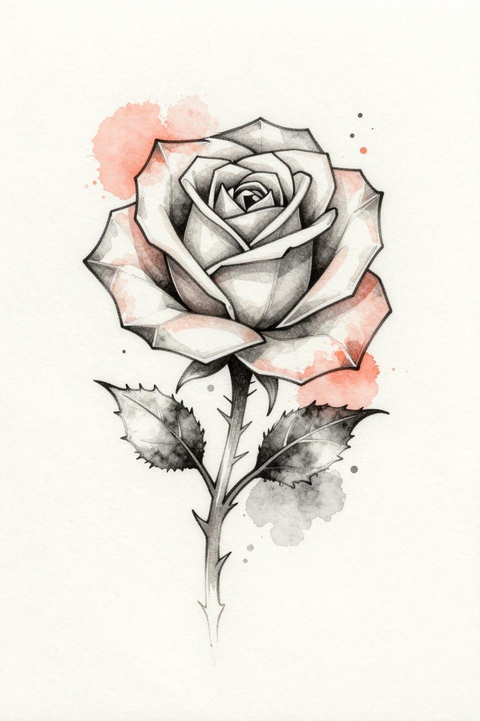
A geometric rose with angular faceted petals and a thorned stem, where coral watercolor blooms bleed into the charcoal outline skeleton. The anchoring linework skeleton is what makes this version more durable than pure watercolor applications.
Watercolor without a bold outline base blurs by year three to five on most placements. Here the geometric outline structure slows that process. On the hand, lighter skin tones will hold the coral bloom longer than olive and deeper tones. Check back tattoo ideas for women if you want this style in a more protected placement.
Woodcut Etching at the Knuckle: Texture Before Scale
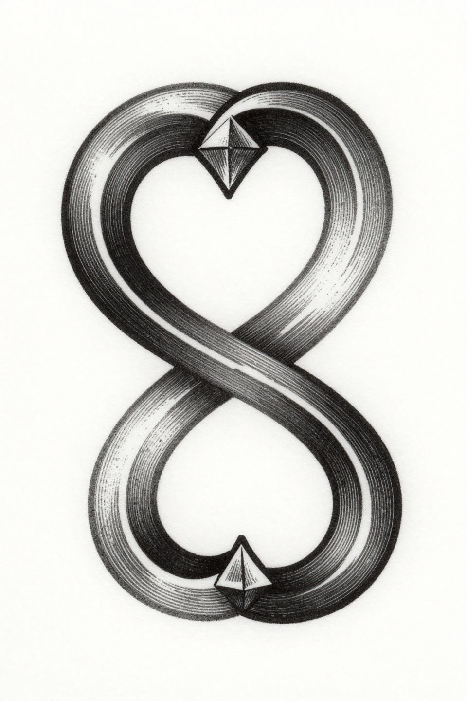
Two intersecting curved arcs forming an infinity loop, with an offset diamond at convergence and parallel line engraving texture throughout. The crosshatch shadow density gives this design visual weight without needing solid fills.
Woodcut-style linework ages differently than solid black. The parallel lines can merge at the edges over time, which can read as intentional texture thickening or muddy fill depending on how tight the spacing was at application. Ask your artist to space the engraving lines at 1.5mm minimum for hand placement.
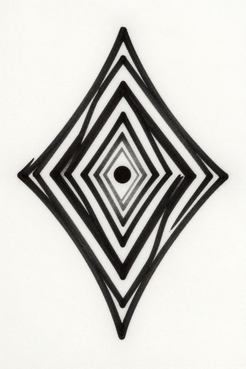
Geometric Moon Fine Line: Placement Decides Everything
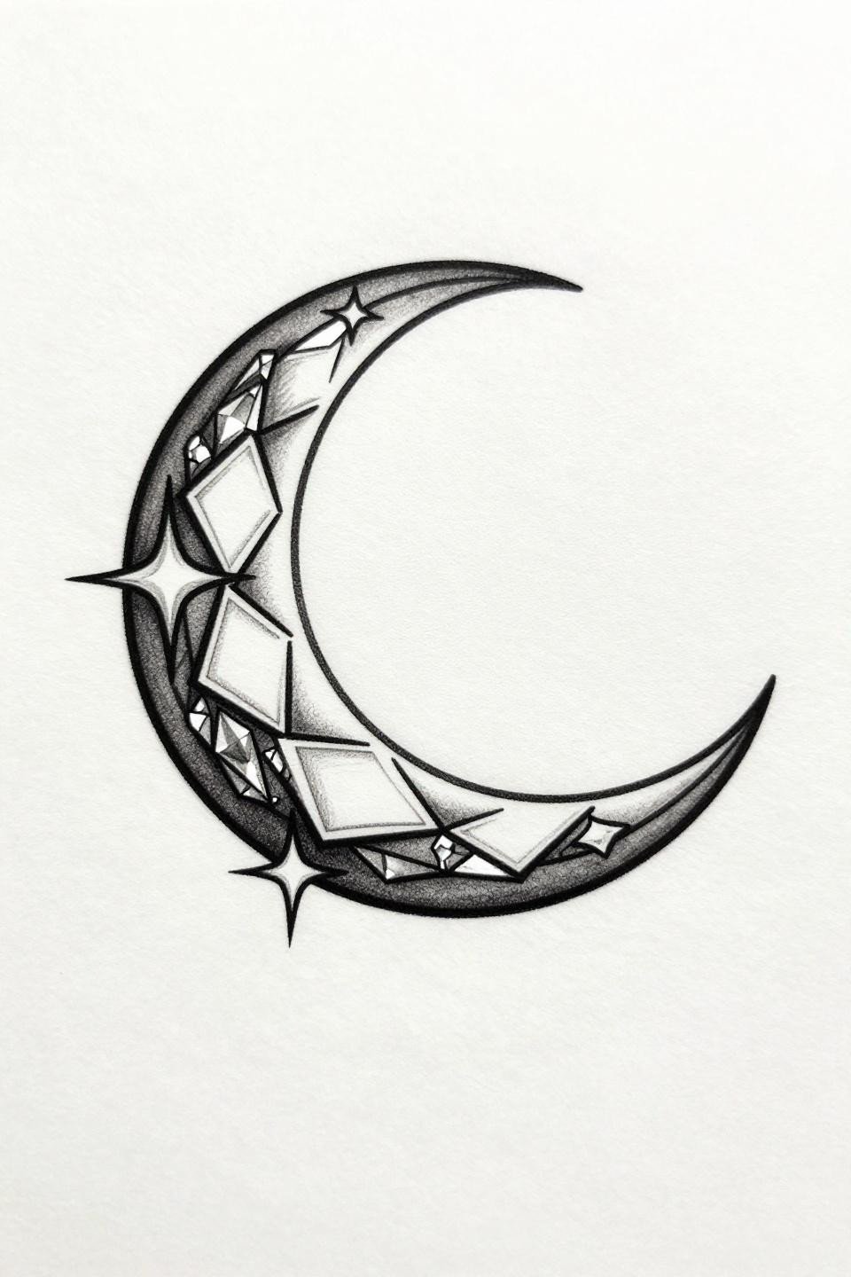
A crescent moon with crystalline geometric facets along the inner curve and three sharp star points radiating from the outer edge, executed in pure hairline work with zero fills. The zero-fill single-needle approach is striking on paper and aggressive on hand skin.
This design belongs on the inner wrist or sternum, not the hand dorsum or fingers. The negative space strategy only works where the skin is less exposed and less mobile. On hands, UV and friction will erode the hairline detail within two years.
Sketch Style Sigil: Reading the Construction Lines
Two interlocking angular brackets forming an abstract strength sigil, with a micro dot at the convergence point and visible construction lines as part of the design language. The intentional rough sketch marks read as collector-coded rather than unfinished.
Sketch style relies on the imperfection being consistent throughout. If the rough marks appear in some areas and disappear in others, it reads as inconsistent execution rather than a stylistic choice. Check healed work portfolios before booking this.
Art Nouveau Hexagon: When Color Pigment Matters
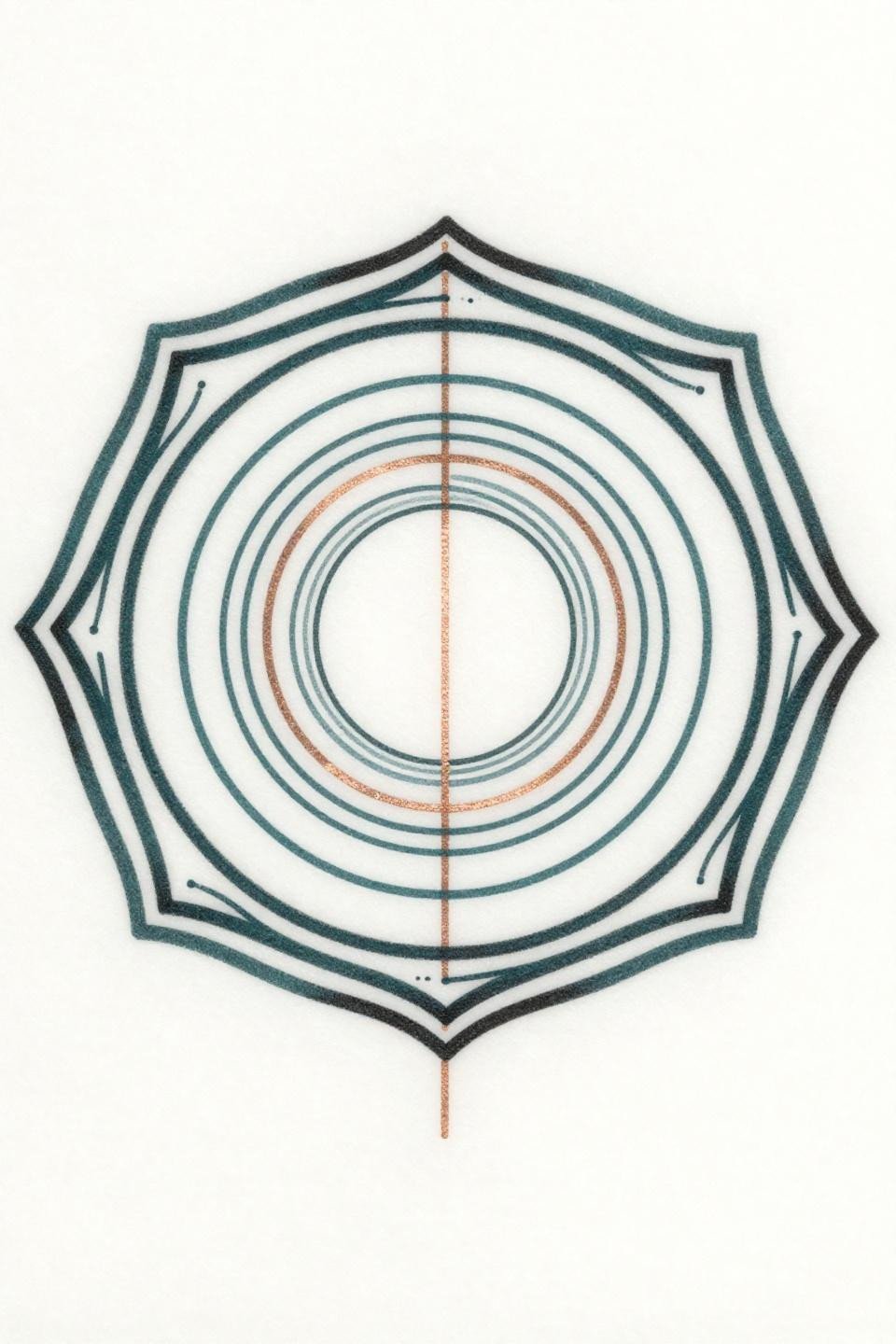
A geometric hexagon with nested concentric circles, a bisecting vertical accent line, and art nouveau organic curves at the outer border, rendered in deep teal and copper metallic ink. The teal and copper palette is distinctive, but both pigments have documented fade rates faster than black on sun-exposed skin.
Teal ink on the dorsal hand surface will shift toward grey-green within five years without UV protection. The structure of this design survives, but the color story changes. Worth noting when cross-referencing mehndi patterns to adapt as permanent hand art for geometric color strategies.
Neo-Traditional Shield: Negative Space Does the Work
Three intersecting angular brackets forming a shield shape, with a diamond accent at the apex and negative space carved between the thick angular forms. High-contrast negative space cutouts in neo-traditional work read sharper on the back of the hand than filled designs do over time.
The back of the hand has enough flat surface area to support this scale. The key is placing the diamond apex toward the wrist, following the natural taper of the hand, rather than orienting it toward the fingers where the skin gets more mobile.
Old School Scorpion: Bold Outlines Earn Their Keep Here
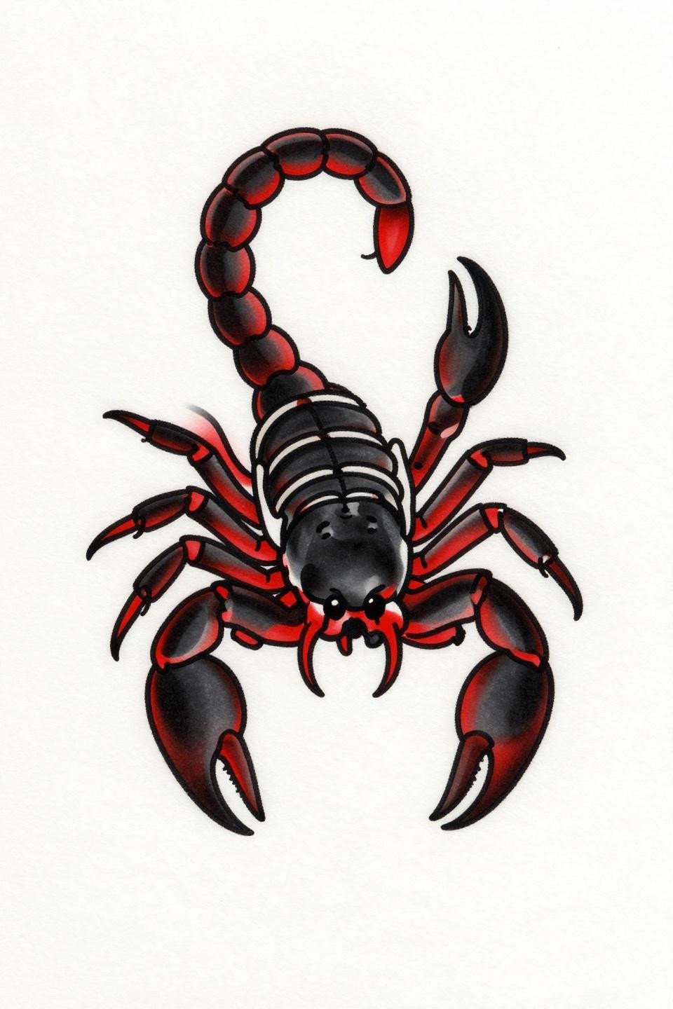
A classic sailor-style scorpion with a coiled upward tail, segmented articulation, and forward-thrusting pincers, filled in crimson red against solid black ink. The bold 2-3pt single-outline structure is why traditional American flash has survived hand placement better than any other style.
At year ten, a properly executed traditional scorpion on the back of the hand still reads. The red will have shifted warmer, the black may have softened at the edges, but the design stays legible. That’s the longevity argument for old school on this placement.
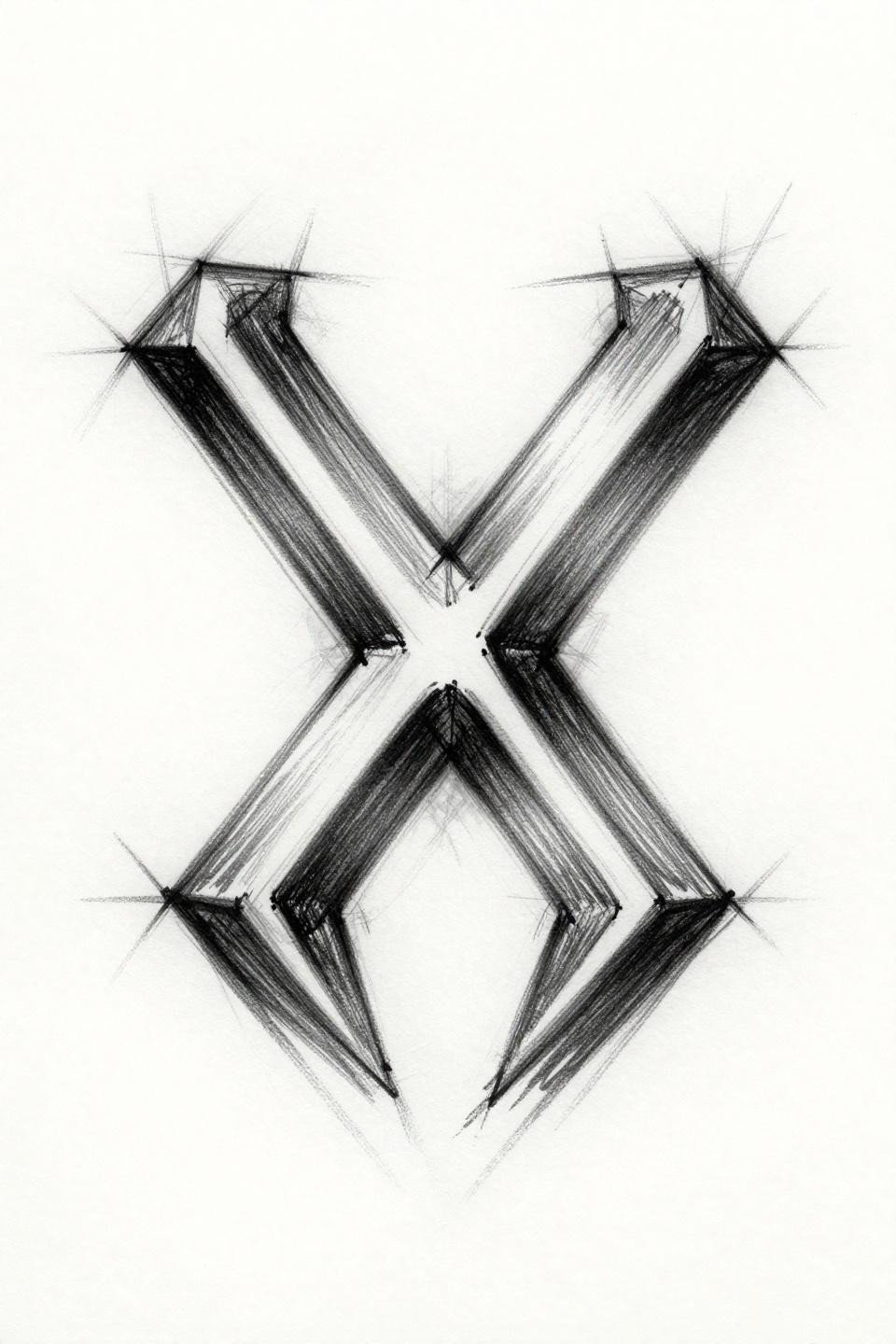
Irezumi Infinity: Brushstroke Weight on Finger Skin
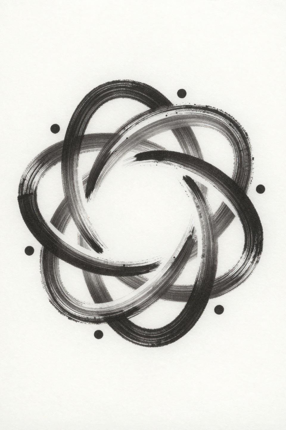
A continuous brushstroke infinity figure-eight with variable stroke weight and two micro dot accents at the intersection, executed in wet ink calligraphic quality. The variable brushstroke weight is the design’s primary visual interest and its main vulnerability on finger skin.
The thick-to-thin stroke variation that defines this piece will compress toward a uniform weight as the skin on the inner finger renews. It won’t disappear, but the calligraphic character will flatten. That’s an acceptable trade-off if the collector understands it going in.
Tribal Triangle: When Saturation Is the Whole Plan
A large equilateral triangle with nested horizontal line divisions, a single off-center accent dot, and bold tribal angular lines forming a diamond frame around it. Full black saturation at this density requires an artist who commits to multiple layered passes, not one heavy-handed single pass.
Blackwork at full saturation holds indefinitely if the application is correct. The tell is patchy fill with visible underlying skin between ink deposits. Flat, even fills with no patchiness are the veteran signal. Ask to see healed blackwork specifically.
Sacred Geometry Finger Ring: The Touch-Up Is Built In
Interlocking circles forming a sacred geometry mandala with compass-drafted precision, clean angular intersections, and a single centered dot. Used as a finger ring placement, this is one of the cleaner single-needle sacred geometry applications in current flash.
Finger ring tattoos need a touch-up every two to three years minimum. On this design, the intersecting circle structure means partial fade reads as intentional degradation, which is the best-case scenario for a placement this aggressive.
Art Deco Scarab: Bilateral Symmetry as Placement Logic
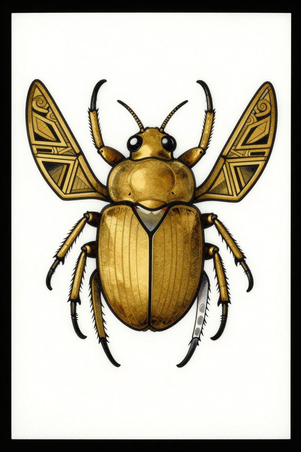
A forward-facing scarab with symmetrical art deco wing panel inlay, spiral antennae, and visible mandible detail, rendered in solid gold and black fills with bold outlines. The bilateral symmetry along the vertical axis is what makes this design work centered on the back of the hand.
Gold pigment on hand placement is a commitment. It fades faster than black and requires touch-up to maintain the two-tone contrast. On lighter skin tones, the gold reads warm and bright fresh. On deeper tones, the black structure carries more visual weight from day one.
Blackwork Dotwork Moon: Stipple Density as Aging Insurance
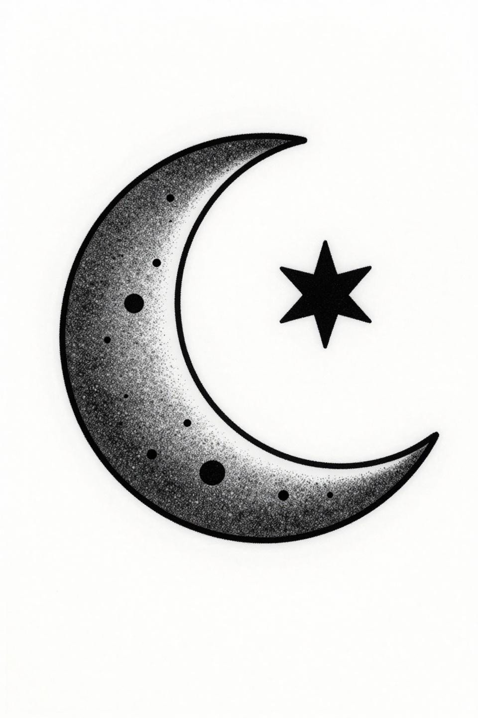
A crescent moon with a geometric star point nested in the inner curve, with stipple dot texture going from dense at the core to open at the edges. The stipple density gradient from 90% to open is doing the tonal work that grey wash does in other styles, but with more longevity built in.
Dotwork ages more predictably than linework on hand skin. Individual dots can migrate slightly without destroying the gradient read. Consistent dot size across the full gradient is the quality signal here. Inconsistent dots read muddy once they’ve softened.
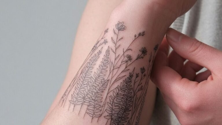
Botanical Fine Line: Where Delicacy Meets Its Deadline
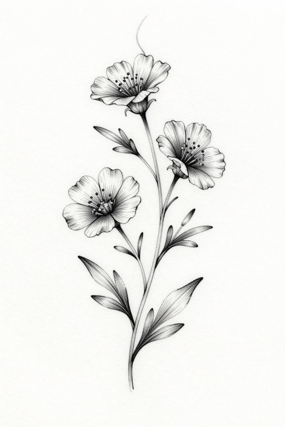
A botanical vine with three wildflower blooms, minimal paired leaves, and flowing asymmetric organic curves, executed in pure hairline work with no grey wash. The zero-fill botanical approach is the most popular hand tat request and the most commonly under-discussed in terms of longevity.
On a protected placement like the inner forearm, this style holds five to seven years before needing work. On the hand, that timeline compresses to two to three. This belongs on the hand only if the collector accepts the maintenance schedule.
Single Line Triangle: The Design That Holds Its Shape
Abstract interlocking triangles formed by one unbroken continuous line, with a single centered dot accent and pure open negative space throughout. The unbroken single-line construction means there are no endpoints to migrate independently, which gives this more stability than multi-element designs on the same scale.
At this level of minimalism, the quality signal is in the transitions. No wobble at direction changes, consistent line weight from entry to exit. On lighter skin, the open negative space reads clean for longer. On olive and deeper tones, the bold line weight is already correctly weighted for long-term contrast.
Pull three to five of these based on your actual placement zone, not just the design. Back of hand, inner finger, and knuckle side each have different rules. Match the design weight to the zone and send that specific combination to your artist as the reference.