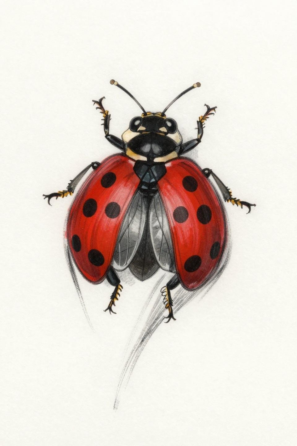
Ladybug tattoos punish scale errors harder than almost any other subject. At 2 inches or under, every line weight decision either holds or falls apart, and most artists reach for a 1RL when a 3RL outline would actually age cleaner on that placement.
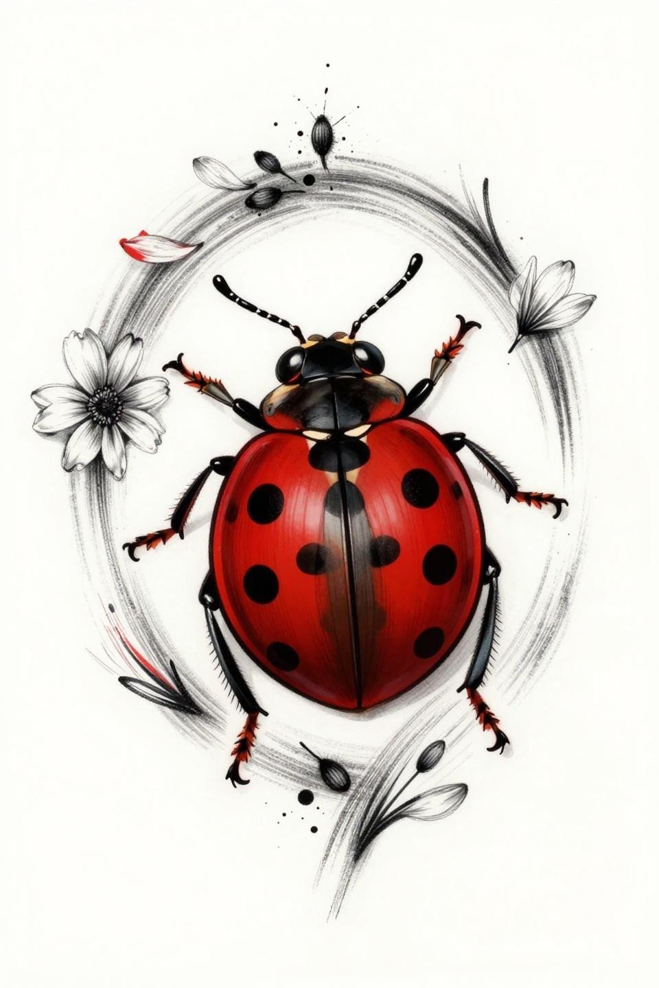
The subject has more style range than people expect. Micro realism, old school flash, dotwork, even trash polka all have legitimate ladybug references worth studying before a consultation.
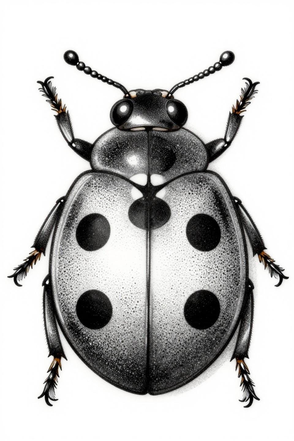
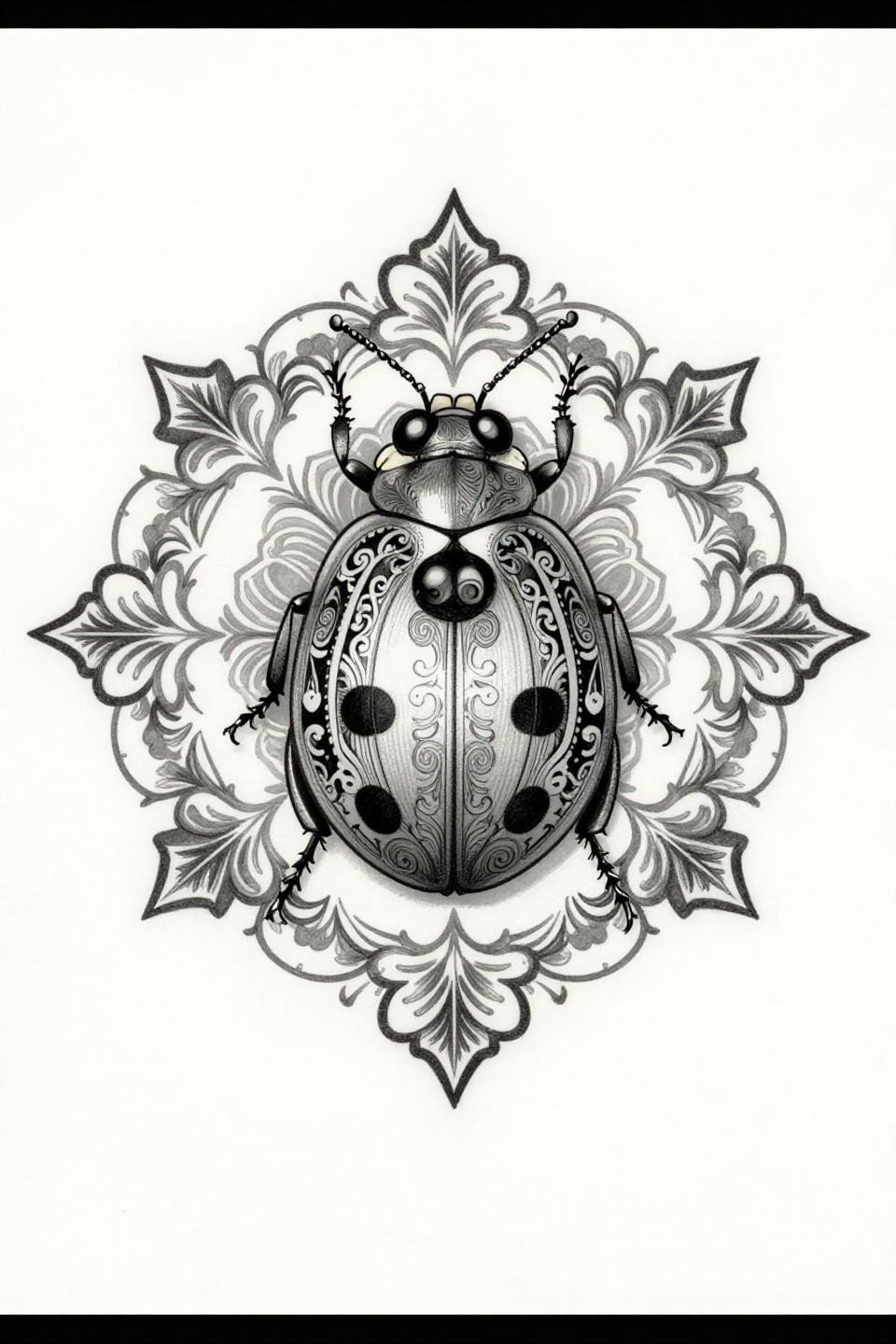
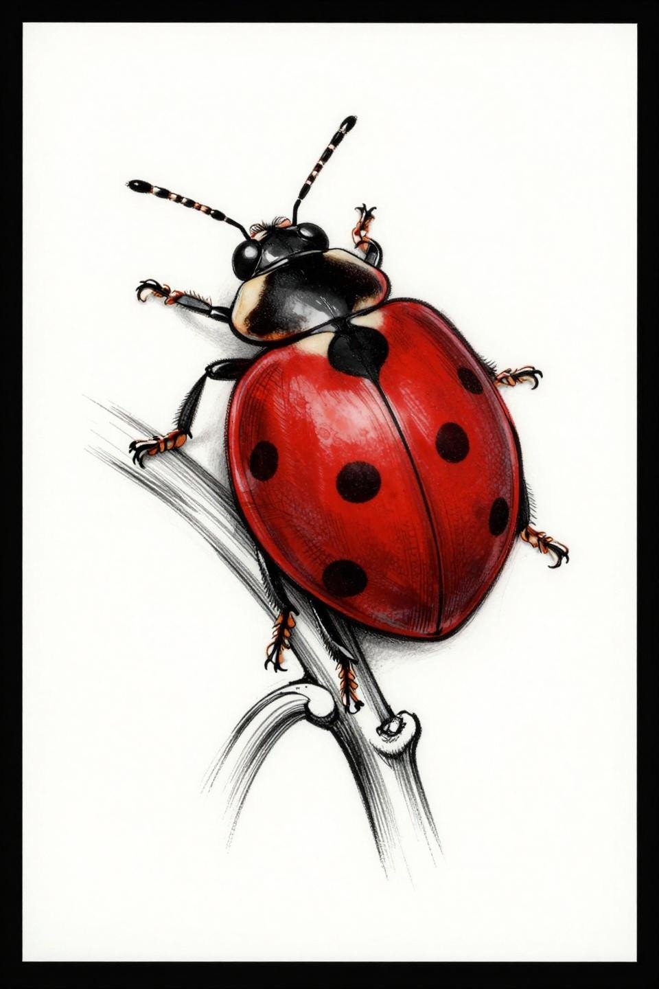
Micro Realism Ladybug: Where Single Needle Work Lives or Dies
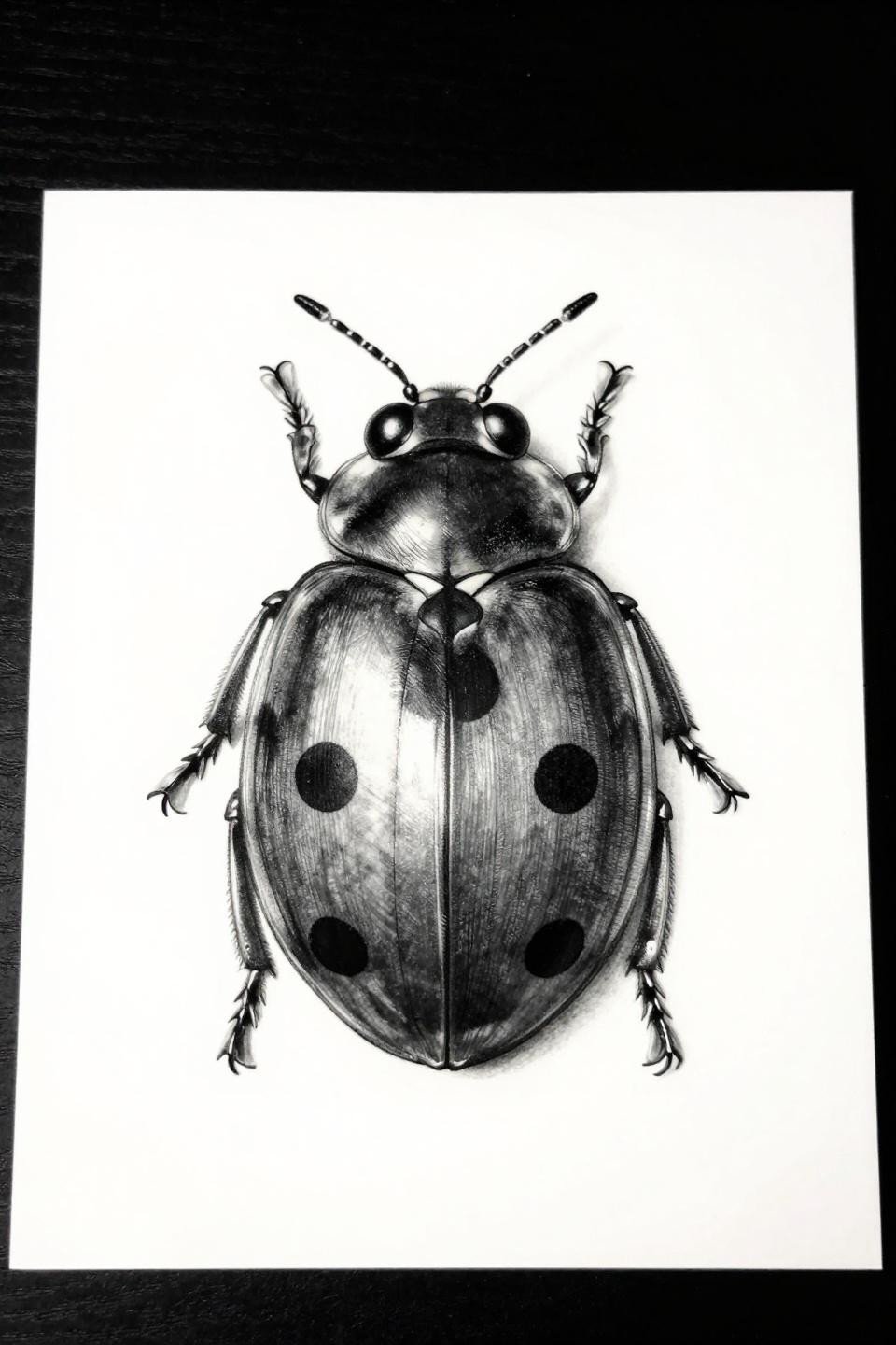
This micro realism reference uses hairline 1RL single-needle strokes with grey wash dilution from dense black at the thorax dome to near-open at the elytra edges, mapping the metallic shell highlights precisely.
On lighter skin tones this reads crisp for 5-7 years with proper sun protection. On olive and deeper tones, the fine line weight needs to be bumped or contrast collapses within three years of healing.
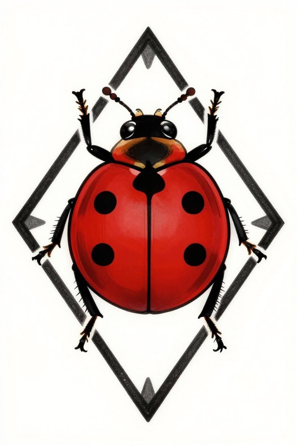
Art Deco Frame: Why the Border Does More Work Than the Bug
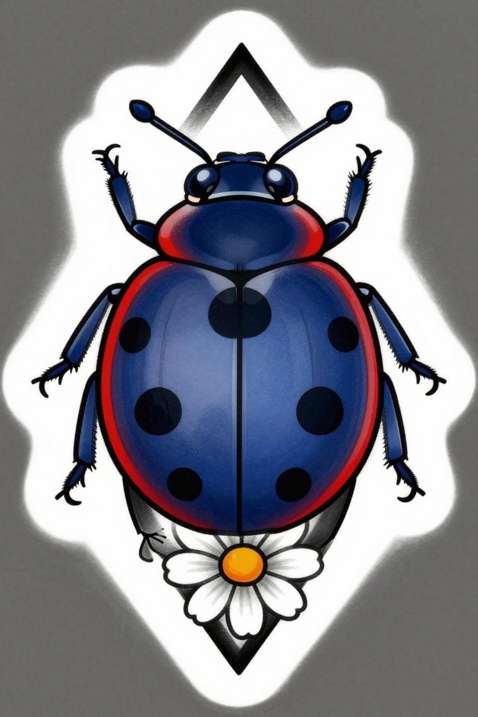
Art deco flash with a diamond frame border, five-petaled daisy perch, and bold 3pt black outlines around flat crimson and deep indigo fills. The geometric containment is structural, not decorative.
The thick outline weight here is the longevity signal. Bold 2-3pt outlines at this scale hold clean for a decade or more, which is why traditional and deco-adjacent designs outlast fine line on high-movement placements like the wrist.
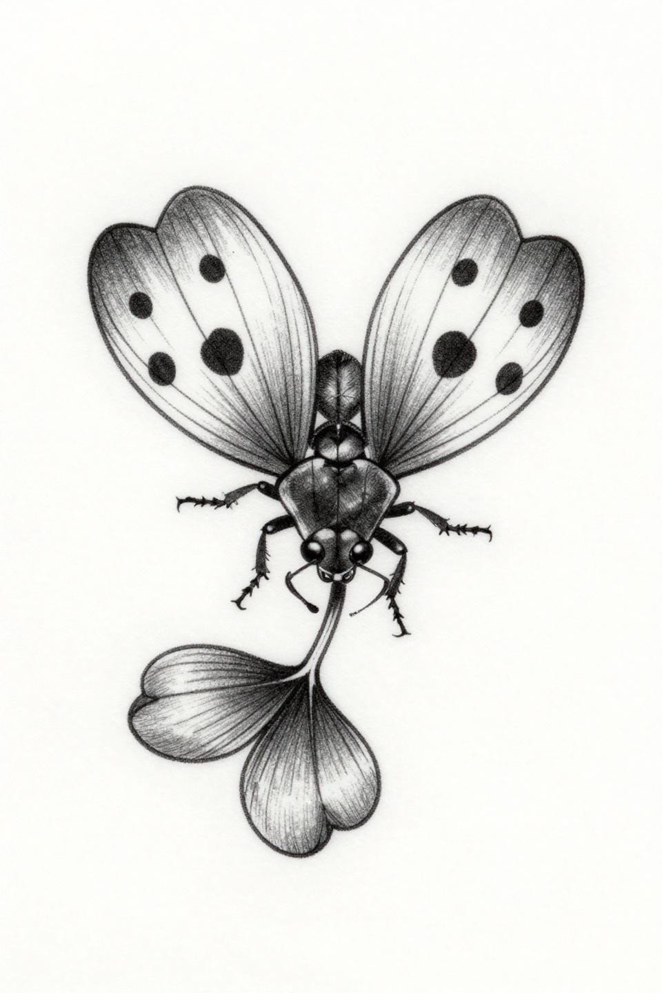
Chicano Grey Wash in Flight: Reading Translucent Wings Without Color
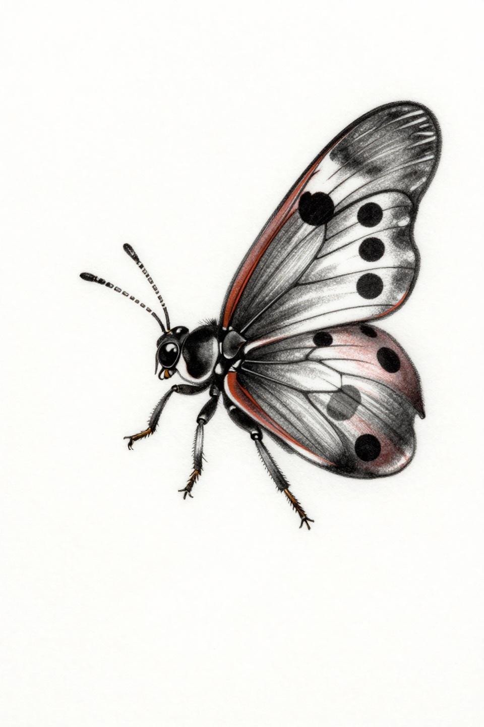
Chicano grey wash in a flight pose, elytra split to expose the hindwings with full vein network shading rendered through diluted grey wash midtones only, no solid black fields filling the form.
Grey wash dilution from dense to open like this demands an artist who controls machine speed consistently. Check their healed work portfolio specifically for grey wash pieces, not just fresh shots where everything looks sharp.
Sak Yant Mandala Frame: When Ritual Geometry Contains a Garden Bug

Lateral profile ladybug enclosed in a circular sak yant mandala frame, built entirely from parallel ruled line engraving and dense radiating strokes in burnished gold and solid black, zero grey wash.
The two-color constraint forces the visual weight into line density rather than tonal range. This style sits well on the sternum or upper chest where the radial symmetry aligns with the body’s natural axis.
Sketch Raw Style in Ascent: Loose Line as a Deliberate Technical Choice
Ascending flight composition with gestural loose linework on the sketch raw style reference, the elytra in V-formation and hindwing veining rendered through confident single-pass strokes rather than built-up shading.
Sketch style reads as deliberate only when the artist controls the wobble. The tell is the curves at direction changes. No hesitation marks, no doubled lines where the needle lifted.
Old School Ventral View: The Underrated Angle That Solves Symmetry Problems
Old school flash from the ventral perspective, six jointed legs splayed in bilateral starfish symmetry, bold 2-3pt black outlines containing flat crimson and solid black fills with zero grey wash or gradient.
The ventral angle is genuinely underused in ladybug references. It locks the composition into a symmetrical shape that wraps cleanly around curved placements like the ankle or shoulder cap.
Neo-Traditional Ladybug on Strawberry: Pairing Two High-Contrast Subjects
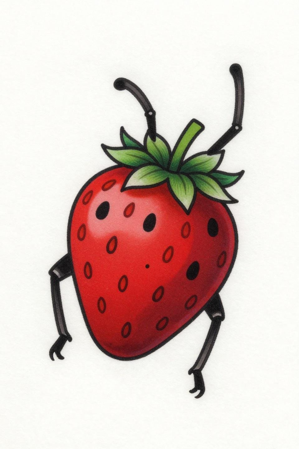
Neo-traditional diagonal composition with the ladybug mid-crawl on a strawberry, both subjects rendered in flat crimson fills and bold outlines, the strawberry’s seed dimples adding texture without competing line weight.
Pairing two red subjects in one piece works here because the value contrast between the black spot field and the red shell carries the read. On olive skin, this color combination holds longer than pink or pastel-adjacent palettes.
Dotwork Stipple Rings: How Dot Density Maps Tonal Volume
Pure tonal stipple gradient with no outlines, the form built entirely from dot density moving from 90% coverage at the thorax core to near-open negative space at the elytra margins, enclosed in concentric rings.
Dotwork at this density requires consistent dot size across the full gradient. Inconsistent dot weight is the most common failure point in stipple work and reads as muddy within the first year of healing.
Tribal Geometric Ventral: Crimson Accent in a Black Ink Architecture
Ventral climbing posture locked inside a diamond tribal frame, the angular symmetry of the border mirroring the articulated leg geometry, with crimson red as a single accent color against solid black ink.
Single-color accent in blackwork like this is a protected placement strategy. The less color, the less fading differential over time, which matters on wrist and forearm placements that see constant UV exposure.
Fine Line Clover Grip: Organic Placement Without Botanical Filler
Fine line minimal reference with the ladybug gripping a three-lobed clover stem, hairline 0.5mm single-needle strokes and open negative space replacing any background fill or framing element.
This is the format that works best on the inner wrist or ankle where negative space reads as intentional rather than unfinished. The asymmetric spot placement on the elytra is the complexity signal in an otherwise restrained design.
Watercolor Ladybird on Clover: The Anchoring Problem Every Collector Should Know
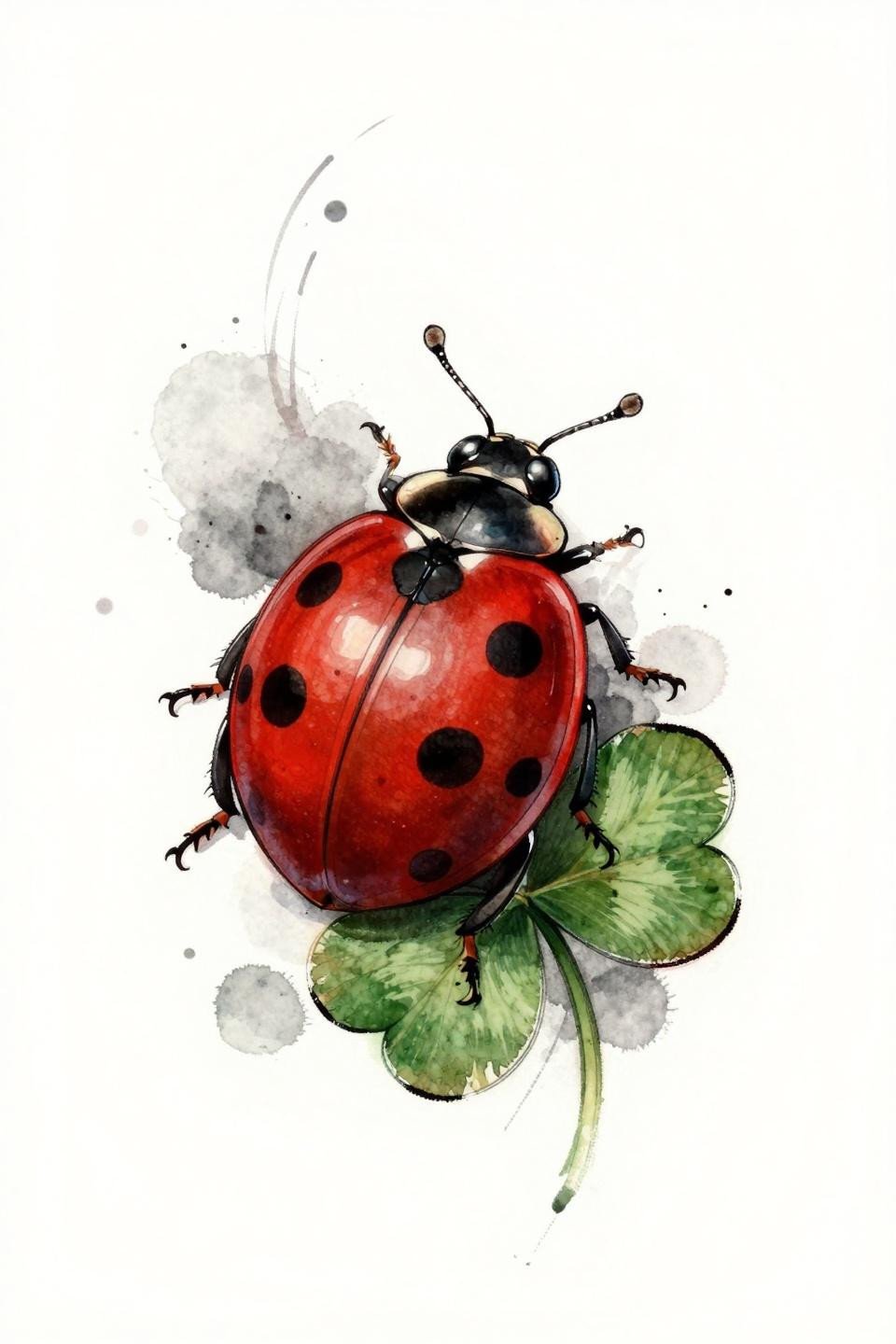
Watercolor style with cadmium red and black ink washes bleeding outward from a lateral three-quarter ladybird, the calligraphic brush mark quality built through wet bleed edges rather than contained fills.
Watercolor without a solid anchoring outline blurs by year three to five, especially on high-movement placements. This reference works cleanest when an artist lays a fine line structural pass beneath the wash layer.
Art Nouveau Filigree Shell: When Surface Ornament Replaces Spot Pattern
Art Nouveau dorsal view with filigree ornament replacing the standard spot pattern across the elytra, the spiral-coiled antennae and sinuous floral mandala frame carrying the period’s botanical curve logic throughout.
Vector-precision linework at this scale is an artist skill signal. Clean line tension with no wobble at the spiral terminations separates a well-executed Art Nouveau piece from one that just borrows the aesthetic vocabulary.
Trash Polka Ladybug in Bloom: Aggressive Marks Around a Delicate Subject
Trash polka with the ladybug in open-wing flight surrounded by wildflower petals in a circular scatter, whip-shading strokes and splatter marks framing the subject without consuming it.
The contrast between the controlled bilateral subject and the aggressive gestural surround is what makes trash polka work at this scale. This format needs a minimum 4-inch canvas to read, not a wrist piece.
Continuous Line Ventral: One Unbroken Stroke as the Entire Design
Single continuous line reference, the entire ventral form described in one unbroken 2pt stroke with no interior fills or grey wash, the leg articulation and segmented abdomen built purely through line routing decisions.
This is one of the harder formats to execute cleanly at small scale. The artist cannot hide hesitation inside shading, every direction change is exposed, making this a legitimate portfolio flex when healed correctly.
Bumblebee Irezumi Flash: The Yellow and Black Read That Outlasts Red
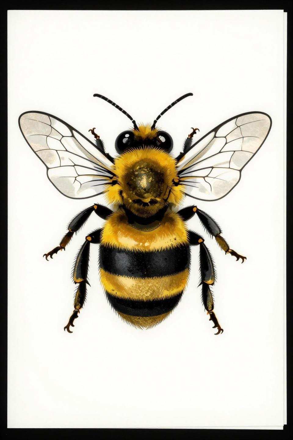
Japanese irezumi bumblebee in frontal hover, flat gold leaf fills against solid black outlines, the transparent wing vein networks rendered through linework rather than any grey wash or tonal fill.
Gold-and-black is a stronger long-term palette than red-and-black for insect subjects on most skin tones. Yellow pigments in quality inks hold saturation longer than cadmium red, which shifts toward orange on lighter skin within five to eight years.
Botanical Scientific Ladybird on Stem: Line Weight as Anatomy Reference
Botanical scientific profile with feathered line weight variation, the tarsal grip on the strawberry stem requiring finer strokes than the elytra outline, the anatomy dictating the needle pass rather than a uniform line rule.
Protected placements like the inner arm or sternum give this style its best shelf life. The line variation reads for years in low-UV zones. On the outer forearm, expect the thinnest strokes to soften noticeably within three years.
Geometric Blackwork Frontal: Hexagonal Segmentation as a New Anatomy
Geometric blackwork from a frontal face-on perspective, the carapace broken into precise hexagonal cells with bold outlines and flat black fills, the grey wash reserved only for the midtone transitions between segments.
Blackwork at full saturation holds density indefinitely when the artist commits to layered passes. Flat fills with no patchiness are the veteran signal here. A single-pass fill will show gaps at year two to three.
Etching Woodcut Ladybug Over Strawberry: Crosshatch as Tonal Architecture
Woodcut etching style with dense parallel-line engraving and crosshatch shading building all tonal volume across the carapace, thorax, and strawberry below, the crimson accent held to the elytra only.
Crosshatch density this tight reads well on the forearm and upper arm where the skin surface is flat enough to maintain line separation during healing. On curved placements like the ankle, tight parallel lines have a higher blow-out risk.
Pull three to five references from this collection that share the same scale, placement, and line weight range. Mixing a fine line botanical with an old school ventral in the same consultation brief creates confusion, not range. Pick a direction, send tight references, and let the artist work.