I’ve been pushing ink for over a decade, and I still get excited when someone walks in with a half-formed idea and we turn it into something permanent. Tattoo patterns and designs aren’t just Pinterest boards, they’re living art that changes with your body, your skin, your life. Let me walk you through what I’ve learned from thousands of hours in the chair.
Popular Styles That Actually Hold Up
Some styles age like leather, others like cheap denim. Here’s what we see working long-term in real shops.
Geometric and Sacred Geometry
Clean lines. Symmetry. These patterns demand precision, and when they’re done right, they settle into the skin beautifully. I’ve tattooed mandala sleeves that looked sharp as hell five years later because the lines were bold enough. The mistake people make? Going too fine. Hair-thin geometric lines blur into mush. I tell clients: if you want geometry, commit to line weight. Dotwork within geometric patterns, those stippled gradients, age softer than solid black fills, which can look patchy as skin texture changes.
Traditional and Neo-Traditional Patterns
Old school bold. The classic sailor stuff, roses, anchors, snakes wrapping daggers, survived because it works. Thick black outlines, limited color palette, readable from across a bar. Neo-traditional opens the color range and gets more illustrative, but the bones are the same: strong outline, clear silhouette. In my chair, these are the tattoos I never worry about. They heal predictably, they touch up cleanly, and they look intentional at fifty.
- Japanese (Irezumi): Waves, koi, cherry blossoms, dragons, these patterns flow with the body’s contours. The wrap-around composition is an art form. I’ve seen full backs that took years, and the patience shows.
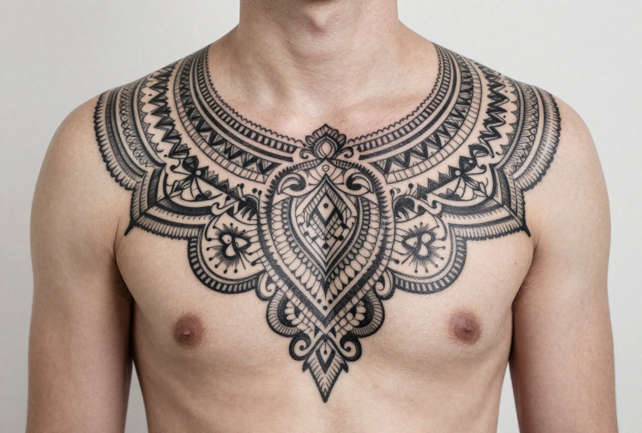
- Ornamental: Lace patterns, henna-inspired designs, mehndi-style florals. Popular with clients who want decorative work without figurative imagery. These read feminine but I’ve tattooed them on everyone.
- Tribal and Blackwork: Solid black patterns, Polynesian-inspired designs, bold negative space. The ink density is high, so healing’s heavier. We see this a lot on arms and calves, places with good skin tension.
Design Ideas That Mean Something
Pattern without purpose is just wallpaper. The best designs I’ve done started with a story.
Nature and Organic Patterns
Vines that follow muscle flow. Leaves that cluster around a scar. I’ve tattooed snake scales wrapping forearms where each scale was a year sober. Organic patterns let us hide personal symbols inside the visual noise, birth flowers, animal tracks, wave frequencies of a loved one’s voice. The sensory specifics matter: the way fern fronds unfurl, how water ripples overlap, the spiral of a seashell. These translate to skin with movement built in.
Abstract and Contemporary Patterns
Brush strokes. Splatter. Deconstructed geometry. These are harder to sell to cautious clients but they’re where I get artistic freedom. One of my favorites was a client’s grandmother’s handwriting, fragmented and scattered across a shoulder like torn paper. Abstract patterns need confident placement, they’re not forgiving of awkward positioning. We spend longer on the stencil, moving it, living with it before the needle touches skin.
- Textile patterns: Tartan, paisley, quilt blocks. I’ve done sleeve sections that matched family clan patterns. The repetition is meditative to tattoo and visually striking.
- Architectural details: Art deco fan shapes, gothic tracery, Islamic geometric tiling. These scale well and carry cultural weight.
- Scientific visualization: Sound waves, constellation maps, topographic lines. Nerdy in the best way, and deeply personal.
Best Placements for Pattern Work
Skin moves differently everywhere. I can feel the difference between tattooing a bicep and a rib, one’s drum-tight, the other’s like pushing through water.
Flat Planes and Flow Areas
The outer forearm is honest skin. What you see is what you get. Geometric patterns thrive here because there’s minimal distortion when you flex. Thighs too, especially the outer thigh, that broad canvas. I’ve done full ornamental pieces that read like fabric draped on the leg. The back, between shoulder blades, is another flat plane but it’s tricky: clients can’t see it healing, so they pick at it blindly or let clothing rub. I warn people about that.
Curved and Contoured Spots
Japanese patterns wrap joints intentionally, elbows, knees, the neck. The design bends with the body, becomes part of movement. This is where organic patterns shine. A snake that coils around a calf muscle looks alive when the muscle contracts. But small, intricate patterns on fingers? They blow out. The skin’s too thin, too mobile. I turn down finger detail work unless clients understand it’ll need constant refreshing.
- Chest: Great for symmetrical patterns, but it hurts. The sternum vibration makes clients twitch, which affects line quality.
- Behind the ear: Trendy placement, limited space. Simple patterns only. I’ve seen too many elaborate designs become smudged hieroglyphs.
- Hands and feet: High turnover skin. Even the best pattern work fades fast here. I do them, but I prep clients for reality.
Color Choices: What Lasts vs. What Fades
Black and grey is the honest default. It ages with dignity. But color has its place, and I’ve learned which pigments earn their spot.
Red holds. Not bright cherry red, but deeper crimson, burgundy. I’ve got Japanese work on my own leg from fifteen years ago, the red still reads. Yellow? Softens to a warm cream. Pretty, but not what you started with. Blues and greens are middle ground, teal seems to have staying power, navy definitely does. White ink? I call it “magic marker on skin.” It disappears on lighter complexions, turns yellowish on darker ones. I use it for highlights, not primary pattern elements.
Color saturation matters more than hue. A bold, simple color pattern outlasts delicate watercolor every time. That washed, painterly look? Gorgeous fresh. At five years, it’s a bruise memory. I tell clients who want that aesthetic: plan for regular refresh sessions, or accept the fade as part of the piece.
- Blackwork with skin breaks: The negative space becomes part of the pattern. This ages incredibly well because the contrast is built in.
- Earth tones: Ochre, sienna, olive. These harmonize with skin undertones rather than fighting them. Less jarring as they settle.
- Neon and pastel: Instagram bait. I’ve done them. They look unreal for six months, then they ghost. Not sorry about saying it.
Tips for Choosing Your Pattern
After all these years, the consultation is still my favorite part. Here’s what I wish every client knew walking in.
Bring References, Not Blueprints
I love when someone shows me three paintings, a textile pattern, and a photo of light through trees. I hate when they hand me someone else’s tattoo and say “this exact thing.” Tattoo patterns should be adapted to your body, your scale, your skin tone. A good artist will redraw, combine, interpret. The worst sessions I’ve had were clients who couldn’t release control. The best were collaborations where we both surprised ourselves.
Think About the Long Game
That tiny, intricate pattern behind your ear will look different at thirty than at twenty. Skin changes. Weight shifts. Sun happens. I have clients who’ve outgrown tattoos, literally, on stretched skin from pregnancy, or figuratively, the tribal band that screamed 2003. Choose patterns that can evolve with you, or that are bold enough to stay legible through change. Placement matters here too. A thigh piece hides easily; a hand pattern is your constant introduction.
- Size appropriately: Complex patterns need room to breathe. Don’t compress a sleeve design into a four-inch space.
- Consider your existing work: New patterns should talk to old tattoos, not ignore them. Even mismatched pieces can be bridged with transitional elements.
- Trust the stencil phase: If it looks off on your skin pre-ink, it’ll look worse permanent. Speak up. We want you to.
- Healing is part of the design: That crisp pattern will scab, flake, look dull for weeks. The final result emerges around six weeks. Patience.
Final Thoughts
Patterns and designs aren’t just decoration, they’re how we mark time, claim space, carry memory in our largest organ. I’ve watched clients cry getting memorial patterns, laugh through silly ones, sit in meditative silence for spiritual work. The best tattoo pattern is one that feels inevitable, like it was always meant to be on your body. Find an artist who listens, who pushes back when needed, who knows how ink actually lives in skin. Then commit. The permanence is the point.
Frequently Asked Questions
How do I know if a pattern will look good on my specific body shape?
A good artist will stencil the design and move it around while you stand, sit, flex. What looks flat on paper distorts on curved skin. I always have clients check the stencil in a mirror from multiple angles before we start.
Can I combine multiple pattern styles in one tattoo?
Absolutely, but it needs intention. I’ve blended Japanese waves with geometric framing, or organic florals with ornamental borders. The transition between styles is where the artistry lives, abrupt clashes look accidental.
Why do some tattoo patterns look blurry after healing?
Usually line weight was too fine, or the artist worked too shallow. Sometimes it’s natural spread, ink migrates slightly in fat-dense areas. Bold patterns with adequate spacing age cleaner. I design for the healed result, not the fresh photo.
How often should I expect to touch up patterned tattoos?
Blackwork and traditional patterns often need no touch-up for a decade. Color pieces, especially with yellows or pastels, might need refresh at five to seven years. High-friction placements like hands or feet need more frequent attention. I offer touch-up pricing to returning clients because maintenance is normal.
