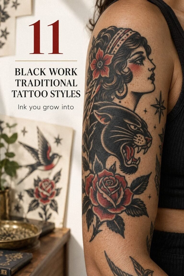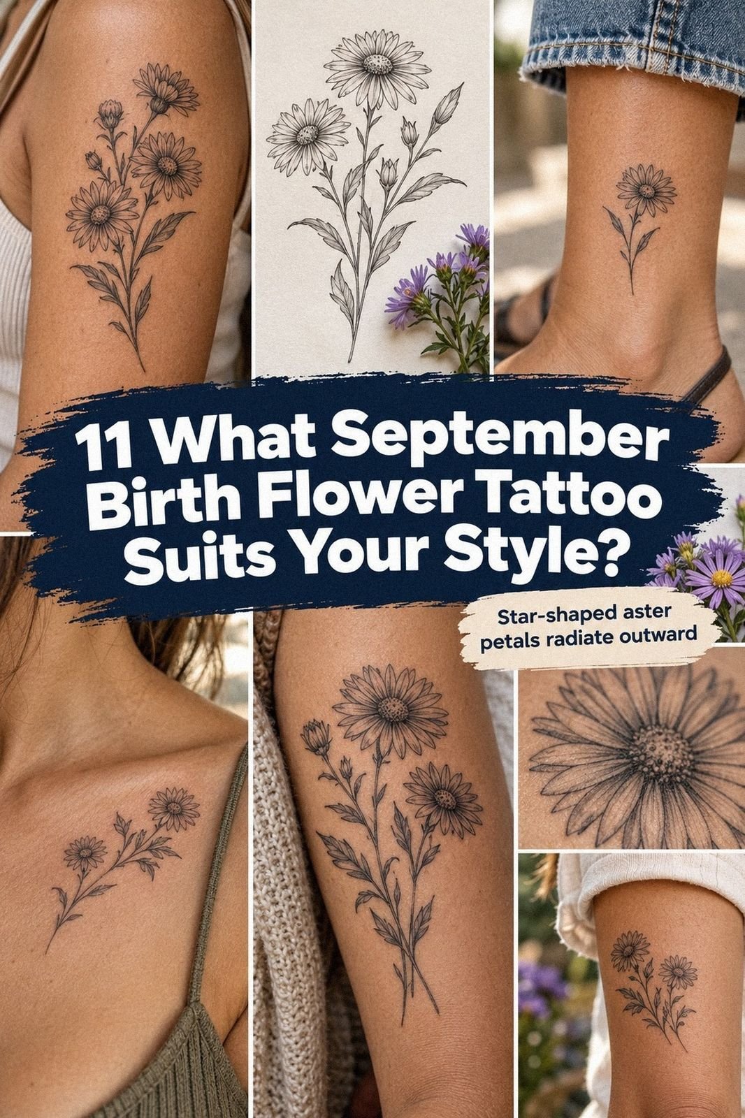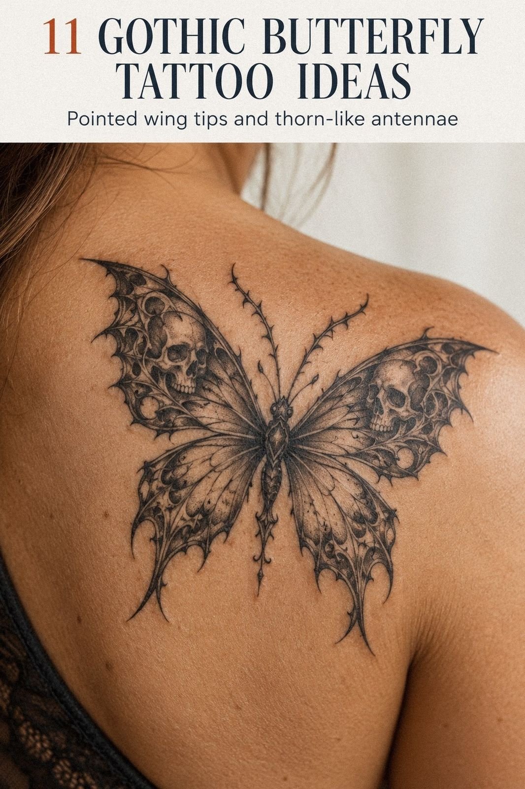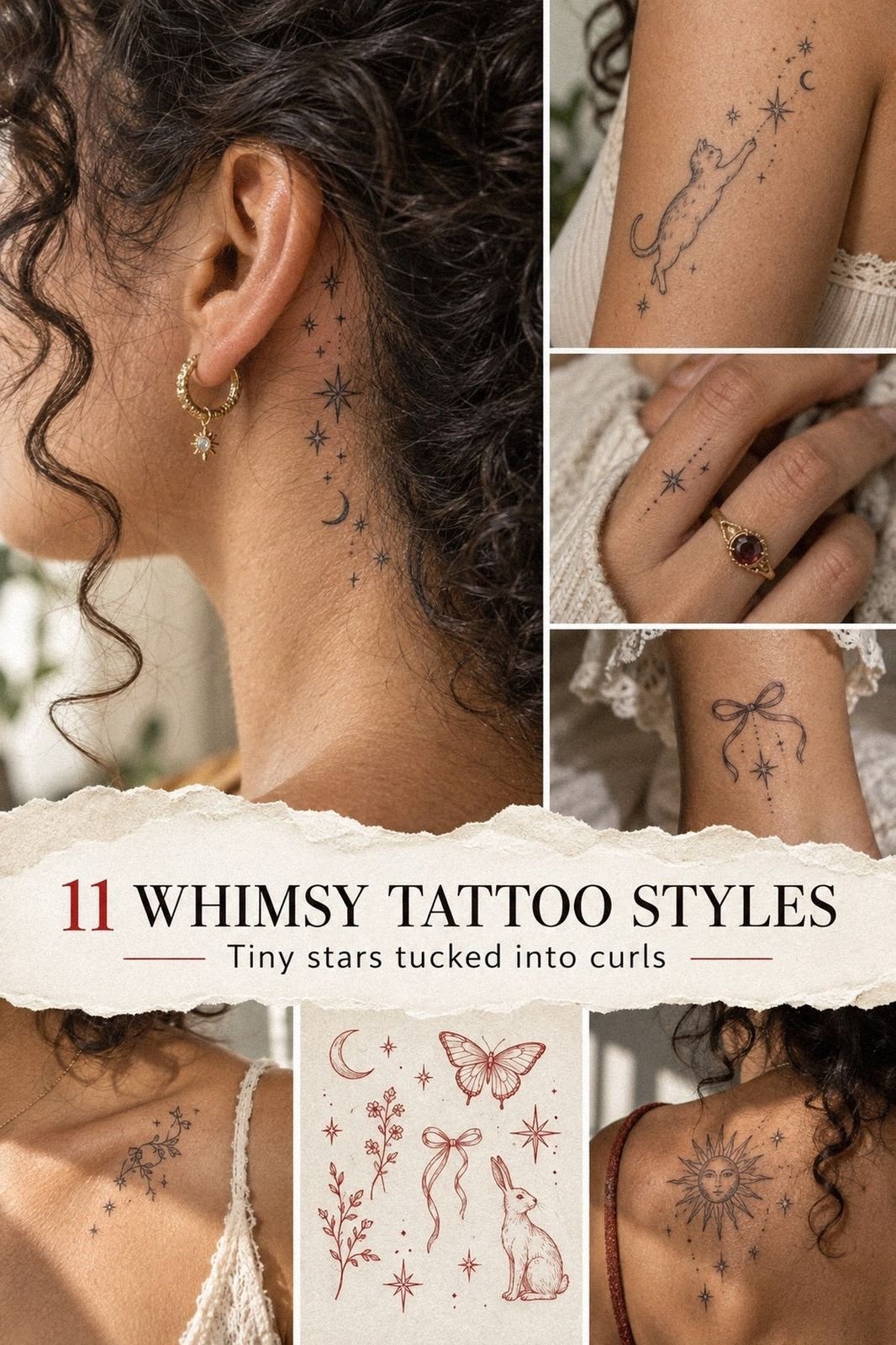
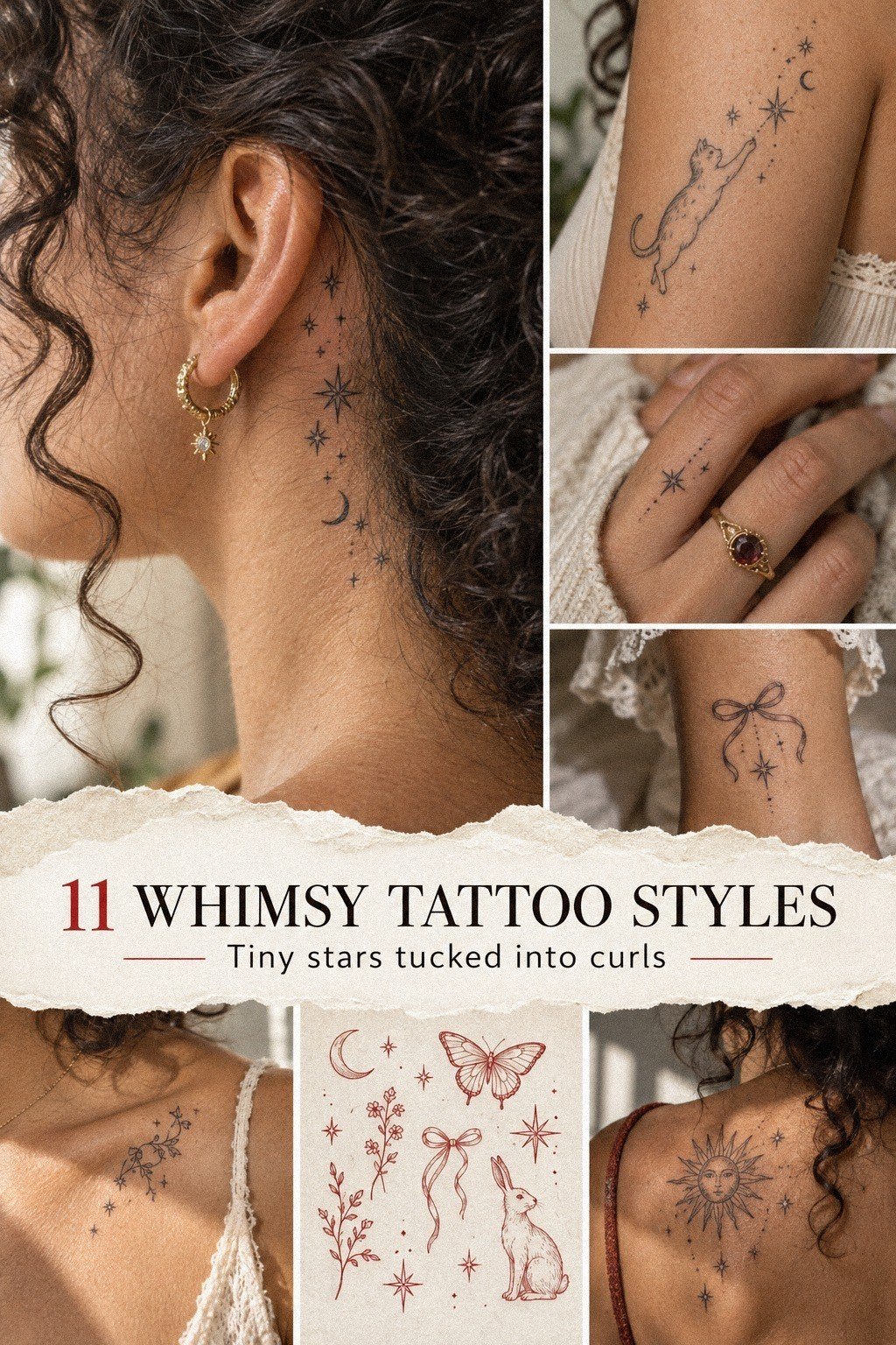
Whimsy Tattoo designs can feel delicate without disappearing into your skin. I got mine while turning 30, after weeks of second-guessing the placement and line weight. The final piece was smaller than my palm, but it still felt striking, personal, and unmistakably mine.
- I Sketched My First Whimsy Tattoo
- Why I Chose a Moonlit Mushroom Motif
- Add Delicate Fairy Tale Linework
- Where Should Placement Go?
- Black, Red, or Blue?
- The Meaning of Tiny Symbolic Stars
- I Prepared for the Tattoo Pain
- Watch the Intricate Ink Heal
Here’s What It Looked Like Before
Before the appointment, I had a clear patch of skin and a reference folder full of screenshots. Nothing was decided yet. I knew I wanted something symbolic, but I didn’t want a random moon, oversized flower, or copied design.
I measured the area against my hand and kept the first sketch between 1 and 3 inches. That’s small enough to stay understated, but large enough for clean lines to remain readable. You don’t need a huge tattoo to make your idea feel important.
The first version looked whimsical, intricate, and slightly chaotic. I liked its playful energy, but I could already tell the tiny details would compete with one another.
Before I Booked the Session
I compared several artists before booking. Their portfolios showed different approaches to fine-line work, and I paid attention to healed pieces rather than only fresh photographs.
I also asked how each artist handled darker skin, small symbols, and placement changes. That conversation gave me more useful information than a polished social-media post.
My budget included the consultation, design adjustments, session time, and a possible touch-up. That made the final quote easier to judge.
If you’re still deciding, start with the first sketch, then compare it with your preferred placement. The design and body location need to work together.
- I Sketched My First Whimsy Tattoo
- Why I Chose a Moonlit Mushroom Motif
- Add Delicate Fairy Tale Linework
- Where Should Placement Go?
- Black, Red, or Blue?
- The Meaning of Tiny Symbolic Stars
- I Prepared for the Tattoo Pain
- Watch the Intricate Ink Heal
- Fine Lines, Strong Protection
- Whimsigoth Tattoo Details
- What Every Mark Means
1I Sketched My First Whimsy Tattoo
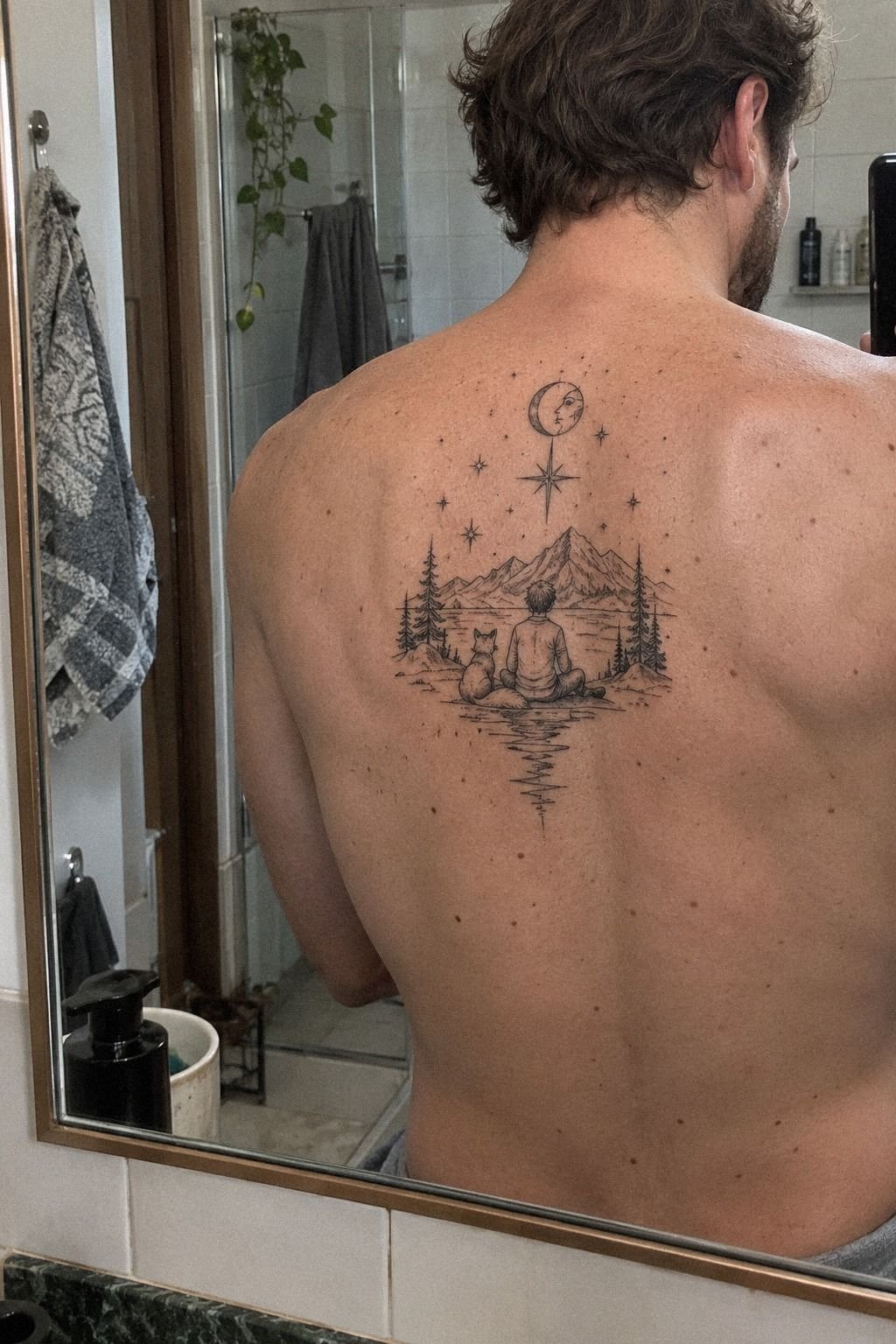
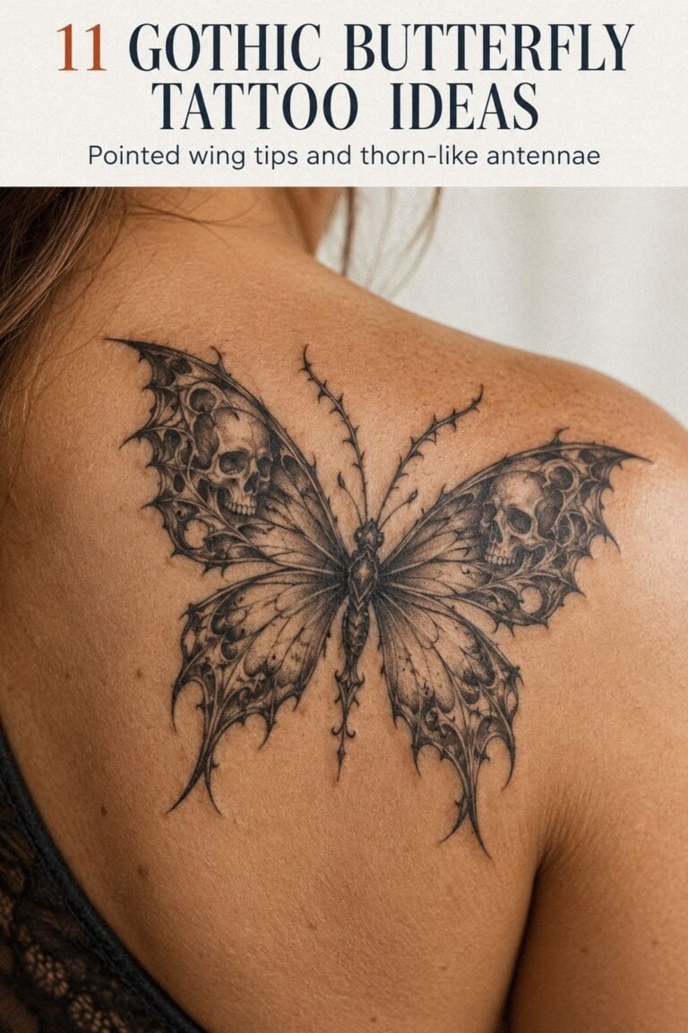
I started with an upper-back placement because I wanted the design to feel whimsical, not childish. My first draft had too many curls, stars, leaves, and tiny characters crowded into one shape.
It looked ornate on paper, but it would’ve become muddy once reduced. I removed half of it. That was the difficult part.
A simple central figure, one curved tail, and a small black ink accent gave the idea more breathing space. If you’re planning your own sketch, show your artist the full page, including the parts you almost deleted.
The final drawing used confident linework with a few hair-thin details. I liked the contrast between the fine-line work and the larger open areas because it made the piece feel crisp instead of busy.
You can keep a design intricate without filling every inch. In fact, controlled restraint often gives a small tattoo a more polished, timeless quality.
And I kept one uneven little curve from my original sketch. It wasn’t technically perfect, but it made the tattoo feel expressive. You’ll remember that kind of decision long after you forget which reference image started the process.
2Why I Chose a Moonlit Mushroom Motif
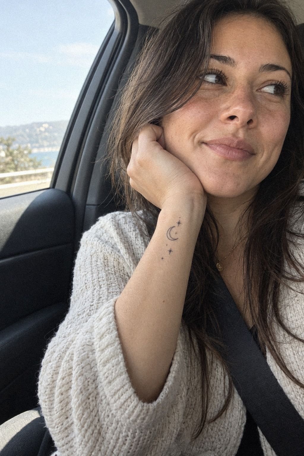
For the wrist idea, I wanted a crescent moon with a few tiny stars rather than a full scene. The wrist placement was visible, but the concept still felt meaningful because I connected it with night walks and changing direction.
I asked for crescent moon linework with three different star sizes. That small variation kept the design from looking stamped on.
The most charming version used an open-skin center instead of solid black fill. I considered shading, but I skipped it. Solid shading would’ve made the tattoo feel heavier, while the open center kept it sleek and light.
But a wrist tattoo is visible often, so I checked the stencil from several angles before agreeing. I moved my hand, bent my wrist, and looked at it under bright studio lights.
You should do the same, especially if your design has a clear direction. That extra check is worth it when a small change can improve the final result.
3Add Delicate Fairy Tale Linework
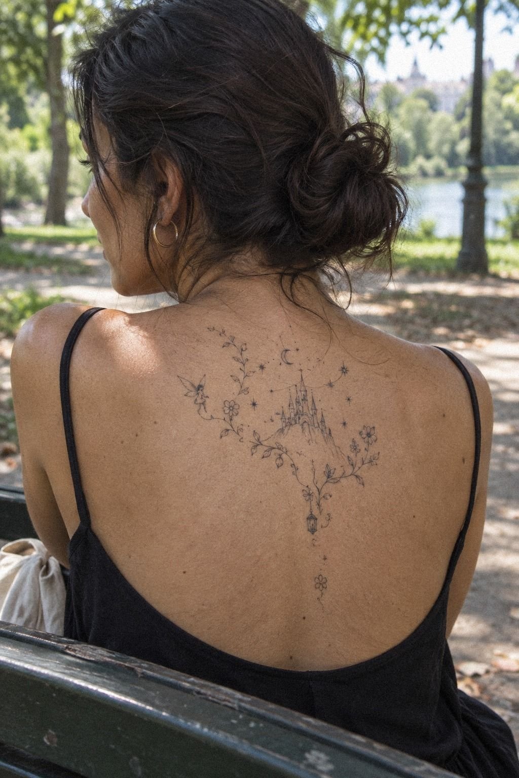
The upper-back design gained its fairytale feeling through fairy-tale linework rather than a literal castle or princess.
4Where Should Placement Go?
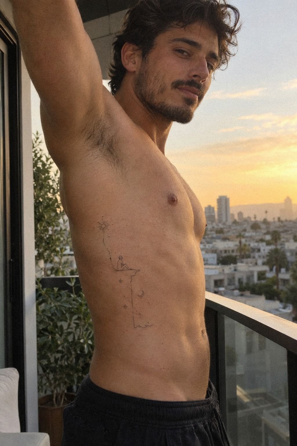
I chose the ribs for one version of the idea because the long, narrow shape suited a flowing design. The rib placement looked elegant, but I knew the area could be more painful than the forearm or upper arm.
Before the appointment, I placed the transfer stencil at three different heights. Higher looked refined, middle felt balanced, and lower made the design disappear when I moved.
I picked the middle position because you could still see the curve when I twisted. The studio lighting also revealed how the shape changed with my posture.
The session felt raw in the first few minutes. Rib skin gives you less padding, and the sensation was sharper than the wrist. If you’re sensitive, ask whether your artist can pause between sections.
You don’t win anything by pretending your body isn’t reacting. A clear conversation can make the session feel more manageable.
Still, the placement made the tattoo feel daring. A similar design on the outer arm would be easier, but it wouldn’t have the same hidden quality.
You have to decide whether visibility, comfort, or movement matters most to you. I wrote those priorities down before booking, which stopped me from making an impulsive choice.
5Black, Red, or Blue?
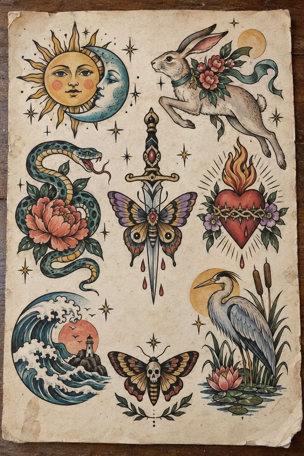
I tested color on paper before letting any pigment near my skin. The flash sheet included black outlines, muted red, warm yellow, and a small blue accent.
The winning palette used mostly blackwork ink with one restrained color note. I chose muted red pigment because it looked vibrant beside the open skin.
Too many colors would’ve made the design feel less timeless and harder to read from a distance. The restrained approach felt bold without becoming noisy.
I also compared the sketch beside my skin tone under studio lighting. A color that looks soft on white paper can look very different on the body.
Your artist should show you healed examples from different clients, not only fresh work. That comparison gives you better value than guessing from a digital mockup.
And I skipped bright yellow. It looked cheerful in the flash drawing, but it didn’t give the main lines enough contrast.
The red mark had more presence, and the final result stayed playful without turning noisy. That was the better choice for my personal style!
6The Meaning of Tiny Symbolic Stars
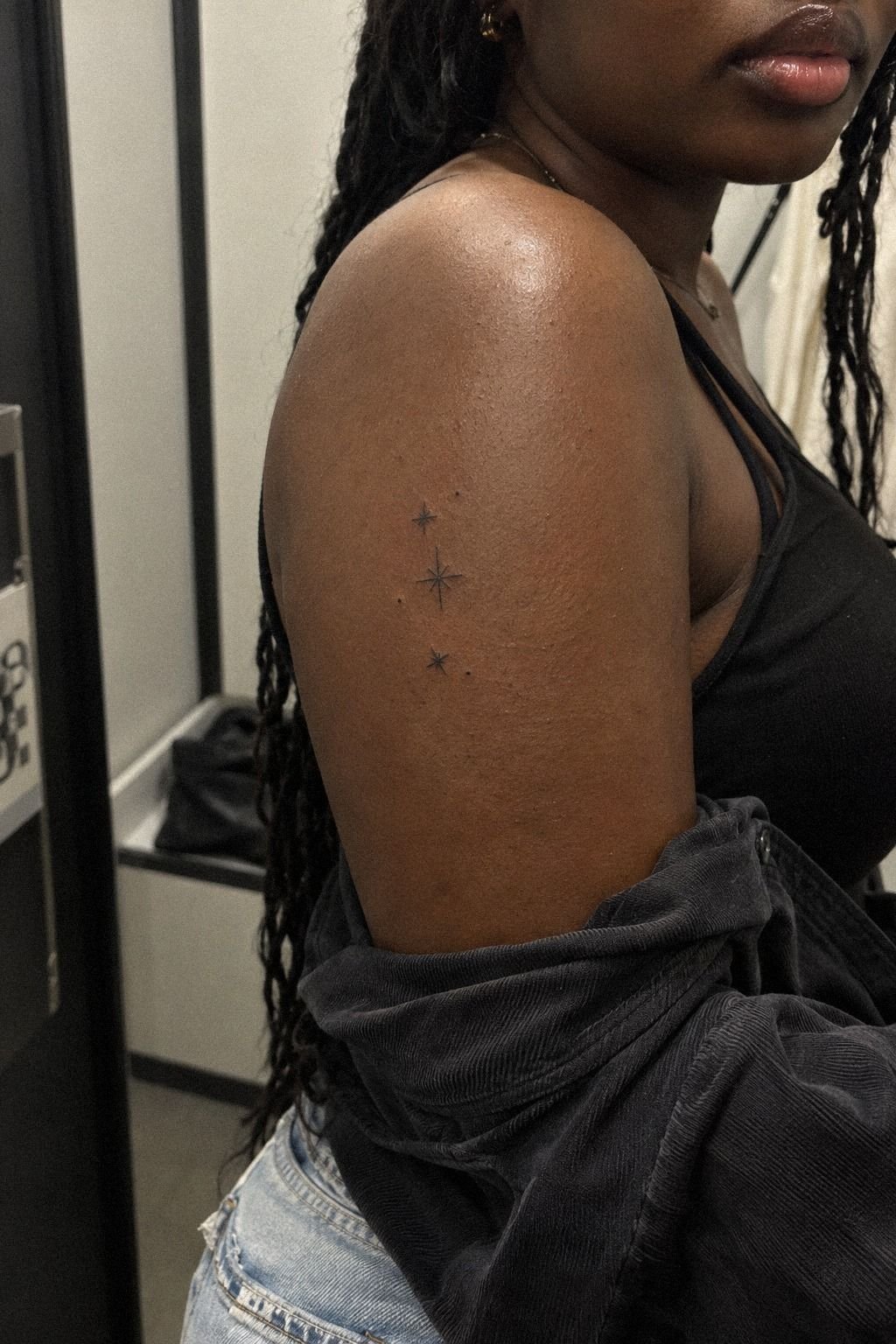
The stars were the smallest marks in the design, but they carried the most meaning. I used one larger star for a person who helped me change direction and two smaller ones for goals I hadn’t reached yet.
My artist drew the symbolic stars in varied sizes with generous space between them. That kept the arrangement graceful instead of decorative for decoration’s sake.
If you’re adding symbols, decide what each mark means before you ask for more. Meaningful details are easier to protect from trend-chasing.
The upper-arm placement gave the stars enough room to remain distinct. I avoided putting them directly over a bend or high-friction spot because tiny details need stable skin to stay clear.
A few star tattoo details can be stronger than a crowded constellation. That balance made the design feel dainty, personal, and quietly powerful.
What would you rather remember, the number of marks or why you chose them? I chose meaning over symmetry.
The arrangement isn’t mathematically even, and that’s exactly why it feels personal rather than manufactured. The slight imbalance gives it an expressive quality.
7I Prepared for the Tattoo Pain
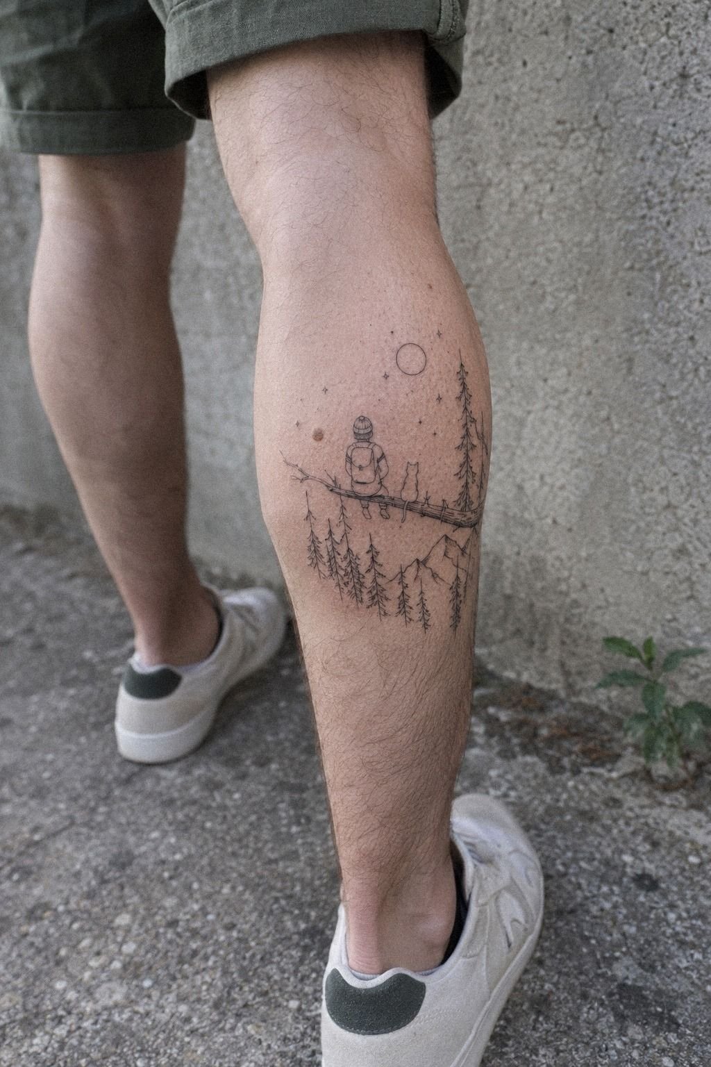
I expected a constant sharp sensation, but the tattoo pain came in waves.
8Watch the Intricate Ink Heal
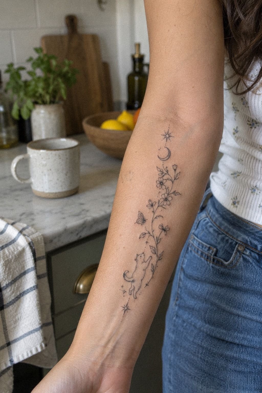
The first day looked sharper and darker than the healed result. The skin felt warm and tender, and the fine lines seemed almost too crisp.
I followed the artist’s instructions instead of adding products that weren’t recommended. I washed gently, patted the area dry, and used a light layer of aftercare balm.
The surface settled over roughly 2 to 3 weeks, while the tattoo took about 2 to 3 months to fully settle beneath the skin. During that period, I avoided picking, rubbing, and unnecessary friction.
During the peeling stage, the design looked dull and slightly cloudy. That was unsettling, especially because the small stars appeared softer than they had on appointment day.
You shouldn’t judge the final tattoo while the surface healing stage is still changing. Patience is part of getting a clear result.
And I kept it away from direct sun and swimming during the early healing period. The finished lines became elegant again once the skin calmed down.
The intricate details didn’t vanish, but they did lose that fresh-session intensity. The healed tattoo looked more natural and less dramatically dark.
9Fine Lines, Strong Protection
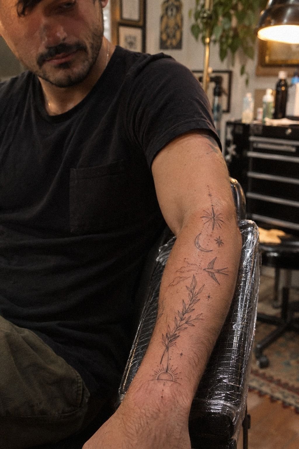
Fine lines need thoughtful placement and consistent sun protection. I knew the design might soften over time, so I avoided putting the thinnest marks where straps, cuffs, or constant friction would rub them.
The artist used solid black pigment for the central outline and left the smallest decorative marks lighter. That balance mattered.
Black ink with good placement generally ages more reliably than extremely faint lines, especially when you protect the area from UV exposure.
I apply broad-spectrum sunscreen once the tattoo is fully healed and cover it when I know I’ll be outside for hours. You don’t have to treat your skin like museum glass, but you do need to respect what sunlight can do to delicate work.
I also accepted that aging is part of the tattoo. Some lines may widen slightly, and that doesn’t mean the design failed.
A polished tattoo can become more lived-in without losing its original story. That’s a graceful trade I was willing to make.
The fine-line healing notes helped me stop judging the piece too early.
10Whimsigoth Tattoo Details
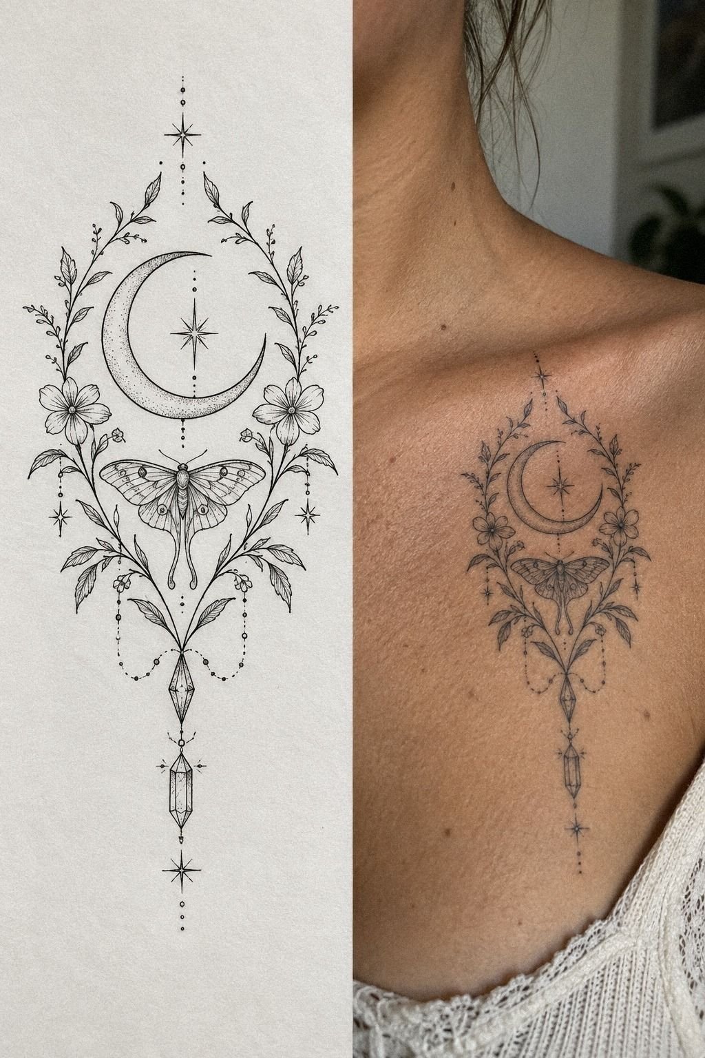
The healed design looked different from the stencil, so I photographed both side by side. The stencil was precise, while the healed version had softer edges and a more intimate feeling.
I called the look whimsigoth tattoo because it mixed delicate marks with a darker, more mysterious mood. I didn’t add extra symbols just to make the style obvious.
The crescent, pointed leaves, and celestial symbols already gave it enough character. The result felt edgy, romantic, and slightly haunting without becoming theatrical.
If you’re building a collection, repeat one visual language instead of copying one exact design. I used curved lines, small celestial details, and open skin across several ideas.
That curved line language connected the pieces without forcing them into a matching set. The effect stayed understated but recognizable.
But I wouldn’t chase a trend if the symbols don’t mean anything to you. Fairytale tattoos, magical tattoo ideas, and fairytale tattoos can all be charming, yet your favorite reference still needs to fit your body and your history.
A timeless idea can still feel vibrant. It just needs to belong to you first.
11What Every Mark Means
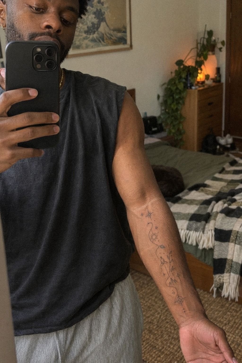
The final inner-forearm design looked understated from across the room and more intricate up close. That contrast became my favorite part.
You see the shape first, then the tiny stars, curved lines, and small symbolic marks reveal themselves. The tattoo feels graceful without asking for attention.
I used healed tattoo ink as the standard for judging the result, not the bright photograph from the appointment. The deeper brown skin around the design gave the black lines a bold, grounded quality.
The negative space kept the composition readable. It also stopped the smaller marks from turning into one indistinct patch.
My strongest advice is to let your artist question the sketch. I wanted one extra star, and they explained that it would close a gap that helped the main shape breathe.
I listened, and the finished piece became more polished. That small edit had more practical value than adding another decorative detail.
And I still notice the tattoo when I’m having a difficult day. That’s the part I didn’t predict.
The design isn’t loud, but it feels empowering because I chose every mark slowly, including the empty spaces. Trust your eye!
How Much It Cost
Tattoo pricing depends on the artist, region, studio minimum, placement, design complexity, and session length. In the United States, a small piece often falls around $100 to $300.
I planned my budget around the higher end because I wanted time for stencil adjustments and a careful fine-line setup. Your price may be different, and a reputable artist should explain the estimate clearly.
The studio minimum may cover a small tattoo, while a detailed piece can use an hourly rate. Ask whether the quote includes the design, deposit, session, and touch-up policy.
I also asked whether the design deposit would count toward the final total. That detail matters when you’re comparing artists at different price points.
Don’t choose the cheapest quote without checking healed photos and hygiene practices. The hygiene practices and portfolio quality are worth more than saving a small amount.
For me, the cost was worth it because the artist took time with placement, line weight, and adjustments. A lower price wouldn’t have offered the same confidence.
What I Learned Before Choosing Whimsy Tattoo
I used to think a whimsy tattoo had to be tiny, pale, and packed with miniature details. After living with mine, I think that definition is too narrow.
The most successful designs balance a playful idea with enough structure for the eye to understand it quickly. A meaningful concept still needs a readable shape.
I also changed my mind about pain. I wouldn’t tell you that ribs, feet, hands, or sternum are easy areas. They can be intense.
But the pain is temporary, while the placement affects how you see the design every day. For a first tattoo, the forearm, thigh, or shoulder may offer a more forgiving starting point.
The decision came down to three questions: will the main shape still read when the tattoo heals, does the placement suit the movement of your body, and can you explain why the symbols belong there?
If the answer is yes, your design has a strong foundation. If not, more sketching may save you money and regret.
My one mistake was trying to preserve every mark from my first sketch. I thought removing details would make the tattoo less special.
It did the opposite. The open space, controlled line weight, and one imperfect curve gave the piece a personal, timeless quality.
If you’re comparing dreamy tattoo ideas with darker fairytale tattoos, save healed examples rather than only fresh ones. Look at line spacing, contrast, and how the artist works across different skin tones.
The placement decision, color test, and healing timeline were the three most useful parts of my own process.
Before You Compare Quotes
A cheap tattoo isn’t automatically a good value, and an expensive one isn’t automatically better. I judged the artist portfolio first, then considered communication, hygiene, healed work, and design judgment.
The best value came from an artist who explained what needed simplifying. That advice prevented me from paying for details that wouldn’t remain readable.
I also asked for a written artist quote before booking. It included the expected session time, deposit policy, and possible touch-up information.
If you’re trying to protect your budget, compare the complete process rather than one hourly number. The lowest initial price may not represent the lowest overall cost.
The cost breakdown and artist questions helped me make the decision without rushing. That preparation was worth it!
What People Always Want to Know
How much does a Whimsy Tattoo usually cost?
A small Whimsy Tattoo usually costs about $100 to $300 in the United States, with studio minimums near $50 to $100 and hourly rates around $100 to $250. The final price depends on size, placement, artist, region, and detail level. Ask for a quote before booking.
Are Whimsy Tattoo a good idea for a first tattoo?
Yes, Whimsy Tattoo can be a strong first choice when you pick a readable design and tolerable placement. Personal symbols make the result meaningful, while an outer forearm, thigh, or shoulder may feel easier than ribs or feet.
How do I choose a tattoo artist for Whimsy Tattoo?
Choose an artist with a portfolio showing clean linework, healed results, and consistent hygiene. Healed photos are the most useful proof. Look for experience with fine-line or illustrative work, then ask how they adapt designs for your skin and placement.
How much do Whimsy Tattoo hurt?
Pain varies by person and zone. Ribs, feet, hands, and sternum often feel sharper, while the forearm, thigh, and shoulder are usually more tolerable. Placement comfort affects the experience more than the word “whimsy.” Eat beforehand, hydrate, and tell your artist when you need a pause.
How long does a Whimsy Tattoo take to heal?
The surface usually settles in about 2 to 3 weeks, while complete healing can take about 2 to 3 months. Gentle aftercare and avoiding sun and swimming during early healing help protect the result. Follow your artist’s specific instructions.
What’s the best placement for Whimsy Tattoo?
The best placement depends on visibility, pain tolerance, and line longevity. An outer forearm gives you an easy view and moderate comfort, while the upper arm offers more privacy. Friction protection matters if your design uses very fine lines.
Where I’d Start First
If I had to pick one, I’d start with the outer forearm. You can see the design while it heals, the placement is usually more tolerable, and the lines aren’t hidden in a high-friction spot.
Save your favorite reference and book the artist whose healed portfolio makes you stop scrolling. Then review the meaning behind each mark before you approve the stencil.
A Whimsy Tattoo doesn’t need to be huge, loud, or packed with detail. It needs a clear idea, a confident shape, and enough personal meaning to stay powerful after the fresh-session glow fades.