
Cute meaningful tattoos can stay hidden on demand when you choose placement before decoration, keep the linework crisp, and give the meaning room to breathe. I learned that after sketching eleven ideas and rejecting half of them. The final pieces felt personal, wearable, and surprisingly easy to live with.
- Behind My Ear, The Birth Flower Stayed Private
- Rose, Two Initials, And Two Hearts
- Can A Crescent Moon Stay Visible Yet Hidden?
- My Pet’s Paw Print Became The Mark
- Coordinates Under A Dainty Sun, Not A Block Of Numbers
- What Did Symbolic Dots Look Like On A Finger?
- Fortune Cookie For Luck: A Playful Detour
- Along My Rib, A Fierce Reminder
Editor’s note: Start with the memory, then choose the symbol. A striking idea can stay minimal when the placement does some of the storytelling.
- Behind My Ear, The Birth Flower Stayed Private
- Rose, Two Initials, And Two Hearts
- Can A Crescent Moon Stay Visible Yet Hidden?
- My Pet’s Paw Print Became The Mark
- Coordinates Under A Dainty Sun, Not A Block Of Numbers
- What Did Symbolic Dots Look Like On A Finger?
- Fortune Cookie For Luck: A Playful Detour
- Along My Rib, A Fierce Reminder
- Three Stars For My Siblings
- The Wave That Marked My Healing
- Matching Ink With My Oldest Friend
1Behind My Ear, The Birth Flower Stayed Private
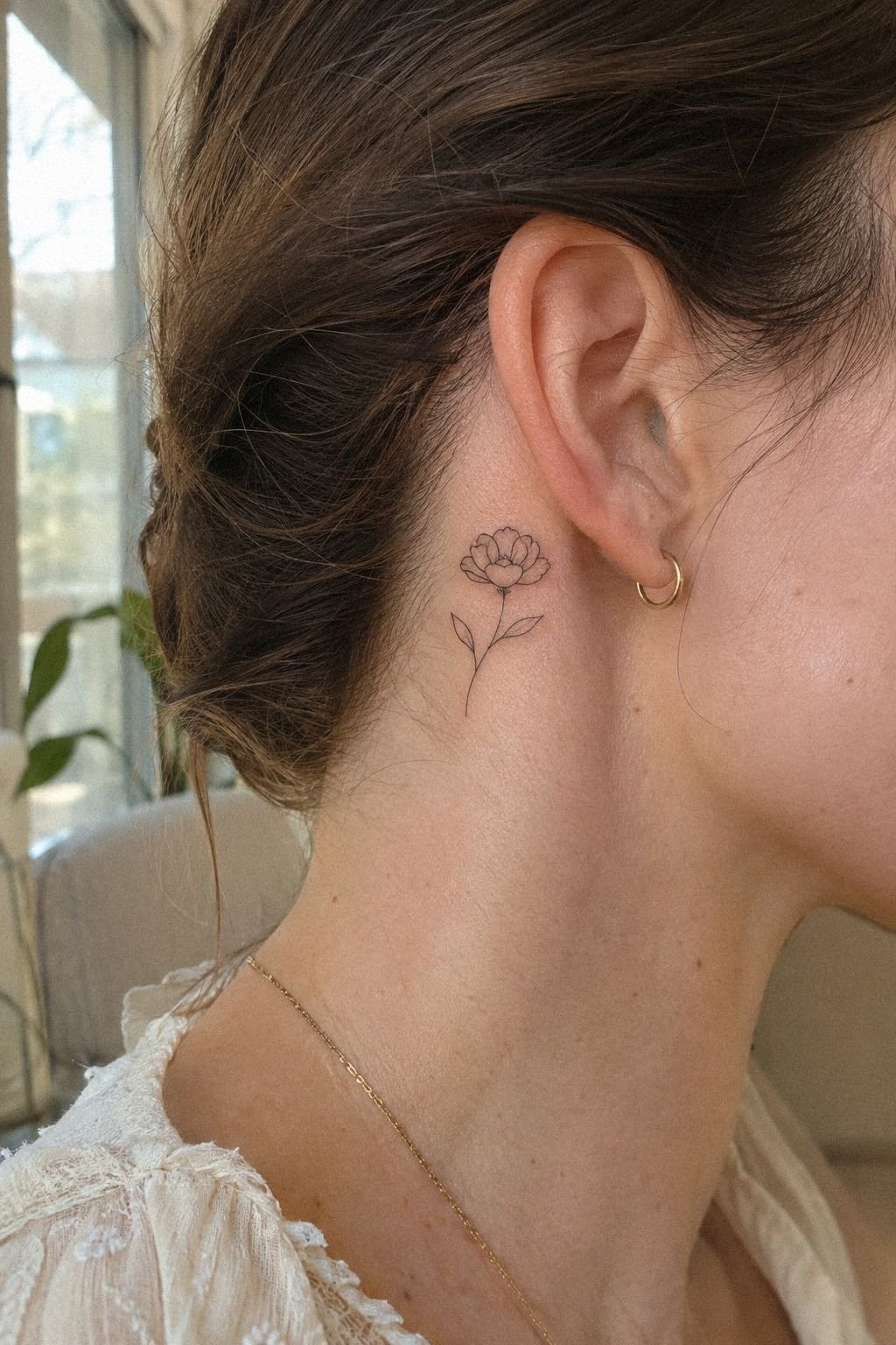
I wanted something delicate enough to feel private, but striking enough to read clearly at a glance. The single stemmed flower behind my ear gave me both.
I used my birth month as the starting point, then asked for an intricate petal shape without extra leaves crowding the design. Your artist can scale the birth flower around the curve behind your ear, where a tiny tattoo still looks intentional.
I brought a reference sketch of a simple fine-line birth flower and marked the placement with a temporary stencil first. That placement test mattered. I turned my head, tucked my hair back, and checked whether the stem still looked graceful from the side.
It did. The final outline felt minimal, personal, and far less fussy than the first sketch.
I kept the black soft rather than asking for gray wash. A crisp black line gives your eye a cleaner shape, while overly pale ink can disappear before the design has settled.
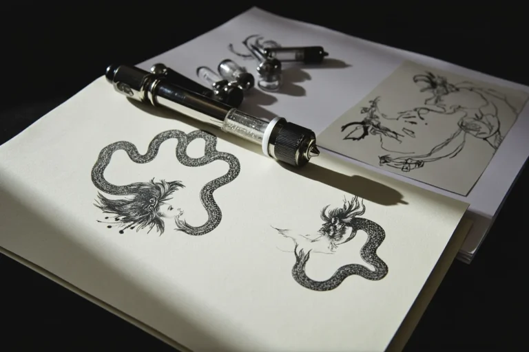
My artist used a single-use fine-line cartridge and a small stencil transfer, so I could approve the size before the session began. That tiny pause was worth it!
I also thought about value. A hidden tattoo still needs to be readable when you see it yourself, and a slightly larger custom design can be a better budget choice than squeezing every detail into a miniature mark. The custom design gave the flower more presence.
If you’re collecting little meaningful tattoos, compare this placement with these small meaningful tattoos. You’ll notice the best tiny pieces don’t need ten details. Your favorite detail may be the one the artist leaves out.
2Rose, Two Initials, And Two Hearts
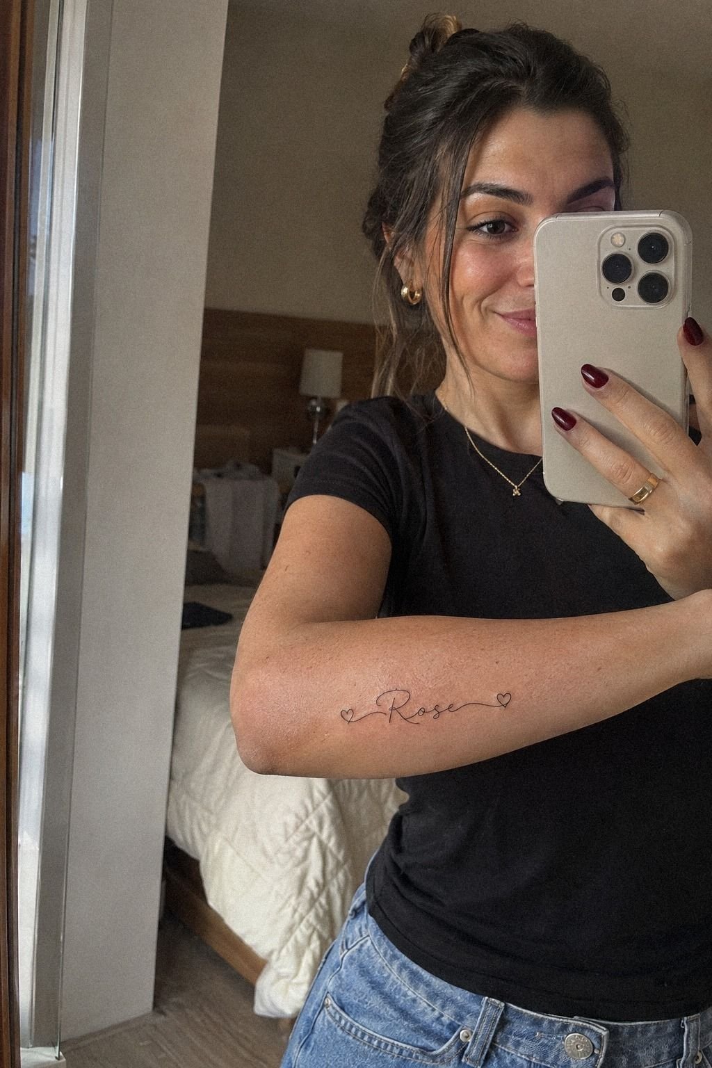
The word “Rose” came from a family nickname, and I wanted two small hearts to carry initials without making the piece look like a logo. The matching initials kept the idea intimate, while the hearts made it feel romantic without becoming ornate.
3Can A Crescent Moon Stay Visible Yet Hidden?
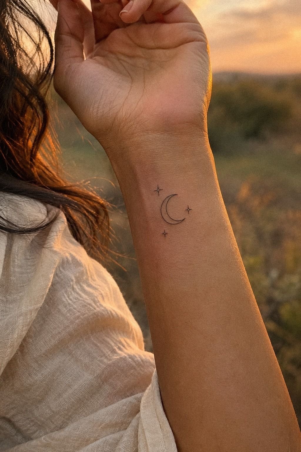
I chose the inner wrist for a crescent moon because I wanted the design visible during ordinary moments. I could glance at it while holding a coffee cup or turning a key, and the small stars would stay close to the pulse point.
The placement felt sacred without looking heavy, especially with a clean crescent and restrained dotwork. The inner wrist gave me control over who saw it.
My artist used black crescent linework with three uneven stars, not a symmetrical cluster. That irregular spacing gave the moon a more natural, expressive shape.
Your wrist has a narrow visual field, so a single strong curve usually works better than a crowded celestial scene. I asked for the crescent tips to point toward my hand, which made the crescent linework feel like it was moving with me.
I tested the stencil in two positions before choosing the final one. Higher on the wrist felt more polished, but lower made the crescent easier for me to see.
I went with the lower placement and kept the stars tiny. The finished tattoo was elegant, understated, and easy to cover with a cuff when I wanted less visibility.
The stencil position made that choice clear.
The cost stayed close to the studio minimum because I chose a simple symbol instead of adding a whole constellation. That was a better budget decision for me, and it showed that a meaningful tattoo doesn’t need a large price tag. The studio minimum made the simpler version easier to justify.
If moon imagery speaks to you, compare this with other meaningful symbol tattoos. You can make a symbolic tattoo powerful through placement and spacing instead of adding more ink.
I wouldn’t put this exact design on the side of the hand. Your wrist gives the fine curve more protection from constant friction.
The wrist placement suited the delicate symbol.
4My Pet’s Paw Print Became The Mark
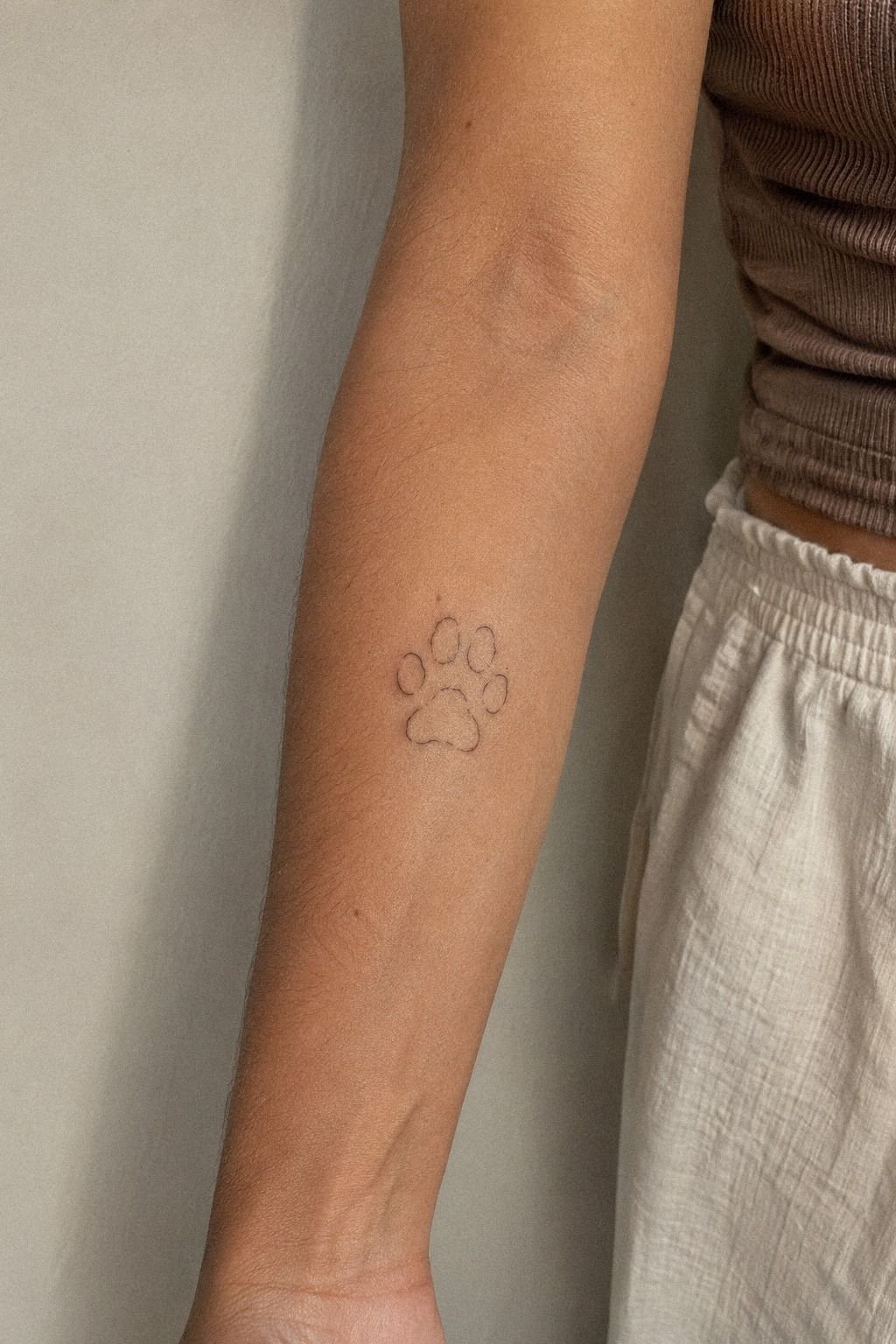
This tattoo started with a messy paper paw print and a very clear feeling. I didn’t want a realistic portrait, and I didn’t want a generic paw icon either.
I asked my artist to keep the uneven toe shapes from the original print, because those small imperfections made it unmistakably my pet’s mark. The paper paw print carried more emotion than a polished replacement would have.
We transferred the reference beside a paw-print stencil and simplified only the smudged edges. The final outline stayed bold enough to read, with tiny gaps between the pads so the design wouldn’t become one dark blob.
Your artist may need to redraw a scan before making the reference stencil. That’s normal!
The goal is to preserve the recognizable shape, not trace every accidental ink mark.
I skipped the extra heart and date I had planned. They made the design feel less raw, and the paw already carried enough history. I placed it on the inner forearm so I could cover it with a sleeve when needed.
The result was personal, direct, and more emotional than the polished version I first imagined. That inner forearm placement also gave the mark enough room.
I also asked to see healed examples from the artist’s portfolio. Fresh work can look sharp, while healed lines show whether the spacing still works.
If the artist’s healed work was inconsistent, I wouldn’t consider the appointment worth the cost. The healed portfolio was more persuasive than any new studio image.
If you want a tribute with more context, look through very meaningful tattoos. Your reference doesn’t have to be clean.
Sometimes the uneven part is the whole point. That tribute design stayed honest to the memory.
5Coordinates Under A Dainty Sun, Not A Block Of Numbers
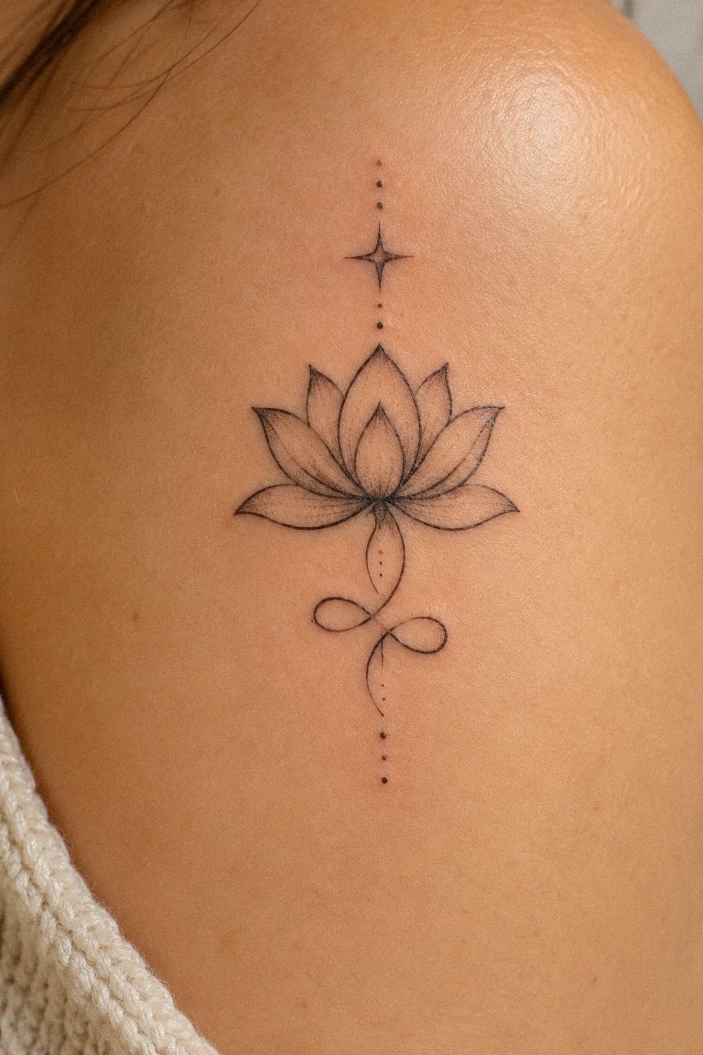
I wanted the coordinates of my childhood home, but I didn’t want a block of numbers floating alone on my skin. A dainty sun gave the design a visual anchor, while the coordinates beneath it kept the meaning private. I chose a hand-drawn flash reference because its imperfect energy helped me imagine the final balance.
The childhood coordinates stayed at the center of the idea.
My artist drew a small sun with open rays, then placed the numbers underneath in crisp lettering. We checked every digit twice.
You should verify coordinates from the original map source before your appointment, and you should read the stencil backward in a mirror if the placement makes that useful. A single wrong number would change the story completely.
The original map source mattered more than the secondary symbol.
The first sketch was too ornate. It had twelve rays, little dots, and a curved line around the coordinates.
I asked for fewer elements, and the design became more powerful. The final sun felt vibrant but controlled, with enough negative space for the numbers to remain readable.
Your tattoo doesn’t need to explain why a location matters. You already know. That negative space gave the numbers authority.
I kept the dimensions modest enough to hide under a watch strap, though I didn’t squeeze the numbers into a microscopic line. Fine lettering needs room. The watch strap helped me judge the coverage without shrinking the tattoo too far.
For more location-led inspiration, explore tattoos with deep meaning. You’ll get a better result if your artist can read the reference without guessing.
The budget question mattered here. I spent more time refining the lettering than choosing the symbol, and that custom design time affected the quote. For me, the value came from getting every digit right.
The custom lettering was where the appointment earned its price.
6What Did Symbolic Dots Look Like On A Finger?

I tested the finger placement because I wanted something edgy and almost secretive. The finger tattoo used a few symbolic dots rather than a crowded symbol, which kept it minimal while still feeling personal.
7Fortune Cookie For Luck: A Playful Detour
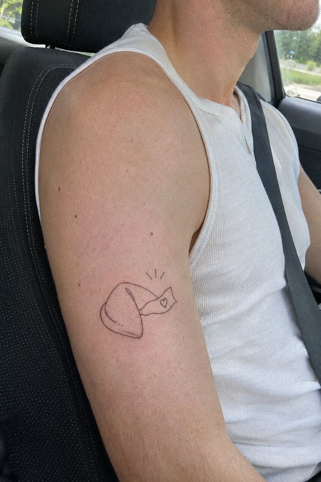
I wanted one tattoo that didn’t take itself too seriously. The fortune cookie on my upper arm gave me that playful break from solemn symbols and family references. I kept the shape simple, with a curved fold and a tiny paper fortune showing from the center.
The idea felt whimsical, but the placement still looked polished when my arm was bare. The fortune cookie became my most playful symbol.
I asked for fine-line fortune-cookie ink with a slightly thicker outer contour. That contrast helped the small shape read from a distance.
Your artist can keep the inner lines lighter, but the outside needs enough strength to hold the silhouette. I chose the upper arm because I could hide it under a short sleeve or show it when I wanted.
The upper-arm placement gave me that flexibility.
The first fortune said “good things,” and I rejected it. Too generic.
I changed it to a private word that only made sense after a difficult year. That small edit made the design meaningful without turning it serious.
The finished piece was charming, crisp, and unexpectedly comforting whenever I saw it. The private word carried the emotional weight.
I didn’t add stars, sparkles, or a banner. The cookie already had a clear outline, and more decoration would’ve made it look like a sticker. Your personal joke can be a stronger anchor than a standard quote!
If you want a lighter idea, these unique tattoo ideas can help you find a symbol that still sounds like you. The simple contour kept the tattoo playful instead of cluttered.
The design was worth it because the concept was clear before I booked. I didn’t pay for endless revisions, and the final mark still had enough personality to feel iconic. That clear concept saved both time and money.
8Along My Rib, A Fierce Reminder

The rib placement came from a sentence I needed to remember, but I didn’t want the words visible every day. I chose a short reminder and placed it along the curve beneath my ribs.
The design was fierce and intimate, with narrow lettering that followed the body instead of sitting in a straight horizontal line. The rib placement made the message feel private.
I brought healed rib lettering to my artist and asked for a style that stayed readable without looking heavy. We tested the phrase on transfer paper and moved it several times. Your ribcage changes shape when you breathe, so the stencil can look different standing, sitting, and lying down.
I checked all three positions before approving it. The healed lettering set a realistic standard.
The session was more intense than my forearm tattoo. The ribs are close to bone, and the vibration felt sharp in places.
I kept the phrase short because I didn’t want discomfort to pressure me into accepting a rushed design. My artist worked in short passes, and the finished lettering felt raw, elegant, and private.
The short phrase helped me stay focused.
I wouldn’t choose this placement only because it looks striking. You need to think about clothing friction, sleep, and aftercare during the first days.
A soft, loose shirt helped me avoid rubbing the fresh tattoo. The value was emotional, not just visual.
Clothing friction became part of my decision.
If this area interests you, compare it with side tattoos for women with meaningful designs. Your reason for choosing the ribs should survive the discomfort, not just the reveal. Those rib tattoos need a personal reason behind them.
9Three Stars For My Siblings
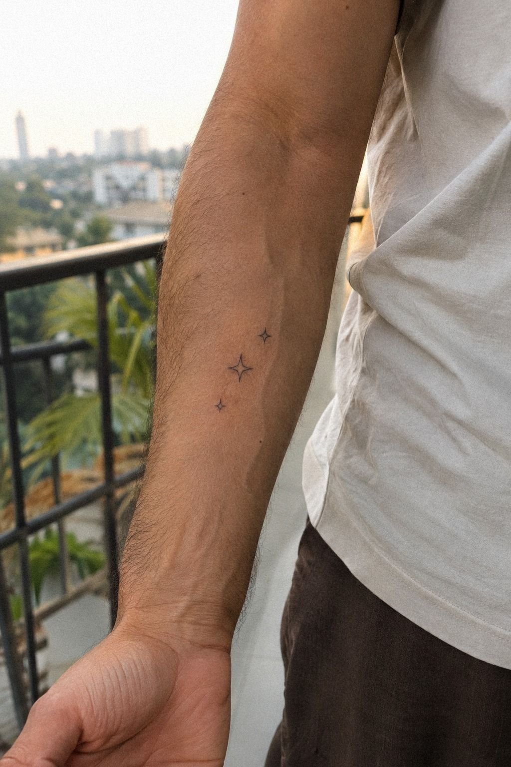
I wanted three stars for my siblings, but matching symbols felt too obvious. The sibling stars became more expressive when each one had a slightly different size, while the shared shape kept the connection clear.
10The Wave That Marked My Healing

The wave was the one design I changed most. I first wanted a realistic ocean line, but it looked too busy beside my other tattoos. I simplified it into one flowing curve with a small break near the crest.
That empty space represented the pause I needed before making a major decision. The wave design became more meaningful after I removed detail.
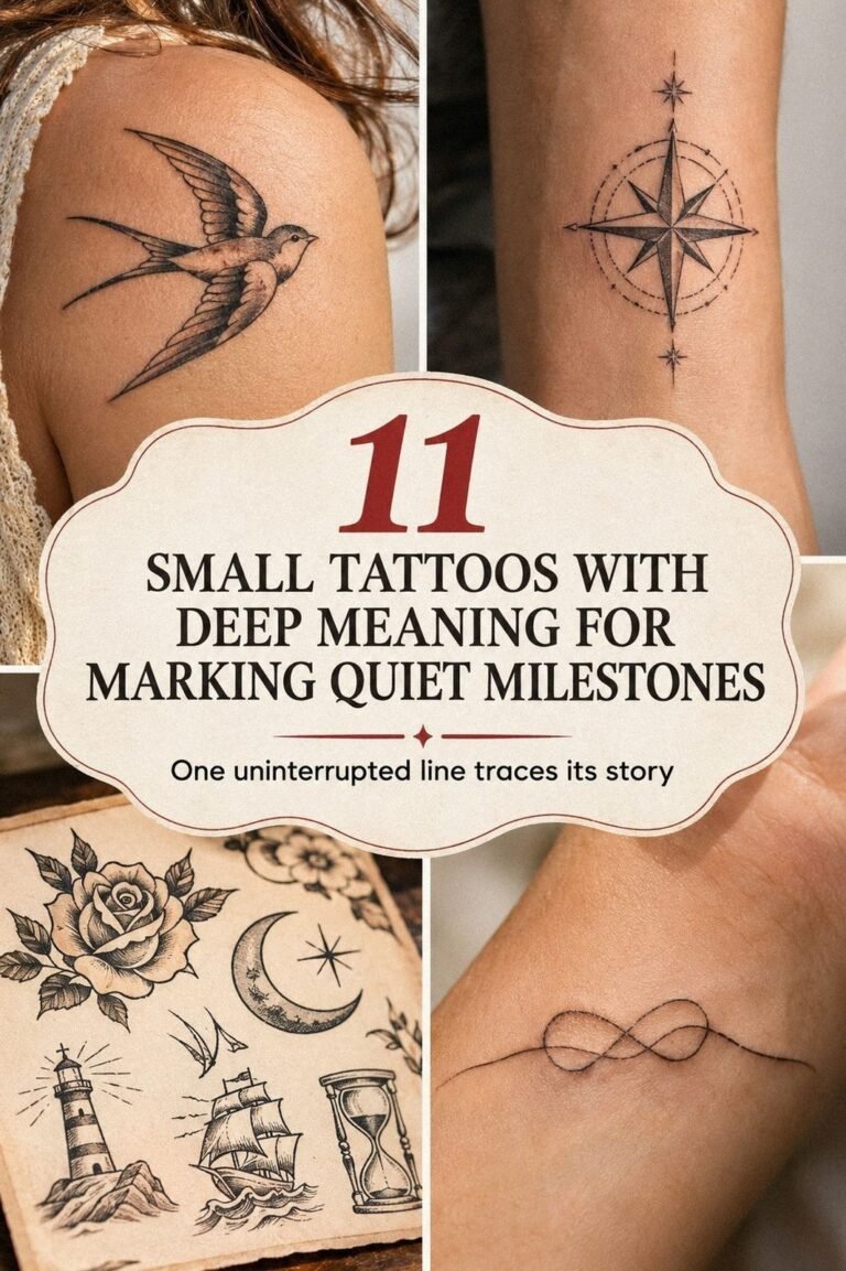
The stencil on the left side of my reference sheet looked almost too simple, while the settled version on my thigh showed why restraint mattered. I used healed black wave linework as the standard, not the fresh stencil.
Your artist should be able to show work after the surface has settled, because fine lines can soften during healing and over the years. The healed wave linework showed what I could realistically expect.
The thigh placement gave me a more tolerable session and enough room for the curve to breathe. I asked for a line that was sharp but not heavy, then kept the rest of the skin untouched. The final tattoo felt soothing, graceful, and quietly empowering.
It marked recovery without forcing me to explain recovery. The thigh placement gave the curve enough space.
I wouldn’t use a wave as a universal healing symbol if it doesn’t connect to your own memory. Mine came from a specific morning near the coast, not from a trend board.
You can find more ideas among these meaningful tattoos for men, then write down the moment behind your favorite before booking. The right design will have a story you can still feel years later. These healing tattoos work best when the memory is specific.
11Matching Ink With My Oldest Friend
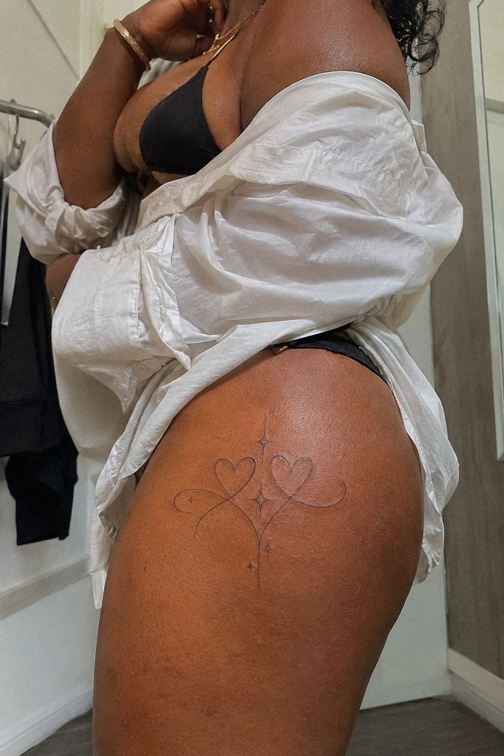
The final idea was a matching tattoo with my oldest friend. We chose a small, timeless mark that felt personal to both of us, but each person adjusted the placement slightly. The matching tattoo stayed connected without demanding identical skin.
How Much It Cost
My artist priced the appointment around the studio minimum and the time needed for custom design, not by the number of ideas I brought. In the United States, a tiny meaningful tattoo often lands near the shop minimum, while a custom piece with lettering, placement testing, or multiple stencil changes can move into an hourly rate. Your city, artist, demand, and design complexity will change the final quote.
The studio minimum was only one part of the decision.
I wouldn’t choose an artist from the lowest number alone. Look for clean healed work, safe studio practices, and a portfolio that matches your line style.
Your consultation should cover the design, placement, expected session length, aftercare, and whether a touch-up policy exists. Ask before the appointment, not while you’re already in the chair. The custom appointment should feel clear before you pay a deposit.
For your healing plan, the surface commonly settles in about 2 to 3 weeks, while complete healing can take about 2 to 3 months. Gentle washing, light moisturizing, and avoiding direct sun and swimming matter during that period.
You can read more placement ideas in small meaningful tattoos, but your artist’s aftercare instructions should guide your specific piece. The aftercare instructions are more important than a generic timeline.
I wouldn’t call a low quote automatically good value, and a higher quote isn’t automatically excessive. Ask what the price includes, whether the consultation is separate, and how the studio handles touch-ups. That makes the final cost easier to judge.
The touch-up policy should be part of the conversation.
Check These Before I Book
I start with the artist’s healed portfolio, not only recent work. Fresh tattoos can look crisp and vibrant, while healed examples reveal whether small gaps remain open and whether fine lettering stays readable. The healed portfolio tells me more than a dramatic studio presentation.
Then I ask about the studio minimum, custom drawing time, deposits, touch-ups, and aftercare. I want the complete cost before I book.
If the answer is vague, I don’t treat the appointment as a good value. The studio policy should be easy to understand.
I also bring a reference that shows the subject, but I leave room for the artist’s judgment. A skilled artist may suggest a bolder contour, a sharper curve, or a different placement.
That conversation can turn a cute idea into a striking one. The reference sketch starts the discussion rather than ending it.
For more planning help, I compare my notes with first tattoo ideas. The strongest references explain the feeling and placement without demanding an exact copy.
How I Keep A Hidden Tattoo Readable
Hidden doesn’t have to mean microscopic. I leave enough space between letters, petals, dots, or stars for the design to stay crisp as the skin changes. A readable silhouette usually gives a tiny tattoo more staying power.
I also avoid packing too many symbols into one mark. A readable silhouette usually has more long-term value than a crowded design with every meaningful detail included. The line spacing is part of the design, not an afterthought.
Placement matters just as much. Behind the ear, the upper arm, the inner forearm, and the thigh gave me useful control over visibility.
Hands and fingers felt more exposed to friction, so I treated them as a more daring choice. The hidden placements helped me decide how private each idea needed to be.
If you’re comparing hidden placements, these small wrist tattoos show how much spacing and scale can affect the final result. I pay attention to whether the design still reads from a normal viewing distance.
When Is A Custom Tattoo Worth The Cost?
A custom tattoo is worth the cost when the design carries something specific that a flash piece can’t express. My paw print, coordinates, and private lettering all needed personal adjustments. The custom design earned its place when it preserved a detail only I could explain.
Custom work isn’t automatically better. If you already love a simple flash design, changing it just to make it unique can weaken the idea and increase the budget without adding value. The flash piece may be the stronger choice when its shape already feels complete.
I ask myself three questions: Will I still understand the meaning later? Can the placement stay private when I need it to?
Does the quote match the artist’s healed work? If the answers are yes, the appointment feels worth it.
The healed work anchors the decision in something real.
I also avoid booking during a rushed emotional moment. A timeless symbol can still feel raw and empowering, but I want to know why I’m choosing it before the stencil touches my skin. For more comparisons, I revisit meaningful symbol tattoos and remove any detail that doesn’t serve the story.
Why I Stopped Chasing A Meaningful Tattoo That Explained Everything
I used to think a meaningful tattoo had to be instantly understandable. I wanted the symbol, date, and explanation to line up so nobody could misunderstand it.
Then I noticed that my favorite pieces weren’t the ones with the most information. They were the ones that brought back a physical moment, like a hand on my shoulder or the sound of waves before a hard conversation. The physical memory mattered more than a complete explanation.
That changed everything! I started with the memory, not the object.
The flower represented a birthday, but the narrow stem also reminded me of a letter my grandmother kept in a drawer. The moon wasn’t just a moon.
It marked the season when I learned to make decisions without asking everyone else first. Your meaning can be layered without being printed on your skin.
The layered meaning made each symbol feel more personal.
I also stopped treating hidden placement as a compromise. Behind the ear, along the ribs, and under a sleeve gave me control over attention.
A tattoo can be visible to you and private from the room around you. That feels especially valuable when your work, family, or comfort level changes.
My most personal piece isn’t the largest one. It’s the one I can cover without feeling like I’m erasing it.
The private placement gave me that control.
The practical lesson is less romantic, but it matters. Fine lines can soften.
Finger tattoos can fade. Skin tone, sun exposure, friction, and placement all influence how a design ages.
I prefer black ink with enough spacing, a readable silhouette, and an artist who can show healed work. If you’re still deciding, write down what you want to remember. Then remove half the decoration.
The surviving mark usually feels more personal. The black ink helped keep my choices crisp.
The Questions Worth Answering First
How much does a Cute Meaningful Tattoos usually cost?
A small tattoo in the United States commonly costs about $50 to $100 at a studio minimum, or $100 to $250 per hour. Your final quote depends on the artist, region, size, lettering, and placement, so ask for pricing before booking. The final quote should include any custom drawing time.
– Studio minimum – Hourly rate – Custom drawing time – Touch-up policy
Are Cute Meaningful Tattoos a good idea for a first tattoo?
Yes, especially when you choose a tolerable placement and a readable design. A small personal piece can make your first appointment feel manageable, but fine lines still need careful aftercare and realistic aging expectations.
The inner forearm, outer thigh, and upper arm are often easier starting points than ribs or hands. A small personal piece can still feel powerful.
– Clear stencil approval – Simple linework – Meaningful subject – Healed portfolio examples
How do I choose a tattoo artist for Cute Meaningful Tattoos?
Choose an artist whose portfolio shows clean linework, healed work, and the kind of symbolism you want. A healed portfolio tells you more than a fresh studio presentation, especially for fine lettering or tiny shapes.
Check hygiene practices, consultation quality, and whether the artist explains placement limits. The artist’s portfolio should match the result you want.
– Healed linework – Fine lettering – Single-use supplies – Clear aftercare
How much do Cute Meaningful Tattoos hurt?
Pain varies by person and placement. Ribs, feet, hands, and sternum tend to feel more intense, while the forearm, thigh, and shoulder are often more tolerable.
Your placement usually matters more than the tattoo’s emotional meaning, so choose a body area you can sit through calmly. The placement choice affects the session.
– Rib sensitivity – Hand friction – Forearm tolerance – Shorter session
How long does a Cute Meaningful Tattoos take to heal?
The surface commonly heals in about 2 to 3 weeks, while complete healing can take about 2 to 3 months. Your aftercare routine should include gentle washing, light moisturizing, and avoiding sun and swimming. Follow your artist’s instructions if they differ from general guidance.
The aftercare routine protects the fresh design.
– Mild cleansing – Thin moisturizer – No picking – Limited sun exposure
What’s the best placement for Cute Meaningful Tattoos?
The inner forearm, upper arm, thigh, and shoulder offer useful visibility control and tend to be more tolerable than hands, feet, ribs, or sternum. Your best placement balances privacy, friction, pain, and line longevity.
If you want a hidden design, compare the rib ideas in side tattoos for women with meaningful designs. The best placement is the one you can live with comfortably.
– Coverable placement – Enough line spacing – Lower friction – Personal visibility
Where I’d Start First
If I had to pick one, I’d start with the birth flower behind the ear. Its fine stem carries a private meaning, yet the placement disappears under your hair when you need a clean slate.
That combination gives the idea strong value: personal, coverable, and distinctive without demanding attention. For one last comparison, these unique tattoo ideas may help you refine the symbol.
Pin that idea for later, and let your first appointment stay personal.