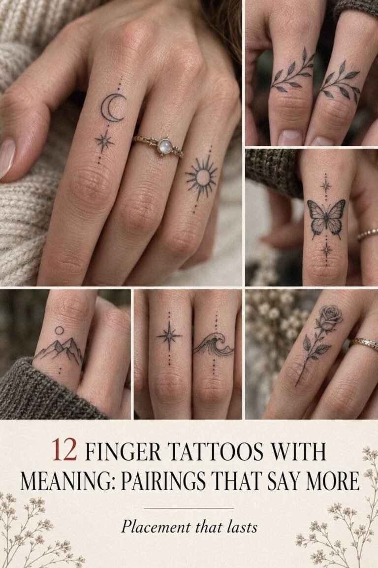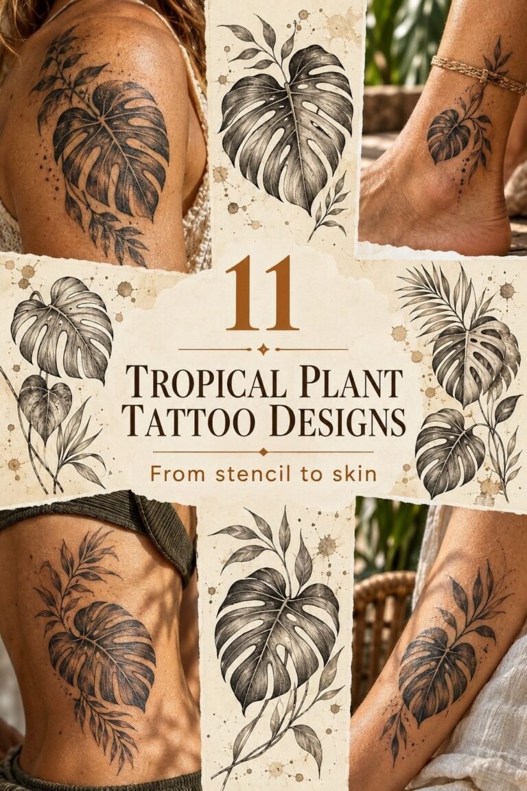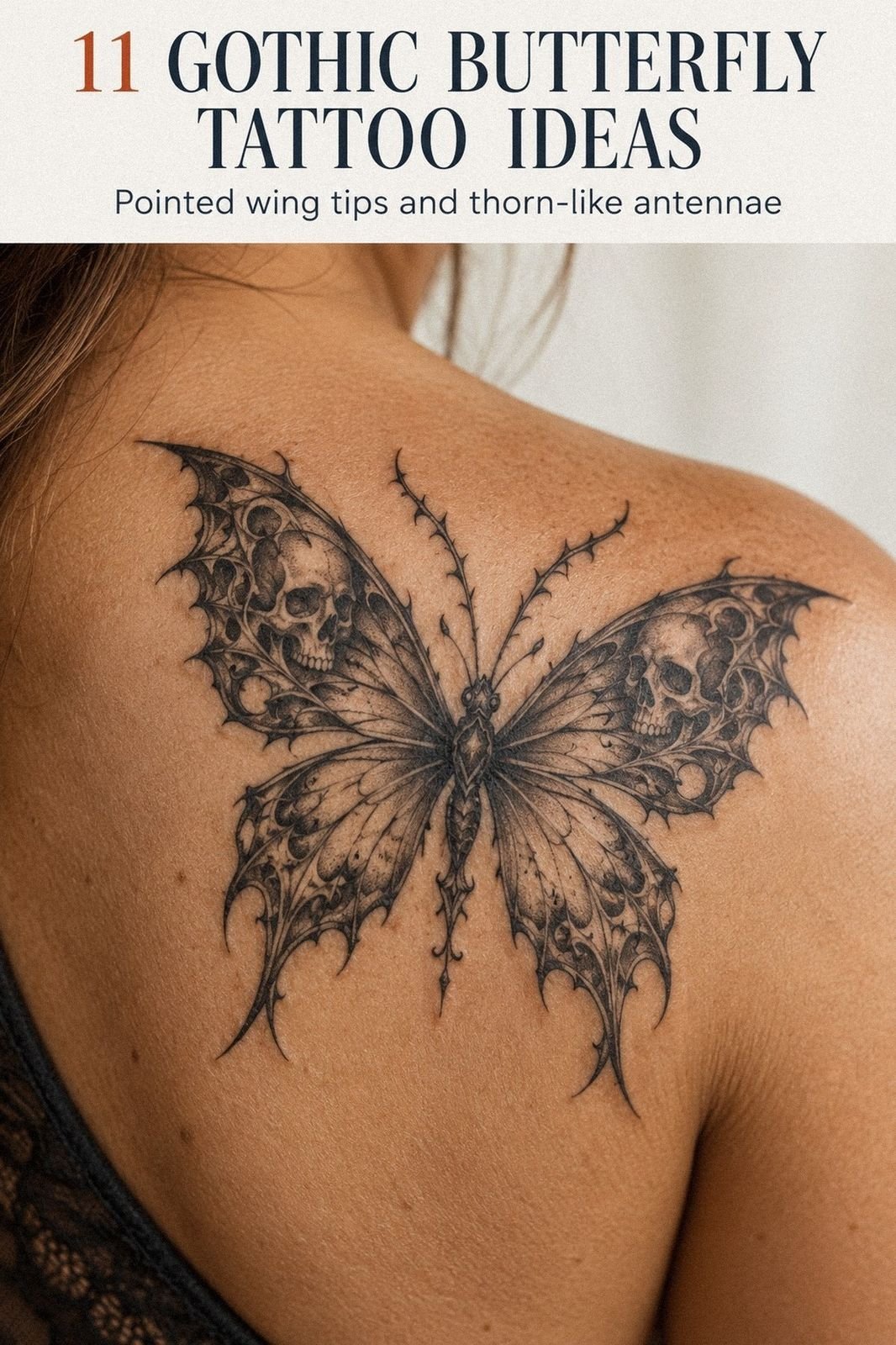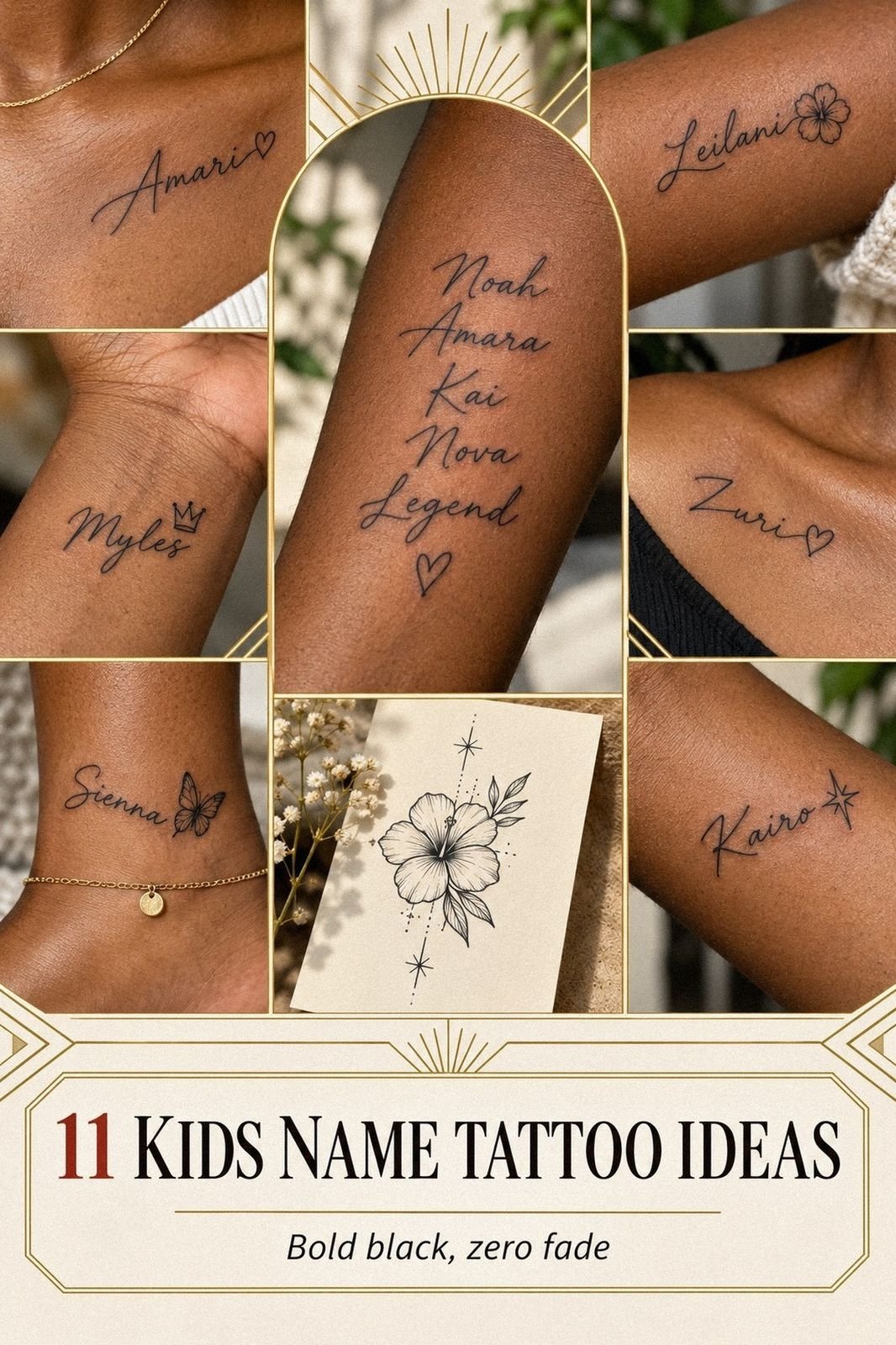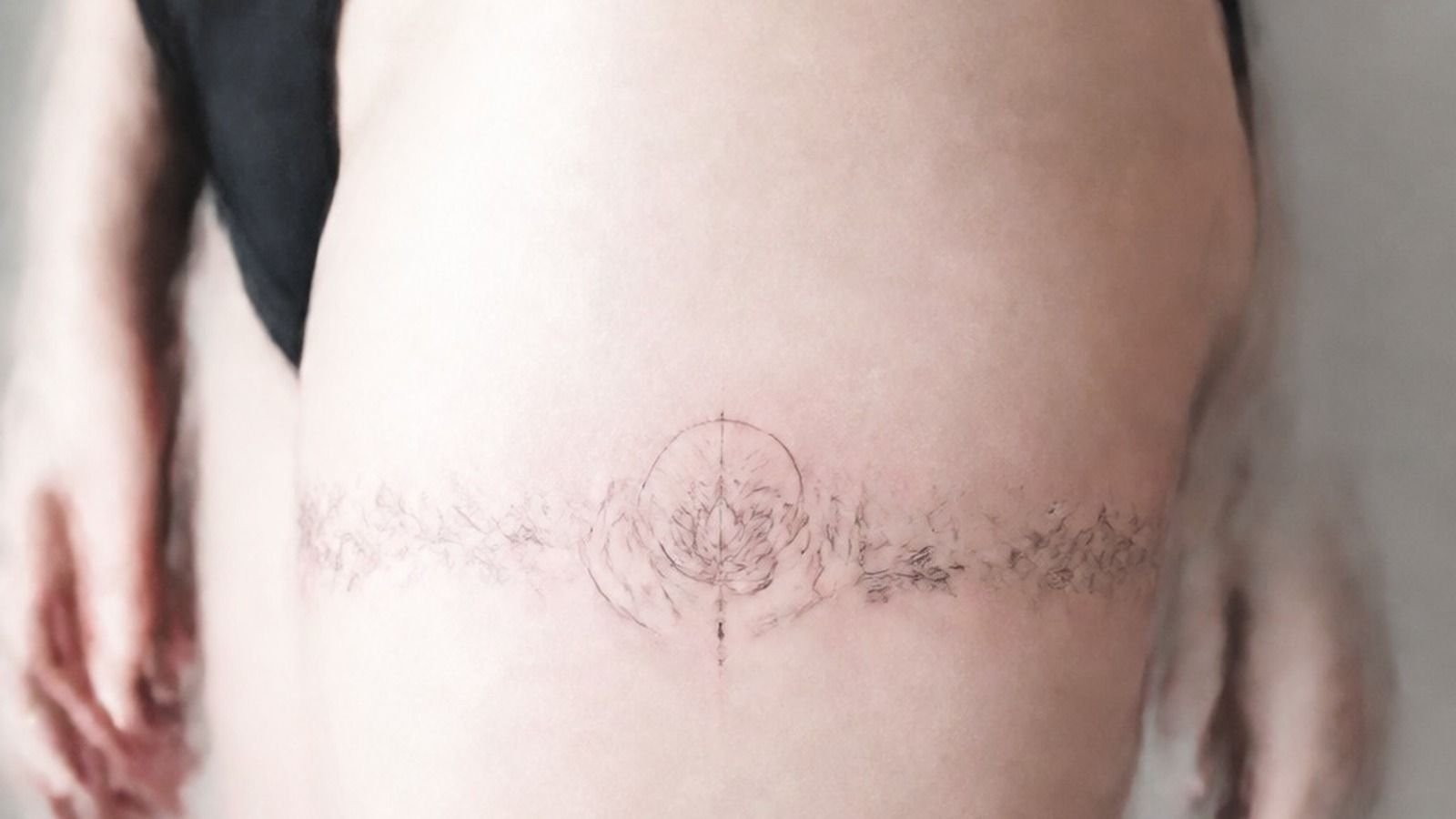
Half the consultations I book start the same way. Somebody sits down, pulls up a screenshot, and says “I want something small that means a lot.” Then they show me a design with eleven elements packed into an inch and a half.
Meaning is the easy part. You already have it.
The hard part is turning a private thing into a shape that reads clean on skin for twenty years, on a body that stretches, tans, and ages. That’s a craft problem, and it has rules.
Here’s how I approach symbolic work in my chair, what it costs, where it hurts, and which choices I watch people regret.
Start With the Meaning, Then Pick the Shape
Come in with the story. Don’t come in with the drawing.
When somebody tells me “my grandmother grew dahlias and she raised me,” I’ve got a hundred directions. Single bloom in single-pass linework.
A stem with two leaves in fine line. A bold trad dahlia with solid fill that’ll still punch in 2050.
When somebody hands me a saved image instead, I’m reverse-engineering their meaning from a stranger’s tattoo, and it usually fits worse.
The symbols that age best are the ones with simple silhouettes. A moon. A key. A snake.
A single flower. You should be able to squint at it from six feet and still name it. If the shape falls apart when you squint, it’ll fall apart in ten years too, because that’s what healed ink does. It softens and spreads a little.
Always. If you’re still deciding between styles, our fine line vs bold line breakdown covers the trade in more detail.
Small Symbols Turn to Soup When You Cram Them
There’s a physical limit to how much detail fits inside a given amount of skin, and it’s lower than Pinterest suggests.
Ink migrates. A hair-thin gap between two lines at 1 inch becomes no gap at all by year eight.
That’s not bad tattooing, that’s just how skin behaves. The industry word for the result is soup: a small piece so detailed it heals into a smudge you can’t read.
My working floor for a symbol with internal detail is about 1.5 inches. Below that I strip elements out or bump the size up.
A compass with a full rose, cardinal letters, and shading needs 2.5 to 3 inches minimum. A crescent moon with three dots is happy at 1 inch and will still be crisp forever. Ask your artist directly: what’s the smallest this reads at in ten years?
A good one has an answer ready.
Semicolon Tattoos Don’t Owe Anyone an Explanation
If you want it, get it, place it where you can cover it on the days you don’t feel like telling the story.
What a Meaningful Symbol Actually Costs
Shop minimums are real and they’re not negotiable. In the US you’re looking at $100 to $250 minimum just to sit down, even for something that takes fifteen minutes. That covers a fresh needle, tubes, ink caps, setup, and breakdown.
Hourly runs $100 to $250 per hour in most markets, higher in major cities and for artists with a waitlist. In France expect 120 to 200 euros per hour.
Tip on top of that, 15 to 20 percent is normal in the US. And budget for one touch-up around the 6 to 12 month mark if you picked a high-wear spot. Most shops do the first touch-up free or cheap if you followed aftercare.
More on pricing structure in our tattoo cost guide by size and style.
Fingers Are Rented Space
Finger ink lives on skin that regenerates fast and takes constant friction, so plan on touch-ups every 1 to 2 years or accept it looking blurry.
Why Sailor Jerry Symbols Still Read at Twenty Feet
Look at a Sailor Jerry swallow from the 1940s next to a modern micro piece from 2019. The Jerry piece wins, every time, and it’s not nostalgia.
That whole vocabulary was built around bold black outlines, limited color, and negative space doing half the work. A swallow, an anchor, a dagger through a rose.
Big shapes, hard borders, solid fill with big mags so the color packs in one pass instead of getting scratched at fifty times. Bold will hold.
That’s the entire physics of it: a thick line has margin to spread into before it loses definition, and a thin one doesn’t.
You don’t have to get a trad tattoo to steal the lesson. Even if you want fine line work, ask for a slightly heavier outer contour on the main shape.
It gives the piece a spine. Ten years later it still reads from across the room instead of dissolving into a grey bruise. Our American traditional symbol guide breaks down the classic vocabulary if that’s the direction you’re leaning.
Irezumi Rules Marco Still Follows
My studio partner Marco trained in Japan, and there’s a whole grammar in irezumi that most people getting a “Japanese-inspired” symbol never hear about.
Direction matters. A koi swimming up the body reads as struggle and ambition. Swimming down reads as having arrived.
Dragons carry water, tigers carry wind, and the two get paired for balance rather than thrown together for looks. Cherry blossoms scattered loose mean impermanence, which is why they’re falling in traditional work instead of sitting neatly on a branch.
The technical side is just as strict. Traditional Japanese work uses background wind bars and finger waves to tie elements together, so a single floating symbol pulled out of that system often looks orphaned.
If you want one small Japanese motif, ask for it composed as a standalone rather than clipped out of a bodysuit design. Marco also still does some tebori hand-poked shading, which heals softer than machine work and takes roughly 30 percent longer in the chair. See Japanese tattoo meanings explained for the full symbol set.
Bring References So I Get the Vibe
Send me five images for mood, tone, and line weight, and I’ll draw you something that fits your body instead of tracing somebody else’s arm.
Placement Decides How Long the Meaning Lasts
Where you put a symbol matters more than what the symbol is. Skin isn’t uniform. Some zones flex constantly, some catch sun, some rub against clothes and gym equipment every single day.
High-wear zones are fingers, hands, feet, elbows, knees, and the inner bicep. Those fade, blur, and blow out faster.
Low-wear zones are the outer and upper arm, thigh, calf, and upper back. Those age beautifully with barely any intervention.
Pain reads honest here. Lines feel sharper, shading is a dull burn, and color packing is the spiciest part. Ribs and sternum are genuinely rough because there’s no muscle padding over bone.
Outer arm and calf are chill enough that people fall asleep on me. Tap out for five minutes rather than pass out on me. Full breakdown in our tattoo pain chart by body part.
Anchor Watercolor Symbols With Line
Watercolor gets a bad reputation and most of it is earned, because people get it done without structure.
Pigment splashes with no containing line have nothing holding them in place. Five years later you’ve got a soft coloured bruise where a bird used to be.
The fix is simple and every competent artist knows it: build the subject in confident black line first, then let the color bleed around and behind it. The line carries the readability. The wash carries the mood.
I’ll do watercolor all day if it’s anchored with line. I won’t do it floating. If an artist offers you loose splashes with zero linework and doesn’t mention how it’ll heal, that’s your answer about them.
Compare healed examples in our watercolor tattoo aging guide.
Handwriting and Memorial Pieces Need a Clean Scan
Memorial work is the one where I slow everything down.
If you’re bringing a loved one’s handwriting, get me the highest resolution scan you can, ideally on plain paper at 600 dpi. A phone photo of a card at an angle gives me warped letterforms I have to guess at.
I’ll also tell you when a signature is too fine to survive. Ballpoint strokes can be thinner than my thinnest needle grouping, so we scale the whole thing up until the strokes hit at least 1mm wide.
Coordinates, dates, and short quotes all live or die on letter spacing. Cramped kerning closes up as ink spreads and turns into a solid bar.
I build in extra air between characters knowing it’ll tighten over time. That’s the part clients push back on in the stencil and thank me for years later. More examples in our memorial tattoo ideas roundup.
Angel Numbers Deserve Better Type
111, 222, 444, whatever sequence you’re carrying. The meaning is yours and I won’t argue with it. The typography is mine to protect.
Repeating digits create optical problems. Three identical characters in a row read as a texture rather than a number if the spacing is tight, and thin serif numerals lose their little feet within a few years. I steer people toward a clean sans or a hand-drawn numeral with slightly heavier stems.
On a single needle the strokes need to be short and deliberate, one clean pull each, not ten fuzzy passes.
Placement helps too. Numbers on the inner forearm or the back of the upper arm stay legible far longer than the same numbers on a finger or the side of the wrist. See the angel number tattoo placement guide for layouts that hold.
Black and Grey Against Full Color
Black is your best friend for longevity. Color is spice.
Black and grey built with grey wash, whip shade, and pepper shading ages more gracefully than almost anything, because you’re working with dilutions of one pigment that all fade at roughly the same rate. The piece gets softer as a whole rather than going patchy. Push the contrast during the session so it doesn’t heal flat.
Color fades unevenly. Reds and yellows are the first to go, especially on skin that catches sun. Blues and greens hold longer.
Fine red-ink work is gorgeous and has a real following right now, and I’ll happily do it, but I tell everyone straight: red sits lighter in the skin and you’ll want a refresh sooner than you would on black. For symbolic pieces that need to last, I push black with one accent color rather than a full palette.
Details in our black and grey vs color aging comparison.
Matching Symbols Land Differently on Two Bodies
Same stencil, two people, two totally different results. That surprises people every time.
Skin tone changes how ink reads. On deeper skin, high-contrast black work and bold shapes sing while thin grey wash can get lost, so I adjust line weight and lean on solid fill. Body size and placement change the scale needed, too.
A 2-inch symbol that fits perfectly on one forearm looks stranded on a bigger arm.
The move for matching pieces is to keep the symbol identical and let size, weight, and placement flex per person. Nobody notices the half-inch difference.
Everybody notices when one of the two looks cramped. Our matching tattoo ideas guide has layouts that work across different bodies.
Skip the Micro Detail on Ribs and Sternum
Bony areas heal differently. Skin over the ribs is thin, it flexes with every breath, and the healing tends to be more reactive than on a fleshy calf.
I’ve seen more blowouts on ribs than anywhere except fingers. Not because artists are careless there, but because there’s less forgiveness in the tissue. If you want rib work, go bolder than you would elsewhere and give the design room.
Bold will hold applies double on a rib cage.
Sessions on ribs also run shorter because most people genuinely can’t sit through more than 2 to 3 hours there. Budget for two visits on anything substantial. Read what to expect from rib tattoos before you book.
Choose the Artist Before You Choose the Design
The style you want has specialists in it, and the difference between a specialist and a generalist is enormous on small symbolic work.
Look at healed photos. Not fresh ones.
Fresh ink always looks perfect because the lines are still swollen and the pigment is sitting in surface trauma. Healed photos at 6 months or 1 year are the actual portfolio.
If somebody has none, ask. If they get weird about it, leave.
The word for a bad tattooer in this business is scratcher, and the tells are consistent: wobbly lines, uneven depth, portfolios with only fresh shots, prices way below shop minimum, and no consultation before the needle. Our how to choose a tattoo artist guide walks the whole vetting process.
Aftercare Is Where You Actually Protect the Meaning
First few days it’s an open wound. Treat it like that.
Wash gently with unscented soap two or three times a day, pat dry with a paper towel, and apply a thin layer of ointment. Thin.
Don’t suffocate it. A smothered tattoo heals gummy and can lose pigment in patches.
Around day four or five it’ll peel like a sunburn. Don’t pick the flakes or you’ll pull color out with them, and you’ll be back in my chair paying for a touch-up you caused.
Then comes the silver skin stage, that shiny slightly cloudy look that lasts a couple weeks. That’s normal and it clears.
Surface healing runs 2 to 4 weeks. Deeper healing takes 3 to 6 months.
The four things that kill a tattoo are sun, pools, gym friction, and picking. Sunscreen at SPF 30 or higher on healed ink forever is the single highest-return habit for keeping symbolic work sharp. Step by step in our tattoo aftercare timeline.
Why Most Meaningful Tattoos Get Ruined Before They Heal
Here’s the part nobody wants to hear. The design almost never fails. The decision-making around it does.
The tattoo I retouch most often isn’t a big piece. It’s a tiny three-letter word somebody wanted on the side of a finger. I’ve reworked that same spot three times in two years for the same client, and every time she asks why it won’t hold, and every time the answer is the same: it’s a finger.
That skin turns over constantly, she washes her hands twenty times a day at work, and no ink survives that without maintenance. She’s fine with it now.
But she wasn’t fine with it the first time, because she thought a tattoo was a thing you get once.
The pattern I see over and over is people negotiating against their own tattoo. They want it smaller than it should be so it stays discreet.
They want it on the spot with the worst wear because that’s where it looked good in a photo. They want fifteen elements because every one of them means something.
Then they want it cheap and they want it today. Every single one of those choices trades ten years of legibility for a slightly better first week, and the first week is the only week that doesn’t matter.
The other killer is treating aftercare as optional once the piece looks decent. People go back to the gym on day three, sit in the sun on day six, pick a flake on day nine, and then blame the artist at month four when there’s a gap in the linework.
I can control needle depth, line quality, and saturation. I cannot control what you do in the two weeks after you leave. That split is where most disappointment actually lives.
So the honest version is this: a meaningful tattoo isn’t a purchase, it’s a relationship with a spot on your body. Some spots need attention every couple of years. Some need almost none.
Pick knowingly, size it so it can breathe, and stop asking your skin to do something skin doesn’t do.
A Few Things Worth Answering
How much does a small meaningful tattoo cost? Expect the shop minimum first, which runs $100 to $250 minimum in most US studios regardless of how tiny the piece is. That covers sterile setup, which costs the same whether you’re getting a dot or a sleeve panel.
Beyond the minimum, hourly rates land between $100 and $250 per hour depending on the artist’s experience and your city. Add 15 to 20 percent for tip and set aside a little for a touch-up if you’re going somewhere high-wear.
Where do meaningful tattoos hurt the least? Outer arm, inner forearm, calf, and thigh are the chill zones, sitting around 3 to 4 out of 10 for most people. Those areas have muscle and fat padding between the needle and bone, which is exactly what dulls the sensation.
Ribs and sternum are the spicy end at 8 out of 10 because the skin sits directly over bone with nothing in between. Lines feel sharper and quicker, shading is a dull burn, and color packing with big mags is the most intense part of any session.
How long until a small symbol tattoo is fully healed? Surface healing takes 2 to 4 weeks, and that’s when it stops being an open wound and finishes peeling. Full healing in the deeper layers of skin runs 3 to 6 months, which is when the color settles into its final tone.
During the surface phase you’ll go through weeping, flaking, and then the silver skin stage where everything looks shiny and slightly cloudy. Don’t judge your tattoo until at least the one month mark, because it always looks duller mid-heal than it will at the end.
Should I get flash or custom for a symbolic piece? Flash is pre-drawn work the artist has already designed, and it’s usually faster, cheaper, and technically tighter because they’ve inked it before and know exactly how it heals. Custom makes sense when the meaning is specific to you, like handwriting, coordinates, or a combination nobody else would draw.
A lot of artists run pick and stick days where flash goes for a flat rate, and those pieces are often the best-composed things in the shop. If your symbol is a common one, a swallow, a moon, a snake, flash will almost always outperform a rushed custom.
Do fine line tattoos fade faster than bold ones? Yes, and anyone telling you otherwise is selling something. Single needle and fine line work uses less pigment deposited in thinner strokes, so there’s simply less ink in the skin to lose before the design starts breaking up.
Bold linework has margin to spread into, which is why traditional pieces from the 1950s still read clearly. Fine line is genuinely beautiful and I do a lot of it, but plan for a refresh around the 5 to 8 year mark and keep it off high-wear placements.
The Best Meaningful Tattoo Is One You’ll Still Recognize
Give the shape room, put it somewhere your body isn’t fighting it, and let a good artist push back on you. That’s the whole thing.