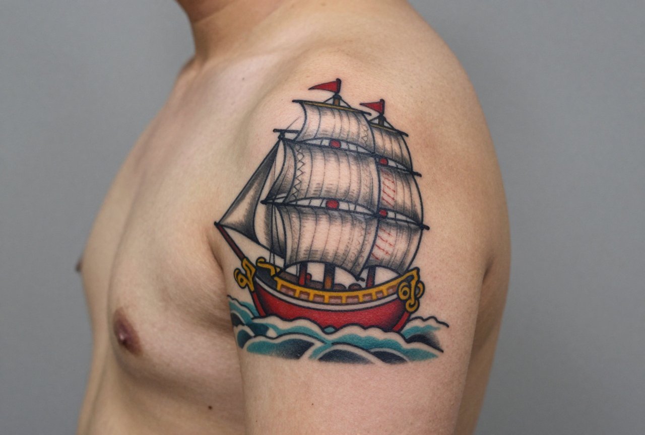
A traditional ship tattoo hits different. It’s not just a boat on your skin, it’s a piece of maritime history, a symbol of passage and return, rendered in the bold, readable style that American tattooing built its reputation on. Think thick black outlines, limited but saturated color, and imagery that still reads clearly from across a room or twenty years down the line. The ship motif has been a staple since the early 1900s, when sailors walked into shops on the Bowery or in Honolulu and asked for something that meant they’d survived the journey. Today, the traditional ship remains one of the most requested designs in shops that value heritage over trends.
Origins & History
From Sailor Skin to Mainstream
The ship tattoo started on sailors. That much is obvious. But the style itself crystallized in the early 20th century through artists like Sailor Jerry Collins, who worked in Honolulu from the 1930s to 1970s. Jerry didn’t invent the ship motif, European and Japanese sailors had been getting maritime tattoos for centuries, but he perfected the American traditional approach. Bold lines. Fast execution. Designs that held up under tropical sun and salt water. The ship meant a sailor had crossed the equator, or survived a particularly brutal voyage, or simply that the sea was their life. Shop culture back then was rough, fast, and functional. You got what was on the wall, maybe with a name added, and you didn’t spend three hours debating shading styles.
What the Ship Actually Meant
Symbolism was practical, not mystical. A full-rigged ship meant you’d sailed around Cape Horn. A ship with sails down meant you’d returned home. A ship sinking? That was darker, sometimes a memorial, sometimes a warning. The point was that these tattoos told a story to other people who knew the code. Today, most people getting traditional ships haven’t spent a week on open water, and that’s fine. The imagery has transcended its origins, but it still carries that weight of journey, risk, and return. Any artist worth their salt knows this history and brings it to the design, even if you’re a landlocked accountant from Ohio.
Key Characteristics & Motifs
Traditional ship tattoos have rules. Break them and you’ve got something else, maybe beautiful, but not traditional. Here’s what defines the style:
- Thick black outlines: The ship’s hull, masts, sails, and rigging all sit in heavy black lines, typically 5-14 needle groupings. These lines do the heavy lifting. They define the form. Without them, the tattoo dissolves over time.
- Limited color palette: Red, yellow, green, blue. Maybe some brown for the hull. No gradients, no soft fades. Each color sits in its own outlined space, like a coloring book page.
- Stylized waves: Not realistic water. Traditional waves are repeating curls, often with white caps suggested by negative space or simple lines. They frame the ship and give it motion.
- Clouds or wind bars: Those radiating lines behind the ship? That’s wind, or sometimes just atmosphere. They fill background space and add dynamism.
- Banners and scrolls: “Hold Fast,” “Homeward Bound,” a loved one’s name. The banner wraps around or sits below the ship, integrating text into the image rather than floating it nearby.
- Optional companions: Swallows, anchors, compasses, roses. These fill gaps and add narrative layers. A ship with a swallow means return, since swallows always come home.
The overall composition is usually compact. The ship fills the space efficiently. No wasted skin, no floating elements that don’t connect. This isn’t just aesthetic, it’s how tattoos aged when touch-ups were rare and sun protection was nonexistent.
Color vs Black and Grey
The Classic Approach
Color traditional ships are the standard. That saturated red on the hull, the yellow sails, the deep blue water. Color in traditional work isn’t subtle. It’s declarative. Each pigment is chosen for visibility and longevity. Red ages to a dusty rose but stays readable. Yellow can fade to a pale cream, which is why good artists pack it dense. Green sometimes goes muddy, especially cheaper formulations, so experienced artists might lean toward a blue-green or skip it entirely. The black outline saves everything. Even when color fades, the ship’s shape remains unmistakable.
Black and Grey Traditional
Black and grey traditional ships exist, though they’re less common. This approach uses whip shading and dotwork to create depth without color. The result is starker, more graphic, sometimes more menacing. It can look incredible on darker skin tones where color saturation is harder to achieve, or for people who simply prefer the aesthetic. The trade-off is that without color to separate elements, the composition needs to be cleaner. Every line matters more. Some artists specialize in this; others will steer you toward color because it’s what the style historically demands. Either way, the black outline remains non-negotiable.
Best Placements
Traditional ships need space to breathe. The masts, the rigging, the hull’s curve, compress them too much and you lose the readability that makes this style work. That said, good artists can adapt.
- Thigh: Ideal. Flat surface, plenty of real estate, easy to heal. The ship sits naturally here, masts rising toward the hip, waves wrapping the outer thigh. Pain is moderate. You can hide it or show it.
- Upper arm/shoulder: Classic sailor placement. The ship’s hull curves with the deltoid, sails reaching toward the shoulder cap. This is what your grandfather’s generation wore. Still looks right today.
- Chest: Broad canvas. A ship here can be large, detailed, framed by other work. The sternum area hurts, there’s no muscle padding, just bone and thin skin. Worth it for the impact.
- Forearm: Tricky but doable. You need a longer, narrower composition. Maybe a ship in profile rather than three-quarter view. The inner forearm is softer skin; the outer forearm takes line better but moves more during healing.
- Back: Maximum space. Some of the best traditional ship tattoos I’ve seen span shoulder blades, the hull centered, sails spreading wide. This is where you go big or go home.
- Calves and shins: The shin is bone city. Painful. But the calf’s muscle belly holds a ship well, especially if you’re building a lower leg with nautical themes.
Avoid tiny spots. Finger ships? No. Behind the ear? Absolutely not. The detail collapses, the lines blur together, and in five years you’ve got a blue blob that vaguely suggests maritime disaster.
Who It Suits
Honestly? Anyone who wants one. The traditional ship doesn’t require sailor credentials. It doesn’t demand a specific aesthetic or lifestyle. What it does require is commitment to the style. If you’re drawn to delicate watercolor, fine-line florals, or photorealistic black and grey, a traditional ship will feel jarring on your skin. It belongs with other bold work, or as a statement piece that anchors a collection.
I’ve seen traditional ships on punk kids, on grandfathers getting their first tattoo at sixty-five, on women building full traditional sleeves, on chefs and carpenters and coders. The common thread is an appreciation for history, for durability, for tattoos that look like tattoos. Not like illustrations, not like photographs. Like skin art with lineage.
Skin tone matters for color choices, but not for the style itself. A good artist adjusts pigment selection and saturation. Darker skin can absolutely carry traditional color; it just needs an artist who knows how to work with melanin-rich skin rather than fighting it.
Modern Variations
Neo-Traditional and Beyond
Some artists push the envelope. Neo-traditional ships keep the bold outlines but add more complex shading, more color transitions, more elaborate backgrounds. You might see a ship with a full moon behind it, rendered in soft grey tones that Jerry would have scoffed at. Or a ship with a kraken wrapping its tentacles around the hull, the creature’s eye glowing with white ink highlight. These aren’t traditional by purist standards, but they’re valid evolution. The ship motif adapts because it’s strong.
Mashups and Subversions
I’ve seen ships with rocket boosters instead of sails. Ships inside bottles with skull stoppers. Ships on fire, ships in space, ships made of flowers. The traditional framework holds these experiments together. Without the bold outline and limited palette, they’d be something else entirely. With it, they’re conversation pieces that still read as tattoo history.
Choosing an Artist
This is where people mess up. Not every artist who can do a decent rose can do a ship. The rigging alone, those tiny lines connecting mast to sail, requires steady hands and real understanding of how ships actually work. An artist who doesn’t know a mizzenmast from a foremast will draw something that looks wrong to anyone with basic nautical knowledge, and subtly off to everyone else.
Look for:
- Portfolio ships: Actual examples, not just “I can draw that.” How’s their water? Their cloud work? Do the sails look like sails or like deflated balloons?
- Line consistency: Traditional lives or dies on clean, confident lines. Check their healed work, not just fresh photos. Instagram filters hide nothing from time.
- Color packing: Solid, even saturation. No patchy spots, no “I’ll fix it when you come back.”
- Shop reputation: Old-school shops with traditional specialists. Walk in, look at the flash on the walls. If there’s a ship sheet that’s been there since 1998, probably a good sign.
Ask about their preferred needle groupings. A traditional artist will have opinions, 14 round liner for the hull, maybe 9 for finer details, 15 mag for color packing. If they sound uncertain or say “whatever works,” keep looking. This style demands intentionality.
Price will reflect experience. A small traditional ship might run $400-600. A large, complex piece with full background? $1500-3000 or more. Good work isn’t cheap. Cheap work isn’t good. You’ve heard it before because it’s true.
Final Thoughts
The traditional ship tattoo endures because it works. It’s readable, symbolic, historically grounded, and visually striking. It doesn’t chase trends. It doesn’t need explanation. On your skin, it becomes part of a longer story, one that started in ports and parlors a century ago and continues every time someone sits in a chair and asks for the same image that sailors got before them.
Get it because you love the sea, or because you love the style, or because you’re marking a passage in your own life. Just get it done right. Find the artist. Sit through the hours. Let it heal clean. And twenty years from now, when the color’s settled and the lines have softened slightly, you’ll still have a ship that looks like a ship. That’s the whole point.
Related Style Guides
- Traditional Tattoo Stencils: Complete Guide
- Warrior Tattoo Ideas That Mean Something
- Different Tattoo Ideas That Actually Work
- Explore more
Frequently Asked Questions
What does a traditional ship tattoo symbolize?
Traditional ship tattoos symbolize a journey through life, both literal and metaphorical. They represent guidance, adventure, and the ability to navigate through difficult times. Sailors originally got them to mark their first crossing of the Atlantic or to ensure safe passage home.
What are the classic colors used in traditional ship tattoos?
Classic traditional ship tattoos use a bold palette of navy blue, red, green, black, and yellow. These colors were chosen because they held up well over time and were available to early tattoo artists. The limited color scheme helps define the iconic old-school aesthetic that remains popular today.
What other elements are commonly paired with ship tattoos in the traditional style?
Traditional ship tattoos often include banners with names or dates, compasses, anchors, swallows, and roses. Stormy waves, lighthouses, and pin-up girls are also frequent additions. These elements add personal meaning and fill out the composition while staying true to the classic sailor tattoo tradition.
Where is the best placement for a traditional ship tattoo?
The chest and upper arm are the most traditional placements for ship tattoos, as they provide enough flat space for the detailed rigging and sails. Thighs and backs have also become popular for larger pieces. The key is choosing an area with enough room to let the ship’s lines and colors read clearly from a distance.