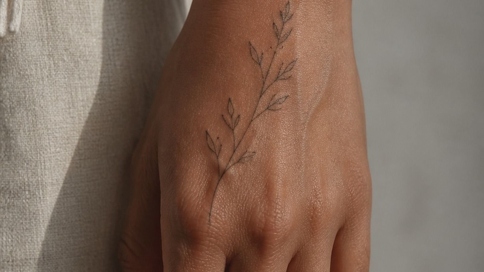
Knuckle tattoos can stay crisp for years, but only if you give the lettering enough width, contrast, and breathing room. I got mine after turning 30, when I knew I wanted visible ink but didn’t want tiny details turning to soup. I planned hard. It paid off.
Here’s what it looked like before
Before the tattoo, my hands were bare except for a small healed mark near my wrist. I’d been saving that patch of skin for the right idea, which sounds dramatic until you remember how often you see your own hands.
I held up paper lettering against my knuckles in daylight, under studio light, and while gripping a coffee cup. Your hands don’t sit flat for long, so your design can’t only look good in one posed photo. That was my first rule.
- I Mapped My Knuckles Before Choosing Lettering
- I Tested Word Length Across Four Knuckles
- I Matched Ink Weight To My Hands
- I Chose Blackwork For Cleaner Knuckle Readability
- I Checked Finger Movement Before Finalizing Placement
- I Built Symmetry Around My Existing Hand Tattoos
- I Compared Bold Letters With Fine Linework
- I Used Negative Space Between Each Knuckle
- I Planned A Darker Design For Fading
- I Reviewed Healing Photos From Hand Tattoos
- I Measured Pain Across Each Knuckle
- I Adjusted The Design For Skin Texture
- I Selected Symbols With Personal Meaning
- I Positioned Tiny Icons Below The Knuckles
- I Avoided Details That Blur On Hands
- I Scheduled Touch-Up Time Before Tattooing
- I Followed A Strict Knuckle Tattoo Aftercare
- I Checked The Design During Daily Movement
- I Decided Whether Matching Knuckle Tattoos Fit me
1I Mapped My Knuckles Before Choosing Lettering
I traced each knuckle with a skin-safe stencil marker before settling on letters. You’ve got four separate little panels, not one smooth strip, and your word needs to read even while your hand bends.
My artist and I used a fine-tip tattoo stencil to check where the letters would land. I’d skip a long sentimental phrase here. Your knuckles need bold, simple shapes that read from across the room, sorry, across the street.
Then I photographed the stencil with my fist loose and closed. If you can’t read your word in both positions, you need to move it or simplify it.
2I Tested Word Length Across Four Knuckles
Four letters usually gives you the cleanest result, especially for Mens Knuckle Tattoos and other visible hand tats. I tested five-letter words too, but the extra character made every letter skinny and cramped.
You don’t need a word that explains your whole life. You need one that holds. Block lettering with open counters beats skinny script every time because the gaps stay visible as your skin shifts.
I chose a short word with straight strokes and one rounded letter. It looked bold without feeling loud. That little balance matters!
3I Matched Ink Weight To My Hands
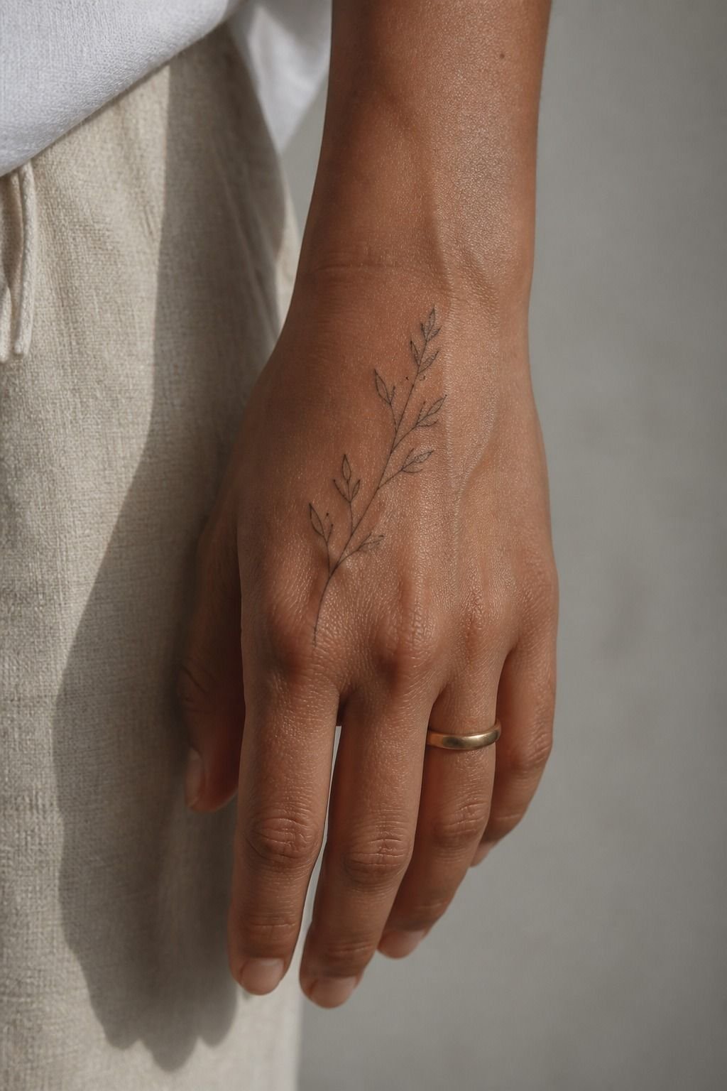
Your hand size should set the line weight, not a saved Pinterest reference. On my hand, a whisper-thin line looked elegant on paper but disappeared once the stencil sat over my knuckle creases.
I asked for single-needle linework only where it could breathe, then bumped the main letter outlines thicker. That gave me crispy and confident lines instead of ten fuzzy pulls trying to force a delicate look.
If your fingers are narrow, don’t panic and shrink everything. Make the word shorter. Your tattoo will age cute on you when the design has room to spread.
4I Chose Blackwork For Cleaner Knuckle Readability
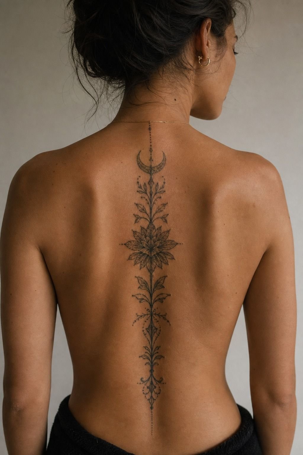
For my main letters, I chose solid black ink over grey wash. Black is your best friend for longevity, and knuckles are a high-wear zone with constant soap, friction, sun, and movement.
You can get soft details elsewhere, but I wouldn’t make a knuckle tattoo soft just to match a fine-line forearm piece. Blackwork has enough contrast to survive the daily beating your hands take.
That choice made the whole tattoo feel modern and intentional. No timid outline pretending it’s tougher than it is.
5I Checked Finger Movement Before Finalizing Placement
I opened and closed my hand for a few minutes while wearing the stencil. Sounds basic.
It isn’t. The skin folds differently when you make a fist, and a letter sitting too low can vanish into a crease.
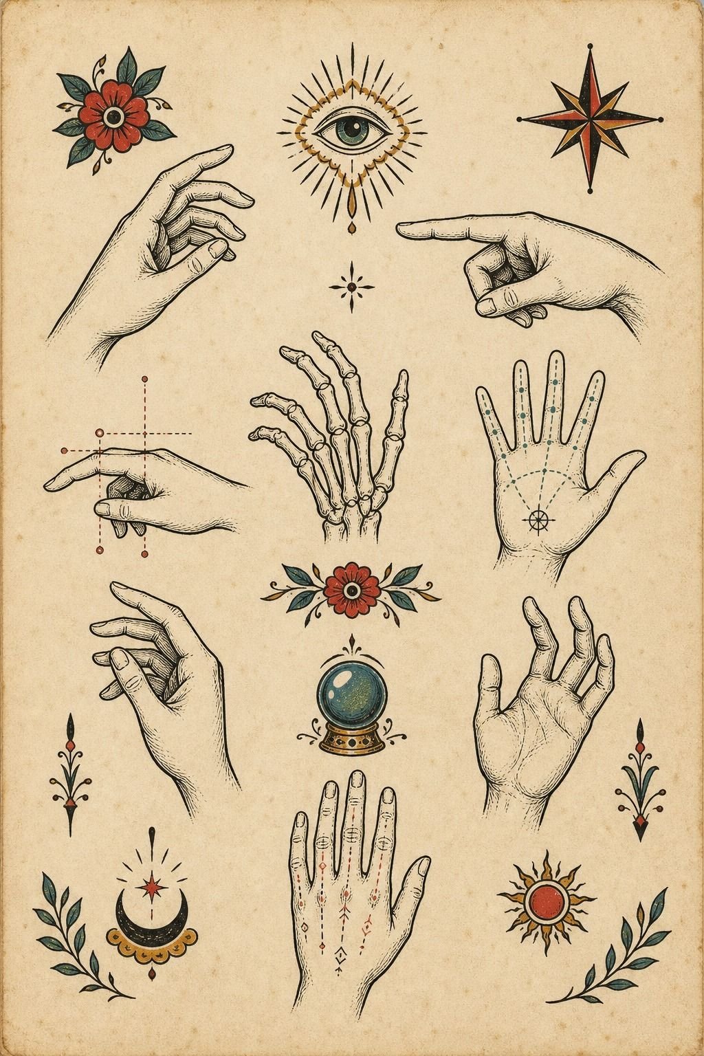
A sheet of traditional tattoo flash helped me compare layouts without getting attached to one exact reference. You can borrow the vibe, but if you want Pinterest-exact, I’m not your artist.
I kept each letter above the deepest fold. Your hand will move thousands of times before it fully heals, so placement has to work in real life.
6I Built Symmetry Around My Existing Hand Tattoos
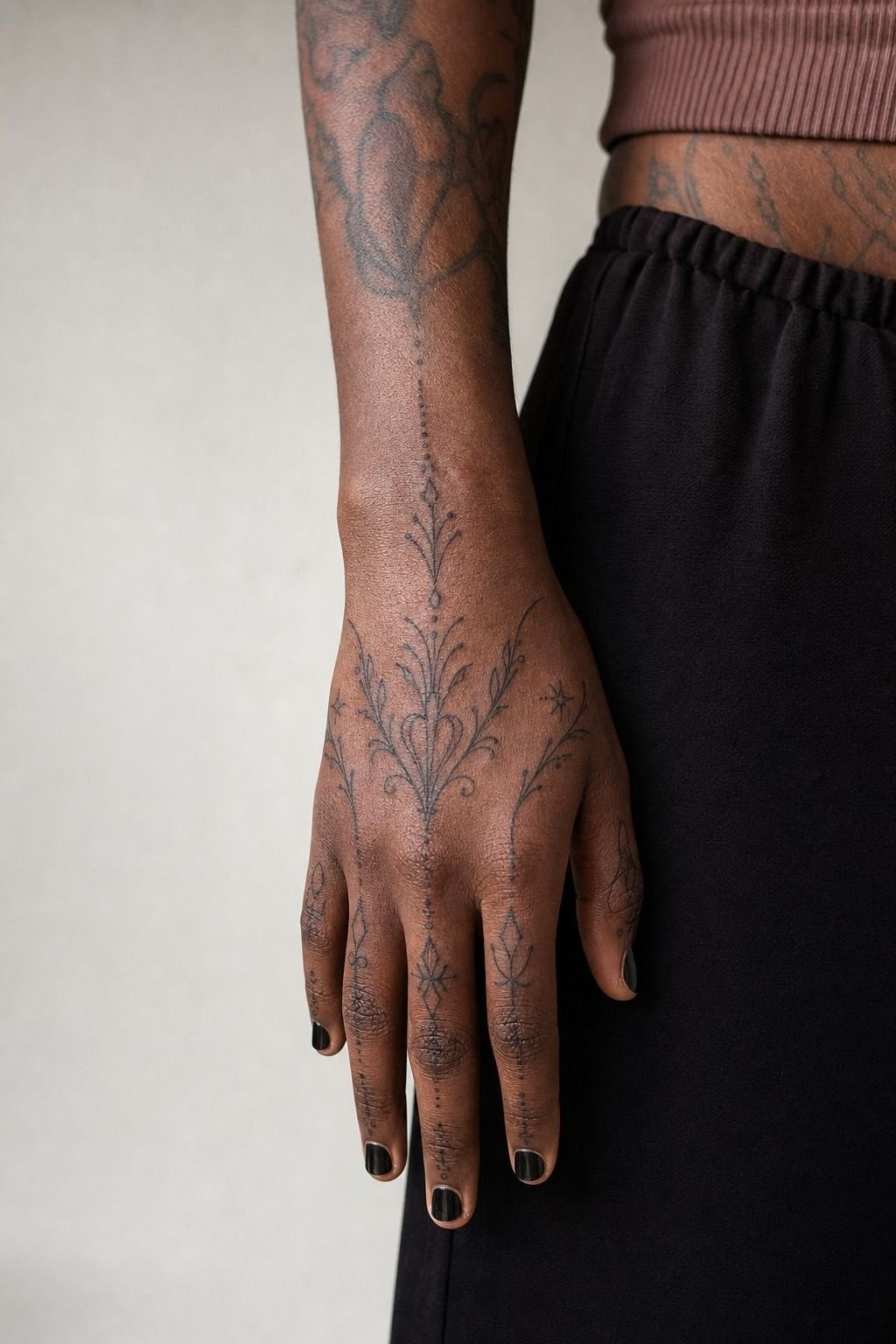
My hand already had a small wrist tattoo, so I treated the knuckles as part of a larger composition.
7I Compared Bold Letters With Fine Linework
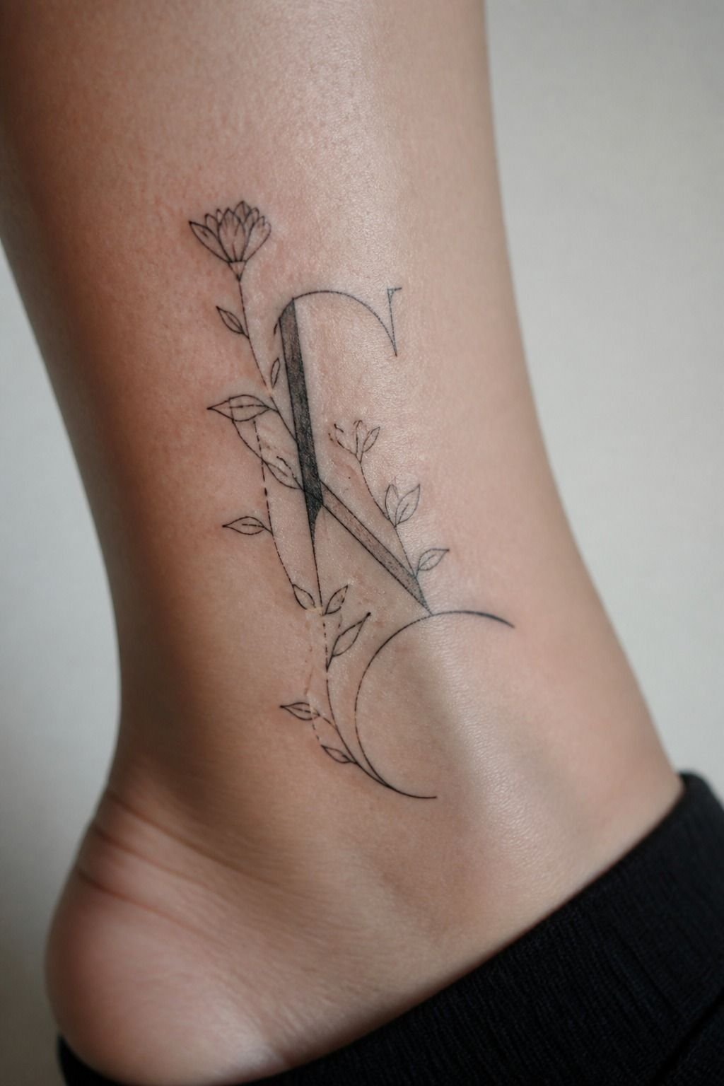
Fine line can work on knuckles, but only for a simple mark or a bigger-than-you-think letter. I put fine-line lettering beside a heavier black outline before deciding, and the difference was immediate.
The thin version looked soft and refined in the stencil. The bold version looked better once my hand was relaxed, which is how people will see it most of the time.
I picked the heavier option. Your tattoo doesn’t need to be huge, but it does need enough ink to stay legible after a few summers.
8I Used Negative Space Between Each Knuckle
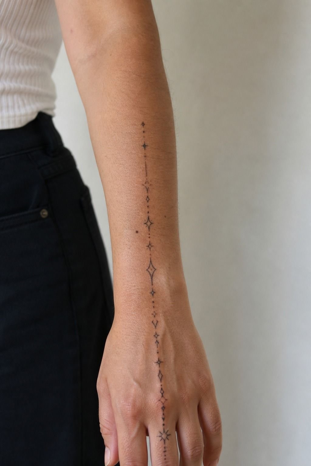
The gap between letters is doing more work than most people realize. I left visible skin between each character instead of pushing the design edge to edge.
That negative space keeps knuckle lettering from becoming one dark bar when the tattoo settles. And yes, that means your word may need fewer letters. Better a clean four-letter design than a crowded eight-letter mess.
I checked the gaps in a mirror from a few feet away. If your letters merge at that distance, they’ll only get muddier later.
9I Planned A Darker Design For Fading
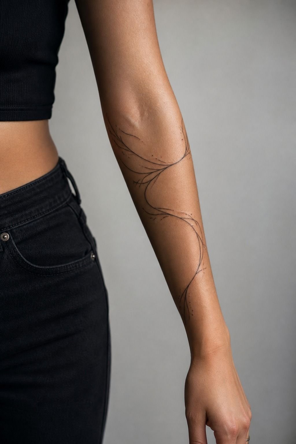
Hands fade. That’s not your artist failing or your tattoo being doomed. It’s just skin that gets washed, rubbed, exposed, and bent all day.
I planned for that with carbon black pigment and a clean outline around the letters. A darker design gives you a little visual insurance, especially if you work with your hands or spend time outdoors.
Read why tattoos blur over time before you commit to micro-detail. You’ll understand why tiny flourishes are the first thing I cut from hand designs.
10I Reviewed Healing Photos From Hand Tattoos
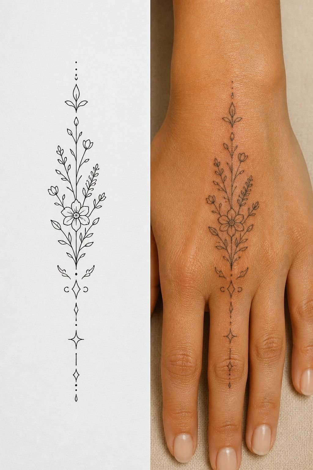
I didn’t choose my artist from fresh tattoos alone. I asked to see healed hand work, because fresh ink is bright and tight on nearly everyone.
The healed photos showed whether the black ink saturation stayed even, whether lines spread too much, and whether the artist knew how to work around hand texture. That’s the portfolio evidence you want.
You should look for work healed at least several weeks, not just a pretty stencil shot. Fresh tattoos sell the idea. Healed tattoos tell you the truth.
11I Measured Pain Across Each Knuckle
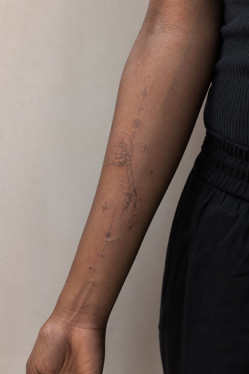
Knuckles were spicy, but manageable. The lines felt sharper over bone, then the shading turned into a dull burn. I’d put hands closer to feet, ribs, and sternum than to a chill outer arm.
I took breaks when I needed them and kept water nearby. Numbing cream isn’t something I’d use without asking your artist first, because different studios have different rules and timing.
You don’t get a prize for white-knuckling it. Tap out for five rather than pass out on me. The tattoo will still be there when you sit back down.
12I Adjusted The Design For Skin Texture
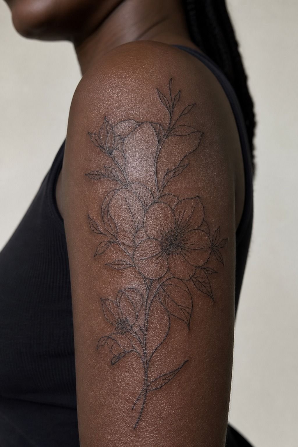
Skin texture is part of the design, especially across knuckles. Mine had natural creases and a couple of rougher spots, so I changed the stencil instead of demanding ruler-straight perfection.
My artist used rounded letter terminals rather than tiny sharp corners. Those small adjustments helped the lettering sit with my skin instead of looking stamped on top of it.
But don’t confuse texture with a reason to accept scratchy work. One clean pull is still the goal. Your lines should be intentional, not fuzzy because somebody rushed.
13I Selected Symbols With Personal Meaning
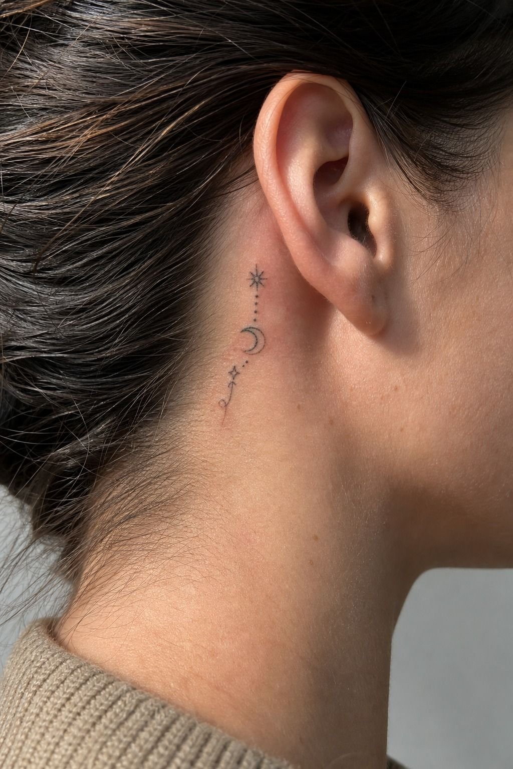
I kept the lettering personal without making it cryptic.
14I Positioned Tiny Icons Below The Knuckles
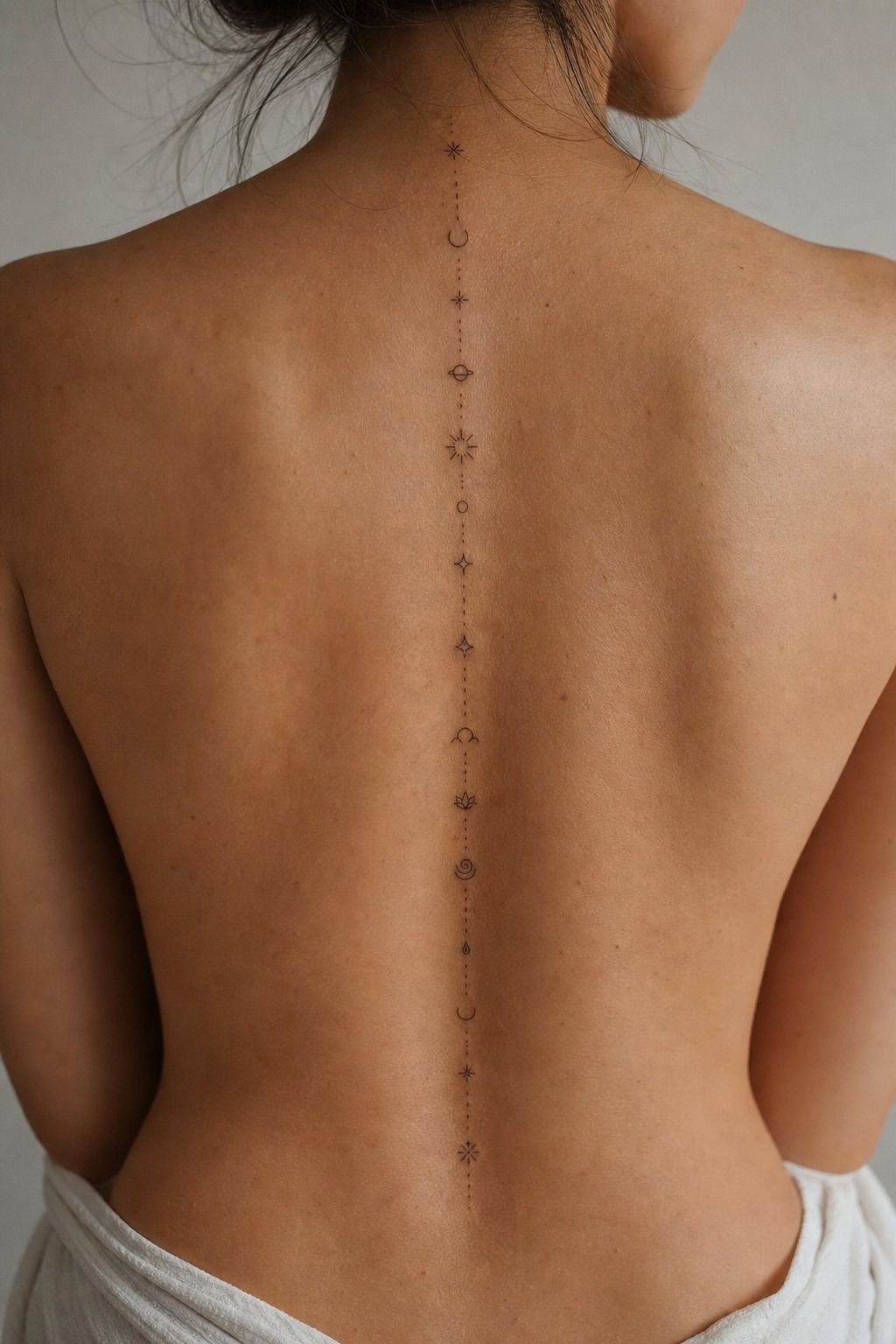
I put my small icon below the main knuckle line instead of squeezing it between letters. That lower hand placement gave the mark its own clean lane.
A micro symbol tattoo can look charming there if it has one strong silhouette. I’d skip stars with tiny internal lines, miniature faces, or little ornamental borders. They’re cute fresh, then they turn to soup.
Your icon should support the lettering, not compete with it. One black shape. A little air around it.
Done.
15I Avoided Details That Blur On Hands

I cut decorative swirls, hairline serifs, and tiny dots from the first draft. I liked them, but liking a detail isn’t enough reason to tattoo it on a high-wear zone.
Instead, I used bold traditional lettering as my reference for proportion. Traditional designs are not subtle, and that’s why so many still read clean decades later.
Want a visual test? Make the design small on your phone, then look at it from arm’s length. If you can’t read it, your tattoo won’t magically become clearer on skin.
16I Scheduled Touch-Up Time Before Tattooing
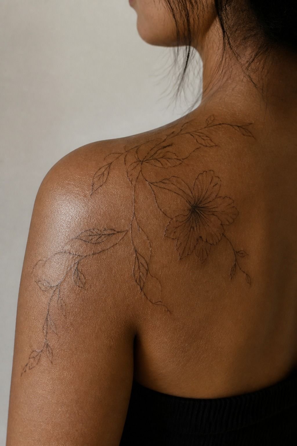
I scheduled a possible touch-up before the first needle even hit skin. That didn’t mean I expected bad work. It meant I understood that hands sometimes need maintenance.
Most studios charge a shop minimum around $50 to $100, while many US artists work around $100 to $250 per hour. Hand tattoo touch-ups vary by artist, region, and how your skin heals.
You should ask what their touch-up policy is in writing. A calm answer is a good sign.
A defensive one? I’d keep looking.
17I Followed A Strict Knuckle Tattoo Aftercare
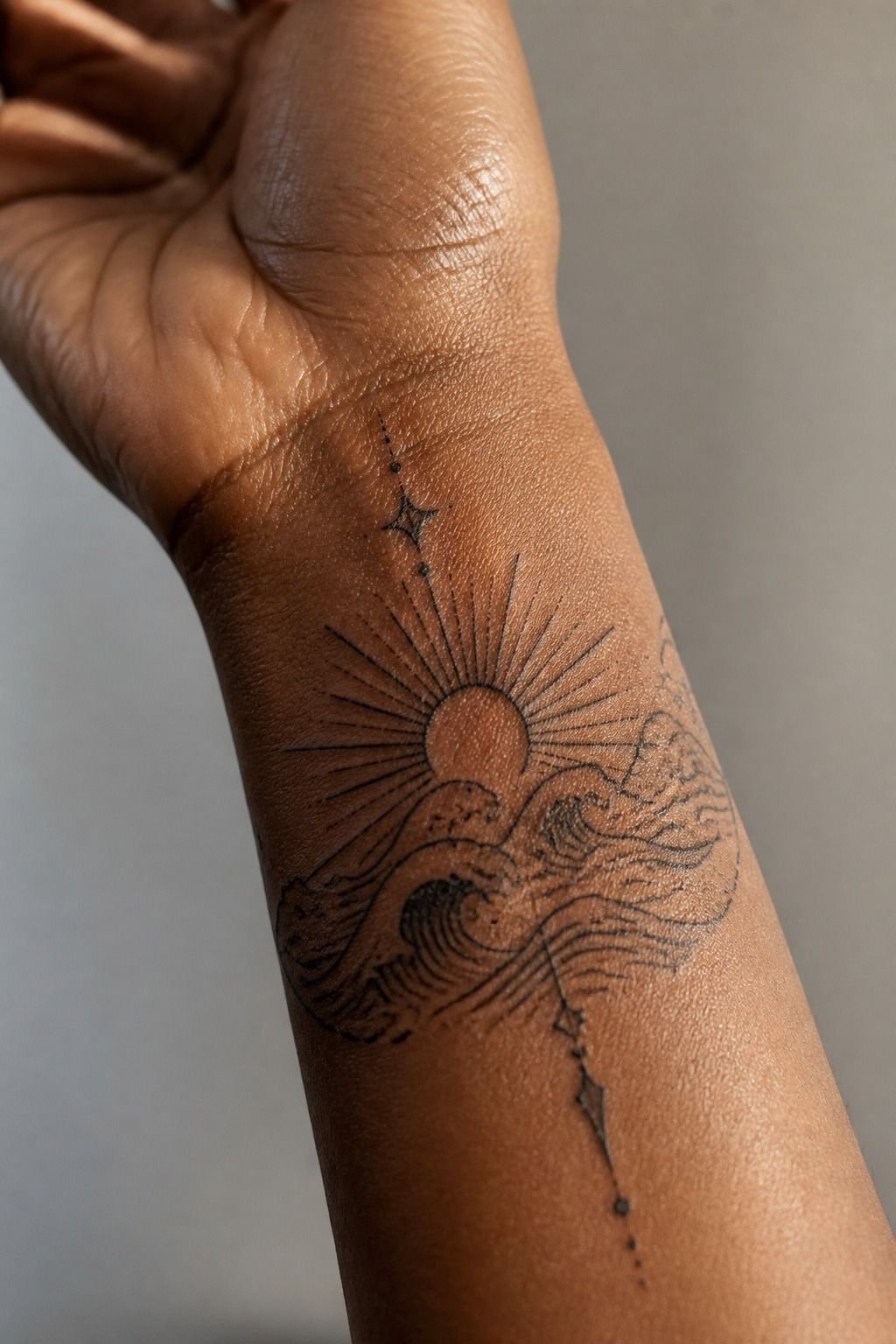
The first few days, your knuckle tattoo is an open wound. Treat it like that. I washed mine with unscented gentle soap, patted it dry, and used a thin layer of aftercare ointment.
Don’t suffocate it under a thick shiny coat. And don’t pick when it peels like a sunburn, because you can pull color right out with the flakes.
I avoided pools, direct sun, and gym friction while the surface healed. It took about 2 to 3 weeks to settle on top, while full healing kept going for roughly 2 to 3 months.
18I Checked The Design During Daily Movement
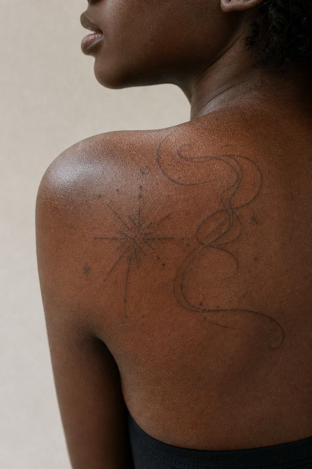
After the first healing phase, I watched how the tattoo looked while driving, typing, washing dishes, and holding a glass. Not glamorous, but that’s the real test.
The healed black lettering stayed readable because the letters had open space and enough weight. Your tattoo should work while you’re living, not only while your hand is posed flat for a photo.
For less exposed placements with a calmer pain level, look at where tattoos hurt less. Outer arm, thigh, and calf are much more forgiving than hands.
19I Decided Whether Matching Knuckle Tattoos Fit me
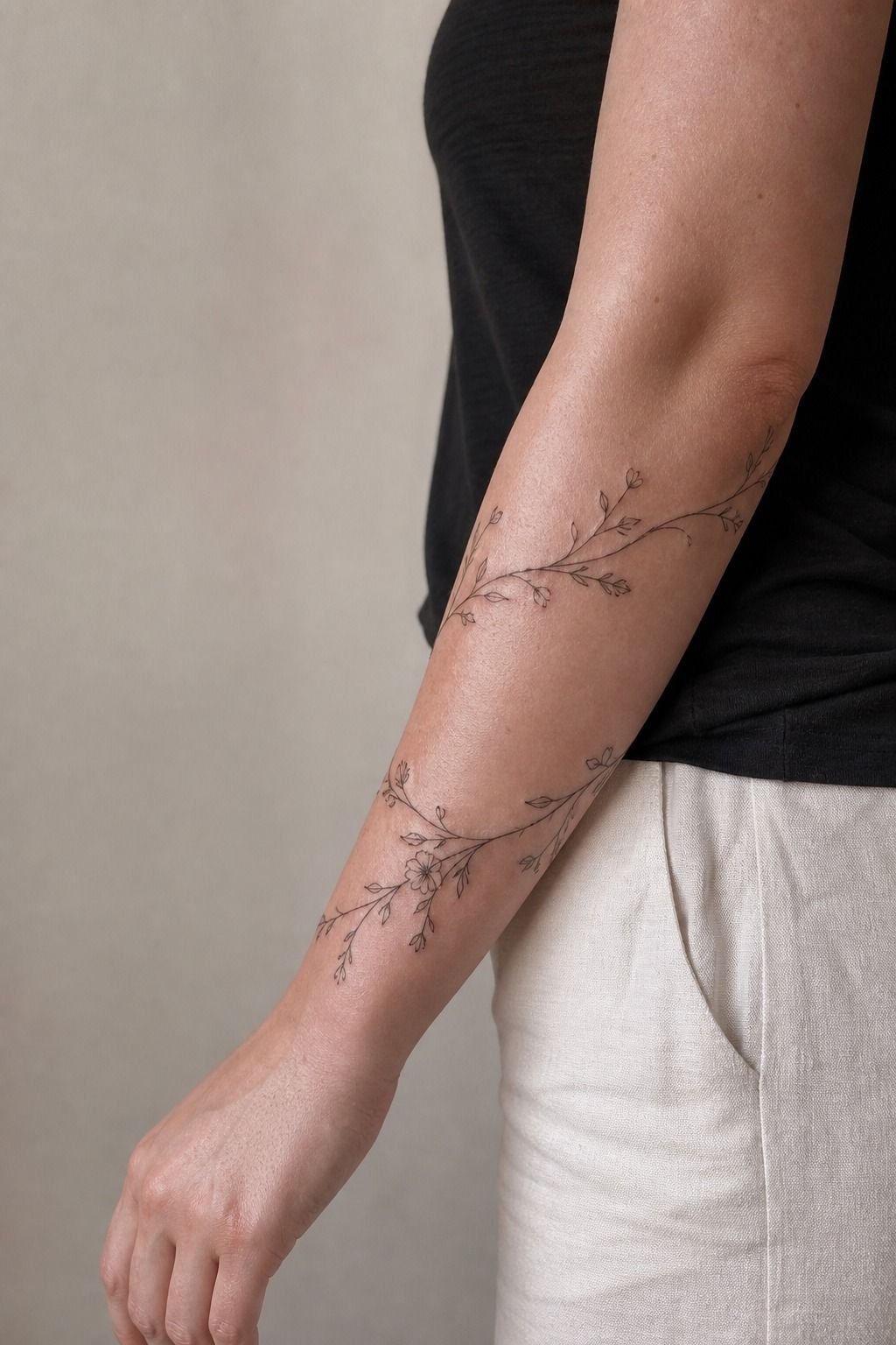
Matching knuckle tattoos can look bold and harmonious, but I didn’t force both hands to say the same thing.
How Much It Cost
My design was small, but hand placement takes focused setup and careful application. You’re paying for clean drawing, stencil adjustments, sterile setup, and an artist who won’t rush fragile skin.
I’d rather pay a solid artist once than bargain-shop a visible tattoo I’ll see every day. Cheap work on hands has a way of becoming expensive later.
My Knuckle-Flow Rule
Here’s the part I’ve learned from watching hand tattoos heal: people overfocus on the word and underfocus on the skin underneath it. Your knuckles aren’t a blank label.
They flex, swell, dry out, get wet, catch sun, and rub against everything you touch. A good artist sees all of that before they draw the first letter.
I went back and forth on fine line because I love the delicate look. But for my own knuckles, I knew I wanted something that would still read years later. That meant choosing blackwork lettering with enough width to survive normal spread.
It wasn’t the daintiest option in the stencil book. It was the honest one.
You don’t need to go full old-school trad if that isn’t your style. You do need to respect why trad holds up.
Strong silhouettes. Clear gaps.
Enough contrast. Bold will hold because skin isn’t paper, and your tattoo will soften as it heals.
I’ve seen people chase tiny details because they’re afraid of looking too visible. Then they get a design that fades into a gray little smudge and needs rebuilding. That’s the losing option.
If you’re nervous about a visible hand tattoo, move it up the finger, down toward the wrist, or choose a small symbol below the knuckles. Give your idea a better surface instead of asking it to do the impossible.
And yes, hands need maintenance sometimes. That’s not a failure. It’s the trade for putting art in a place that lives hard.
Keep it clean, wear sunscreen after healing, and pick an artist whose healed work looks solid. You’ll be glad you did.
What People Always Want to Know
How much do knuckle tattoos usually cost?
A simple knuckle tattoo usually costs about $100 to $300 in the US. A clear quote before the appointment matters more than chasing the lowest price.
– Shop minimum, about $50 to $100 – Hourly artist rate, about $100 to $250 – Placement, design weight, regional pricing
Are knuckle tattoos a good idea for a first tattoo?
They can be, if you accept visibility and possible touch-ups. Simple black lettering gives you the best chance of a clean result, while tiny decorative lettering is a rough first choice.
– Short word or bold symbol – Healed portfolio proof – Clear aftercare plan
How do I choose a tattoo artist for knuckle tattoos?
Choose an artist with healed hand photos, clean linework, and a studio that takes hygiene seriously. Healed work is the receipt, especially for high-wear skin.
– Crisp outlines – Even saturation – Real healed hand tattoos
You can also compare styles in this traditional knuckle tattoos guide.
How much do knuckle tattoos hurt?
Knuckle tattoos hurt more than an outer arm or thigh because the skin is thin and bone sits close underneath. Short sessions and breaks make it manageable.
– Sharp line sensation – Spicy bone spots – Dull burn during shading
How long do knuckle tattoos take to heal?
The surface usually heals in about 2 to 3 weeks, while complete healing can take roughly 2 to 3 months. Gentle aftercare protects the ink while your skin settles.
– Unscented soap – Thin ointment layer – No picking, pools, or direct sun
What’s the best placement for knuckle tattoos?
The best placement is high enough to avoid the deepest finger crease, with enough space between letters. Open spacing ages better than packed lettering.
– Main knuckle plane – Small icon below the letters – Outer hand for a lower-wear alternative
Where I’d Start First
If I had to pick one, I’d start with bold black lettering. Thin hand details fade into gray too fast, while a simple dark word keeps reading through daily wear. Pin the layout you love, then let your artist adjust it for your actual hand.