Traditional tattoo stencils are the backbone of Western tattooing. Bold black outlines. Saturated reds, yellows, greens, and blues. Anchors, roses, swallows, pin-up girls, and daggers. The style emerged from sailors and sideshow culture, got polished in 1950s street shops, and still dominates flash walls today. The stencil matters here more than in almost any other style, those thick lines need to be crisp, the color fields mapped precisely, because there’s no hiding behind soft gradients or photorealism. What you see on the transfer paper is damn close to what lives on skin.
Origins & History
This style didn’t appear in a vacuum. Sailors returning from the Pacific brought Japanese influence, but American traditional distilled everything down to its essentials. Speed mattered. Early tattooers worked on foot traffic, sometimes doing twenty pieces a day. Complex shading ate time. The stencil became the blueprint for efficiency.
The Sailor Jerry Era
Norman Collins, aka Sailor Jerry, operated out of Honolulu during the 1940s and 50s. His stencils were legendary, clean, symmetrical, designed to be readable from across a bar. Jerry refined the boldline approach: single-pass outlines thick enough to hold, simple enough that a steady hand could execute them fast. His flash sheets, still reproduced today, show how stencils controlled negative space. Skin breathes around a traditional piece. The stencil planned that breathing room.
Street Shop Flash Walls
Walk into any old-school shop and you’ll see it: binders of acetate stencils, decades deep. Some designs have been tattooed thousands of times. The stencil isn’t a limitation; it’s a shared language. Clients point, artists adapt size and placement, and the transfer goes down. This democratized tattooing. You didn’t need a custom drawing for every piece. The stencil made art accessible at fifteen bucks a pop.
- Flash originated as advertising, artists painted sheets to display options
- Stencils were traced from flash, creating repeatable, recognizable icons
- Regional variations developed: West Coast bolder, East Coast more illustrative
- Machine improvements in the 1970s-80s allowed slightly finer lines, but the stencil philosophy held
Key Characteristics & Motifs
Traditional stencils prioritize readability. Ten feet away, you know exactly what you’re looking at. The design language is immediate.
The Visual Toolkit
Lines are confident. Not sketchy, not tentative. A traditional stencil shows one solid outline, sometimes a second pass for weight, never the wispy multiple-line nonsense you see in fineline work. Shading is minimal, usually black whip shading or sparse greywash to suggest dimension without modeling. Color sits in distinct blocks, separated by those black borders like stained glass.
Common motifs carry specific meanings, though most clients today choose them for aesthetics:
- Swallows: originally 5,000 nautical miles sailed, now general travel and return
- Anchors: stability, often with “Mom” or a partner’s name
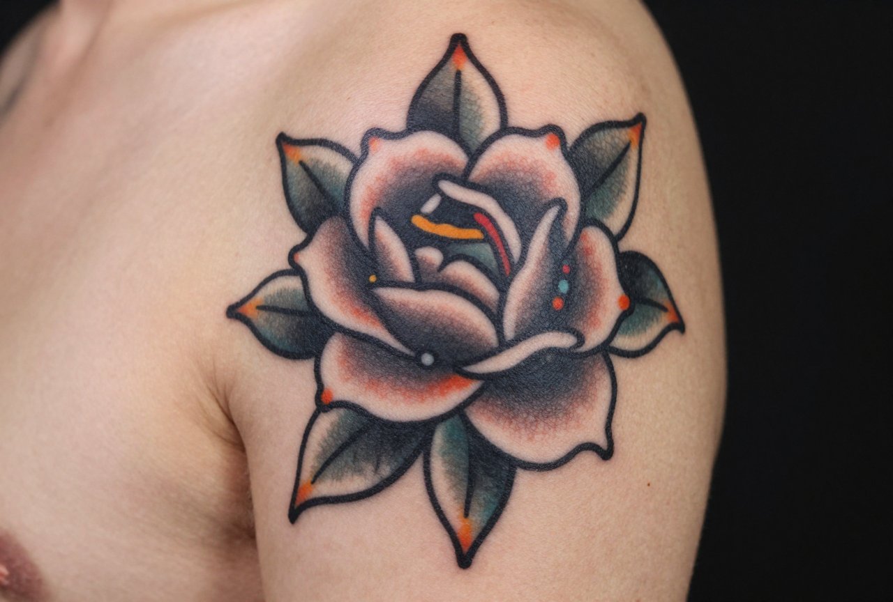
- Roses: beauty and pain, the duality
- Pin-ups: nostalgia, desire, the male gaze reframed
- Daggers and snakes: danger, protection, transformation
- Panthers and tigers: strength, ferocity, American masculinity
Stencil Construction
A good traditional stencil transfers completely. No gaps in the outline, no fuzzy edges where the spirit paper didn’t adhere. Artists often reinforce the stencil with a sharpie after transfer, especially on areas where skin stretches or sweats. The stencil line becomes the tattoo line. Deviation shows. That’s why experienced traditional artists are particular about their transfer technique, pressure, timing, skin prep.
Color vs Black and Grey
Traditional doesn’t demand color. Black and grey traditional has its own lineage, particularly in Chicano tattooing and certain East Coast shops. But the classic American palette, red, yellow, green, blue, with black, remains dominant.
Color traditional stencils need to account for saturation. The stencil marks where color stops, where black outline contains it. Without that containment, colors bleed together, muddying the design. A sloppy stencil means a green panther with unintentional teal edges.
Black and grey traditional relies more on contrast. The stencil must show where solid black goes, where greywash begins and ends. Less forgiving, honestly. Color distracts; greyscale exposes every wobble in the line.
- Color traditional: bolder, more forgiving of minor imperfections, ages with character
- Black and grey traditional: sharper, more graphic, requires precise stencil execution
- Skin tone affects both; darker skin often reads black and grey more dramatically
Best Placements
Traditional stencils are designed for the body. They wrap, they fill awkward spaces, they read well on curved surfaces. The style was born for arms, legs, chests, working-class placements that showed or hid easily.
Classic Spots
Outer forearm: the billboard. Everyone sees it. Traditional stencils fit the long, relatively flat canvas perfectly. The design faces outward, readable to others.
Upper arm/shoulder: the first tattoo for generations. Traditional sleeves built from separate flash pieces, connected by filler, stars, dots, waves. Each stencil applied individually, the overall composition emerging over years.
Chest: bold centerpieces, often symmetrical. Eagles, ships, women. The stencil must account for sternum flex, pectoral movement. Artists stretch the transfer, sometimes split designs across the divide.
Thigh: increasingly popular, especially for larger pieces. More real estate, less visibility concerns. Traditional stencils scale well here.
What to Avoid
Hands and fingers are tricky. Traditional lines are thick; at small scale, they blur together. The stencil shrinks, detail disappears. Some artists refuse traditional finger tattoos, knowing the stencil won’t survive the translation. Neck and face similarly, social visibility aside, the skin there behaves differently, and traditional stencils aren’t optimized for it.
Who It Suits
Not everyone. That’s fine. Traditional stencils speak to specific sensibilities: people who value clarity over subtlety, history over trend, permanence over delicate evanescence. The style ages exceptionally well because it was designed to. Those thick outlines hold. The limited palette doesn’t shift unpredictably.
It suits collectors building cohesive bodies of work. A traditional sleeve tells a story through accumulated icons. It suits first-timers who want something recognizable, respectable, unlikely to embarrass in twenty years. It suits people who walk into shops and point at flash rather than bringing Pinterest boards.
Doesn’t suit those wanting photorealistic portraits. Doesn’t suit minimalists seeking single-needle whisper-thin lines. Doesn’t suit anyone who needs their tattoo to be “unique” in a way that requires explanation.
Modern Variations
The style persists because it adapts. Neo-traditional emerged in the 1990s-2000s: bolder colors, more illustrative detail, subject matter beyond classic flash. The stencil process remains similar, but designs incorporate more complex shading, unconventional imagery, animals, figures, objects rendered with traditional structure but contemporary content.
Japanese influence appears in some modern traditional, particularly background elements. Waves, wind bars, cherry blossoms. The stencil must integrate these smoothly, maintaining the boldline discipline.
Some artists specialize in “ignorant style” or deliberately crude traditional, embracing wobbly lines and naive drawing. Even here, the stencil matters, it just carries intentional imperfection. Know the difference between intentional and incompetent before you commit.
- Neo-traditional: more detail, broader color range, complex compositions
- Traditional with Japanese elements: background integration, larger scale
- Ignorant/crude style: deliberate rawness, know your artist’s intent
- Lettering integration: banners, script, often poorly executed; choose carefully
Choosing an Artist
This matters more than design choice. Traditional stencils are unforgiving. A wobbly line in a watercolor piece might read as texture. In traditional, it’s a mistake. Look for artists whose portfolios show consistent line weight, solid color saturation, healed results.
What to Examine
Ask to see healed photos, not just fresh work. Everyone’s fresh tattoos look decent. Traditional specifically: check how the black settled, whether colors remained distinct, if lines stayed crisp. Good artists keep these records. Be wary of those who don’t.
Watch them stencil. Do they take time with placement? Do they adjust for your specific anatomy? A stencil slapped on hastily suggests rushed execution. The best traditional artists obsess over transfer precision, they know the tattoo follows the stencil exactly.
Shop culture clues: flash on walls, reference books visible, other artists doing similar work. Traditional thrives in community. Lone practitioners working in isolation often miss the stylistic nuances that shops transmit apprentice to apprentice.
Red Flags
- Portfolio showing only fresh, no healed work
- Lines that vary dramatically in weight within single pieces
- Colors that look muddy or indistinct even fresh
- Artist unable to explain why they chose specific stencil placement
- Heavy reliance on custom drawing when you wanted classic flash
Final Thoughts
Traditional tattoo stencils represent something rare in contemporary tattooing: a style that knows exactly what it is. No identity crisis, no desperate trend-chasing. The stencil is the promise, the tattoo is the fulfillment. That directness appeals to people tired of ambiguity.
The style will outlast current fashions. It has survived a century already, through wartime, counterculture, mainstream acceptance, and Instagram’s visual churn. The stencil endures because it works. Bold lines. Clear images. Colors that settle into skin and stay readable for decades.
Get one because you love the look, not because you think you should. But if you do love it, if the flash wall speaks to you, if you want art that announces itself without apology, find a practitioner who respects the tradition. Let them transfer that stencil. Feel the cool of the spirit paper. Watch the design emerge. Then sit for the needles, and join the lineage.
Related Style Guides
- Warrior Tattoo Ideas That Mean Something
- Different Tattoo Ideas That Actually Work
- Biblical Tattoo Ideas That Actually Work on Skin
- Explore more
Frequently Asked Questions
How were traditional tattoo stencils made before thermal printers existed?
Traditional tattoo stencils were hand-drawn or traced using carbon paper, then applied to the skin with a thin layer of deodorant or green soap. Some artists used hectograph pencils or spirit duplicator paper to create reusable stencil sheets that could be pressed onto the skin.
Why do some traditional artists still prefer hand-cut stencils over modern methods?
Hand-cut stencils offer a looser, more organic line quality that matches the aesthetic of traditional tattooing. Many artists find that the slight imperfections and weight of hand-drawn stencils actually improve the final tattoo’s character and flow.
What is the difference between a carbon stencil and a hectograph stencil in traditional tattooing?
Carbon stencils use carbon paper to transfer a drawn image directly onto the skin, while hectograph stencils use special aniline dye paper that creates a purple-blue transfer. Hectograph stencils tend to last longer on the skin during the tattooing process and were the standard in early American traditional shops.
How do you keep a traditional hand-applied stencil from smearing during a long tattoo session?
Artists would often let the stencil dry completely before starting, then work in sections rather than wiping the entire area at once. Some would also lightly spray the stencil with a fixative or apply a thin barrier of petroleum jelly to protect the lines from excess wiping and moisture.


