Fine Line Tattoo Words can stay clear for years if you give the letters enough skin, contrast, and breathing room. I chose mine the week I turned 30, after sitting on the word for months. Small, personal, and still readable. That was the whole point.
Here’s what it looked like before
The patch along my ribs had been blank skin I kept saving for the right idea. I’d considered a bigger floral piece, then a quote, then nothing at all. But every option felt like I was trying too hard to make the tattoo explain me.
I wanted one word that landed quietly. No giant statement.
No Pinterest-exact copy. Just a clean little marker that would still feel like mine when the novelty wore off.
I Chose One Word With a Personal Meaning
I picked a word with a real job in my life, not something that sounded good for a photo. On the ribs, the finished single-needle black ink sits close to the body and feels intimate without begging for attention. You can see why the placement works when the word follows the side rib instead of fighting it.
Your word doesn’t need a public explanation. Mine doesn’t. If you’re choosing a term from grief, family, recovery, or a private joke, give yourself a few weeks before booking.
A word that still hits after 30 days is usually stronger than the one you found at 1 a.m. You can also compare ideas in this words with two meanings tattoo guide.
I Tested Lettering Styles on My Skin
Before I committed, I drew the word in three styles with a black cosmetic pencil on my forearm. Script looked soft, but the printed version read faster from arm’s length. That test saved me from choosing a font that only worked at zoom level.
You should test your lettering standing up, moving your wrist, and looking in a mirror. A word that looks elegant on a flat screen can turn fussy on curved skin.
I’d skip ultra-thin loops if your word has lots of letters. They’re charming fresh, then they start crowding each other as the ink settles.
I Compared Dainty Script With Printed Type
Dainty script is intimate. Printed type is clearer. On a healed upper arm, fine line serif lettering can look refined and calm, while a loose cursive word can feel more personal but needs more room between strokes.
I tell clients to choose print when the word is longer than six or seven letters, especially if they want it under 2 inches wide. Script wins for a short word with open letters, like “bloom” or “soft.” Tiny Tats With Meaning don’t need to be microscopic. Make the word breathe, and it’ll age cute on you.
I Matched Ink Weight to the Word Length
A longer word needs a little more line weight. That’s the Breathing Room Rule I use when I’m mapping lettering around a calf. On golden-tan skin, the linework needs enough contrast to read while the leg moves, bends, and catches daylight.
You don’t want every letter made with the same whisper-thin needle just because the tattoo is called fine line. Fine line means controlled, not invisible.
For a seven-letter word, I’d rather use crispy, confident lines than force a delicate stroke that heals faint. Fine line tattoo needle choices and placement matter more than a trendy font.
I Sketched a Fine Line Word in Lowercase
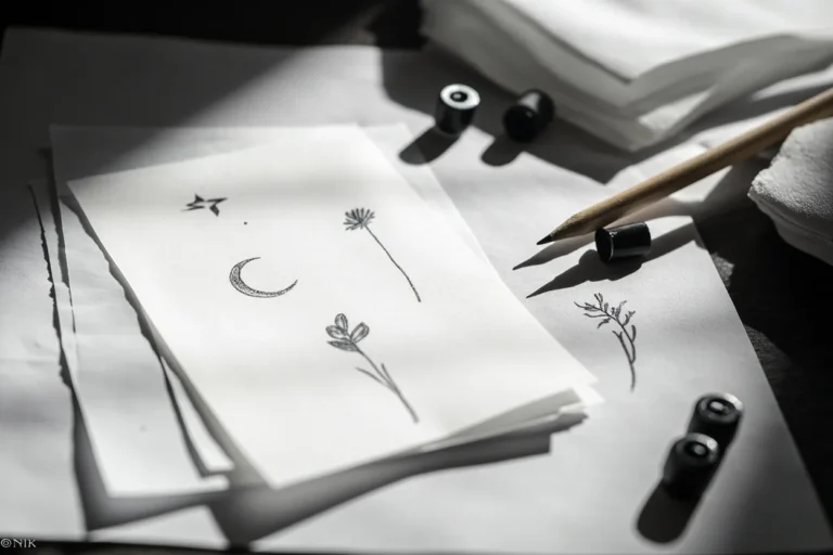
Lowercase lettering was the version that felt most like me. I sketched it first on aged off-white flash paper, then looked at it beside uppercase and title case. Lowercase softened the shape without making it childish.
You can use a flash-sheet approach before going custom: several versions, different spacing, one or two subtle flourishes. But don’t make the letters so ornate that they lose their job.
A Fine Line Writing Tattoo should be readable at a glance. If someone has to lean in six inches to decode it, bump the design up.
I Placed a Tiny Phrase Along My Wrist
A wrist phrase can look clean, especially against deep ebony skin where the contrast is sharp and direct. But the wrist is high-wear. Handwashing, sleeves, sun, watches, and constant movement all ask a lot from fine lines.
I kept the phrase short and gave the letters a little height instead of squeezing them into a skinny strip. That size on a wrist is gonna mush out if you force twelve words into it.
Move longer text up the forearm so it breathes and ages nicer. Your wrist can still hold something meaningful, just don’t treat it like a notebook margin.
I Tried Vertical Lettering Along My Rib
Vertical lettering along the rib is spicy, no question. The skin is thin, breathing moves it, and the body curve makes stencil placement matter. Still, a narrow vertical word can look elegant when the letters follow the rib instead of sitting stiffly across it.
I’d use a 2-inch stencil strip before committing so you can see the full line in the mirror. You should stand naturally, not twist for the photo.
And if your artist says the letters need more space, listen. They’re protecting the tattoo you’ll have after healing, not just the first-day reveal.
I Positioned One Meaningful Word Beneath My Collarbone
The collarbone is a strong spot for one meaningful word. It’s visible when you want it to be, soft under a tank strap, and broad enough for a clean horizontal line. On warm ivory skin, black-and-grey fine line ink gives the word a gentle, settled look.
You’ll feel the collarbone more than the outer arm, but it’s manageable in a short session. Lines feel sharper. Shading is a dull burn.
For one word, you’re usually dealing with linework, not a long color-packing marathon. I’d skip a giant flourish here because it can fight the natural clavicle line.
I Designed a Fine Line Word Behind My Arm
Behind the arm, near the triceps, is a low-drama placement that still has flow. The Outer Arm Flow Map is simple: let the word travel with the limb, not wrap so tightly that it breaks when you move.
You can keep this placement private in a T-shirt and show it off in a sleeveless top. That makes it a solid first tattoo option if you’re not ready for a hand or neck piece.
I’ve seen people rush into inner-bicep text because it feels hidden, then regret how much it rubs and fades. The outer upper arm generally wears better.
I Checked How Script Followed My Ankle
The ankle looks delicate, but it isn’t easy territory. It gets shoe friction, sock friction, sun, and a lot of movement. On the stencil-versus-healed comparison, the difference is usually spacing: what looked tiny and sweet on paper needs room on actual skin.
You should follow the ankle’s curve with the word instead of laying it across the bone like a label. A Fineline Word Tattoo can work here, but keep it simple and expect maintenance if you wear sandals all summer. But if you want low fuss, I’d choose the calf over the ankle every time.
I Added a Small Botanical Detail Beside the Word
A tiny botanical detail can make one word feel less floating, especially at the collarbone. I like a fine line olive sprig or one simple stem beside lettering because it frames the word without swallowing it. On deep brown skin with warm undertones, clean black contrast is your best friend.
You don’t need a whole bouquet. One leaf, two leaves, a little curve.
That’s enough. I’d avoid micro petals packed around every letter because that’s how a delicate tattoo turns to soup later.
Keep the botanical detail airy, and your word stays the lead.
I Turned Handwriting Into a Custom Tattoo
Handwriting tattoos can be devastating in the best way. A parent’s note, a friend’s signature, your own messy old journal line, those marks carry texture no font can fake. On the hand, though, custom handwriting stencil work needs a brutally honest size check.
You should bring a high-resolution scan, not a blurry screenshot. Your artist can preserve the character while opening cramped loops and broken strokes. That’s not changing the meaning.
It’s making sure the tattoo heals readable. For hand placements, understand that touch-ups are part of the deal.
High-wear zones don’t care how sentimental the reference is.
I Used Red Ink for a Single Delicate Word
Fine red ink has a particular mood. It can look soft and intimate on an upper back placement, especially when the word is short and the design has clean contrast. But red is spice, not your only plan for longevity.
I like red for one deliberate word, not a dense paragraph. Your artist should use saturated red tattoo pigment in a controlled pass, without chewing up the skin trying to make it brighter. And patch-test conversations are worth having if you’ve had sensitivity issues before.
Black generally holds longest. Red can still be gorgeous if you accept that it may need more attention.
I Reviewed Letter Spacing at Actual Tattoo Size
This is the part people skip, then regret. I print the lettering at actual tattoo size, hold it against the ankle, and look from a few feet away. If the counters inside letters like “a,” “e,” and “o” are already closing, the design isn’t ready.
The Two-Millimeter Gap Rule is not a universal law, but it’s a useful gut check for small lettering. You need visible skin between strokes. You need a little air inside letter shapes.
Your artist may redraw the font, and that’s good. One clean pull beats ten fuzzy ones every single time!
I Considered How Fine Lines Age on Skin
Fine lines widen a little as skin changes. That’s normal tattoo physics, not failure. Black is your best friend for longevity, and simple shapes with enough contrast still read from across the room in ten years.
I went back and forth on making mine smaller. I’m glad I didn’t. The flash-sheet versions that held up best had open lowercase lettering, clear starts and finishes, and no hairline flourishes choking the word.
You can see more long-term placement advice in these fine line tattoo ideas. Bold will hold, even when the tattoo itself stays delicate.
I Prepared My Skin for Detailed Lettering
I treated the appointment like an appointment, not a casual errand. I ate a real meal, drank water, wore loose clothing, and showed up with clean skin. For a spine-adjacent word, you’ll want a shirt that gives your artist access without making you freeze.
Don’t arrive sunburned. Don’t show up dehydrated after a night out. And don’t use numbing cream unless your artist has said it’s okay, because some products change how skin takes ink.
The spine can be spicy, but a short lettering tattoo is usually manageable if you breathe and take breaks. Tap out for five rather than pass out on me.
I Followed Aftercare for Crisp Fine Line Words
First few days, it’s an open wound. Treat it like that. I washed my wrist lettering with gentle unscented soap, patted it dry with a clean paper towel, then used a thin layer of fragrance-free ointment.
You don’t need to suffocate it. You don’t need to scrub it.
It’ll peel like a sunburn, and you cannot pick the flakes without risking color loss. Skip pools, hard gym friction, and direct sun while the surface heals.
The guide to fixing a bad fine line tattoo is useful too, but clean healing is far easier than repair.
I Chose an Artist for Tiny Lettering Precision
I chose an artist by healed work, not just fresh photos. Fresh tattoos can make almost any line look dark and crisp. Healed photos show whether their single-needle work stays clean, whether their letters spread, and whether they understand different skin tones.
Your artist should be happy to talk stencil size, needle grouping, placement, and what they’d change. If they promise they can make every Pinterest reference exact, I’d walk.
References are for vibe. Your skin, your movement, and their hand are the real design conditions.
A good artist will protect the result, even when that means saying no.
How much it cost
My fine line word tattoo was a short appointment, but tattoo pricing has a floor. In the U.S., many shops have a $50 to $100 minimum, while artists commonly charge about $100 to $250 per hour. Your city, artist demand, placement, and redraw time all change the final number.
I’d rather pay a proper minimum for clean lettering than chase a bargain. Cheap tattoos aren’t cheap if you need a cover-up later. Your money should go toward an artist whose healed lines look solid, not toward extra decorative noise.
Why I Still Like the Restrained Version
Years later, I still like that I didn’t turn the idea into a whole paragraph. The word has room around it, so it feels calm instead of crowded. And it has changed with me without becoming a costume.
I see lots of people pressure themselves to choose the most original concept possible. You don’t have to.
A Unique Fine Line Tattoo can be one ordinary word if it means something real to you. What matters is whether you can look at it on a bad Tuesday and still feel that small click of recognition.
For me, the choice comes down to three things: readability, placement, and whether the word has enough weight to outlast the mood that brought you in. If one of those is weak, pause. If all three are there, book it.
The Questions Worth Answering First
How much does a Fine Line Tattoo Words usually cost?
Usually, a Fine Line Tattoo Words tattoo costs about $100 to $300, though a shop minimum may run $50 to $100. Clean custom lettering is worth paying for because spacing and stencil work decide whether your tattoo heals readable.
– Shop minimums – $100 to $250 hourly rates – Custom redraw time
Are Fine Line Tattoo Words a good idea for a first tattoo?
Yes, they can be a great first tattoo if you choose a tolerable placement and leave enough room around each letter. A simple black word is easier to live with than a packed micro design, and it gives you a clear starting point.
– Outer forearm – Upper arm – Outer thigh
How do I choose a tattoo artist for Fine Line Tattoo Words?
Choose an artist with healed lettering photos, clean linework, and a studio that takes hygiene seriously. Healed portfolio evidence matters more than a feed full of fresh tattoos. You can also study the fine line needle and placement guide before your consult.
– Healed close-ups – Consistent spacing – Clear stencil process
How much do Fine Line Tattoo Words hurt?
Pain depends on placement. Ribs, feet, hands, and sternum are spicier; outer arm, shoulder, calf, and thigh are usually more tolerable. Short sessions help because most word tattoos involve a limited amount of linework.
– Ribs and sternum – Hands and feet – Forearm and calf
How long does a Fine Line Tattoo Words take to heal?
The surface usually heals in 2 to 3 weeks, while full settling can take 2 to 3 months. Gentle aftercare protects crisp lines: wash softly, moisturize lightly, and keep it out of pools and direct sun.
– Unscented soap – Thin ointment layer – No picking
What’s the best placement for Fine Line Tattoo Words?
The outer forearm and upper arm are strong choices because they’re readable, lower-wear, and generally easier to sit for. A little extra skin real estate helps fine lettering age better than a cramped finger or wrist phrase.
– Outer forearm visibility – Upper arm longevity – Calf placement flow
Where I’d Start First
If I had to pick one, I’d start with a single black word on the outer forearm. You can’t force tiny lettering onto high-wear skin and expect it to stay crispy. Give it room, choose an artist with healed work, and let the meaning do the heavy lifting.