I’m Hazel, and I’ve spent enough years behind the machine to know that most “easy arm tattoos drawing” searches end the same way: someone shows up with a phone full of screenshots, and half of them are drawings that were never designed to go on skin. A pencil sketch can hold a hundred hairline strokes. An arm can’t. Skin moves, spreads, and heals over the top of your linework, and the drawing has to survive all three.
So this is the studio version of that list. Nineteen designs that draw easy, tattoo clean, and still read from across the room in ten years. Plus the money talk, the placement talk, and the one adjustment I make on almost every arm piece that walks in.
Is a Bigger Arm Tattoo Actually Worth the Extra Money?
Short answer: usually yes, and not for the reason people think. It isn’t about presence. It’s about the physics of ink under skin.
Every line you put down spreads a little as it heals, and keeps spreading slowly for decades. On a two-inch piece with six internal details, that spread eats the gaps between lines and the whole thing turns to soup by year eight.
Bump that same design to three and a half inches and the gaps survive. Same drawing, same artist, wildly different piece at forty.
Here’s the honest math from my books. A 2-inch fine-line sprig runs about $150 and there’s a real chance you’re back for a cover or a rework inside a decade.
The 4-inch version of the same sprig runs about $280 and it’s still crispy at fifteen years. You’re not buying more tattoo, you’re buying the version that holds.
If you’re stacking several small pieces instead, my small tattoo guide covers where the size floor actually sits per style.
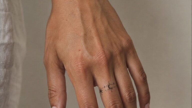
The exception is placement. A tiny piece on the outer bicep behaves way better than a tiny piece on a finger, because the skin barely turns over there. Size and placement are one decision, not two.
Where Your Tattoo Budget Actually Goes
Most people quote me a number they saw on Pinterest and it’s off by half. Here’s what you’re really paying for in a US shop in 2026.
The line that surprises people is the shop minimum. If you want three tiny pieces done on three separate visits, you’re paying that minimum three times.
Book them in one sitting and you pay it once. That’s often a $200 difference for the exact same ink.
Deposits are normally $50 to $150 and come off the final price. They’re not a fee, they’re insurance against no-shows, and they’re non-refundable everywhere for a reason. For a fuller breakdown by style and body part, see the tattoo cost guide.
The Change That Costs Nothing and Saves the Tattoo
Nine times out of ten, the free fix is this: bump the size up one inch and move it off the wrist.
The wrist is a high-wear zone. It rubs on sleeves, desks, steering wheels, and gym bars, it gets full sun year round, and the skin is thin over bone so fine lines blow out easier there than anywhere else on the arm. A design that lasts twenty years on the outer forearm will need a rework on the wrist inside five.
Slide the same piece three inches up the forearm and it breathes. It sits flatter, it takes shading better, it heals faster, and you can still see it every time you look down.
Costs zero dollars. I suggest it on maybe half the arm consultations I do, and nobody’s ever come back mad about it.
The one-inch bump is the same idea in the other direction. Going from 2 inches to 3 inches on a botanical or a script piece usually adds ten minutes of machine time and maybe $40, and it doubles the lifespan. If you’re deciding between the two, my placement guide has the full wear map for arms.
- Fine-Line Botanical That Ages Clean
- Wrap a Snake So It Moves With Your Wrist
- Why Does a Wrist Outline Mush Out?
- Single Needle Script Against Bold Traditional Lettering
- Irezumi Dragon: What Horiyoshi-School Layouts Get Right
- Stack Angel Numbers Down the Inner Bicep
- Black and Grey Rose With a Soft Grey Wash
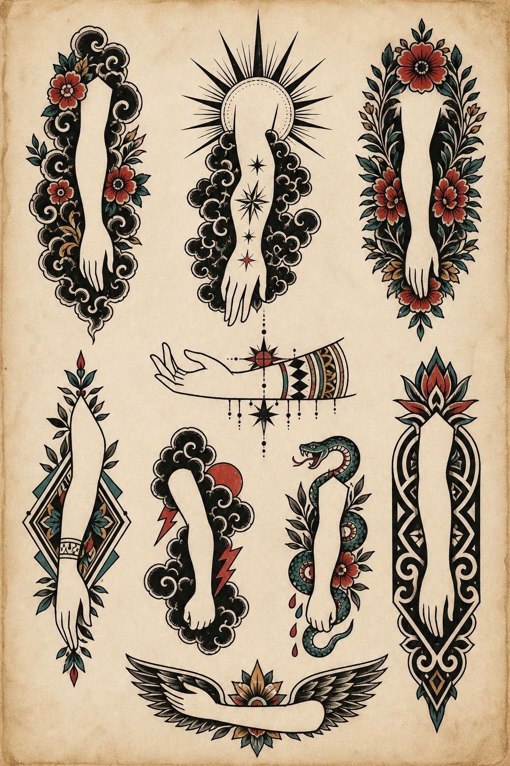
- Flash Sheet Against a Custom Sleeve Layout
- Eternal Versus Dynamic: How Ink Choice Reads at Year Ten
- Draw a Mountain Range as One Clean Pull
- Micro-Realism Eye on the Inner Forearm
- Is the Outer Bicep Really the Chill Spot Everyone Says?
- Turn a Koi Upstream So It Fits the Forearm
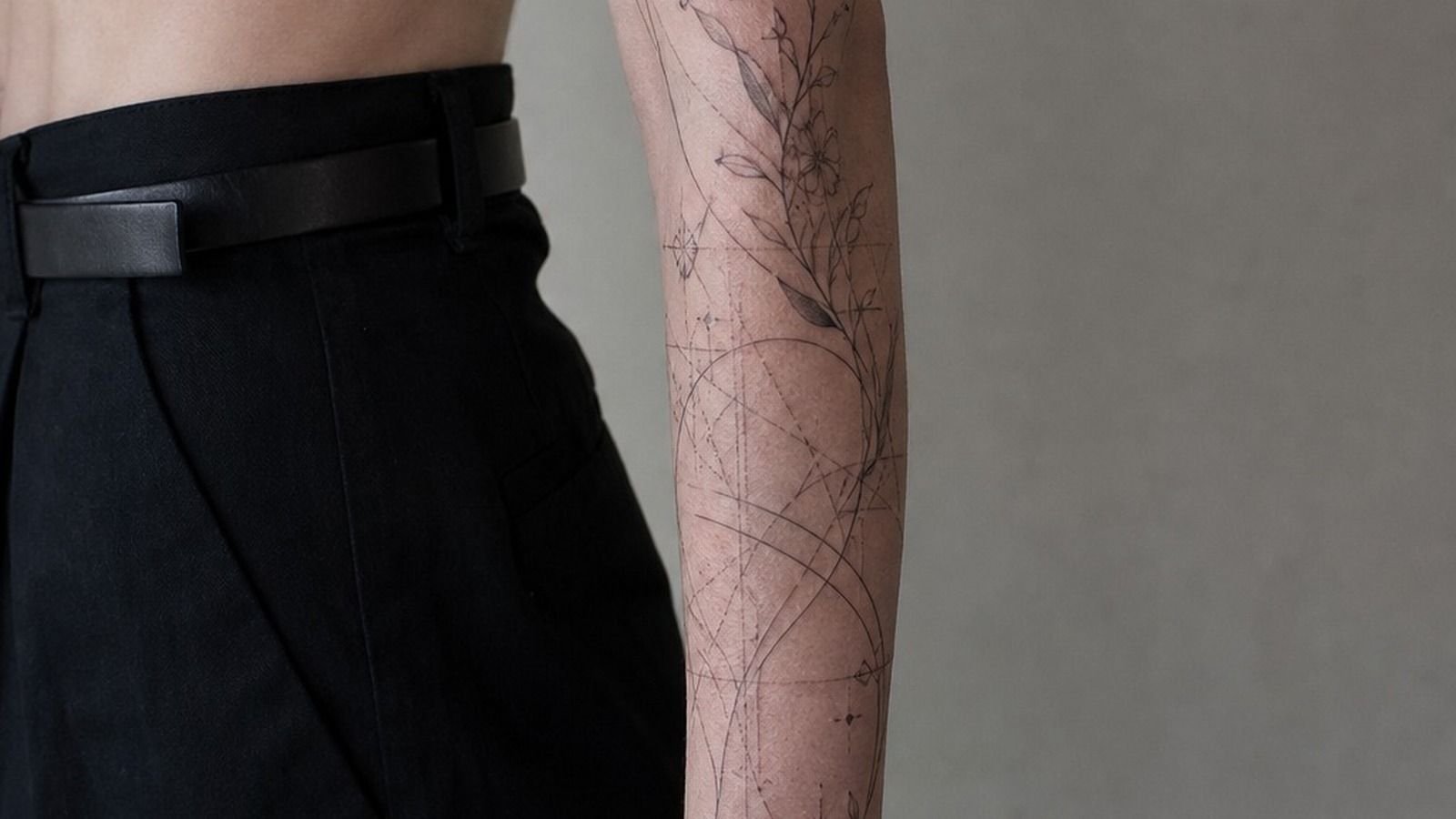
- Geometric Linework That Holds Its Shape
- Whip-Shaded Moth Across the Elbow Ditch
- Build a Matching Set That Doesn’t Look Matchy
- American Traditional Swallow, Because Bold Will Hold
- What Happens to a Watercolor Piece Without Line?
- Sleeve It Later: Leave Room Before You Fill the Gaps
1Fine-Line Botanical That Ages Clean
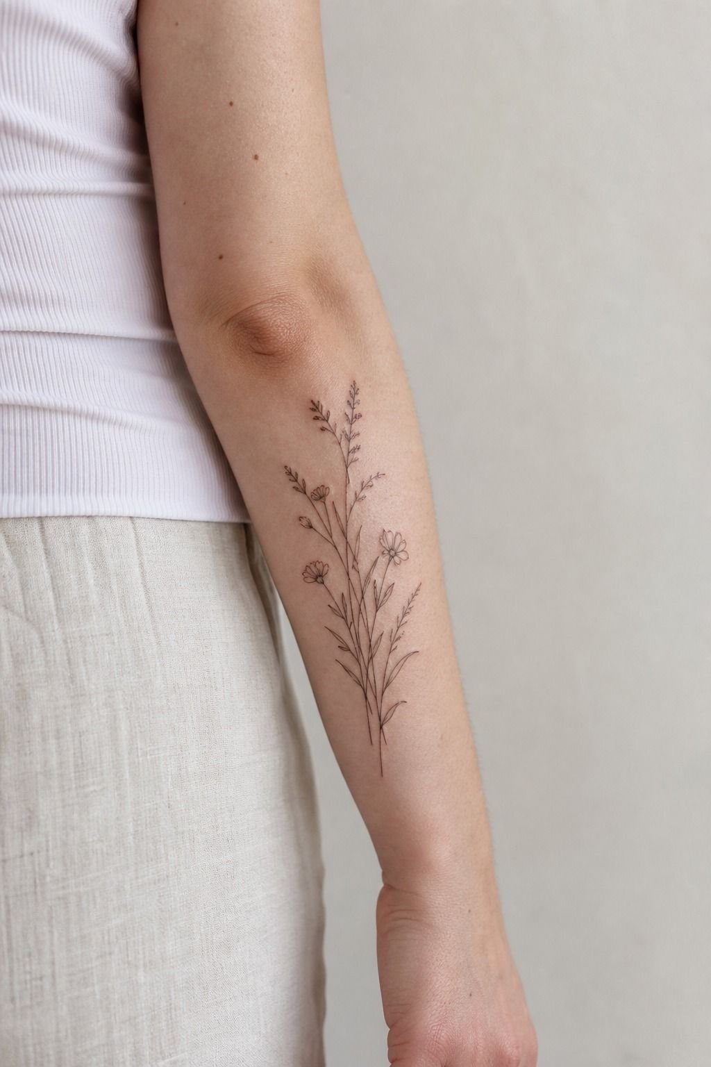
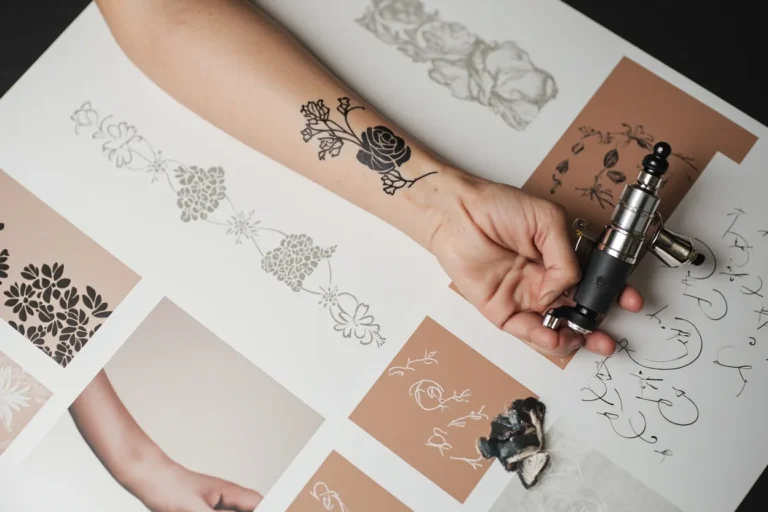
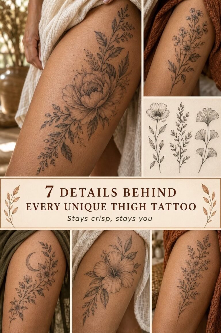
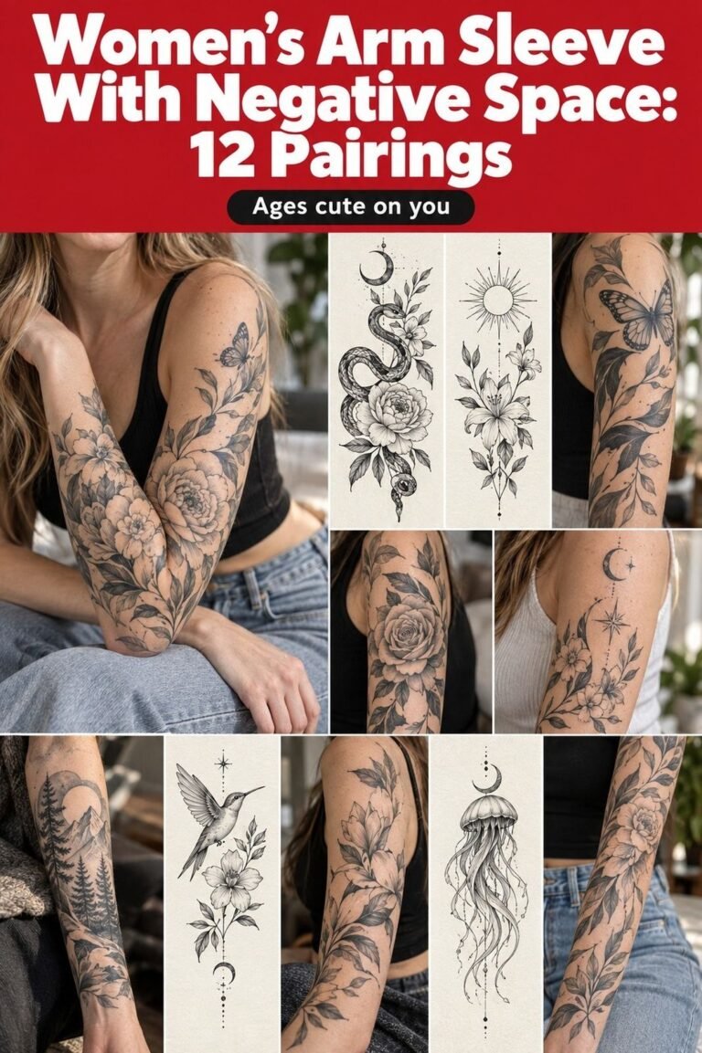
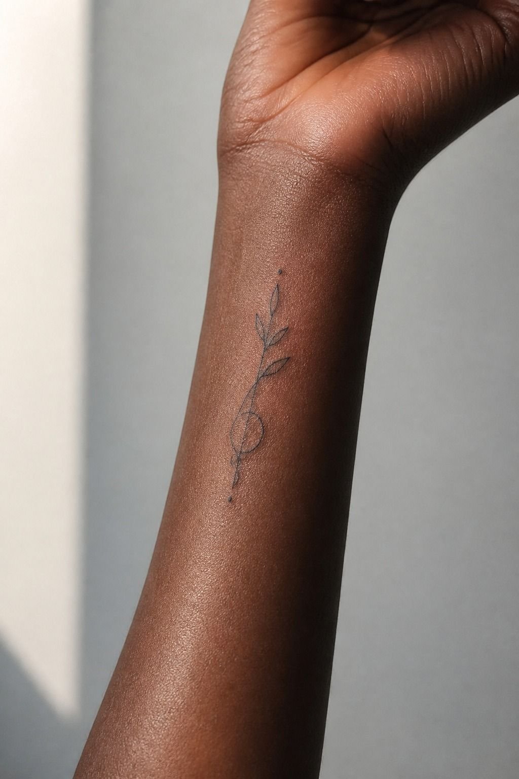
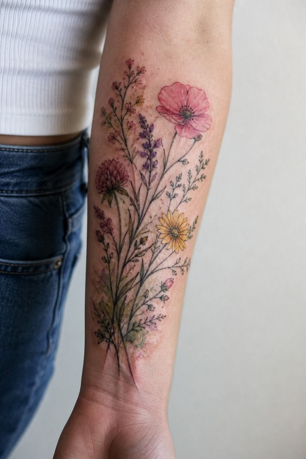
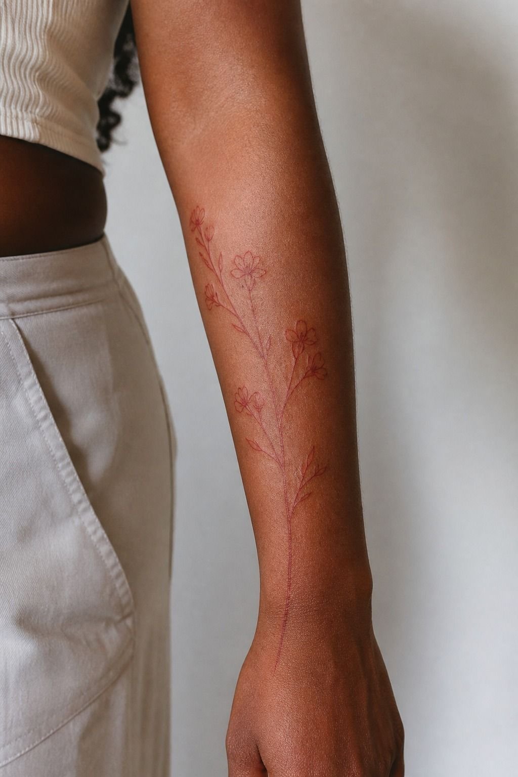
Single stem, one clean pull per line, a couple of leaves with negative space between them. This is the most requested arm piece I do and the easiest to draw badly.
The mistake is drawing every vein in every leaf. Under skin those veins merge into a grey blob within a few years. Draw the leaf silhouette confident, put two vein lines in it, and stop.
Bold will hold.
I run these at 3 to 5 inches on the outer forearm, single needle for the stem and a 3RL for the leaf edges so there’s a bit of weight variation. Weight variation is what makes it read botanical instead of flat.
Anything smaller than 3 inches, I’ll push back or simplify the drawing on the spot. There’s more on line weight and needle choice in my fine line tattoos breakdown.
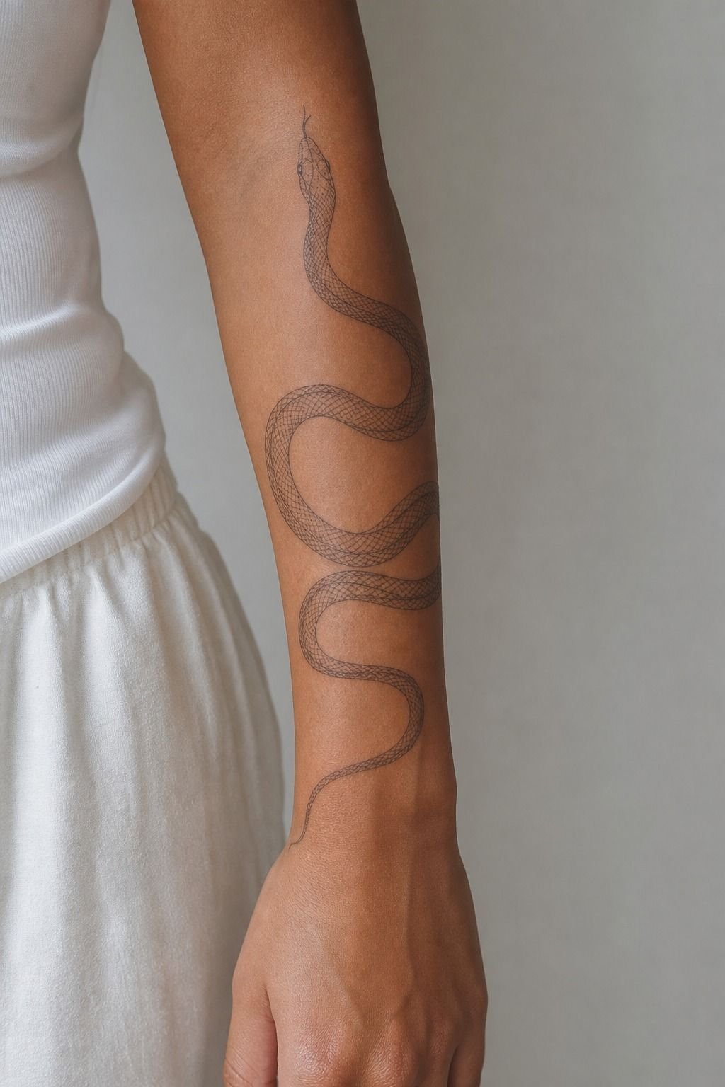
2Wrap a Snake So It Moves With Your Wrist
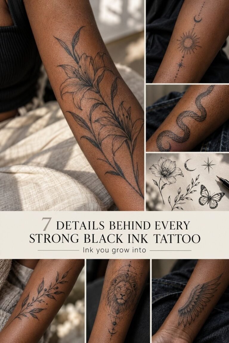
A snake is the best beginner drawing on this whole list because the body is one flowing S-curve, and an S-curve is the shape an arm already wants.
Draw the spine of the curve first as a single line, then thicken it into a body. Head at the top near the elbow, tail tapering toward the wrist, belly scales as short horizontal ticks rather than full outlines.
The scales are where people overwork it. Ticks heal.
Full scale outlines pack in and go solid.
Wrap it so the body crosses the arm at an angle instead of running straight down. When you rotate your wrist, an angled snake looks like it’s moving. A straight one just looks crooked.
Full layout notes live in my snake tattoo writeup.
3Why Does a Wrist Outline Mush Out?
Because thin skin over bone plus constant flex equals ink migration, and there’s no way to draw around it.
When a needle goes slightly too deep, ink lands in the layer below the dermis and spreads sideways. That’s a blowout.
It looks like a grey bruise ghosting off your line. On the outer bicep you’d have to really overwork the skin to cause one. On the wrist, a heavy hand or one extra pass will do it, because there’s barely any padding between skin and bone.
Add sun and friction and you get fade on top of spread. That’s why a lot of wrist pieces look soft and grey at year six while the same artist’s forearm work still looks crispy. If you want the wrist anyway, go bolder than feels right, keep the internal detail near zero, and accept a touch-up every few years.
4Single Needle Script Against Bold Traditional Lettering
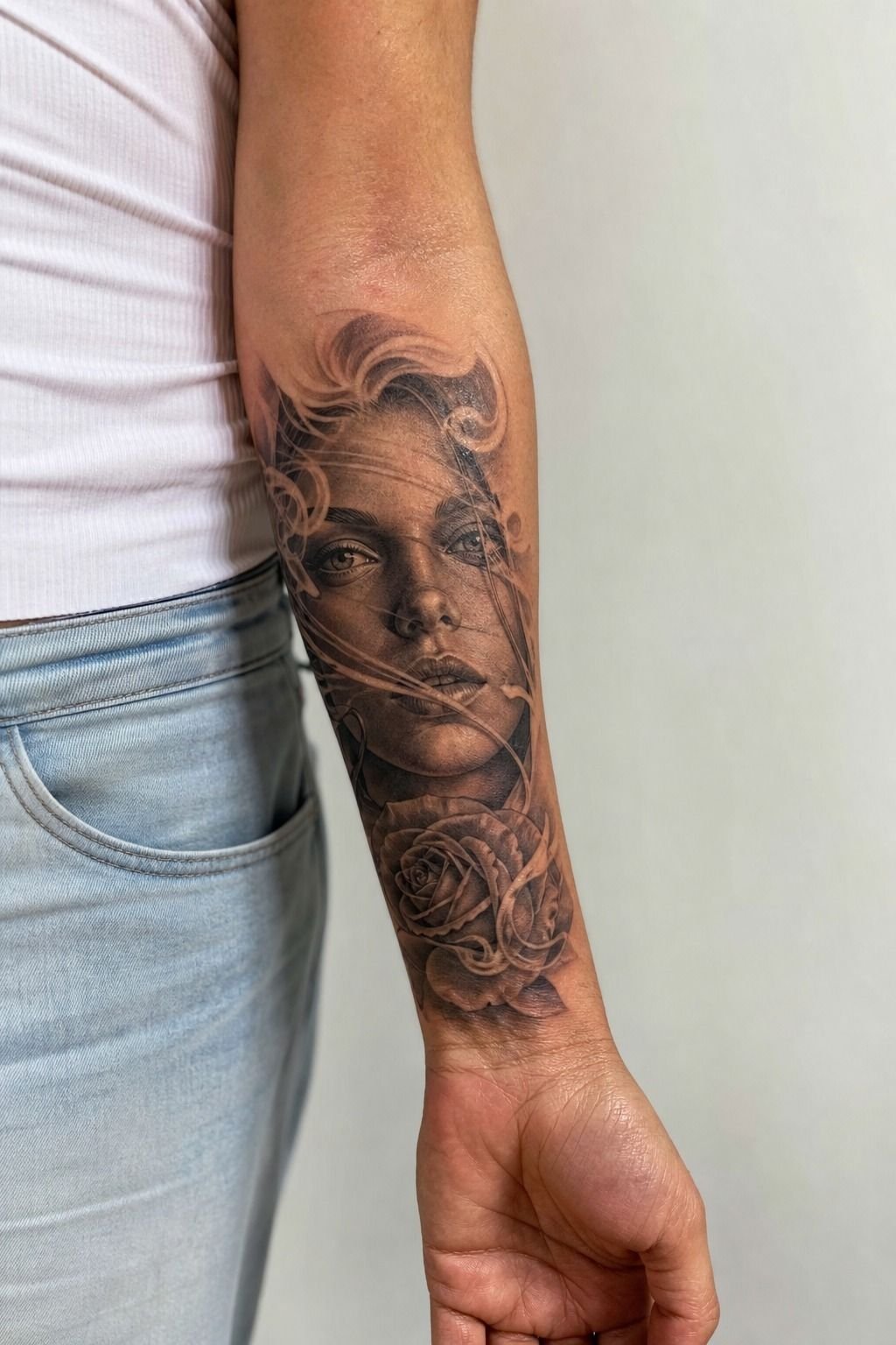
These two look similar on paper and behave like opposites on skin.
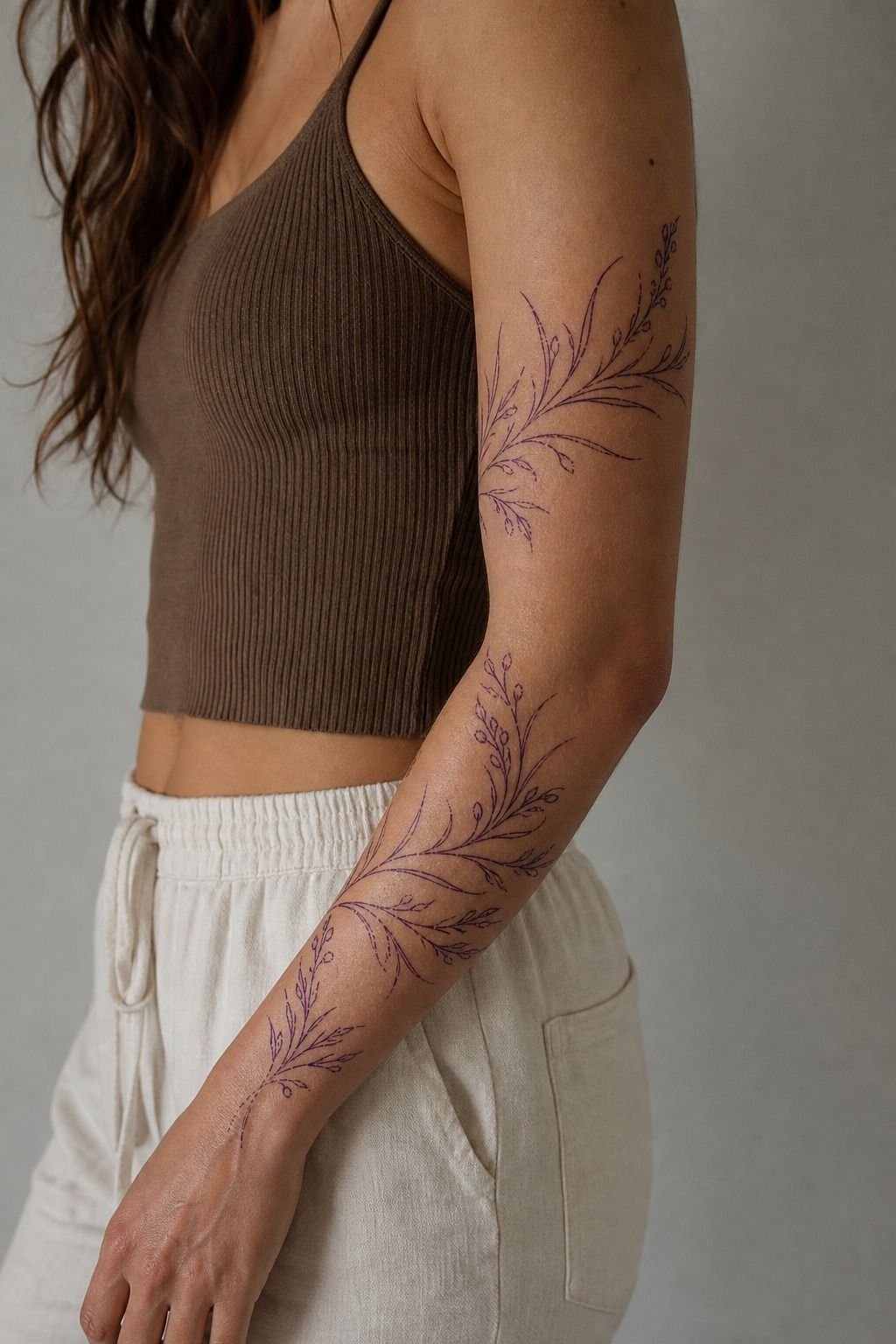
Single needle script is delicate, elegant, and reads beautifully for about the first eight years. Then the hairlines soften and the loops start closing up.
It’s gorgeous, and it’s maintenance. Bold traditional lettering with thick strokes and open counters will look almost identical at year twenty as it did at week four.
My honest split: if the words are short and you want them tiny and tucked on the inner bicep, single needle is fine and you’ll love it. If it’s a full quote, or it’s going anywhere that sees sun, go with weight. See the script tattoo guide for font choices that survive both ways.
5Irezumi Dragon: What Horiyoshi-School Layouts Get Right
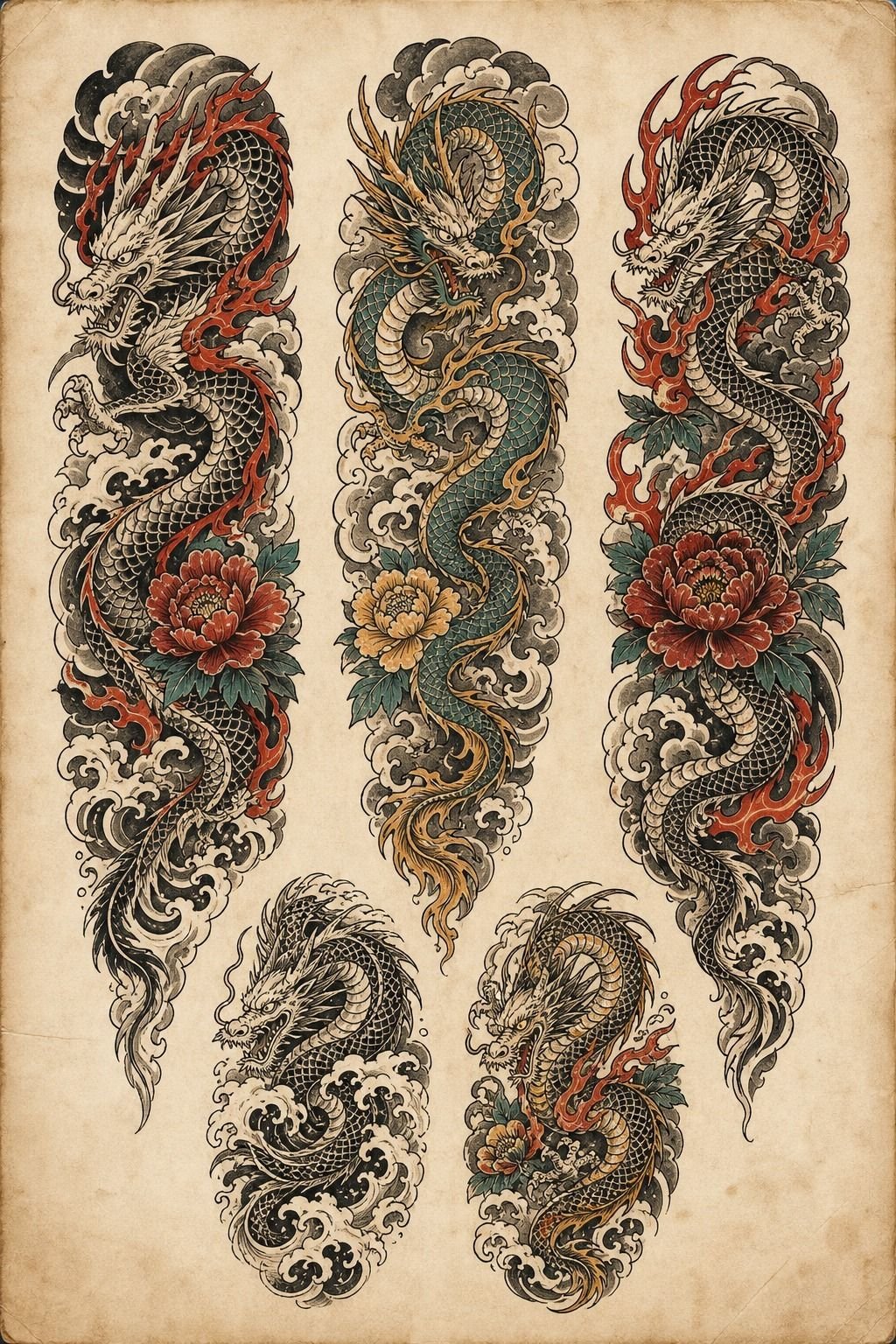
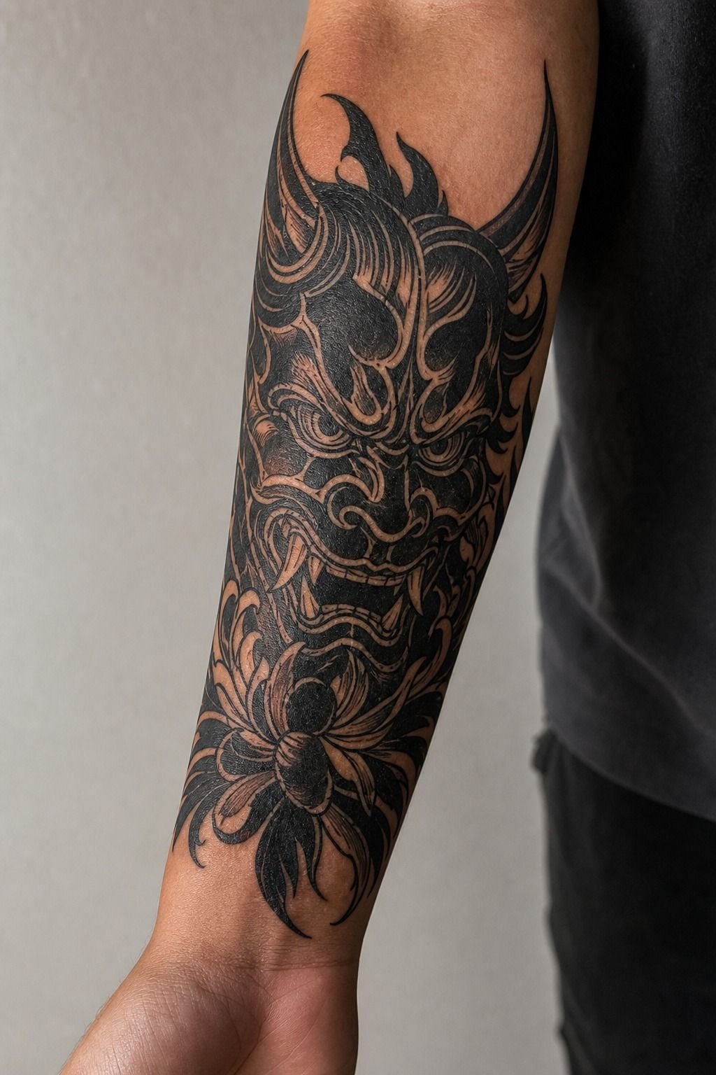
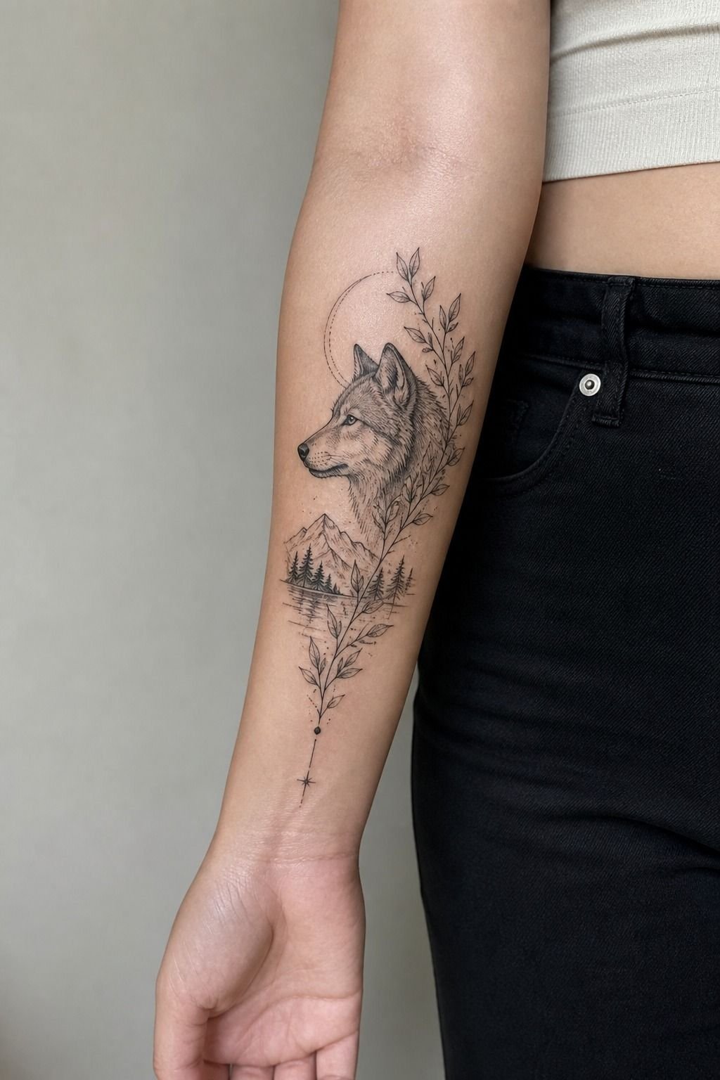
Even if you’re never getting a full Japanese sleeve, the traditional irezumi layout is worth stealing from as a drawing exercise.
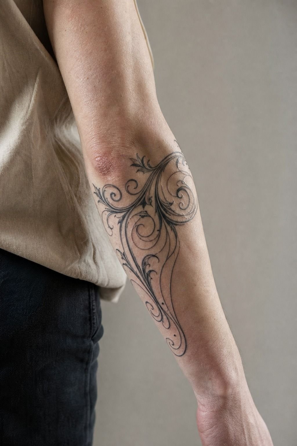
Those layouts never fight the body. The dragon follows the natural spiral of the arm, the background wind bars run perpendicular to the body to create depth, and there’s always negative space breathing between elements. Nothing is centered, nothing is symmetrical, and that’s exactly why it reads powerful.
Compare that to a dragon drawn flat on paper and slapped on a bicep. It looks pasted on because it was designed for a rectangle, not a cylinder.
Trace your own arm outline on paper before you draw. It changes everything.
My Japanese tattoo piece goes deeper on background elements and body flow.
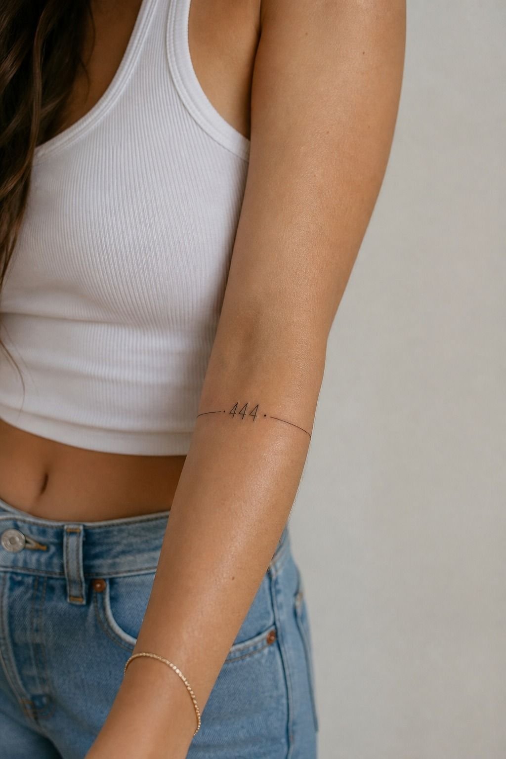
6Stack Angel Numbers Down the Inner Bicep
111, 222, 333, whatever your number is. This one draws itself and the whole job is the typeface and the spacing.
Inner bicep skin is soft, so numbers spread more than you’d expect. I keep strokes at least 2mm wide and I leave the counters (the holes in the 8s and 0s) generous. A tight 8 becomes a solid oval eventually.
Vertical stacking reads better than horizontal here because the bicep is a long narrow plane. Run them down the arm with even gaps and it looks intentional.
Cram them side by side and it looks like a barcode. There’s a full number-by-number rundown in my angel number tattoo guide.
7Black and Grey Rose With a Soft Grey Wash
The workhorse of arm tattoos, and for good reason. It fits any size from 3 inches to a full outer forearm, it flows with the limb, and grey wash heals velvety when it’s laid down right.
Draw the petals as overlapping shapes, not as one flower with detail inside it. Each petal needs its own outline and its own shadow edge. That separation is what keeps the rose readable when the greys soften.
Push the contrast harder than looks right in the stencil. Grey wash lightens about 20% as it heals, so a piece that looks perfectly balanced on day one will heal flat. My black and grey breakdown has the shading progression I use.
8Flash Sheet Against a Custom Sleeve Layout
Flash is pre-drawn work off the wall. You pick, you stick, you’re out in an hour at a fixed price, usually $150 to $400 for arm-sized pieces. Custom means I draw for your arm specifically, and you’re paying for design time plus machine time.
Flash gets a bad reputation it doesn’t deserve. A flash piece drawn by a good artist has already been tested on skin dozens of times.
The proportions work. The line weights are proven.
A custom piece is a first draft by definition.
Where custom wins is layout. If you know you want a full sleeve eventually, the pieces need to be planned together or you’ll end up with a patchwork of good tattoos that don’t talk to each other. Start with a map, fill it over years.
Plenty of layout examples in my cool arm tattoos roundup.
9Eternal Versus Dynamic: How Ink Choice Reads at Year Ten
Ink brand matters less than the internet says and more than nothing.
Dynamic and similar heavy blacks are what most of us use for outlining because they’re dense and they stay dense. Eternal and Fusion cover the color range, and both hold saturation well when they’re packed properly. The variable that actually decides longevity isn’t the bottle, it’s whether the artist got it saturated in one solid pass instead of scratching at the same spot fifty times.
Overworked skin scars, and scarred skin doesn’t hold pigment evenly. That’s the patchy healed color you see on cheap work. Ask your artist what they use if you’re curious, but watch how they work more than what’s on the tray.
Light colors are the real risk. Yellow, white, and pastel pink fade fastest under UV, especially on arms that see daily sun. Black is your best friend for longevity, color is spice.
10Draw a Mountain Range as One Clean Pull
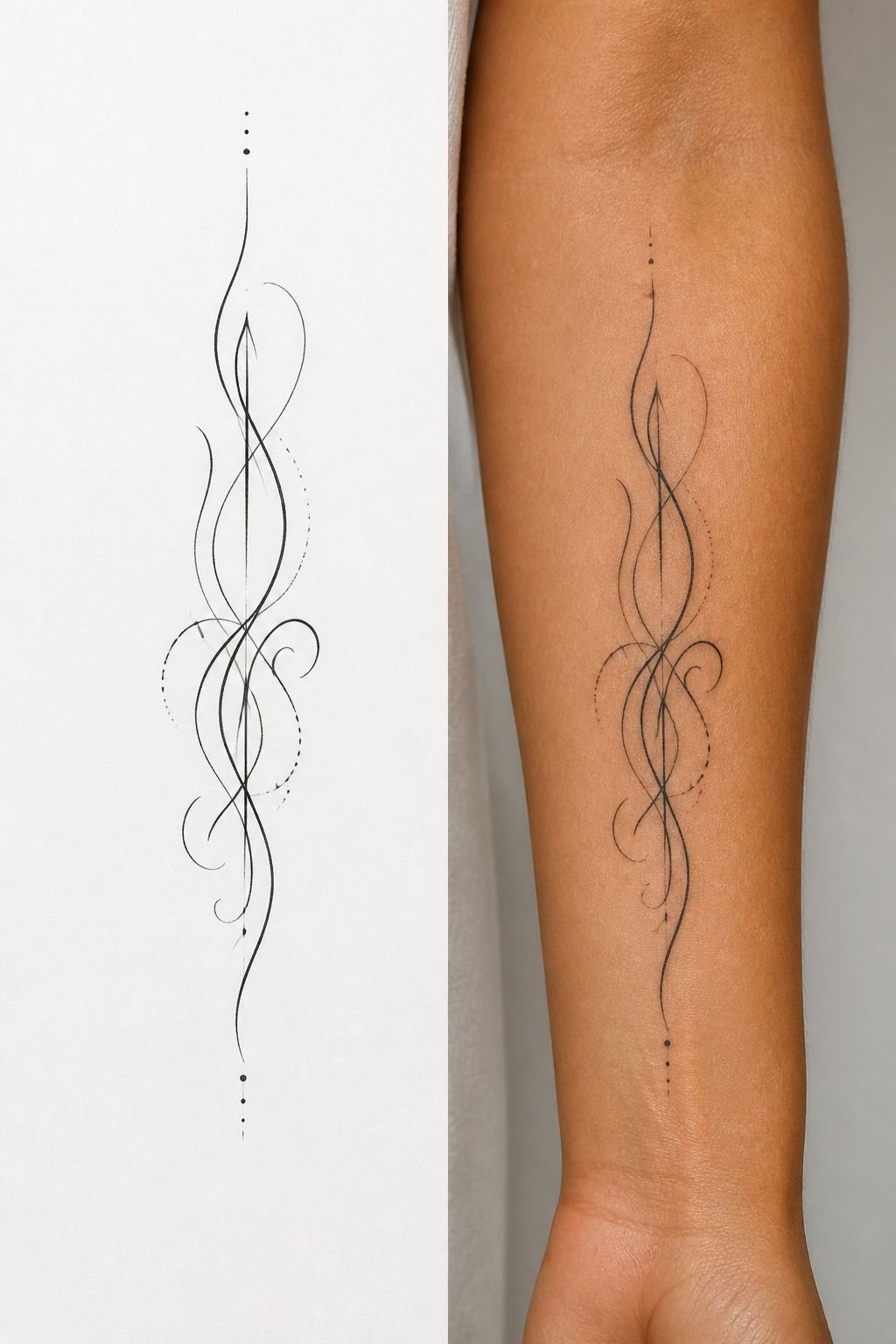
Easiest drawing on the list. Three peaks, one continuous zigzag, done.
The upgrade is negative space. Instead of shading the whole mountain, shade only the shadowed face of each peak and leave the lit face bare. That’s two shapes per mountain and it reads instantly, even at 2 inches.
Skip the tiny pine trees at the base. At arm scale those become a fuzzy grey band within five years.
If you want a treeline, draw four large trees, not twenty small ones. Same reasoning applies across most minimalist tattoos: fewer, bigger shapes always win the long game.
11Micro-Realism Eye on the Inner Forearm
This one’s beautiful and it’s the highest-maintenance piece here. Be honest with yourself before you book it.
Micro-realism relies on tonal gradients packed into a small area. Those gradients compress as they age, and the whole point of the piece is those gradients. Expect a touch-up around year five and another around year twelve if you want it to keep its depth.
Inner forearm is the right call for it. Low sun exposure, low friction, flat plane, and you’re the one who sees it most. Minimum size I’ll take is about 3 inches for an eye.
Below that the iris detail turns into a dark circle. My realism notes cover which subjects survive small scale and which don’t.
12Is the Outer Bicep Really the Chill Spot Everyone Says?
Mostly, yeah. It’s the easiest arm real estate to sit through and the best-aging.
Lines feel sharper and more precise. Shading is a dull burn that gets old around hour three.
Color packing is the spiciest part because we’re going back over skin that’s already irritated. On the outer bicep all three stay manageable.
Tap out for five rather than pass out on me. Full body comparison in my tattoo pain chart.
13Turn a Koi Upstream So It Fits the Forearm
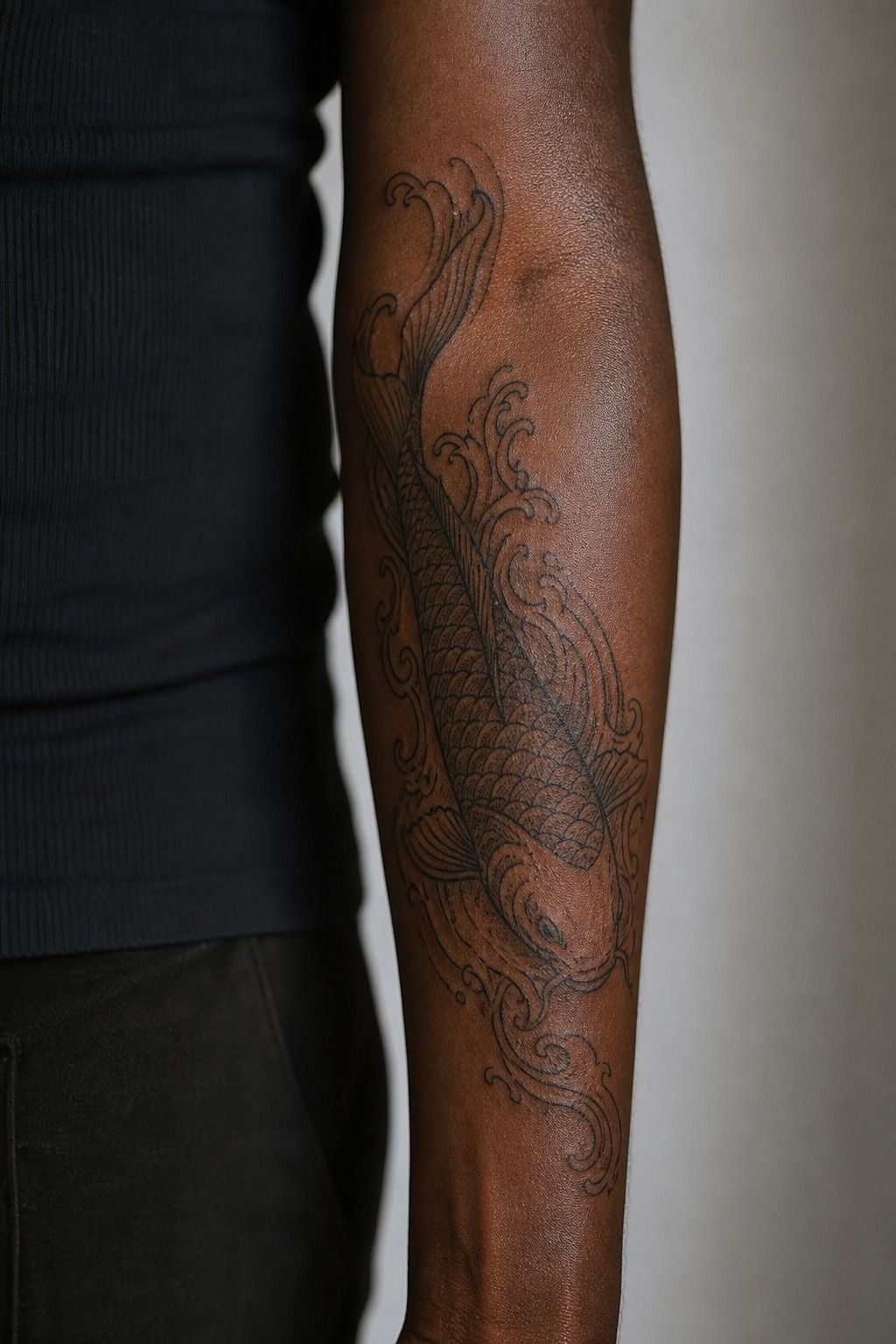
Koi are traditionally read by direction. Swimming up means still striving, swimming down means the goal’s been reached. Pick on purpose, because people will ask.
For drawing, the koi body is a comma shape with a fanned tail. Get that comma flowing along the forearm’s length and the rest is detail work. Scales as crescents, not circles, and only on the visible flank.
At forearm scale, 6 to 8 inches, a koi with water and a few maple leaves runs 4 to 6 hours and lands around $600 to $1,000. It’s one of the best value pieces on an arm because it fills the space without needing a full sleeve commitment. More on composition in my koi fish tattoo guide.
14Geometric Linework That Holds Its Shape
Straight lines are unforgiving. Any wobble shows, and any spread makes parallel lines look like they’re melting together.
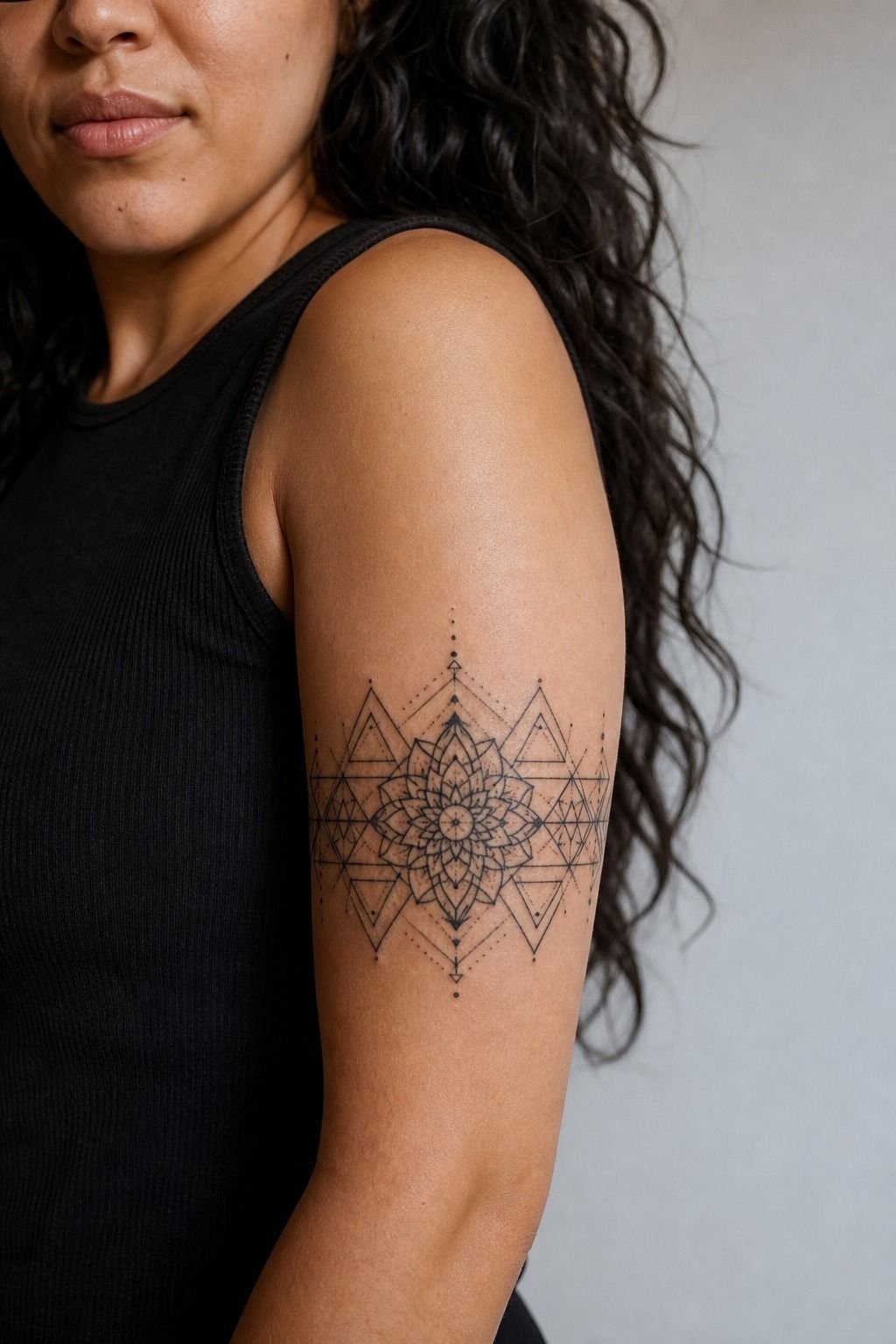
The rule I use: never place two parallel lines closer than 3mm apart at arm scale. Under that, they’ll merge. Sacred geometry designs pulled off the internet routinely violate this by a mile, which is why so many of them heal into grey shields.
Simplify before you commit. Take the design, remove a third of the lines, and check if it still reads. It almost always does, and now it’ll survive.
My geometric tattoo writeup shows the same design at three densities so you can see the aging difference.
15Whip-Shaded Moth Across the Elbow Ditch
Bold outlines, symmetrical wings, whip shading fanning out from the body toward the wing edges. Beautiful piece, brutal placement.
The elbow ditch is thin, it flexes constantly, and it swells during the session. It also heals slowest of anywhere on the arm, three to four weeks minimum, and it’s the one spot where I genuinely warn people they may need a touch-up regardless of how well they heal.
If you want the moth without the pain and the maintenance, sit it just below the ditch on the upper forearm. Same visual impact when your arm’s at your side, half the misery, and it’ll stay crispy. That’s the version I recommend to about eight out of ten people who ask.
16Build a Matching Set That Doesn’t Look Matchy
Matching arm pieces work best when they share a system rather than a design. Same line weight, same size, same placement on each person, different subject.
Two people with identical sprigs on identical inner forearms reads a little literal. One person with a sun and one with a moon, drawn in the same weight at the same 3 inches, reads intentional. It also ages together because it’s the same technical spec.
Book them in the same sitting if you can. One shop minimum instead of two, and the artist keeps the hand consistent across both. There’s a set of pairings that work well in my matching tattoos collection.
17American Traditional Swallow, Because Bold Will Hold
A hundred years of American traditional exists because the format works. Heavy black outline, limited color palette, solid fill, big simple shapes.
A trad swallow drawn in 1950 and a trad swallow drawn last week look nearly identical at forty years old. Nothing else on this list can say that. The thick outline acts as a container, so when the color inside spreads slightly it has nowhere to go.
The drawing is genuinely beginner friendly too. Wing as one shape, tail as a fork, body as an oval, three feather lines per wing.
Resist adding more. Everything I love about the style is in my American traditional rundown.
18What Happens to a Watercolor Piece Without Line?
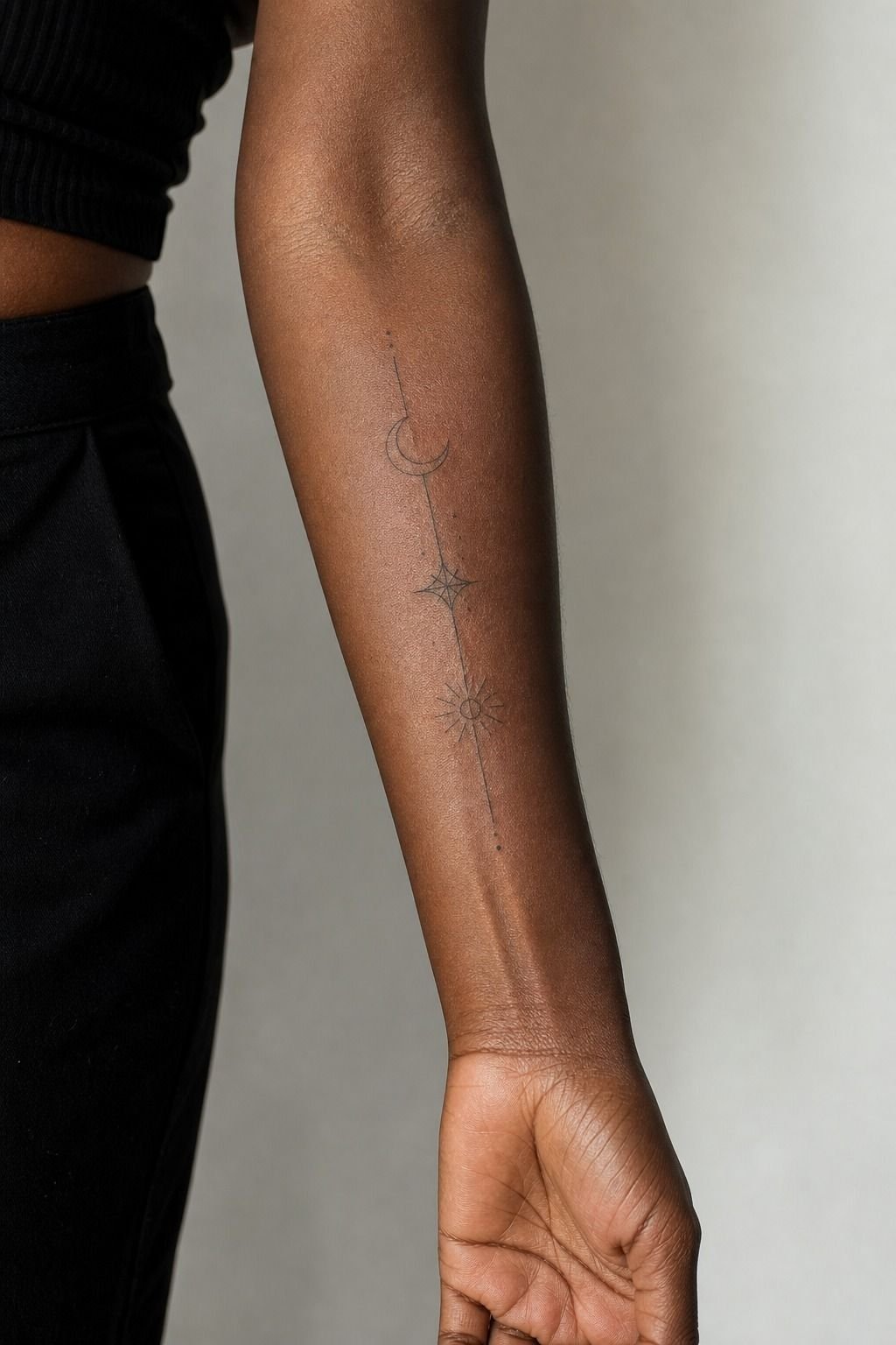
It disappears into a bruise. That’s the whole answer, and it’s why I only do watercolor anchored with line.
Watercolor works on paper because paper is white and stays white. Skin is a warm translucent surface that yellows slightly with age, and soft-edged pigment with no boundary just diffuses into it. Ten years out, an unlined watercolor piece looks like a faded stain.
Put a confident black line under it and the whole thing changes. The line carries the image, the color carries the mood, and when the color softens you still have a tattoo.
Any artist who tells you line ruins the watercolor effect hasn’t seen enough of their own work heal. More on the anchored approach in my watercolor tattoo piece.
19Sleeve It Later: Leave Room Before You Fill the Gaps
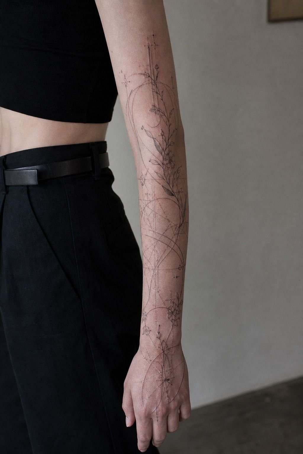
If there’s any chance you’ll want a sleeve down the line, plan for it on tattoo number one.
Scattered small pieces at random angles are the hardest thing to sleeve around. Every gap-filler has to work with three neighbors, and you end up with background just to connect things. That background is expensive and it’s not what you actually wanted.
Instead, place your first few pieces along one line, keep the sizes in the same family, and leave the inner arm mostly open. Inner arm is the flex space that ties a sleeve together.
Do that and your artist can build around you for years. If it’s your first appointment ever, start with my first tattoo checklist before you book anything.
Aftercare That Actually Protects the Drawing
First few days it’s an open wound, so treat it like one. Wash twice a day with gentle unscented soap and lukewarm water, pat dry with a paper towel, and put on a thin layer of ointment.
Thin. Suffocating it under a thick coat traps moisture and pulls ink.
Around day four it’ll start peeling like a sunburn. Don’t pick the flakes or you’ll pull color out with them, and that’s how you get a patchy spot that needs a touch-up. Switch to unscented lotion once the peeling starts.
Around week two you hit the silver skin stage where it looks shiny and a little cloudy. That’s normal, the color comes back by week four as the dead layer finishes turning over. Full timeline and product notes in my tattoo aftercare guide.
What kills arm tattoos, in order: sun, pools, gym friction, picking. Sunscreen once it’s fully healed, every single time your arm’s out. It’s the difference between crispy at twenty years and soft at eight.
FAQ
How much does a forearm tattoo cost? Expect $120 to $300 for a small fine-line piece under 4 inches, and $900 to $2,000 for a forearm half sleeve in black and grey spread across two or three sessions. Most US shops charge a shop minimum of $80 to $150 that applies even to twenty-minute work, plus an hourly rate between $100 and $250 depending on the artist’s experience and demand. Deposits of $50 to $150 come off the final total, and a 15 to 20% tip is standard.
If you’re getting several small pieces, book them in one sitting so you pay that minimum once instead of three times.
Is the forearm a good spot for a first tattoo? It’s one of the best. The outer forearm sits around 3 or 4 out of 10 on pain, it’s a flat low-wear plane that holds linework for decades, and you can see it healing every day which makes aftercare easy to stay on top of.
Compare that to the elbow ditch or wrist, both high-wear zones where thin skin and constant flex cause spread and blowouts. If you want something visible but low commitment, the outer forearm at 3 to 5 inches is the size and spot I recommend more than any other for a first piece.
How long does an arm tattoo take to heal? Surface healing takes two to four weeks depending on placement, with the outer arm closer to two and the elbow ditch closer to four. The deeper layers keep settling for three to six months, which is why color looks slightly cloudy at week three and sharpens up by month two.
The peeling phase hits around day four and is the highest-risk window, since picking flakes pulls pigment out and leaves patchy spots. Stay out of pools, saunas, and direct sun for the full three to four weeks, and skip gym sessions that grind the area against equipment.
Will a small fine-line tattoo turn blurry? It can, and size is the deciding factor. Ink spreads a little as it heals and keeps spreading slowly for decades, so any design with internal details packed closer than about 3mm will eventually merge into a solid patch.
That’s what artists mean by soup. A 2-inch piece with six details is at risk. The same drawing at 4 inches, with a third of the details removed, will still read clean at twenty years.
Placement matters too: fingers, hands, and the wrist are high-wear zones where even well-drawn fine line needs touch-ups every few years.
Should I bring a reference photo or let the artist design it? Bring references, absolutely, but bring them for vibe rather than for tracing. If you want a Pinterest image copied line for line, most good artists will turn it down, partly because it’s another artist’s work and partly because it was drawn for a different body.
Bring three or four images that share a mood, tell your artist the size and placement you’re picturing, and let them redraw it for your arm’s shape. That redraw is what you’re paying design time for, and it’s the difference between a tattoo that flows with the limb and one that looks pasted on.
Where to Start
If I had to pick one from this list for someone walking in tomorrow: fine-line botanical, 4 inches, outer forearm. It draws easy, it heals fast, it hurts about as little as tattoos hurt, and it’ll still look sharp when you’re sixty.
Bring your references, be honest about your sun and gym habits, and let the artist push the size up an inch if they suggest it. That suggestion is free and it’s usually the thing that saves the piece.
Still narrowing it down? Browse the cool small tattoos collection for pieces that work at 2 to 3 inches, or the blackwork and floral galleries if you already know the direction you’re going.