Biomech watercolor tattoos are what happens when H.R. Giger’s nightmares collide with a spilled paint tray. You’ve got the mechanical guts, gears, pistons, torn flesh revealing chrome and wire, floating in those loose, bleeding color washes that define watercolor style. In my chair, I’ve watched this hybrid evolve from a niche experiment to something clients specifically request. It’s not easy to pull off. The two styles fight each other: biomech wants precision, tight edges, controlled shadow; watercolor wants chaos, bleeding boundaries, happy accidents. When it works, though, it’s unforgettable. When it doesn’t, you’ve got a muddy mess that neither style can save.
Origins & History
Biomechanical tattooing exploded in the late ’80s and ’90s, riding the Alien franchise’s cultural shockwave. Artists like Paul Booth and Guy Aitchison built careers on making skin look like it was peeled back to reveal machinery underneath. It was dark, obsessive, technically demanding. Every rivet had to read, every shadow had to sell the illusion of depth.
Watercolor tattoos came later, maybe early 2010s, imported from illustration and fine art traditions. No black outlines, color bleeding into skin like actual pigment on wet paper. Purists hated it. Traditionalists called it a fad that wouldn’t last. I remember shop arguments about whether it was even “real” tattooing.
The mashup started around 2015-2016, I’d guess. Instagram accelerated it. Artists started experimenting: what if the mechanical elements were the “real” structure, and the watercolor was the atmosphere, the emotional layer, the dream logic surrounding it? Some early attempts were disasters. The watercolor would swallow the mechanical detail, or the biomech would look pasted onto a colorful background. It took years of artists figuring out how to make them actually talk to each other.
Where the Styles Actually Meet
The breakthrough was treating watercolor as negative space and atmosphere rather than subject. The mechanical parts stay tight, rendered with conventional techniques. The watercolor exists in the gaps, the background, the implied space between machine and skin. It’s not two tattoos fighting for the same real estate, it’s one vision with distinct jobs.
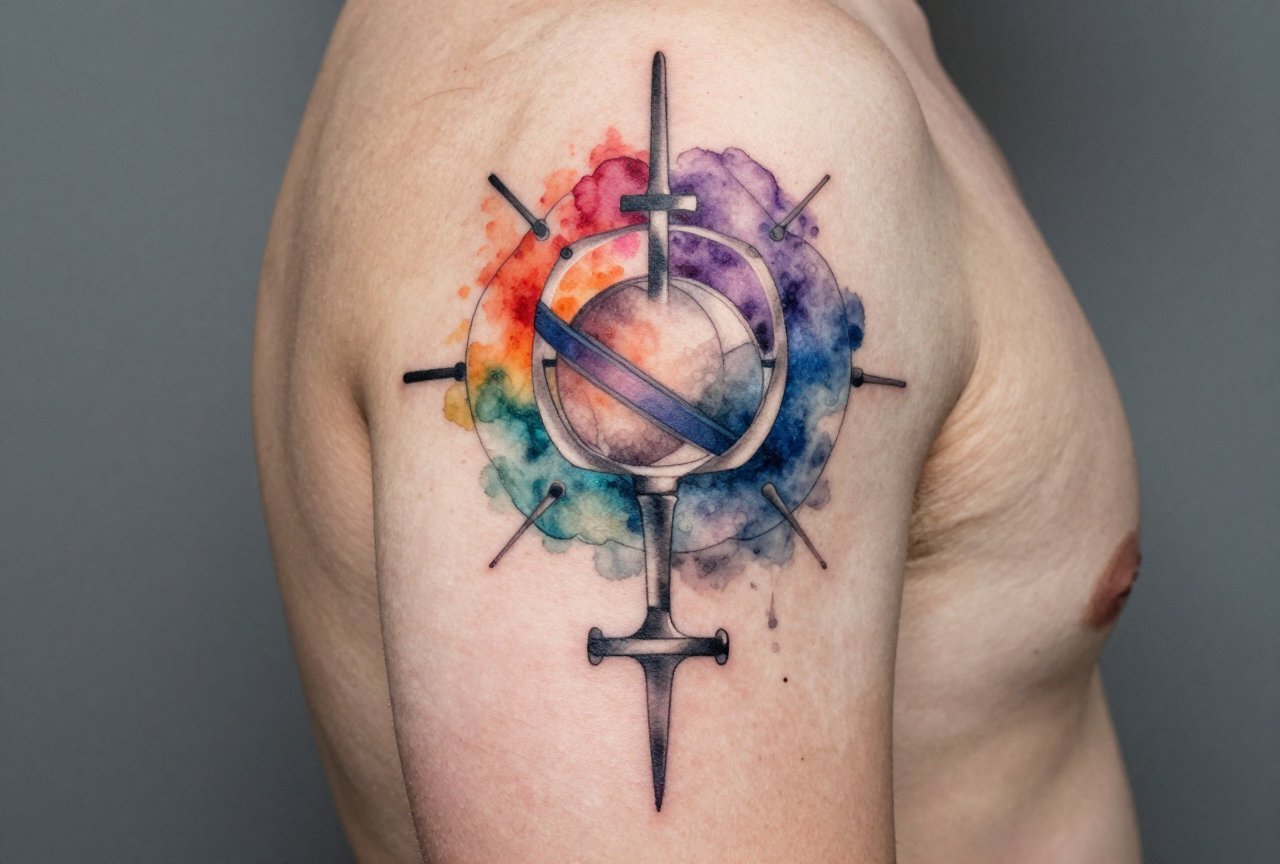
Key Characteristics & Motifs
What separates a real biomech watercolor piece from a generic “cool robot with splashes”? In my experience, it’s about the integration.
- Torn entry points: The skin doesn’t just sit next to the machine, it rips, peels, corrodes. I spend serious time on those edges where epidermis becomes something else. The watercolor often bleeds from these wounds, like the color itself is leaking from the body.
- Recognizable mechanical parts: Gears, pistons, hydraulic lines, cable bundles. Not random “tech shapes.” I tell clients: if I can’t tell what it’s supposed to be, the illusion breaks. The watercolor can be abstract; the biomech cannot.
- Directional flow: Good watercolor has movement. It drips, splatters, pools in directions that make sense. In biomech watercolor, that flow often follows the mechanical forms, wrapping around cylinders, trailing from exhaust ports, suggesting heat or energy discharge.
- Strategic black: This style needs black for the biomech to read, but too much kills the watercolor’s airiness. The best pieces use black as structural glue, concentrated in the mechanical elements, fading to nothing as color takes over.
What Fails
I’ve fixed pieces where someone tried to make the watercolor itself form mechanical shapes. Color bleeding doesn’t hold edges like that. It looks like a bruised circuit board. Another failure mode: watercolor so dominant the biomech reads as an afterthought, a few gray lines drowning in pink and blue. The balance matters more than almost any other hybrid style.
Color vs Black and Grey
Here’s where shop talk gets real. Color biomech watercolor is gorgeous fresh. That neon magenta against gunmetal gray, electric blue bleeding from a piston housing, it’s stunning on day one. I’ve done pieces like that. But I warn every client: those bright watercolor pigments fade faster than the black and grey structural work. In five years, you might have a very detailed machine surrounded by pastel ghosts. The contrast that made it sing disappears.
Black and grey watercolor, using washes of black dilution instead of color, ages more gracefully. It stays in the same tonal family as the biomech. The tradeoff is impact. A full color piece stops people across the room. Black and grey whispers instead of shouts.
My compromise suggestion for clients who want longevity and color: limited palette. One dominant color, maybe two. Deep crimson bleeding from mechanical wounds. A single teal wash suggesting coolant. The color becomes symbolic rather than decorative. It has meaning to hold onto even as it softens.
Best Placements
Biomech watercolor needs room. The style falls apart in small formats. I’ve tried to talk clients out of 4-inch pieces that cram too much concept into too little skin. The watercolor needs space to breathe, to fade, to suggest. The biomech needs space to detail.
- Upper arm/shoulder to elbow: Classic biomech territory. The cylinder of the arm naturally accepts mechanical forms. Watercolor can wrap around, trail down toward the elbow. I’ve done pieces where the color suggests the machine is “running hot,” bleeding down the arm.
- Thigh: Huge canvas, good for complex compositions. The flat planes let you build real mechanical depth. Watercolor pools and splatters naturally here. Pain level is manageable for long sessions.
- Back panel: The ultimate statement piece. Spine becomes central mechanical column. Ribs offer natural framing for watercolor bursts. I’ve spent 40+ hours on back pieces in this style. They’re marathons.
- Forearm: Riskier. Smaller, more sun exposure, faster fade. But visible, which matters to some clients. I do these with simpler mechanical cores and more restrained color.
We see this a lot: clients want ribs or feet because they’re “cool placements.” I push back. Ribs distort with breathing. Feet lose pigment to friction and sun. The watercolor especially suffers. Pick placement for the art, not the Instagram pose.
Who It Suits
Not everyone. I say this with love. Biomech watercolor is loud, conceptually heavy, visually busy. It works for people who already live in that aesthetic space, metalheads, industrial designers, sci-fi obsessives, people who own too many Giger prints. If your wardrobe is minimalist neutrals and your apartment is Japandi, this tattoo will colonize your visual identity in ways you might resent.
It also suits certain skin tones differently. The watercolor’s transparency means it interacts with your natural undertone. On very dark skin, the bright color washes can struggle for visibility unless the artist knows how to build saturation without muddiness. I’ve watched talented artists fail here because they applied techniques that work on pale skin. The biomech black and grey holds fine; the color needs adjustment. Find someone who’s actually worked your skin tone.
Age-wise, I’ve tattooed this on 22-year-olds and 55-year-olds. The older clients often have the best patience for long sessions and the clearest sense of whether they’ll still want a mechanical arm in twenty years. Younger clients sometimes haven’t sat with the image long enough. I always ask: “Have you wanted this specific thing for at least two years?” The ones who hesitate usually aren’t ready.
Modern Variations
The style keeps mutating. I’ve seen organic biomech watercolor, less metal, more bone, tendon, alien biology, still with the color washes. There’s cyberpunk variation: neon color palettes, holographic effects suggested through white ink and strategic negative space. Some artists are doing “biomech watercolor meets trash polka,” adding the style’s signature red and black graphic elements, text splashes, collage effects.
Another direction: micro-biomech. Tiny mechanical elements, almost jewelry-scale, surrounded by expansive watercolor fields. It’s the opposite of the traditional “machine taking over the body” scale. More like finding a mechanical secret in a dream.
What I won’t do: AI-generated design replication. Clients bring phone images from Midjourney, want them exactly. Those images don’t understand skin, aging, how ink sits in tissue. I use them as conversation starters, then redraw everything. The machine doesn’t know where your shoulder blade ends. I do.
Choosing an Artist
This is where I get passionate. Biomech watercolor demands dual mastery. Most artists can do one or the other. Finding someone genuinely fluent in both is rare. Here’s what I tell people searching:
- Portfolio depth in BOTH styles: Not one biomech piece and three watercolors. Consistent, varied examples of each. Look for healed photos, not just fresh work. Watercolor especially changes dramatically.
- Ask about their planning process: Do they freehand the watercolor? Pre-draw everything? The best biomech watercolor artists I’ve known sketch the mechanical structure precisely, then freehand the color response in the session. Too rigid and it looks dead. Too loose and the structure collapses.
- Check their blacks: In healed work, are the mechanical elements still crisp? Or did they blow out, fuzz at edges? Biomech with blown lines looks like a melted toy.
- Consultation chemistry: This style needs trust. You’ll sit for multiple long sessions. If the artist talks down to you, rushes questions, or seems annoyed by your references, walk. I’ve seen great technical artists lose clients because they couldn’t collaborate.
Price reflects reality. A skilled biomech watercolor artist charges accordingly. This isn’t a $200 walk-in. Budget for quality or wait until you can. I’ve covered too many cheap biomech pieces that became expensive fixes.
Final Thoughts
Biomech watercolor tattooing lives in the tension between control and release, between the engineered and the organic. That’s why it works when it works. The body itself becomes the battlefield or the marriage of those forces. I’ve tattooed this style enough to respect its difficulty, to know the failures as intimately as the successes. It’s not a safe choice. It demands an artist who can hold both disciplines in their head simultaneously, and a client who understands they’re signing up for something that will evolve on their skin for decades. The color will soften. The mechanical lines will stay longer, become the anchor. If that future sounds beautiful to you, not just the fresh photo, but the aged reality, then this might be your style. If you want it to look exactly like day one forever, get a print. Skin is alive. This tattoo style celebrates that fact more than most.
Frequently Asked Questions
How long does a biomech watercolor tattoo take to complete?
Most pieces need multiple sessions. A substantial upper arm runs 12-20 hours. Back pieces hit 40+. The watercolor layers especially can’t be rushed, skin needs to settle between color passes, and the artist has to read how each wash heals before building the next.
Does the watercolor technique make the tattoo hurt more?
The technique itself doesn’t change pain level, but these pieces often require longer sessions. Watercolor’s layered, diluted application means more total needle passes over the same area. I break long biomech watercolor sessions into manageable chunks rather than marathon sittings.
Can you add watercolor to an existing black and grey biomech tattoo?
Sometimes, but it’s tricky. Existing black and grey biomech has established values and edges that watercolor might fight against. I evaluate case by case, some older pieces have enough open space and softer edges to accept color integration. Others would need significant reworking first.
Why do some biomech watercolor tattoos look muddy after healing?
Usually one of three things: too many colors bleeding into each other without strategic negative space, watercolor applied too densely over black instead of around it, or simply an artist who hasn’t mastered how pigments at different dilutions interact during healing. Fresh color intensity doesn’t guarantee healed clarity.


