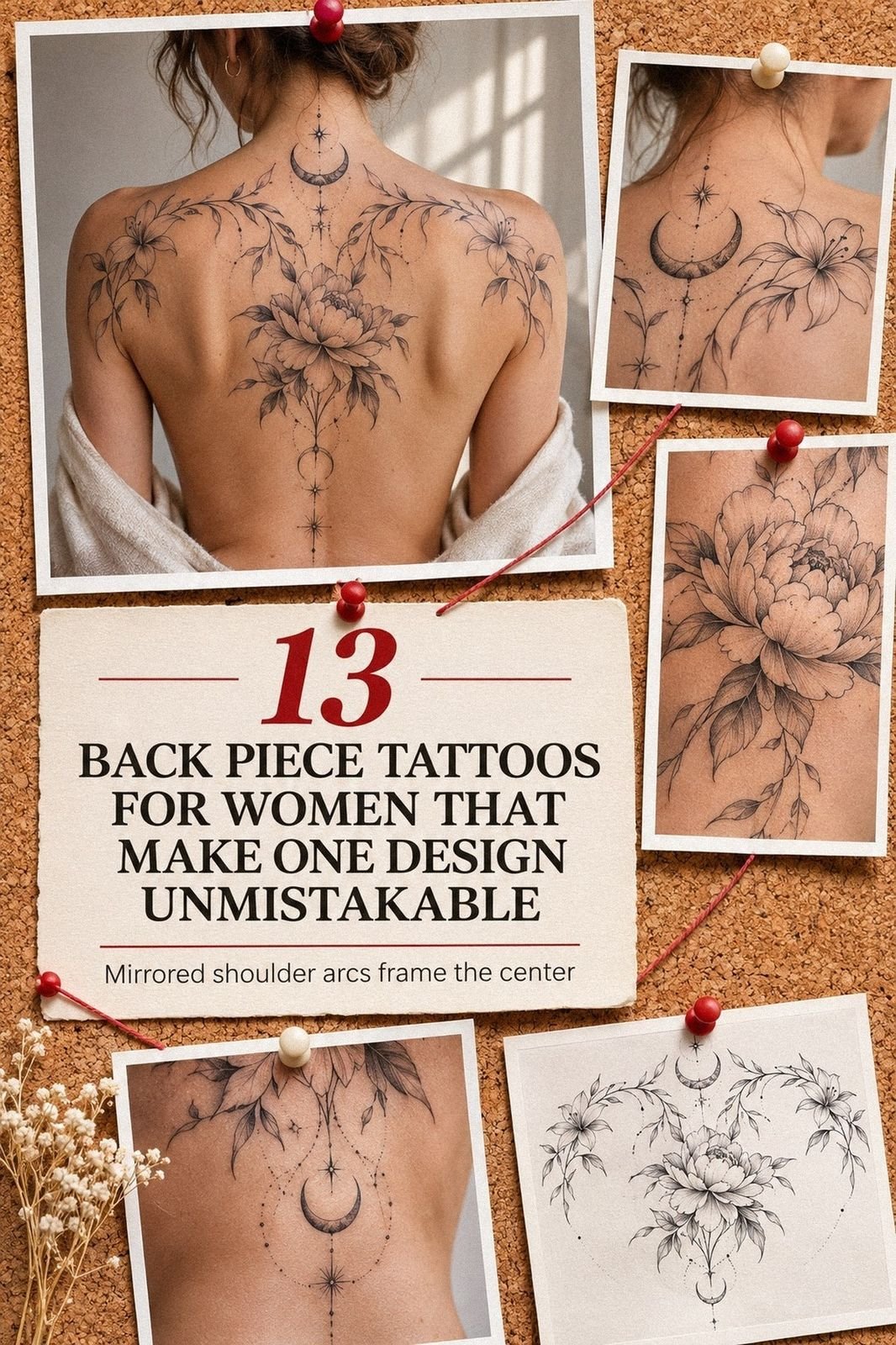
Back piece tattoos for women can still look crisp at 40 when you plan placement, line weight, and healing before you book. The strongest concepts feel personal, expressive, and readable rather than crowded with every trend at once. That distinction matters!
- Start With a Striking Full Back Tattoo Concept
- Let the Linework Carry the Mood
- Give the Spine a Strong Visual Rhythm
- Choose a Half-Back Shape With Intention
- Let One Flower Lead the Composition
- Balance Bold and Dainty Details
- Map the Design Around Your Curves
- Choose Imagery With a Fierce Point of View
A lasting design needs a clear silhouette, deliberate rhythm, and enough negative space for softened lines. You’ll make better choices when you plan for healed ink, not only the fresh result. Your future self deserves that level of care.
Editor’s note: Start with the concept that still feels meaningful when the trend has moved on. Compare broader references in these women’s back tattoos before you save anything.
My one rule is simple: choose the idea first, then let scale, linework, and placement support it. A design brief with three personal words can keep your consultation focused and stop attractive but unrelated details from taking over.
- Start With a Striking Full Back Tattoo Concept
- Let the Linework Carry the Mood
- Give the Spine a Strong Visual Rhythm
- Choose a Half-Back Shape With Intention
- Let One Flower Lead the Composition
- Balance Bold and Dainty Details
- Map the Design Around Your Curves
- Choose Imagery With a Fierce Point of View
- Keep Ornate Ink Readable From Afar
- Match Vibrant Color to the Subject
- Prepare for Pain and Healing
- Plan the Appointment Around the Whole Piece
- Think About Visibility, Clothing, and Future Additions
1Start With a Striking Full Back Tattoo Concept
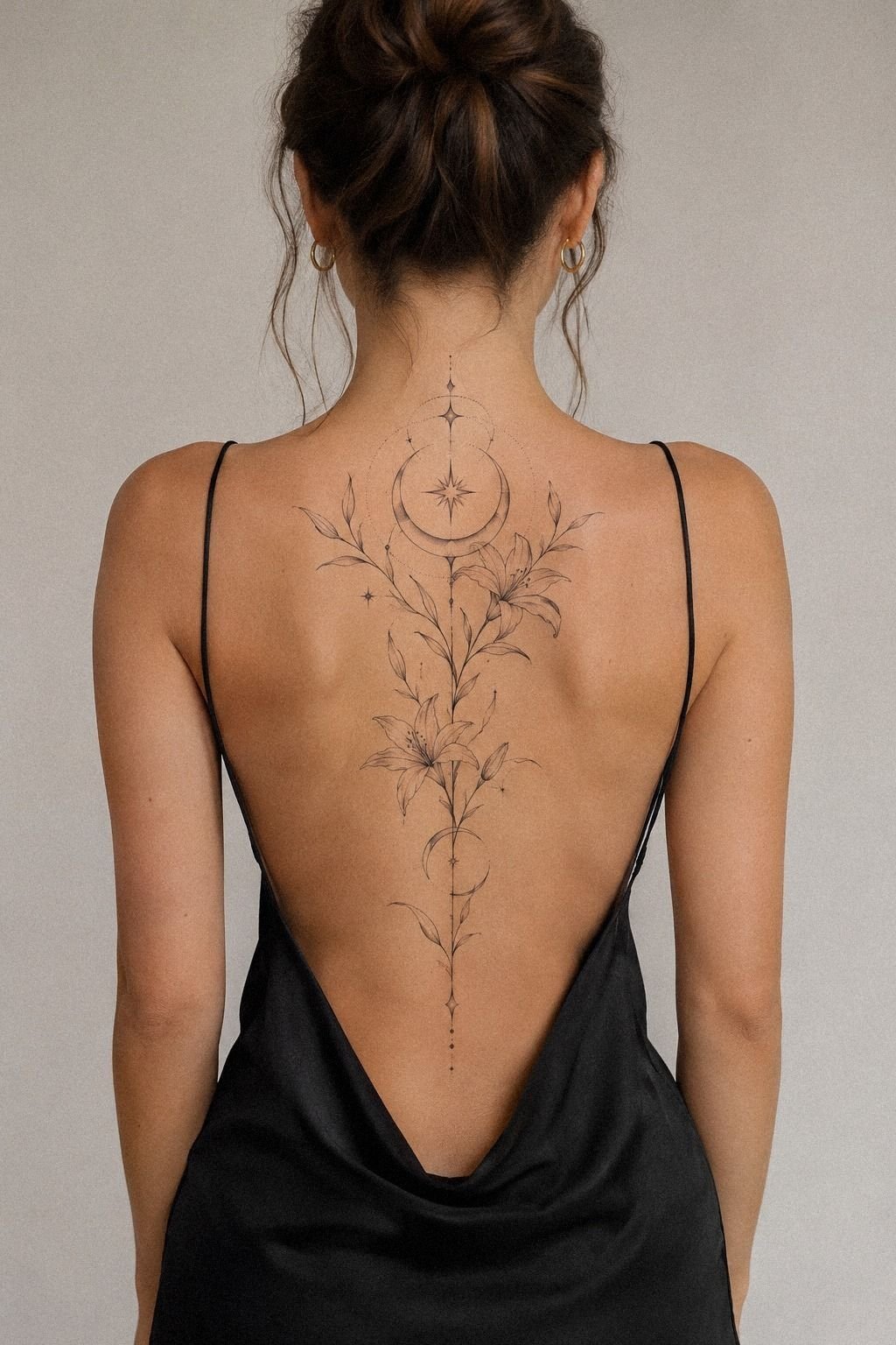
Begin with the feeling you want your full back piece to carry. A few stars, symbols, or botanical marks can feel symbolic, classic, and personal when their spacing looks intentional.
The goal isn’t maximum detail. It’s a striking idea with a readable center.
Sketch the concept at full scale before you choose an artist. Mark the shoulder blades, spine, and the point where the tattoo should stop.
I like the constellation scale rule here: one visual anchor, three supporting marks, and open skin around them. If every mark is identical, the design loses its rhythm.
Don’t judge the sketch only from a phone screen. Hold it against your back, turn sideways, and check how it moves when you lift your arms. Your anatomy changes the balance, so the full-scale stencil should be tested while you’re standing naturally.
The best first concept isn’t the most intricate one. It’s the one you’ll still recognize when fine details soften slightly over time. Black ink can keep the main shapes readable, while a restrained layout gives your future self options.
Before you book, ask whether the artist’s proposed scale is worth the cost. A slightly larger, cleaner concept may offer better value than a tiny design packed with fragile details. You can compare back tattoo women ideas before setting a budget.
2Let the Linework Carry the Mood
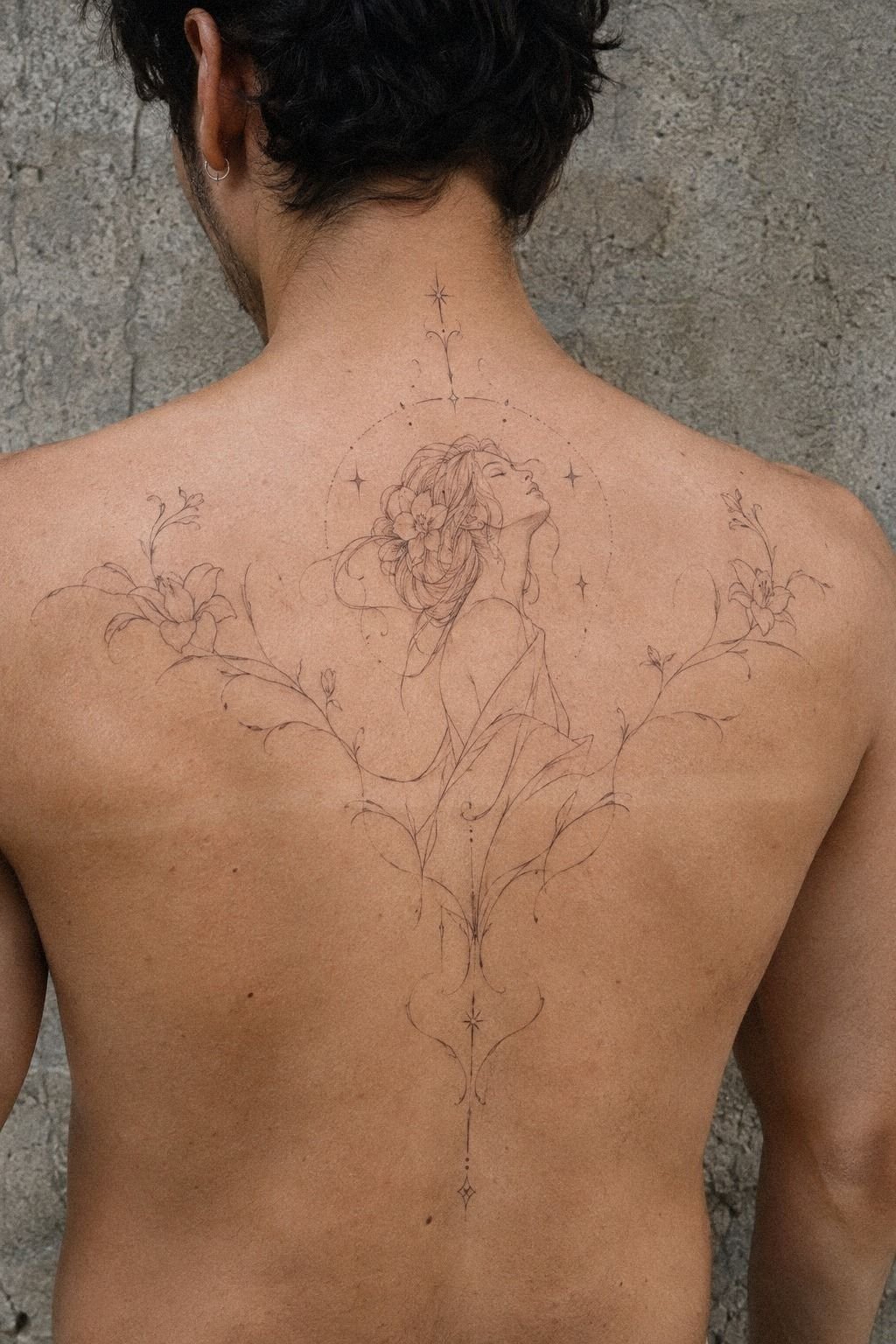
Choose linework by studying healed tattoos, not only fresh studio work. Intricate linework can be breathtaking, but it needs breathing room, consistent pressure, and a clear hierarchy to stay legible.
Fine lines suit an understated concept when the subject has a strong silhouette. They can make a moon, hand, moth, or botanical stem feel delicate without making the entire piece disappear into the skin.
I prefer a deliberate mix of weights over one uniform outline. A slightly heavier contour can protect the focal subject, while finer interior marks create an elegant sense of depth. Ask your artist where those changes will happen before the stencil is applied.
3Give the Spine a Strong Visual Rhythm
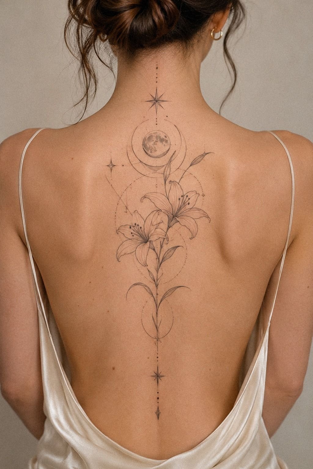
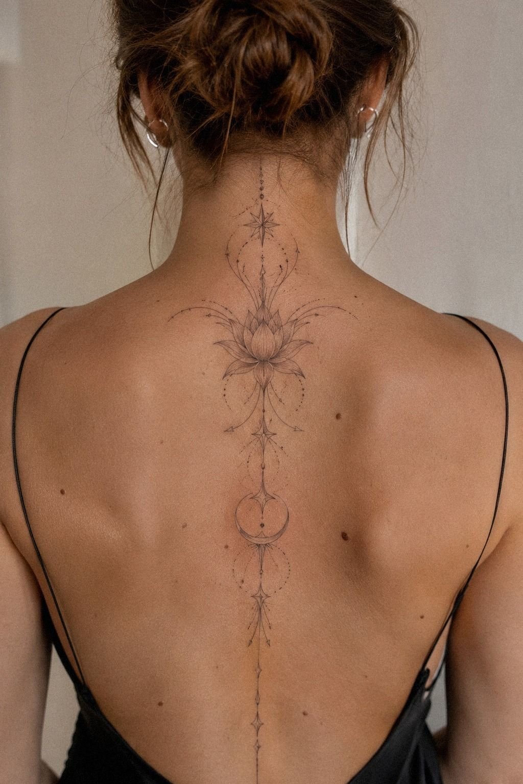
Use the spine as a visual guide, not a line you must cover from neck to waist. A sacred vertical sequence can feel graceful when the gaps are measured by the design instead of filled automatically. Repetition can create meaning without making every symbol explain a separate story.
Have your artist mark the centerline while you stand naturally. Your posture changes when you twist, arch, or pull your shoulders back, so a stencil that looks straight while you’re rigid may drift once you relax. Take the extra minute!
A spine-centered layout works best when its symbols share a visual language. A moon, hand, eye, botanical stem, or star can stay meaningful when the shapes are simple. You don’t need every mark to compete for attention.
The spine is a bony zone, so comfort varies. Ask about breaks, pacing, and whether a nearby shoulder placement would be more tolerable. Your budget should include time for a careful stencil rather than rushing through the appointment.
For another angle, browse back shoulder tattoos for women. A shoulder-blade composition can carry symbolic weight without requiring a full vertical run, and that may be the smarter choice if you want a smaller commitment.
4Choose a Half-Back Shape With Intention

A half-back tattoo gives you a graceful stopping point, which can be smarter than forcing symmetry. Let the design occupy one shoulder blade, one side of the spine, or a curved section near the ribs. Half-back balance keeps the composition controlled and easier to extend later.
Start by deciding which side of your body should carry the visual weight. If you want the piece visible with an open-back shirt, a shoulder-blade placement reads more clearly than a design tucked low near the waist. Your clothing habits should guide the stencil placement.
I’d avoid putting a tiny, detailed design in the middle of a large untouched area. It can look accidental rather than dainty.
Scale the main shape until it has presence, then let smaller marks fade outward. That’s the difference between dainty and lost.
A half-back design can also connect to an upper-arm tattoo later. This upper arm tattoos for women guide may help you compare how a shoulder-blade composition can travel without becoming a full sleeve.
When you’re weighing cost against future flexibility, ask whether the first session creates a strong stopping point. A polished composition can be worth it if you want control over your budget, your schedule, and the option to expand.
5Let One Flower Lead the Composition

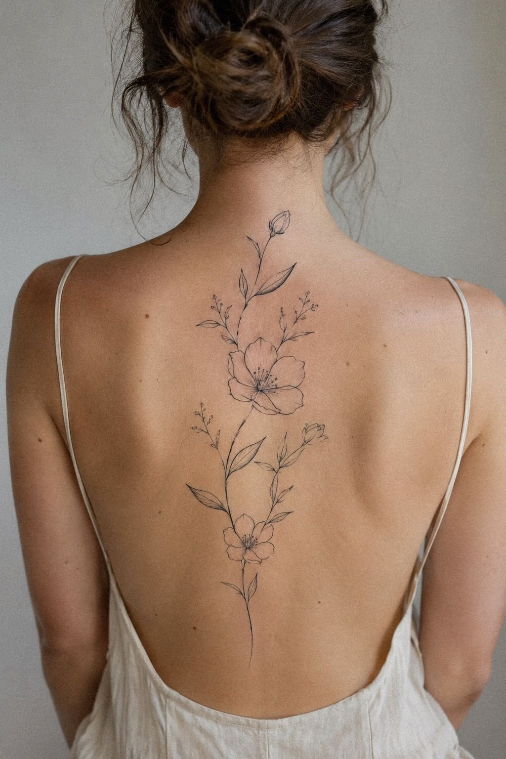
For a floral back tattoo, begin with the stem and movement before choosing every petal. One flower can be romantic, vintage, or empowering when it has a reason behind it. Don’t start with a random bouquet because it photographs well.
Ask your artist to show the design in three stages: the main flower, the secondary leaves, and the smallest accents. A botanical hierarchy stops the composition from becoming a flat cluster. One expressive bloom should lead, while smaller stems create flow.
I wouldn’t focus on petal detail before checking the overall silhouette. Up close, the flower may look ornate and playful.
From several feet away, it can become a dark knot. Your artist should be able to reduce the design to a clean outline and still make it recognizable.
Choose black botanical ink when longevity matters most, then add restrained color only if it serves the flower. That approach may offer stronger value than paying for vibrant details that don’t improve the silhouette.
You can compare floral directions with thigh tattoos for women unique, since those examples often show how stems and leaves follow a larger body curve. Save the concepts that still feel personal after the novelty wears off.
6Balance Bold and Dainty Details

Balance isn’t about making every part equally bold. It’s about deciding which mark deserves attention first, which one supports it, and which one can remain quiet. That is the sweet spot!
A bold focal point can give a large back tattoo confidence, while delicate accents keep it from feeling heavy. I like one dominant shape surrounded by smaller, quieter marks rather than several equally loud symbols.
Don’t let a love of detail erase the skin between elements. Negative space makes a composition feel sharper, more expressive, and easier to read when you step back. Your artist should be able to explain why every filled area exists.
If you’re unsure, print the concept at several sizes and hold each version against your back. A scaled paper stencil will reveal whether the central subject still has presence or whether the details have swallowed it.

7Map the Design Around Your Curves
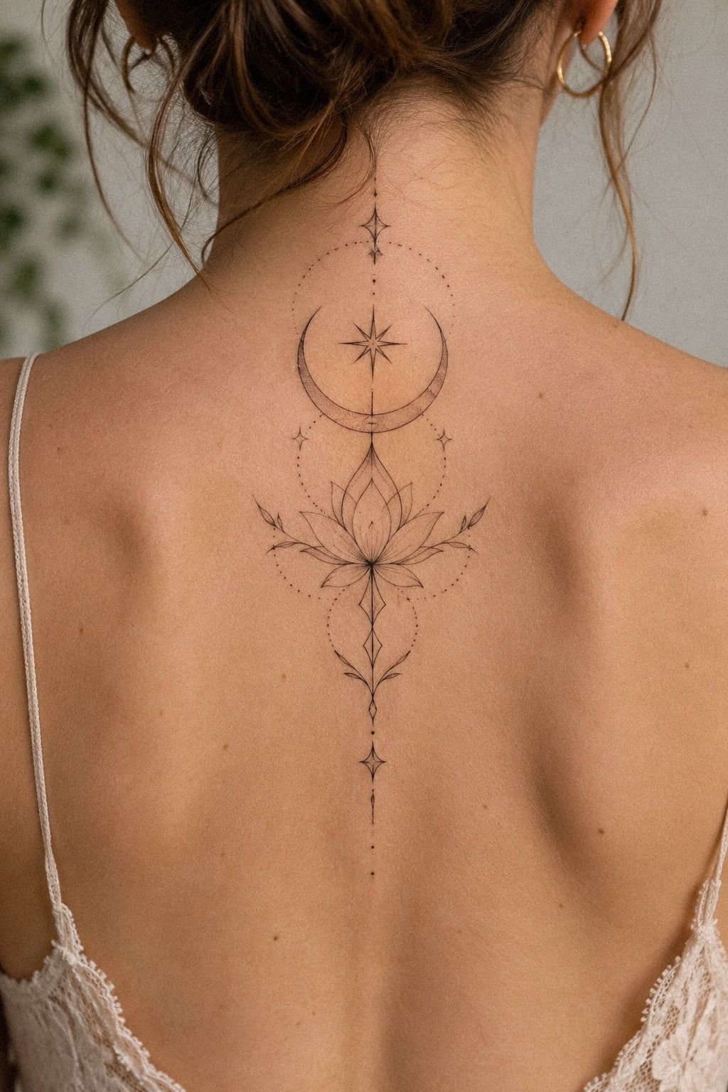
Map the tattoo while your body is standing, breathing, and relaxed. A design that looks perfectly straight while you’re holding tension may feel crooked when your shoulders drop. Natural-posture stenciling is a small step with a major effect.
Trace the curve from the neck toward the lower back, then identify where the design should widen or narrow. Flowing marks can follow the shoulder blades, while a sharper central symbol can keep the spine visually grounded. The line should support your anatomy.
Ask your artist to check the stencil from behind, from the side, and while you move your arms. You don’t need a dramatic pose. A few ordinary movements can reveal whether the design pulls toward one shoulder.
A graceful spine tattoo doesn’t have to be symmetrical. Slight variation can make it feel raw, personal, and alive. If both sides are identical, the piece may look formal; if every side is different, the focal point may disappear.
Before paying a deposit, ask whether the proposed stencil is worth the time and cost. You can compare back shoulder tattoos for women if you want a softer curve instead of a strict central column.
8Choose Imagery With a Fierce Point of View
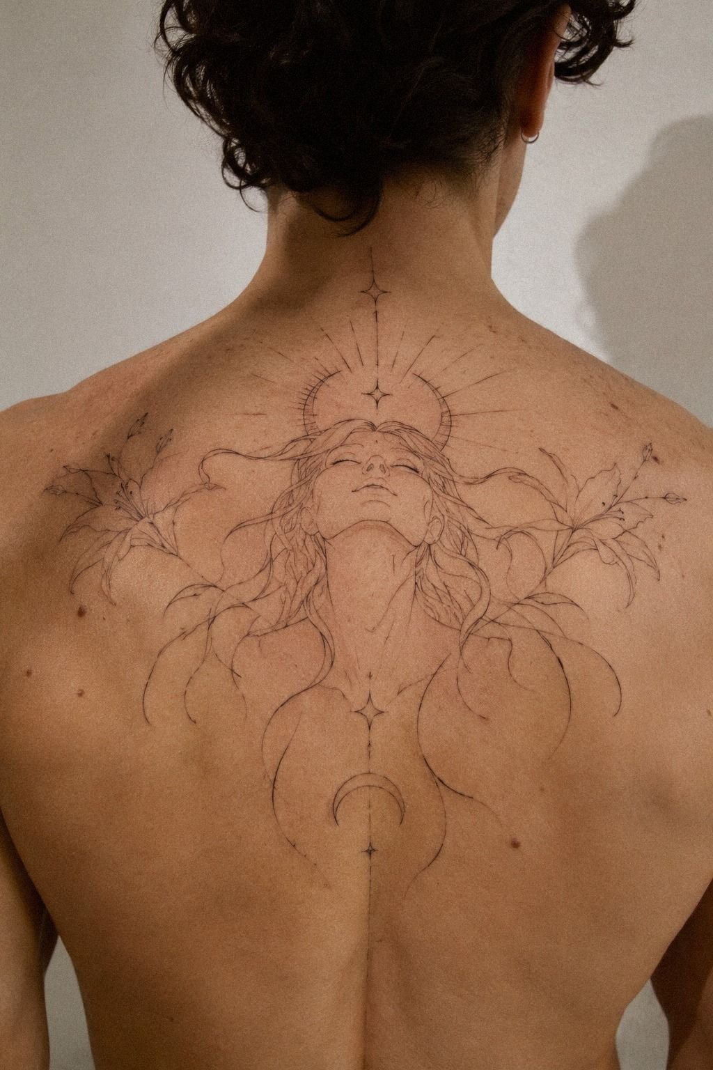
Choose imagery that still feels like you when the trend has moved on. A serpent, panther, dagger, moth, or sharp botanical form can feel fierce without relying on excessive shading. The silhouette should be clear before the ornamental detail is added.
Write down three words before you choose the final subject. Maybe yours are protective, daring, and romantic.
Those words will help you reject designs that are stylish but emotionally empty. I’d rather see one iconic symbol with a strong outline than six unrelated images competing for attention.
Your artist can soften a fierce image through posture, scale, and line direction. A serpent that curves around the shoulder feels flowing. A dagger aligned with the spine feels sharp.
A moth with open wings feels expressive.
Don’t let the word feminine force you into a narrow visual category. A masculine emblem can become personal through placement, linework, and scale. Meaning matters more than a preset category.
If your imagery wants more coverage, review back tattoos for women and look for compositions that stay readable from a distance. A clear concept usually offers better value than a crowded collection of unrelated symbols.
9Keep Ornate Ink Readable From Afar

Test ornate ink at three distances before you approve it. Stand close, take several steps back, and ask whether the subject still reads without an explanation. Ornate detail should reward a second look, not hide the main idea.
I love an elaborate border when it frames a meaningful center. I don’t love decorative marks added simply because empty skin feels uncomfortable. A clear silhouette will carry the design farther than another layer of curls, dots, or tiny flourishes.
Ask your artist to simplify the concept into its strongest shapes. If the reduced version still feels recognizable, the full treatment has a solid foundation. If it collapses, the design needs editing before the appointment.
10Match Vibrant Color to the Subject
Match color by testing the healed direction you want, not by copying a fresh flash concept. Healed color references tell you more about saturation, contrast, and softness than newly finished work ever can.
Ask how the artist chooses pigment for your skin tone and how the palette will interact with black outlines. Vibrant doesn’t have to mean loud. A controlled red, blue, green, or ochre accent can make a personal symbol feel vibrant.
Consider where color matters most. A single jewel-like accent may guide the eye better than a full rainbow palette. If every section competes, the design loses its crisp hierarchy.
Your budget should include a realistic conversation about touch-ups. Color, sun exposure, placement, and aftercare all affect long-term appearance. A lower initial price isn’t always better value if the plan needs repeated correction.
Compare related placement ideas through shoulder tattoos for women. Save only the color choices that still feel timeless rather than merely bright in the moment.
11Prepare for Pain and Healing
Prepare for the practical part before you admire the design. Ask about session length, breaks, clothing, aftercare, and the areas where your body may react most strongly. Planned breaks can make a long appointment easier.
Pain varies, and no universal chart can predict your experience. The spine, shoulder blades, and ribs may feel different from one another. I’d rather schedule a patient session than pretend endurance is a personality test.
Healing deserves the same attention as the concept. Follow the artist’s cleaning instructions, avoid soaking the fresh tattoo, and protect it from unnecessary friction. Aftercare instructions are part of the design process, not an afterthought.
Surface healing often takes a few weeks, while the tattoo continues settling afterward. Don’t judge the final result too quickly. Settled ink gives you a more honest basis for deciding whether any touch-up is needed.
If you have an event, trip, or athletic commitment coming up, mention it before booking. Timing affects how carefully you can protect the area. Healing time belongs in your calendar and your budget.
12Plan the Appointment Around the Whole Piece
A large tattoo rarely needs to happen in one heroic sitting. Dividing the work into thoughtful sessions can protect the design, your comfort, and the artist’s concentration. Session planning should follow the composition rather than an arbitrary deadline.
Ask whether the first appointment will establish the central structure or complete one contained area. I prefer a session that leaves the main subject strong and readable, even if the surrounding details come later.
Bring questions about deposits, hourly rates, touch-ups, and cancellation policies. A clear conversation protects both sides and makes the consultation feel more professional. Written pricing is more useful than guessing from someone else’s finished piece.
Your artist should also explain how the design may change as it moves across the back. Skin texture, curvature, and posture all matter. Artist consultation is where a beautiful idea becomes a workable plan.
13Think About Visibility, Clothing, and Future Additions
Placement changes how often you see the tattoo and how often other people see it. Some people want a private piece that appears only in certain clothing, while others want the shoulder blades visible whenever they wear an open-back top. Clothing visibility should influence the stopping point.
Think about future additions before committing to a crowded border. A clean edge can remain satisfying on its own and still leave room for another motif later. Expansion space is useful when your taste may evolve.
Don’t force a full-back design simply because the phrase sounds impressive. A half-back, shoulder-blade, or spine composition can feel just as powerful when the scale and silhouette are intentional. Placement scale should serve the subject, not the label.
If you want a design that can travel toward the arm, compare the movement in upper arm tattoos for women. The best continuation will feel planned from the beginning, even when you wait years to add it.
Why Age-Worthy Back Ink Needs a Real Point of View
I don’t think an age-worthy tattoo has to be minimal. It has to be edited.
My favorite compositions contain one meaningful subject that can be understood immediately, then a quieter layer of detail that rewards a closer look. That balance feels personal without becoming precious.
The mistake I’d avoid is choosing a style before choosing a reason. Fine-line work, blackwork, neo-traditional color, and botanical imagery can all age well when the placement suits the subject. None can rescue a design chosen only because it was popular that month.
I also respect empty skin. At first glance, an unfinished stencil can tempt you to fill every gap. Then the focal image becomes clearer once you step back.
The open areas give the eye somewhere to rest and keep the piece from becoming a dark blur.
I’m firmly on the side of planning for the healed version first. Fresh ink can look ethereal, but settled ink tells the truth. Ask for healed examples, talk honestly about UV exposure, and let your artist explain where lines may soften.
The strongest piece isn’t the one with the most detail or the highest price. It’s the one whose scale, symbols, and line weight agree with your body. A cohesive composition will feel stylish, polished, and personal long after the appointment is over.
A Few Things Worth Answering
How much does a full back tattoo usually cost?
A full back piece typically varies from about $50 to $100 for a shop minimum and around $100 to $250 per hour in the US. Artist, region, size, and detail change the total. A written consultation estimate is more useful than copying someone else’s final price.
Is a back piece a good first tattoo?
It can be! I’d choose a clear concept, a comfortable placement, and an artist with healed work in the style you want. The back gives you space for readable scale, but a thoughtful first-tattoo plan matters more than choosing a tiny design simply because it’s your first.
How do I choose an artist for a back piece?
Choose an artist with clean examples in your preferred style, healed work, and clear studio hygiene practices. Ask how they handle line weight, skin movement, and aftercare. A healed portfolio tells you more than a page of fresh close-ups.
How painful is a back tattoo?
Pain varies, but the spine, ribs, shoulder blades, and lower back can all feel different. Your experience depends on placement, session length, and personal sensitivity. Scheduled breaks can make a long appointment easier, and you should tell your artist when you need to pause.
How long does a back tattoo take to heal?
Surface healing usually takes about two to three weeks, while the tattoo continues settling afterward. Wash gently, moisturize as directed, avoid soaking the area, and protect it from sun. Patient aftercare helps the lines and color settle as cleanly as possible.
Where I’d Start First
If I had to pick one step, I’d start with the full-scale concept. A clear silhouette gives every later choice a job, from line weight to placement to color. Your strongest reference should support the meaning, not replace it.
Book the consultation when you can discuss scale, healing, budget, and future additions without rushing. Let the healed version guide the final design. Start there!