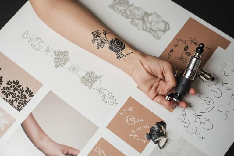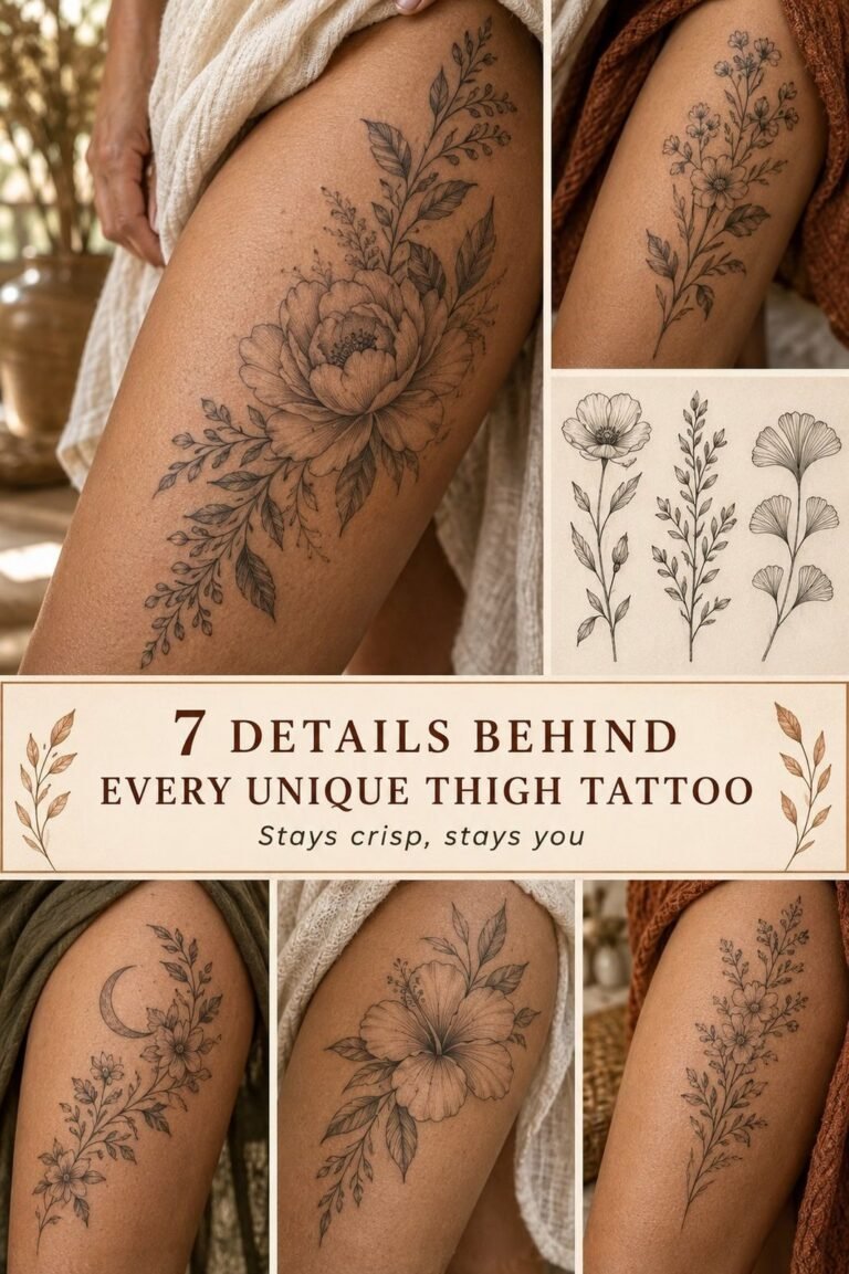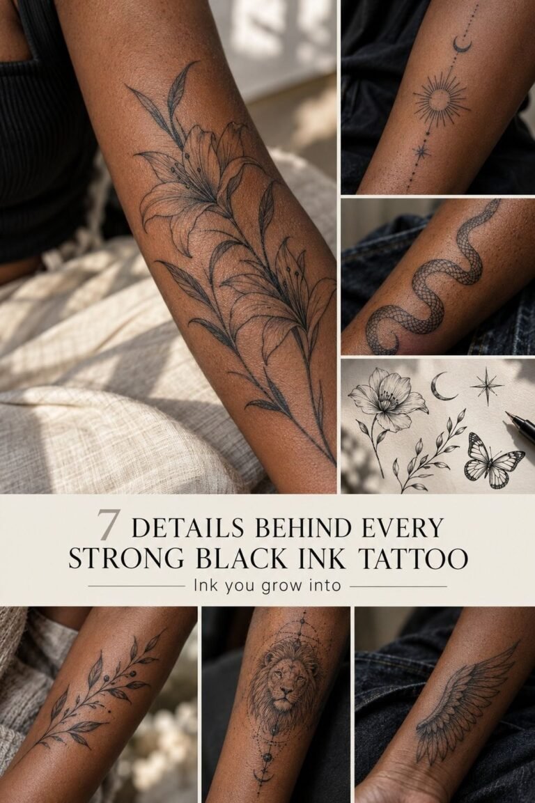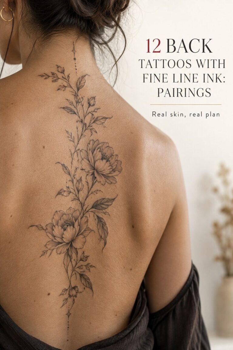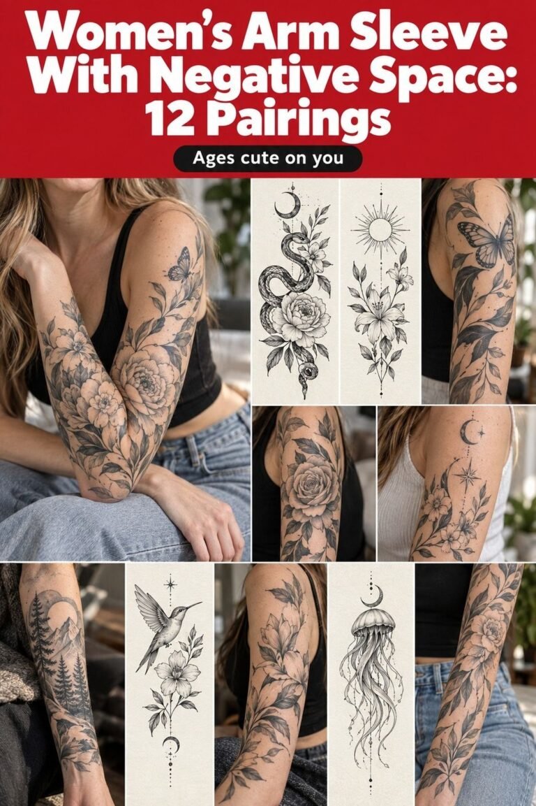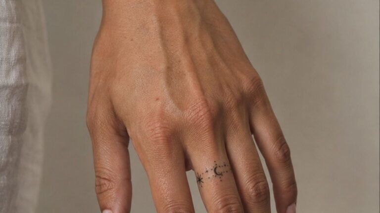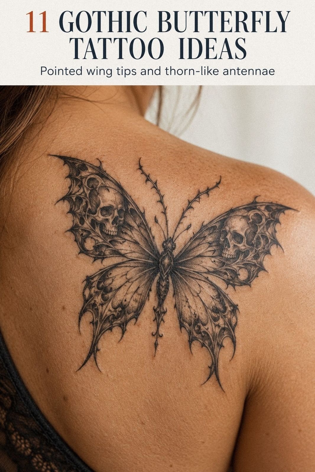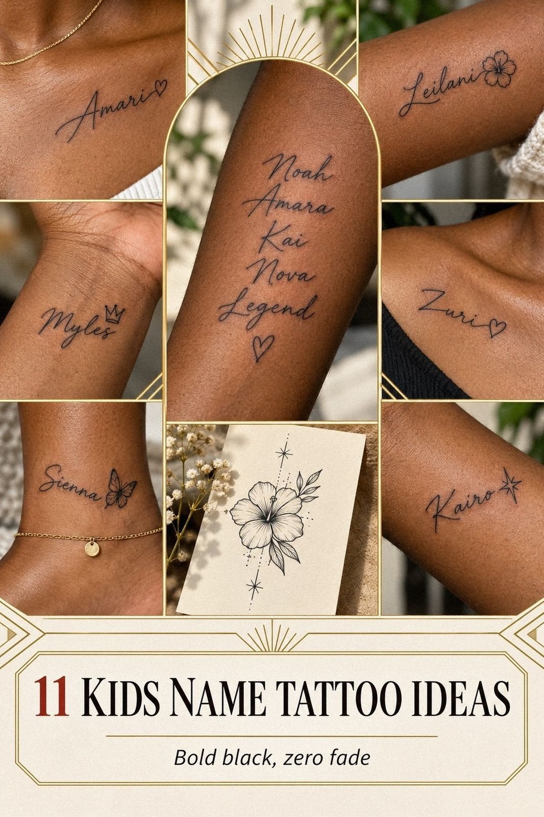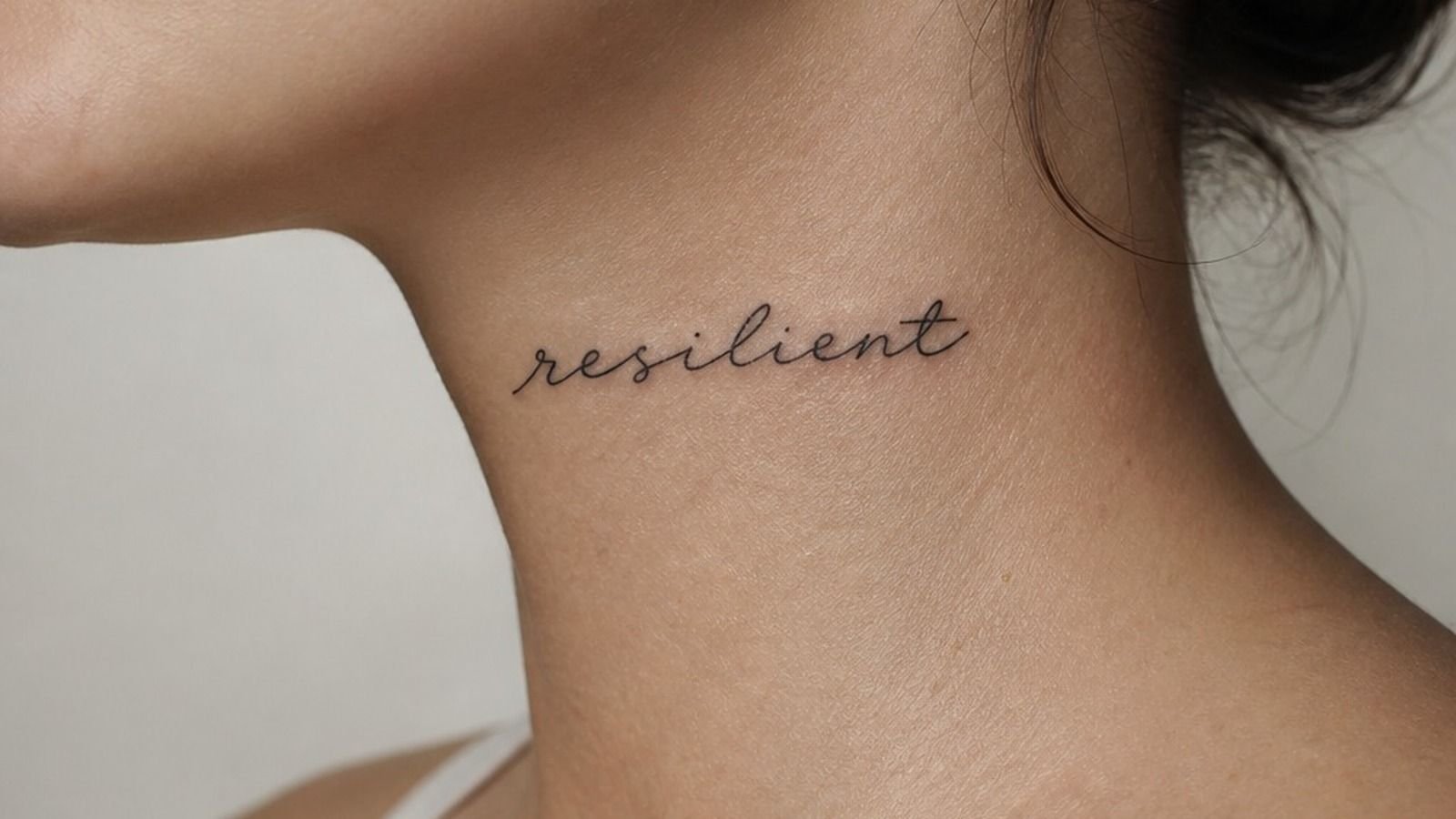
Word neck tattoos can stay clean for years when you give the letters enough breathing room. I got mine the week I turned 30, after sitting on the word for longer than I expected. It’s small, visible, and still feels like mine.
Here’s what it looked like before
Before the tattoo, the side of my neck was just a patch of skin I kept saving for the “right” idea. I’d tried temporary marker versions, phone mockups, even holding a printed stencil against my collarbone. Nothing landed.
I didn’t need more words. I needed one word that could take up space without shouting. The bare skin made that decision feel bigger than it was, but that’s neck placement for you.
- I Chose a Word That Survives Trends
- I Tested the Script Against My Neck
- I Marked the Exact Front-Neck Placement
- I Compared Side-Neck and Down-the-Neck Text
- I Checked Letter Size From Every Angle
- I Matched Ink Weight to My Skin
- I Built Meaning Into Two Simple Words
- I Reworked a Quote for Neck Readability
- I Reviewed Japanese Text With a Translator
- I Balanced Vertical Letters Along the Spine
- I Planned Around Hair, Collars, and Movement
- I Checked Neck Tattoo Pain Expectations
- I Confirmed the Artist’s Lettering Portfolio
- I Prepared for Swelling and Uneven Lines
- I Protected the Words During Healing
1I Chose a Word That Survives Trends
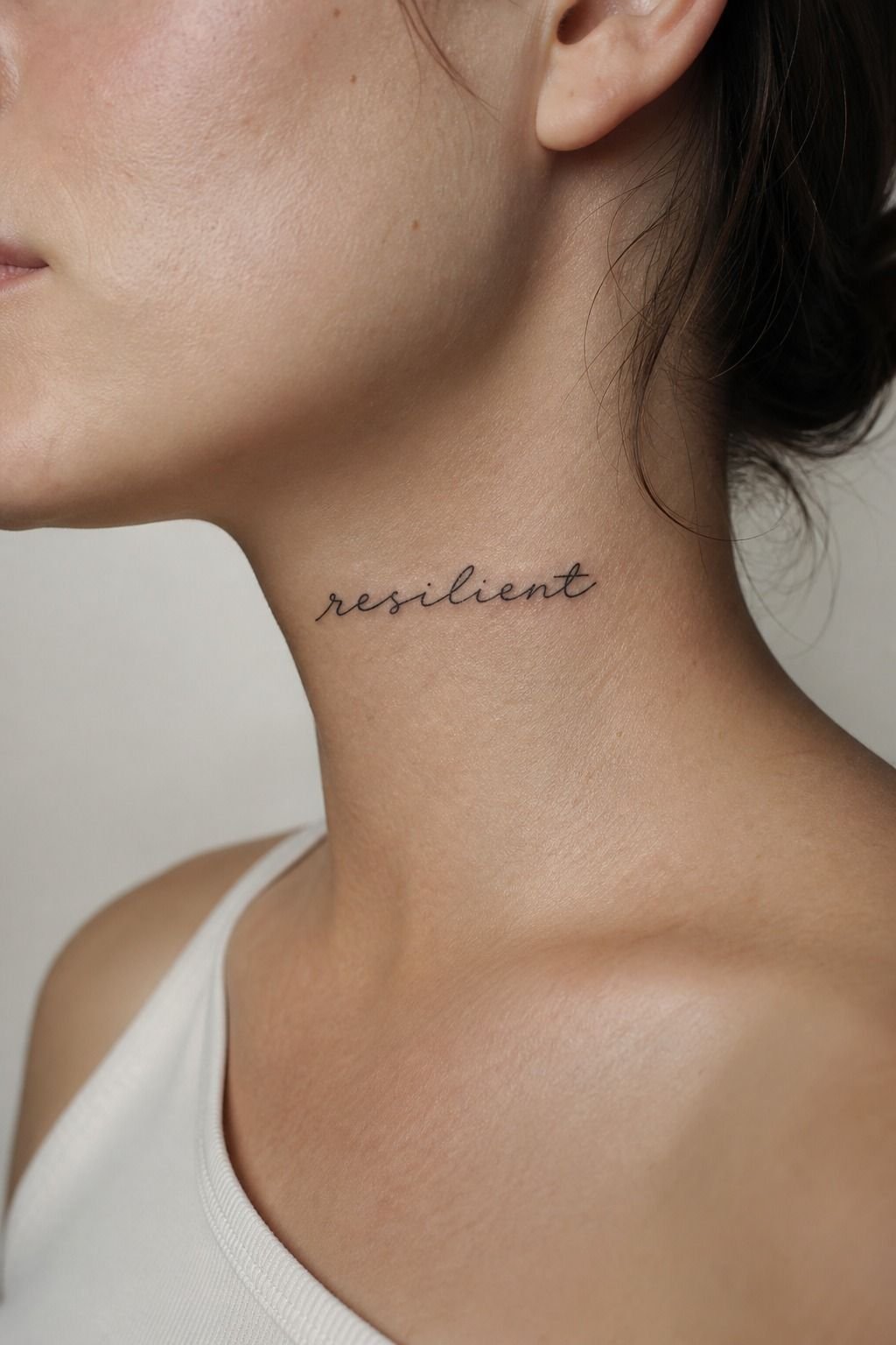
I skipped trendy phrases and picked a word I’d still recognize if nobody else ever saw it. For a word neck tattoo, that matters more than making it look clever on a Pinterest board. Your neck is visible in mirrors, photos, work calls, all of it.
I wrote my options in a plain Moleskine notebook for a few weeks. If a word felt forced on paper, it wasn’t getting near my skin. Mine had to feel calm, personal, and timeless, not like a caption I’d delete next month.
You should say it out loud too. Does it still sound like you when you’re having a rough day?
That’s the test. For more ideas that hold emotional weight, I’d look through these meaningful word tattoos.
2I Tested the Script Against My Neck
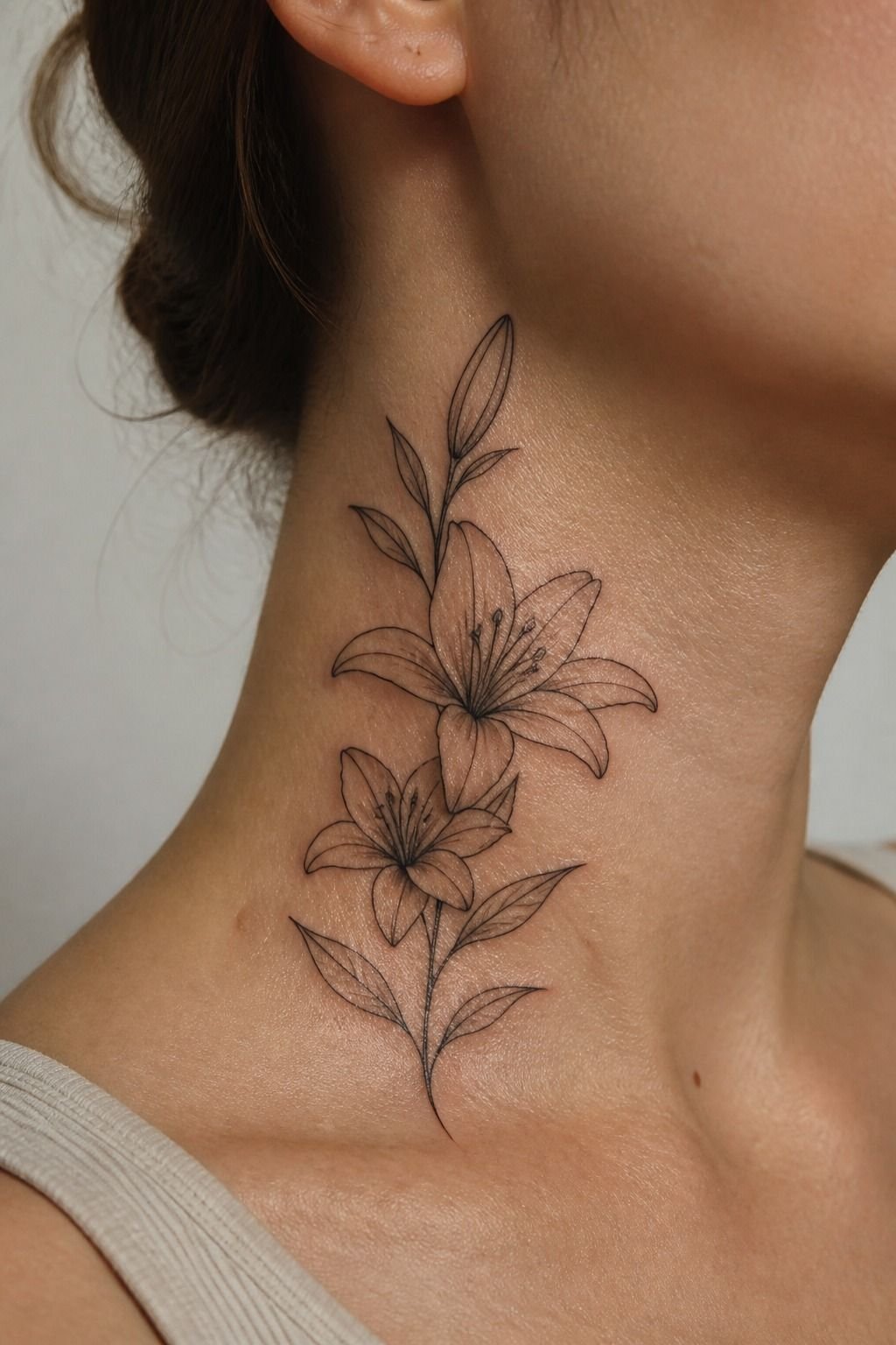
A script-neck-tattoo needs to follow your anatomy, not fight it. I tested cursive, serif, and soft handwritten lettering against the curve below my ear. The crispier option won because the loops in the others got chewed up once I turned my head.
I asked for a stencil in black stencil transfer paper, then checked it standing, sitting, and looking down at my phone. Your neck moves constantly. A script that looks elegant on a flat screen can go wobbly on skin fast.
But I didn’t pick the thinnest line possible. Fine line is soft and refined, sure, but the line still has to be confident. One clean pull, not ten fuzzy ones.
That’s what heals nice.
3I Marked the Exact Front-Neck Placement
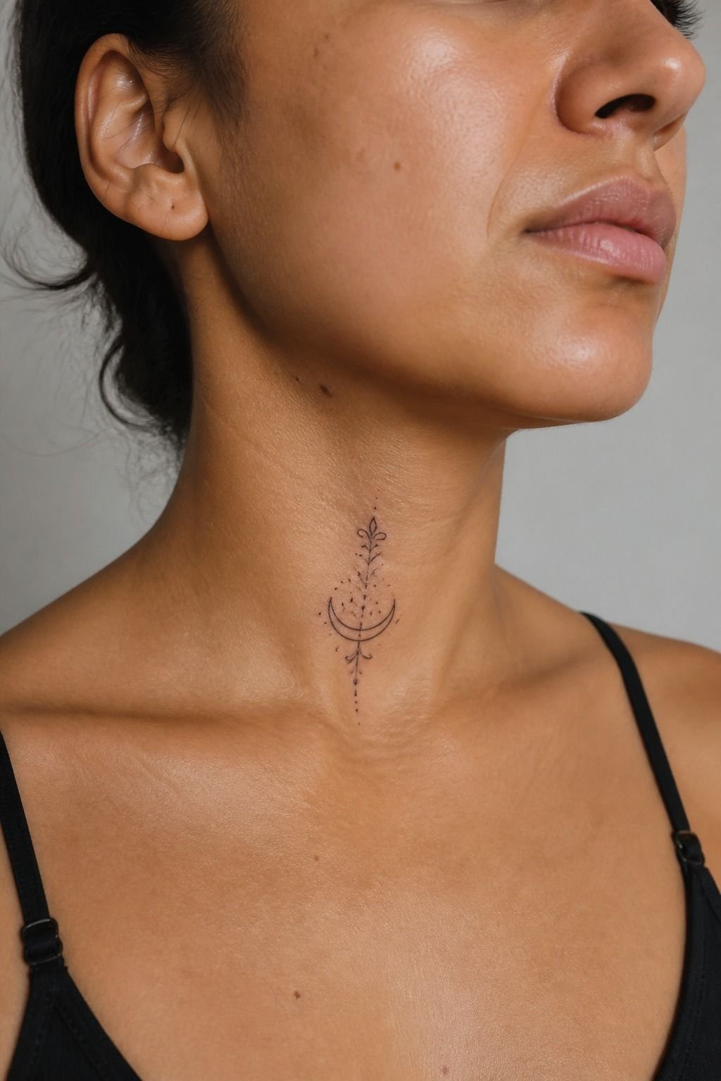
For a middle-of-neck-tattoo, I’d mark the placement with your chin relaxed, not lifted for a photo. I watched where the skin folded when I looked down, then kept the lettering above that deepest crease. It gave the design more air.
My artist used a surgical skin marker and measured the centerline twice. We left a little space above the collarbones because I didn’t want the word swallowed by necklaces or crew-neck shirts. Small changes matter here.
If you’re torn between exposed and easier-to-hide placement, browse these small neck tattoos. Your front neck is bold.
Your side neck is more flexible. Neither is “better,” but you’ve got to choose with your real wardrobe in mind.
4I Compared Side-Neck and Down-the-Neck Text
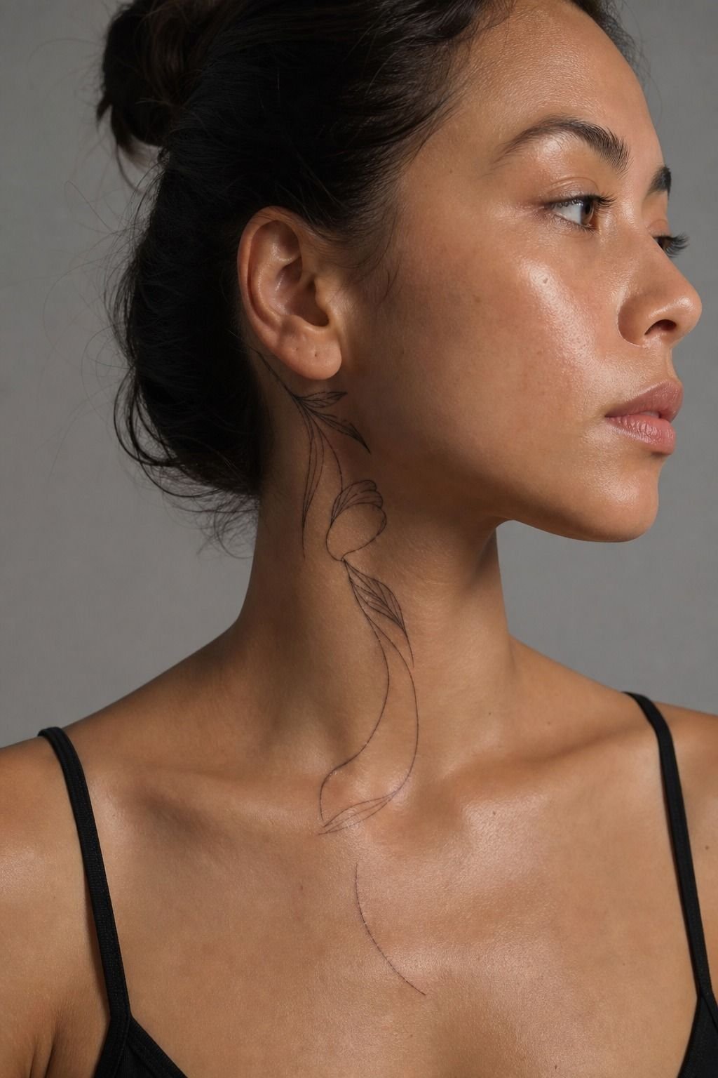
Side-neck text reads softly from a three-quarter angle, while a down-the-neck-tattoo has more drama and less forgiveness. I laid both options over the same word. The vertical version looked bold, but it made every uneven letter obvious.
A side placement works when you want the word to move with your profile. Down-the-neck lettering works best when the word is short, usually one to three simple syllables.
Long phrases start looking like a receipt. Nobody needs that.
And I’d skip wrapping tiny cursive too far toward the throat. It can look intimate in a close-up, then disappear from across the room. Keep enough contrast that your tattoo still reads when you aren’t posing.
5I Checked Letter Size From Every Angle

This was the part that saved me from a future soup situation. I wanted a delicate neck-text tattoo, but I didn’t let the letters drop below a size my artist could pull cleanly. Tiny details blur together over time, especially where skin bends and rubs.
We looked at a lettering flash sheet with three weights. The medium option looked less precious than the smallest sample, and that’s why it won. It had room for the counters inside letters like “a,” “e,” and “o” to stay open.
Hold your reference about an arm’s length away. Can you still read it?
If not, bump it up. That size on a neck is gonna mush out if you force it too small. Read more about why tattoos blur over time before you commit.
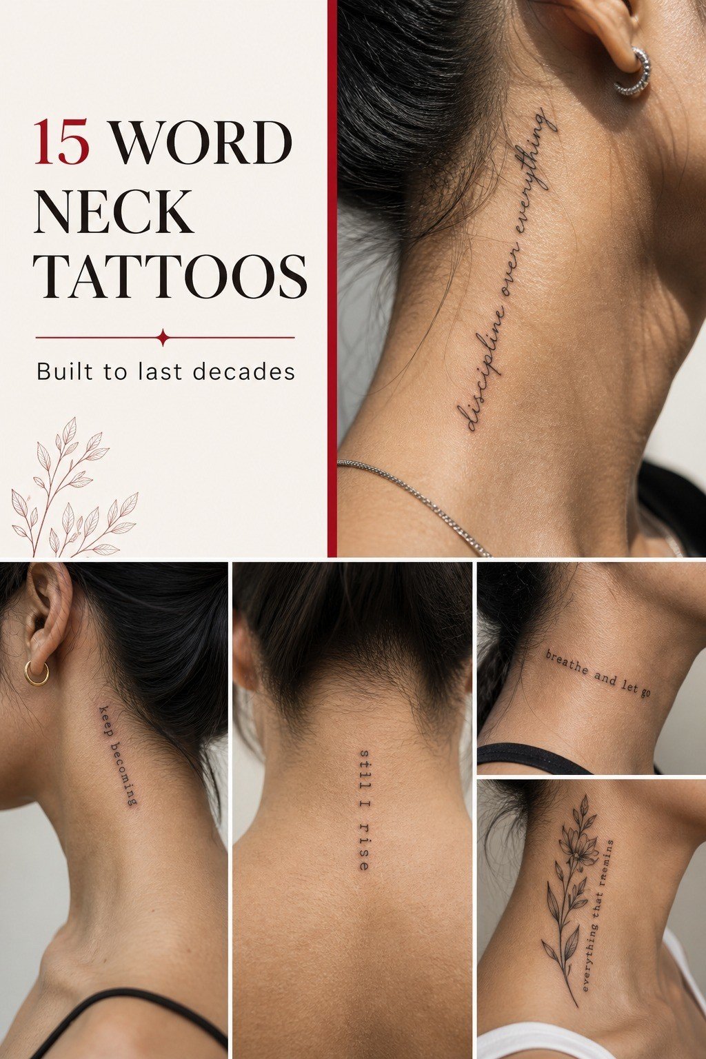
6I Matched Ink Weight to My Skin
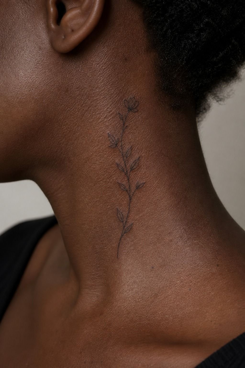
Skin tone doesn’t limit your design, but it should shape your line-weight conversation.
7I Built Meaning Into Two Simple Words
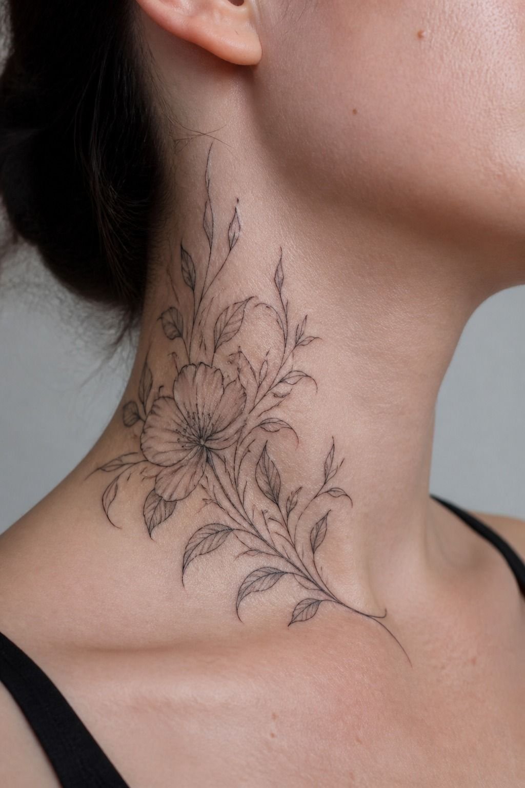
Two words can hit harder than a paragraph. I considered a quote, then landed on a pair that held the same feeling without explaining my whole life to strangers. Short wording gave the single-needle lettering room to breathe.
I kept the words on one gentle line instead of stacking them. Stacked text can look charming in a sketch, but it’s easy to make it too compact on the neck. Mine needed a quiet rhythm, not a logo.
What do you want the words to do for you? Remind you, protect you, or simply make you smile?
I wrote each option on my mirror for a month. The one I stopped noticing was out.
The one that still made me pause stayed.
8I Reworked a Quote for Neck Readability
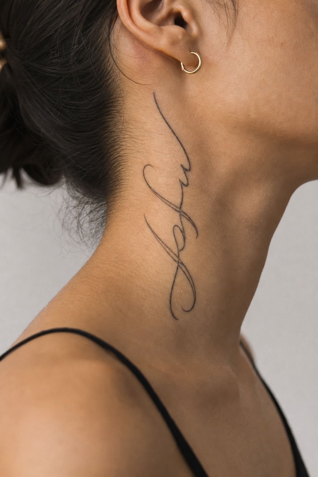
A neck-quote-tattoo needs editing. I cut my original phrase down until every word earned its place, because a neck isn’t a notebook page. The final version was cleaner, warmer, and easier for my artist to letter without cramming.
I chose black and grey ink instead of red or white. White ink can heal faint, and fine red can be gorgeous but needs an artist who knows how to keep it from looking patchy. For this placement, I wanted simple black that would hold.
But don’t chase an exact Pinterest copy. Bring references for vibe, spacing, and line feeling.
Your artist should redraw it for your neck, your skin, and your movement. That custom adjustment is what makes it feel like yours.
9I Reviewed Japanese Text With a Translator
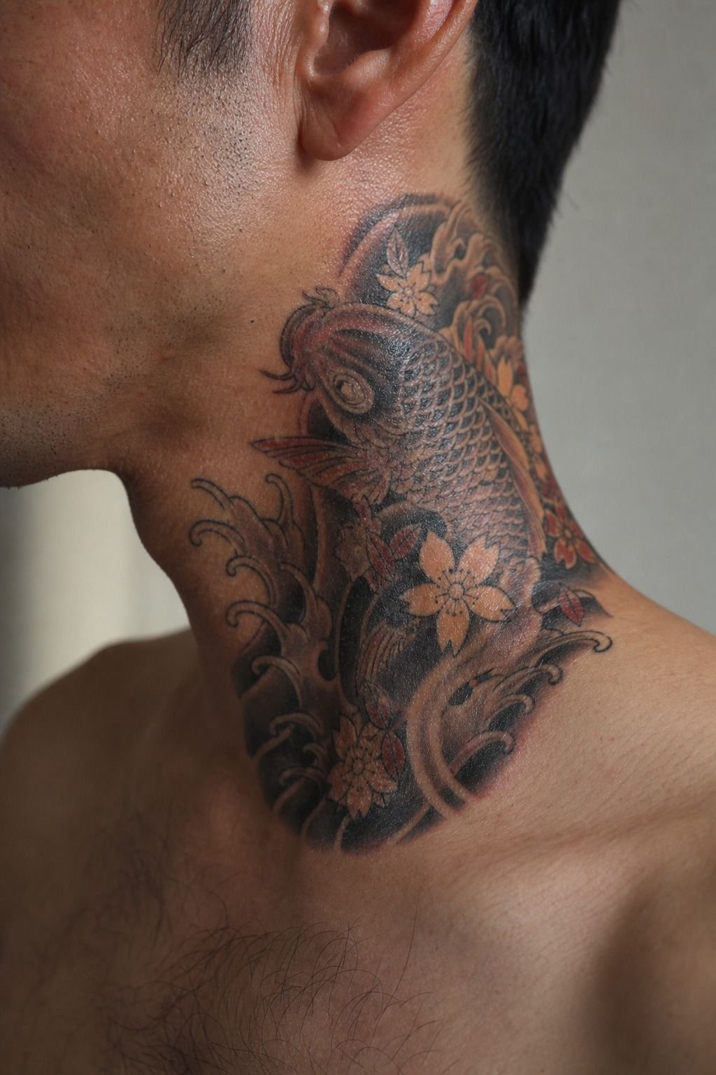
For a japanese-text-tattoo, I would never rely on an image search or an auto-translation screenshot. I had the meaning checked by a fluent translator before an artist ever made a stencil. Text carries weight, and getting it wrong is avoidable.
The placement guide helped me see how the characters would sit along the side of the neck. Japanese characters can make a bold, graphic composition, but only if you respect the language and leave clean spacing between each mark.
I’d also ask an artist who has healed examples of this work, not just fresh flash. If you want a different language, the same rule applies. These arabic word tattoos meanings are another reminder that translation comes before aesthetics.
10I Balanced Vertical Letters Along the Spine
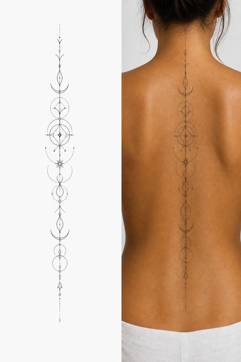
For vertical lettering, I used what I call the Spine-Line Rule. Each letter had to sit on the body’s natural centerline, with enough gap that the word still looked intentional when my shoulders rounded forward.
Simple geometry. Big difference.
The stencil looked almost too open on paper. On skin, it was right. That’s why I trust a purple transfer stencil more than a tiny digital mockup.
Your body adds movement, shadows, and a little visual noise.
I kept the letters upright rather than tilting them into an exaggerated calligraphy angle. Tilt can feel dramatic, but it ages awkwardly if the alignment is off by even a few millimeters. Straight, airy, and readable was the move.
11I Planned Around Hair, Collars, and Movement
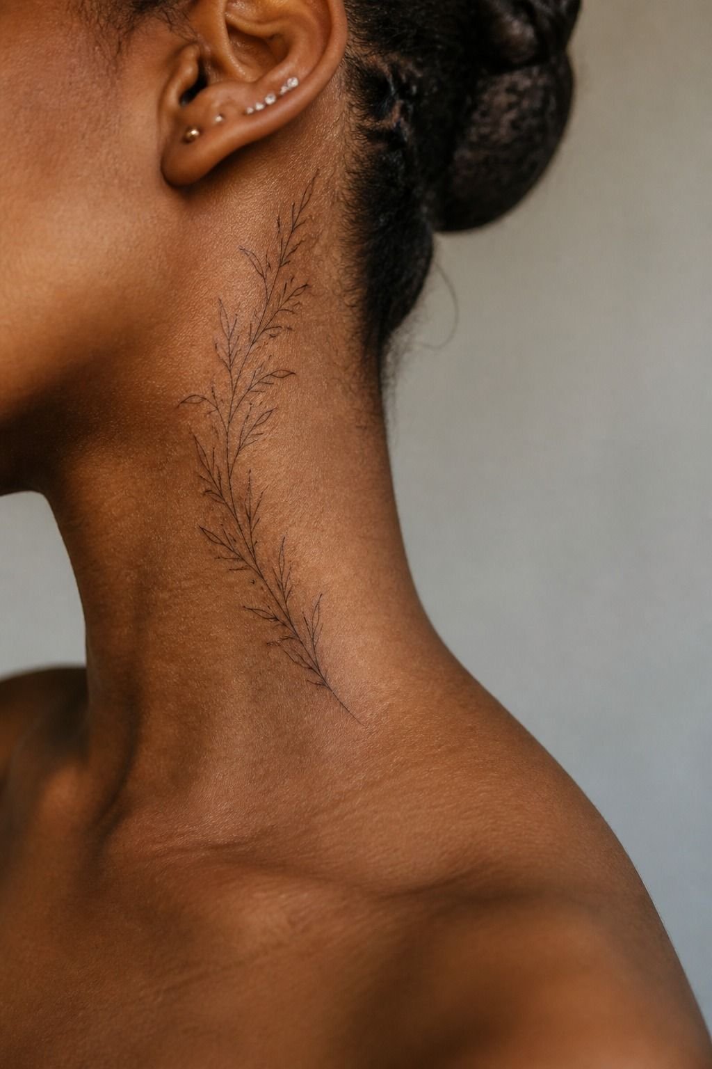
Your hairstyle is part of the placement plan. I wear my hair down often, so I chose a spot that could peek out rather than vanish completely. A high collar, ponytail, and loose hair all gave me different views of the same fine-line script.
I also wore a crew neck and a button-up to my appointment. It sounds fussy.
It isn’t. You’ll learn fast whether your tattoo is going to sit under friction from a collar, necklace, or helmet strap.
And I avoided the exact spot where my hair rubs every day. High-wear zones need more maintenance. If your tattoo will live in constant friction, make the line a little bolder now instead of paying for touch-ups after it fades.
12I Checked Neck Tattoo Pain Expectations
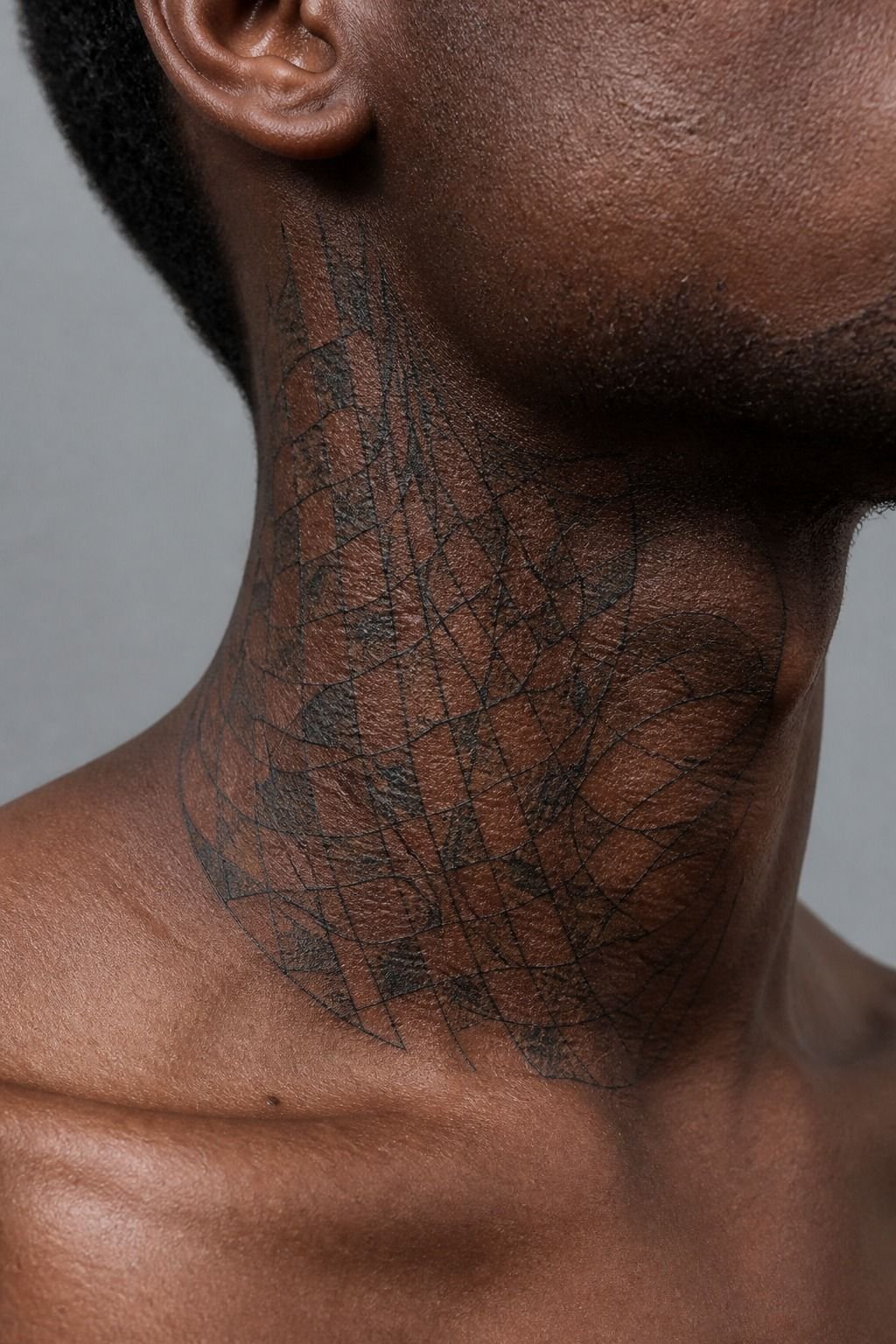
Neck tattoos aren’t impossible, but they can be spicy. Lines feel sharper, shading feels like a dull burn, and color packing is usually the roughest part. Mine was lettering only, so the session stayed short and manageable.
The side of the neck felt more sensitive near the jaw and closer to the throat. I ate beforehand, brought water, and asked for a five-minute pause when my body started tensing. Tap out for five rather than pass out on me.
For a broader pain map, see where tattoos hurt less. You don’t need to prove anything by sitting still through a bad moment.
13I Confirmed the Artist’s Lettering Portfolio
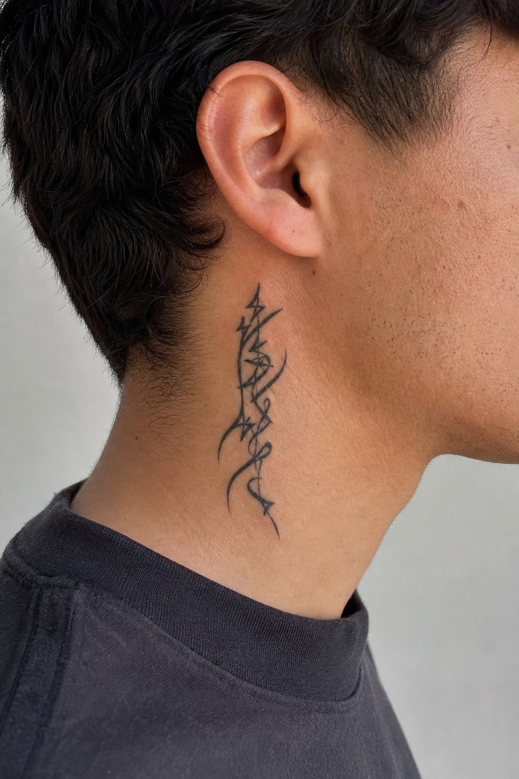
I didn’t book the first artist whose Instagram looked polished. I looked for healed lettering tattoos, close-up linework, and examples on different skin tones.
Fresh tattoos can hide scratchy technique. Healed work can’t.
Your artist should have crispy, confident lines and photos that aren’t blurred into oblivion. I wanted to see clean spacing, consistent stroke weight, and lettering that didn’t drift around curves. If they only post filters and flash drawings, I’d keep looking.
Ask how they approach neck movement too. A good answer sounds practical: stencil placement, posture checks, one clean pull, and not overworking the skin. If you’re choosing a visible placement, these neck tattoos for women can help you compare flow.
14I Prepared for Swelling and Uneven Lines
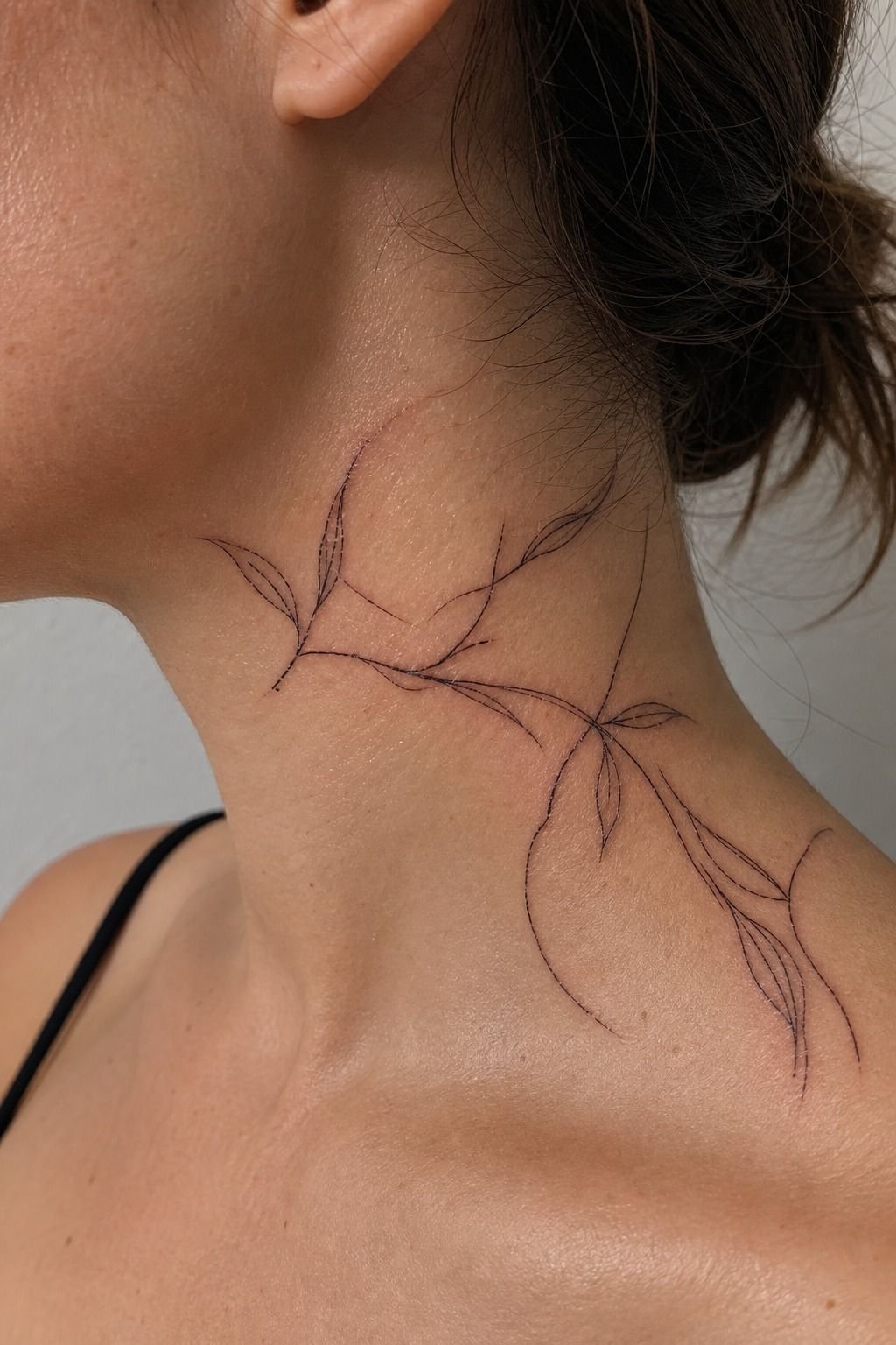
The Neck-Movement Check is simple: expect a fresh tattoo to look a little swollen and slightly uneven at first. I took a photo after the appointment, then stopped judging it every hour. Fresh ink is not the final result.
My artist used a thin layer of tattoo aftercare ointment, not a heavy coat that turned the area slick. Too much product can suffocate healing skin. You want it lightly moisturized, clean, and left alone.
But I also planned around sleeping. I used a clean pillowcase, avoided tight turtlenecks, and didn’t book a sweaty workout the next morning.
It’s not glamorous. It’s how you keep a delicate line from getting irritated before it settles.
15I Protected the Words During Healing
First few days, it’s an open wound. Treat it like that. I washed my neck gently with unscented liquid soap, patted it dry with a clean paper towel, and used only a thin layer of aftercare.
Around day four or five, mine started peeling like a sunburn. I didn’t pick the flakes, even when the letters looked a little cloudy. Pulling flakes can pull color out, and that’s a miserable reason to need a touch-up.
No pools, no direct sun, no gym friction if you can avoid it. Once the silver-skin stage shows up, keep using sunscreen.
Your ink doesn’t need a complicated routine. It needs clean skin, patience, and a little protection.
If your wording leans mystical, these witchy tattoos may give you a better direction.
The Two-Week Reality Check
I tell clients to judge a word neck tattoo after the surface has healed, not while it’s glossy, flaky, or freshly red. You’ll see it settle over 2 to 3 weeks, and then it’ll keep maturing below the surface for 2 to 3 months.
That wait can feel long. But a calm, healed result beats panic-texting your artist on day three every time!
How much it cost
My small custom word piece sat near the shop minimum plus the artist’s time, which is normal for clean lettering. The honest cost isn’t only the appointment. You’re paying for stencil fitting, placement checks, hygiene, and an artist who knows when a line needs more room.
I wouldn’t bargain-shop visible lettering. A cheap tattoo can become expensive when you’re paying later for cover-up work, laser sessions, or repeated touch-ups. Spend on the portfolio, not the trendy studio lobby.
Why I’d Keep the Design Simple
I’ve watched people try to turn a neck tattoo into a whole autobiography. It rarely helps. The neck has a narrow canvas, moving skin, and almost no place to hide weak decisions.
A small word can feel intimate and captivating because it doesn’t explain itself on command.
When I first considered mine, I kept adding things. A tiny star.
A date. A second line in another font.
Every addition made the design more decorative and less like me. I went back and forth, then stripped it down to the word that had survived every version.
That was the answer.
There’s pressure to make a visible tattoo mean everything. I don’t buy that.
Your tattoo can mark a season, a person, a promise, or nothing you need to discuss at dinner. It can be gentle without being vague.
It can be bold without turning into a billboard.
The best lettering artists understand restraint. They know that negative space is part of the tattoo, that a clean line has to be placed with intent, and that skin will change.
A tiny super-detailed design might look refined in a fresh photo, then turn to soup later. I’d rather make a choice that still reads from across the room in ten years.
That’s the real standard. Not whether strangers recognize the font. Whether you catch it in a mirror years later and still think, yep, that’s mine.
What People Always Want to Know
How much does a Word Neck Tattoos usually cost?
A small word neck tattoo usually costs about $100 to $300 in the US. Most shops have a $50 to $100 minimum, while experienced artists often charge $100 to $250 hourly. Shorter words and simple black linework keep your appointment shorter.
Are Word Neck Tattoos a good idea for a first tattoo?
Yes, if you’re ready for visible ink and choose a simple design. A clear, readable word can age well when it has enough size and contrast. You should start with a placement you can live with at work, around family, and in photos.
How do I choose a tattoo artist for Word Neck Tattoos?
Choose an artist with healed examples of clean lettering. You want consistent linework, readable spacing, and a hygienic studio, not just pretty fresh pictures. Ask to see healed neck pieces and compare several artists before you book.
How much do Word Neck Tattoos hurt?
They can hurt more than an outer arm tattoo because the neck has thin skin and lots of movement. Side-neck placement is often easier than the throat or areas close to bone. Eat first, hydrate, and take breaks when you need them.
How long does a Word Neck Tattoos take to heal?
The surface usually heals in 2 to 3 weeks, while full healing can take 2 to 3 months. Wash with gentle unscented soap, use a thin layer of moisturizer, and avoid sun, pools, picking, and collar friction.
What’s the best placement for Word Neck Tattoos?
The side neck is a strong first choice because it follows your profile and can hide under hair. A center-neck word feels more visible and dramatic, but you should keep the letters larger so they don’t crowd together.
Where I’d Start First
If I had to pick one, I’d start with the word itself. A clean word survives changing fonts, haircuts, and trends because it’s yours before it’s visual. Pin the phrase that keeps returning to you, then let a strong lettering artist make it breathe.