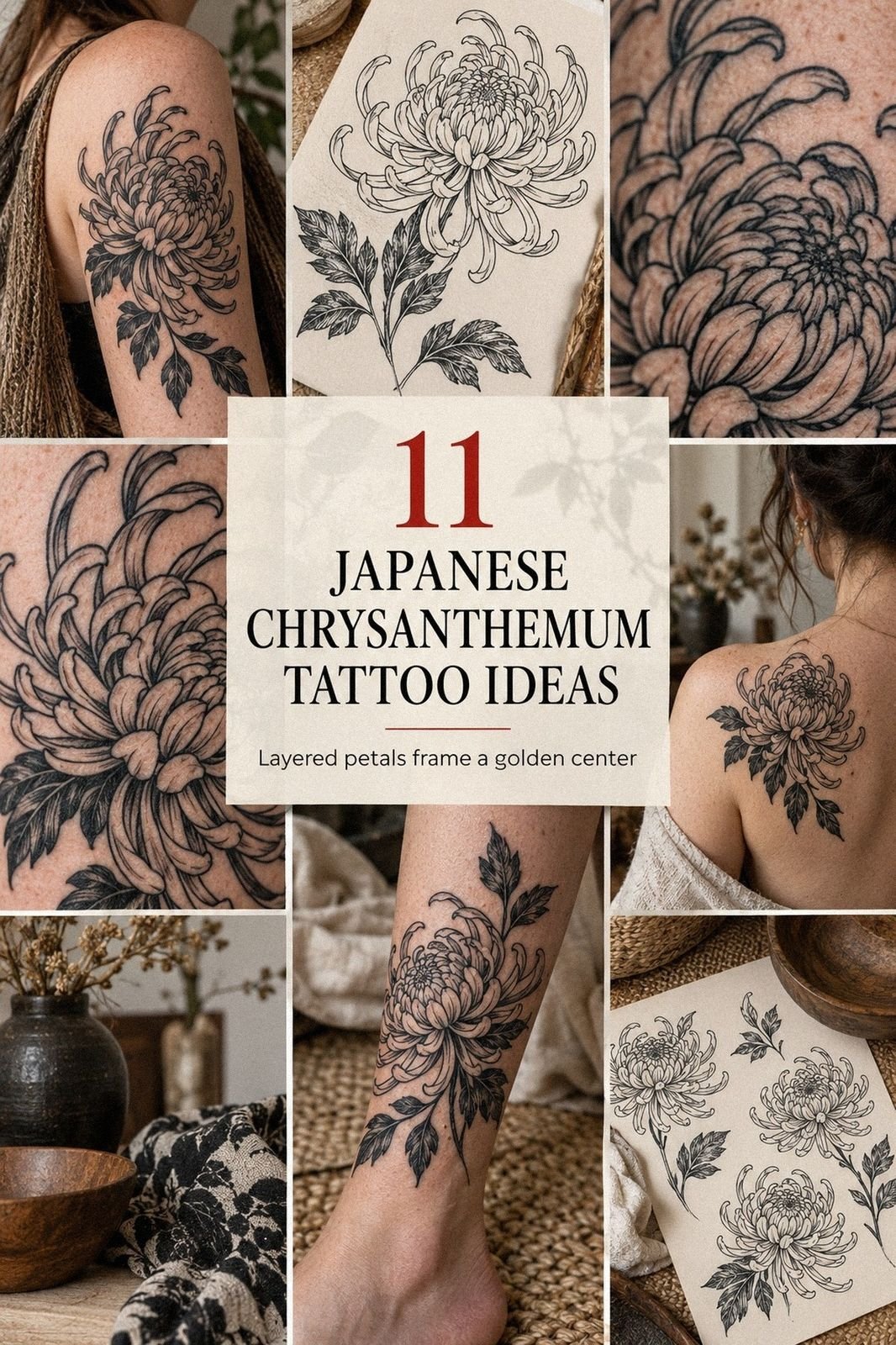
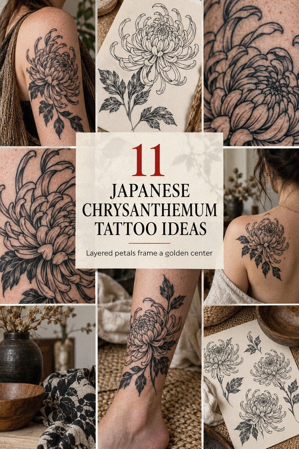
I got my first Japanese chrysanthemum tattoo the week I turned 30, after months of changing the sketch and second-guessing the placement. I wanted something striking that could stay crisp for years, not a tiny impulse mark I’d hide by summer. The final piece feels personal, bold, and unexpectedly easy to live with.
Before the Appointment: The Blank-Skin Decision
Before the appointment, my upper arm was simply blank skin I’d been saving for an idea that could carry real meaning. I wasn’t looking for a random flower. I wanted an unmarked upper arm to hold a design that felt symbolic, intricate, and personal without looking like someone else’s flash.
I kept returning to the chrysanthemum because its petals have movement. You can make it delicate or fierce, minimal or ornate, depending on the outline and shading.
I didn’t want a flat flower sitting on my skin. I wanted the center to pull your eye inward while each petal seemed to turn outward.
My first sketches were too small. They looked dainty on paper, but the details collapsed from a normal distance. So I compared a few printed chrysanthemum sketches at different sizes and asked myself a blunt question: would I still recognize the flower five years from now?
That question changed the whole project. I stopped chasing the smallest possible tattoo and started thinking about readable lines, open skin, and a placement that would move naturally with my arm.
If you’re planning your first piece, you’ll want that same pause before choosing a final stencil. You can browse more tattoo design drawings with unique layouts before you commit.
My budget mattered, too. I wanted a design worth the cost, not the cheapest appointment I could find. The long-term value would come from clear planning, strong line control, and an artist whose healed work looked as good as the fresh pieces.
- I Chose a Black Chrysanthemum Tattoo Outline
- Why I Matched Petal Flow to My Forearm
- The Collarbone Stencil Test
- I Added Japanese Peony Leaves for Contrast
- Blackwork or Soft Wash? My Shading Decision
- Fine Linework Along My Shoulder
- I Balanced Fierce Petals With Delicate Details
- What the Center Needed to Mean Something
- I Reviewed Healing Photos Before Choosing Color
- Black Ink or Red Accents? My Final Choice
- I Preserved Negative Space Around Each Petal
1I Chose a Black Chrysanthemum Tattoo Outline
I chose a black chrysanthemum tattoo outline because the silhouette had to work before any shading was added. The artist drew broad outer petals, tighter inner petals, and a slightly irregular edge that kept the flower from looking mechanically perfect. That uneven rhythm made it feel raw and expressive.
The first version had too many little points. It was intricate, sure, but the flower looked nervous instead of graceful.
I asked for fewer turns and stronger curves, and the artist widened the spaces between several petals. You don’t need every detail to make a design feel elaborate.
Sometimes a cleaner outline gives your eye more room to understand the shape.
We tested the drawing against my fair cool-pink skin under bright studio light. The carbon stencil transfer showed exactly where the black would sit, and I could see that the lower petals needed a little more length.
I didn’t rush that adjustment. If the outline looks cramped before the needle starts, it’ll feel even tighter once the design is permanent.
The version I approved was sharp, classic, and understated at the same time. It didn’t rely on extra symbols to make its point.
If you’re comparing outlines, you’ll want to judge the outer contour first, then the center, then the negative space. My tattoo outline drawing stencil design guide helped me understand why that order matters.
That planning was worth it. The value wasn’t in adding more petals; it was in making every major curve readable.
2Why I Matched Petal Flow to My Forearm
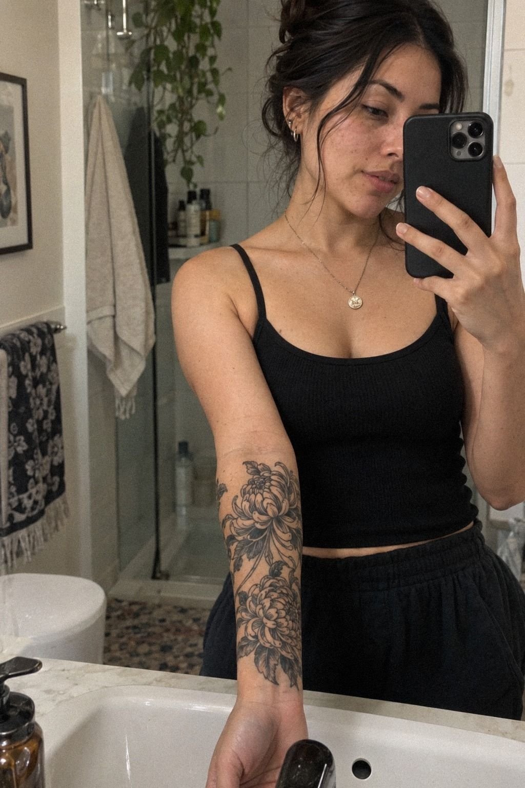
For the second idea, I matched the forearm placement to the natural direction of my arm instead of forcing the flower to sit straight on the page. When I turned my wrist, the petals appeared to open toward my elbow. That small adjustment made the design feel flowing and alive.
My forearm is medium warm ivory, so I wanted clean black marks with enough open skin to keep the pattern readable. The artist rotated the stencil twice before I liked it.
One angle looked elegant when my arm was still but twisted awkwardly when I moved. The better version followed the long line of the forearm, and it looked intentional from both directions.
I nearly chose a perfectly centered flower. I’m glad I didn’t.
Perfect symmetry would’ve made the tattoo feel stiff, while the slightly angled petal-flow stencil gives it motion. If you’re using a forearm design, you’ll want to check it while standing, sitting, and turning your hand palm-up.
Your tattoo should make sense during movement, not just in one posed photo.
The final outline looked sleek and powerful without becoming aggressive. I liked that it could read as a Japanese floral tattoo from across the room, then reveal finer details up close. You can compare placement ideas in this Japanese floral tattoo collection before choosing your own angle.
That check saved me from paying for a placement I’d regret. A few extra minutes gave the design much better value.
3The Collarbone Stencil Test
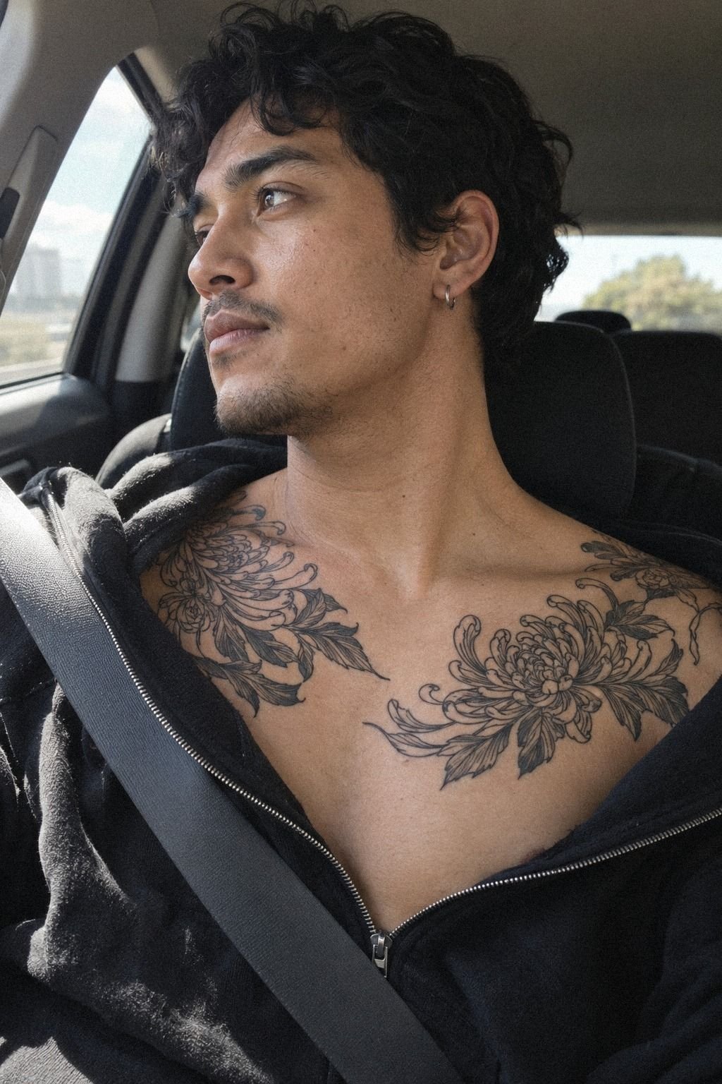
I tested a chrysanthemum tattoo stencil on my collarbone before approving the needlework.
4I Added Japanese Peony Leaves for Contrast
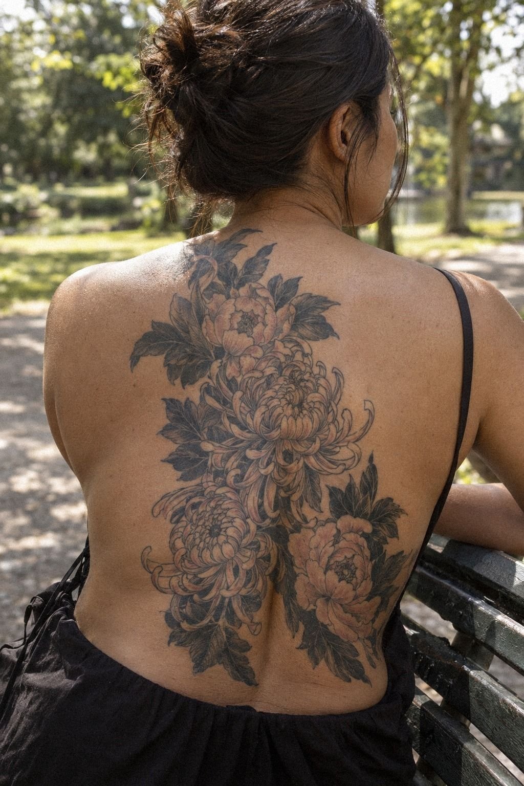
I added Japanese peony leaves around the chrysanthemum because the flower needed a darker counterweight. The leaves created pointed shapes beside the rounded petals, and that contrast made the central bloom feel more intricate without adding another flower.
At first, I asked for too many leaves. The draft became busy, and the chrysanthemum lost its role as the main subject. The artist removed two leaves and left a clean gap near my shoulder.
That open skin gave the design a more elegant rhythm and kept the composition from looking crowded.
The final leaves were shaded with compact black strokes rather than filled into one heavy mass. Against my golden tan skin in the reference version, that balance would read especially well because the leaf edges would stay crisp while the petals remained dominant. You can be bold without covering every available inch.
I liked this version because it felt classic but not predictable. The leaves made the flower seem rooted, while the open spaces kept it light.
If you’re considering a Japanese peony tattoo beside your chrysanthemum, you’ll want the peony to support the main bloom rather than compete with it. I compared both styles through this traditional Japanese tattoo artists guide.
The added foliage was worth the cost because it solved a real composition problem. It wasn’t decoration for its own sake.
5Blackwork or Soft Wash? My Shading Decision
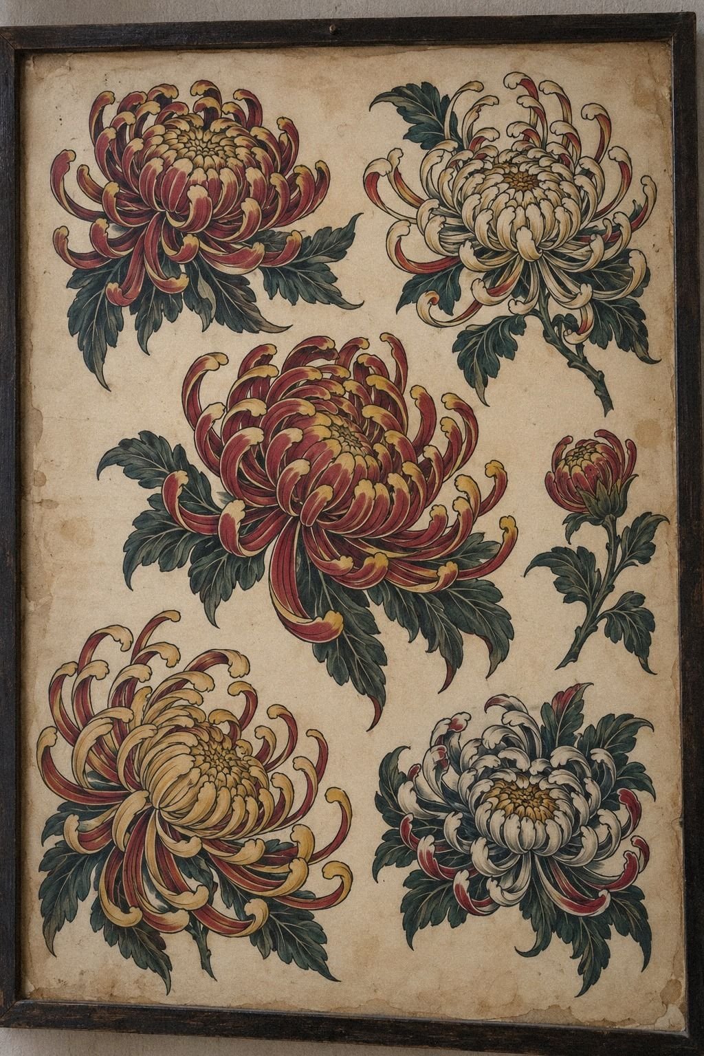
I selected traditional chrysanthemum tattoo shading after looking through a sheet of hand-drawn designs on aged off-white paper. The designs showed dense black petals, curved folds, and small centers that felt iconic without looking flat.
The bold version scared me at first. I thought heavy shading might overpower the flower, especially as my first ink.
Then I noticed how the darker folds separated one petal from the next. A good black section wasn’t just decoration.
It gave the eye a map.
We chose a controlled amount of blackwork shading and left several petals open. That choice made the design more vibrant and kept the center from becoming one dark circle.
If you’re drawn to traditional work, you’ll want to ask where the artist plans to leave skin untouched. Negative space is what lets bold ink breathe.
I also rejected a soft gray wash. It looked romantic on the page, but it didn’t give the outer petals enough structure.
The black version felt more timeless and powerful, and it suited the Japanese influence better. You can study related forms in this traditional Japanese cloud tattoo meaning guide.
For my budget, controlled blackwork made more sense than chasing several colors. It delivered the strongest visual impact without adding unnecessary complexity.
6Fine Linework Along My Shoulder
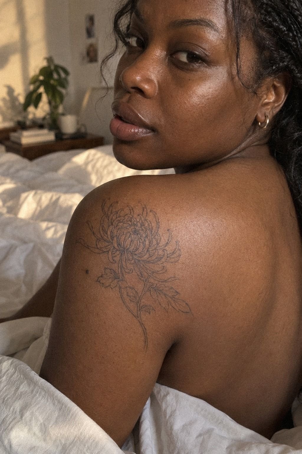
I placed fine linework along the shoulder in a second reference design because I wanted to understand the quieter side of the style.
7I Balanced Fierce Petals With Delicate Details
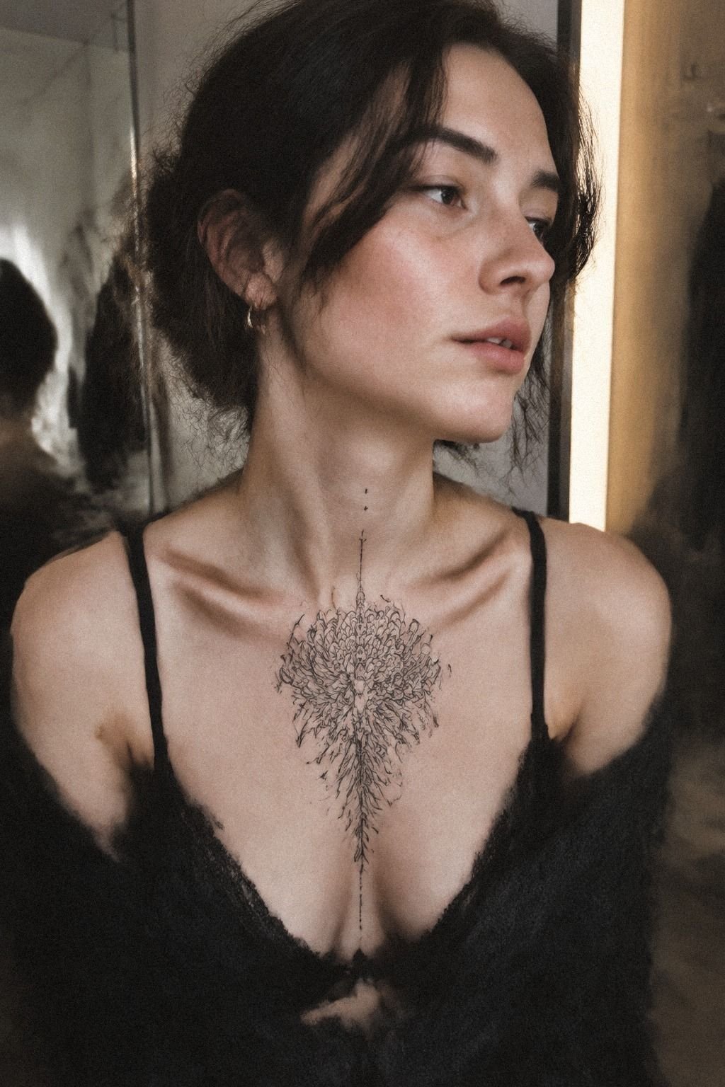
I balanced sternum placement references by pairing fierce outer petals with delicate details near the center. The flower sat on fair cool-pink skin, and the symmetrical position made it feel sacred, romantic, and slightly haunting.
The sternum is striking, but it isn’t the easiest placement for a first appointment. The skin is close to bone, and the area can feel more intense than the forearm, thigh, or shoulder. I liked the visual drama, yet I knew I didn’t want my first experience to be defined by enduring the most uncomfortable location.
The design itself taught me something useful. Fierce doesn’t mean thick everywhere.
The artist used heavier marks around the outer petals, then switched to finer petal fold lines near the center. You get contrast without losing the flower’s softness.
If you’re choosing a sternum chrysanthemum, you’ll want the center aligned carefully and the stencil checked while your body is relaxed. A tiny shift can change the whole balance. I kept the sternum version as inspiration, but my upper arm gave me a more comfortable and practical result.
That felt like the right compromise!
The upper-arm placement was worth it for me. I got the meaningful shape I wanted without forcing myself into the most intense option.
8What the Center Needed to Mean Something
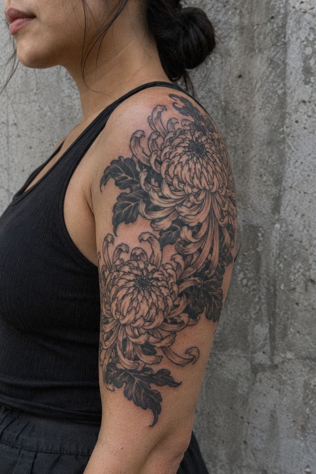
I used symbolic chrysanthemum centers to give the design a private meaning without adding obvious text. The upper-arm reference showed a woman with medium warm ivory skin and a central flower that felt expressive, meaningful, and refined.
My artist offered three center options: a tight spiral, a dark circular core, and a small cluster of curved petals. I chose the curved cluster because it suggested growth without making the symbolism too literal. You don’t need a date or word inside a flower for the tattoo to carry a story.
The center became the part I noticed most during the appointment. Once the petal-center detail was finished, the rest of the flower suddenly made sense. It gave the surrounding lines somewhere to lead, and the design stopped feeling like a collection of separate marks.
I rejected a tiny initial hidden inside the bloom. It would’ve made the tattoo more personal on paper but less timeless on skin.
If you’re adding meaning, you’ll want to choose a symbol that still feels right when nobody else knows what it represents. Mine is quiet, personal, and empowering.
I also read this tattoo meaning guide before settling on the center. The final choice felt more valuable because it came from my own story, not a symbol I’d copied blindly.
9I Reviewed Healing Photos Before Choosing Color
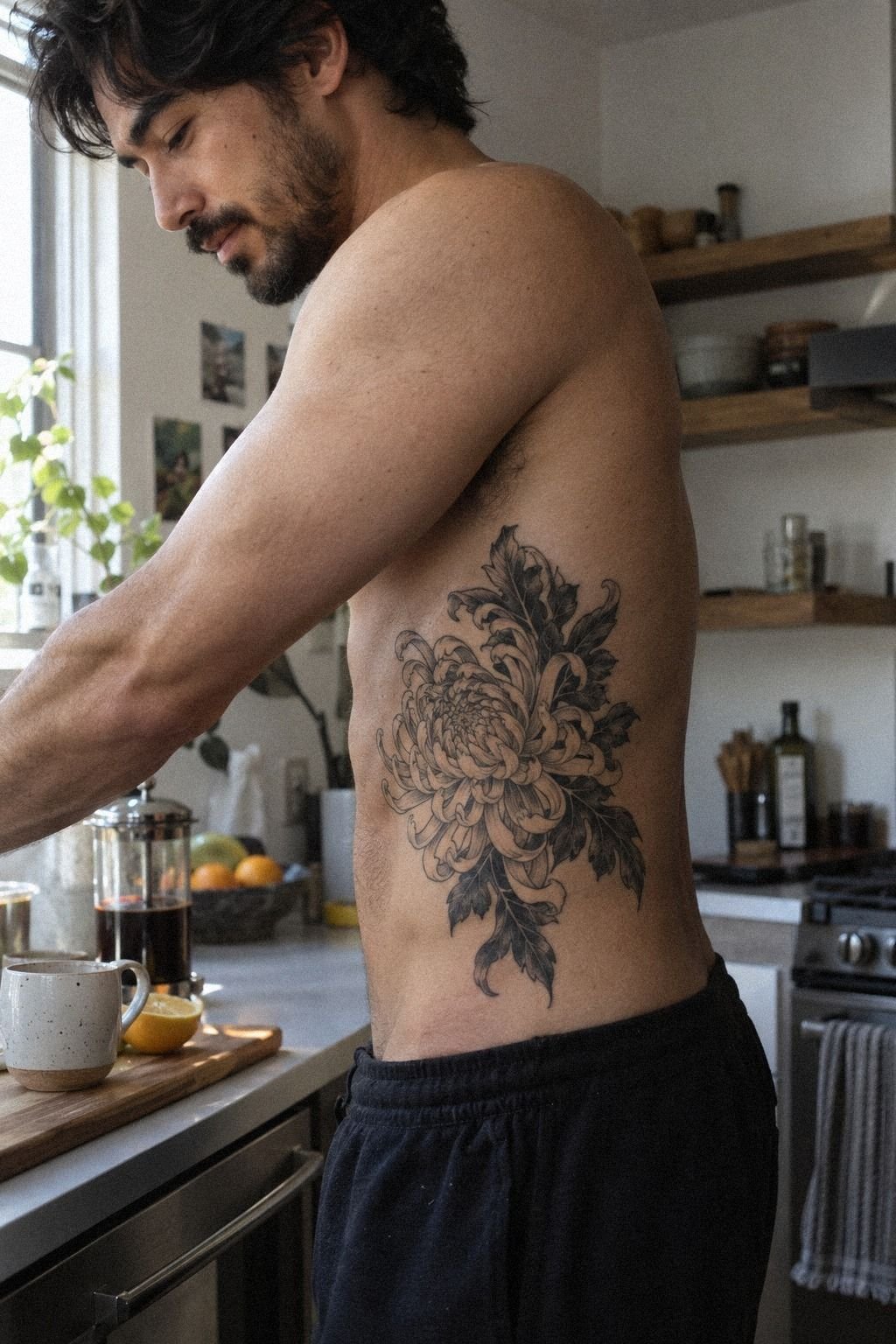
I reviewed healed tattoo photos before choosing whether to add color. The rib reference showed a clean chrysanthemum on medium olive skin, and I compared fresh images with photographs taken several months later.
Black looked crisp and classic in every healed example. Red accents were more vibrant, but they changed the mood and would need careful placement to avoid making the flower feel too playful. I wanted an edgy, timeless result, so I kept the first version mostly black.
The artist explained that surface healing usually takes about two to three weeks, while the tattoo settles more completely over roughly two to three months. During that time, I knew I shouldn’t scratch, soak it in a pool, or expose it to strong sun. Your aftercare matters as much as the original linework.
I also learned that very fine lines can spread slightly over time, while solid black paired with good placement tends to remain readable. That doesn’t mean every black tattoo ages perfectly.
It means you should protect healed black ink from UV exposure and choose spacing that can tolerate natural change. I kept the red idea for later.
When I compared the possible long-term value, black was the safer first investment. It gave me the clearest result without making the decision feel permanent in two different color systems.
10Black Ink or Red Accents? My Final Choice
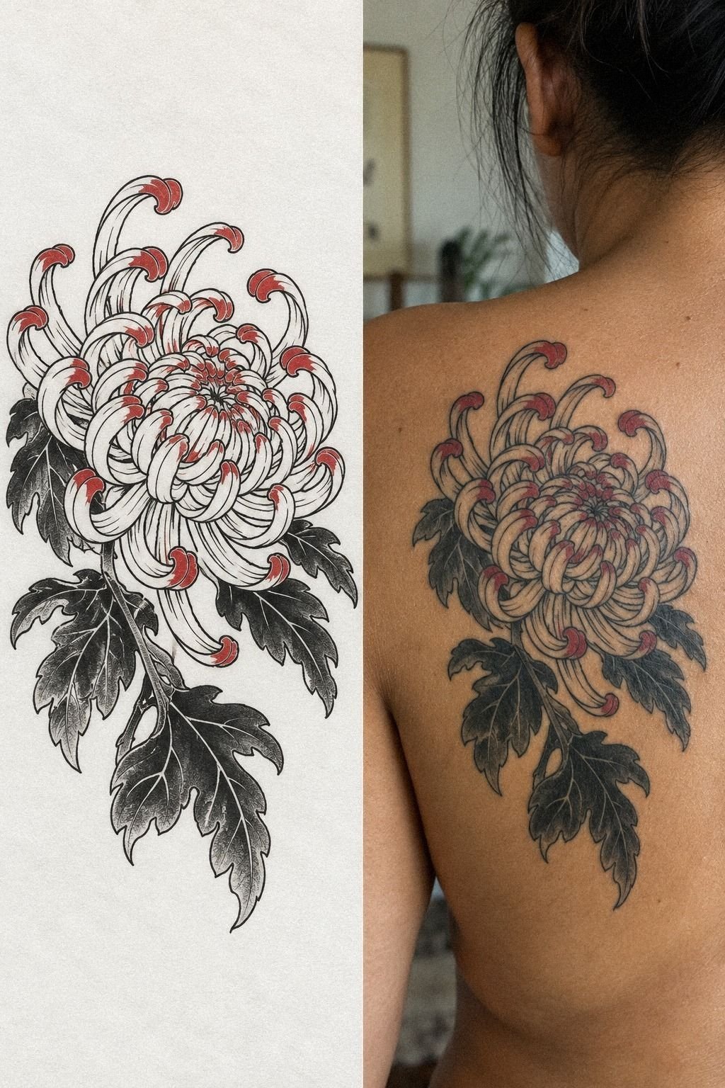
I combined crisp black ink with red accents in a split reference, showing the stencil on white paper beside the healed design. The black side defined every petal, while the red appeared only in small inner folds.
That comparison made the decision easier. Fresh color looked lively, but the healed version felt more nuanced. The red softened the fierce quality of the flower and gave it a romantic edge.
I liked it, though I wasn’t sure I wanted that mood permanently.
I asked the artist to mark possible red areas with a temporary pen. The strongest placement was near the center, where a small accent could create focus without turning the entire chrysanthemum into a bright graphic. If you’re considering color, you’ll want to ask how it will interact with your skin tone and the surrounding black.
I chose black for my first session and left the door open for color later. That wasn’t indecision.
It was a deliberate way to see how the red tattoo accent would age before committing. You can always add a restrained detail, but removing color isn’t a casual correction.
The black-only version felt polished and personal!
For my budget, black was the better value. I could always pay for a small color addition later, but I couldn’t easily reverse a color choice I disliked.
11I Preserved Negative Space Around Each Petal
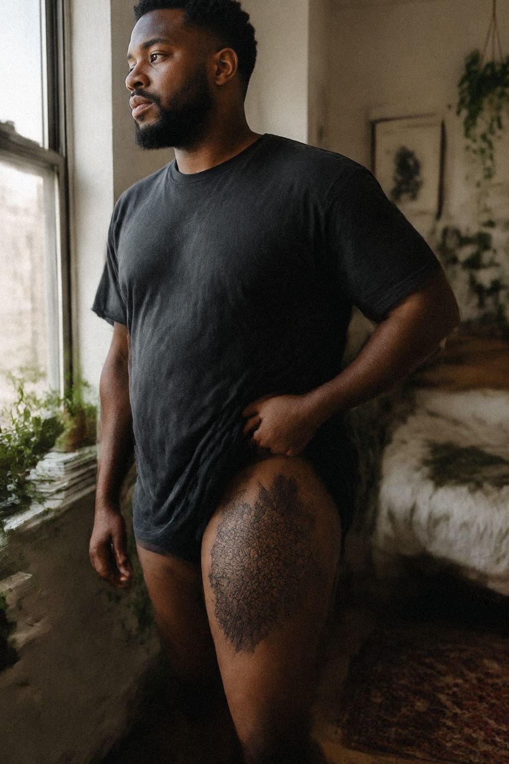
I preserved negative space around each petal because open skin is part of the design, not leftover skin. On deep brown skin with a warm undertone, the gaps helped every dark curve stay visible and gave the flower a crisp, graceful outline.
The temptation is to fill every fold. I understand it.
Dense shading can feel bold and finished, especially in a traditional design. But when every area is dark, your eye loses the difference between one petal and the next. The open spaces created a sharper silhouette and a more expressive flow.
My artist measured the spacing by eye and adjusted several inner petals before the stencil dried. We didn’t use a rigid grid. The open-skin spacing followed the flower’s natural movement, which kept the design from looking computer-generated.
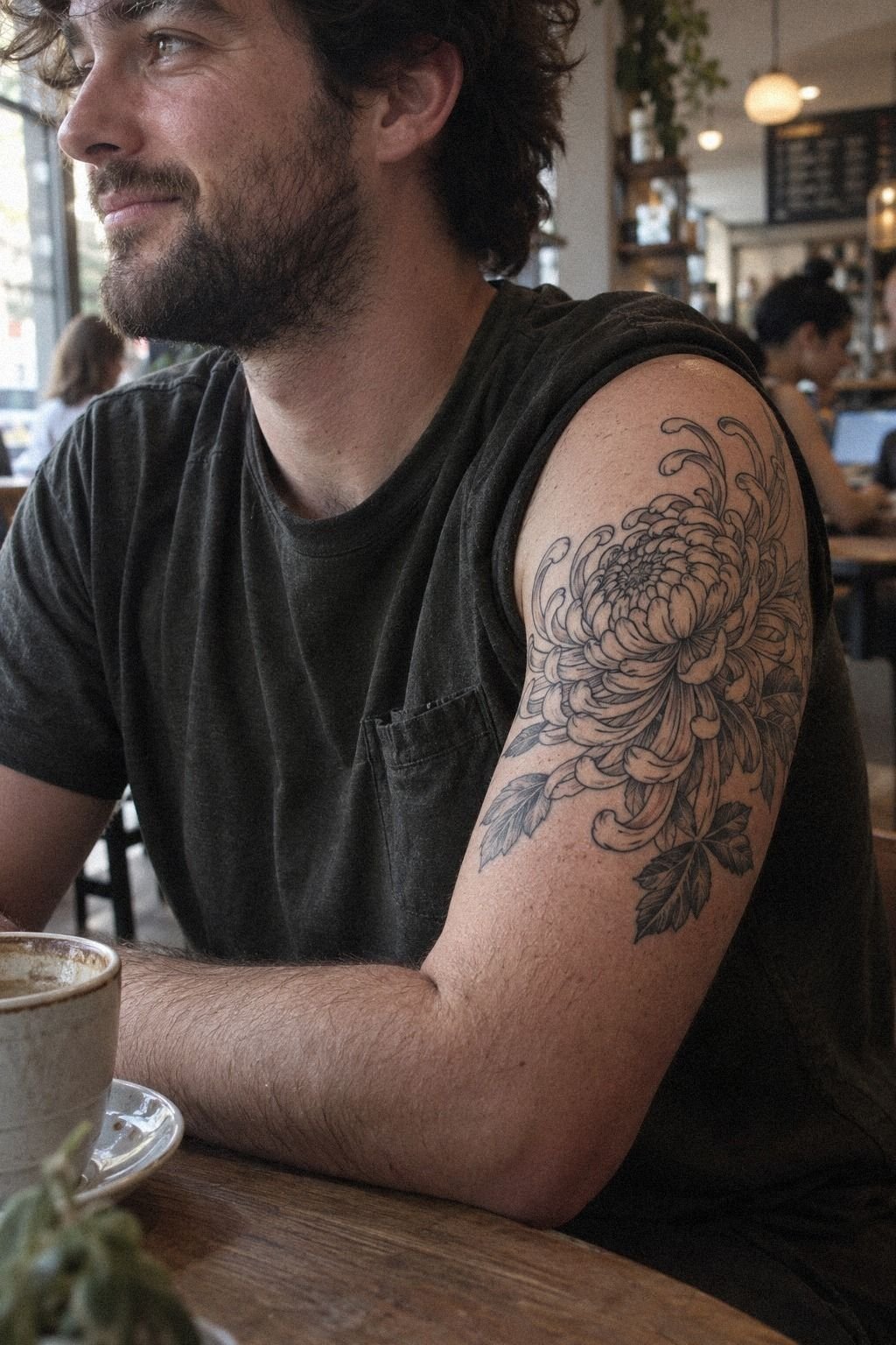
If you’re planning a thigh chrysanthemum, you’ll want to check the design while standing and sitting because the skin shifts. I also asked how the lines might age if they softened slightly.
The answer reassured me: wider gaps and confident outlines would preserve the shape. That choice made the tattoo feel understated from far away and intricate up close.
You can compare similar spacing decisions in this tattoo outline drawing stencil design guide. The lesson was simple: readable structure gives a tattoo more lasting value than crowded detail.
How I Judged the Artist’s Portfolio
I didn’t choose an artist because one fresh chrysanthemum looked impressive. I searched for healed floral work with clear edges, balanced black areas, and consistent spacing.
I wanted to see how the petals looked after several months, especially on different skin tones. A portfolio that only shows freshly completed work can hide how fine lines settle.
The strongest artist had a crisp, stylish portfolio but didn’t oversell it. The work felt expressive, polished, and technically controlled. If you’re comparing artists, this traditional Japanese tattoo artists guide can help you identify the qualities worth checking.
I also asked about hygiene, deposits, touch-ups, and the estimated session length. Those details affect the real cost, not just the number quoted in an initial message.
How Much It Cost: The Honest Session Math
My appointment didn’t have a universal price because tattoo costs change by artist, region, size, and session length. I won’t invent a fake receipt to make the story sound cleaner. For a typical US reference, a boutique studio minimum may land around $50 to $100, while an hourly rate may run about $100 to $250.
My custom chrysanthemum design required more planning than a tiny flash piece because we revised the outline, checked the stencil, and considered how the petals would age. You should ask whether the consultation, drawing time, touch-up policy, and deposit are included before booking.
I also wouldn’t choose an artist only because the quote is low. A clean portfolio, strong hygiene, healed work, and experience with Japanese floral designs matter more than chasing the cheapest appointment. If you’re comparing portfolios, this tattoo design website ideas guide can help you think about presentation and quality.
The most useful budget question is simple: what do you want to protect? For me, it was the outline and placement. I was willing to simplify the color plan so I could spend more attention on clean linework.
That trade felt sensible, and it kept the tattoo focused.
Black, Red, or Both? My Value Test
I kept asking whether the extra color would be worth it. The answer depended on what I wanted the tattoo to do, not on which version looked more exciting for five minutes.
The red design was vibrant and playful. The black version was more timeless, iconic, and easier to evaluate as it settled. Since this was my first tattoo, I valued a strong silhouette more than a dramatic finish.
That doesn’t mean color is a bad investment. It can be meaningful when it supports the composition.
I simply didn’t want color to cover up weak spacing or uncertain linework. This watercolor tattoo design guide helped me compare how different palettes can affect edge definition.
For me, the better value was a refined black chrysanthemum with room for a future accent. I’d rather add one deliberate detail later than pay for a crowded design now.
The Blackwork Longevity Rule
The opinion I came away with is clear: placement and spacing matter more than chasing the newest style. A delicate tattoo can age well when it has enough room, while a bold piece can blur if the lines are packed too tightly.
I learned this by comparing fresh and healed photographs, not by trusting a perfect studio image. The healed tattoo portfolio showed me which artists understood skin as a changing surface. You should look for natural-light photos, different skin tones, and work that has settled for at least several months.
My own mistake was spending too long choosing between black and red before I had fully approved the silhouette. Color is memorable, but structure is what carries the tattoo. And if your design doesn’t read clearly in plain black, color probably won’t rescue it.
I still love the red-accent version, but I prefer my finished black chrysanthemum. It feels raw, iconic, and personal without asking for attention. If you’re building a reference folder, you can also browse this watercolor tattoo design guide to compare how color changes edge definition.
That lesson saved me from spending more money on a feature that wasn’t essential. Clear structure is the part that remains worth it.
What I’d Change Next Time
I’d bring fewer sketches and make the main decision earlier. Too many variations can make a meaningful tattoo feel like a shopping list of possibilities.
I’d also test the stencil from more angles before discussing color. The placement was right, but I could’ve reached that answer sooner if I’d focused on movement first.
The one thing I wouldn’t change is the open space. It keeps the petals sharp, graceful, and readable. You can review more Japanese floral tattoo ideas if you’re still deciding between a dense traditional composition and a more restrained design.
My final advice is direct: spend your budget on the silhouette, placement, and artist. Those choices determine whether the tattoo still feels meaningful years later.
A Few Things Worth Answering
How much does a Japanese Chrysanthemum Tattoo Design usually cost?
A Japanese chrysanthemum tattoo usually costs about $50 to $100 at a US studio minimum or about $100 to $250 per hour, depending on the artist, region, size, and placement. A clear quote should explain the deposit, session time, drawing process, and touch-up policy before you book.
Are Japanese Chrysanthemum Tattoo Design a good idea for a first tattoo?
Yes, a Japanese chrysanthemum can be a strong first tattoo because clean lines and thoughtful spacing can stay readable as the piece settles. A comfortable placement such as the forearm, thigh, or shoulder may feel more manageable than ribs, feet, hands, or sternum.
How do I choose a tattoo artist for Japanese Chrysanthemum Tattoo Design?
Choose an artist with clean Japanese floral work, healed photographs, consistent line control, and visible studio hygiene. A strong healed portfolio matters more than one impressive fresh tattoo, so ask to see work from several months earlier and compare how the petals and black areas settled.
How much do Japanese Chrysanthemum Tattoo Design hurt?
Pain varies by person and placement. Ribs, feet, hands, and sternum tend to feel more intense, while the forearm, thigh, and shoulder are often more tolerable. A practical placement can make your first appointment easier, especially if you’re nervous about sitting for a longer session.
How long does a Japanese Chrysanthemum Tattoo Design take to heal?
The surface usually heals in about two to three weeks, while complete settling can take roughly two to three months. Wash gently, moisturize as directed, and avoid strong sun and swimming during early healing. Simple aftercare protects the lines while your skin repairs itself.
What’s the best placement for Japanese Chrysanthemum Tattoo Design?
The forearm, upper arm, thigh, and shoulder are practical choices because they offer readable space and are often more tolerable than bony areas. A generous placement also gives the petals room to age without crowding, especially if your design includes bold outlines and internal shading.
Where I’d Start First
If I had to pick one, I’d start with the black chrysanthemum outline. It gives you the clearest silhouette, leaves room for future color, and won’t depend on tiny details staying perfect.
Save the reference, check the stencil twice, and choose an artist whose healed work still looks crisp. Mine still feels like me.