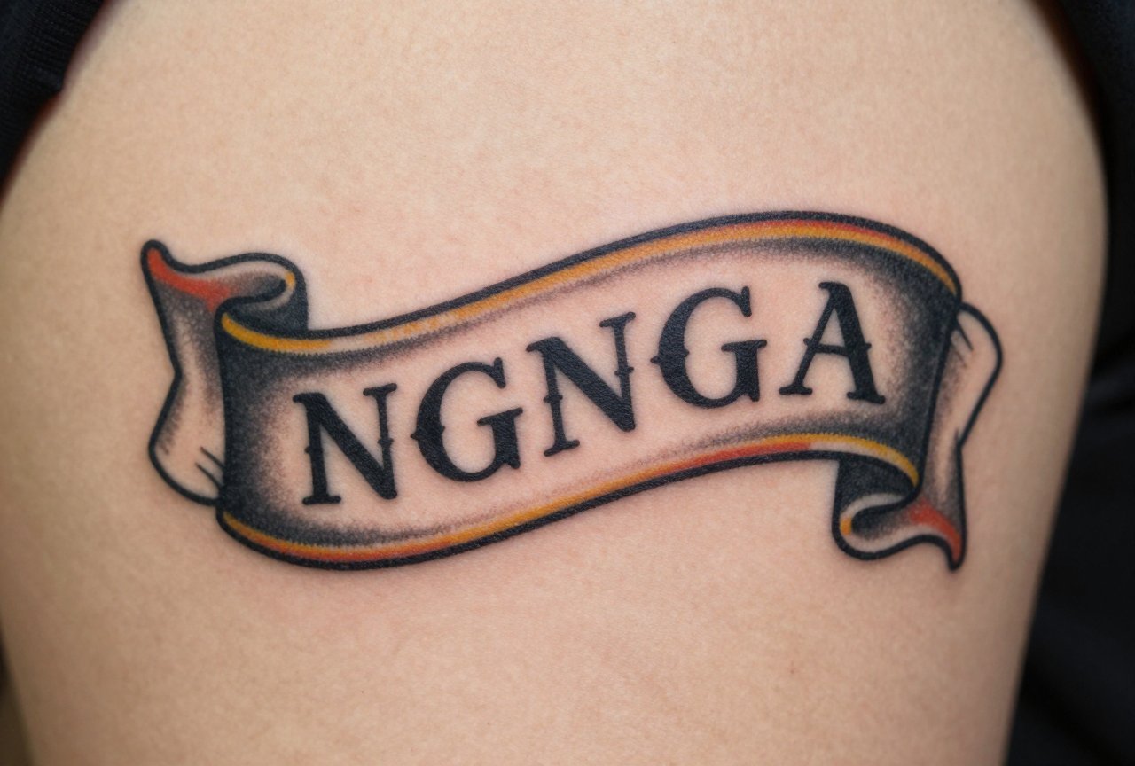
A traditional banner tattoo is that curved ribbon of scrollwork you’ve seen wrapped around roses, daggers, hearts, and names since your grandpa’s navy days. It’s the workhorse of American traditional tattooing, the element that turns a standalone image into a story, a date into a memorial, a name into a declaration. I’ve tattooed hundreds of these over the years, and the banner is one of those deceptively simple designs that separates a scratcher from someone who understands how skin actually works. The curves have to flow with the body. The lettering has to read at a glance. And the scrollwork has to hold up when that crisp black line softens into a grey halo ten years down the road.
Origins & History
Sailor Jerry and the Early American Tradition
The banner as we know it solidified in the 1930s and 40s with Norman “Sailor Jerry” Collins and his contemporaries working out of Honolulu. These guys were tattooing sailors who wanted Mom’s name, their ship’s launch date, or a sweetheart back home. The banner gave structure to sentiment. It framed the emotional content in a visual language that felt masculine, permanent, and graphically bold. I’ve got flash sheets from the 50s in my shop where half the designs incorporate some form of scrollwork. It wasn’t optional, it was the grammar of the style.
The European influence runs deeper than most people realize. Military regalia, heraldic scrolls, and printer’s ornaments from the 19th century all fed into what became the tattoo banner. Sailor Jerry and others distilled these decorative traditions into something that could be executed quickly, read clearly from across a bar, and heal solid on skin that was about to see a lot of salt water and sun.
How the Style Spread
By the 60s and 70s, every port city shop had their version of the banner. Ed Hardy kept the tradition alive through the lean years when realism and tribal were dominating. I apprenticed under an artist who trained in the 80s, and he made me draw 50 banners from flash before I ever touched skin. “If you can’t make a banner sing,” he’d say, “you can’t make anything sing.” It was tedious as hell, but he was right. The banner teaches flow, negative space, and how to make lettering work with imagery instead of fighting it.
Key Characteristics & Motifs
A traditional banner isn’t just any curved line with text. There’s a specific vocabulary. The ends typically curl or fold back, creating depth through simple shading rather than realistic perspective. The main body of the banner usually has a center line or “break” that gives it dimension, with parallel top and bottom edges that swell and taper with the curve. I’ve seen so many botched attempts where someone just draws a wavy rectangle and slaps letters in. It looks flat. It looks wrong.
- Scroll ends: Classic options include tight curls (like a fiddlehead), pointed folds, or rounded “swallowtail” cuts. Each reads differently, curls feel decorative, points feel aggressive, swallowtails feel nautical.
- Center shading: The break line down the middle creates the illusion of a ribbon passing over itself. Done right, it’s two tones of grey and a clean black outline. Overworked, it turns muddy.
- Lettering integration: The text follows the banner’s curve. Straight block letters on a curved ground look amateur. The letters themselves need to bend, compress at the edges, and breathe with the scroll’s movement.
- Companion imagery: Roses, daggers, anchors, hearts, swallows, and skulls are the classic partners. The banner weaves through, behind, or around these elements.
In my chair, I always ask clients what the banner is doing. Is it wrapping around something? Passing behind? Being held? The relationship matters. A banner floating in space with no connection to its imagery looks like a sticker, not a tattoo.
Color vs Black and Grey
The Classic Bold Approach
Traditional banner tattoos in full color hit different. The banner itself is typically skin-tone or off-white with black outlines and grey shading, but the surrounding imagery brings the red roses, green leaves, yellow gold. The banner becomes the neutral ground that makes the color pop. I’ve tattooed banners where we kept the scroll completely black and grey and let a crimson heart behind it do all the talking. The contrast is the point.
Black and Grey Variations
Black and grey traditional has its own following, especially for memorial pieces where clients want something more subdued. The challenge here is keeping the banner from disappearing. Without color contrast, you rely entirely on line weight and shading gradation. I tend to use heavier outlines on black and grey banners and add more decorative flourishes, extra curls, stippled texture, or ornamental shading, to give the eye something to hold onto. These age differently too. Color banners tend to keep their structure because the black lines have color fields to define. Black and grey banners can turn into soft grey smears if the original contrast wasn’t aggressive enough.
Best Placements
Banners are adaptable, but some spots just work better. The curve of the banner needs to follow the curve of the body, or it looks like it’s fighting the skin.
- Forearm: The natural cylindrical shape lets a banner wrap slightly, giving it dimension. Inner forearm is classic for names and dates. It hurts, but it’s worth it.
- Chest/upper chest: A banner across the upper chest, above the heart, is maybe the most traditional memorial placement there is. The slight curve of the pectoral muscle gives the banner a natural home.
- Thigh: Great real estate for larger banners with companion imagery. The muscle movement adds life to the scroll’s curves.
- Ribs: I’ve done banners that follow the rib curve. They look incredible when the person stands straight, but the distortion when they breathe or bend is something to discuss beforehand.
- Lower leg/shin: The flat plane works well for straight banners, but curved ones can look twisted as the muscle wraps. I usually adjust the design to account for this.
Fingers and hands are tough. Small banners there tend to blow out and fade fast. I warn clients: you’ll be back for touch-ups, and the lettering might never stay crisp.
Who It Suits
This style doesn’t care about your aesthetic tribe. I’ve tattooed banners on punk kids, grandfathers getting their first tattoo at 70, military guys, and people who otherwise only collect Japanese work. The banner is democratic. What matters is your intention. Are you marking something permanent in your life? The banner is literally built for that.
That said, it helps if you understand what you’re getting. This isn’t realism. The heart won’t look like a photograph. The letters won’t be some delicate script. The banner is a graphic statement, bold and simplified. If you want subtlety, we can adjust, softer shading, thinner lines, but then you’re drifting from traditional into something else, and you need to know that going in.
Modern Variations
Neo-Traditional Updates
Neo-traditional banners keep the structure but add more dimension, more color saturation, more ornamental detail. I’ve seen artists do banners with jewel-toned gradients, gold filigree patterns inside the scroll folds, or integrated natural elements like vines growing through the lettering. It’s still readable as a banner, but the craftsmanship level is cranked up. These take longer, cost more, and need an artist who can actually draw, not just trace flash.
Minimal and Single-Needle Approaches
On the other end, there’s a trend toward extremely fine-line banners, sometimes single-needle work that looks almost like an etching. I’m skeptical of these for longevity. I’ve watched too many delicate pieces blur into illegibility. But done with intention, larger scale, simpler text, strategic placement, they can work. I just make sure clients understand the trade-off. That whisper-fine banner will not look the same in five years.
Choosing an Artist
Not every traditional artist loves banners. Some find them boring, repetitive, beneath their current ambitions. You want someone who still respects the fundamentals. Look at their healed work, not just fresh photos. A banner that looks crisp at day three but lost its lettering contrast at month six is a failure, and you won’t see that on Instagram.
- Ask to see lettering specifically. Many artists hide weak lettering behind flashy imagery.
- Check if their banner curves make sense on actual bodies, not just flat flash sheets.
- Notice whether their scroll ends are consistent and intentional, or lazy afterthoughts.
- Talk to them about aging. If they can’t discuss how the lines will spread, they haven’t been doing this long enough.
In my shop, I still draw banners by hand before stenciling. The computer can generate curves, but it doesn’t understand how a body moves. That understanding only comes from time, repetition, and the occasional mistake you never make again.
Final Thoughts
The traditional banner tattoo is one of those foundational forms that every serious artist should be able to execute, and every collector should understand before requesting. It’s not just a decorative frame, it’s a structural element that carries meaning, creates visual hierarchy, and connects tattooing’s past to its present. If you’re getting Mom’s name in a classic scroll or commissioning a neo-traditional piece that pushes the form, respect the banner’s logic. Let it curve with your body. Let the lettering breathe. And give it the boldness it needs to still read clear when you’re old, grey, and the lines have softened into the stories they were always meant to become.
Frequently Asked Questions
How small can the lettering be in a banner tattoo before it becomes unreadable?
I generally won’t go smaller than 10-12 point equivalent for banner text, and even that assumes simple block lettering. Script or ornate fonts need to be larger. Remember: ink spreads slightly under skin over time. What looks crisp fresh can blur together if you push too small.
Do banner tattoos need to be horizontal, or can they curve vertically?
Vertical banners work great, especially on arms and ribs. The key is that the curve follows your body’s natural lines, not fights them. I’ve done vertical banners that arc along the outer forearm and diagonal banners that cut across shoulders. The direction matters less than the flow.
Can a banner tattoo be added around an existing tattoo?
Yes, but it’s trickier than starting fresh. The existing tattoo’s style needs to match the banner’s traditional language, and the integration has to look intentional, not like an afterthought. I’ve done this successfully, but it usually requires adjusting both the banner and sometimes touching up the older piece to harmonize them.
How much does a traditional banner tattoo typically cost?
Small name banners run $150-300 in most shops. Larger pieces with companion imagery can hit $500-800 or more depending on the artist’s rate and your location. Don’t bargain shop on lettering, you’ll be reading this every day. Pay for someone who cares about readability.