I’ve been tattooing long enough to know that “beautiful” means something different on skin than it does on paper. That Pinterest-perfect watercolor rose? Gorgeous on your screen. On your ribs, after five summers of sun and three kids? Different story. I’ve tattooed thousands of people, and I tell every client the same thing: the most beautiful tattoo is the one that still looks good when you’re sixty. Let’s talk about what actually works.
Popular Styles That Hold Their Beauty
Some styles are built to last. Others are built for Instagram. Here’s what I’ve watched age gracefully in my chair.
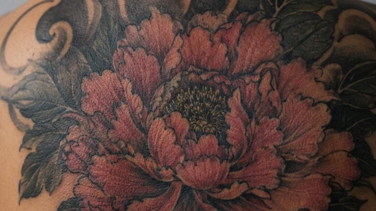
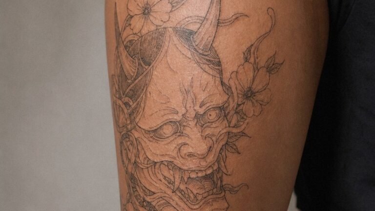
Japanese Traditional
I’ve done full sleeves of koi, dragons, and cherry blossoms that look better at year ten than year one. The secret is bold lines, saturated color, and big shapes. Japanese traditional doesn’t whisper, it shouts. And shouting carries across a room, even when the ink softens. The skin moves, the color settles, but the composition holds. We see this a lot in the shop: someone comes in with a faded tribal band from 2003, then points to our Japanese portfolio and says, “That. I want that to last.”
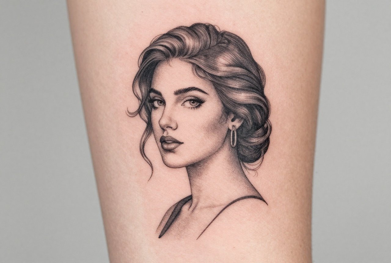
Black and Grey Realism
Portraits, animals, religious imagery, this style lives or dies on contrast. I’ve watched poorly executed greywash turn to mud in three years. But when it’s done right, with real black saturation and purposeful negative space, it’s stunning. The way light hits a healed black and grey piece, especially on an outer forearm or calf, still gets me after fifteen years. The skin texture becomes part of the image.
- Japanese Traditional: bold lines, flat color, large compositions
- Black and Grey Realism: contrast-dependent, needs experienced hands
- Neo-Traditional: thicker outlines than old school, richer color palette
- Fine Line: trendy now, but requires touch-ups and careful placement
Design Ideas That Mean Something
The most beautiful designs I’ve tattooed weren’t the most complex. They were the most specific. A client brought me her grandmother’s handwriting on a grocery list, “love you, see you Sunday”, and we put that on her collarbone. Simple. Black script. No flourishes. She cried when she saw it. That’s beautiful.
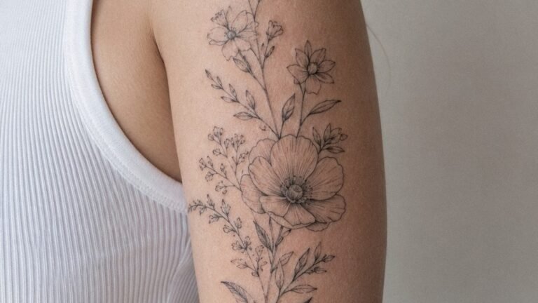
Botanical and Nature Work
Flowers, leaves, trees, these never go out of style because nature never does. But here’s what I tell clients: choose something that grows where you live, or where you’re from. I’ve tattooed California poppies for transplants who miss the light. Pine branches for Minnesota kids who moved south. The connection matters more than the aesthetic. A generic rose is pretty. Your mother’s peony bush, rendered from a photo you took, is beautiful.
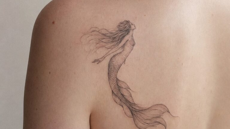
Abstract and Geometric
These work when they’re intentional, not just decorative. I’ve done sacred geometry that followed the muscle structure of a client’s back, lines that moved with her, not just on her. Abstract watercolor can be stunning, but I warn people: the soft edges blur. The hard edges stay. If you want watercolor, give me something to anchor it. A solid linework mandala with watercolor splash behind it? That works. Pure watercolor “floating” on skin? I’ve seen it disappear.
Best Placements for Lasting Beauty
Placement is everything. I’ve tattooed the same design on a shoulder and a foot, and they look like different tattoos after healing. Skin thickness, sun exposure, friction, stretching, they all rewrite your ink.
The upper back, outer upper arms, and calves are the sweet spots. Thick skin, less sun, minimal stretching. I’ve got clients with fifteen-year-old back pieces that barely shifted. Compare that to inner bicep tattoos that blew out from muscle growth, or finger tattoos that needed three touch-ups in two years. The hand is a billboard, everyone sees it, but it’s also a war zone. Knuckles fade. Palms blur. It’s not that these spots can’t be beautiful; they just demand more commitment.
- Upper back/shoulder blades: minimal sun, stable skin, large canvas
- Outer forearms: visible, but protectable; great for medium-sized work
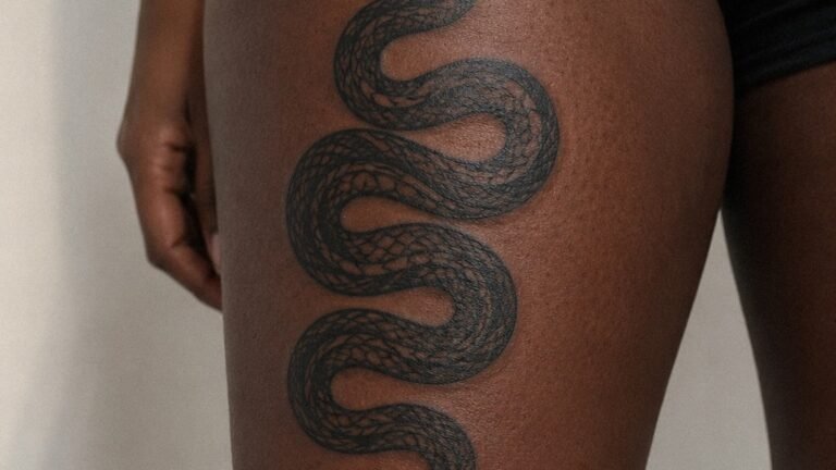
- Thighs: hidden or shown, forgiving for detailed pieces
- Ribs and sternum: painful, stretch with breathing, but striking when healed
- Behind the ear and neck: trendy, but sun exposure is brutal; plan for fading
Color Choices: What Stays, What Goes
I’ve watched color trends come and go. Teal and coral were everywhere in 2016. Now I’m covering some of them up. Here’s the reality from under the needle.
Black and Grey: The Default
Black ink is carbon. It’s been used for thousands of years because it works. Grey is just black diluted. This palette ages like leather, softens, gains character, never looks wrong. If you’re nervous about color commitment, start here. I’ve had clients add color later, but you can’t subtract it easily.
Color That Lasts
Dark green, navy blue, deep red, purple, these pigments have larger molecules and better stability. I’ve got a client with a fifteen-year-old Japanese dragon where the red scales still pop. Bright yellow, pastel pink, light teal? They ghost. White ink turns ivory, then beige, then disappears into lighter skin tones. On darker skin, white can heal with a grey cast. It’s not about skin tone being “harder to tattoo”, that’s ignorant shop talk. It’s about physics. Light colors reflect light. Skin is opaque. The math doesn’t work forever.
That said, I’ve seen stunning color work on every skin tone. The key is choosing saturation over brightness. A deep emerald hits harder than a neon green, and it’ll still hit in a decade.
Tips for Choosing Your Beautiful Tattoo
After all these years, the clients who love their tattoos forever did a few things right. The ones who cover them up or laser them off usually skipped these steps.
Live With the Image
Print it out. Tape it to your mirror. Look at it every morning for three months. If you’re not sick of it, if you keep finding new details, that’s a good sign. I’ve had people bring me sketches they drew five years ago. That’s beautiful already, the patience, the persistence.
Trust the Artist’s Eye
You found the image. We make it work on skin. I’ve redrawn thousands of reference photos, adjusting composition for the curve of a calf, simplifying detail for the size of a wrist, adding contrast where the original was too soft. The best tattoo I ever gave was one the client almost didn’t get: she wanted a photorealistic wolf, I pushed for a stylized geometric version. She trusted me. Five years later, she still sends me photos of it in different lighting.
- Research artists whose healed work you can see, not just fresh photos
- Bring reference, but stay open to adaptation
- Consider your future self: careers change, bodies change, tastes change
- Budget for quality; good tattoos aren’t cheap, cheap tattoos aren’t good
- Plan the tattoo around your life, not your vacation
Final Thoughts
Beauty in tattooing isn’t about trend or technique alone. It’s about fit, the right design, the right placement, the right artist, the right reason. I’ve tattooed elaborate back pieces that took forty hours and simple words that took twenty minutes. Both can be beautiful. Both can be disasters. The difference is usually how much thought happened before the needle touched skin.
So take your time. Find an artist who asks you questions, not just what you want but why you want it. Look at their healed work. Trust your gut when something feels off. And remember: this isn’t a painting you hang on a wall. It’s a painting that hangs on you, through everything. Make it something worth keeping.
Frequently Asked Questions
How do I know if a tattoo style will look good on my specific skin tone?
The best approach is to look at an artist’s healed portfolio on skin tones similar to yours. Darker pigments, deep reds, greens, blues, show up vibrantly on all skin tones. The issue isn’t whether color works, but which specific pigments and saturation levels your chosen artist has mastered.
Should I get a tattoo before a beach vacation or big event?
Absolutely not. Fresh tattoos can’t handle sun, sand, or soaking for several weeks. I tell clients to plan backward from their event, minimum four weeks healed before vacation, longer for large pieces. Nothing ruins a tattoo faster than a sunburn on fresh ink.
Why do some beautiful tattoos look blurry after a few years?
Usually it’s a combination of placement, sun exposure, and original line quality. Thin lines on high-movement areas spread naturally. UV rays break down pigment. An artist using a single needle for everything might look crisp fresh, but that delicacy doesn’t hold. Bold heals better.
Is it okay to bring a Pinterest photo and ask for exactly that tattoo?
You can bring references, but expect the artist to adapt it. Skin isn’t paper. What works in a digital image might need composition changes for your body. Direct copying of another person’s custom tattoo is also frowned upon in shop culture, it’s their personal piece, not clip art.