I’ve been pushing ink for the better part of fifteen years, and I’ve watched the same cycle repeat: someone walks in with a Pinterest screenshot they made at 2am, I tattoo it, they love it for six months, then they start seeing the flaws. The design that looked “amazing” on a screen doesn’t always translate to skin. Skin moves. Skin ages. Skin is not paper. So let’s talk about what actually makes a tattoo design amazing, not just in that first Instagram photo, but ten years down the line when you’re still living with it.
Popular Styles That Hold Up
Not every trending style is built to last. I’ve seen watercolor pieces fade into muddy blurs and ultra-fine line work blow out into hairline chaos. Here are the styles that consistently deliver in my chair.
Traditional and Neo-Traditional
Bold lines. Saturated color. Limited palette. This stuff was designed for skin before anyone knew what Instagram was. The heavy black outlines act like a fence, keeping color where it belongs. I’ve got traditional pieces on my own arms from 2008 that still read clean from across the room. The imagery is recognizable, roses, eagles, ships, pin-up girls, and that recognizability matters. When a design has clear structure, your eye fills in gaps as it ages. A fuzzy rose is still a rose. A fuzzy abstract blob is just a blob.
Japanese and Irezumi
Full sleeves, back pieces, bodysuits. The Japanese tradition understands skin as a three-dimensional canvas. Waves wrap around arms. Dragons flow with muscle movement. The designs are built for the body, not slapped on top of it. The color palette is time-tested: deep greens, strong reds, black and grey backgrounds. I’ve tattooed koi that swim up forearms and phoenixes that rise across chests. Twenty years from now, those will still be readable. The density of the work helps too, there’s no empty space to get weird with age.
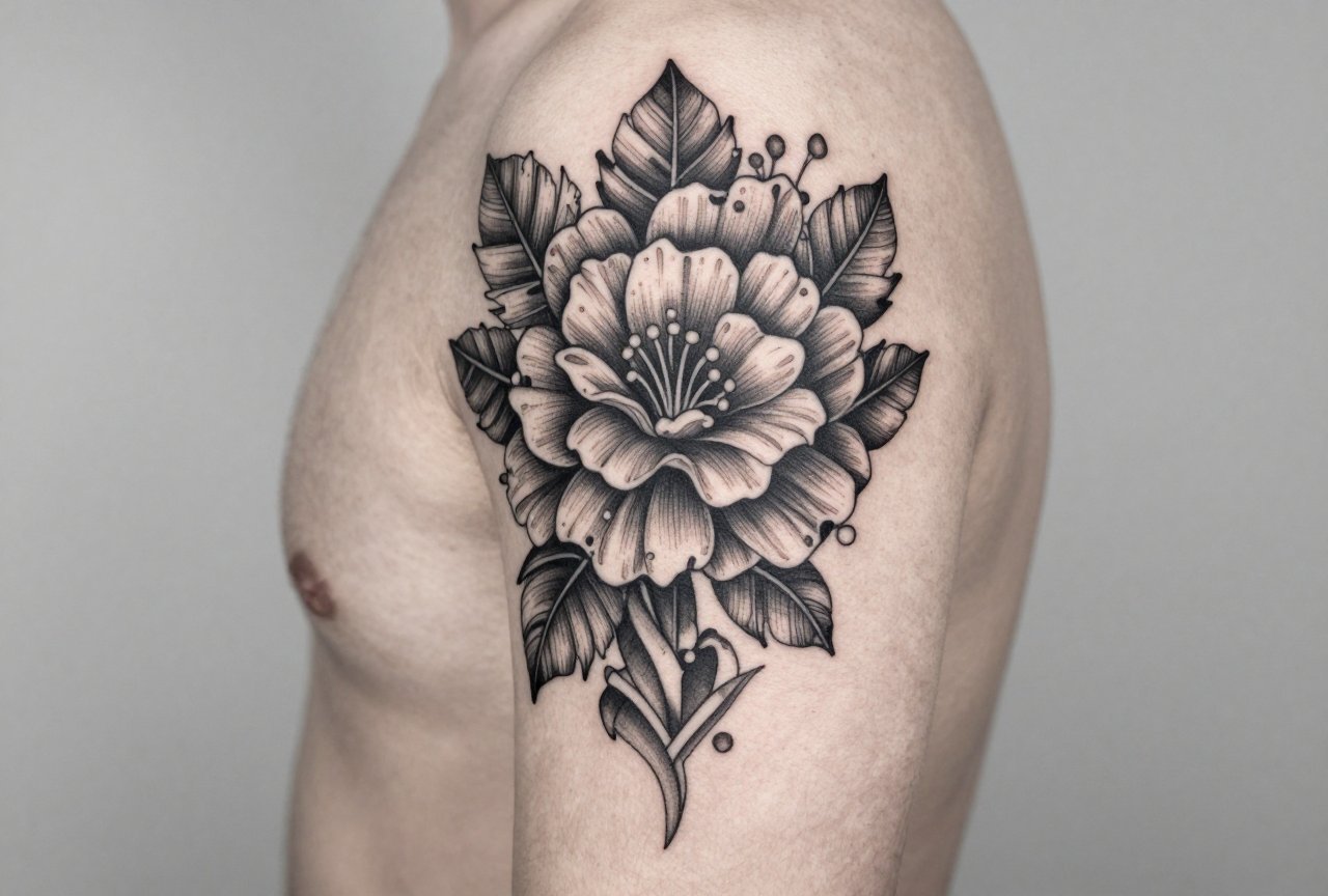
Black and Grey Realism
This is where I spend most of my days now. Portraits, wildlife, religious imagery. The key is contrast. You need deep blacks, bright highlights, and enough mid-tone to connect them. A common mistake I see: people want “soft” black and grey, which translates to “no black at all.” Five years later, it’s a grey smear. I tell clients: the black is the skeleton of your tattoo. Without it, everything collapses.
Design Ideas That Actually Mean Something
Amazing designs aren’t just technically good, they resonate. But resonance doesn’t require a twelve-paragraph backstory. Some of my favorite pieces have been deceptively simple.
- Botanicals with personal connection: Not just “a flower.” Your grandmother’s peonies, the wild sage from your childhood backyard, the fern you pressed on a first date. Specificity shows. I can tattoo a generic rose in my sleep, but a particular cultivar with the right leaf curl? That takes attention, and it reads as genuine.
- Animal portraits with personality: Your dog’s actual mismatched ears. The way your cat sits with one paw tucked. Real reference photos, not stock images. I did a pit bull last month where the client brought twenty photos to get the head tilt right. The tattoo is unmistakably that dog.
- Geometric work that respects anatomy: Mandalas, sacred geometry, dotwork. These can be stunning when placed to emphasize the body’s structure, centered on a chest, flowing with a shoulder cap. They become disasters when scaled wrong or placed on a spot that stretches unpredictably. I’ve fixed too many geometric pieces that looked perfect on a flat design but distorted on a curved calf.
- Text and lettering: The most requested, most butchered category. Script needs to be readable at size. I won’t go smaller than 10-point equivalent for most fonts. And please, no full paragraphs on ribs. It spreads. It blurs. I’ve seen “Only God Can Judge Me” become “Only God Can fudge Me.” Not a joke. Actually happened.
Best Placements for Longevity
Where you put it matters as much as what you put there. I have this conversation daily.
High-Movement Areas to Approach Carefully
Inner biceps, elbows, knees, fingers, sides of the neck. These places move constantly. Skin sheds faster. The tattoo works harder just to exist. I did a gorgeous geometric piece on someone’s inner elbow five years ago. It’s held okay, but it needed a touch-up at year three. Compare that to a back piece I did the same year, barely any change. If you want something delicate and detailed, put it where your body stays relatively still. Upper outer arm. Thigh. Back. Chest, if you’re not planning major muscle transformation.
Spots That Age Gracefully
The “good skin” zones: outer forearm, calf, upper back, shoulder blade. These areas see consistent sun exposure (which you should be protecting against anyway), but they don’t fold and crease as aggressively. I’ve got a full sleeve on my own left arm. The outer side still looks fresh. The inner elbow and wrist? Softer. That’s just reality. Design accordingly, put your detail where skin cooperates, let the simpler elements handle the stress zones.
Color Choices: What Lasts vs. What Fades
People always ask: “Will this color fade?” Everything fades. The question is how, and how fast.
Black is king. It lasts. It stays readable. It’s the foundation I build everything on. Dark blues and deep greens are workhorses too, navy, forest, teal. I’ve seen twenty-year-old pieces where these colors still punch. Red is tricky. Bright cherry red tends to pink out. Darker crimsons hold better. Yellow and white? They’re the divas. White especially, it’s not really “white” on most skin tones after healing. It becomes a light skin tone, a highlight, a texture. I use it knowing it will settle, not stay pure.
The biggest color mistake I see: too many colors, too close together, without enough black separation. It looks amazing day one. Year three? It’s a soup. I did a cover-up last month of a “rainbow watercolor” piece that had become a bruise-colored stain. The client was devastated. We rebuilt with structured black and grey, limited color accents. Much better.
Tips for Choosing Your Design
After all these years, here’s what I actually tell people sitting in my chair.
- Live with the image: Print it. Tape it to your bathroom mirror. Look at it every day for a month. If you’re not sick of it, that’s information. Most people are shocked how fast novelty wears off.
- Consider the artist’s strengths: I turn down work outside my wheelhouse. A good artist will. If you want photorealism and they specialize in American traditional, that’s a mismatch. Look at healed photos, not just fresh work. I keep a binder of healed pieces from one, three, five years out. That’s the truth of my work.
- Scale appropriately: Amazing detail needs amazing space. I can’t make a portrait the size of a quarter that reads as anything but a dark spot in ten years. Give complex designs room to breathe.
- Think about your future self: Not in a judgmental way. Just practically. Will this work with your professional life? Your body as it changes? I tattoo people at sixty getting their first piece. I tattoo twenty-year-olds covering work from teenage years. There’s no right timeline, but there is a right level of consideration.
Final Thoughts
Amazing tattoo designs aren’t about finding the most impressive image online. They’re about finding what works for your specific skin, your specific body, your specific life. I’ve watched trends come and go, tribal bands, infinity symbols, watercolor explosions, single-needle minimalist everything. The pieces that still look amazing years later share common DNA: strong structure, appropriate scale, thoughtful placement, and colors that respect how skin actually behaves.
The best compliment I get isn’t “that’s amazing” on day one. It’s when someone comes back after five years, ten years, and the work still holds. Still reads. Still means something. That’s the real goal. Everything else is just fresh ink.
Frequently Asked Questions
How do I know if a design will look good on my specific body shape?
Bring reference photos and try printing the design at size, then taping it to the planned spot. Move around, see how it flows with your movement. A good artist will also freehand or stencil adjustments to fit your anatomy. What looks flat on paper curves differently on a shoulder or calf.
Is it okay to combine multiple styles in one tattoo?
It can work, but it needs intention. I’ve blended traditional flowers with black and grey portraits successfully because the contrast was deliberate. Randomly mixing watercolor with heavy blackwork usually looks like two different tattoos fighting. Pick a dominant language and let accents support it.
How much should I expect a detailed, amazing design to cost?
Quality work isn’t cheap, and cheap work isn’t quality. Large, detailed pieces from experienced artists run hundreds to thousands depending on hours. I charge by the piece or by the hour, and I’m upfront about estimates. Good artists will be transparent. Beware of anyone vague about pricing.
Can I bring my own design, or should I let the artist create something?
Both approaches work. If you bring art, expect the artist to adapt it for tattooing, some details won’t translate. I prefer collaborating: you bring ideas, references, meaning, and I design for skin. The result is usually better than either of us would make alone.

