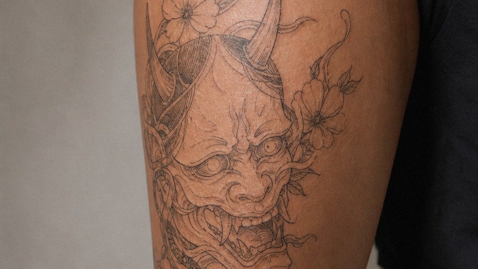
Black and grey tattoos can age beautifully when the design uses strong values, readable shapes, and enough contrast for the body placement.
Quick answer: Black and grey tattoos use black ink and diluted shading to create depth. They work for realism, religious imagery, animals, florals, skulls, scripts, and large compositions.
Black And Grey Tattoo Guide style directions
A tattoo style is more than a look. It decides line weight, shading, color, artist fit, and how the piece will read years after the first photo.
| Direction | Best use | Watch out for |
|---|---|---|
| Soft realism | Smooth portrait depth | Needs specialist |
| Blackwork mix | Bold contrast | Can get heavy |
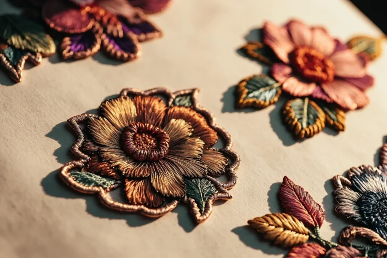
| Floral shading | Classic depth | Petal separation |
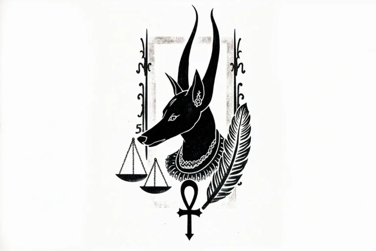
| Religious imagery | Serious tone | Detail size |
| Animal portrait | Strong values | Healed proof |
How to make it work on real skin
A black and grey tattoo is a study in restraint, the grey does nothing without a true black to push against.
Black and grey is not automatically low maintenance. Smooth shading takes skill, and pale grey can fade into softness.
The best versions have a full value range: darks, mids, lights, and clean skin breaks.
Black and Grey Tattoo Guide: Contrast, Shading and Longevity: artist fit and aging
This style depends on execution. Line weight, contrast, spacing, and the artist’s healed portfolio matter more than the label used on social media.
Ask what should be simplified for your skin, placement, and size. A good tattooer will protect the design from becoming too fragile.
- Ask for healed black and grey examples.
- Check whether the design has enough dark anchors.
- Use enough size for smooth shading.
- Avoid low-contrast reference photos.
Mistakes to avoid
Do not choose black and grey because it seems simpler than color.
Do not let every part of the tattoo sit at the same grey value.
What makes this style work after the fresh photo
A good black and grey tattoo guide tattoo is not just a surface look. It depends on line weight, contrast, spacing, artist fit, and how the design will settle after the skin stops looking glossy.
Use the style directions as a way to compare references: Soft realism, Blackwork mix, Floral shading, Religious imagery, and Animal portrait. If those examples look unrelated, the style may need a tighter brief before the artist can design something coherent.
| Reference to compare | What to inspect | Decision rule |
|---|---|---|
| Soft realism | Smooth portrait depth | Needs specialist |
| Blackwork mix | Bold contrast | Can get heavy |
| Floral shading | Classic depth | Petal separation |
| Religious imagery | Serious tone | Detail size |
| Animal portrait | Strong values | Healed proof |
Artist fit matters more than the trend name
Some tattooers are strong at bold traditional work and weak at tiny realism. Some can draw ornamental symmetry but not faces. Some can pack black smoothly but struggle with delicate color. Match the artist to the style, not just the studio location.
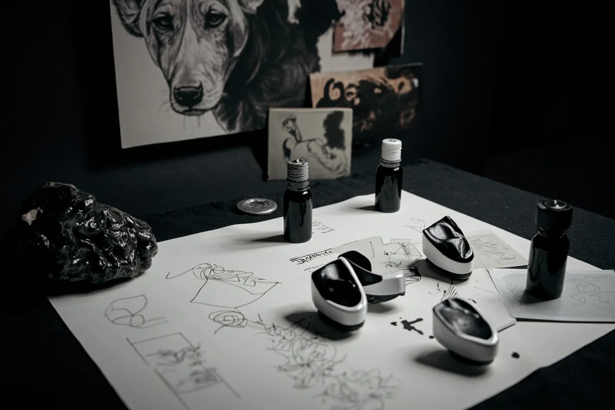
Healed portfolio examples matter here. Fresh photos show the first hour. Healed photos show whether lines hold, shading settles smoothly, and the tattoo still reads without perfect lighting.
How to brief the design without over-controlling it
Bring references for mood, placement, and detail level. Then give the artist room to redraw the idea for skin. A tattoo design has to survive curves, pores, movement, sun, and time; a flat reference image does not.
Visual reference note: Save references that show healed work, not only viral fresh tattoos. If a style looks good only under studio lighting, ask what it looks like six months later.
Reader questions before you book
Is this style good for a first tattoo?
It can be, if the design is readable, the placement is realistic, and the artist has healed examples in the same style.
How do I know if an artist can do this style?
Look for healed work, not just fresh photos. Check line consistency, shading, symmetry, and whether similar designs still read clearly.
Should I make the design smaller to save money?
Not if size is what keeps the tattoo readable. Shrinking a detailed style often creates a weaker tattoo and a future touch-up problem.
What should I bring to the consultation?
Bring style references, placement photos, a rough size range, and notes on what you do not want. That is enough for a good artist to design from.